I always use a very high quality, pre-primed, heavy-duty linen canvas by a leading manufacturer. I also choose a very coarse linen. Why? When observed very closely, the surface of such canvas is a series of round bumps linear in both directions.
Once I have suggested the drawing, or perhaps more correctly the positioning of my masses, I like to color the canvas with a wash of chosen color. I never use pure turpentine, only because it denies any body in the pigment in places on the canvas where no other paint will cover this wash which, without the addition of oil, will not survive time.
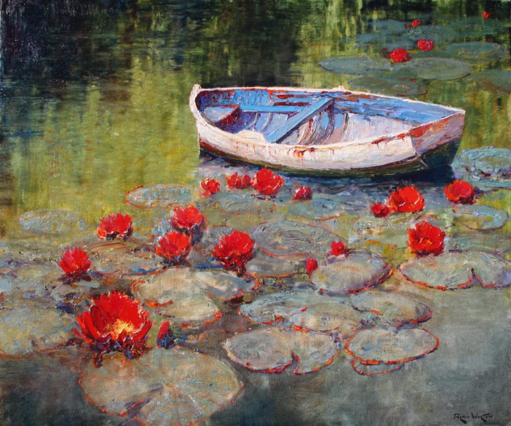
At this point in the procedure, I have no white or opaque colors on my palette. The result is an effect as pure in color as a watercolor on white paper. Often the most gorgeous colors are dark and intense. Here I might bypass the wash and apply the pigment without medium. Then because I require a lift in the tone or lightness of an area, I use a knife to scrape off most of the paint. Now because the canvas has all its multiple mini-projectories, the paint will be left only in the recesses of the canvas. So, actually what happens is that the white of the canvas bumps is seen through the applied pigment. From very close, it appears spotty, but from afar, the eye reads a lighter value of a delightful dark pigment which has in no way lost its transparency or luminosity. Also because the paint is so recessed in the canvas texture, one can apply either a scumble or impasto without drying time.
At this point, I normally choose to scumble, also because being so thin and adhering to the canvas projectories only it will harden quickly. Until I really have my picture talking to me, I don’t choose to paint wet in wet.
What I’m describing is more for large canvasses in one’s studio. Plein air small works don’t belong to this category. Small plein air, one tends to go in fully loaded. There is too much wind and way too many bugs to do anything else.
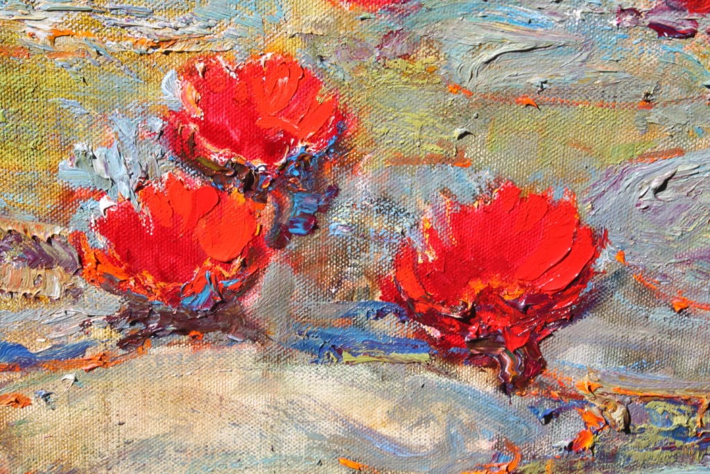
Scumbling, a very light touch to the canvas with a large flat brush using undiluted paint, will offer numerous effects but never totally cover the wash or the scratched areas. Otherwise, why bother to put them in, in the first place. Every stage is part of the finished painting.
Now comes the impasto. For some reason or another, lumpy paintings have become the vogue. The idea of a lump on a canvas is that under angular lighting, a lump will catch the beam of light and visually leap off the canvas. Now this is great for highlights in high-toned colors. If the painting is ultimately varnished, your lumps will “shine” as well under spotlights. If you don’t want shine or glitter, don’t lump. Lumps in a dark area glisten and totally destroy the intensity of the dark. Recently, I saw a show where the whole painting was lumps. Wonderful for the manufacturer but a disaster to the painting – and the viewer!
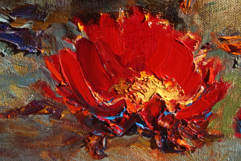
Painting florals is interesting. A knife is good, but it tends to lose the delicacy and femininity of a petal. As petals of a rose, for example, are so perfect a non-textural finish is needed. No shadows are required in a petal under the sun. A brush stroke will leave fiber striations, which cast minute shadows. A latex gloved finger will give you a petal beyond your expectations. But use a new finger for every application. Otherwise, you will have the most devastating mud pie!
There is no need at any stage of a painting to apply any pigment which will not be seen in the finished work. One can, of course, rub color over another color to create a secondary value – but let’s not get too complicated!
Marc Hanson says
Wonderful post Alan! And I love the look of your linen in the close ups. As long as we’re probably all pretty serious painters here, and interested in materials as well as technique, would you mind mentioning the brand and ‘type’ of linen, as well as if it’s primed with an oil based primer or an acrylic based primer. The surface of your paintings have always been very, very attractive. Thank you for sharing and for the additional information if you choose to share it… Marc Hanson OPA
Alan Wolton says
Thanks, Marc! I have used Claessens (Belgium) for many years. They have an array of canvas products. My choice is a #29 oil primed linen. It also comes in numerous linen texures and also acrylic.
Marc Hanson says
Thanks Alan. I’ll check it out.
Dale Landrum says
Excellent. The bit about transparent washes to “block” in the main shapes is so true. The so-called “spectral” color of whatever color we are using, has an obvious charm all it’s own as far as I am concerned. No doubt simplicity has a certain power. Occasionally my wife will be in my studio when I am starting a painting, and has asked me to stop and leave the “extremely” sketchy design alone (…it works already…why spoil it?) This of course tells me something. But I don’t have enough canvas or time to spare for all the “extremely simple” compositional washes that have some unique charm to them. Add to this the need to set out and do “complete paintings…” Still, the old saying that goes “say more with less” has all too much truth in it. Years ago I read somewhere that Renoir started his portraits with transparent strokes of alizarin crimson. I imagine it applied to his landscapes as well.
Thanks so much for your contributions, as well as giving humanity some excellent artwork to enjoy.
Dale Landrum
Alan Wolton says
Wives certainly tend to recognize the charm of an initial sketchy approach. Perhaps because, at this point, the somewhat abstract image appeals to a color sense. Once it starts being something, it becomes judgeable. Thanks for your kind comments.
Tom Watson OPA says
An interesting explanation of your procedure. For years I painted on expensive linen, probably because of all the implications that if you want to do great paintings, you must use the most expensive materials. Well, call me a picaroon, but I honestly prefer a good quality, but lesser expensive cotton duck canvas. Did I feel a cold chill in the air, just now? 😉 I like the more consistent texture, and it seems that I can get just about the same effects you have described on either canvas, so why should I pay a lot more for the word “linen?” I know, some say it has better longevity and that is probably true, but I have hung on to several of my paintings on cotton duck that are over 50 years old, and they are in great shape. And, they were stored for 30 years in the garage. I guess finding the materials and methods we personally like is all part of the painting experience.
Tom Watson OPA
Alan Wolton says
Interesting! I did not have such luck with cotton used in the days when I was somewhat penniless. I still have a 20×24″ cotton covered board by a leading manufacturer (painted in 1955) where much of the sky is gone leaving the cotton surface visible.
Jeanean Songco Martin says
Great article and so appropriate for my class. I was trying to demonstrate how interesting it is to use a combination of different marks to describe form and your example is perfect to show how this is done. I will forward your article. You have inspired me to try a coarser linen. I have always been partial to Claussens #15 a smoother grade but I would like to try something different now seeing the beautiful results you have gotten. Of course, it would be even nicer to see the real painting. I love Titian’s paintings and he uses a course linen too. Thanks for the article! p.s. I paint with my fingers too. guess I should use a glove.
Alan Wolton says
Thank you, Jeanean. Definitely use a cheap medical latex glove – but don’t be surprised as they disintegrate on your hands. They’re not intended to be resistant to oil. Paint under the fingernails can be toxic and is the devil to remove.