I made my first painting when I was 21 years old. Up to that point I had never been in an art museum, nor was I aware of the French Impressionist painters. I discovered their work looking at an art history book my girlfriend had. I was immediately drawn to the work, like nothing I had ever experienced before. It was life changing. My friend encouraged me to try painting and gave me a set of acrylic paints, so I proceeded to make some copies of the Impressionist work I saw in the book, plus enrolled in some art classes at the community college. A drawing class and two painting classes. I was also working but would paint on the weekends and evenings.
Two years later in 1975 at 23, I decided to paint full time, quitting my job where I had saved as much money as possible, about $6,000, to give it a go. My paintings were rough, drawings poor and clumsy, with little evidence of real talent. More than talent I was determined and tenacious and I absolutely knew this was my path. Painting was something that completely filled me with wonder, excitement and a sense of being very alive. For the first time I felt a purpose and calling in my life.
I’m not sure where it came from but I was also certain I would be able to survive as a painter. My parents certainly instilled in me a work ethic, but they also did not understand nor really support my choice. Years later when asked what he thought at the time, my dad replied “I thought he was a hippy”. All that changed when they saw my commitment, hard work, plus my paintings really improving. After almost six years of painting full time and a visit from my parents to my place in Arcata, CA, about 700 miles from their home and where I grew up, plus seeing the conditions I lived in, my dad gave me a call. He said my mother cried all the way home as she was so sad to see the cold water, showerless, no kitchen stove, just a hot plate, funky studio living quarters I resided in. He offered to cover my expenses for a painting each month. This from parents that really had no connection to the fine arts, but were getting to know it some, through my passion and love of art. They sent a modest check for a few years to help me out, building a nice collection of my work. My paintings eventually started to sell, beyond just a sale here and there. That was after 14 years of working very hard at drawing and painting. I believe there is great power in committing oneself 100% to what it is you want to do as an artist, or anything in life for that matter. When I made that decision to paint full time,
I was certainly naive in matters of life and art but my desire and passion, single mindedness and work ethic carried me each day. It was a good time to throw caution to the wind as well. From 1975 to 1988 I never paid more than $150 per month for a place to live or work, and $25 brought home a couple large bags of groceries. In 1989 my wife Terry, also an artist, and I bought our home, so of course expenses went up, but we were both selling our paintings and bringing in more money than any time before. We are in the same house in 2025 and have never missed a house payment, plus we built two studios on our property 20 years ago. All of that I attribute to working hard, growing and improving as a painter, plus never losing faith in the process and commitment to a life as a painter.
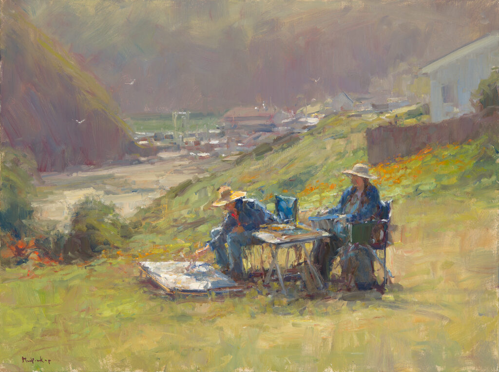
I also believe luck and being in the right place at the right time play a role in shaping our life. Luck is fueled by commitment and hard work. My decision to move to Humboldt County brought me to a place that was beautiful, with an abundance of diverse landscape painting opportunities and an art community that embraced me, one where I met some lifelong friends, painters that I learned from and helped me grow.
Making a commitment and following through on it, connected me over the years with so many fine people, fellow painters, patrons and friends. I have witnessed that support from so many people for all these years. In the lean years I had landlords trade for rent as well as dentists and other professionals who traded, and people buying the work, usually for not more than $150. When one believes completely in what one does and works hard at it, many people will see that commitment and support it in many ways.
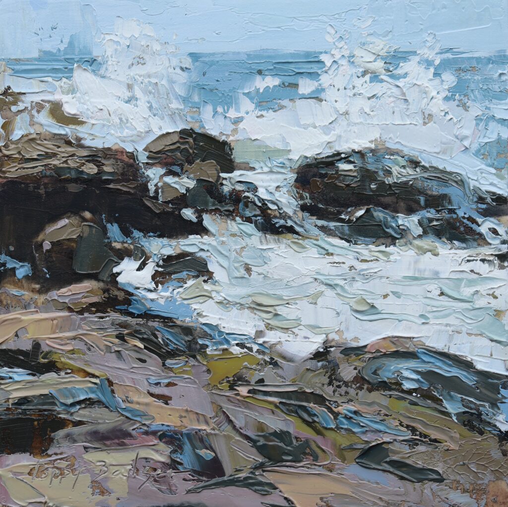
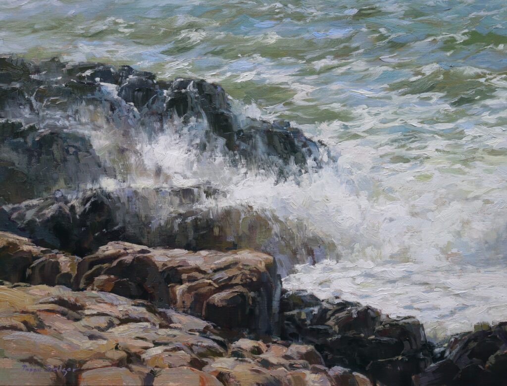
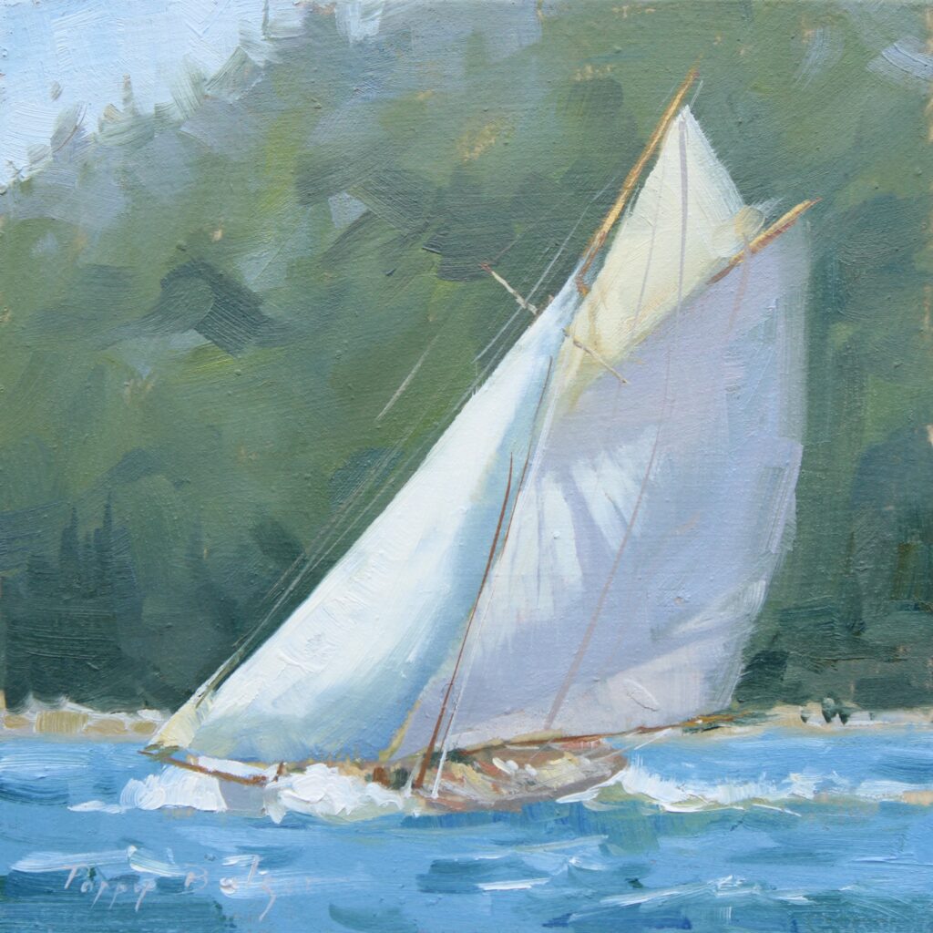
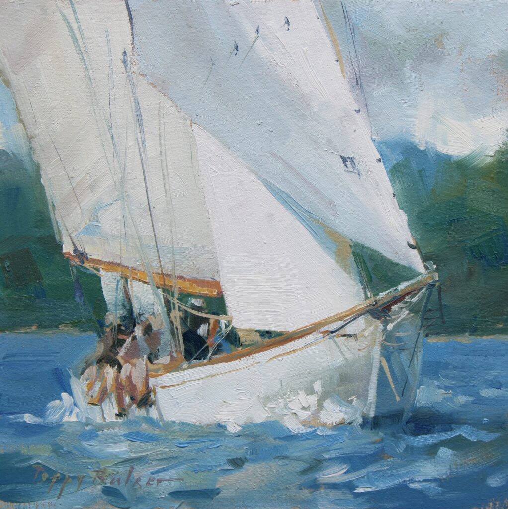
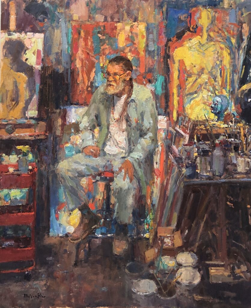
Honesty and painting what you believe to be true and meaningful is so important to making work that is authentic. I have always believed it’s a mistake to ever think about what the market is looking for or trying to find what connects with buyers. One needs to connect on a deep level with the work they do and the people that love your work and those that purchase it, will sense that and follow your journey. I sell a lot of work, but I paint a lot more that hasn’t yet sold and fills my studio. For me, and my own wellbeing as an artist, I would find it to be unfulfilling to repeat over and over those paintings that were popular and sold. I think when trying to make art one needs to explore and push ourselves into unknown territory, or try something that is very difficult, exploring different subjects or one’s process of painting. I love this quote from Miles Davis. He was once asked why he didn’t play ballads anymore, “because I can” was his answer. Now I do love Miles Davis ballads but even more so, I love how he never stopped growing as an artist, even if I didn’t like everything he made.
I think we need to trust in the path we chose, and with commitment to that path, plus hard work, conducting oneself with great character and consistency, lots of effort to get ones work out and seen, that even with all the bumps in the road, and I still face those bumps today. Life as an artist is very magical and fulfilling, even with all the struggles and mood swings while trying to make your very best work. We never arrive, yet we keep trying to move forward. That makes painting very exciting and I believe keeps us reaching for more.