Square is Rare. Reviewing paintings that were exhibited in the 2024 OPA National, Eastern, Western, and National Salon shows reveals that not many were in a square format (13.5 % or 80 squares out of 592 total paintings). If you are a representational painter and have little experience with a square format, I encourage you to read on. Being an unfamiliar format, it may require rethinking and adjusting your design ideas, especially center-of-interest (COI), balance, and placement of primary, secondary, and tertiary shapes within your composition. Other painting tools such as values, drawing, color, edgework, paint-application, harmony, and the like apply as they do in rectangle format paintings.
Three Benefits of Daring to Paint Square.
1. Experimentation can lead to new learning and growth. Why venture into a new format that you may have little or no experience with? For me, experimenting is an important way to grow as an artist. When I intentionally try new methods, I may initially fail but stretching my abilities helps me become a better painter. I am a novice in painting square. However, recent attempts of daring to paint square have helped me strengthen my design choices in all my paintings, whether they are horizontal, vertical, or square.
The square format challenges me to think how to best arrange and prioritize shapes throughout the canvas to convincingly tell the visual story I want to convey. Since there is no favored side (all four outer edges are equal), there is no natural area-skew that rectangular canvases offer. I pay more attention to balance, COI, and shape placements. I identify upfront tradeoffs as to where I want the viewer’s eye to move and where is the best location and way to present the COI. These are things I do with rectangular paintings. However, the square format is new and different. It reminds me of the importance of these design choices.
2. Another reason to consider experimenting with squares is that it can help set you apart from the pack. Based on the 2024 OPA shows, over 85% of exhibited paintings were horizontal or vertical rectangles.
3. A final, albeit less important reason to consider a square format is that social media platforms, such as Instagram, are shown primarily in a square format. If you paint square, your social media image is purely presented (not cropped).
In this article, I will discuss square canvases painted by Piet Mondrian, two personal paintings of mine, and one painted by Joaquin Sorolla y Bastida. I will analyze the paintings by Mondrian and Sorolla and explain compositional choices I made to enhance and draw you into the squareness of my paintings. I will conclude with five specific tips.
Piet Mondrian Went Square Early On.
Let’s look at an abstract square painting that was created by Piet Mondrian in 1929 titled, Composition No. III, with Red, Blue, Yellow, and Black.
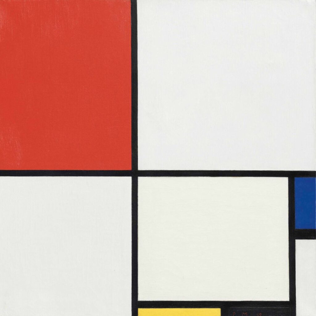
In my opinion, design is one of the most important skills in our painting toolkit. Mondrian’s Composition No. III design has unequal and therefore unbalanced shape choices, yet, when placed together there is dynamic and varied interest, balance, and symmetry. Specifically, the intersecting narrow black horizontal and vertical shapes that go from edge to edge are off center and meet to the left and below the center of the square (creating unequal quadrants and tension). The smaller yellow, black, and blue rectangular color shapes on the lower right side of the painting help counterbalance the larger red shape in the upper left.
These fundamental design choices of Piet Mondrian’s abstract square painting format work in an elemental way. They provided me with clues on how to think about painting in a square format for my representational/impressionistic paintings. Let’s discuss the first example.
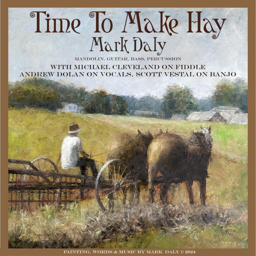
Haymakers by Mark Daly (oil, 20” x 20”, 2024). I recently painted this in a square format because it was going to be used as the cover of a new song that I wrote called Time To Make Hay (more information on my music website: www.MandoMusic.com). The rural scene was based on plein air painting trips to Shipshewana, Indiana, and supports the song’s lyrics. A square painting naturally fit the square format needed for the song’s packaging. What I did not realize is that I was going to embark on a journey of painting design growth.
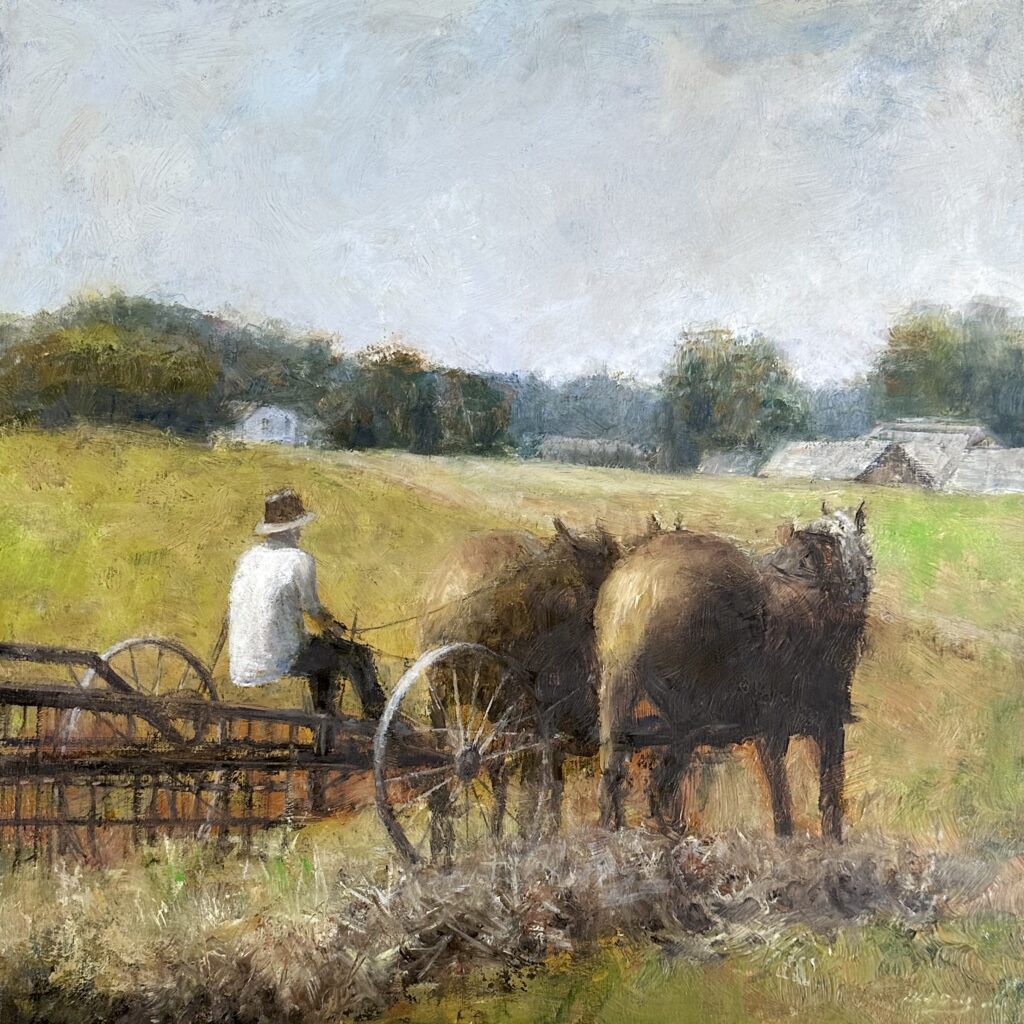
The round wheels and gently sloping hillside in Haymakers soften the tension of the square format. As you can see, the horses and figure (the haymakers) are the COI. In front of the horses, there’s a soft-edged path that leads from middle-right to the upper-left. The addition of the small white building (secondary shape) above the haymaker’s head at the end of the trail was an addition I made to take advantage of the square format. It helps move the eye through the composition. The flatter, light-value sky shape was chosen as a rest area and because it reinforced the lyrics, “Going where the sun is going to shine…dark clouds have left and moved away”. By design, the sky is lighter and warmer on the upper right corner. This helps counterbalance the figure’s light valued shirt located toward the opposite corner. Each shape choice works within the square format and plays a prioritized role that supports the painting’s idea.
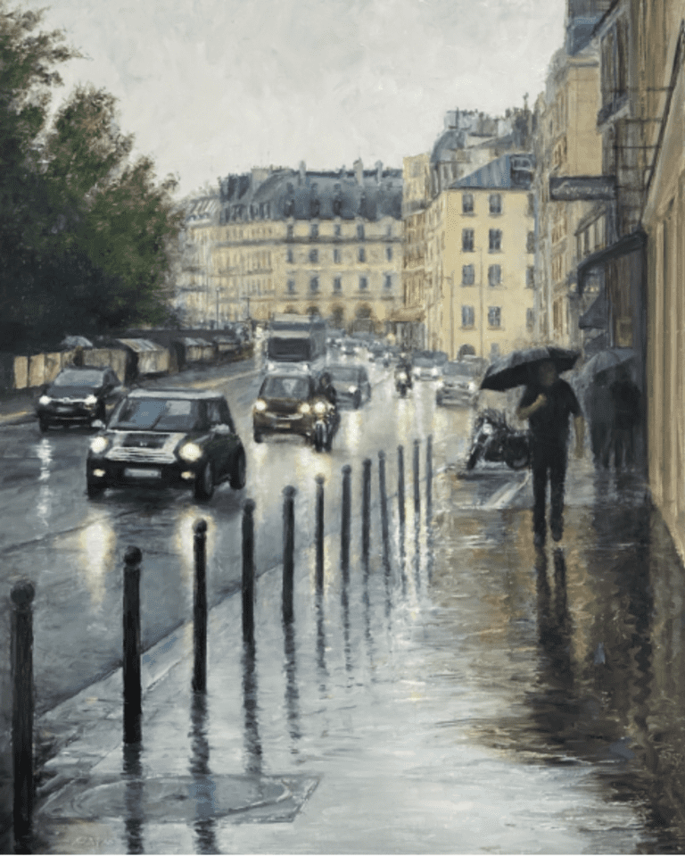
Rain Along The Avenue by Mark Daly (oil, 30” x 30”, 2024). After painting Haymakers, I wanted to try more squares. Rain Along The Avenue’s square format is a made-up scene of New York City. Having painted many city scenes with flags and figures, this was an opportunity to experiment with an unincumbered design within a square format. There were no photo references, only the memory and experience of many previous attempts of painting similar motifs, all in a rectangular format.
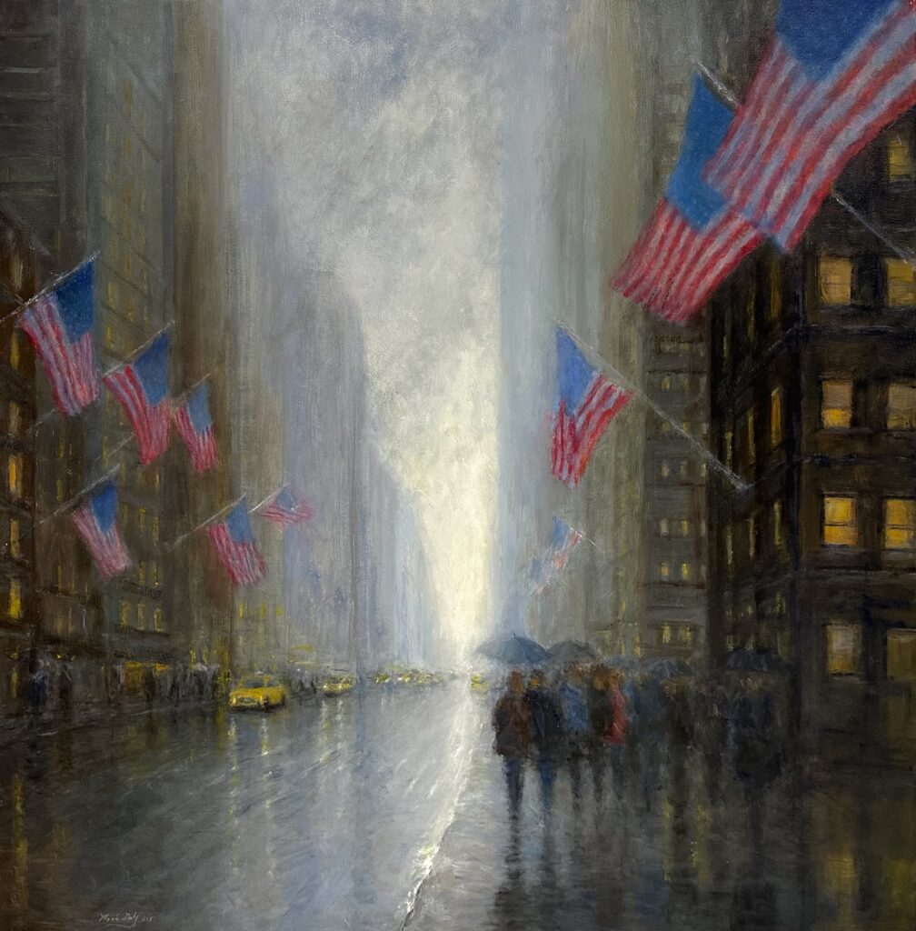
I sketched, prioritized, and chose various design choices and elements before applying paint. For example, the V shape formed by the receding thirteen flags along both sides of the street and the reflected narrowing angular shaped light from the sky help add perspective and create downward movement towards the COI (figures). Like the Mondrian abstract painting’s black intersecting lines, the flags and bright sky are intentionally placed off center. The yellow cab on the lower left and the small flag above it (blowing in a different direction from the other flags) provide counterbalancing visual interest to the large flags on the right side and the figures below them.
Other less obvious design choices that break up the equilibrium of the square canvas are the use of round shapes and lost edges (umbrellas, curved figures, and broken edges from the clouds in the sky and the upper areas of the distant buildings). I chose rectangular windows (intentionally not square) to add visual interest and variety to the square format. There are prioritized primary, secondary, and tertiary shapes placed throughout the composition. Judgmentally, these specific square format design choices made the painting’s story more convincing and engaging.
One way to check the power of a good square painting design is to rotate it 90 degrees, view it on each of its four sides and see how the visual elements hold up (or not).
Strolling Along The Seashore by Joaquin Sorolla y Bastida (oil, 205cm x 200cm, 1909, Sorolla Museum, Madrid). While not a perfect square, it is very close. Sorolla took full advantage of prioritizing and placing appropriate shapes on a square format in this painting. I don’t think it would be as engaging or interesting if he painted it in a typical rectangular format.
(Sorolla Museum, Madrid).
Strolling Along The Seashore is a good example of how to leverage a square format to make a better painting. Compositionally, Sorolla uses the two figures (his wife Clotilde and daughter Maria) in a counter balancing way. The figures dominate the painting. They lean forward (toward the right side of the canvas). This creates diagonals and adds movement and life to the composition. The large parasol held in Clotilde’s left hand counterbalances Maria’s hat held in her right hand. Maria’s directly viewed face counterbalances Clotilde’s veiled face.
Sorolla effectively used round shapes that offset the square format. For example, the curved transition from the large ochre colored sand shape in the painting into the water above it breaks up the equidistance of the four outer edges of the canvas. The curved parasol on the lower left side of Clotilde provides a point of entry. Its angular parasol shaft points to Clotilde’s hand. The round shaped hats (one worn, the other held) add beauty, bring visual variety, and help communicate Sorolla’s story of two elegant women walking on the beach.
The Dare to Paint Square Challenge: Five Suggested Steps to Becoming a Better Square Painter. The main idea of this article is not to have you become a square painter, rather it’s to challenge you to continue to experiment with your design choices and to seek new ways to paint so that you can improve your painting abilities in whatever format you choose.
When considering a canvas choice, the outer four edges make up an important design decision. A square format, while not traditional, does provide certain advantages. But the design choices must work within those advantages (and disadvantages). The square format has natural tension. It is less familiar. That does not mean it should be ignored.
In conclusion, here are five suggestions to help you paint in a square format:
- Find examples of square paintings that inspire you. Study them. Learn what makes them tick. Borrow ideas that you can incorporate into your own visual stories in a square format.
- For your paintings, choose designs that will leverage all areas of the canvas. Still life paintings are naturals for a square format (you can easily choose and set up the composition to leverage the square shape). Prioritize your shape sizes and placements to convincingly tell your story. Choose your COI carefully and consider balance and counterbalance within a square format. Map out eye movement throughout the square.
- Draw your design options in a sketchbook or pad before painting. See how the different, prioritized shapes enhance a square format, interrelate with each other, and support the overall purpose and story of the painting you want to share with others.
- Try at least five squares before you give up.
- Write down what you learn with each attempt. Apply learnings to future paintings (square and rectangular).