Did you know that OPA has been sharing artists’ blog posts for over ten years? We have an extensive collection available to the public on our website. This summer, OPA will be taking Deep Dives into our archives and sharing our favorite posts from years past. Please enjoy this first Deep Dive by Lori Putnam OPA.
I would like to start by making it very clear that there is absolutely nothing wrong with being an artist who chooses NOT to turn art into a “career.” It in no way makes that person less of an artist; it only means that he or she is not going to rely on creating art to earn a living. If you are one of those artists who makes art solely for the joy it brings, congratulations!
Beginning-Mid-Level Career Artists
Entering exhibitions and competitions:
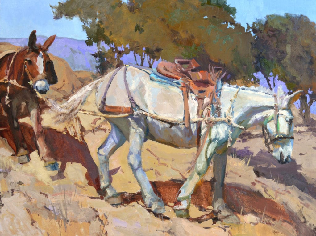
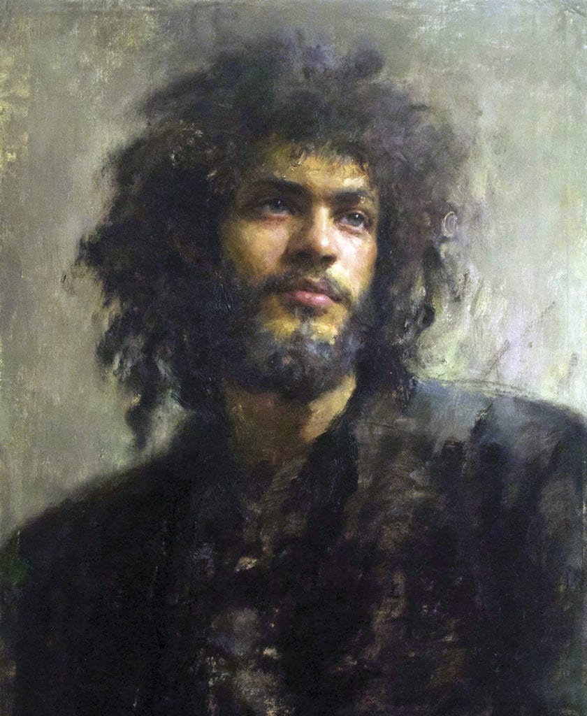
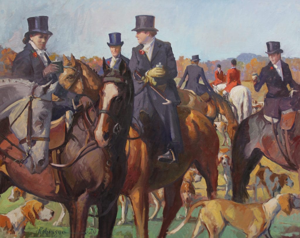
36″ x 48″ – Oil on linen
For the rest of us, building a career is, at the very least, time-consuming. It can also be super demanding and, at times, expensive. Someone told me once to expect a good resumé item to come in at no less than a grand. That was many years ago. I suspect by now, it costs much more. By this I mean the expenses incurred with membership fees, entry fees, crating fees, shipping fees, travel to the event (if you are fortunate enough to be able to attend), return shipping fees if the painting or paintings do not sell, etc. Costs can add up quickly. At this point, you are up to several thousand dollars, and this does not take into account the time, supplies, framing, and lest we forget, painting the award-winning painting!
Okay. So many of you already know this part. But for anyone just entering the world of competitions, it may be tough news. Yet, entering competitions is one way to begin to build a good resumé and career. Quite frankly, it is also one of the least expensive ways to start. [Note: yes, you will be rejected from time to time and want to give up. Do not. I say this with all honesty and humility. Pouting, making accusations, and posting your failure all over social media will get you nowhere. Try again. It is true that the very piece that did NOT get into one event, may win the top prize in another. You must learn to leave your ego out of this and continue to seek these opportunities.]

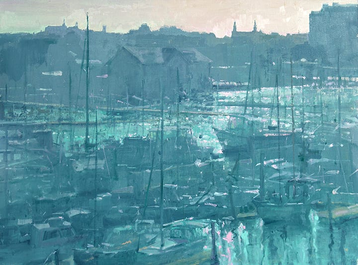
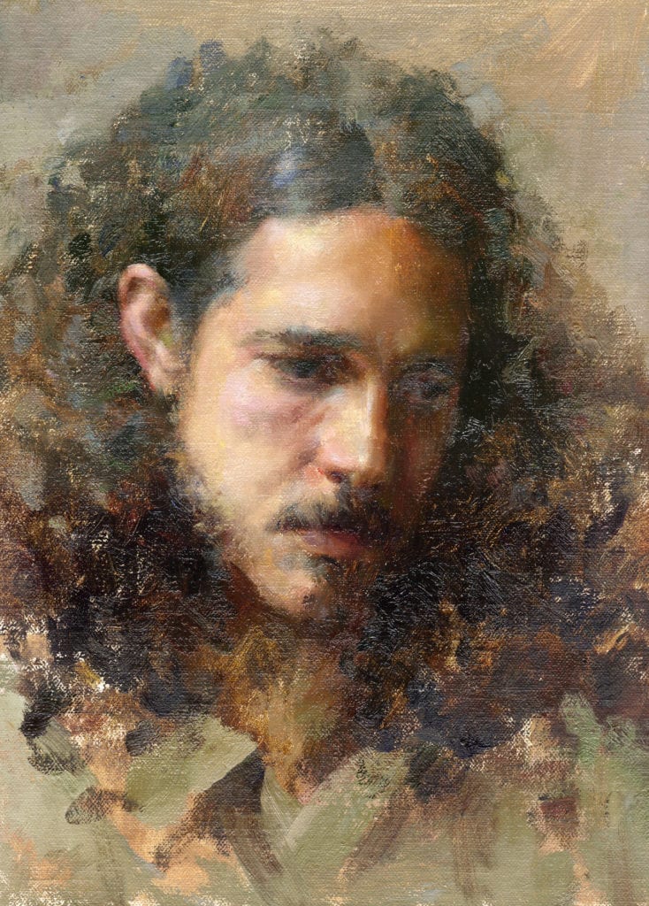
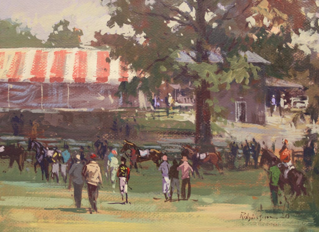
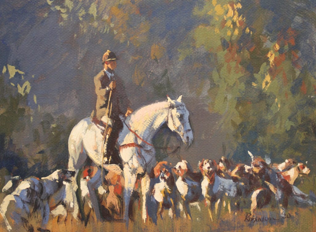
14″ x 18″
Networking:
Another way to help your career is to attend conventions and events that are meaningful to you. For example, you have already taken the step to belong to OPA. If you can take one trip this year, why not try to go to the conference? I remember my first one. My $1200 painting was hanging next to David Leffel OPAM’s $100,000 masterpiece. I could have tucked my tail and retreated; instead I felt a sense of “WOW. Here I am! Next to these amazing painters!” Research conferences, conventions, and other networking opportunities and set a goal to make it happen.
Sometimes even more difficult than going to an event, is to leave your ego or shyness at home. As artists, many of us are introverts. I am no exception. This can manifest itself in one of two ways: arrogance or timidity. Fight both. A few public speaking, improv, or acting classes, professional coaching or counseling, followed by rehearsing and preparing what you might say, can get you through a lot. You will not die. You will make new connections and friends that will have an effect on your career for years to come. I met Quang Ho OPAM at my first OPA conference. He, in turn, has mentored me and become one of my dearest friends. We are now working together on projects. Whether you mean to or not, the people with whom you connect can help build your career. This is in no way using their goodness. It is just a product of it. Chances are you will help their careers as well.
Mid-Level-Upper-Level Career Artists
First of all, you should STILL be doing those things listed above. Now, you will add…
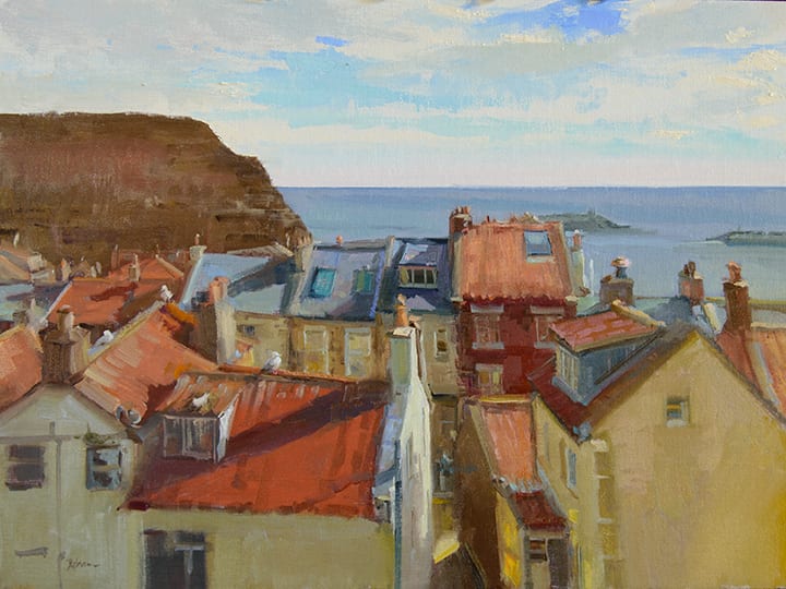
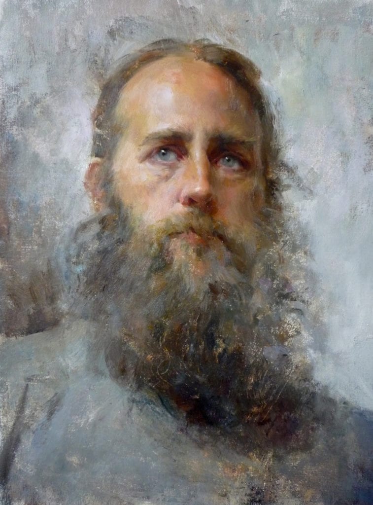
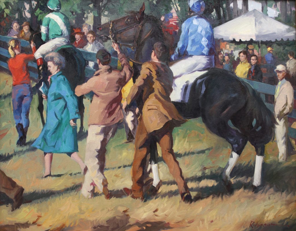
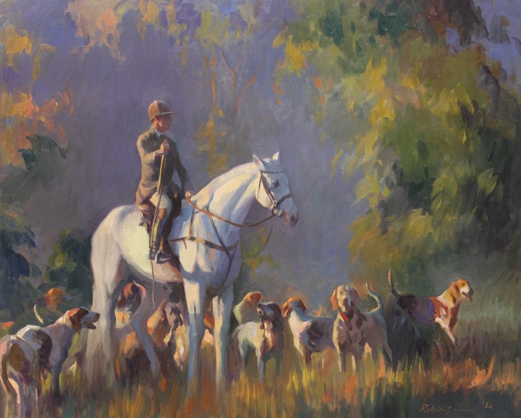
30″ x 40″ – Private collection
Marketing and Advertising:
Go ahead and say it with me… marketing. See, it is not an ugly word. Some people cringe when they hear it, but the truth is that you produce a product. It is one that is near and dear to your soul, but it is still a product to the mere mortals (buyers) of the world, and it has to be marketed. No one is going to accidentally stumble onto your front porch looking for a great piece of art.
Marketing can mean a lot of things. For instance, if you are putting your work on Facebook, Twitter, Instagram, Pinterest, a blog, or any other social media, you are marketing. You are just choosing the free route which does not seem quite as icky somehow. The question is, are you making those efforts on a whim or do you have a plan? Research what works and what does not, which types of posts are getting the best response, and what subjects your followers most want to see. Follow the advice of experts to make “free” marketing work for you.
There will come a time, mid-level career, that you may find it a good idea to up your game with paid marketing. You need to know when you are ready for such a leap. One of the best ways to determine that is to answer these simple questions:
- Do I paint regularly and produce a steady stream of work?
- Is my work consistent in style? (You will keep growing, but your work should look like YOURS, not your instructor’s).
- Can I commit to at least a year of paid advertising?
Paid advertising can be in the form of print ads or banner ads in publications, direct mail, or whatever. The hard truth is that it will cost money to do these things. This is money you don’t have, after all, because you are an artist building a career. But like a lot of things, if you advertise consistently, doing so will pay for itself over time.
When I began print advertising in a meaningful way (by that I mean not just once here or there to get editorial coverage), I was absolutely in no position financially to do it. You are thinking, “yeah, but you were not as broke as I am.” Yes, I was. The point is, I did it anyway and lived on faith and water for a very long time. Only you know your responsibilities and can make this decision. After about eight months of consistently advertising, I noticed things changing. Collectors, gallery owners, event organizers, and other artists do not always distinguish between paid ads and editorial content. This is great news! As your ads show up every month, the lines become more and more blurred. All people really remember, is that your name is in the magazines “all the time.” Name recognition builds clout. Clout builds careers.
You-Think-You’ve-Made-It Level Artists
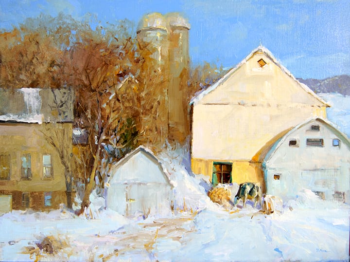
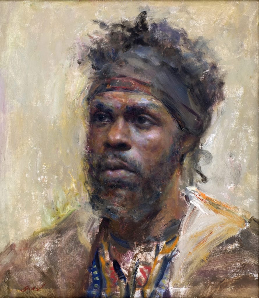
18″ x 24″
All of the above and then some:
Sorry to tell you this, but the stakes are even higher for you now. There are still important exhibitions in which you will need to participate. They may be on the museum-level and/or high-end-private-collector-level. It is also a good idea to be a leader by continuing to exhibit as Masters of those core groups and organizations that helped “make” your career in the first place.
While the demands are greater on you now, so is your responsibility. Look to the artists who still do this. They are revered. The others who allowed ego to make decisions for them are getting lost in the pile. If you are at the top of the heap, congratulations. You are now one of the artists whose name may show up in the history books. For you, public appearances, lectures, community involvement, and mentoring will solidify this, and you may well be remembered for many generations to come. You will leave a legacy behind and your children and grandchildren will reap many benefits!
As for conventions, mailings, and advertising, you should still do those. (Remember, someone else is eager to take your place if you do not!) But your efforts are directed differently now. You are doing these things because it keeps your name fresh among the newer converts to this business. The museum directors, the top 1% of collectors who want to visit your private studio, and buy your books that are now worth several hundred dollars — they are watching. They get magazine subscriptions and they watch TedTalks and CBS Sunday Morning. Your name has to stay on the tip of their tongues. Now that you can offer only a few pieces on the market each year and have guaranteed collectors ready to buy, your calling is a higher one. Use it for good.
A Few Other Quick tips:
Snail mail – Send handwritten notes to would-be workshop attendees and art buyers. People love a personal touch.
30″ x 40″ – Private collection
Become an expert – on a topic you are passionate about. People will come to you for lectures and answers.
Get your art seen – If you are at “museum exhibition” level, great. If you are not, but you paint lovely dog portraits, ask your veterinarian if you can hang your work there. Put ego aside and just do it. It’s a start.
Start a blog (or wipe the dust off of that old one you started) – Don’t make it all about You, You, You. Be giving and share your information.
Support your friends – Going to art openings for your friends is a great way to learn how things work, meet others in the business, and maybe even find a great gallery. Just remember, it is THEIR night. Do not approach a gallery owner during someone else’s moment to shine.
Email – Begin an email campaign. Start your list of people with a few or hundreds, but start it. (By the way, NEVER add anyone to your list without permission.) Then, email people on the list in a very personable way. Sure, send them announcements about all of your great trips and accomplishments, but also send them stories and helpful tips and links (like one to that last blog post you finally got around to doing).
Social media – Free. Use it. Don’t abuse it. You do not want to shove your news down everyone’s throat, but remember that most things must be posted more than once, in different groups, and at different times of the day. If you feel you are already doing too much of this, enlist someone else to “brag” on your behalf and tag you.
Volunteer for an Organization – So much good can come from being part of an art organization. By default, your name is in front of people all of the time. There are many great artists in positions in organizations but there are also many who are, perhaps, not as great yet. If your name is in a publication as a leader in an organization, the assumption is that you are a professional, good at what you do, and everyone should know and respect you.
Set goals – and I should add, WRITE THEM DOWN. Goals keep you on track. These should certainly be artistic goals, but you should also write career goals. Make them just beyond what you think you can actually reach in a specific period of time. On April Fool’s Day in 2005, I became a full-time painter. I gave myself many goals. One of them was for where I wanted to be in 10 years. Happy anniversary to me! But I didn’t stop making goals all along the way. Things change; your goals change. Write them all down. Make them happen. If you don’t realize a goal in the specified time frame, reevaluate what you did or what you might have done differently or even if the goal was totally unattainable in the first place. Example: Paint en plein air on Mars. More realistic goal: Plein air paint a space station launch.
So what are you waiting for? No matter where you are in building your career, I have given you something to do. Go do it!
