When teaching, the first thing I like to point out is that PAINTING IS HARD! So after 20 years or so it was interesting to try to break painting down into its essential parts in order to be a better instructor. Of course, there is nothing new here other than the way my brain has distilled my ongoing education. See if anything below resonates with you.
After much thinking and analyzing I realized that my seven steps are inspiration, composition, drawing, value, color, paint application (includes edges), and calling it done. It also seems that there is usually an element of contrast or balance to most steps; something dominant and supportive in the composition (not 50/50), some stuff drawn out or rendered out and some less so, some dark and some light, strong color and muted color, sharp edges and soft edges, thick paint in the light and thin darks… and usually not half and half or 100% or 0% in any of these aspects.
Truly one can spend the rest of one’s life in any of these steps or areas, and yet as artists we generally wield them simultaneously! This is why PAINTING IS HARD. I make the analogy to juggling or spinning plates. And just to make it more complicated, sometimes if we get too involved in process we somehow defeat the spark which inspired us to make art. To use a musical analogy, we don’t enjoy listening to musicians practicing scales. We want to hear creative melodies and stories. In painting this is ‘picture making’.
In terms of subjects, still life is a great way to hone the process. You don’t have to contend with changing weather and light as you do when painting landscape, and you don’t need the artistic anatomy understanding of the figurative or portrait artist. You can have your setup available for as long as you need, and you can even begin to introduce narrative or other kinds of inspiration; color, drawing; whatever is motivating you. Once you have a handle on your process and materials you can venture into other subjects with some confidence.
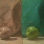
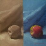
It became apparent after teaching a few workshops that folks were missing value, which is simply the range from light to dark with which we render form through light and shadow. It is a foundation for representational painting, and yet it seems that often we are seduced by color, and miss value. This can really create problems and frustration! So, I began starting still life classes with an exercise where everyone paints a simple object monochromatically, and then in color; the same size on the same canvas, side by side.
It’s quite a revelation. I will wager that nearly any painting that you love will look good in black and white. The values are like a great skeleton on which the painting hangs. And sadly the inverse is also true; when a painting isn’t rocking your world you’ll often find that it doesn’t hold up well in grayscale either.
So, try leaning into value a bit and you might make some quick progress! Just spend a little extra time trying to capture the accurate range of light and shadow before getting lost in color.
And don’t forget the secret eighth step: REPEAT OFTEN!


