• Skip to primary navigation
  • Skip to main content
  • Skip to primary sidebar
  • Skip to footer
  • Help Desk
  • My Account

OPA - Oil Painters of America

Dedicated to the preservation of representational art

  • Home
  • About
    • Mission, Policies & Bylaws
    • Board of Directors
    • Presidential History
    • Frequently Asked Questions
    • History
    • OPA Staff
    • Contact Us
  • Membership Services
    • Member Login
    • Membership Information
    • State & Province Distribution For Regionals
    • Update Member Information
    • Membership Directory
    • Contact Membership Department
  • Events
    • Exhibitions
    • Online Showcase
    • Lunch and Learn
    • Virtual Museum Road Trip
    • Paint Outs
  • Resources
    • Brushstrokes Newsletters
    • Ship and Insure Info
    • Lunch & Learn Video Archives
    • Museum Road Trip Video Archives
  • Services
    • Sponsorship Opportunities
    • Scholarships
    • Critique Services
    • Workshops
    • Have A HeART Humanitarian Award
  • Online Store
  • Awardees
  • Blog
    • OPA Guest Bloggers
    • Blogger’s Agreement (PDF)
    • Comment Policy
    • Advertisement Opportunities
  • Show Search
Hide Search

Fireside Teakettle

Barbara Schilling OPA · May 4, 2015 · 3 Comments

Fireside-Teakettle
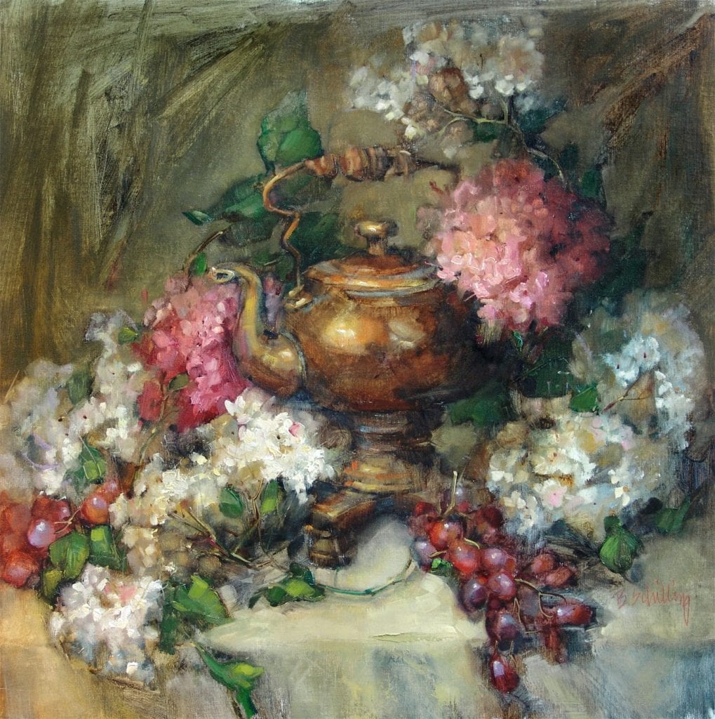
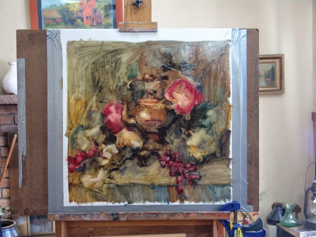
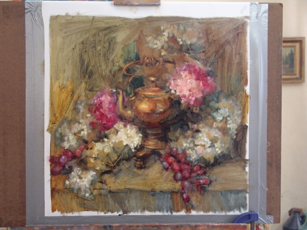
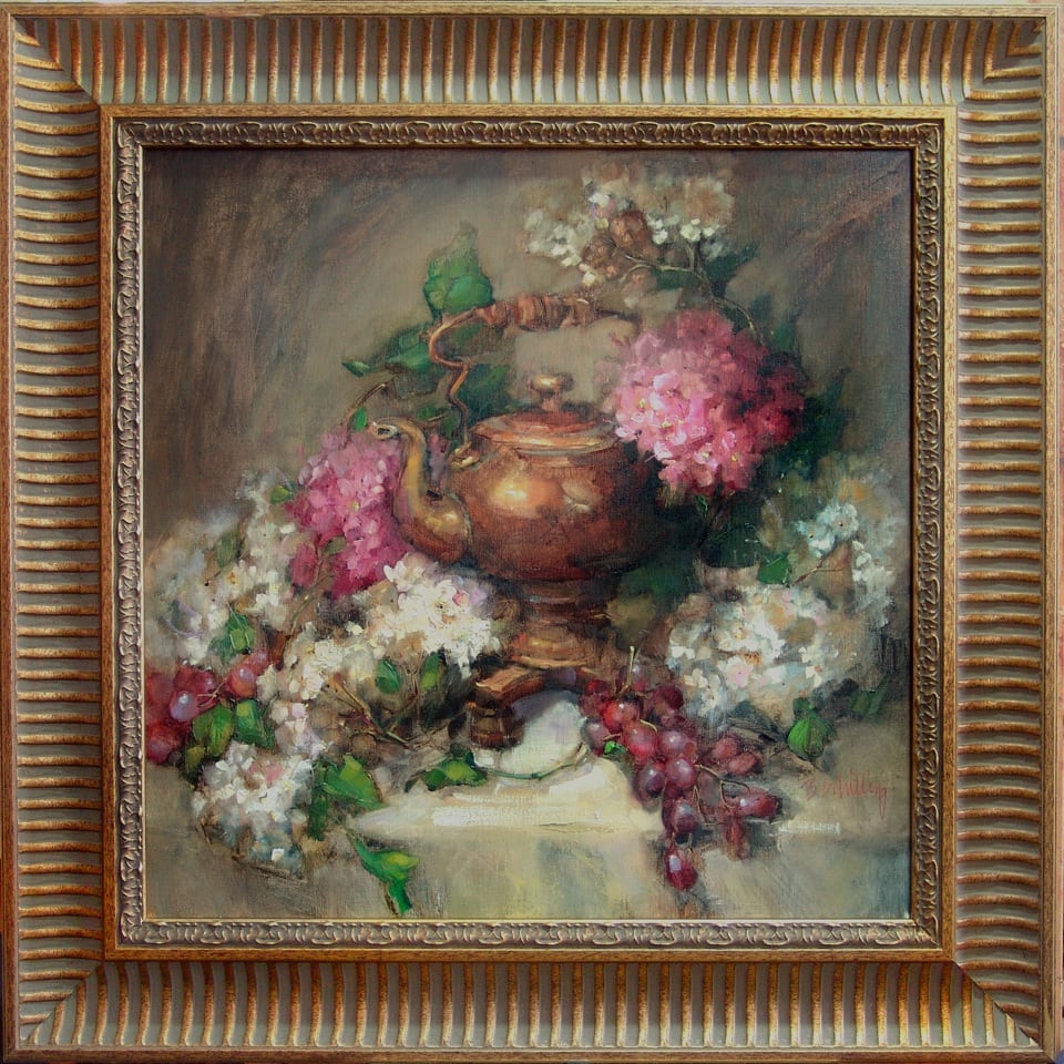
I’ve had some requests to post some of my processes so I am going to do a step-by-step of this painting. The teakettle is an antique given to me by an old friend…I wish I knew the story of it, I’ve never seen another one like it. I hope you enjoy the information on my technique(s)!
No two paintings are ever approached or completed in exactly the same way. I think it is very important to allow the energy to flow naturally and sometimes that may take a course during a painting that you didn’t originally plan. I think that is not only ok..I think that is necessary if your painting is going to find life. While the “rules” to painting are absolutely necessary to learning how to create a pleasant and believable work of art, it is with practice that you can learn to bend and remake some of those rules. That is when an artist truly begins to find their own voice. That is an evolution that must take place or the artist is simply mimicking that which has already been said.
There are as many visions for a painting as there are artists to paint it. The following process is simply my vision.
Let me begin with my palette. The colors I choose are very important for the technique I use. I love the combination of transparent and opaque and there are two things you must have to get that effect:

  1. Oil primed linen (I use Centurion oil primed. I stretch my own canvases so I purchase it by the roll. It is also available prestretched. I find that Jerry’s Artarama has some reasonable prices)
  2. Transparent Pigments. I have certain colors and certain brands that I cannot paint without.

Most of my colors are Rembrandt unless otherwise specified (The brand is important because colors and transparency can vary a lot from one to another)

Rembrandt transparent pigments;

  • transparent oxide red
  • transparent oxide yellow
  • transparent yellow light
  • olive green
  • transparent oxide brown

other “must have” transparent colors that I do not have a preferred brand:

  • alizarin crimson permanent (make sure you are getting one that is permanent, the older alizarin crimsons would fade with time)
  • ultramarine blue
  • quinacridone rose
  • viridian green

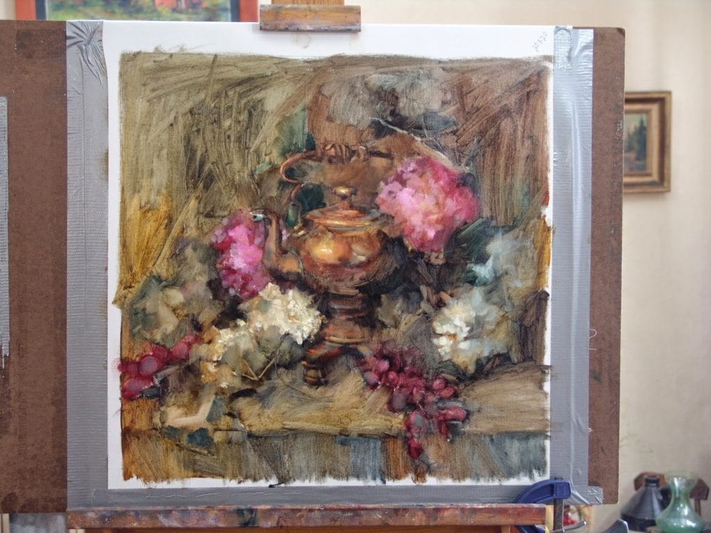
These are my initial layout and block-in colors. I do not use any opaque pigments at this point.
I do not use all these colors for every painting it depends on the color harmony or local color of the objects for each painting.
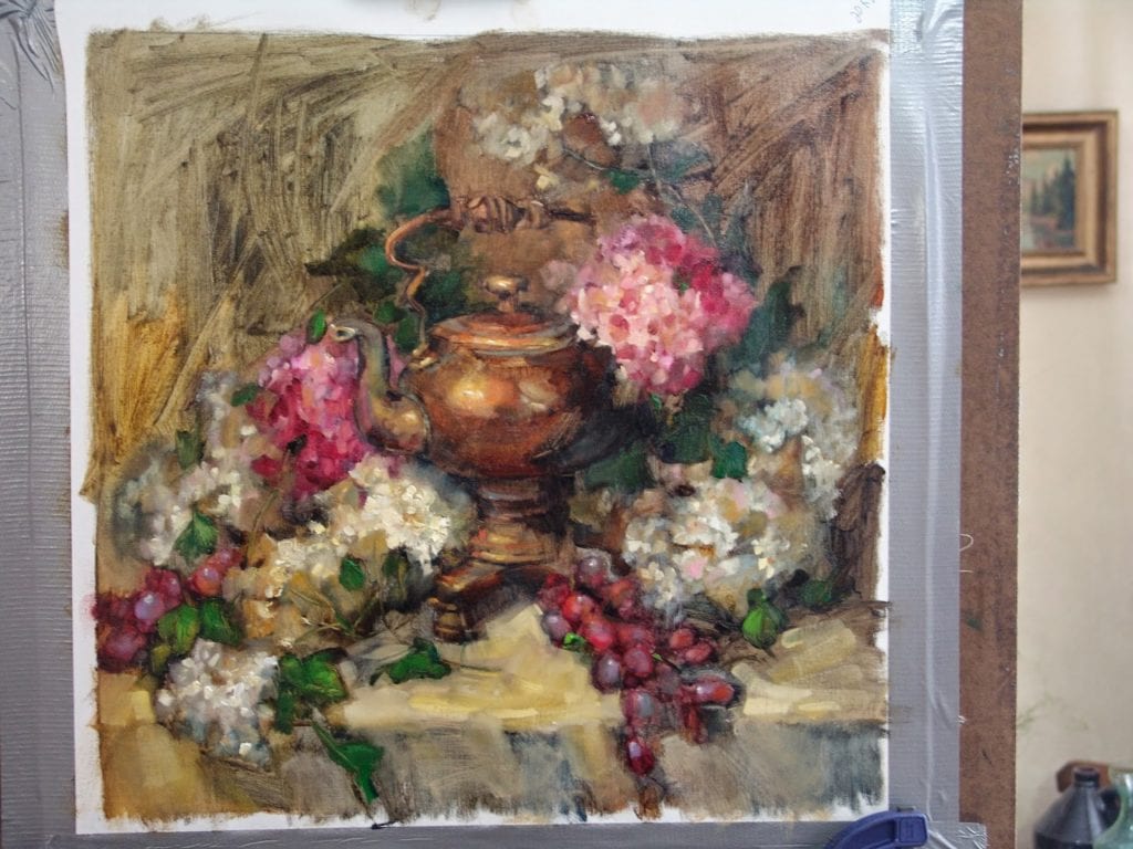
Opaque pigments;

  • Titanium white (I prefer Rembrandt, but use others too) Any time you add white to a color it starts becoming more opaque…the more white the more opaque.
  • cadmium lemon yellow
  • cadmium yellow medium
  • cadmium red light
  • yellow ochre
  • cobalt blue
  • dioxazine purple (sometimes)
  • burnt sienna

Mineral spirits is my primary brush rinse and thinner although I may use some liquin as I progress to the final stages of the painting.
I like to keep my brushes sharp (chisel edged). I use almost all Silver Bristlon Brights or angled (these are a little harder to find) I like a semi-stiff bristle. If I want to “scrub out” a larger area I will use a natural bristle bright as they are stiffer and tend to be more durable for that rough treatment.
It is hard to keep brushes sharp for long and I do replace them every couple of months.
I learned a technique from Daniel Keys for putting a folded cardstock over the tip and securing with a bulldog clip. It does help but you have to do it carefully or you can really mess up the bristles!

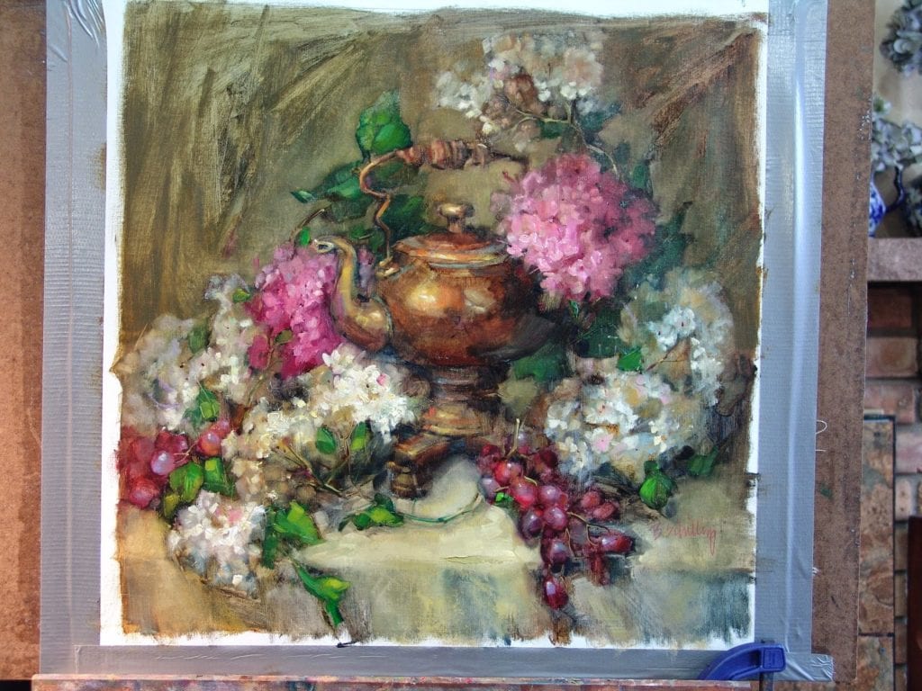
Ok..lets start painting!!

1
When I start a painting I like to imagine the flow of the design. My initial marks are following the eye path I wish to create. Then I will start loosely sketching some of the more precise shapes so I get them right. I have started with transparent oxide red and ultramarine blue on this one.

2
now I have started adding local color to the objects, although I am still just viewing them as shapes and not as specific objects.

3
All The colors used at this point are transparent. I am judging my middle value of each color for the most part. Where I want to create lighter values I either “scrub-out” with a paintbrush or wipe-out with a paper towel.

All my canvas is covered now.  I find white areas distracting and like this stage when the painting is starting to feel like it is getting somewhere.
All my canvas is covered now. I find white areas distracting and like this stage when the painting is starting to feel like it is getting somewhere.

5
Here’s where volume starts. I begin usually at my determined focal point. That way I can decide as I go along how much I would like to abstract the secondary objects. Simply adding white to some of my mixtures will give me the correct opaque color for my higher value areas. Areas that will remain darker in value but still want a sense of solidness to them (like the teakettle) will require using a mixture of my darker opaque pigments. Yellow ochre works well for this as does burnt sienna. A very dark, opaque color can be acheived using burnt sienna and ultramarine blue.

6
As I continue to add opacity I create more volume in my shapes and more importance to the areas I wish to lead the eye throughout the painting. At this point I call it my “push and pull”. I wipe out where I feel I’ve added too much detail and it is distracting to my focal point.
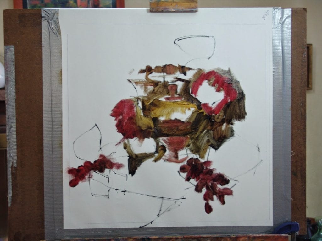
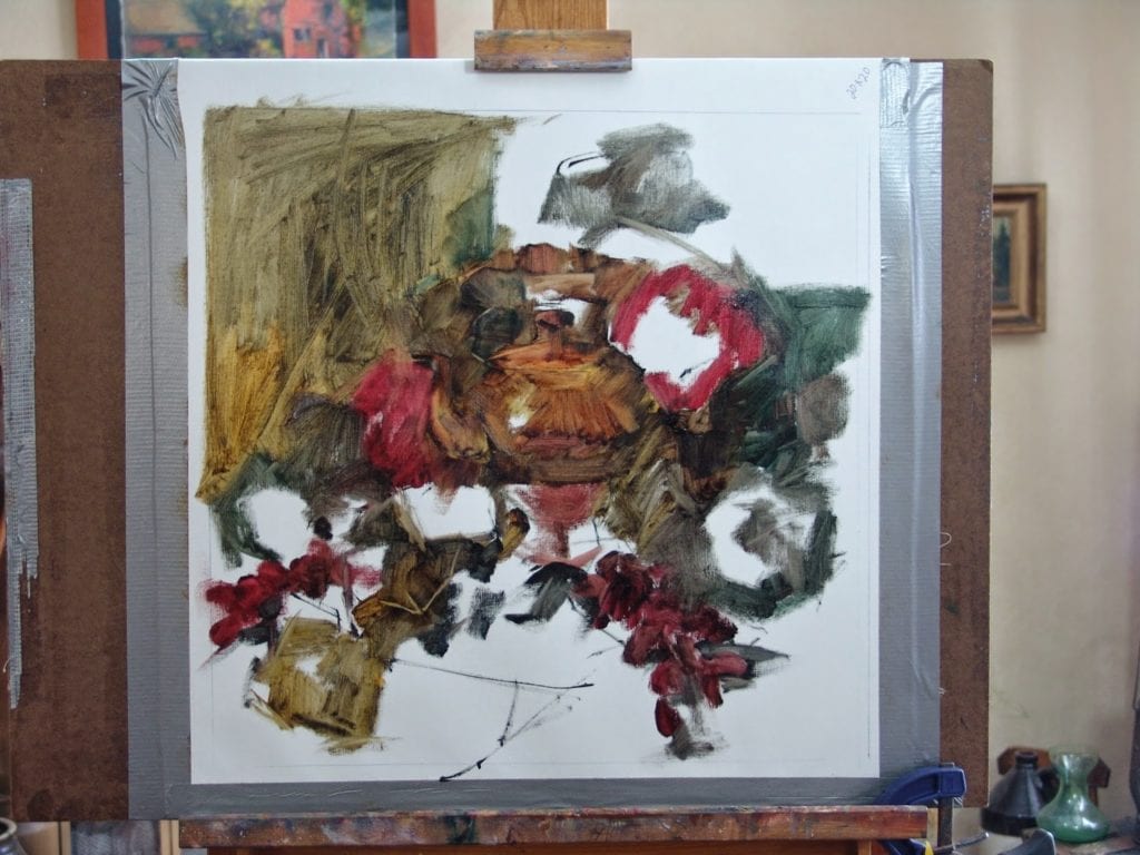
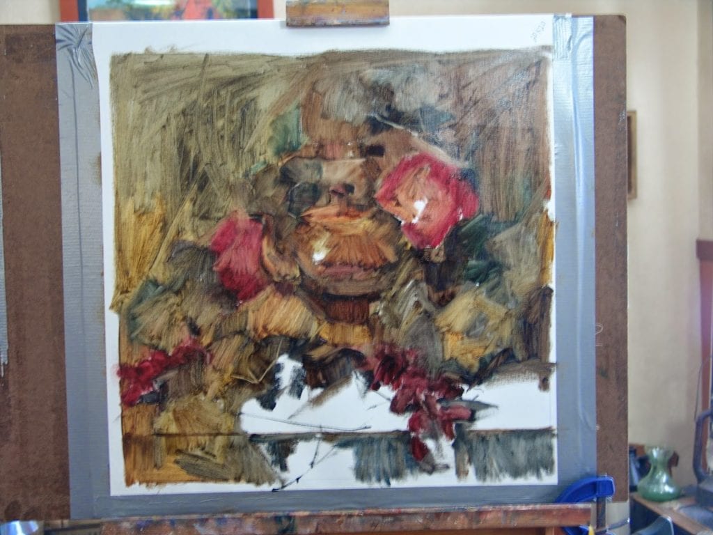
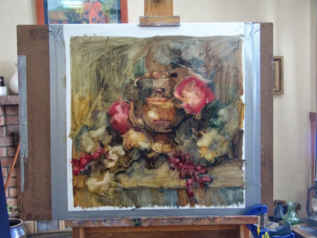
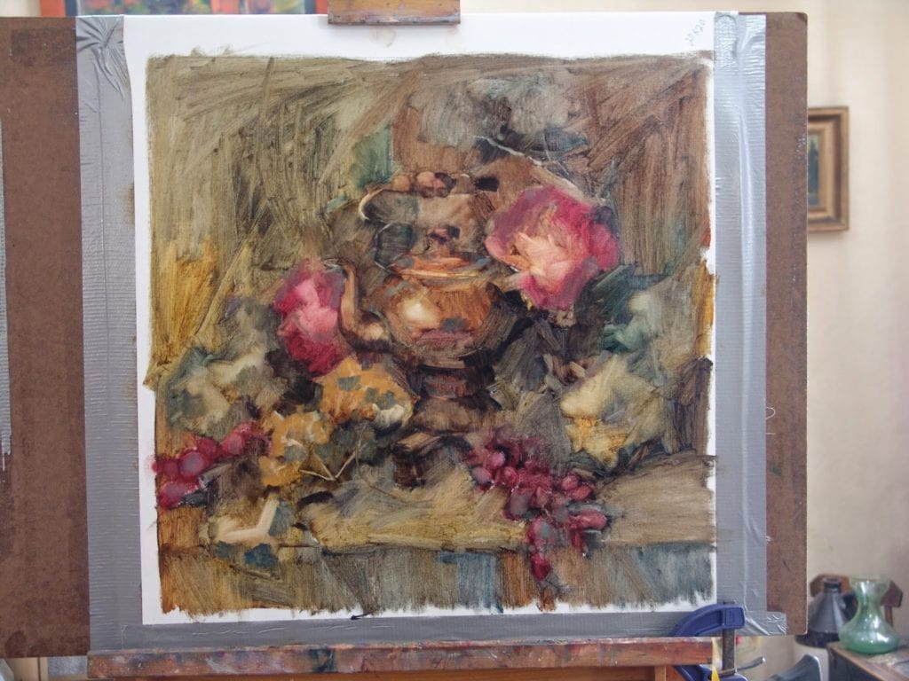
My opaque areas are also where I usually apply my thickest paint. sometimes putting it on so thickly that I can almost sculpt with it to create form. I only do this where I want the most important parts of my painting to be. The point of interest.

7
Although I am working on the background throughout the painting process it is important to really evaluate how it is interacting with the objects as the objects are becoming more solid. You may want areas of the background to remain transparent but you also want it to feel “real” where the light may be bouncing off it.

8
scrub out…add in..hmm..scrub out again. This process requires some courage. if something isn’t working, it doesn’t matter how “nice” it is, sometimes it just has to go. A painting is not about one beautiful passage it is a part of the story as a whole. If that precious passage is not right for the painting…off with it!!! It’s only paint after all.

9
Now I must make a lot of decisions. Where to darken, lighten, add detail, subtract detail, balance some color, readjust some compositional elements….a lot of stepping back and just looking. Walk away and come back. Look at it through a mirror. Stand on your head to look at it. Whatever it takes to help you see it with a different perspective.

10
I step back, I leave it for a day, I think it’s done. Oops, the bottom left corner is too warm…I’ll adjust that. But overall I feel satisfied.

Fireside Teakettle
Finished!

Oil Painting

Reader Interactions

Comments

  1. Nancy Ness says

    May 4, 2015 at 8:36 am

    Wonderful article, thanks so much. I am at a point where finding the movement lines and pushing and pulling the underpaonting is what I needed to hear.

    Reply
  2. Barbara Schilling says

    May 4, 2015 at 9:25 pm

    Nancy I’m glad you found it helpful! Testing new waters is always challenging but can also be over rewarding.

    Reply
  3. baidasamir says

    May 12, 2015 at 2:38 am

    Thank You Barbara for your explanation. It’s very helpful for many of us. I hope that other artists will try also to explain their way of painting.

    Reply

Leave a Reply Cancel reply

Your email address will not be published. Required fields are marked *

Primary Sidebar

Snapshot of the Author

Barbara Schilling OPA (Contributor)
I am always seeking to find a balance between abstract and representational. I love strong textures, thick paint and vibrant colors. Painting to me is about creating an energy that comes through to the viewer. I am an active member and Signature artist in American Women Artists (AWA) and Oil Painters of America (OPA). I am also an Associate member in the American Impressionists Society (AIS).
Visit Author Website

Subscribe via E-mail

Featured

Search OPA Blog

Guest Blogger Schedule

To read author biographies, learn about past bloggers or submit an article for review, visit the OPA Guest Bloggers page.

OPA Blog Reference

Comment Policy
Advertisement Form
Blogger’s Agreement
Sitemap

Footer

  • Home
  • About
    • Mission, Policies & Bylaws
    • Board of Directors
    • Presidential History
    • Frequently Asked Questions
    • History
    • OPA Staff
    • Contact Us
  • Membership Services
    • Member Login
    • Membership Information
    • State & Province Distribution For Regionals
    • Update Member Information
    • Membership Directory
    • Contact Membership Department
  • Events
    • Exhibitions
    • Online Showcase
    • Lunch and Learn
    • Virtual Museum Road Trip
    • Paint Outs
  • Resources
    • Brushstrokes Newsletters
    • Ship and Insure Info
    • Lunch & Learn Video Archives
    • Museum Road Trip Video Archives
  • Services
    • Sponsorship Opportunities
    • Scholarships
    • Critique Services
    • Workshops
    • Have A HeART Humanitarian Award
  • Online Store
  • Awardees
  • Blog
    • OPA Guest Bloggers
    • Blogger’s Agreement (PDF)
    • Comment Policy
    • Advertisement Opportunities

© 2025 OPA - Oil Painters of America · Design by Steck Insights Web Design Logo