• Skip to primary navigation
  • Skip to main content
  • Skip to primary sidebar
  • Skip to footer
  • Help Desk
  • My Account

OPA - Oil Painters of America

Dedicated to the preservation of representational art

  • Home
  • About
    • Mission, Policies & Bylaws
    • Board of Directors
    • Presidential History
    • Frequently Asked Questions
    • History
    • OPA Staff
    • Contact Us
  • Membership Services
    • Member Login
    • Membership Information
    • State & Province Distribution For Regionals
    • Update Member Information
    • Membership Directory
    • Contact Membership Department
  • Events
    • Exhibitions
    • Online Showcase
    • Lunch and Learn
    • Virtual Museum Road Trip
    • Paint Outs
  • Resources
    • Brushstrokes Newsletters
    • Ship and Insure Info
    • Lunch & Learn Video Archives
    • Museum Road Trip Video Archives
  • Services
    • Sponsorship Opportunities
    • Scholarships
    • Critique Services
    • Workshops
    • Have A HeART Humanitarian Award
  • Online Store
  • Awardees
  • Blog
    • OPA Guest Bloggers
    • Blogger’s Agreement (PDF)
    • Comment Policy
    • Advertisement Opportunities
  • Show Search
Hide Search

Tips for your Toolbox

Bill Farnsworth · Oct 9, 2017 · 1 Comment

"Good night sleep tight" by Bill Farnsworth
“Good Night Sleep Tight”
Bill Farnsworth

I hope this blog finds you well and painting.
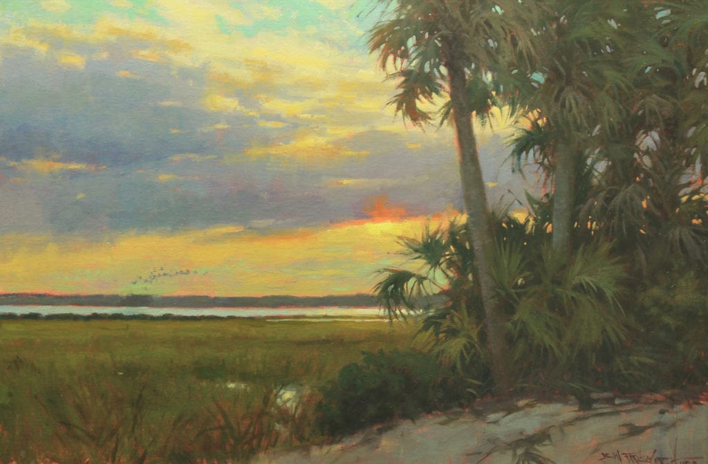
Here are some tips for your tool box as you try to achieve the next level. For starters, we need to know what’s wrong with your painting and how to correct it. There are two major problems, value, and shape.
VALUE
There are 9 values in painting. 5 representing the middle value and 1 and 9 representing white and black, then there are 3 light values and 3 dark values.
I have found the best way to is to start with a “known value.” It may be the sky or your darkest dark. I usually start at my focal point where you will have your lightest lights and darkest darks most of the time. In the block in stage, you can create a 3 value relationship. A dark, a light and a mid tone. If they are all near each other, you can compare everything off of these values. Comparing the values next to each other will create a bench mark for your painting.
SHAPE
As we determine a value, we have to consider what shape it is. Seeing shapes is nothing more than drawing. The key element of drawing is seeing the angle of a line and general mass. Look for intersecting lines and the overall silhouette. Work your big shapes to small shapes. Remember; You are always drawing while you paint.
Now, after you feel you have gotten the right shapes and values, let’s determine the color and its temperature.
COLOR TEMPERATURE
You have two ways to go with color; Warm and Cool. 
If the color looks muddy on your painting, it’s because the temperature is wrong. Mud is not the color at the bottom of your brush washer tank. Mixing paint is always a challenge for students but doesn’t have to be if you have a plan.
First, determine the color family of the shape you want to paint. Stick with just simple two color mixing in secondary colors, like orange, green, purple, etc…. Next match the value (most important). Then modify the color temperature and chroma.
Too many students get hypnotized by color and lose the most important goal. Don’t worry about capturing that special color, instead focus on getting the right value. If the value is right and the color is somewhat close, you will be fine. Your painting might be overall cool or warm and will still work because of how each color relates to one another. It’s all about comparisons.
EDGES
When everything in your painting looks right, consider your edges. You should have sharp, soft, and lost edges. Edges will make your painting believable.
PRACTICE
Stick with these tips and practice, practice, practice.

Education

Reader Interactions

Comments

  1. Tina Swindell says

    October 9, 2017 at 9:15 am

    Excellent post! Thank you. Sharing with my painting buds.

    Reply

Leave a Reply Cancel reply

Your email address will not be published. Required fields are marked *

Primary Sidebar

Snapshot of the Author

Bill Farnsworth
As a 1980 graduate of The Ringling School of Art and Design, Bill Farnsworth has spent the last thirty years creating paintings for magazines, advertisements, children’s books, and fine art commissions of portraits and landscapes.
Visit Author Website

Subscribe via E-mail

Featured

Search OPA Blog

Guest Blogger Schedule

To read author biographies, learn about past bloggers or submit an article for review, visit the OPA Guest Bloggers page.

OPA Blog Reference

Comment Policy
Advertisement Form
Blogger’s Agreement
Sitemap

Footer

  • Home
  • About
    • Mission, Policies & Bylaws
    • Board of Directors
    • Presidential History
    • Frequently Asked Questions
    • History
    • OPA Staff
    • Contact Us
  • Membership Services
    • Member Login
    • Membership Information
    • State & Province Distribution For Regionals
    • Update Member Information
    • Membership Directory
    • Contact Membership Department
  • Events
    • Exhibitions
    • Online Showcase
    • Lunch and Learn
    • Virtual Museum Road Trip
    • Paint Outs
  • Resources
    • Brushstrokes Newsletters
    • Ship and Insure Info
    • Lunch & Learn Video Archives
    • Museum Road Trip Video Archives
  • Services
    • Sponsorship Opportunities
    • Scholarships
    • Critique Services
    • Workshops
    • Have A HeART Humanitarian Award
  • Online Store
  • Awardees
  • Blog
    • OPA Guest Bloggers
    • Blogger’s Agreement (PDF)
    • Comment Policy
    • Advertisement Opportunities

© 2025 OPA - Oil Painters of America · Design by Steck Insights Web Design Logo