• Skip to primary navigation
  • Skip to main content
  • Skip to primary sidebar
  • Skip to footer
  • Help Desk
  • My Account

OPA - Oil Painters of America

Dedicated to the preservation of representational art

  • Home
  • About
    • Mission, Policies & Bylaws
    • Board of Directors
    • Presidential History
    • Frequently Asked Questions
    • History
    • OPA Staff
    • Contact Us
  • Membership Services
    • Member Login
    • Membership Information
    • State & Province Distribution For Regionals
    • Update Member Information
    • Membership Directory
    • Contact Membership Department
  • Events
    • Exhibitions
    • Online Showcase
    • Lunch and Learn
    • Virtual Museum Road Trip
    • Paint Outs
  • Resources
    • Brushstrokes Newsletters
    • Ship and Insure Info
    • Lunch & Learn Video Archives
    • Museum Road Trip Video Archives
  • Services
    • Sponsorship Opportunities
    • Scholarships
    • Critique Services
    • Workshops
    • Have A HeART Humanitarian Award
  • Online Store
  • Awardees
  • Blog
    • OPA Guest Bloggers
    • Blogger’s Agreement (PDF)
    • Comment Policy
    • Advertisement Opportunities
  • Show Search
Hide Search

Snow Cones and Grits

Lori Putnam · Mar 26, 2018 · Leave a Comment

Sometimes it seems that painters look for answers anywhere except from where they can most readily find the truth… personal observation. I get loads of emails asking about everything, literally, from what kind of brushes I use to where to eat in Rome. A recent question came in regarding the different colors for painting snow versus those for painting white sand. I love this question! It seems logical and that it should have an easy answer.
The problem is, there are no easy answers. Sure, I could spout all sorts of physics equations and present scientific research on the reflective and refractive indexes of surfaces. Any of you can look online and read the same. (Search Albedo Measurement just for fun.) Of course, what we are really talking about are the differences between snow cones and grits.
Percentage of diffusely reflective sunlight relative to various surface conditions:
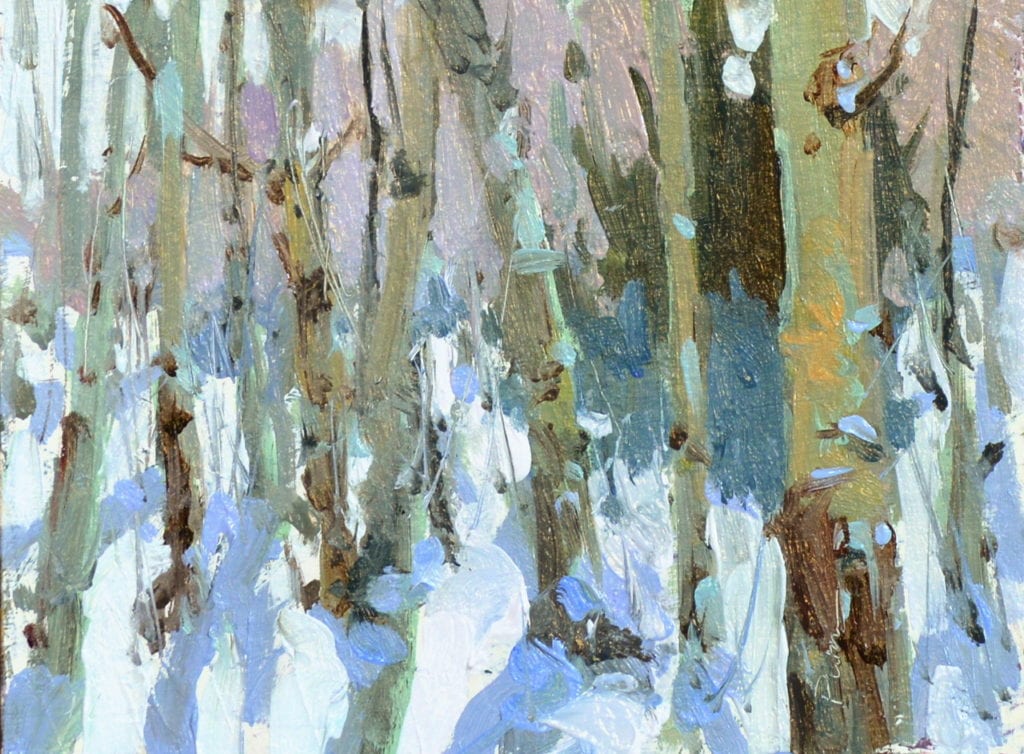
“Snow Mass”
Lori Putnam OPA
6″ x 8″
The combination of reflection and refraction of an ice crystal is such that the snow can appear to be sparkling different colors. Snow is translucent (whereas water is transparent), and when there are a g’zillion tiny snowflakes laying on top of their hexagonal selves, the light is reflected back toward the light source and the viewer. A snowflake has such a complex, intricate structure that light hits internal crystal faces and bounces around inside the crystal, refracting the light wave and causing it to change angles (refract).Since all the colors in sunlight add to give white, what we see when we look at snow is white: the sunlight that has reflected off and refracted through the water (ice) crystals to come back at us. So, what’s that color in the shadow, then? It is the sky and surrounding objects’ colors (not white light, but say blue, violet, or whatever). Because it is in its purest state, it may appear rather saturated.
If we are looking at white sand, however, we need to remember that it is comprised of different particles such as silicone dioxide (in the form of granite) and other gems and minerals filled with particles of impurities. The light hitting these tiny grains scatters about, some absorbing more light, others very little, and at differing speeds. The appearance to the novice may be similar to snow, but after much observation it becomes more apparent that one is an opaque surface and the other a translucent one. Just as in any situation, the same theory applies to the shadow color, which is reflected sky and surroundings’ colors, but is now relative to a totally different surface condition.
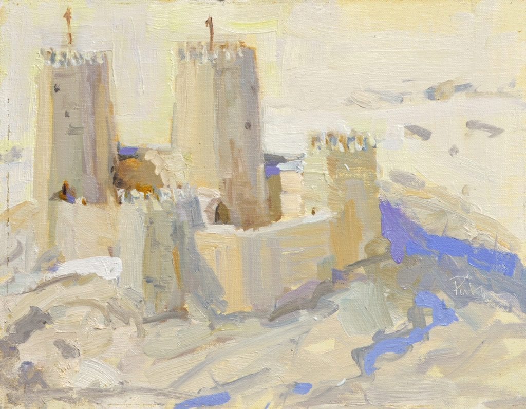
“Vacation Home”
Lori Putnam OPA
11″ x 14″
Plein air (private collection)
Do you need to understand all of this to be a painter? No. Simply take the time to go out and truly observe. Any time that we as artists rely on some other artist’s color formula, we are merely poor imitations of the other artist. Will it work? Probably. Will it get really boring to you after a while? Absolutely. I believe that if we keep an open mind and an open eye, our powers of observation continue to get better and better, with or without a scientific understanding for what we are seeing. What we once saw as gray, suddenly looks blue or violet. As we continue to progress in our development, we begin to notice the effects of nearby buildings, trees, etc. into that blue shadow as well. That is usually when our sometimes overly chromatic purple shadow actually becomes more beautiful due to other colors we choose (or not) to put in as well. Instead of just looking intense, the color is now alive and vibrant.
Wait! I just asked you to learn to observe and now I’m asking you to make a decision about those observations. Yep. You’re a big boy/girl now and you get to make your own decisions. You choose what to put in and what not to put in. You choose how chromatic or neutral you want your painting to be. You are in control of the painting, rather than the other way around. This is where science, personal observation, and creativity collide and you are a full-fledged artist. Congratulations.
Here’s my challenge: Find out where you think you are along this path, and be open to growth into the next phase. Never just settle for someone else’s answer; find your own.
A final word: Yellow sand, good; yellow snow, not so good.

Oil Painting

Reader Interactions

Leave a Reply Cancel reply

Your email address will not be published. Required fields are marked *

Primary Sidebar

Snapshot of the Author

Lori Putnam
Modern Impressionism stretches the boundaries with artists painting in styles ranging from near realism to almost abstraction. Putnam’s work is closer to the latter. Recognized for her expressive brushwork, contemporary compositions, and intelligent use of color, Nashville, TN native Lori Putnam paints small to medium-sized works en plein air and creates large paintings in her studio. Having painted and taught in more than 30 countries (including Ukraine, New Zealand, Guatemala, much of Europe, and the UK), she believes that works created from life help her maintain freshness in her studio paintings as well. In 2019, she accepted an appointment as Vice President of Art Ambassador for a Colorful World and travels often to work with children in less advantaged areas. These experiences shed light on her purpose. Putnam says, “It is finally clear why I am here on the Earth. Bringing joy and laughter amidst the most horrific circumstances fills my soul”. In 2021, Putnam won both the $15,000 Grand Prize and the People’s Choice Award for the Plein Air Salon Competition. The awards went to two different paintings and were chosen from more than 8,000 entries.
Visit Author Website

Subscribe via E-mail

Featured

Search OPA Blog

Guest Blogger Schedule

To read author biographies, learn about past bloggers or submit an article for review, visit the OPA Guest Bloggers page.

OPA Blog Reference

Comment Policy
Advertisement Form
Blogger’s Agreement
Sitemap

Footer

  • Home
  • About
    • Mission, Policies & Bylaws
    • Board of Directors
    • Presidential History
    • Frequently Asked Questions
    • History
    • OPA Staff
    • Contact Us
  • Membership Services
    • Member Login
    • Membership Information
    • State & Province Distribution For Regionals
    • Update Member Information
    • Membership Directory
    • Contact Membership Department
  • Events
    • Exhibitions
    • Online Showcase
    • Lunch and Learn
    • Virtual Museum Road Trip
    • Paint Outs
  • Resources
    • Brushstrokes Newsletters
    • Ship and Insure Info
    • Lunch & Learn Video Archives
    • Museum Road Trip Video Archives
  • Services
    • Sponsorship Opportunities
    • Scholarships
    • Critique Services
    • Workshops
    • Have A HeART Humanitarian Award
  • Online Store
  • Awardees
  • Blog
    • OPA Guest Bloggers
    • Blogger’s Agreement (PDF)
    • Comment Policy
    • Advertisement Opportunities

© 2025 OPA - Oil Painters of America · Design by Steck Insights Web Design Logo