Perhaps one of the more perplexing problems for new and developing landscape artists is how to effectively depict grasses. It’s easy for grasses to come out looking contrived or worse, like a bad hair transplant. I know, cuz I’ve been there, done that. Not the hair transplant, the contrived looking grasses. Here’s a workable solution for painting more natural looking grasses:
Try Painting Masses Not Grasses!
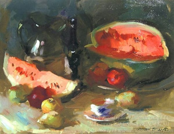
Sergei Bongart
In my painting, Low Country Marsh, the big mass on the right has the look and feel of grass even though individual blades are not really painted. But the irregularly shaped box with it’s vertical side and horizontal top is well defined. The sides are in shadow, the tops are in light. It’s the irregular, relatively soft juncture (edge) between tops and sides that gives the feel of grass. A little detail in the foreground mass helps the viewer infer detail in that mass, too. The same idea plays out in the background tufts of grass as well. The only detail is in the foreground and even there, it’s pretty sparse mostly suggested.
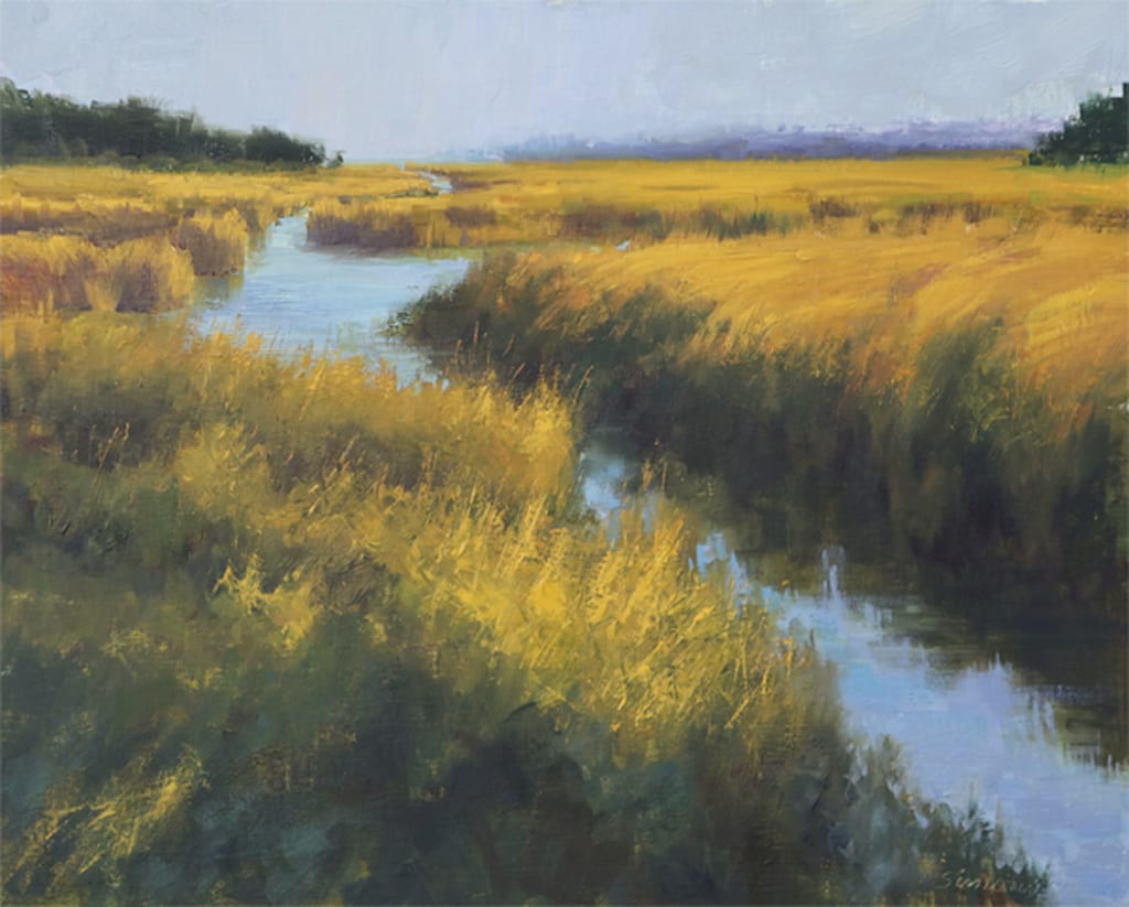
Robert Simone
16″ x 20″
In short, “Painting Masses Not Grasses”, means keeping all detail subordinate to the overall mass. Your viewer’s mind will fill in what’s lacking.
Leave a Reply