When I wrote my book on painting with a concept, I listed five key elements for creating a workable, harmonious painting: Values, Edges, Paint Quality (integrity of the paint), Agent (you as the painter guiding the work), and finally, Color/Temperature. It’s the last element I’d like to explore here.
When I began to paint, I saw local color first and foremost. It’s easier to see than values and edges. Beautiful reds, blues and yellows naturally draw the eye much like impasto (opaque) paint will. Color, or the lack of color, has an inherent emotional feature.
It’s generally accepted that color begins and ends with the Color Wheel. I never saw the relationship to the color wheel and the painting problems that were before me. Many teachers use it as an absolute truth to be rigidly followed. But, the color wheel is NOT an absolute truth. It only represents a theory. Theories are not absolute-they are grounded in principles but don’t contain the truth in an ultimate way.
A theory merely points us in a direction.
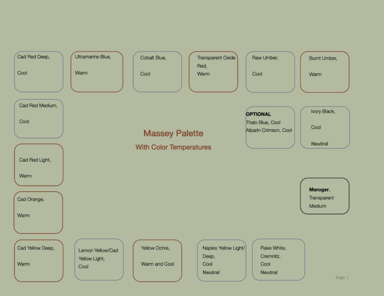
Included is an image of my palette used when I teach. To help students, I list below each color whether I view it as a warm color, or a cool color. To me, the neutrals, including Naples Yellow, are all cool; the yellows are warm with the exception of Lemon Yellow, which appears cool because it has less warmth than the other yellows on my palette. Likewise, Cadmium Red Light is the only red that appears warm. Alizarin and the other Cad Reds appear cool.
The Blues are all cool with the exception of Ultramarine Blue. It’s the warmest Blue in the family of blues meaning it reads warmer than the others because of its mixture when produced and those materials used to create the paint Ultramarine Blue.
Think about Cerulean, Thalo, Cobalt, King’s Blue…..they are very cool when used next to UM Blue. In a warm set up or composition, I would use UM Blue to complement the other components of a warm set up.
Yellow Ocher is an interesting color. I paint with it to warm a background or turn an edge (cool). It seems to absorb whatever temperature is placed near it. It’s an opaque paint so it has the quality of a neutral or cool hue. But, if painting a white cup, you could mix some yellow ocher to develop a shadow plane. It won’t drop the value too much but can assist the shadow in anchoring the object. Painting with black as a shadow for white objects is too abrupt or harsh. To me it reads “dead on arrival.”
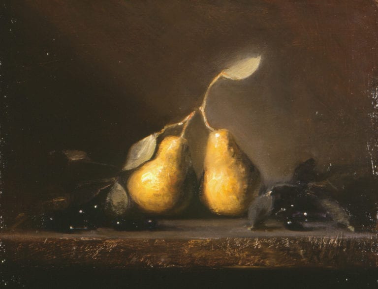
9″ x 12″ – Oil
As we grow as painters, we begin to develop our own language and that language includes color choices. We become more sensitive to how temperature plays a role in our work. For me, I reach for a color based on its temperature and what is needed by the painting. What do I mean?
Let’s say you are painting a portrait. The subject is Caucasian and fair. Most of the flesh you paint will be colorless. But, there are moments on the face you want to come forward and show the topography of that particular fair model. Conversely, there are moments in the picture that will need to recede, or turn back.
Cad Red LT is warm and it will read closer to the viewer. Cad Red Med/Cad Red Dark will recede more than Cad Red LT. Why? Because the Medium and Dark have more blue in them when they are produced as a color. Blue is a color which recedes.
The principle here: Warm colors appear to advance; Cool colors appear to recede and give the painting a sense of air space and time. You must decide on the color structure of your painting EACH TIME you go to the easel.
A Word About Neutrals.
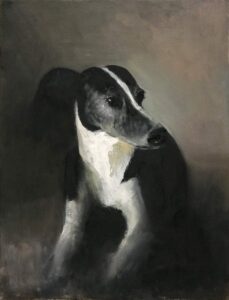
Cosmo by M Kathryn Massey OPA
14″ x 11″ – Oil
Notice how little color is seen thus far in the painting with the dog being black and white; both cool, neutral colors.
Neutrals are used to change both the value and the temperature of a color. In principle, Black, White, Grey, and Naples Yellow are used to cool down a color OR, to change its value. Because they are cool, when mixed with any other color they will immediately cool that color AND change its value. This is why I view color and temperature as married. I don’t understand them as being separate. Temperature changes are paramount to good painting.
We don’t know these more advanced ideas when we begin to paint. How can we? In closing, a few thoughts on color:
-If you are having trouble incorporating a color into your work, take it off your palette for a month or so. See if you can achieve what you need without it.
-Each family of reds, blues, greens, yellow, blacks, etc., are warmer or cooler within the family of that color. Determine for yourself which is warmer and which is cooler within the family of color.
-Using both cool and warm temperatures in the same painting will make more color disharmony and tension. (Think Vuillard)
-A still life up, a model, an interior, etc., will be either warm or cool as a concept. Use the paints that will depict your concept.
-Use a neutral to turn an object away from the viewer so the illusion of dimension is realized. Do not use pink, red, yellow, orange for instance to turn an object as it goes into shadow. The illusion won’t work. Use cool grey, blue, or violet to help with your conceptual illusion.
-If you break any principle in painting, know why you are breaking the principle.
-There are no mistakes…..only better choices.
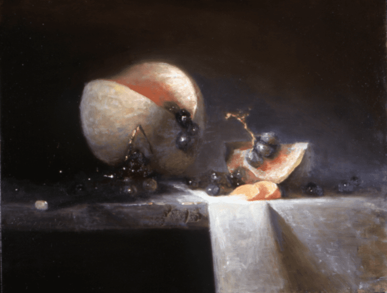
20″ x 16″ – Oil
Leave a Reply