As artists, we tend to accumulate frames that just don’t quite work. They may have gotten damaged being shipped to a gallery, or banged around being transporting to a show. Maybe they were “ok” frames, but the finish just wasn’t up to gallery standards, or the color didn’t compliment the art.
There are many ways to bring new life back to those old frames so they can come out of storage and proudly showcase your best art!
I have been a fine art restorer for over 35 years and have learned many tricks about repairing damaged frames that I would like to share. Most artists have the ability to refurbish their own frames, but they lack the know-how. Being able to modify your frames can not only save thousands of dollars, but can open a whole new opportunity to individualize and modify frames to be one of a kind pieces that will enhance your art.
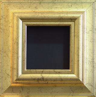
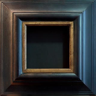
I am going to give a step-by-step guide to create a lovely, hand-rubbed, soft black finish. These same steps can be used to modify an existing finish, or be used with other base colors (not just black). So have fun and get creative!
A friend and wonderful artist, Connie Kuhnle, has used some beautiful, soft, greyed colors for her plein air landscapes. One of my favorites is her antiqued mustard yellow frame on a white and yellow farmhouse scene…sheer perfection!!
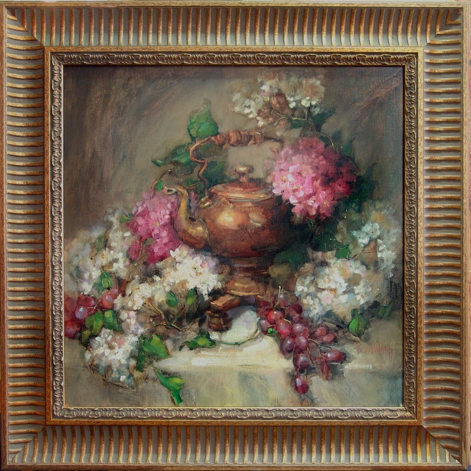
I often use antiquing and waxing to add interest to a newly purchased frame that just doesn’t quite have the richness I desire. It is a fairly quick and simple step that can make a remarkable difference.
Frame Makeover
Supply list for warm black antique finish:
- Black paint — I use semi gloss spray enamel, but any good quality, black acrylic enamel paint will work. You can use a brush-on, although you may find that you have some texture of the brush strokes in the finish. They may not be objectionable, depending on the finish you want.
- Red paint — (optional)…same as the black. Used to create a red undertone.
- Fine steel wool
- Fine 280 grit sandpaper
- Antiquing stain…raw umber oil paint will work, as will acrylic. you can also purchase a stain, like Minwax, in a dark walnut color.
- Rottenstone
- Wax or polish for wood (I like “Bison” Black ebony best)
- Hammer with a claw side
- Polyurethane wood finish, semi-gloss, brush or spray
If an antique white frame is desired, you will need white paint in place of black. This same finish works beautifully with a color as well.
- Lightly sand original finish to cut the gloss a little and allow for better adhesion of the new paint.
- Pound the frame casually, bouncing the claw-side of the hammer over the surface to create even (but not too uniform) scars and indentations if you want a more antique look.
- If red undertone is desired, spray (or brush) on red paint. Allow to dry as per instructions on the paint.
- Lightly rub with steel wool
- Spray (or brush) on black enamel and allow to dry.
- Use sandpaper on edges and across the surface to allow some red to show through and give a “worn” look to the finish. It is going to look best if you have fairly even streaking throughout the frame. If the streaking is not even, the frame will look splotchy.
- Apply raw umber antiquing with a wide brush and wipe with a soft rag, paper towel, or cheesecloth to remove some, but not all, of the antiquing. Allow stain to remain in the crevices as well as the indentations that you made. Allow to dry.
- Spray or brush with polyurethane finish to seal. Allow to dry.
- Apply polishing wax and allow it to dry, then buff to a nice hand-rubbed luster.
- Dust lightly with rottenstone…especially in crevices and detailing of frame. Buff again.
While the written steps may appear time consuming, they really are not. It is important to give each of the finish layers time to dry, so from start to finish, it will take a couple of days, but actual working time on the frame shouldn’t be more than an hour or two. With practice, you will find it easier and easier to achieve the results you are after and start adding your own variations to create one of a kind finishes!
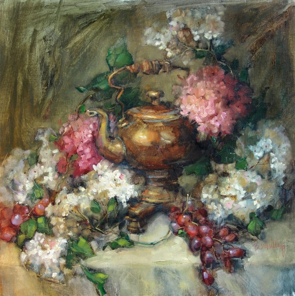
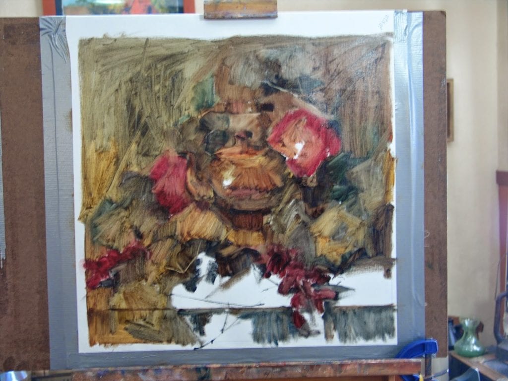
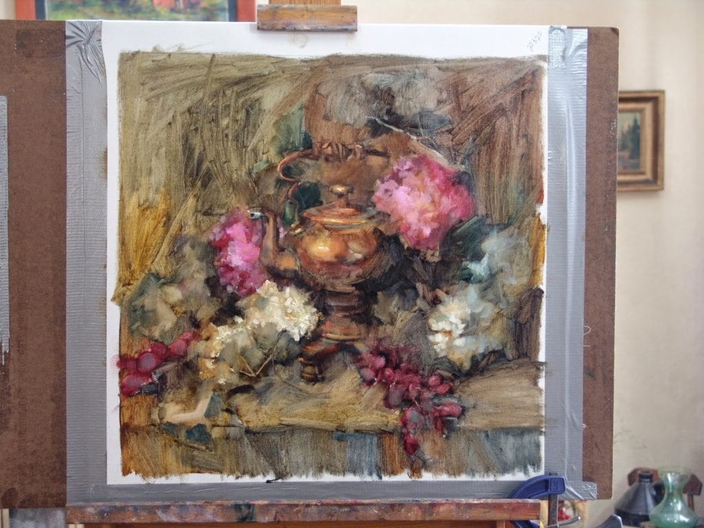
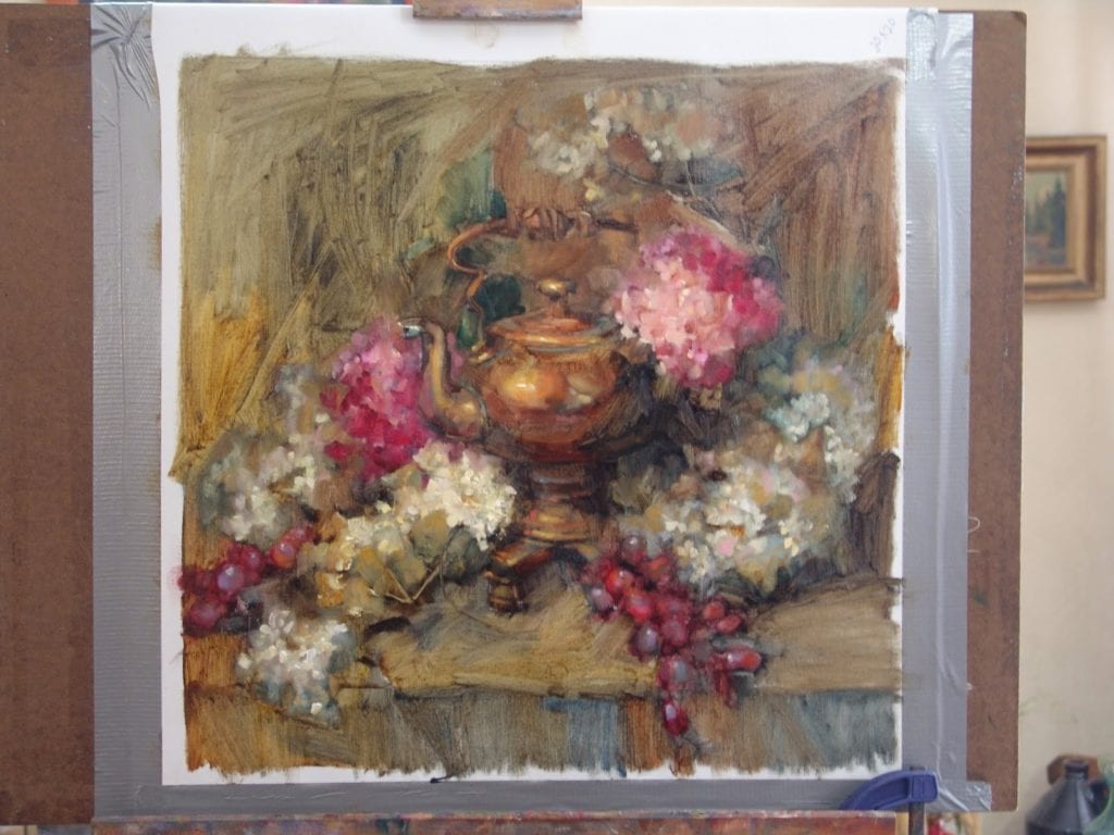
12″ x 12″ – Oil
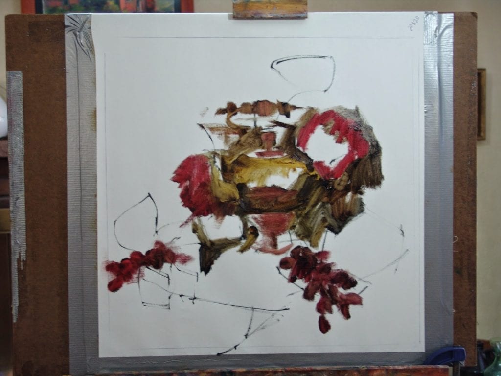
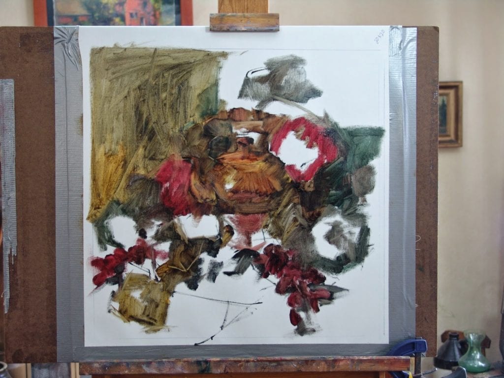
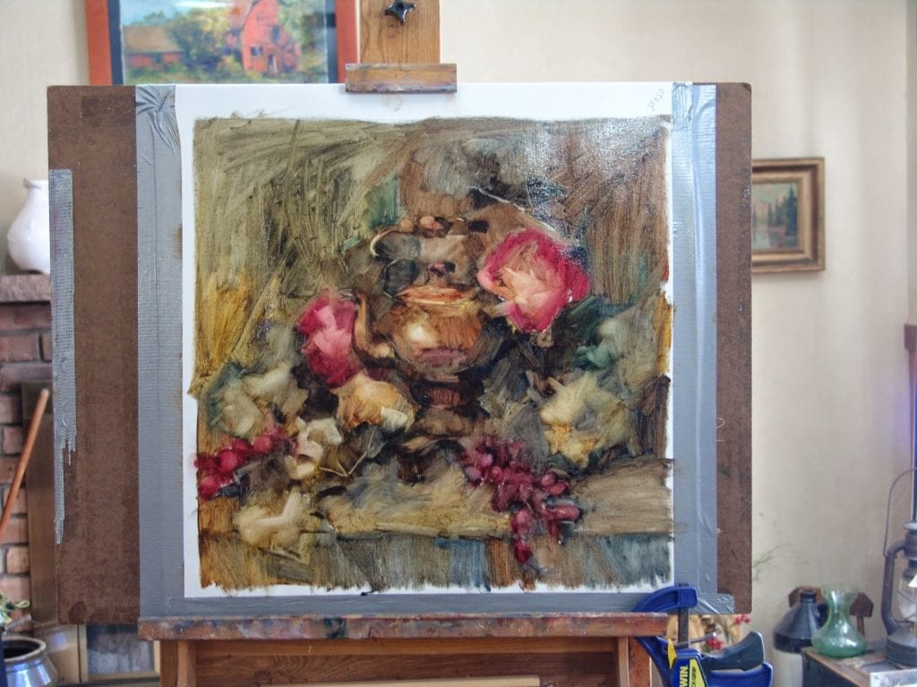
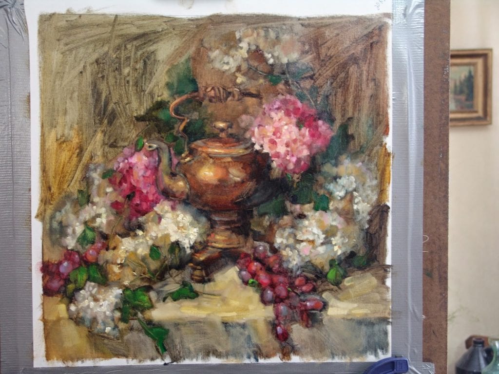
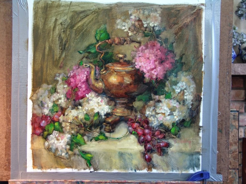
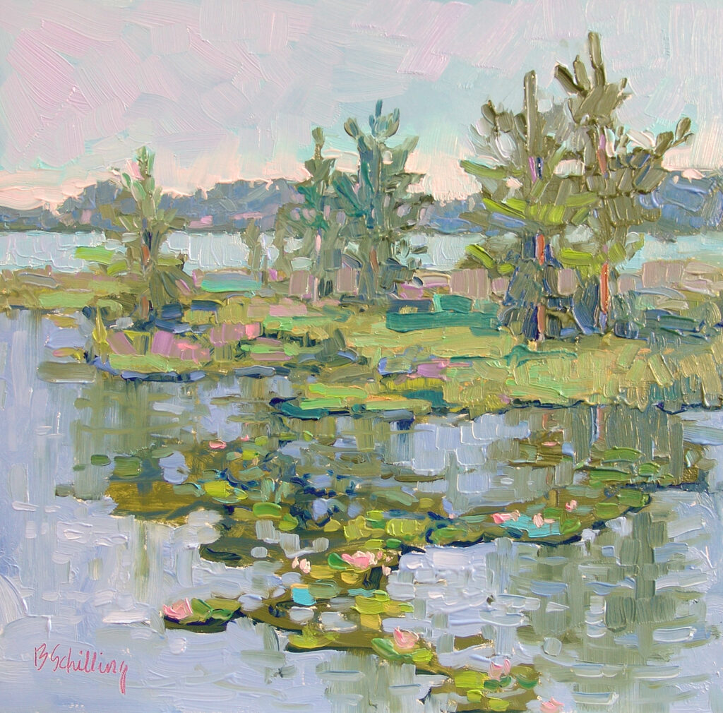
12″ x 12″ – Oil