A sketch has charm because of its truth – not because it is unfinished.
— Charles Hawthorne
A few years ago, I was painting along a roadside in Wisconsin for the Door County Plein Air Festival and, while focused intently on finishing up what would certainly be seen as a masterpiece someday, I was interrupted by a young art critic who drove past and yelled out “WORST…PAINTING…EVER!”. Now, although it didn’t turn out to be the masterpiece I’d intended, I was convinced this painting showed enough promise to not be the “worst”. And honestly, if this guy had seen some of my earliest outdoor work he’d need to throw them into the mix as well and probably wouldn’t have spoken with such conviction. But all of this got me thinking – what defines our best and worst efforts outdoors? If the goal of a plein air painting is a finished masterpiece, judging the result is more straightforward. But if the goal is simply to “study” – to learn and gather information in order to develop a finished masterpiece in the studio, it’s a little more difficult to quantify the results. This is especially true if you’re like me and learn quite a bit from making mistakes. If this is the case it might just be entirely possible to paint the “Worst Painting Ever” and also have it be the “Best STUDY Ever”.
by Dave A. Santillanes OPA
oil, 9″ x 12″
by Dave A. Santillanes OPA
oil, 24″ x 30″
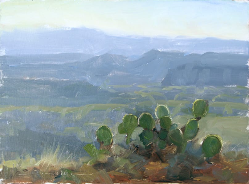
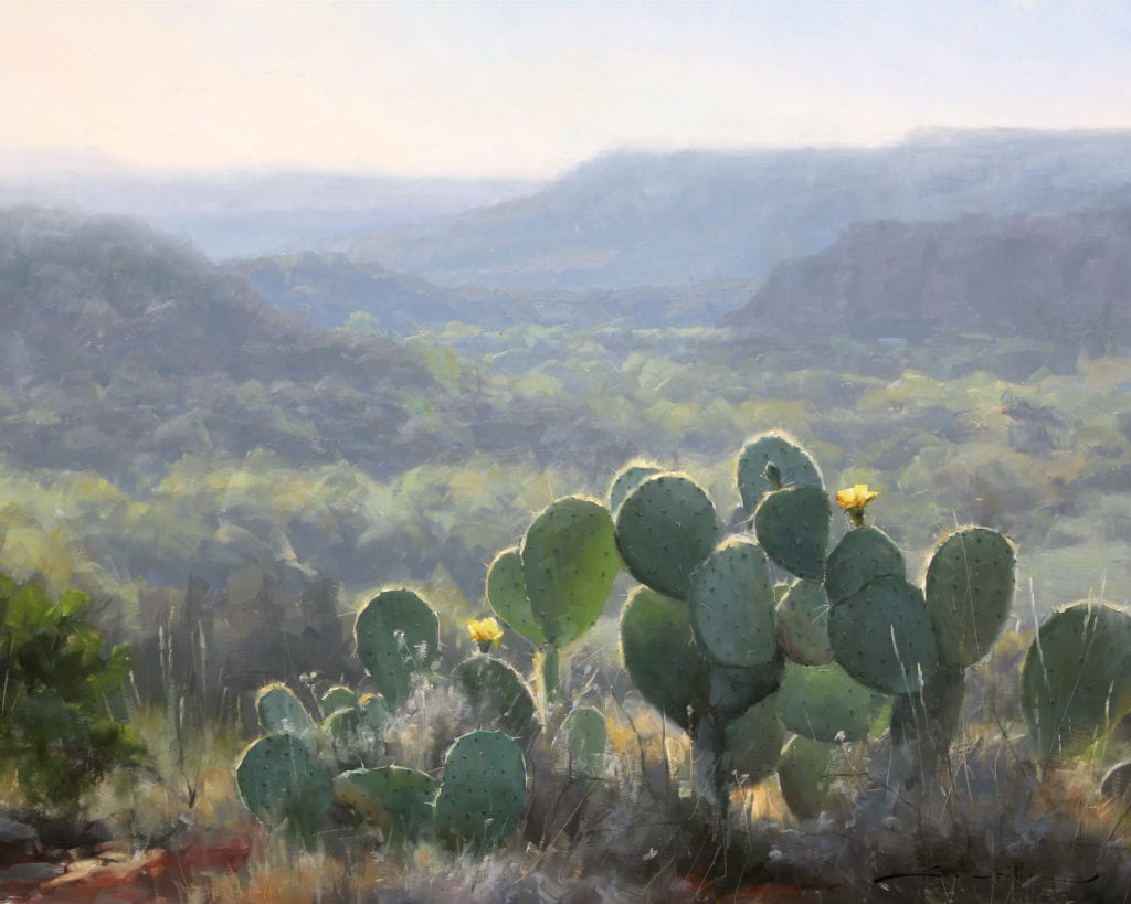
Although the “Back O’Beyond” study wasn’t the infamous “worst painting ever”, it definitely required further exploration. And these hurried notes became invaluable in the studio as I painted “Desert Bouquet”
THE BEAUTY OF THE STUDY
Since the time I began painting almost 20 years ago, my goal has always been simply to STUDY. To figure out exactly how nature works and translate what I’m seeing into paint. So although I joke that my aim is to paint the “Best Painting Ever Painted”, I’m hardly ever looking for a finished piece outdoors. Instead, I want to capture only the things that I can’t do in the studio – things I can’t get from a photo. I’m taking notes on color, light and atmosphere. And my focus is usually on the shadow shapes where I want to establish their exact value, color and temperature. I’m arranging those shapes to lay the groundwork for overall design but I’m not obsessing about composition at this stage – there’s plenty of time for that in the studio. In fact sometimes when I’m in the field, I’ll often ignore composition all together, especially when time doesn’t allow it… like when an afternoon thunderstorm moves in and I’m about to get struck by lighting. This might make for a bad painting but not necessarily a bad study and definitely a smart one
Once I get back to the studio where time is more abundant, I’ll take those brief, hurried notes and spend hours, maybe even days working out composition. For me, creating a painting on the spot with the same refinement as a studio piece has never been part of the plan. But, what I’ve found is that within these brief – sometimes hurried notes – occasionally a finished painting emerges all on its own. In fact, a mere study, in it’s brevity can indeed be beautiful – even beyond the beauty of a more refined piece. As Charles Hawthorne, founder of the Cape Cod School of Art once said, “A sketch has charm because of its truth – not because it is unfinished”. I think of it as “poetry” compared to a “novel” – both can be beautiful. And although it’s no use arguing this case with someone at a plein air opening who doesn’t understand why every speck of canvas isn’t covered in paint, there are plenty of examples throughout history where studies qualify as masterpieces. But this doesn’t always happen and sometimes a study is just a study. It may even be the worst painting ever.
by Dave A. Santillanes OPA
oil, 12″ x 9″
by Dave A. Santillanes OPA
oil, 9″ x 12″
The above two plein air pieces stand on their own, in my opinion, as finished paintings. I tried in vain to develop these into larger pieces in the studio but to no avail. The larger paintings used more “words” but said much less.
JUST A STUDY
And when a painting does fail miserably outdoors (or indoors) I euphemistically call it a “nice study”. If you happen to end up with one of these all is not lost. After all you’ve just spent two hours intently observing the scene… you’re now the visual expert of it. If anyone asks you a question about this place and the two hours you spent there, you have the answer. Once when I was painting near my home, four police cruisers pulled up and one of the officers jumped from his car, approached my setup and, catching his breath asks, “have you seen a short, Hispanic male with a baseball cap running through the area?” My first thought was that I fit this description precisely, but, realizing I wasn’t their suspect I was honored that they had come to me for my visual expertise on the scene. I considered offering my painting as evidence but instead just answered “No”. The point is don’t discount an intense 2-hour visual study of a scene. Many things will happen in those two hours to create the “story” that you want to tell. And be confident that you picked up a thing or two regardless of how the painting turned out. For me, once a painting falls short of my lofty visual goals, I don’t try to whip it into shape in the studio by painting over the top of it and destroying my notes (good notes or bad). And I don’t go back to the scene multiple times with the same canvas. If I return to the scene it’ll be a new attempt, a new story with a new canvas. But what I do instead is use my plein air notes and photos in the studio and seek out the good stuff. I’ll analyze the notes I got right and try to make sense of the notes that are too vague. I’ve learned that even my worst efforts outdoors contain something useful to help read and interpret photos from the scene. There are just too many good, often unintentional, things that happen when we paint outdoors. In our haste to capture a fleeting moment or escape a coming storm, we subsequently distill the scene down to only the essential elements – elements that tell the exact story we want to tell – without all the peripheral distractions. In working fast and simplifying we don’t have time to paint the things we don’t want to or aren’t interested in painting – and that’s a good thing.
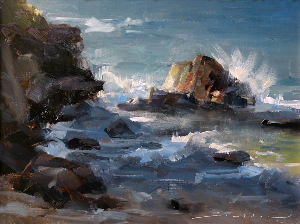
by Dave A. Santillanes OPA
Oil, 12″ x 9″
by Dave Santillanes OPA
Oil, 12″ x 9″
by Dave Santillanes OPA
Oil, 24″ x 24″
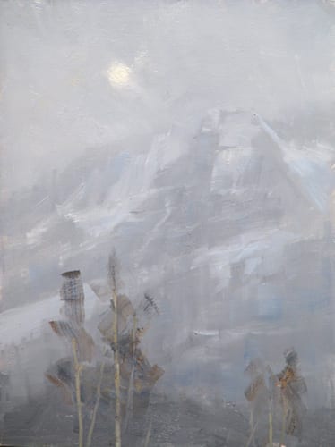
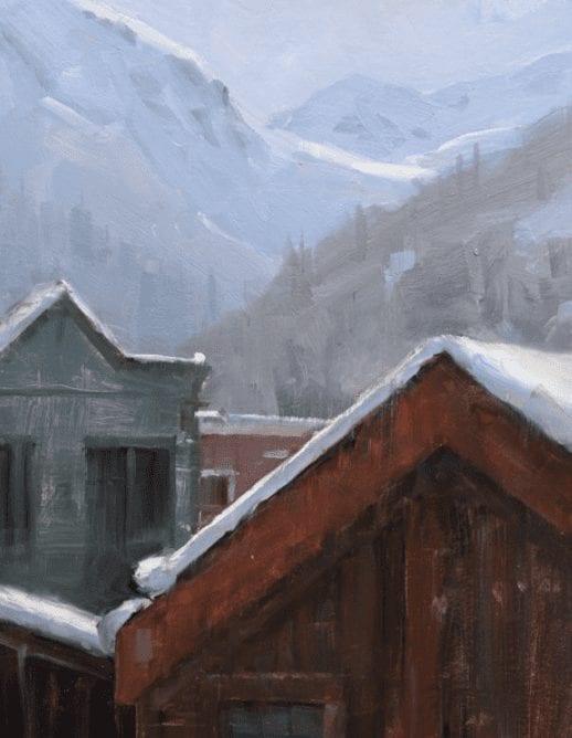
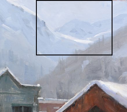
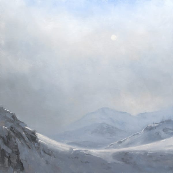
I painted “Telluride Homes” as a winter storm approached. This began outdoors as a winter storm approached. My first idea was to paint the “peaks” of the homes juxta-posed with the peaks beyond. Not a spectacular painting but a nice study. At some point during those two hours of painting and shivering, the story changed and I became intrigued with the design of light on a distant peak. “Edge of the Storm” is the finished studio piece.
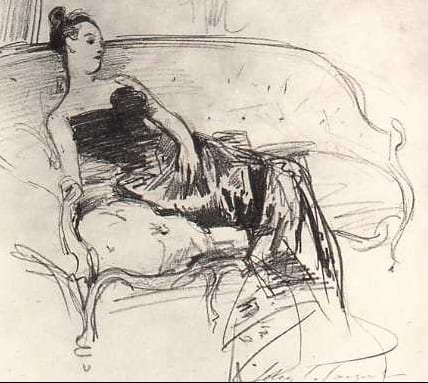
Madame X portrait
John Singer Sargent
1883 Graphite
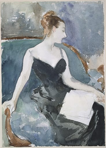
John Singer Sargent portrait
1883 Watercolor
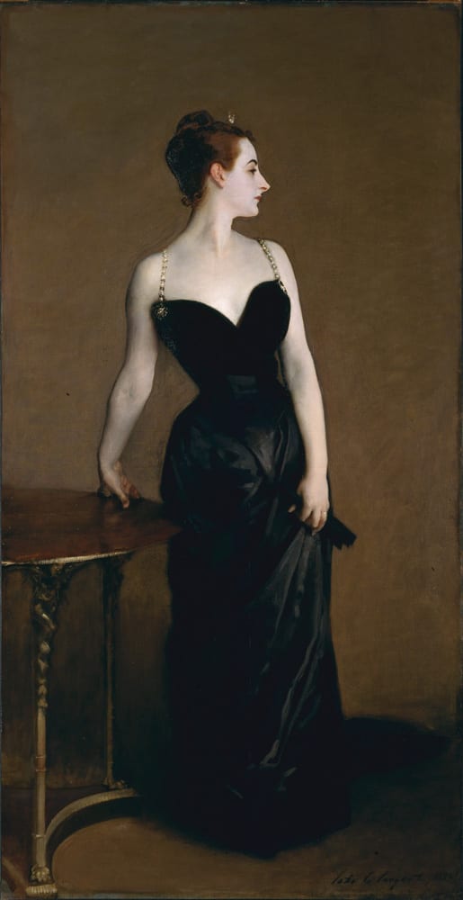
by John Singer Sargent
93″ x 44″
1883 Oil on Canvas
These quick sketches for Madame X might not pass as masterpieces, but the resultant studio painting certainly does.
by Dave Santillanes OPA
Oil, 10″ x 8″
by Dave Santillanes OPA
Oil, 40″ x 30″
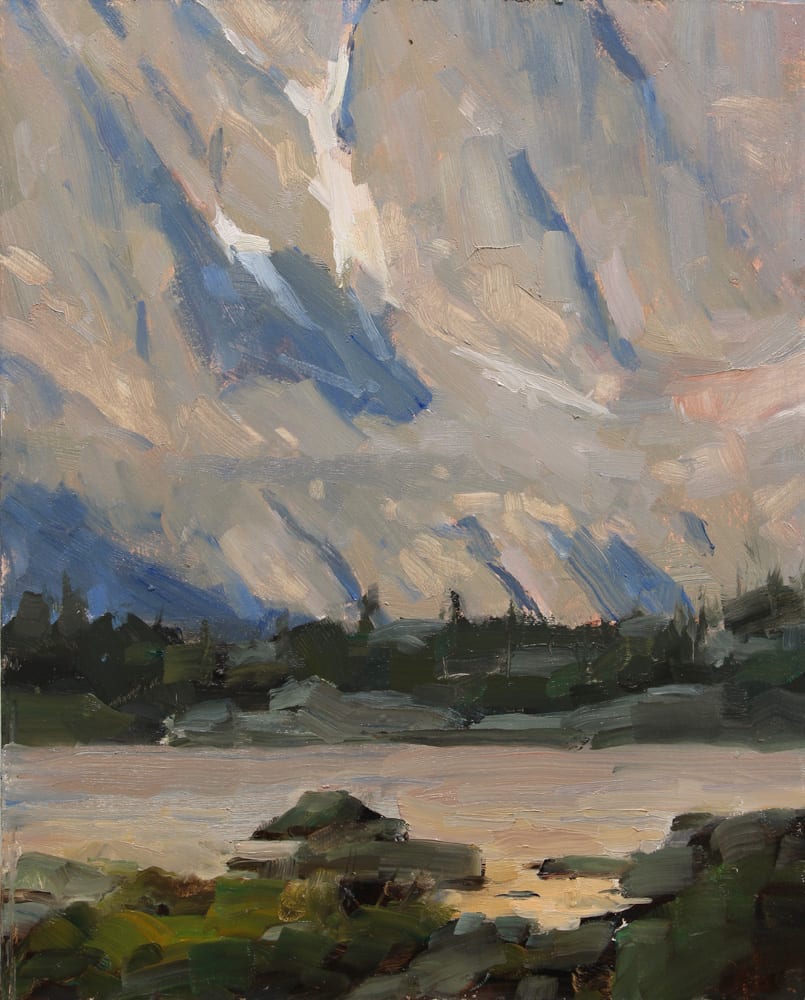
The small study of Lake of Glass never made a direct leap to a large studio piece, but it inspired and served as an invaluable reference on several pieces, including this 40″ x 30″.
LEAVE THE FRAMES AT HOME
Ultimately what I’m saying is RELAX and remember how much fun this is. I teach several workshops throughout the year and I’m always imploring my students to leave their frames at home when we go out painting for the first time. I’m not trying to lower the bar for expectations but simply reminding them that painting outdoors is only one part of the process. The goal is, of course, to take GOOD notes as opposed to BAD ones, but it’s my way of saying don’t put too much pressure on yourself because there’s something to learn from the bad ones too. So my advice to every plein air painter is to get outside, “point to the stands” (as my friend Joshua Been is fond of saying), and paint the worst painting ever, it might just be the most valuable study you’ve ever done.
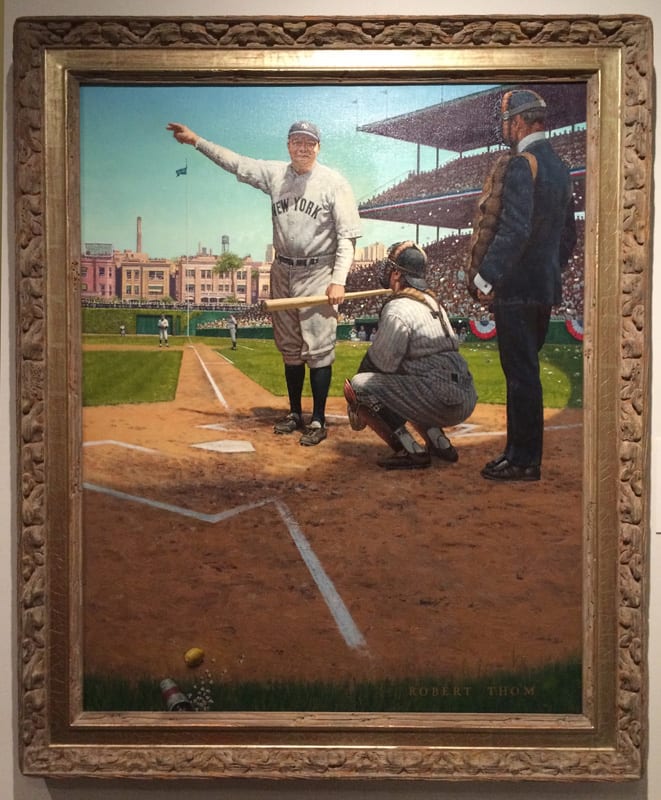
Babe Ruth pointed to the stands and then knocked one out of the park. But in painting sometimes a swinging bunt with a few errors in the field will also get the job done.