• Skip to primary navigation
  • Skip to main content
  • Skip to footer
  • Help Desk
  • My Account

OPA - Oil Painters of America

Dedicated to the preservation of representational art

  • Home
  • About
    • Mission, Policies & Bylaws
    • Board of Directors
    • Presidential History
    • Frequently Asked Questions
    • History
    • OPA Staff
    • Contact Us
  • Membership Services
    • Member Login
    • Membership Information
    • State & Province Distribution For Regionals
    • Update Member Information
    • Membership Directory
    • Contact Membership Department
  • Events
    • Exhibitions
    • Online Showcase
    • Lunch and Learn
    • Virtual Museum Road Trip
    • Paint Outs
  • Resources
    • Brushstrokes Newsletters
    • Ship and Insure Info
    • Lunch & Learn Video Archives
    • Museum Road Trip Video Archives
  • Services
    • Sponsorship Opportunities
    • Scholarships
    • Critique Services
    • Workshops
    • Have A HeART Humanitarian Award
  • Online Store
  • Awardees
  • Blog
    • OPA Guest Bloggers
    • Blogger’s Agreement (PDF)
    • Comment Policy
    • Advertisement Opportunities
  • Show Search
Hide Search

Deborah Tilby

Skies

Deborah Tilby · Aug 30, 2021 · Leave a Comment

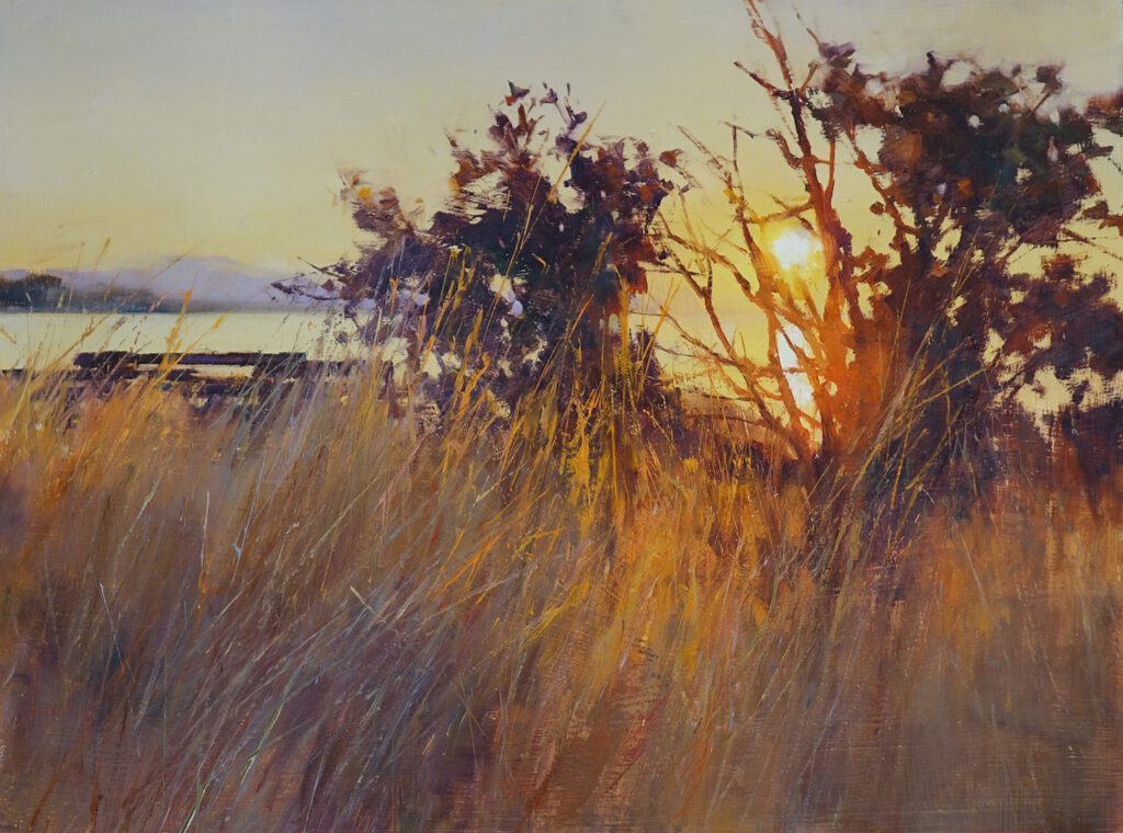
Golden Glow by Deborah Tilby OPAM
12″ x 16″ – Oil

The topic of skies in the landscape comes up all the time with my private students and is a subject with which many painters struggle. I thought I would share a few things I have learned.

I will start with the most obvious, which is that the sky sets the tone of the painting.  If you are depicting a sunset, sunrise, cloudy day, fog or even bright midday sun, the sky should convey that mood. Care must be taken to make sure that the mood established in the sky is carried through the rest of the landscape.

Newer painters often forget that everything in a painting must be bathed in the same light. This means that the landscape must reflect the sky in temperature of light.  This is obvious when painting a strong sunrise or sunset, but can be easy to miss when painting a scene with subdued light, especially when the light is a cooler color temperature.  For example, if the sky’s light is cool and the artist paints the reflected light a warm color temperature, the painting simply will not work. The same temperature MUST be carried throughout the entire painting.

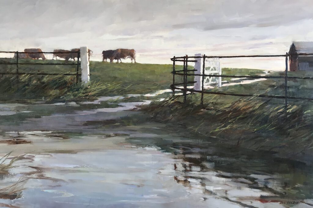
Rainy Day Cows by Deborah Tilby OPAM
20″ x 30″ – Oil

The sky is also an important compositional device and has much to contribute to the overall design. For example, when there are strong diagonals within the landscape, clouds can be arranged to counterbalance with diagonals of their own in the opposite direction (in a subtle manner of course!)  Another example is when the painting contains a series of horizontals in its land forms, the artist can choose to either echo the effect with more horizontals in the clouds, or contrast with more vertical cloud formations.

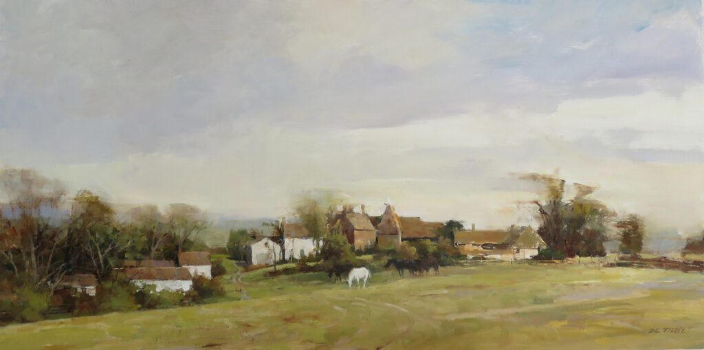
Horses by Deborah Tilby OPAM
12″ x 24″ – Oil

Often times the sky contributes to the overall success of the painting by being subdued in form, value and color, while still playing an important role in setting the mood.  If the landscape or seascape is very complex with lots going on, the sky needs to be very low contrast and subtle so as not to draw attention away from the busier areas of the painting.

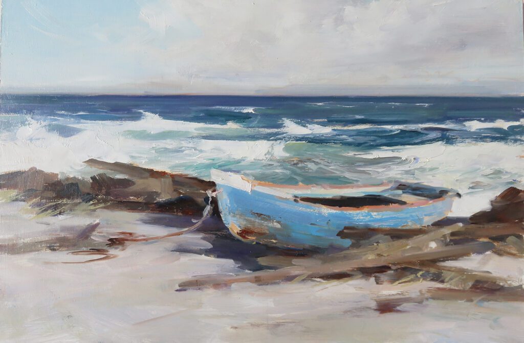
By The Sea, study by Deborah Tilby OPAM
8″ x 12″ – Oil

The mistake I see most often with my novice students, and sometimes elsewhere, is the habit of painting a blue sky with a color that is very intense and/or far too dark, particularly a dark Ultramarine Blue.  This takes all the light out of the sky, and makes it look artificial. Remember to squint to see how light in value the sky really is in comparison to the other planes of the landscape.

Also, it is important to remember when painting clouds, our job is to give the impression that they are light, airy and full of moisture; they are not solid objects. In an impressionistic painting, all sorts of colors can be introduced into the clouds, just remember to keep the colors subdued to avoid making them look heavy.  

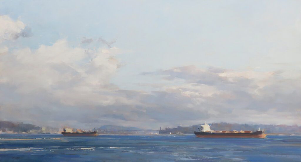
A View of the Bridge by Deborah Tilby OPAM
13″ x 24″ – Oil

So…pay attention to the sky in all stages of your painting and do not make it an afterthought!  Better to plan the design, values, temperature, intensity and edges right from the beginning.

Deborah Tilby  SFCA,  OPAM
www.deborahtilby.com

https://www.instagram.com/deborahtilby/

MY REJECT CUPBOARD

Deborah Tilby · Aug 28, 2017 · 8 Comments

I have a ‘might be salvageable’ cupboard where I keep a stack of paintings that didn’t work for one reason or another. I like to play about with them when I have an odd hour here or there. Sometimes adjustments to the colour or values is all that is needed or the brushwork can be cleaned up or the painting is too tight and some bolder brush or knife work might liven it up. Or, at the time, I didn’t have a clear idea how to handle a new subject but later I can see my through it. Of course there are those pictures that just shouldn’t have been started in the first place – the ones where I scratch my head and wonder what ever was I thinking!
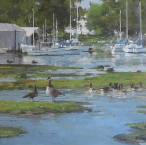
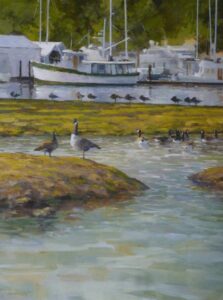
The painting below was done from some reference I gathered when visiting with a friend on his boat at a marina in Sidney, a town not too far from my studio. It started life as a 24×18 with a fairly faithful representation of the boats in the background, a lot of rocks and water in the foreground and some geese in the middle bit. It didn’t work. It was boring and it ended up in the reject cupboard. A few months ago, I hauled it out and tackled it again.
I’ll post the new version first followed by the ‘reject’.I invite you to play ‘spot the difference’.

What did I do?

I sorted through my reference files and found another group of boats with the same lighting and, without planning or drawing anything, I started on the right and worked across to the left. First I broke up that dull wall of green with some sky and a suggestion of buildings and added some rocks and beach and then the boats and reflections.
I decided that the large rock, upon which the two geese are standing, was too large and dominated the space so I flattened it. And the row of sleeping geese, which I had once thought made an interesting shape, seemed contrived and had to go. I started replacing them with water and reflections and some more mud but stopped before eliminating all of them. I probably went to make a cup of tea. I’m glad I did because I quite like the two that remain.
I then tried a number of approaches to the bottom third but nothing worked so I stuck a piece of masking tape across it at the 18″ mark. Better. I took out most of the rocks and mud I had painted and went back to a larger area of water to lead into the painting. This time I kept it simpler allowing the top third to draw the eye.Better still.
I think this one can stay out of the cupboard……..

Footer

  • Home
  • About
    • Mission, Policies & Bylaws
    • Board of Directors
    • Presidential History
    • Frequently Asked Questions
    • History
    • OPA Staff
    • Contact Us
  • Membership Services
    • Member Login
    • Membership Information
    • State & Province Distribution For Regionals
    • Update Member Information
    • Membership Directory
    • Contact Membership Department
  • Events
    • Exhibitions
    • Online Showcase
    • Lunch and Learn
    • Virtual Museum Road Trip
    • Paint Outs
  • Resources
    • Brushstrokes Newsletters
    • Ship and Insure Info
    • Lunch & Learn Video Archives
    • Museum Road Trip Video Archives
  • Services
    • Sponsorship Opportunities
    • Scholarships
    • Critique Services
    • Workshops
    • Have A HeART Humanitarian Award
  • Online Store
  • Awardees
  • Blog
    • OPA Guest Bloggers
    • Blogger’s Agreement (PDF)
    • Comment Policy
    • Advertisement Opportunities

© 2025 OPA - Oil Painters of America · Design by Steck Insights Web Design Logo