• Skip to primary navigation
  • Skip to main content
  • Skip to footer
  • Help Desk
  • My Account

OPA - Oil Painters of America

Dedicated to the preservation of representational art

  • Home
  • About
    • Mission, Policies & Bylaws
    • Board of Directors
    • Presidential History
    • Frequently Asked Questions
    • History
    • OPA Staff
    • Contact Us
  • Membership Services
    • Member Login
    • Membership Information
    • State & Province Distribution For Regionals
    • Update Member Information
    • Membership Directory
    • Contact Membership Department
  • Events
    • Exhibitions
    • Online Showcase
    • Lunch and Learn
    • Virtual Museum Road Trip
    • Paint Outs
  • Resources
    • Brushstrokes Newsletters
    • Ship and Insure Info
    • Lunch & Learn Video Archives
    • Museum Road Trip Video Archives
  • Services
    • Sponsorship Opportunities
    • Scholarships
    • Critique Services
    • Workshops
    • Have A HeART Humanitarian Award
  • Online Store
  • Awardees
  • Blog
    • OPA Guest Bloggers
    • Blogger’s Agreement (PDF)
    • Comment Policy
    • Advertisement Opportunities
  • Show Search
Hide Search

Robert Simone

Dappled Light Is the New Paisley

Robert Simone · Jan 6, 2020 · Leave a Comment

This work is a derivative of
“1970 Plymouth Fury Gran Coupe”
by Alden Jewell
licensed under CC BY 2.0

Remember paisley?  I do.  My brother had a 1971 Plymouth Fury Gran Coupe with a paisley vinyl top.  It was a boat of car like those behemoths you’d see in Dirty Harry movies. It looked like a family man’s car.  Like something, an accountant might drive to the office.  But underneath the reserved styling was a pure 1960’s muscle car.  Lots of horsepower and very fast.  And, oh, that vinyl top! The paisley was brown on brown and smartly understated.  Just enough to add a decorative flair.  But not so much that it attracted too much attention to itself.
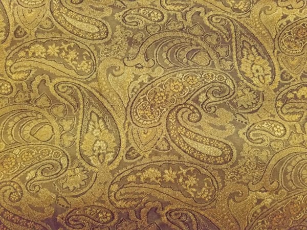
Photo by Robert J. Simone

Enough about the car.  Let’s talk about what paisley has to do with painting dappled light!  Paisley is an intricately woven pattern of tear drop shapes.   It originated in Persia in the 3rd century.  Before gracing vinyl roofs on cars, it was an ornamental textile design.   The shapes themselves can be long and narrow, short and wide, big or small.   For me, the beauty of paisley is that it appears to flow randomly across whatever it’s used to decorate.  It’s utterly designed in a logical repetitive fashion that feels random and conveys movement.  Lots of movement.  And that’s where the connection to dappled light comes in. 

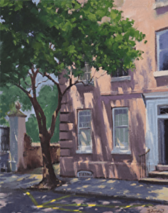
When painting dappled light we shouldn’t blindly try to copy our reference.  We should take advantage of the opportunity to design a more interesting pattern than nature sometimes gives us.  One that intentionally moves the viewer’s eye in orchestrated fashion through the painting.  That’s what I did in “Charleston Charm”.  The flow of light filters through the Crepe Myrtle onto the wall in an interlocking pattern of jagged shapes.  It moves from upper left to lower right.  When the light contacts the sidewalk the pattern angles back toward the left, leading the eye to the yellow parking stripes on the street which direct the gaze back to the upper left and the viewer’s path begins anew.  With each circular pass through the painting more interest is discovered; the door, the railing, the post on the left and so on.  But it’s the seemingly random pattern of interlocking light and shadow shapes that generates all the movement.
https://data.fineartstudioonline.com/websites/26056/works/26056_3076546m.jpg
 “Charleston Charm” by Robert J Simone
20″ x 16″ – Oil
Available at Reinert Fine Art

The best example may be “Mending the Sail” by Joaquin Sorolla.  Truly one of the all-time Tour de Force masterpieces, this huge painting features a seemingly random pattern of dappled light.  At 7’3″ x 9’10” this is certainly not an alla prima painting where Sorrolla observed the pattern of light and painted what he saw.  Surely, he observed this scene or something very similarly.  And he must have done preliminary sketches and studies. But no doubt he did a fair amount of designing the pattern of dappled light.  Why wouldn’t he? It lends itself so well to helping direct the path a viewer’s eye would take.  And therein lies one of the least discussed, yet most important skills a painter can possess, the ability to orchestrate movement. 

I’ll discuss that subject in depth in my next article.  But for now, let’s take a quick look at how Sorolla used dappled light to help move the eye through “Mending the Sail”.   There are other very powerful compositional elements here, but the pattern of light certainly plays a prominent role.  The strong vertical pattern of light and shadow to the left, just beneath the woman in pink, grabs the eye pulling it into the heart of the painting.  It moves the gaze downward toward the folds below.  Then the eye meanders along the spots of light on the folds until it reaches the figures on the right.  And suddenly the strong verticals are repeated in the silhouetted chair behind the older gentlemen.  The gaze catches the heads and faces and more dappled light on the left and makes another pass spiraling outward as it goes.  But it’s the dappled light that initiates all the movement.  It’s a little like noticing the paisley first then the car.  In that sense, both the paisley and the dappled light are functional decoration. 
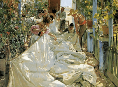
“Mending the Sail” by Joaquin Sorrolla

Intelligent Design

Robert Simone · Jul 22, 2019 · Leave a Comment

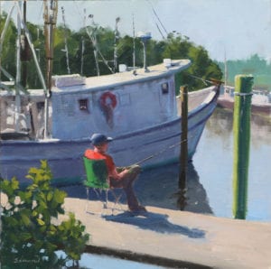
“Just Wetting A Line” by Robert J. Simone
16″ x 16″ – Oil on linen

Design, noun, 2) the purpose, planning or intention that exists or is thought to exist behind an action, fact or material object. 

In this post, I want to say a few things about intelligent design.  Intelligent design requires creativity.  It means using our imagination. It involves planning and purpose.  In painting, it’s a process of sorting through a myriad of details selecting only those which support intents.  Which implies a clear intent exists in the first place.  Intent may take various forms, but it usually flows from an emotional response to subject matter.   It could be the desire to convey a simple mood, to extol the beauty of nature or tell a story.  Whatever its form, intent looks beyond the mere transcription of facts.  Art is not in the facts.  That’s not to say the ability to represent nature is dispensable.  That’s still important.  But art is in the selection process aimed at setting emphasis.  It involves seeing nature in simplified, paintable terms.  Simplification is, therefore, the root of design.  Design differs from composition in that you can crop to a good composition, but design requires thoughtful arrangement of elements.  

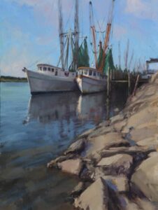
In May of 2018, I participated in the Forgotten Coast En Plein Air event in Florida’s Panhandle.  My official capacity was as a Plein Air Ambassador.  Tons of great subject matter there including an abundance of shrimp boats.  Indeed, the fleet of commercial shrimpers is one of the regions enduring legacies. Early in the week, at the Florida’s Finest Plein Air exhibition (which included a few of my works), I overheard one patron say to another “The last thing I want to see is another painting of a shrimp boat”.  I understood the comment completely.  Shrimp boats are part of the prevailing culture.  They’re as plentiful as bikinis on South Beach.  Surely some of the thrill is gone.  No doubt shrimp boats are the most painted subjects in the area.  But I don’t see them every day.  So, to me, a marina full of shrimpers is an amusement park for artists.  I was drawn to the marina at Mill Pond as if pulled by a giant magnet. 

“Johnny Ray’s Girls”
by Robert J. Simone
24″ x 18″ – Oil on linen

Amidst the retorts of laughing gulls, breathing in the aroma of salt air and diesel fumes, I walked the perimeter dock of the “U” shaped cove, admiring vessel after vessel.  I was captivated by the weathered charm of the gritty watercraft as the words “Who wants another painting of a shrimp boat” reverberated in my head.  Inhaling once more, the pungent admixture of salt air and low droning engines fueled my inspiration. I vowed to do something more than a mere “painting of a shrimp boat”.  With that clear intention in mind, I looked for something a shrimp boat could do besides sit for a portrait.  That’s when the crusty visage of a rod and reel fisherman appeared.  Light bulbs went off as I saw the possibility of using the shadow side of a shrimp boat as a foil for the play of light and shadow across his figure.  That decision clearly shifted the emphasis away from shrimp boats, without avoiding the boats altogether.  So, the painting became more than just “another painting of a shrimp boat”.  The overall design plan was the stacking of values from foreground to background, dark in front of light in front of dark in front of light and so on.   Emphasis on the figure was further supported by using very saturated colors for his shirt, chair, and hat.  The warm shadowy sides of his face and arms further separate him from the cool shadow behind.  At the same time, virtually every value on the figure is either lighter or darker than the shadow side of the vessel.  Simply put, contrasts in value, temperature and saturation differentiate the figure from its foil.  I could further dissect the design of the painting but the decision to use the boat as a foil for the figure is enough to illustrate some salient points about design.  It’s also enough to say, “Mission accomplished”. 

RobertJSimone.com 

Paint Masses Not Grasses!

Robert Simone · Jun 4, 2018 · Leave a Comment

Perhaps one of the more perplexing problems for new and developing landscape artists is how to effectively depict grasses. It’s easy for grasses to come out looking contrived or worse, like a bad hair transplant. I know, cuz I’ve been there, done that. Not the hair transplant, the contrived looking grasses. Here’s a workable solution for painting more natural looking grasses:
Try Painting Masses Not Grasses!

"Still Life With Watermelon" by  Sergei Bongart
“Still Life With Watermelon”
Sergei Bongart
In art, a mass is a three dimensional solid with identifiable boundaries. Big areas of grass are somewhat boxlike. That is they have sides and tops.  When painting grasses, it’s much more important to paint the sides and tops of the big irregular shaped box (mass) than it is to paint individual blades of grass.This approach draws on the Sergei Bongart: Notes on Painting as compiled by Norm Nason. The notes assert, “The hardest skill for artists to learn is to be simple. That’s because we have a natural inclination to create detail, a tendency we must overcome. The first rule is to begin big and simple, then move toward the small and complex”. Notice the operative word “toward” in that last statement. Moving toward the small and complex doesn’t mean we actually arrive at small and complex. We can stop anywhere along way.  The notes say, “The best art amazes us because of what the artist left out….any beautifully rendered detail can be strengthened by this editing process”.  I believe in the power of suggestion. So I like to stop well short of a lot of small and complex detail. There are associative properties that make the power of suggestion work. We can add a few finely painted details to a loosely painted mass of grasses and our viewers will automatically associate the entire mass with those few details. They will infer a level of detail everywhere and think you painted a lot more individual grasses than you did.  This way  your viewer becomes an active participant in your painting. They will enjoy it more. And see it anew each time they look at it. By comparison, if you paint detail everywhere, they will eventually consume it all and tire of the painting. It will become stale and seem contrived.
In my painting, Low Country Marsh, the big mass on the right has the look and feel of grass even though individual blades are not really painted. But the irregularly shaped box with it’s vertical side and horizontal top is well defined. The sides are in shadow, the tops are in light.  It’s the irregular, relatively soft juncture (edge) between tops and sides that gives the feel of grass. A little detail in the foreground mass helps the viewer infer detail in that mass, too. The same idea plays out in the background tufts of grass as well. The only detail is in the foreground and even there, it’s pretty sparse mostly suggested.
LowCountryMarshOPA-16x20-rssp_edited-1
“Low Country Marsh”
Robert Simone
16″ x 20″

In short, “Painting Masses Not Grasses”, means keeping all detail subordinate to the overall mass. Your viewer’s mind will fill in what’s lacking.

Footer

  • Home
  • About
    • Mission, Policies & Bylaws
    • Board of Directors
    • Presidential History
    • Frequently Asked Questions
    • History
    • OPA Staff
    • Contact Us
  • Membership Services
    • Member Login
    • Membership Information
    • State & Province Distribution For Regionals
    • Update Member Information
    • Membership Directory
    • Contact Membership Department
  • Events
    • Exhibitions
    • Online Showcase
    • Lunch and Learn
    • Virtual Museum Road Trip
    • Paint Outs
  • Resources
    • Brushstrokes Newsletters
    • Ship and Insure Info
    • Lunch & Learn Video Archives
    • Museum Road Trip Video Archives
  • Services
    • Sponsorship Opportunities
    • Scholarships
    • Critique Services
    • Workshops
    • Have A HeART Humanitarian Award
  • Online Store
  • Awardees
  • Blog
    • OPA Guest Bloggers
    • Blogger’s Agreement (PDF)
    • Comment Policy
    • Advertisement Opportunities

© 2025 OPA - Oil Painters of America · Design by Steck Insights Web Design Logo