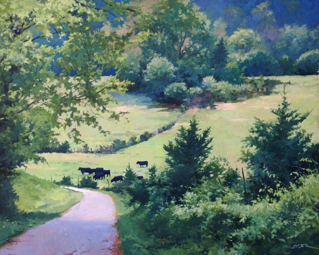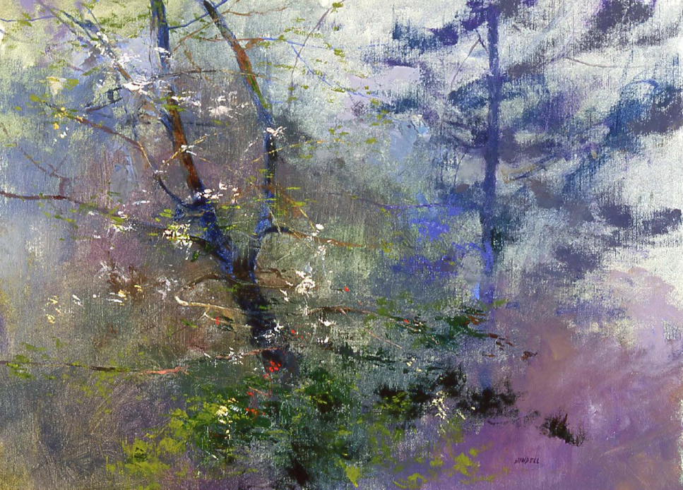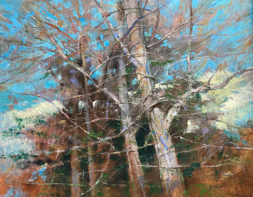
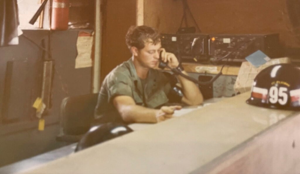
ART continues to play a major role that saved my father’s life. My father, John Melillo, OPA member, is a disabled Vietnam Veteran who continues to heal from PTSD through Art. We work together on his art career. His paintings are inspired from growing up on the East End, Long Island and he also paints from his original photographs that he took while serving in Vietnam circa 1970-71 for his “Life Goes on Series”. I’m amazed each time when he’s completed a new painting and the journey on how he challenges himself. He has been a member of the OPA for many years and it has added to providing solace through the many opportunities to share, learn & exhibit on the OPA platform. OPA, thank you for your service and inspiration.
My dad’s PTSD condition from his Vietnam experience surfaced dramatically when he retired. Never involved with art before, “God gave me this gift as a 3Rd ACT in life to finding Healing through ART.” JM. Every day he’s working on a painting to create something that’s meaningful for him. His paintings tell stories and provide the viewer with their own narrative.
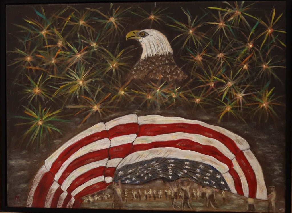
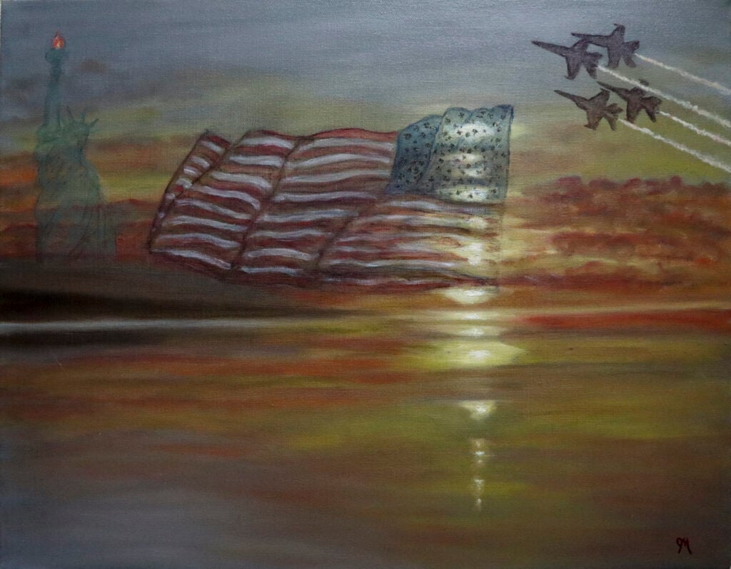
John’s art reflects & celebrates the USA’s 250th Anniversary in July.
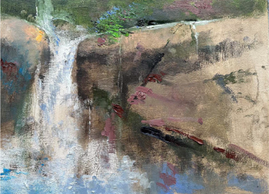
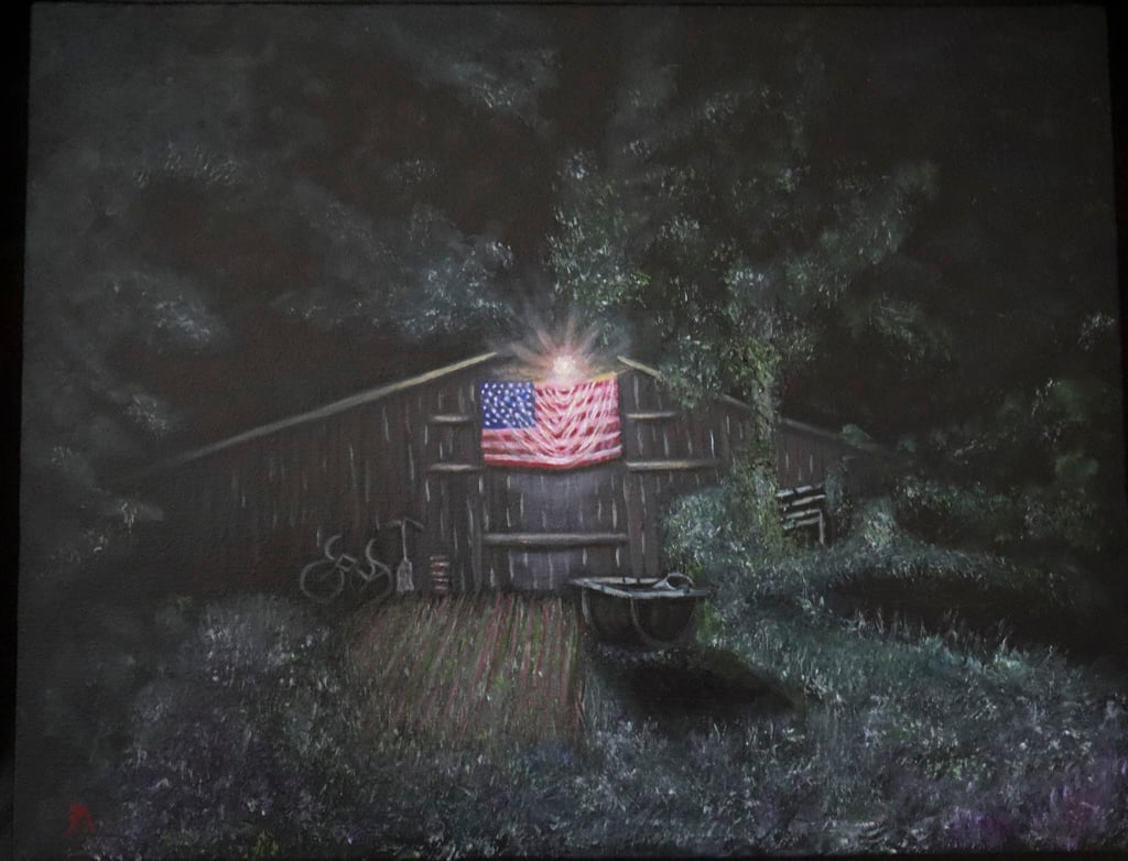
This year for the 250th USA Anniversary, he did a flag oil painting at night titled “THE Old Barn, Oak Street, Westhampton, Circa 1955”. John explained to me “I used to pass this setting many times when my father took me fishing as a boy at the Shinnecock Inlet in the Hamptons, NY. I remembered it clearly and now that fond memory with my father that will last as long as the painting exists. I have painted a new Flag each year for my Life Goes on Series that will also honor this monumental time. One was called the ‘Strength, Hope, Honor & Courage” and “Proudly We Hold our Flag High.’ It’s all about our community coming together to celebrate this GREAT NATION and all the sacrifices it took to make it so.
I asked my father to explain the role today with his art and being a Veteran? “Like many Vietnam Vets, I came home to a hostile environment because of all the Anti-War sentiments. Like most Vets, I tucked it away until I decided to try and help my fellow Vets with their PTSD as well as myself. But more than that, In the last few years, I’ve heard the overwhelming “Thank You For Your Service” comments. Very few guys I served with heard the outpouring of those 5 words (the Vietnam Guys). So whether I’m at a Medal Ceremony, the Vet of the day at sporting events, TV Interviews, etc , I always want to DEDICATE and PASS ON any honors to all those I served with that came home or didn’t make it to hear that sort of appreciation.’ John Melillo.
My father inspires other veterans to heal from PTSD by sharing his ART journey. He presents his ART at a Veteran Resource Fairs that are happening in Suffolk County NY. This provides him the opportunity to meet and talk with other Veterans (+ first responders) about how Art Saved him. We will include them in future events my dad does with art exhibits, talks and even a few art classes that he”ll teach to Veterans. He always encourages them to find something they enjoy to do.
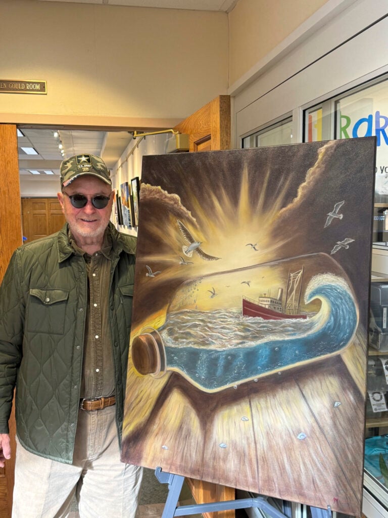
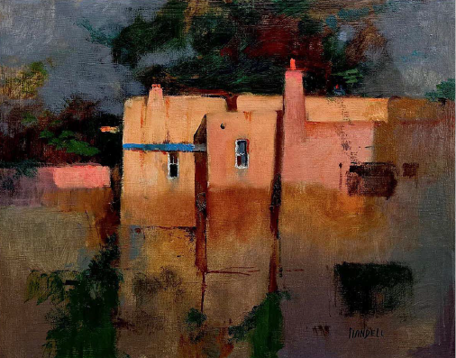
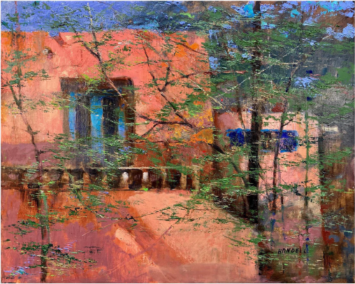
John has permanent art collections for viewing at the Westhampton Starbucks and his art is also up in Riverhead, NY Starbucks. What’s unique about these pieces is he did them with a Realistic Style and the paintings represent that specific area of Long Island where the stores are located. John is also currently featured in “THE DISCOVER L.I.” TV commercial as a Disabled Veteran who paints the East End. John also supports other Veteran organization friends by donating pieces of his ART to help their initiatives and raise awareness.
Thank you, OPA for this honorable platform to share my father’s story and flag paintings as you make a huge difference to educate and inspire others.
Please visit www.artfeelingsjm.com and Instagram: @artfeelingsjm. ALL ART for SALE!