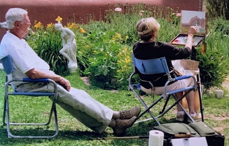
I recently received a photograph from a fellow artist. It was of her mother and father. She wanted to commission a painting of it to give to her mother, who is an artist as well. The photo showed her mother and father at an art workshop. Her Dad was not an artist, but was her Mom’s biggest fan. He would carry her gear, set up her easel and supplies, and then sit back and admiringly watch her paint works of art. As soon as I saw the picture, I saw the painting. I took the commission and began the process of not merely copying the image, but creating a visual story of connection.
So, what were my thoughts on developing the painting? How was the information processed in my mind? It went something like this:
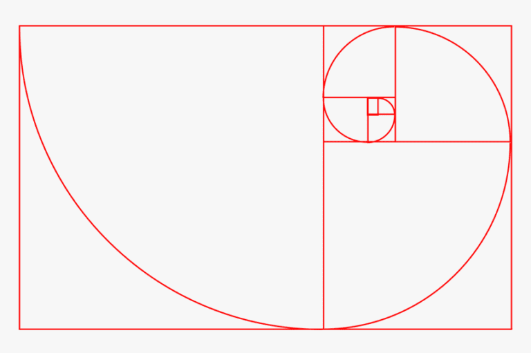
- First, I noticed a natural Fibonacci spiral in the design. I realized that the line leading my eye through the painting was dependent upon the connection between the gentleman’s feet and the shadows of the chair in front of him. If this were broken, your eye would go to the strong contrast between his clothing and the background. I wanted there to be a connection between the two people, for the design as well as for the story.
- Second, I thought about the size and placement of the subject on the canvas. I chose a 12 x 16 inch canvas because it has a longer length to width ratio than the 11 x 14 one that we had originally discussed. I communicated this with the client, and she agreed.
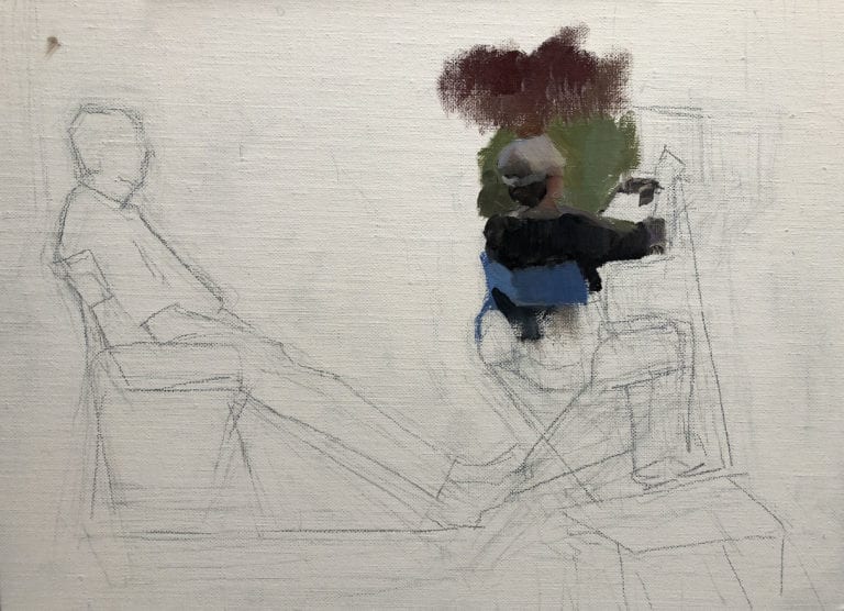
- Because there were two figures, I knew that the proportion would need to be as accurate as possible. If I drew one figure perfectly and then realized I did not have enough room for the other, I would have to start over.
- The placement of the figures on the canvas mattered as well. I chose to have more room to the right of female figure because the pair were facing in that direction, and I wanted the viewer to have a sense of the space outside of the canvas. This placement also helped the eye not linger on the gentleman whose sharp edges and high contrast could have stolen the show.
- The balance of the painting was also important. The canvas had more “weight” or “pull” on the right side because of the size of the artist’s gear, the detail around that figure, the action the figure is engaged in, and her darker values.
- Once I had the placement of the figures noted on the canvas, I began to mix my paint. I chose the colors for my “Color Circle” — the way I premix my colors to get a wide variety of harmonious hues with a limited palette.
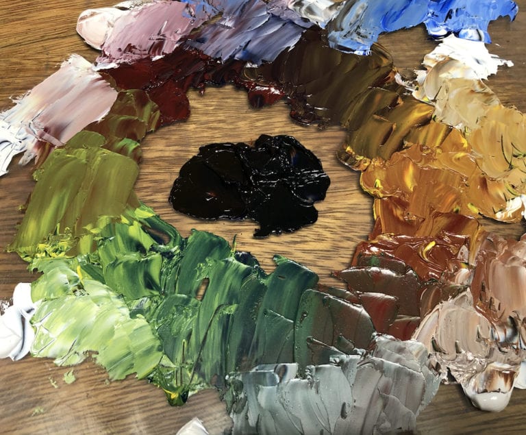
My limited color palette for this painting was as follows:
1 Red: Indian Red
1 Blue: Ultramarine Blue
1 Yellow: Cadmium Yellow Light
Dark: Mixture of Ultramarine Blue and Transparent Oxide Brown
Titanium White
And to the side – Cadmium red to mix in as needed
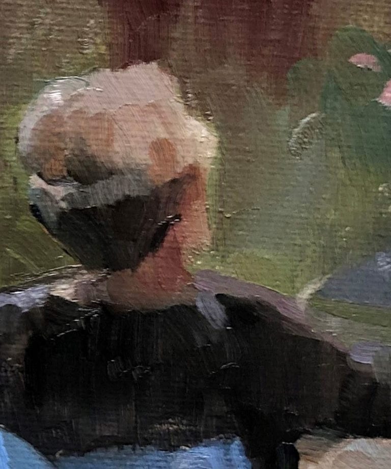
Next, I began painting at the center of interest (the place that I wanted the attention to go the most). This area also had the darkest darks on the canvas. As I painted her head, it was important to get a background color next to her hair and skin to show the relationship of value and temperature, instead of making an isolated color choice. These relationships of color and the interactions between colorsis the way that atmosphere is created in a painting — the interconnection of all of the elements and objects working together. That is why it is important to put a sky in a landscape early, and why the colors of some objects are found in others that are nearby. There should be a definite intertwining of color and movement throughout a scene. This is what is missing many times when artists feel like their paintings are too “stiff”.
I do not paint every painting using this same method. Instead, I let the design dictate the decisions I make. I think about how to not lose the most important design elements of the scene, and try not to let anything distract from it. I also try to have my drawing accurate enough that I can be bold with my brushwork and not rework it.
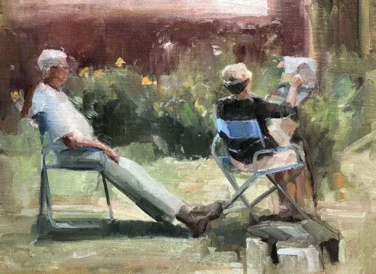
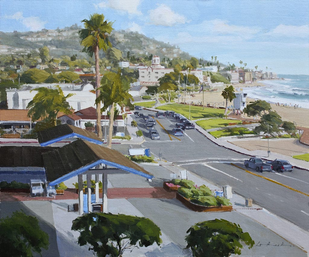
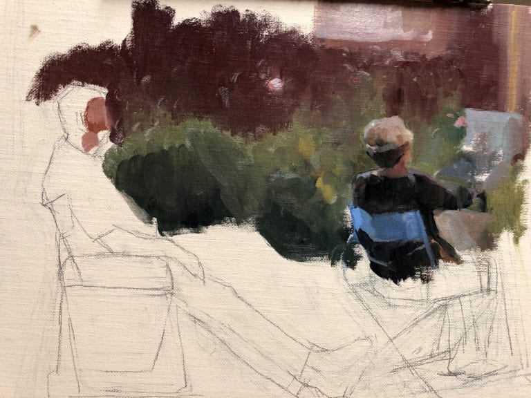
12″ x 16″ – Oil on Linen Board
In this painting, I worked around the lady’s head, then followed the background to where the gentleman was, and then blocked him in. Finally, I circled back to her and the items around her. Even in the placement of the background flowers, I was thinking about my design. I did not mind the sharp edge created by his legs because it added to the movement of the viewer’s eye through the painting, leading to the female figure. I finished the painting with detail on his face- not getting too much detail, but just enough to see the shape of his head and character as much as possible in a small painting. When it said what I wanted it to say, I called it finished.
This painting was about a gentleman, who, although taking up the most space in the painting, was the background figure. His wife was the focus — not just of this painting, but also his life. And he was glad to sit back and watch as she shined in the spotlight. He was connected to her, not just in design, but in heart and in focus. As I compiled my painting, I was doing more than artistic design. I was telling a story of connection.