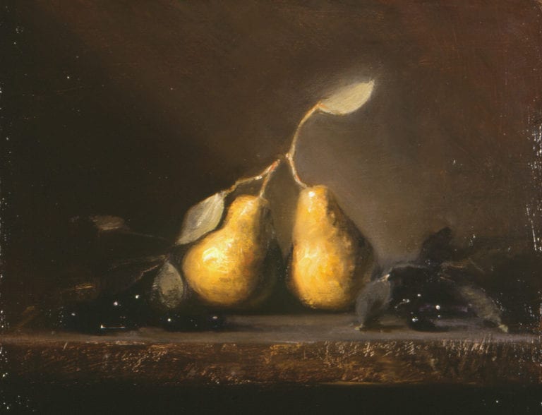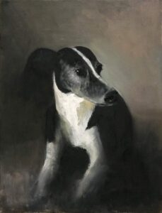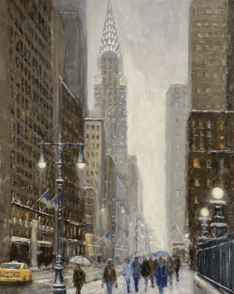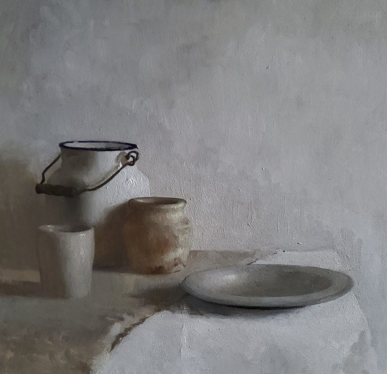
9″ x 12″ – Oil on linen
Oil Painters of America National Wet Paint Competition 2020 – Award of Merit
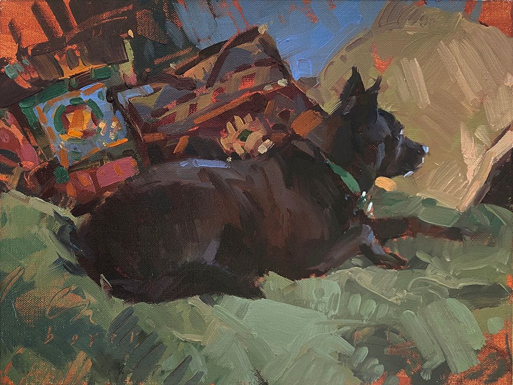
Meet Bean, a diminutive black rescue dog with a randomly crooked smile. Bat Dog impersonator, she races the wind cape flying – when she’s wearing one, and in her mind, I’m sure of it, when she’s not. Bean races. In the dark.
As artists, we may on occasion run headlong into a period of personal darkness. Creativity slips through our fingers, we instinctively tighten our grip and plunge over an emotional cliff, watching the last vestige of inspiration fade like smoke. Darkness closes in.
THE DOOM WHISPERERS
What just happened? Our sextant failed us and we lost sight of our North Star. We lost trust in our instincts. We lost faith in the wind of our spirit and started believing the Doom Whisperers. They’re like orcs…small, truly ugly, and out to suck the joy out of you. Anything or anyone who makes you doubt yourself, including yourself, is brokering doom. If we fall for it we furl our sails, cling to the mast, and start playing defense.
WIN THE DAY
How do we win back the day? We have two choices. Wait it out. Or, learn the art of racing in the dark. I’m not into wasting life, so waiting it out seems like a less than optimal option. I’m opting for racing in the dark. So, how do we go about winning the day in the middle of a pitch-dark night. And I mean win the day literally. Win the return of light, creative inspiration, excitement, and forward motion. The wisdom of a diminutive dog has taught me we can play offense even before the light returns. We can race in the dark.
LESSONS ON RACING IN THE DARK
During an Excellent Adventure at the mostly abandoned dog park, Amanda, Bean dog’s mom, donned a headlamp, clipped on Bean’s night beacon, and unclipped the leash. In the face of darkness, the beaconed Bean flew off into the night at top speed. Uphill, downhill, then circling like a drone creating sky art on the 4th of July. The Bat Dog impersonator then sped back to the safe harbor of Amanda’s headlamp before heading off to race in the darkness again.
That blow-out-the-carbs headlong dive into happiness, smack in the middle of darkness, suddenly seemed way more attractive than my own personal darkness, the creative malaise I’d been blindly stumbling around in. Either I needed to become a dog, or learn to approach life more like a dog. I set about to apply the lessons of how Bean, apparently a Yoda among dogs, transmuted darkness into light.
1. The Night is Your Friend
Our artistic careers will cycle through day and night. Success and Sabbatical. Get used to the nights. Night is a friend, not an enemy. We can learn to love night as well as day. The air is cool. The sky is full of stars. Night is mysterious and holds different possibilities than day. Night is not so crowded with other people’s thoughts and opinions. It gives us a chance to return to our own instincts. We can learn to trust our inner creative voice again. We can find images floating at the boundaries of consciousness that want to be painted. Truly authentic creations, not images contrived to sell, win, or impress.
2. Count to Ten
If you feel like you’ve been plunged kicking and screaming into a creative night, give yourself a minute. Take a breath. Count to ten. Grant permission to set your brushes aside temporarily while your inner eye adjusts to the darkness. It’s time for a bit of nuance. If we can overcome the paralysis and sense of dread being plunged into creative darkness brings we win the option of learning to race in the dark instead. Play in the dark even. Look up at your figurative night sky. Stars! Stars can guide us home. Use the nuance of your new night vision.
3. Rocks aren’t Bears
Use lessons you learned during your artistic daytime to help guide you during your artistic night. Bean learned while racing in the daylight that the rocks she would bound off racing in the dark were indeed rocks, not bears. When you are trying to navigate creative darkness, realize that something that appears to be a looming bear might just be a rock. It not only isn’t going to eat you, you might be able to turn the rock into a launching pad for an exciting new direction.
4. Find your Lighthouse
Part of Bean’s bravery came from knowing that there was a light to guide her home. The beacon of Amanda’s headlamp was the safe harbor to circle back to in the dark before launching out on yet another adventure. It takes a bit more energy to race in the dark, so find your personal lighthouse. It will guide you into harbor. Fill it with whatever things feed your soul and put wind in your sails. When a beacon lights your way, you won’t have to search for ideas. The ideas will find you.
May you find creative adventures and the fun of racing in the dark!
– Lyn
NEW RELEASE – Liliedahl Art Video | “No Fear Oil Painting”™ – A Guide to Creative Brush Handling | with Lyn Boyer – Music by Dave Curley