Marci Oleszkiewicz, grew up in the city of Chicago in a family of four. Her mother home schooled all four children where each child’s gifts were nurtured and encouraged. Marci’s father was a carpenter and there wasn’t a moment in childhood that he was not renovating or working on some project for their home. Looking back Marci attributes much of her creativity to seeing her father always working on something, creating something out of nothing. “My dad would say see Marci if you work at something little by little you will see your idea come about. Seeing my Dad’s work ethic and learning from my Mom the value of self discipline as a home schooler, I believe gave me some of the foundational tools I would need later in life to succeed as an artist.”
Marci’s passion for art was inspired at a young age. As a child, she remembers sitting at her little desk making pictures.
“It seemed I often communicated visually.Whether it was in a Christmas card to family or a personal journal entry, there was always a drawing to be found. I remember imagining my little creations coming alive as I made the final touches.”
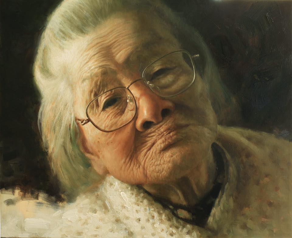
A statement from the Juror of Awards, Kathy Anderson:
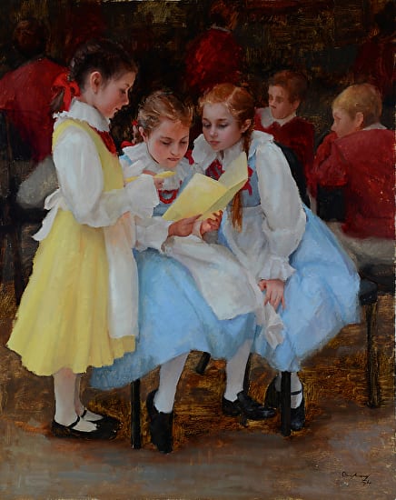
My choice for 1st place in this competition was very easy and instantly identifiable. It fit my criteria of telling an interesting story, or handling a subject in an original way. I’m very drawn to beautiful clean color, and skill in drawing. The little girls in their pastel dresses were a perfect match for me!”
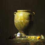
Although she has been studying art and painting for some time, it wasn’t until 2007 when things started to move forward and she began to see what the future might hold for her as an artist. Upon entering several art competitions Marci was not only accepted in two of the top shows, The Oil Painters of America’s national show and the American Impressionist Society’s national show, but also received very substantial awards from both. An award of excellence from the OPA and the best of show award from the AIS. Not long after, she was included in Southwest Art Magazine’s 21 under 31 and had her first two man show at Gallery Russia in Scottsdale, AZ. “Receiving so many incredible honors, one after another, really encouraged and pushed me into becoming a full time painter.” Since then Marci has continued to paint full time, focusing on her annual show that comes up every March at Gallery Russia in Scottsdale, AZ. “I am always so encouraged to hear the response from my collectors every year, how they connect and are so touched by what I paint. It is my goal as an artist to do just that, to create works that resonate with the hearts of others, to speak clearly and deeply to the innermost being. To capture moments of life on canvas that convey beauty, joy, love and truth. I’ve heard it said if you paint from your heart you will speak to the hearts of your viewers, and that is my desire.”
“The Lord has blessed me with this passion for art and I am delighted to be able to share what I see with my students and collectors to show them the beauty and love that surrounds them.”
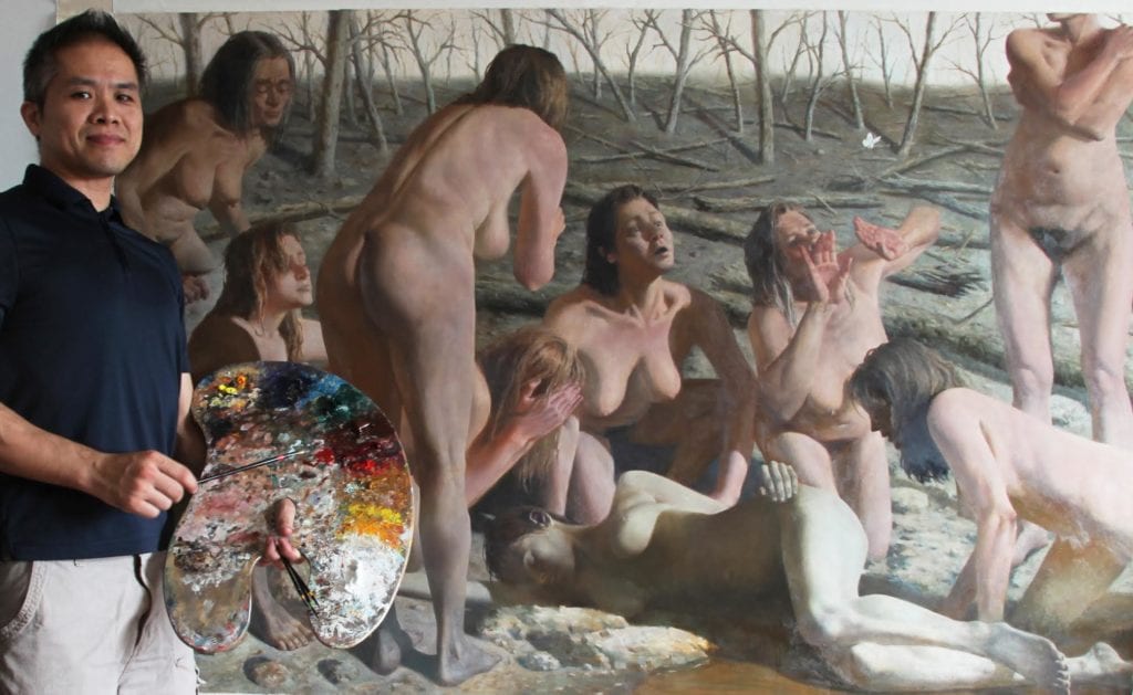
Zimou Tan was named “Chinese Master Artist” in December of 2007 by the Chinese government Art and Culture department, also selected as “The 50 Artists impacted China”. Tan was born and raised in Canton, China, apprenticed to Chinese Master Artist Le, YiFeng at age 12. At age 14 he immigrated to America with his family. Tan taught at art university for about 13 years after his graduation.
Tan has been running Tan’s fine art studios onsite and online, you can find Tan’s demo videos on Youtube, and Vimeo. Tan is specialized in fine art portraitures, to capture the spirit of his subjects. Since 2001, Tan had won numerous painting awards, and published in magazines. Tan is currently the director of Olivet College of Art and Design.
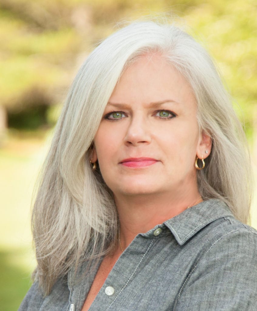
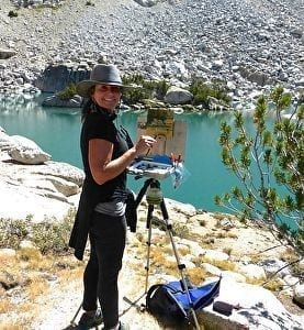
Recognized for her expressive brushwork, intelligent composition, and superb use of color, Nashville Tennessee native, Lori Putnam paints small to medium-sized works en plein airand creates large paintings in her studio. She travels extensively to paint, teach, and share her work around the world.
Prior to becoming a full-time, fine artist in 2005, Putnam owned and managed a graphic design agency for 13 years. In 2008 and 2009, she and her husband sold all of their belongings and traveled to the Italian countryside to live for more than seven months with the sole purpose of the painter’s self-study and artistic growth. A catalyst for Putnam’s artistic career, the concentrated work accomplished during that period culminated in an impressive breakthrough. Advice from artist friends Scott Christensen, Quang Ho, and Dawn Whitelaw, has further impacted the artist’s development and success.
Featured in numerous issues of American Art Collector Magazine, Plein Air Magazine, Southwest Art, Fine Art Connoisseur, and Art of the West, Putnam is recognized as one of the finest American Impressionists of our time. As an Artist Faculty Demonstrator for the Annual Plein Air Convention, she shares her philosophy and painting methods with its 700 attendees annually.
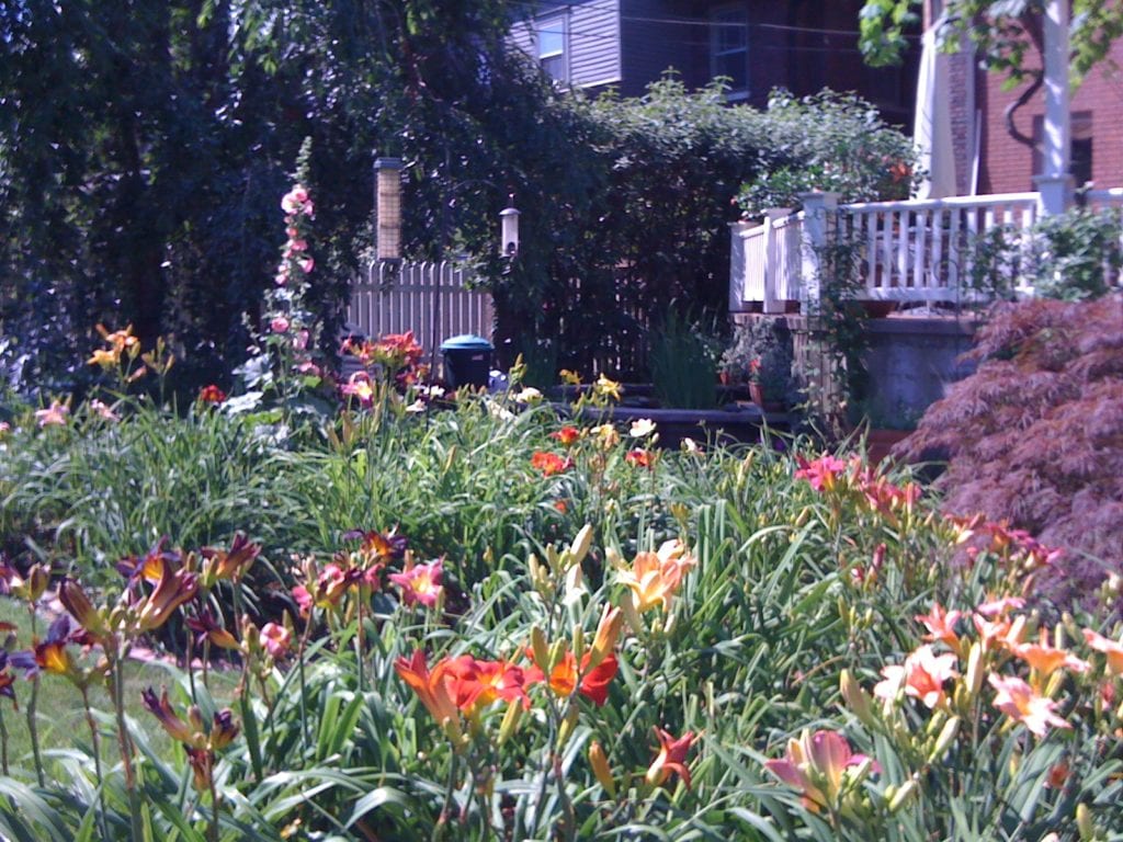
Lori is a member of, and has exhibited with many respected organizations including the Salmagundi Club in New York City, the Oil Painters of America, Laguna Plein air Painters Association, the California Art Club, Plein Air Artists of Colorado, and is past Vice President of the American Impressionists Society. Additionally, Lori participates annually in several invitational plein air events, and winning awards in Colorado, California, Wyoming, Florida, Georgia, and Ireland. Her studio work has also received many awards — most notably from the Salmagundi Club in New York City, the Portrait Society of America, The American Impressionist’s Society, and the Oil Painters of America. Putnam’s art is in the permanent collection at The Academy Art Museum in Easton, Maryland, the Jack Warner Collection, the collection of Plein Air Magazine, and in private and corporate collections, and galleries worldwide. She keeps a studio in Charlotte, Tennessee.
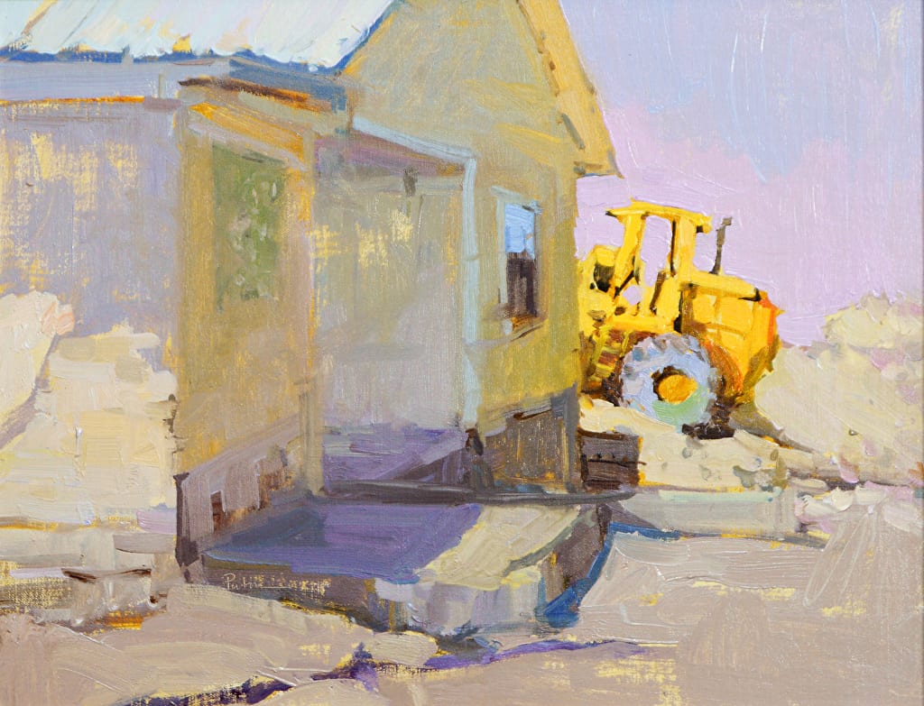
“As a Contemporary American Impressionist, I capture the character of a person, the uniqueness of a place, the color of time, and the relationship of things. Rather than merely copying, I use paint to interpret and to express. What interests me is rarely any specific subject unto itself. Color harmonies, rhythms, patterns, shapes, and my response to these elements excite me. Seeing the world in this way gives me the freedom to explore any subject. The end result, the art itself, engages its viewers inviting them to find their own, personal interpretations.”