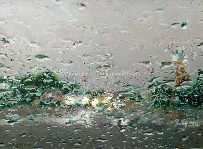
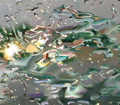
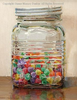
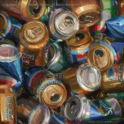
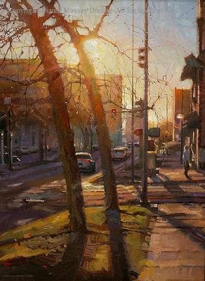
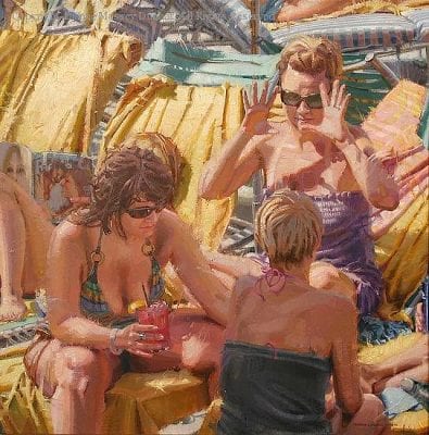
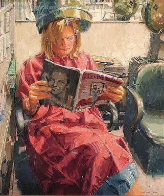
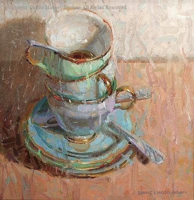
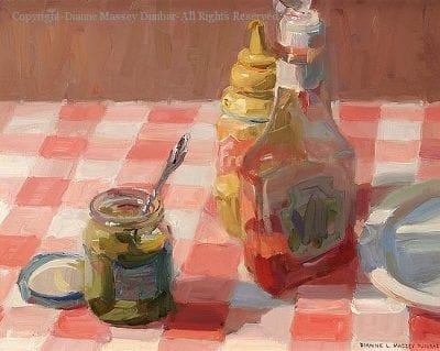
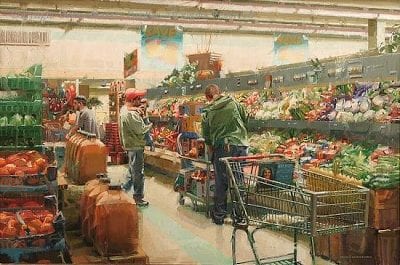
“I paint ordinary objects and scenes from everyday life. While I have the highest respect for artists who paint vistas and exquisite nudes and the like, I believe that there is a great deal of beauty in the world that often goes unnoticed. The amazing color in raindrops, the variety in fallen autumn leaves, the interesting greens one finds in a stack of French fries, there are endless opportunity for paintings. My hope is that people view the world just a little bit differently after seeing my paintings.”
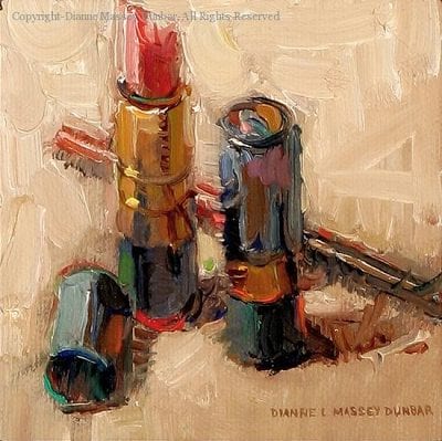
What is so amazing to me is her fabulous ability to take the most mundane of objects and transform them into delectable treats. How can someone take a simple tube of lipstick, or plain glass bottles, or even raindrops on a windshield, and transform those things into objects of desire…paintings sought after and cherished? Dunbar does it and makes it look easy. How she does it is what this interview is about.
Mark Smith, co-owner of the Greenhouse Gallery of Fine Art in San Antonio, said, “To view one of Dianne’s paintings is to experience complexity in its most artistic form. Most often, her choice of subject matter is quite complex, challenging and can be categorized as “crazy”. However, this type of complexity is the stage that most accurately reveals Dianne’s stunning sense of color and expert brushwork. Dianne is a master of articulating her inspiration and the “story” that she finds in the most mundane and overlooked objects and moments.”
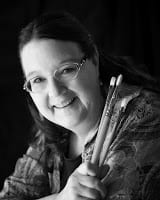
And now more from Dianne Massey Dunbar…
“I want to thank John Pototschnik, whose work I have been watching for some time now and greatly admire, for asking me to answer a few questions. I have tried to answer these questions honestly and openly and I truly hope that my comments are helpful.”
For me, the intellectual part of painting is the process of designing the painting, the drawing involved, and the problem solving along the way. It is not sentimental and it frequently is not much fun. There is skill and experience that an artist draws on, and every painting, no matter how well it has been thought out, has an area somewhere that is troublesome. There are times when work is tedious or even boring. The emotional part of painting is for me what I like and don’t like, the subject matter that I paint, the thinness or thickness of paint, the “play” time I have with a painting, and the colors I may choose. And for good or for bad, I emotionally invest in my paintings.
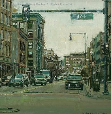
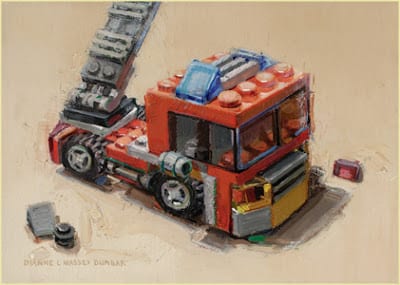
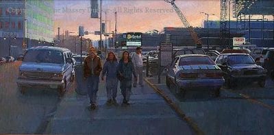
Finding subject matter that is exciting is personal. I am drawn to simple common images: candy bars, cupcakes, rain on my windshield, jars, dishes, road crews, and reflections. After that, almost all of my preparation for each painting is intellectual and frankly a little tiresome. I study various compositions and value arrangements for my chosen subject matter long before I put brush to canvas. I tape the value studies upside down in my kitchen and study them to see if the design and the shapes are working. Once I have a design, only then do I begin painting. And for me, the beginning and early stages of a painting tend to be thoughtful and deliberate and even a little intimidating.
However, I absolutely love to play with paint, so when I have a painting far enough along, I can then begin to have fun with it. I might decide to smear paint, or flick it. I use any number of implements to play with paint, from the jagged edge of gum wrappers to torn pieces of paper towel rolls to palette knives to inexpensive brushes that I have cut gaps in. Today I experimented with my rubber kitchen spatula (I had fun but unfortunately was not happy with the result!).
I think non-artists have a notion that art is the result of “inspiration”. Well, there are times of inspiration, when instinct takes over and something happens on a canvas that I probably can never do again but I look at it in wonder. However, those times are few and far between for me. Being an artist is very much like other careers, there is leaning and thinking and hard work involved.
Describe your typical block-in technique, the thoroughness of your initial drawing, and the part photography plays in your work? I have more than one process that I use, depending on my subject matter. If I am doing a relatively simple still life, between one and three objects, I will do one or two quick thumbnails on a piece of inexpensive canvas board, and if I am happy with the shapes, I will begin to sketch those shapes in on my canvas. On the canvas, I may do a very simple sketch, or a more complete sketch, either very lightly with pencil or with a small brush. I then paint, working from background to foreground, massing in the large areas of a single value without much regard to detail. Once I have the large value shapes in, I can begin to break them down into smaller shapes, etc. I try to work on gradation and edges as I go along.
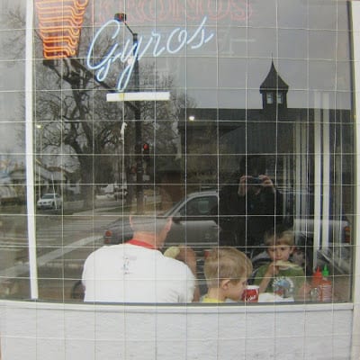
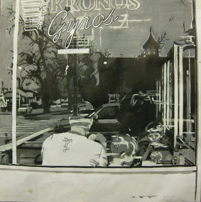
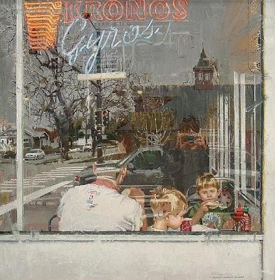
On the more complex paintings, I generally use photographs and work with a grid system. I might start with 20 or more digital images that I study. I look at the overall design, and see what happens when I zoom in or crop the images. I narrow these down to maybe the top five and I have those printed at my local camera shop. Then I make black and white Xerox copies of the color photographs. After the copies are made, I use inexpensive poster paint in white, gray and black and paint directly on the copies exactly where I think I want the light value, the medium value and the dark value. For each photograph I might do two different value studies, to see what the resultant design is. I do this by hand instead of computer because I can make all kinds of decisions when I work by hand that might go unnoticed otherwise.
Every part of that image needs to fall into one of those three values (I have been known to work with four values, but that gets very complicated). I then tape them up in my condo and live with them for a day or two, turning them upside down and sideways to see if the design is satisfactory. It is tedious, but I have found this process works for me and I have more successful paintings. After I have a design I like, then I have that photograph enlarged. However, I keep the value study because that is my “roadmap” for the painting. So, I paint the image that I have chosen, using the values of my value study. If I am working on a square canvas, I might work from an 8″x 8″ photograph, and work on a 16″x 16″ canvas, or 20″x 20″ canvas or even a 24″ square canvas. The photograph is taped to lightweight cardboard and I use a sewing needle and thread to grid the photograph so that if necessary I can move the thread aside to see what’s underneath. I usually use 1″ squares on the photograph. I grid the canvas (the canvas must be the same proportion as the photo you are working from) with very light pencil lines, usually in two or three inch squares. I then paint each square, starting from the upper left hand corner and working to the right. After my canvas is painted, then I go back and make necessary corrections, work on edges, simplifying, etc.
I use other colors in different situations, especially Zinc or Transparent or Flake White Replacement. There are times I really need Indian Yellow. Caucasian Flesh is a very useful color in a number of situations. I also use Venetian Red or Naphol Red and a number of other greens, especially Emerald Green Nova. I mix my blacks, but I do have a tube of black that I use if needed.
Some of these are quite transparent in nature, and some opaque. An artist needs to know the tinting power of different colors and use the intense colors sparingly (Alizarin Crimson and the Phthalos immediately come to mind). However, a lot of wonderful effects can be achieved with a more limited palette, so you do not need all these colors to produce wonderful paintings. Indeed, if you are new to painting, you would probably be best served by using a more limited palette.
How do you decide on a dominating color key for a painting, and how do you maintain it? I use the subject matter to guide this decision. If it is an overcast cloudy day, then much of my painting will be grayish. If I am painting toys, obviously the colors wil be much brighter. However, too much pure color is overwhelming. I mix almost all of my color. I reserve pure or intense color only for small splashes or small areas.
You have entered a number of significant art competitions. Why are art competitions important to you and how do you go about selecting the paintings for these shows? I usually enter two to three art competitions per year. I started by entering local and state competitions, and when I was comfortable with those, I started entering regional and national competitions. There are two main reasons that I enter art competitions. The first one is to see how I stack up against other artists. Secondly, I enter competitions to hopefully have my work seen by other artists, collectors, galleries, and even magazines. There are other good reasons as well: meeting other artists, being inspired, and being challenged. Some art competitions have seminars that an artist can attend to learn and expand their knowledge on any number of topics. And, let’s face it, competitions can be fun! As far as selecting a painting, when I have what I feel is a good to exceptional painting and a deadline for a show that I want to enter is approaching, I will try to put the painting aside and keep it to enter in the show. Be aware that competitions can be expensive, there are entry fees, shipping and storage fees, and perhaps travel fees if you decide to attend the opening.
What do you think of that amazing interview, folks? Personally, I so appreciate Diane’s willingness to submit to this interview…and being so thorough in her answers. I hope you do also.
Click here to receive John Pototschnik’s monthly newsletter