When I first considered making a contribution to the blog, it was with the thought of talking about the amazing and exceptional way Richeson manufactures our Oil Paint. I say that a bit tongue in cheek, because as a salesperson I know virtually every manufacturer will say the same. From my comfortable perch on this train I feel far more inclined to delay what I truly believe is a justifiable “sell job” for a future blog. Instead I would prefer to share with you a secret about the many many manufacturers and retailers that make or sell the many ranges of Mediums you use in the pursuit of your passion.
You see……many are artists in their own right who have ventured into the strange land of making or selling art materials out of a desire to stay close to the artist community as they earn a living and yet while under cover of darkness they pursue their art after working hours. I also know many folks involved in manufacturing who got their start as frustrated artists desperate to improve the quality of a medium but were frustrated with the materials available to them.
There is however a dark side to the secret I share with you. An ugliness has been creeping into the passionate Retailer and Manufacturer’s pursuit to serve the Artist Community. The never ending push to drive down the cost of artist materials over the recent years is at risk of seriously impacting quality. You may well ask……Is competitive price reduction such a bad thing? After all…..I confess…..I too must shop for the best value I can afford.
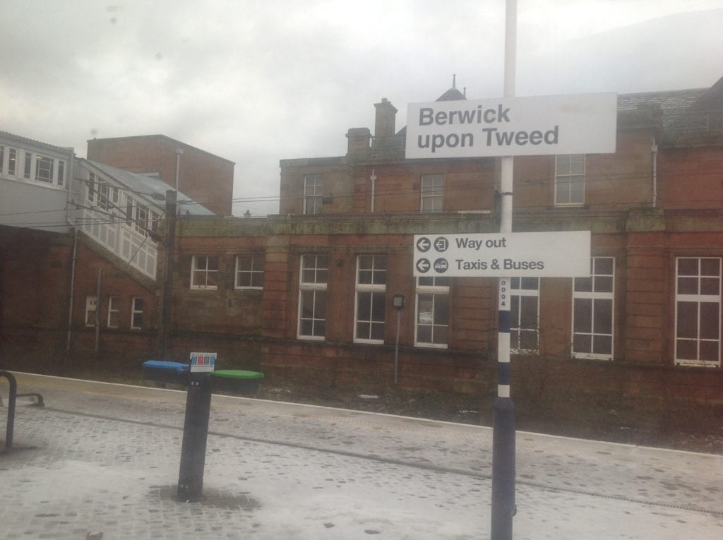
So where is all this rambling on a long train ride from London to Edinburgh heading? It leads me first to reflect on my own guilt at too often purchasing solely on price and neglecting quality, only to later grumble and moan because the silly thing has not functioned or lasted as I expected. I chide myself and renew a commitment to purchase the finest quality widget or thing I can possibly afford for the money available to me.
Enough rambling from my seat on a train in the British Countryside. Next time I will expound on our passion at Richeson for producing only the finest Oils available at a price that is affordable without the need to take out a second mortgage!!!!
Oil Painting
David Gluck Interview
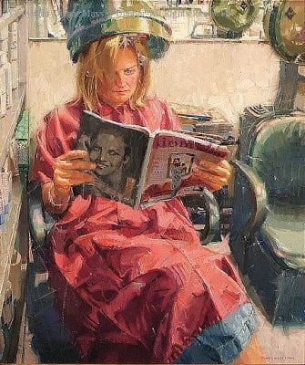
“There’s always one in the crowd”, as the saying goes…and Canadian artist David Gluck is the one.

When I received his responses to my interview questions, I found myself laughing out loud. I also realized that when you encounter a guy like this…it’s really important how you phrase the questions.
Is David Gluck a serious guy or a comedian? I guess that’s for you to decide. Even if he doesn’t take himself seriously, one thing is certain, that cannot be said when it comes to his work.

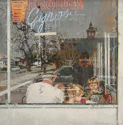
When I saw that his painting, The Trapper, won the very prestigious William Bouguereau Award in the recent Art Renewal Center International Salon, I was totally on board…a phenomenal painting indeed, and an award well deserved.
William Bouguereau (1825-1905) in his day was considered one of the world’s greatest painters. Many consider his paintings to be absolute perfection. But, as modernist thought replaced the academic, Bouguereau went the way of so many great artists…as did the training that helped produce them. Today, some of that solid training is being resurrected and we’re seeing the results. David Gluck’s work is one such example.

The Bouguereau award is given to a figurative piece that displays a strong sense of emotion and theme. Assessing whether The Trapper really met these stringent requirements, Gluck said, “The figure; clearly a man. The theme; manliness. Emotion; pfft, men don’t feel emotions. The only emotions I feel are rage and hunger, which usually go hand in hand.”
How did he feel about receiving the award, “I was actually extremely honored to have received this award. I have been a long time follower of the ARC and they have continued to support my career.”
Wondering what he thought of the great William B…”As far as William Bouguereau goes, I know everyone is a huge fan of the guy, but frolicking wussy peasant children never appealed to me. I will say, his technical proficiency is one to be admired.”
And now, more from Mr. Gluck.

How would you define your role as an artist? I fill up inconvenient blank spaces on a wall.
How does one find their individuality as an artist? It should come naturally. I found that living apart from most other artists and being primarily self-taught was helpful in finding my voice. Also, it helps to wear a hat.
Do you consider the process of painting more important than the result? Not at all, the result is what stands the test of time. Focus on the process is simply post-modernist thought.
What is the major thing you look for when selecting a subject? A fine balance between manliness and awesomeness.
How much of your work is intellectual vs. emotional…and how would you define the difference? I am not really a man with either quality, so I am unsure how to answer that.

What colors are most often found on your palette? My flesh tone palette is Yellow Ochre Pale, Vermillion, Ivory Black, Lead White, and Raw Umber. There is also a yellow stain that might be mustard, but I can’t be sure.
How do you decide on the dominating color key for a painting, and how do you maintain it? Using a limited palette makes it quite simple to harmonize your colors. I feel the color key is often picked in accordance to the mood I am trying to portray.
I love this one…
Do you paint in layers? I typically only wear layers when painting in a cold climate, but otherwise I wear gym shorts with no shirt while painting.
Does photography play a part in your work? Sometimes. I work from life whenever possible, photos when it simply isn’t an option.

How much preliminary work do you do before beginning the final work? I would say at least half of a piece is in the planning. I always do a series of studies starting with thumbnails and preliminary drawings for tone and composition. I end with color studies before beginning on the final canvas. I try to leave very little to chance.
What is your major consideration when composing a painting? Composition of course is key. I try to work this out in the very early stages.
How does your work reflect your personality? Not very well. Most people are surprised I am an artist.
What constitutes classical painting and drawing, and why the resurgence at this time? Got me. Maybe it has to do with global warming or something.
You have the ability to paint incredibly beautiful works while using objects that are pretty common and not necessarily considered beautiful. What is the thought process behind that? Pretty objects and things don’t always make for a beautiful painting. It’s like the old saying…”It doesn’t matter what you say it’s how you say it”.

What advice do you have for a young artist/painter? Make your models bring their own towel to sit on. Otherwise you are stuck with a towel you have no idea what to do with.
What advice would you give a first-time collector? Buy my stuff.
If you could spend the day with any three artists, past or present, who would they be? My wife, Rembrandt, and Bob Ross. Actually, scratch Rembrandt, he doesn’t even speak English.
If you were stranded on an island, which three books would you want with you? One would be a choose your own adventure book to keep life interesting, Cooking with Beer, and maybe one super thick book to use as a seat.
Who has had the greatest influence on your career, and why? Easy answer, my wife. She is my primary influence being a fellow realist and the main contributor in inspiring my work.

When you become discouraged and feel the well is dry, so to speak, what do you do? I call my good buddy Jack Daniels for moral support.
Why do you enter art competitions and how do you go about selecting paintings for them? I enter competitions to win sweet mullah. Apparently I enter the same painting in every competition.
Thanks David for participating in this interview and allowing me to share your fabulous, beautifully executed works. I’m sure we’ll be hearing more of you. I hope it’s good.
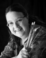
Dianne Massey Dunbar Interview
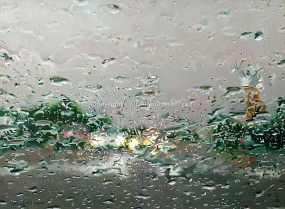
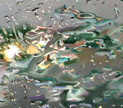
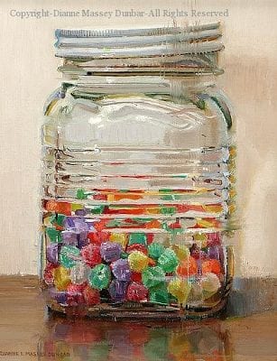
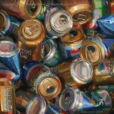
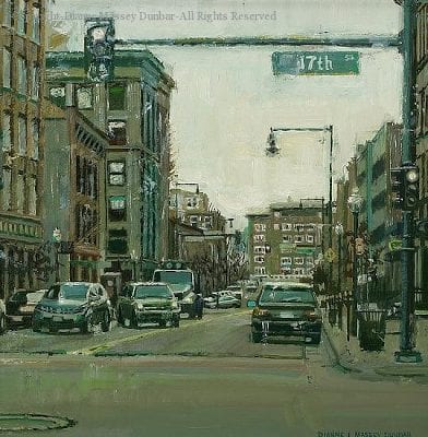
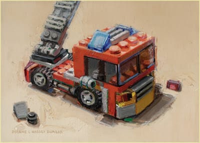
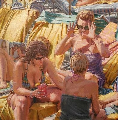
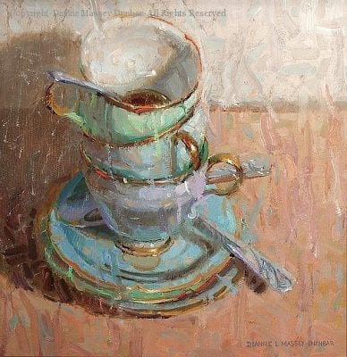
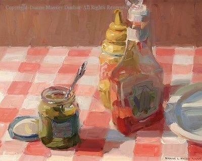
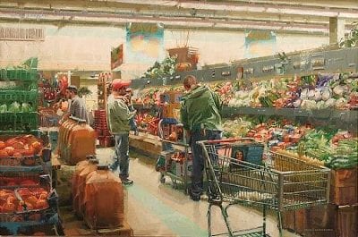
“I paint ordinary objects and scenes from everyday life. While I have the highest respect for artists who paint vistas and exquisite nudes and the like, I believe that there is a great deal of beauty in the world that often goes unnoticed. The amazing color in raindrops, the variety in fallen autumn leaves, the interesting greens one finds in a stack of French fries, there are endless opportunity for paintings. My hope is that people view the world just a little bit differently after seeing my paintings.”
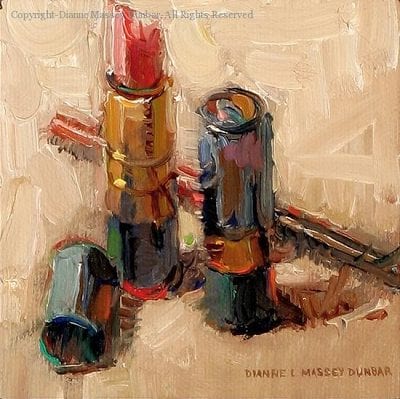
What is so amazing to me is her fabulous ability to take the most mundane of objects and transform them into delectable treats. How can someone take a simple tube of lipstick, or plain glass bottles, or even raindrops on a windshield, and transform those things into objects of desire…paintings sought after and cherished? Dunbar does it and makes it look easy. How she does it is what this interview is about.
Mark Smith, co-owner of the Greenhouse Gallery of Fine Art in San Antonio, said, “To view one of Dianne’s paintings is to experience complexity in its most artistic form. Most often, her choice of subject matter is quite complex, challenging and can be categorized as “crazy”. However, this type of complexity is the stage that most accurately reveals Dianne’s stunning sense of color and expert brushwork. Dianne is a master of articulating her inspiration and the “story” that she finds in the most mundane and overlooked objects and moments.”
And now more from Dianne Massey Dunbar…
“I want to thank John Pototschnik, whose work I have been watching for some time now and greatly admire, for asking me to answer a few questions. I have tried to answer these questions honestly and openly and I truly hope that my comments are helpful.”
For me, the intellectual part of painting is the process of designing the painting, the drawing involved, and the problem solving along the way. It is not sentimental and it frequently is not much fun. There is skill and experience that an artist draws on, and every painting, no matter how well it has been thought out, has an area somewhere that is troublesome. There are times when work is tedious or even boring. The emotional part of painting is for me what I like and don’t like, the subject matter that I paint, the thinness or thickness of paint, the “play” time I have with a painting, and the colors I may choose. And for good or for bad, I emotionally invest in my paintings.
Finding subject matter that is exciting is personal. I am drawn to simple common images: candy bars, cupcakes, rain on my windshield, jars, dishes, road crews, and reflections. After that, almost all of my preparation for each painting is intellectual and frankly a little tiresome. I study various compositions and value arrangements for my chosen subject matter long before I put brush to canvas. I tape the value studies upside down in my kitchen and study them to see if the design and the shapes are working. Once I have a design, only then do I begin painting. And for me, the beginning and early stages of a painting tend to be thoughtful and deliberate and even a little intimidating.
However, I absolutely love to play with paint, so when I have a painting far enough along, I can then begin to have fun with it. I might decide to smear paint, or flick it. I use any number of implements to play with paint, from the jagged edge of gum wrappers to torn pieces of paper towel rolls to palette knives to inexpensive brushes that I have cut gaps in. Today I experimented with my rubber kitchen spatula (I had fun but unfortunately was not happy with the result!).
I think non-artists have a notion that art is the result of “inspiration”. Well, there are times of inspiration, when instinct takes over and something happens on a canvas that I probably can never do again but I look at it in wonder. However, those times are few and far between for me. Being an artist is very much like other careers, there is leaning and thinking and hard work involved.
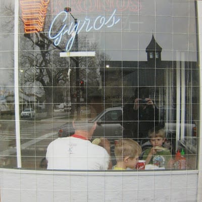
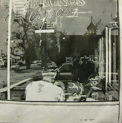
Describe your typical block-in technique, the thoroughness of your initial drawing, and the part photography plays in your work? I have more than one process that I use, depending on my subject matter. If I am doing a relatively simple still life, between one and three objects, I will do one or two quick thumbnails on a piece of inexpensive canvas board, and if I am happy with the shapes, I will begin to sketch those shapes in on my canvas. On the canvas, I may do a very simple sketch, or a more complete sketch, either very lightly with pencil or with a small brush. I then paint, working from background to foreground, massing in the large areas of a single value without much regard to detail. Once I have the large value shapes in, I can begin to break them down into smaller shapes, etc. I try to work on gradation and edges as I go along.
On the more complex paintings, I generally use photographs and work with a grid system. I might start with 20 or more digital images that I study. I look at the overall design, and see what happens when I zoom in or crop the images. I narrow these down to maybe the top five and I have those printed at my local camera shop. Then I make black and white Xerox copies of the color photographs. After the copies are made, I use inexpensive poster paint in white, gray and black and paint directly on the copies exactly where I think I want the light value, the medium value and the dark value. For each photograph I might do two different value studies, to see what the resultant design is. I do this by hand instead of computer because I can make all kinds of decisions when I work by hand that might go unnoticed otherwise.
Every part of that image needs to fall into one of those three values (I have been known to work with four values, but that gets very complicated). I then tape them up in my condo and live with them for a day or two, turning them upside down and sideways to see if the design is satisfactory. It is tedious, but I have found this process works for me and I have more successful paintings. After I have a design I like, then I have that photograph enlarged. However, I keep the value study because that is my “roadmap” for the painting. So, I paint the image that I have chosen, using the values of my value study. If I am working on a square canvas, I might work from an 8″x 8″ photograph, and work on a 16″x 16″ canvas, or 20″x 20″ canvas or even a 24″ square canvas. The photograph is taped to lightweight cardboard and I use a sewing needle and thread to grid the photograph so that if necessary I can move the thread aside to see what’s underneath. I usually use 1″ squares on the photograph. I grid the canvas (the canvas must be the same proportion as the photo you are working from) with very light pencil lines, usually in two or three inch squares. I then paint each square, starting from the upper left hand corner and working to the right. After my canvas is painted, then I go back and make necessary corrections, work on edges, simplifying, etc.
I use other colors in different situations, especially Zinc or Transparent or Flake White Replacement. There are times I really need Indian Yellow. Caucasian Flesh is a very useful color in a number of situations. I also use Venetian Red or Naphol Red and a number of other greens, especially Emerald Green Nova. I mix my blacks, but I do have a tube of black that I use if needed.
Some of these are quite transparent in nature, and some opaque. An artist needs to know the tinting power of different colors and use the intense colors sparingly (Alizarin Crimson and the Phthalos immediately come to mind). However, a lot of wonderful effects can be achieved with a more limited palette, so you do not need all these colors to produce wonderful paintings. Indeed, if you are new to painting, you would probably be best served by using a more limited palette.
How do you decide on a dominating color key for a painting, and how do you maintain it? I use the subject matter to guide this decision. If it is an overcast cloudy day, then much of my painting will be grayish. If I am painting toys, obviously the colors wil be much brighter. However, too much pure color is overwhelming. I mix almost all of my color. I reserve pure or intense color only for small splashes or small areas.
You have entered a number of significant art competitions. Why are art competitions important to you and how do you go about selecting the paintings for these shows? I usually enter two to three art competitions per year. I started by entering local and state competitions, and when I was comfortable with those, I started entering regional and national competitions. There are two main reasons that I enter art competitions. The first one is to see how I stack up against other artists. Secondly, I enter competitions to hopefully have my work seen by other artists, collectors, galleries, and even magazines. There are other good reasons as well: meeting other artists, being inspired, and being challenged. Some art competitions have seminars that an artist can attend to learn and expand their knowledge on any number of topics. And, let’s face it, competitions can be fun! As far as selecting a painting, when I have what I feel is a good to exceptional painting and a deadline for a show that I want to enter is approaching, I will try to put the painting aside and keep it to enter in the show. Be aware that competitions can be expensive, there are entry fees, shipping and storage fees, and perhaps travel fees if you decide to attend the opening.
What do you think of that amazing interview, folks? Personally, I so appreciate Diane’s willingness to submit to this interview…and being so thorough in her answers. I hope you do also.
Here are important links to see more of OPA Signature Member Diane Massey Dunbar’s work:
Click here to receive John Pototschnik’s monthly newsletter
Importance of the Canvas
I always use a very high quality, pre-primed, heavy-duty linen canvas by a leading manufacturer. I also choose a very coarse linen. Why? When observed very closely, the surface of such canvas is a series of round bumps linear in both directions.
Once I have suggested the drawing, or perhaps more correctly the positioning of my masses, I like to color the canvas with a wash of chosen color. I never use pure turpentine, only because it denies any body in the pigment in places on the canvas where no other paint will cover this wash which, without the addition of oil, will not survive time.
At this point in the procedure, I have no white or opaque colors on my palette. The result is an effect as pure in color as a watercolor on white paper. Often the most gorgeous colors are dark and intense. Here I might bypass the wash and apply the pigment without medium. Then because I require a lift in the tone or lightness of an area, I use a knife to scrape off most of the paint. Now because the canvas has all its multiple mini-projectories, the paint will be left only in the recesses of the canvas. So, actually what happens is that the white of the canvas bumps is seen through the applied pigment. From very close, it appears spotty, but from afar, the eye reads a lighter value of a delightful dark pigment which has in no way lost its transparency or luminosity. Also because the paint is so recessed in the canvas texture, one can apply either a scumble or impasto without drying time.
At this point, I normally choose to scumble, also because being so thin and adhering to the canvas projectories only it will harden quickly. Until I really have my picture talking to me, I don’t choose to paint wet in wet.
What I’m describing is more for large canvasses in one’s studio. Plein air small works don’t belong to this category. Small plein air, one tends to go in fully loaded. There is too much wind and way too many bugs to do anything else.
Scumbling, a very light touch to the canvas with a large flat brush using undiluted paint, will offer numerous effects but never totally cover the wash or the scratched areas. Otherwise, why bother to put them in, in the first place. Every stage is part of the finished painting.
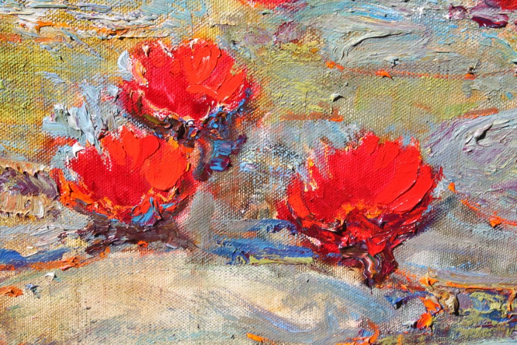
Now comes the impasto. For some reason or another, lumpy paintings have become the vogue. The idea of a lump on a canvas is that under angular lighting, a lump will catch the beam of light and visually leap off the canvas. Now this is great for highlights in high-toned colors. If the painting is ultimately varnished, your lumps will “shine” as well under spotlights. If you don’t want shine or glitter, don’t lump. Lumps in a dark area glisten and totally destroy the intensity of the dark. Recently, I saw a show where the whole painting was lumps. Wonderful for the manufacturer but a disaster to the painting – and the viewer!
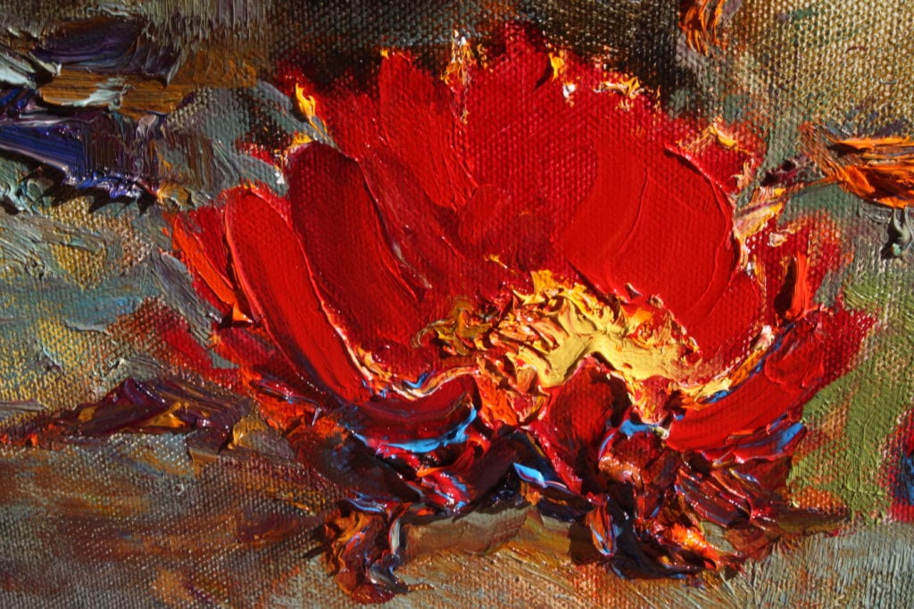
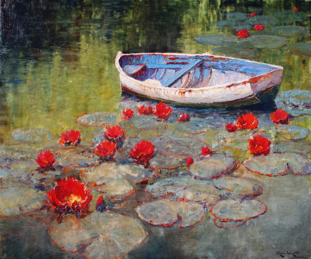
Painting florals is interesting. A knife is good, but it tends to lose the delicacy and femininity of a petal. As petals of a rose, for example, are so perfect a non-textural finish is needed. No shadows are required in a petal under the sun. A brush stroke will leave fiber striations, which cast minute shadows. A latex gloved finger will give you a petal beyond your expectations. But use a new finger for every application. Otherwise, you will have the most devastating mud pie!
There is no need at any stage of a painting to apply any pigment which will not be seen in the finished work. One can, of course, rub color over another color to create a secondary value – but let’s not get too complicated!
Stylistic Unity
Two years ago I had my work critiqued through Oil Painters of America. Todd Williams was the Signature Member who looked at images of ten of my current paintings. He gave me some very helpful insight into my work and useful suggestions. One particular idea he proposed to me was very surprising and has resulted in unexpected changes in the direction of my work.

This is the painting he was discussing. He said something like this: “I notice that you have stylized the clay in the riverbed at the foreground, but you have not stylized the bluffs or sky in the same way. So I am suggesting that you consider the idea of whether you would wish to have stylistic unity in your painting.”
I had never heard anyone talk about stylistic unity, nor had I considered such an idea when making this painting. I knew that somewhere in this suggestion was a powerful catalyst for change in my work. I could not accept the idea of stylizing this entire image in the same way that the clay was treated. So I did not really know where to go with it. But what became clear to me was that the patterned clay was a big part of the reason that I keep returning to this part of the Brazos River for imagery. So in some of my next paintings I gave pattern a stronger voice in my work.


Then I did get back to painting the Brazos again, and here is the evidence of the power of this idea.

So here I am back at the Brazos River. This painting has more stylistic unity than Miller’s Bend. I am happy with the painting. The water is mostly realistic and I have had more fun with the patterns on the right. The concept of stylistic unity is still driving change in my work and is a challenge I am enjoying wrestling with.
OPA Critiques
Are you interested in having your work critiqued by OPA Signature and Master Signature members? OPA offers this service for a minimal $25 fee that goes to support the preservation of representational art, and you receive expert advice enabling you to become the best painter you can become. Click here to learn more about OPA Critiques.