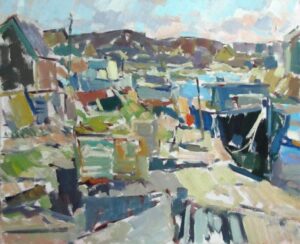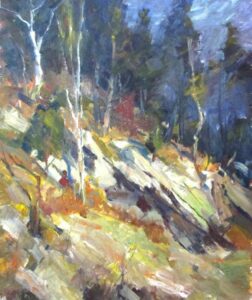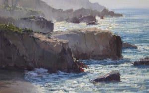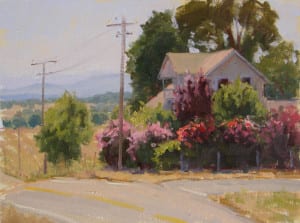
People perhaps just hacked a chunk off the cave wall and started noodling, or charred a bone from last night’s dinner, or took a stick from the fire and began to make marks. The earth itself for thousands of centuries has created a harmonious palette of archival and readily available colors to create some of the most beautiful and enduring art in the world.

This topic has become a passion for me over the recent years, and I have experimented with most of the available historical pigments in one way or another, creating several in-depth projects that involve both artistic and cultural research. The most profound characteristics discovered are that these pigments are splendid to work with and endlessly beautiful.


To my eye, the modern cadmiums are so highly saturated they overpower my canvas and are difficult to handle on the palette. I find this true also of other modern colors such as phthalo greens and blues. Occasionally, when my mad-scientist self gets restless, I break out of this mold and experiment with some of the modern azo, turquoise, and quinacridones, but I usually will spend time muting or graying them down in some way.


It really is a process of elimination. I use just the colors that are safe after they are encased in oil and toss out the fugitive (many of the plant-based colors) or toxic colors. I use caution and strict hygiene habits while painting. Most importantly, the mere fact of having a few select colors on my palette to deal with allows easy and quick decision color mixtures.
More and more interest in hand-ground paints made from natural pigments is surfacing lately. I invite you to choose a few colors, (even if you do not grind the paint yourself, purchase the ready-made), and experiment. Do some studies and see the difference in the surface quality of your canvas. Make that connection between you the painter, the aesthetic of your art, and your materials. The results just might be profoundly gratifying.
Oil Painting
Practicing Art

It all began last fall as I was planning a trip with some artist friends to Italy to paint where Edgar Payne captured those marvelous orange-sailed boats in the early 20th century. I was really nervous. I live in the desert. I don’t know a halyard from a square knot and I knew I’d better start “practicing” painting boats. Two months before the trip, at the OPA conference in Idaho, I went to a demo by Ned Mueller and he advised us to get up every morning and, even before that first cup of coffee, head into the studio and paint a small study for exactly 15 minutes. No more, no less. So, I did just that, except I had my coffee in hand, for 64 days before my trip to Italy. Most of the 64 little paintings were done in black and white to help me with the values, but it also helped me to became familiar with the perspective and beautiful curves of the boat and the sails. It helped me so much that I still do it. Ok, sometimes I miss a morning, but it’s become such a habit that I actually feel guilty when I don’t do it. What do I paint now that I’m back on solid sand? Anything I want to paint. It’s just practice, after all. Although I can tell you that those little, 15 minute studies have grown up to become some of my best paintings. Besides being a great way to warm up my painting muscles (both physical and mental) this is a practice that really pays off.

1. I made an effort to find an art “support group.”
I remembered reading Art and Fear, Observations on the Perils (and Rewards) of Artmaking, by David Bayles and Ted Orland which describes a study about those artists with/without support groups. They studied art students for 20 years and discovered that the ones who had connected with other artists were more likely to still be making art. This connection was more important than talent in the long run.
I think that a good support group, with artists who you trust, is like a marriage that works: when you’re “up” you help them, when you’re down, they help you. Not often in the same place at the same time, but it works. Now I meet with artists at coffee or in one of our studios at least once and usually twice a week. We share show information, frame suppliers, etc., congratulate each other or commiserate and talk about anything that we’re thinking about art-wise over coffee for about 2 hours. We artists, like writers, lead very solitary lives, so this is an incredible way to leave the studio and still feel like we’re “working” and, of course, learning.
2. I rediscovered the joys of getting back to basics
I took a workshop with Skip Whitcomb and he had us working with an extremely limited value palette–white, black and one grey very close to either the white or the grey. Wow. Talk about challenging you to simplify!
Then I did some new color charts with a four color palette I was interested in trying. These exercises really helped me to find new ways of saying what I wanted to say with the paint and reminded me to just enjoy the process of painting, without always having a specific painting or show deadline in mind.
3. I remembered the importance of making mistakes–it’s how we learn.
“You make good work by (among other things) making lots of work that isn’t very good and gradually weeding out the parts that aren’t good, the parts that aren’t yours.” Art & Fear, p26
4. I set some new goals for myself–at least two paintings a week, good or bad!

I revisited old “friends”: some books are more dog eared than others–you know which are your favorites. I also made myself reach for the books that I’d never really spent any time with–I wanted to try new ideas on for size, taking the lessons of other artists and trying them for myself
6. I started to thumb through my old workshop notes.
I wondered, “Why do I keep writing down the same things?” I paid to attention to that and decided to work on those areas. In some cases when I revisited the lessons, lightbulbs went off! I was in a better place to understand some of the ideas now and actually put them to use in my work.
The short version of this is: keep practicing and find artist friends, even if they’re only in blogs! And, as my friend (and fellow artist) Joan Larue always says, “keep your brushes wet!” I’m reminded of the old joke, “How do you get to Carnegie Hall? Practice, practice, practice!” Just substitute “How do you get to the Metropolitan Museum of Art” and you’ll get my point.
Thanks so much for listening and please let me know how it goes for you!
How deep is your space?
At one of my always stimulating dinners with my late friend Zyg Jankowski, he said to me that the first decision a painter has to make about his work is a spacial one: how “deep” do you want to make the picture? John Carlson felt that every foot into nature counted; Ed Whiney had no interest in such realistic depth and recommended a student plan the composition on-site but walk around a corner to paint it. Over the years, I’ve been schizophrenic about the question. Under Emile Gruppe’s tutelage, I naturally followed Carlson’s path. Later, I experimented with a flatter approach , one which, carried to an extreme, can make the subject disappear in a series of flat planes.


Note: for a further discussion of these points, check out YouTube:
Why I Paint En Plein Air

The answer is simple: no painting done from a photo can ever compare to the energy, immediacy, and sense of place that can come through in a plein air piece. Somehow the feel of the day, be it heat or cold or wind or just a perfectly pleasant morning, makes its way down the arm and off the brush and onto the canvas. I wish I knew how it happens so I could fake that quality in the studio, but that’s the magic of plein air. Our experience comes out on the canvas. All our senses help to create the painting, not just our vision. We hear the cows lowing, we feel the breeze, we smell the hay…..it’s all there on the canvas. Even my worst plein air pieces have some small element of that particular day in them. I feel like I’m recording a moment in history: it will never be July 28, 2011 at 6:00 in the morning ever again in the history of the world, but now I have a little bit of it on canvas. How exciting is that?
Not all of my paintings are completed on location, and I paint many larger works entirely in the studio. But every piece I paint has its genesis in plein air studies. Working solely from photos leaves my paintings looking flat and unexciting. I use my reference photos to jog my memory or to help me come up with better designs that I may have overlooked when I was on location. But I can’t tell you how many times I’ve discarded a studio painting because I didn’t have enough plein air information on the scene to make the painting look convincing and alive. All the answers are outside, and even the most frustrating day of plein airing brings a more acute awareness of the subtleties of painting from life. Those skills honed outside make the studio work that much easier and fun.

When the Money Doesn’t Follow

As my brief bio states, I began to paint at age 41 with no prior instruction or education in painting. I knew I wanted to paint, and around my 41st birthday, I began. The rest as they say, is (almost) history.
Most of us were not full time students when we began our careers. Nor were we married to, or partnered with an established painter whose career was already doing well, and in turn, might ‘introduce’ us to the best galleries, invitational shows and teaching institutions, thereby eliminating much of what the majority of painters go through early in their careers. Many of us didn’t come with a Trust nor were we independently wealthy. In other words, we created the space we needed to paint because it wasn’t put before us. We found ways to work at learning to paint with unique and different challenges. None of these ways should ever be discounted or diminished.
My own instruction consisted of a 5-day workshop about once per year, and in the remaining 51 weeks, I painted when and where I could around a marriage and children ages 3 and 5. I also worked out of the home part time to help sustain our family. In 1999, I began to paint full time and saw great progress in my work.
This is probably how most of the women in the OPA memberships worked at their art career and certainly, some men. Many men who have taken my workshops did so upon retirement because they now had the energy and time to paint. It takes courage and tenacity to do so.
In 2006, my family broke apart as I divorced my husband. I could have remained married to a man who was leading a life outside our relationship, but I didn’t close my eyes to that fact to be safe and insulated. My career had to be put on hold to stabilize my sons and my own sense of well-being.
Starbucks?!
I was determined to keep painting, but lost my health insurance in the divorce. I learned if I worked 20 hours per week at Starbucks, I could provide full health benefits for my sons and myself. I was the oldest person working there for some time. I was 53 when I began. In total, I worked there, part time for over 4 years.
While my work during 2006-2010 wasn’t my best, I kept painting and learning to paint. I began to work on a book that is now ready for print; I continually developed my workshops, and was affirmed I am a good teacher; I practiced painting as much as I could within the parameters of my new family situation. I was completely on my own, but it didn’t stop me.
At the end of 2008, the financial world collapsed. All of us have been impacted by this fact. Like you, my sales have fallen off. Traditional art galleries 30+ years in the business are at an all time low in sales and clients. Some galleries closed their doors from the strain. More web based galleries and art exhibitions are popping up.
In addition, many painters who would normally travel to a workshop and spend money on tuition, lodging, food, and transportation are just not as eager now, or able to do so. Many on-line workshops are available to purchase so painters can stay home and hang on to the money they legitimately need in these tough times. I don’t hold this against them. We all need to adjust.
What now?
This article is to generate ideas and input for all of us. I already mentioned one way I found health insurance. Here’s how I’m paying for my tax prep this year.
I have artwork in a posh Victorian inn in northern California. I gave the owner a painting that I created with her signature logo wine showcased in a still life arrangement. She loved the painting, I gave it to her, and in return, she gave me two nights free to stay at said posh inn worth the value of the painting.
Bartering. It’s an old concept and has its place. The logo wine painting is and was the most appealing of all my paintings to the owner. She didn’t have money to pay for the picture outright, but she did have something else: gift certificates for any room in her upscale inn. I parlayed that into a trade for my tax prep. I gave one of the two certificates to the CPA preparing my taxes.
I have other examples that are seeing me through this crunch time. Part-time work, volunteer work, etc. Both have me in the community and being with people. These create opportunities, or, that’s how I choose to see them.
I know there are other creative ways you have put in place to work through this difficult economy. Please, let’s hear what you are doing that might help our OPA members transition through these lean times to keep painting.