To be sound, a painting must be built on a compositional foundation in this order:
- Drawing
- Value
- Color
- Edges
If these get addressed in any other order, problems generally ensue.
Recently, the artist Jeremy Lipking was asked what advice he would give to painters, and he said:
“Draw more, that’s basically it. A lot of people feel like they know how to draw good enough already, but don’t trust yourself. Learn to draw better.”
With the fewest words and most pictures possible, I would like to briefly address the issue of drawing. In the following visual example, I have shown how fundamentally a piece can change when just the drawing is ignored. The values and color are the same in both pieces. The point is obvious:

Too often we divorce drawing from painting, and we do it to our own detriment. Drawing isn’t something we do in school once and then move on to the weightier matters of art; it is always the foundation. It’s also hard to do because it takes sustained and focused practice, which is why students usually, at least initially, copy the stroke quality and edges of other artists, because those things are more easily observed and imitated.
Another mistake we often make is to exclusively think of drawing as line-based. Line can certainly be a useful tool when drawing, because the instruments employed tend to create thinner marks, but really, drawing is about principles, not marks. Thus, I would like to address two principles of drawing: Proportion and Simplification of Form.
1. PROPORTION
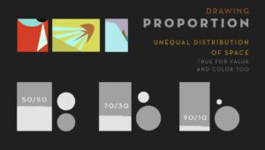
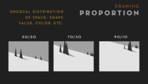
There is a lot one could talk about here, but basically, it comes down to creating an unequal distribution of space in a piece. This is also the same for unequal proportions of value, color, and edges.
In these two examples, I have laid out how proportion of shapes, space, and value can affect a piece. No one of these proportion examples is correct or incorrect all the time, but it’s important to be aware of how and why you’re distributing/dividing space. When plein air painting, this is most often manifest in how we choose a horizon line and a focal point. We usually respond emotionally to everything we’re seeing in nature, and thus want to paint the sky, meadow, trees, and mountains all at once. But of course we can’t have a conversation with two people at once, so everything ends up feeling confused and passive. Next time you’re looking at a scene, try choosing one thing and letting that dominate. This is true within a shape as well (i.e. branches within a tree), which leads us to the next principle.
2. BASIC SHAPES
When I was young I saw how-to-draw books that broke things down into basic shapes and I thought they were lame. The drawings in those books didn’t seem to match the highly rendered pieces that I responded to and used as an aspirational goal. So, as most of us, I focused on rendering and shading and learned how to do it well. That was drawing to me.
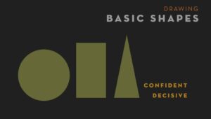
But the more I learned post-high school, I started to see the pattern of truth re-emerge: Basic shapes REALLY ARE the way to draw. And it starts with training our eyes and minds to simplify down what we see to the most basic elements:
But it’s not enough to merely simplify something. In fact, getting to the essence of something is extremely difficult. It’s the same reason why writers often comment that a strong short story is harder to write than a novel. One can use fewer words in a conversation and be either concise or confusing. So, don’t just simplify down shapes, be descriptive with them.

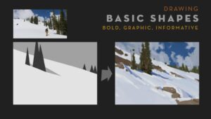
To close, here is an example of how I made choices of proportion and simplification in a painting:

The reference image gives the basic information, but in a static way. I chose the elements I felt were most interesting and descriptive and tried to build a painting around the idea using unequal proportions and descriptive simplification of shapes, values, colors, and edges.
May this be a year of stronger drawing in all of our work.


Leave a Reply