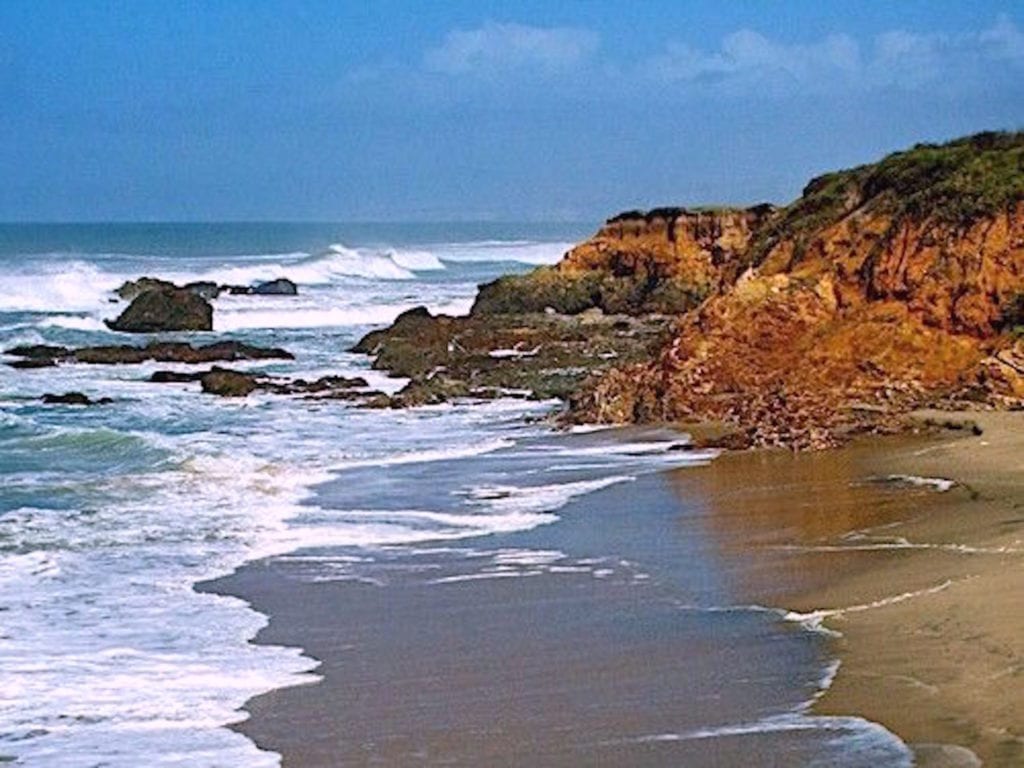
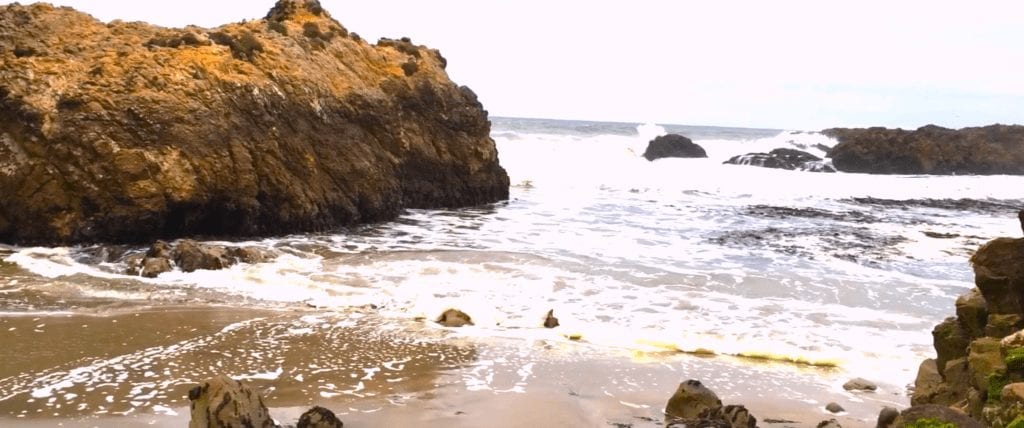
Not this year. After years of California drought, off-shore weather systems were now massing early off the coast. My favorite location had lost most of its sparkle and all of its high color. I am committed to this location at this point, however.
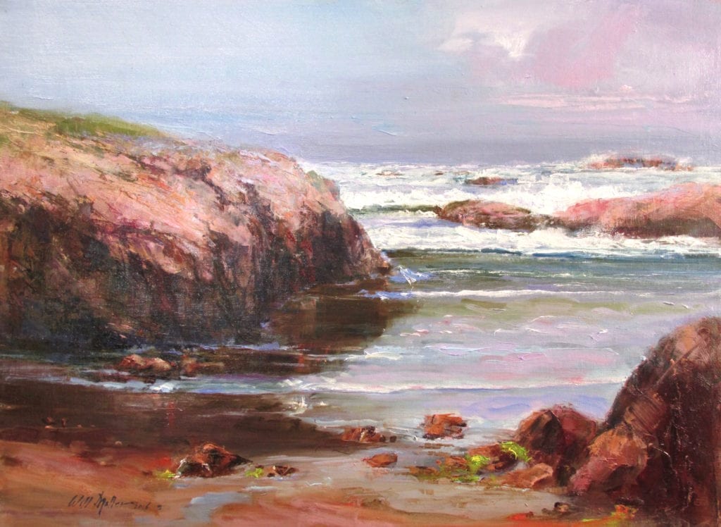
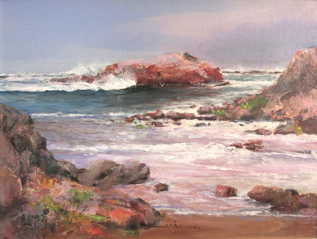
The next task was to paint my large studio piece. I used the same process as with the Plein Air studies—limiting my pallet, holding very tight with Grey mixtures, then adding color to complete San Mateo Coast.
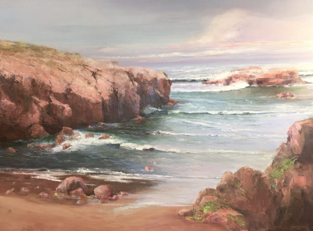
After completing my work for the museum show, I decided to apply the strategy to another painting at a different site. I was especially happy with Point Lobos Calm No. 2 and have since been using the limited pallet with a couple of accent colors for all of my Plein Air work.
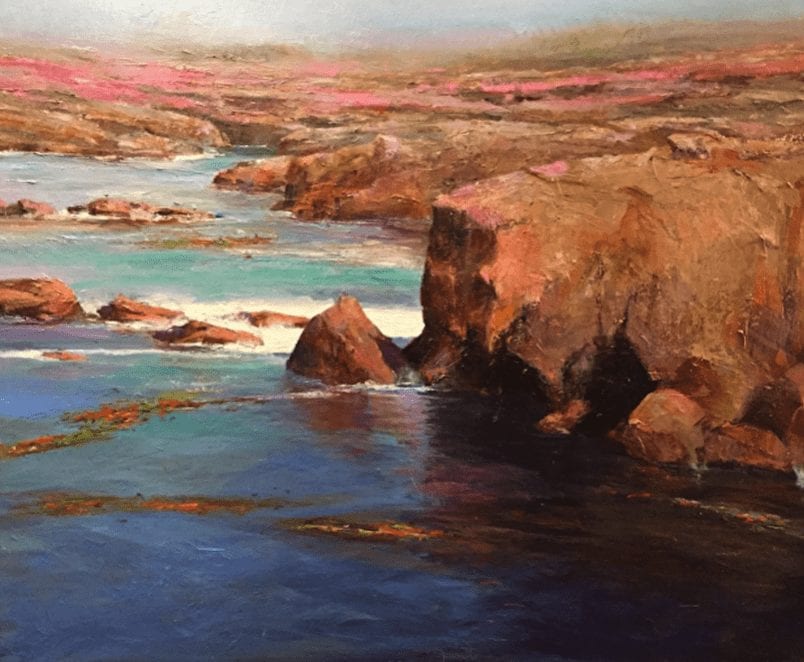
I have just received notice that Point Lobos Calm No. 2 has been accepted to the Oil Painters of America 26th Annual National Juried Exhibition of Traditional Oils.
I think I’ll stick with this approach for awhile!
Marsha Savage says
Very nice discussion of the why of these and color … or not much color. I keep trying to enjoy a limited palette. You inspire to try again! Thank you.
Dot Bunn says
The use of grays to master values first and then add color is an old tried and true method of painting. I teach my students this method to help them understand the importance of value control and to free them to experiment with color more freely after values have been identified. I am a studio painter and use this method most of the time but often use a neutral color rather than gray as my underpainting.
Tessa Smith says
Beautiful images. How fortunate to have time and money to do this!
Theresa Grillo Laird says
In preparation for a Scott Christensen workshop I took a couple of years ago. I practiced with a limited palette of 3 colors plus white for 2 years before taking the workshop.I mixed my own greys from the 3 colors. I found the result to be much more natural looking but it’s also incredibly easy to veer too much towards the greys, painting with them plus a little color instead of the other way around. I miss the greater color I used to have so I’ve added a few colors back to my palette and I’m looking to strike a balance between all grey and all highly colored. Point Lobos is beautiful! What palette did you use for it?
T. Jeff Williams says
Will Maller is a master of the seascape. Enlarge the Point Lobos Calm 2 and see how he integrated the rocks into the water along the shore. You can practically feel the cold ocean water and hear it lapping against the cliffs.