60″ x 60″
Over the past two years I have done several posts on a progression of principles dealing with:
- Drawing
- Value
- Color
- Edges
For the final post in this four-part series, I will deal with the subject of Edges, which is really a discussion about paint application. You may have heard me or others talk before about “hard vs. soft skills”, and I would include edges in the ‘soft skill’ category along with other surface-quality related things like brushwork, texture, etc. I include it in that category because it’s generally a secondary concern to the deeper issues of composition, value, and drawing that affect visual communication. It’s kind of like the icing, not the cake. (But oh, how icing can make or break a cake, right?!) I would also go so far as to say that nowhere in a painting is the personality and temperament of an artist more visible than in their edge work and paint application.
People usually get really excited about edges because, like cake vs icing, edges are such an immediately visible part of a painting. They are also one of easiest parts of a painting to imitate, and thus are often the first part of another artist’s style that will be internalized (often not consciously) as a developing artist searches for his or her style/voice. If you look at the early work of any artist you will usually see that their paint application and edge work will more strongly reflect their influencers (or teachers) and then will diverge into a more unique style once they mature and decide who they are.
So that should be the first major caveat here: Edge treatment really comes down to preference, personality, and stylistic choice.
Edge treatment is also an important tool for emotional communication. If I were to describe a painting’s surface with words like: “Exciting” “Bold” “Aggressive” or “Intense” we would all have different ideas than if I were to say things such as “Calm” “Peaceful” or “Restful”. There’s not one right way; I suppose I’m just saying: Match the delivery to the message. Be purposeful. And be true to yourself.
Categories of Edge Handlers
There are a few major categories of edge handlers that I have observed (there are probably others, but we’ll just use these for now). I have chosen to use examples of four current artists employing these techniques:
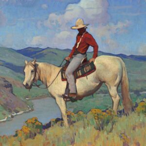
- Focal-Pointers: This style usually tries to create a focal point by an awareness of how we see naturally. If you hold your arm out in front of you and make a fist, that fist-sized area is about the visible space that is in our focus at any given moment. Of course, our mind fills in the blurry parts with information and our eyes dart around to constantly see other focused areas, so most of the time we’re not aware of the lack of clarity. But as artists, we are constantly seeking to direct someone’s eye to an area in a painting that we want them to look. So putting the focal point in sharp focus and then getting more vague/suggestive in detail and focus as we move away from that area can be a powerful way to create importance and dominance in a scene. Photography has pushed this idea into more extreme places, but it can be seen far back into art history and is generally associated with naturalism in painting.

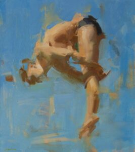
- De-Constructors: Lots of variations on this, but it’s basically what the name suggests: Breaking down edges from their natural hard-edged state to create more interest. Some use this technique to also create
focal point, others to increase the feeling of light bouncing off an object, and some just love the way it livens up the subject/surface and is a means of communicating the emotional intent of a piece. It is almost always seen as more contemporary. Artists today employ it on every level from subtle pulled edges to intensive abstraction.
- Lost-and-Founders: This can look a bit similar to deconstruction, but is different in that it is just a loosing of an edge into soft focus or similar value/color rather than actually breaking the form.

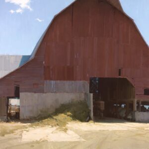
- Hard-Edgers: Once again, the name is obvious, and this is basically about creating hard edges and graphic shapes. This has been done for centuries in situations requiring more
graphic solutions such as mosaics and iconography, but it is a relative newcomer to gallery painting. This style also has modernist roots, as many artists were seeking ways to separate from past naturalistic styles as well as reacting to the harshness of industrialization. Not all were that way, however, as many of the early Southwest artists used this style as means of reacting to the intensively graphic shapes of the Western landscape.
Once again, there isn’t one right way, nor are these techniques mutually exclusive. Most artists, including myself, incorporate elements of all four into their work to varying degrees. But being conscious of what you’re doing and why is an important step to deeper visual communication.
A few final ideas/takeaways:
• Edges can help create focal point, but only in a supporting role. Composition and contrast of value, shape, and saturation/color generally carry more weight in determining focal point.
• Understand focal area and use it to your advantage. Don’t just flip the brush around willy-nilly because it feels fun and artistic. Generally soft focus recedes and sharp focus advances.
• Often a good place to soften an edge is at the bulge of a shape. Pull it tighter where edges come together because that is where things get anchored and carry a lot of visual weight/information.
• Experiment. Every once in awhile try a piece that is just for you in which you experiment with a completely different edge style. Use different tools than you would normally use and get outside your comfort zone.
• Master copies: If you want to really grow in your ability to get more dynamic surface quality in your work, do some master copies of artists who you like. Do multiple copies of different artists so that you don’t just end up being known as “that artist who looks like so-and-so”.
• Generally, my own rule on how much to work an edge comes into play when I step back and look at my piece. If something is calling my attention that I don’t want to do so, then I lessen that attention, either by value, color, or softening the edge.
• Remember the old animation adage: “If it feels right, then it is right!” This is to say that an edge treatment may not make complete sense logically but if it communicates the correct feeling or idea then it is justifiable. Animation does this all the time with color and stylization.
• My general feeling about edges (and paint application in general) is that they should support the theme but not overtake it. If gimmicky paint application is the first thing a viewer is bombarded with it can hinder the visual communication.
Hopefully something here is helpful!
Rachel Williams says
We’ll stated. Thanks
Lorene says
Excellent information – thank you. I wanted to create a painting with pulled edges but after many attempts, it just looked wrong and I couldn’t work out why. This has really helped. It has also helped in my current painting where my subject has soft edges but the background has hard. I haven’t been happy with the hard edges in the background (a bit like paint by numbers looking) but I think the problem may be that I need to soften the closest edges and have them sharper as they go into the corner. Your explanations were so helpful.
Friede says
Thank you so much. This article was really helpful to analyze paintings and so to find my own style.