My color choices are based on observation, feeling, and the desire to express my experience. My brain does not respond to rules and scientific theory. I choose to see what I see and that choice comes from my attitude about what I am painting. Color affects how we see the world, and it leaves us with a definite response. Think of the people who are given a pair of glasses allowing them to see color for the first time. They are brought to tears from the power of color. It is that power we harness in our own color choices.
An artist must experience the subject they choose to paint. In my workshops, I ask that artists bring only reference material that they have gathered firsthand through their sketches or photos, so they can draw on their experience of the scene while painting. Memory of the subject is as important, if not more important, than trying to copy a photo.
When I paint a demo for artists, I tell them, “I see blue here,” or “a warm orange there”. Some students mistakenly think they have failed if they don’t see the same colors as I do. However, that could not be further from the truth. For example, Andrew Wyeth and Vincent Van Gogh saw color in very different ways that were both equally effective. Each artists’ color choices conveyed their attitude about their subjects. While the work showed technical skill, it also expressed vision unique to the individual. Take a look at Van Gogh’s passionate, warm-toned paintings. His shift in color began around 1888 and may have been a result of a medical condition. Imagine if he had not tried to capture what he was truthfully seeing at the time, and instead relied on color theory to compensate for his change in vision from his earlier, darker Dutch period. His work post-1888 is electrifying and instantly recognizable as Van Gogh precisely because of his personal color choices.
There are basic ideas of color that can be helpful, for example cooling a color as it recedes to convey depth, and using warm or cool mixtures to convey light and shadow or to suggest the turning of an object. Objects in shadow are generally cooler than those in light. That is not to say that a shadow may not have warmth in it. Sometimes a shadow will appear to lean to red-purple, which technically is a warm color, but the red-purple can be cooler relative to the portion of the subject in light. For me, trying to remember rules keeps me from just looking and choosing to see what I want to see.
I am often asked, “How can I see color and get the exact mixture I want?” The answer is that to see and to mix are two different things. A very helpful way to learn to mix color is to do color charts using the colors on your palette. I use a limited palette of Titanium White, Cadmium Yellow Pale, Alizarin Crimson Permanent, Ultramarine Blue and Viridian. With these colors, I can make any color I need. The limited palette is a great way to learn to mix color quickly. The limited palette is called the “mother palette,” because most color mixed using it carry a bit of the others in it. It is harder to produce a muddled painting and easier to maintain harmony.
A great example of making color charts is in Richard Schmid’s book Alla Prima. Creating the charts shows you how to mix a variety of colors with confidence. The completed color charts can be carried outside when working in plein air, or held up against a subject when working in the studio. You can ask yourself, “Does the color I see lean towards the warmer, or cooler version of it?” You will begin to define what it is you are actually seeing. Because the charts also show the different values in colors, they will train your eye to see both hue (color) and value. For instance, if you see a tree with green leaves in warm light, holding up the chart of green mixes, will help you identify the subject as a warm green that is in the darker value range.
While you may see color differently than I do, or your friends do, trust what you see and put it down. Color is your personal choice. It would be boring and inauthentic if we all followed rules about which colors to paint trees, water, figures, or shadows. To learn to discern color, especially in nature, look and blink your eyes so you do not stare at the subject too long. If you stare at an area of color, it will lead your brain to give you a generalized local color. The time to squint and stare is when you are evaluating value (light to dark.) Squinting removes details from our subject and we are left with the darkest dark and lightest light shapes. For color, a quick impression (looking away and back again) is needed. Also, try not to see the spot of color in isolation only — look at it in relation to what’s around it. For instance, you might think you see “white” on the roof of a snow scene, but in a quick look, you might actually see a light blue, which reads white relative to its neighbors.
Try taking walks in nature and ask yourself to mentally record what you are seeing. Ask yourself if the object you are looking at is cooler, warmer, grayer, lighter or darker in relation to something else. You will build more ability to identify what you see. Also, be aware of where the light hits an object. Seeing color and value is like stretching a muscle: hard at first, but easier with use.
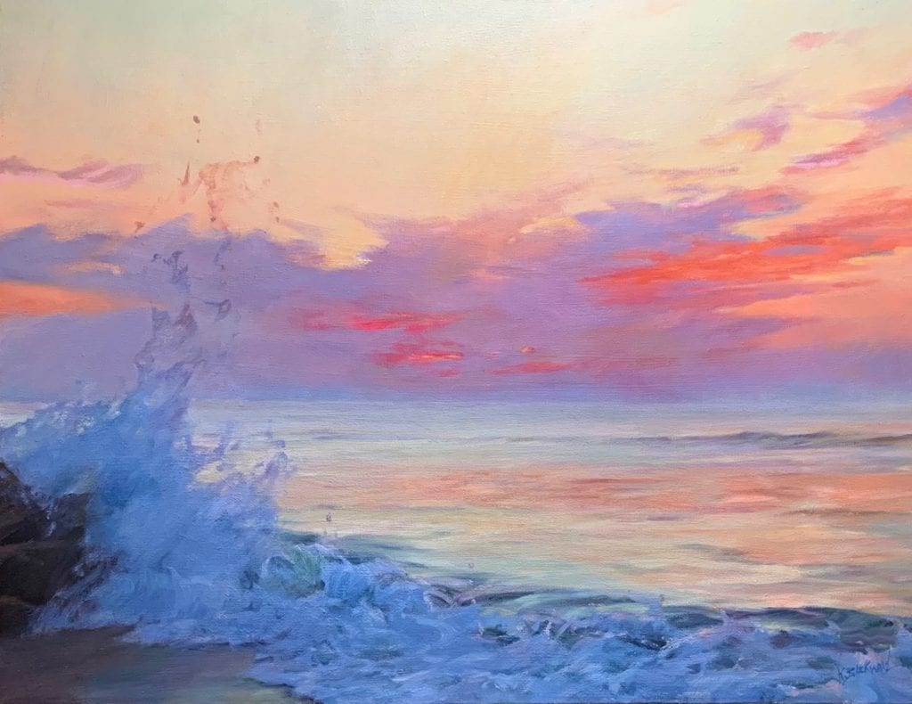
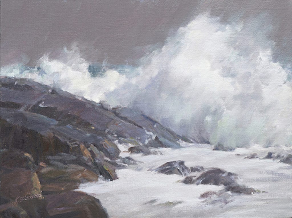
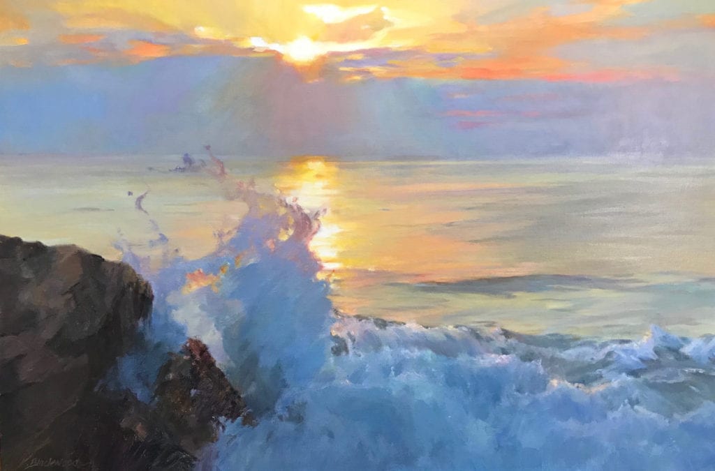
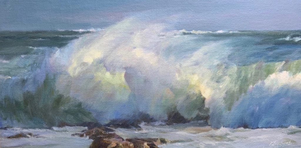
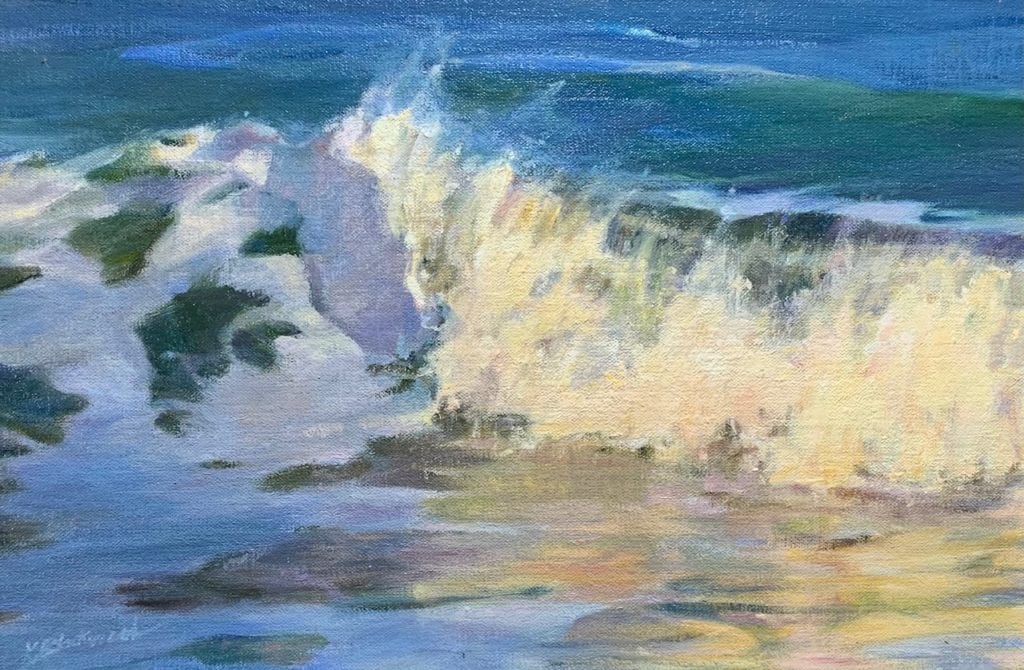
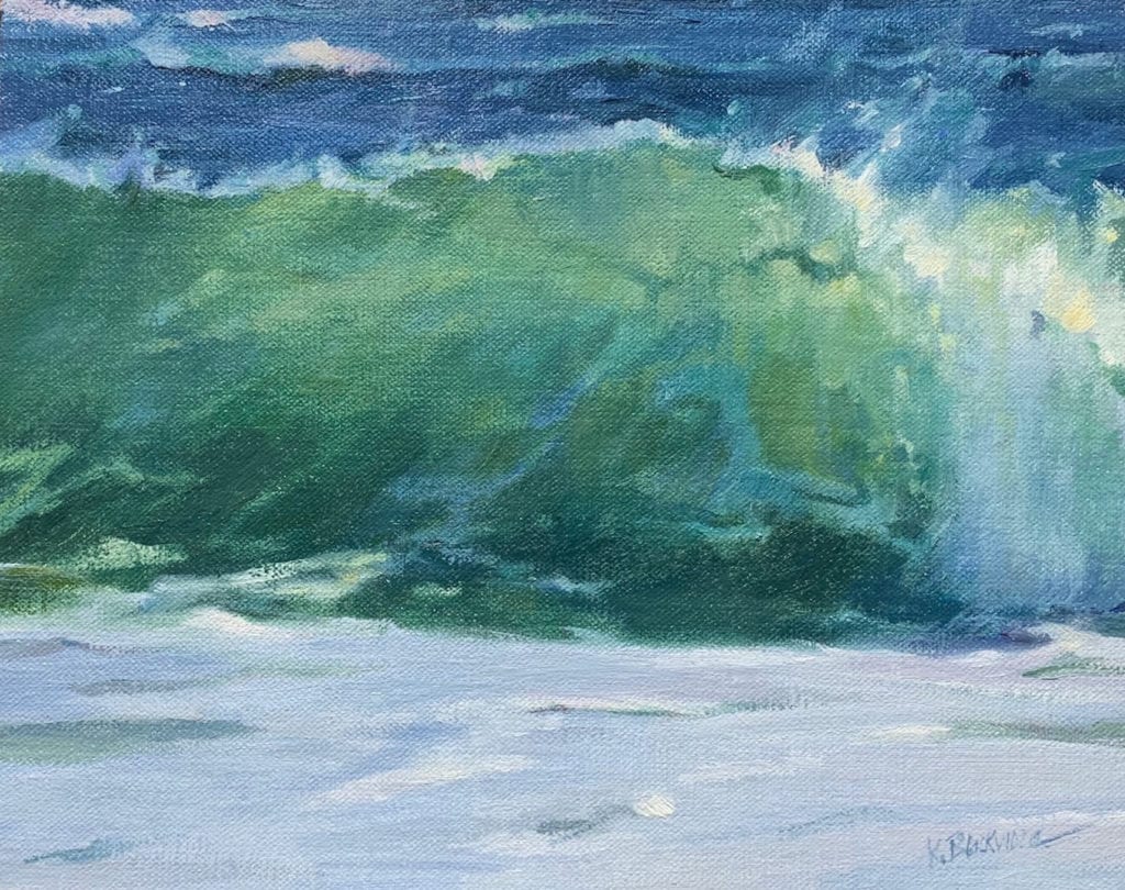
When I see blinding skies and incredible waves that take my breath away, I worry that there is no way my camera will capture what I am seeing and feeling. It rarely does. However, my personal sense-memory is soaking up everything. My attitude affects what I see of the color’s energy and power. When I paint, I am communicating an experience that has moved me. I push the color on my canvas until it elicits that same feeling.
Leave a Reply