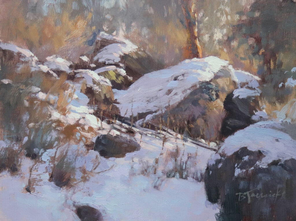
9”x12” – Oil
My first career was as an art director for advertising agencies in New York City in the mid-1980s. Around that time, I took classes at night at the School of Visual Arts. These classes were primarily for aspiring art directors and copywriters, and focused on developing creative, original concepts with strong advertising messages. And as with painting, that was a skill that required practice, experience, and knowledge of what’s been done in the past.
The title of my article, “What’s the Big Idea?” was actually the title of one of those classes. The class’s instructor did an amazing job of getting across to us—sometimes with humor, and sometimes more bluntly—that the best advertising begins with a very focused concept.
This instructor and others (all of whom were full-time art directors, copywriters and creative directors at successful agencies) stressed that it’s vitally important to first zero in on one succinct statement, and then develop individual messages from that overall umbrella idea. This is basically how an ad campaign is developed. If the advertising relies too heavily on only catchy phrases or flashy graphics, the message isn’t as powerful as when there’s one specific, overall concept that serves as the driving force behind each individual ad. Clever wordplays, or even humor can sometimes augment the message, but a focused concept is always the most important.
If you’ve ever seen the movie “What Women Want” (a film that came out in 2000 with Mel Gibson and Helen Hunt) the plot is set in an advertising agency, and I think it is one of the few movies that accurately portrays the thought process that advertising creatives use to come up with a “big idea”. Maybe it’s done differently these days, but this is how we did it when I worked in the field. The comical premise of the movie leverages how much of that process of conceptualizing an initial idea is a mental challenge that has to come first before anything visual or written can be developed. Mel Gibson’s career-greedy character suddenly has the magical ability to read the inner thoughts of Helen Hunt’s character. In the movie, they develop an ad campaign concept for Nike directed toward women. Their concept is “No Games. Just Sports.” That concept would become the umbrella idea for the individual advertising messages from Nike to their female demographic.
Now, after nearly 30 years from when I moved on from my advertising career, I’m realizing that my most successful landscape paintings are those for which I first identify a distinct visual concept. Since I love to paint light in the landscape, my concept usually revolves around light in some way. My goal however, is to pinpoint a very specific visual idea regarding what’s special about the landscape, and how I’m responding to it. Whatever idea I choose to use, that idea becomes the driving force for how I handle each area of the painting, so that the painting as a whole will clearly convey the original big idea. Some areas of the painting will simply serve a supporting role to the main concept.
For example, if I were to identify light skimming the top of a snow-covered rocky slope as my big idea, I would address the overall composition, and each supporting area of the painting so that it best showcases that light skimming the snow and rocks on the slope (as I did with the painting shown at the top of this article). The composition may also have trees and grasses, and the sky peeking through the trees, but those elements would be edited so they support the central theme. If instead my concept was to feature the light peeking through the trees, I would create a very different composition that emphasizes that area as the star of the show, with alternative portions of the composition edited to supporting roles.
To further explain, I’ll show examples of my paintings and describe the big idea behind each:
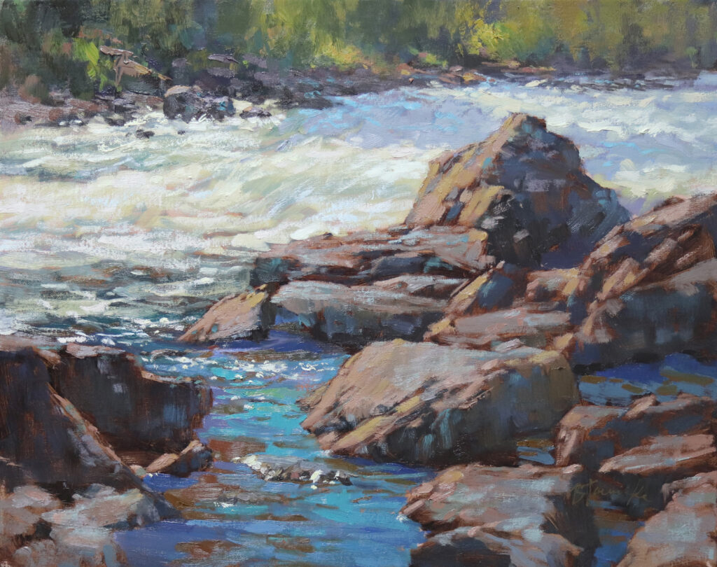
16”x20” – Oil
Big Idea: Radiant light reflected from the rocks and water. I set up the composition for this piece purposely to showcase the patterns of strong light and brilliant blue sky bouncing off of the rocks and water. It’s tempting to define more of the distant area on the other side of the river, but that part of the composition plays only a supporting role so was kept at a minimum.

30”x40” – Oil
Big Idea: As stated right in the title, the passage of light. Sometimes the title comes first before I pick up a brush, which helps me stay on track with my concept. This painting’s message revolves around the pull of the sunlit pathway into the trees, summoning the viewer to follow the light and explore further into the landscape. Notice that I continued the light into the distance, but edited it quite a bit to keep the initial passage of light as the main idea.
Okay, so painting concepts aren’t usually as clever as advertising ones (although some certainly can be). And it may seem like my painting concepts are fairly obvious. But when an artist looks across an overwhelming view of a landscape, a distinct painting idea (what to emphasize about the landscape) may not be readily apparent. There are often many different directions the artist can take regarding how to portray a portion of that landscape. The point I hope to make here is that the more you can focus a visual idea, the bigger the impact your painting will have.
I paint outdoors regularly so that I can gain a genuine understanding of my subjects. But many of my own favorite pieces that I feel have a strong visual message resulted from long hikes during which I took many hours to absorb what’s particularly striking about the landscape I explored. Sometimes I bring a small painting kit for mini color studies on these hikes, but more often it’s quick pencil sketches and detailed notes that accompany my reference photos that I bring back to the studio. With this approach, I can hone in on a certain magical element that stuck with me during my outdoor experience. Then back in the studio, I take my time to carefully explore studies that clearly convey that specific observation.
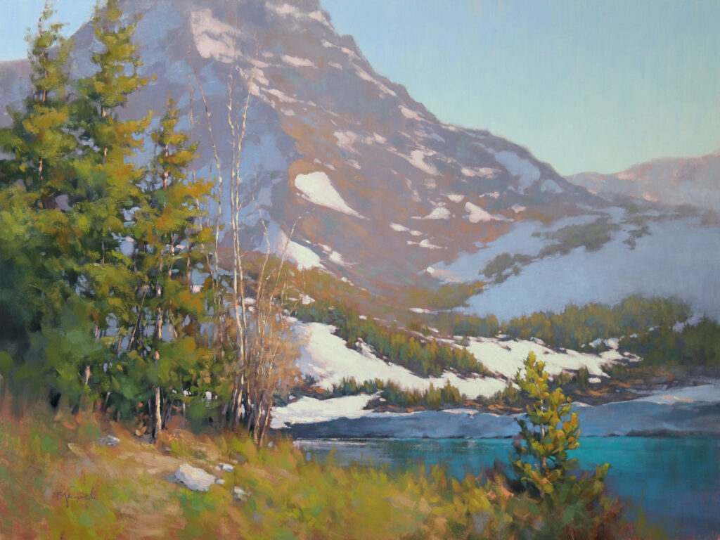
30”x40” – Oil
Big Idea: Magical evening light reflected on the mountainside. The colors on the mountain are quite elusive to photograph but breathtakingly magical in person. For this scene, I relied on careful notetaking with color charts along with sketches on location during an all-day hike. I followed that with multiple studio studies. Besides recording the color information firsthand, absorbing the brilliant visual effects throughout that day contributed to how I expressed my response to the subject.
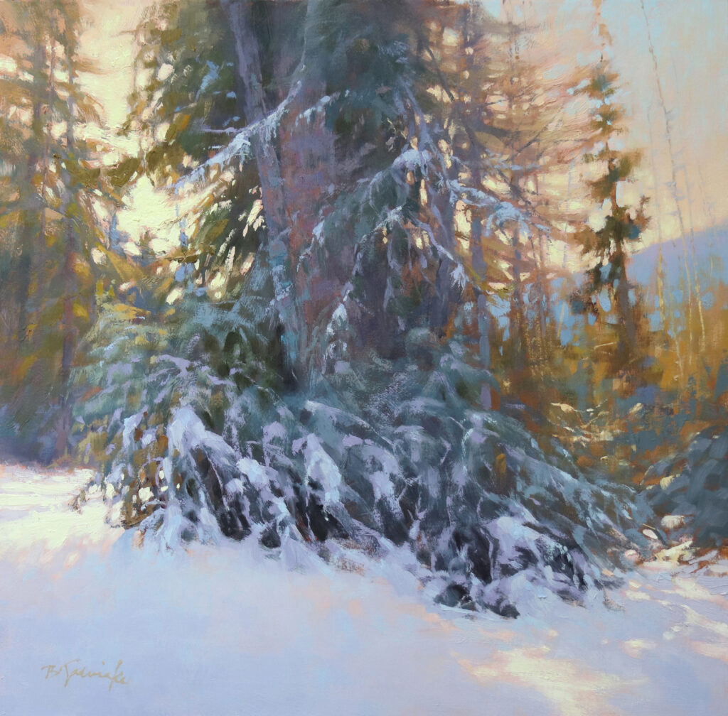
20”x20” – Oil
Big Idea: Delicate branches showcased by strong backlighting. On location, an array of possible compositions presented themselves to me. Some of those compositions would have had me use the long cast shadows as the main idea. However, for this painting, I used the backlighting to feature the delicate edgework of the lacy branches, both in front of the light and within the resulting deep cast shadows.
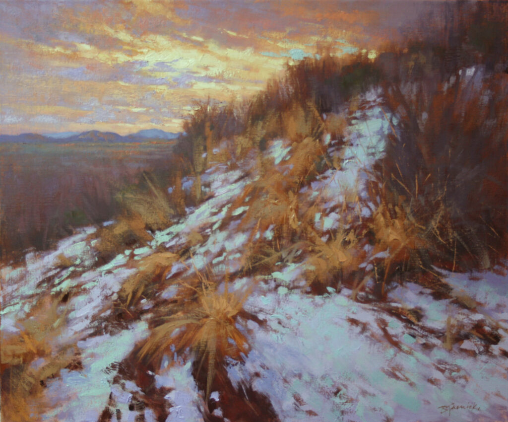
20”x24” – Oil
Big Idea: Way up high. This one is all about being way up near the top of this mountain, and that feeling one gets when standing on a mountain high above everything else and can see for miles. The arrangement of the grass and snow patterns, and their converging sizes, as they lead toward the sliver of light in the sky all contribute to that feeling.
I have to admit that sometimes when I’m painting outside with my full gear, I can get caught up in the technical particulars as I’m racing against the light. Again, it’s only when I nail down a specific visual idea and use the short window of time wisely that I produce what I feel is a successful field study.
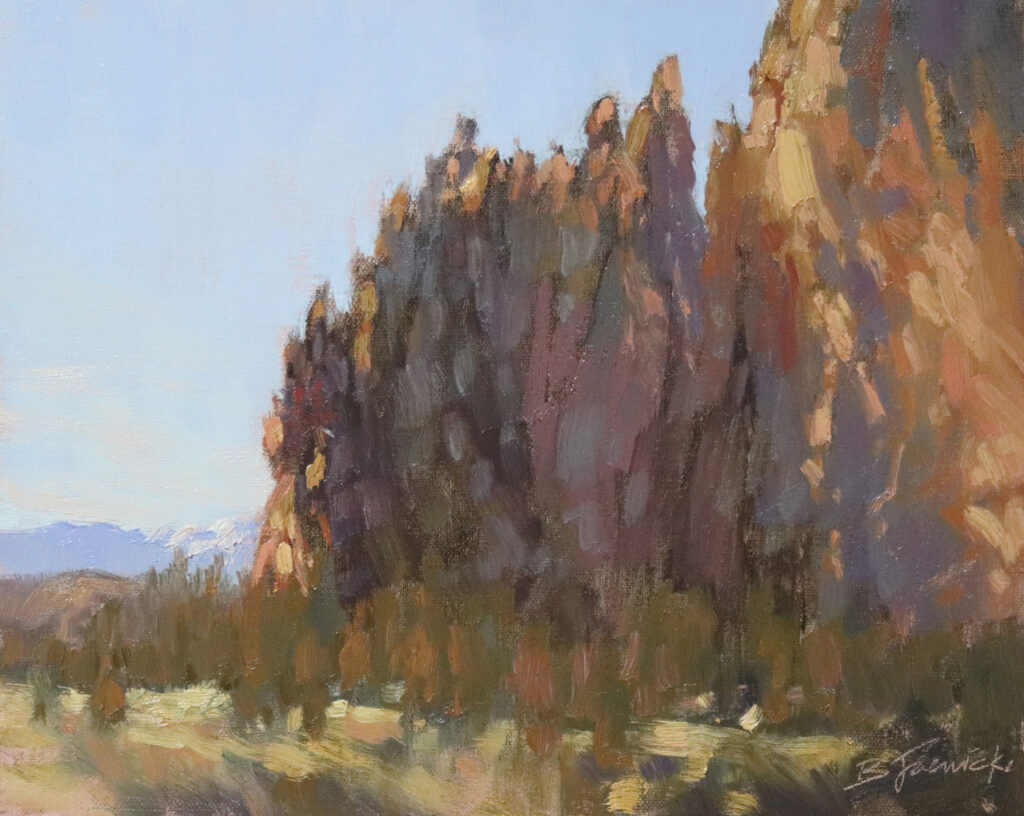
8”x10” (plein air) – Oil
Big Idea: Colorful shadows in the rock. Although I often like to focus on the light hitting the rock structures when I paint at this locale, the large shadow mass here had such varied yet subtle temperature shifts, that I focused on nudging the range of color temperatures to show off those shifts. I kept all else in the composition secondary to this main idea.
Thinking back to my advertising days, I remember poring over the most creative, award-winning ads of the time, aspiring to reach that level. And now, of course, I do the same with the work of my favorite painters. In both fields, I realize that the work that packs the biggest punch always starts with a big ole solid idea!
Sandra Cashman says
Great article! I come from a 30-year career in advertising as well and totally agree with everything she says. I love how she expanded that kind of critical thinking into her painting concepts, and supported it with lots of “show & tell.” I will definitely be thinking about this, moving forward.
Barbara Jaenicke says
Thanks, Sandra! I was sure hoping there would be a few folks like you from advertising backgrounds reading this who could relate!
Jill says
Beautifully expressed. The same concept works for portraits.
Barbara Jaenicke says
Thanks, Jill! Good to know it applies to portraits, too!
Pat Carney says
Excellent article and examples.
Barbara Jaenicke says
Thanks so much, Pat!
Kathleen Williams says
Wonderful article. Very helpful. Love how she explicitly showcased her concept in images of her lovely paintings. I’m going to remind myself to focus on “the big idea” in my next painting.
Barbara Jaenicke says
Thanks, Kathleen! I have to constantly remind myself of my own advice! 😉
Kathy Fox Weinberg says
I only have the 1st rock painting but no other examples. We’re they not included or is my device not displaying?
Kathy Fox Weinberg says
Ignore – suddenly the images appeared!
Barbara Jaenicke says
Don’t ya hate when that happens. 😉 Always happens to me when I first open these OPA blog emails.
Andrea Woods says
A great idea to help focus. A strong light is often the interest in my paintings. But I live in the Pacific NW so I have to deal with a lot of misty, rainy scenes. The last painting you showed, October Morning at Smith Rock would have its own challenges for me. Showing all the color areas on the cliff (which you did very well) often end up looking too spotty in my paintings.
Thank you for an interesting and informative article!
Barbara Jaenicke says
Thanks, Andrea! Yes, you’re right that multiple colors in shadow areas can sometimes fall into that trap of appearing too spotty. It usually all comes down to maintaining those values! 🙂
Lynn Grow says
Outstanding article! Thank you!
Barbara Jaenicke says
Thanks so much, Lynn!
Rick J. Delanty says
Great article, Barbara, about keeping the Main Thing the main thing. Just like a memorable speech, one point is supported by any others. This idea is so well-expressed here, thank you!
Barbara Jaenicke says
Thanks so much, Rick! I sure appreciate that. Now to remind myself of all that in the studio today! 😉
G Baughman, President BJ fan club says
As usual, Barbara nailed the concept. Well done!
Barbara Jaenicke says
Well, thanks a bunch, my friend!! Always appreciate your kind words, and your official title! 😉
Karl Enter says
Finally I’m getting the message thanks to your blog and with help from a couple of other OPA members. I have had the tendency to try to recreate the whole scene as I see it rather than focus. After a recent trip to the Maine coast, I’m faced with the decision making. Two paintings may come out of the same scene but each with a different focus/big idea! Thanks!!!
Barbara Jaenicke says
Thanks, Karl! Glad the blog was helpful and timely for you!
Marcia Walke says
A most excellent article, and the focus of “the big idea” rang true for me. I also worked in advertising, not on a New York scale, but here in Utah, for 30 years. Creating TV, print and radio for a variety of clients. Love the Nike creative story. Now retired and a plein air ,landscape painter. Never thought of applying the “big idea ” to my painting. Thanks Barbara, and I follow your paintings, regularly.
Barbara Jaenicke says
Thanks, Marcia! Glad to hear you can relate!
Kat Bauer says
I too have a background in design which has helped in my painting, but have never been able to put into words why or how it helps. You articulated it beautifully. Thanks so much!
Barbara Jaenicke says
Thanks, Kat! Yes, I definitely think design and concept go hand and hand in either field.
Lori Ippolito says
This article was delightful..it made so much sense and offered a process to tackle the ‘why’ of a painting. I will certainly be thinking about that when i hone in on my next subject.. many thanks to Barbara and OPA for providing the information. The accompanying paintings by the artist were captivating and further emphasized the concept. Bravo!
Barbara Jaenicke says
Thanks for the nice feedback, Lori! Sorry I’m just now seeing this comment, but it sure is appreciated!