• Skip to primary navigation
  • Skip to main content
  • Skip to footer
  • Help Desk
  • My Account

OPA - Oil Painters of America

Dedicated to the preservation of representational art

  • Home
  • About
    • Mission, Policies & Bylaws
    • Board of Directors
    • Presidential History
    • Frequently Asked Questions
    • History
    • OPA Staff
    • Contact Us
  • Membership Services
    • Member Login
    • Membership Information
    • State & Province Distribution For Regionals
    • Update Member Information
    • Membership Directory
    • Contact Membership Department
  • Events
    • Exhibitions
    • Online Showcase
    • Lunch and Learn
    • Virtual Museum Road Trip
    • Paint Outs
  • Resources
    • Brushstrokes Newsletters
    • Ship and Insure Info
    • Lunch & Learn Video Archives
    • Museum Road Trip Video Archives
  • Services
    • Sponsorship Opportunities
    • Scholarships
    • Critique Services
    • Workshops
    • Have A HeART Humanitarian Award
  • Online Store
  • Awardees
  • Blog
    • OPA Guest Bloggers
    • Blogger’s Agreement (PDF)
    • Comment Policy
    • Advertisement Opportunities
  • Show Search
Hide Search

Albert Handell

Ask Albert

Albert Handell · Jun 27, 2022 · 3 Comments

As a sought-after workshop instructor, Albert Handell OPAM is accustomed to answering student’s questions. For this week’s blog, we share his response to two commonly asked questions: 

Question: Do you judge art shows, and if so, how do you select the top winning piece, “Best of Show”?

Yes, I have judged numerous exhibitions. 

I have found that some exhibitions have categories and some do not.  The exhibitions that have categories are usually divided by either subject matter, (i.e. landscapes, portraits, still lives and abstract etc.) or by paint media (i.e. Oils, Pastels, Water Colors, etc.). 

Prize money is usually broken down so that the winner of Best of Show receives the largest amount, for example, $1,500. The First Place winner in each category would then get $1,000, Second Place winners get $500, Third Place winner gets $250 and so on. 
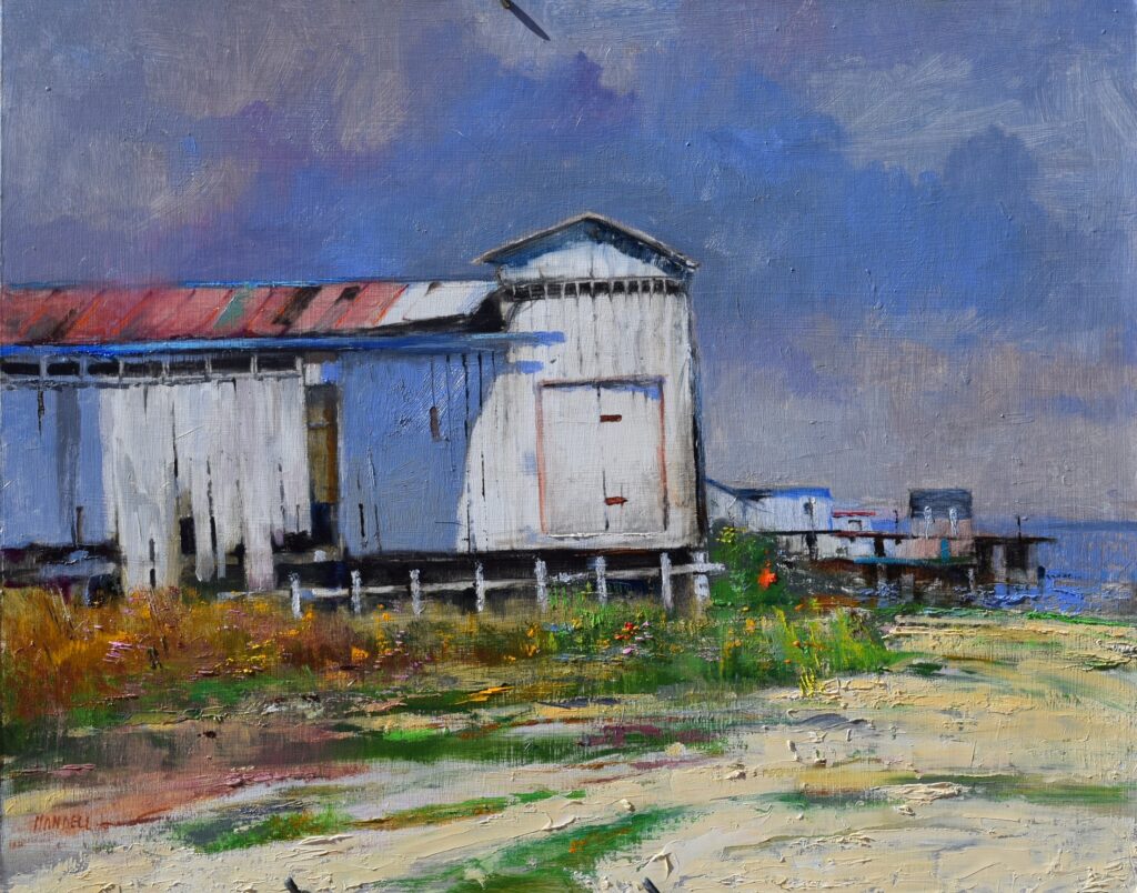
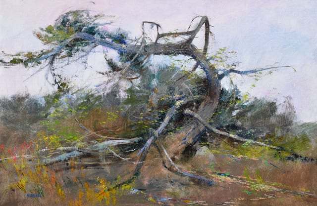
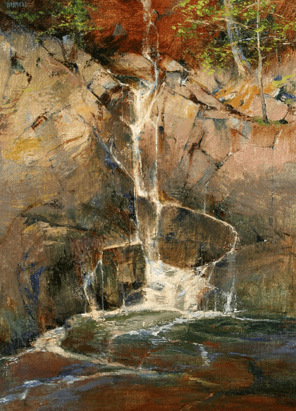
There is Beauty at Every Stage by Albert Handell OPAM
24” x 30” – Oil
First Place at an annual New Mexico statewide exhibition

To pick the best of show for the exhibition, I simply take the first place I’ve selected in each category, move them near each other so I can compare them side-by-side, and decide which one is the strongest. The piece I select becomes Best of Show and the artwork below it in that category moves up one prize (i.e. Second Place becomes First Place, etc.)

Then there is the type of exhibition where artwork of all different mediums and subject matter is mixed together, and not broken down into categories.  Selecting the best of show for this type of exhibition is more difficult. I take the first, second and third place artworks and really scrutinize them before selecting one to be Best of Show. That is how I do it.

I have been on both sides of exhibitions in my life, sometimes as the participant and other times as the judge.  This oil painting below, Woods Interior, Point Lobos, was sent to an OPA exhibition where the largest work could not be more than 16” x 20.” It received Best of Show with a cash award of $3,500. Jeanine and I celebrated that evening!

I hope this insight into judging is helpful.
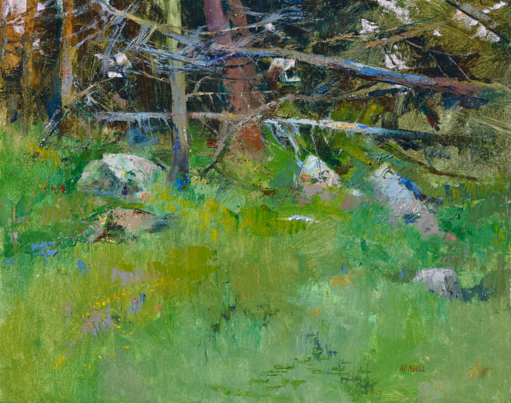
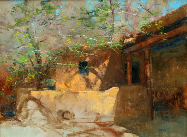
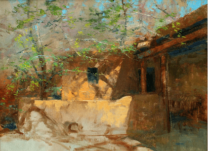
Woods Interior, Point Lobos by Albert Handell OPAM
16” x 20” – Oil
Best of Show, OPA Small Painting Regions Exhibition 2016

QUESTION: Is framing important? What are your thoughts about framing?

Yes, framing is very important. 

To keep the answer to this question simple, for myself when I frame my small oils, I like to use a floater frame. It pains me to lose a half inch all-around my small painting because of the inside lip (or “rabbit”) of standard frames. It might cost more to frame the oil using a floater frame, but I feel better doing so.

In general, the framing should complement the painting!

You don’t want any part of the frame to compete or distract from the painting, (for example, you don’t want the light linen mats of the frame to stand out more than the whites of the painting.)

If the frame competes with the painting, it’s not a good frame. 

Here are some examples of my framing choices:
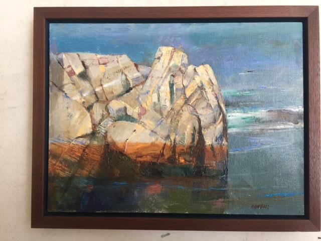
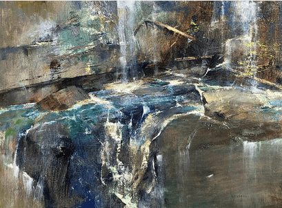
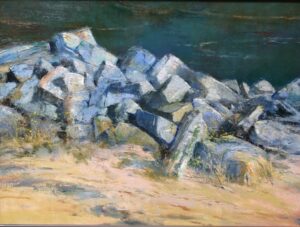
At Point Lobos (China Cove) by Albert Handell OPAM
12” x 16” – Oil

This oil is basically a painting about the weight of rocks.

It started out as a study for a larger oil. I felt it stood on its own merits so I decided to frame it. Since I considered it a “tight” subject matter painting, I decided to float it with a narrow black backing.

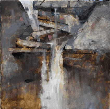
The piece Along the Taos Ski Basin Road (below) is a horizontal painting. I felt it needed a wider floater frame.
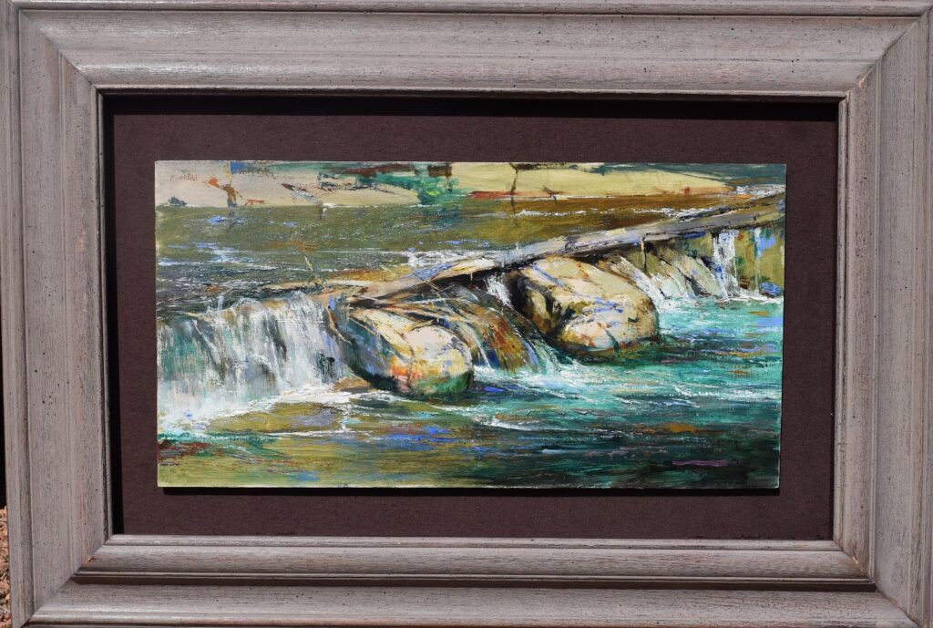
Along the Taos Ski Basin Road by Albert Handell OPAM
12” x 20” – Oil

I hope these two examples of framing give you some good food for thought.

Sincerely,
Albert

Ask Albert May 2020

Albert Handell · Jun 21, 2021 · 2 Comments

We are pleased to share this week’s blog from OPA Master artist Albert Handell.  Albert will be giving a live demonstration at the upcoming OPA National Convention in Santa Fe, NM, August 24-29, 2021. Tickets and more information are available through the OPA website.

As a sought-after workshop instructor, Albert is accustomed to answering student’s questions. For this week’s blog, we share his response to two commonly asked questions: 

Question: When do you know when your painting is finished?

Answer: When I do not wish to paint on it any more.  However, my advice to my students is to see the big picture…

My students seem not to understand the importance of carrying power. How a painting reads from a distance is much more important than the way its details look up close.

The Red Barn by Albert Handell OPAM
20″ x 24″ – Oil

I have noticed that the aspiring artists who work with me are glued to their canvases and hardly ever step back…they do not take into consideration how important carrying power is to their paintings.  They do not take breaks to walk around and see what other people are painting.  NO, NO!  They are glued to their work, frantically trying to finish.

Let’s look at what happens in the process of creating a painting.

Perhaps your subject includes a distant mountain with a field in front, and a little house somewhere in the background. What a large amount of space you are tackling!

You are placing all of this on a 16” x 20” surface which means you are condensing it quite a lot. Also, you are standing and working at arm’s-length from your surface to create a painting that is meant to be seen from 15 feet away. 

All this takes a lot of visual adjusting. I wish students would get into the habit of stepping back from time to time SO THEY CAN ASSESS THEIR PAINTING. They cannot get a fresh look at things if they constantly stay and paint only at arms-length.  They cannot correctly analyze the strengths and weaknesses of their work, so they very easily end up noodling the paint in a frantic attempt to finish.

If they lose sight of the carrying power of what they are creating, they are in trouble without knowing it and cannot satisfactorily complete the piece.

Every good painting must read from a distance to be a finished work of art. My advice for everyone: do the best you can and do not worry about completing your painting in one session. When your work time is over, simply turn your painting to the wall.  The next day, or whenever you come back to it, do not look at the painting as you turn it around. Take a few steps away and then turn around and look.  If you have a good instant reaction, the painting could be finished…or it might need a little tweaking.  Make sure you do not over work, for if you do, you will weaken the painting.

Deep Shadows by Albert Handell OPAM
18″ x 24″ – Oil

Question:  You have said that when oil painting, you prefer using a combination of transparently applied and opaquely applied oils to achieve textual beauty. Please explain. 

Answer:  I will answer this question by giving a few visual examples. 

First, let’s take a look at the painting Deep Shadows.  You can clearly see the transparent application of paint which gives it the atmosphere that is so important in almost all of my paintings. In Deep Shadows I let the opaque flutter of leaves rhythmically stand out and complement the solidity of the massive tree trunk.

Wind Swept by Albert Handell OPAM
24″ x 36″ – Oil

Next, let’s look at the painting Wind Swept where this technique is more subtle. I began painting it by establishing the sky and the rest of the scene transparently and smoothly without any brush marks using Windsor Newton’s Liquin as the medium.

Then I painted the tree, landscape and earth with a combination of transparent and comparatively opaque application of paint and brush work.  My aim was to delicately show the contrast between the sky and the tree. 

Chamisa by Albert Handell OPAM
24″ x 18″ – Oil

Now let’s look at Chamisa. Here is a robust example of using transparent oils with opaque brush work. The lower right-hand part of the painting is transparent so that the opaque application of yellow chamisa and other colors will stand out in contrast. The opaque, vivid chamisa and a few of the façades of the building attract the viewer’s attention and come forward. The background mountain, which has a blue-grey atmospheric quality was applied transparently so that it would recede. The sky is also mostly painted with transparent applications of paint with a few touches of opaque paint here and there, again to keep the sky in the background. 

Invitation to Spring by Albert Handell OPAM
18″ x 24″ – Oil

In Invitation to Spring the transparency and contrasting opacity is quite obvious. 

When I was at the Art Students League in New York, I remember engaging in endless discussions in the lunch room about art and about when a painting is finished. Somebody said, and I could not get it out of my mind “A beautiful painting has an inner light all its own.” As you can see, I never forgot that idea.  I have always leaned towards transparent paint, doing so was part of my nature from the very beginning. I also have always liked textural contrasts. I believe using and combing transparent and opaque passages in a painting help me achieve the inner light I desire in my work. 

Stay tuned for more questions and answers with Albert Handell OPAM, coming this summer on the Oil Painters of America Blog.

Abstract Design and Realism

Albert Handell · Jul 27, 2020 · Leave a Comment

Question: Hey Albert, I watched you demonstrate and I was amazed, are you getting abstract or what?

Well that’s a good question. Sometimes I wonder myself. I always had a good feeling for the design and shapes that make up the composition, I’m not trying to “go abstract,” not at all, I love realism and it’s liveliness!

I do try to paint the feelings I perceive as I hike through the woods, not the woods literally. Also, I find when I pan in on part of a rock face which is out of “context”, unpredictable as a subject, variations of shapes and colors become most prominent. Etc.

When I was 19 at the Art Students League, NYC, and painted portraits, I stood further back in the studio so I couldn’t see the highlights in the eyes but I could see the transition of colors and values from the top of the forehead to the bottom of the chin. I would go after the shapes of the lights and darks and the progression of light as it progressed throughout the entire portrait at the same time as I achieved a likeness.

With that subject everyone knew I was painting a portrait. Not so when panning in on part of a rock face, that could be anything. It is not “predictable” as a portrait is. Therefore it lends itself to being whatever.

Then again when painting mountain streams and trees, two of my favorite subjects, it brings in other questions. I am particularly excited by the energy of the moving water as the water moves forever finding its level. Same with the sense of delicate leaves when painting a group of trees. I have found exacting measuring for these two subjects does not work for me. Well, what does? I prefer to emphasize the moving energy of the water and the sense of flutter for my leaves. I view and paint both of them as rhythms rather than freezing them in time. This may be considered “abstract” or even unfinished?

“Blue Mountain Falls” by Albert Handell OPAM
22″ x 24″ – Oil
Painted in the studio from a photographic reference

This painting is about the energy of water, painted primarily by the movements (rhythms) of the water rather than the exactitude of the photo.

“At the Kaaterskill Waterfalls” by Albert Handell OPAM
22″ x 22″ – Oil

This is a one day painting (it is a block in). It is so alive (my opinion) I decided to leave it alone.

“Rhythms” by Albert Handell OPAM
18″ x 26″ – Oil

After blocking in this oil I painted over the block-in with the rhythms of the leaves and foliage until finished. There is the sense of the abstract in this and other paintings of mine but I consider this as alive and realistic.

“Interior Falls” by Albert Handell OPAM
24″ x 18″ – Oils

Here is a wonderful example of how I established the colors of a painting from top to bottom, starting with the light tan Yellow Ocher mixed with Naples Yellow colors at the top of the rock face to the darker greens at the base of the painting before painting anything else. The delicate waterfalls are painted later mostly as a movement (rhythm).

“Late Morning Light, Santa Fe” by Albert Handell OPAM
18″ x 24″ – Oil

The send of sunlight was the reason for painting this oil. Here again the leaves are secondary to the whole and was painted as a “rhythm”.

What's Important In My Paintings and What Is Secondary?

Albert Handell · Apr 1, 2019 · Leave a Comment

“The Swirl of Life” By Albert Handell
Pastel – 12″x 18″

Do you ever find yourself wondering what’s important in your painting and what is secondary?

I remember when I was younger and not clear about this, (what was of primary importance and what to do about it). This confusion caused me to over-work a number of works, as I tried to get everything I could into a painting. It was a sickening feeling, when I sensed at first I had something and then suddenly I didn’t. And I was blind as to what had happened to the painting!

As I look back I think it was because I hadn’t realized what was important and what was not important. I worked and reworked without clarity, weakening what I had or even losing it completely. This problem plagued me for a few years until finally, I figured out how I could deal with it. This is my personal approach to that problem:

“Portrait of Jerry Shiffer”
By Albert Handell
Pastel – 24″x 18″
Painted on dark sanded paper from life in one sitting. There is no backgrounded painted, it is a vignette. What could I have possibly done to the background to make this portrait more beautiful, more striking? Nothing! The freshness of the vignette is an important part of the whole pastel.

I was taught, I had to paint from edge to edge before I could even consider the painting a painting and also not to get into any specific part of the painting beforehand. This idea for a painting is valid in its own way, but for me only to a limited degree. I felt for me that too much concern about everything else kept me from a certain amount of intimacy or focus for the area(s) of the painting that had originally thrilled me to start the painting in the first place.

I decided to try Vignettes and not paint from edge to edge. Vignettes basically mean just painting the area that interests one, and leaving the rest of the paper or canvas untouched. It also meant forgetting about the concern if others would consider it a study, or a sketch, or worthless. Since I was painting daily I was able to experiment with a number of works to explore this idea.

Something interesting about Vignettes

It seems that if I painted a vignette on a toned ground, it was more acceptable as a painting than when I painted the same vignette on a white ground.

Then what about the portraits I painted with oils or pastel on a pre-toned surface? Since there are no actually painted backgrounds, these portraits were vignettes, yes? Yet they are accepted as finished paintings.

This made sense for portraiture, but what about the landscape?

Yes, it is unfinished, but also beautiful. This vignette was painted on location during one of my Taos mentoring programs. It is fresh, direct and has a uniqueness to it that only a vignette can have. Painting with pastel has a unique combination to the medium of painting and drawing simultaneously. Pastel on U-Art 600 grit sanded pastel paper.

As I was painting mostly with pastel on location, I decided to start the pastel with a watercolor under painting. These transparent watercolor washes added an unexpected texture and contrast to the “backgrounds”. Watercolors also have what is referred to as “watercolor accidents” which if not tampered with are quite beautiful in their own way.

Then with my pastels I just focused in on the area(s) I wanted to paint, had to paint, and painted them. This was very direct and clear to me as to what was important. The unimportant area(s), in order to give the pastel breathing space, I basically left alone or it would be painted with just a minimum of detail or the suggestion of detail. Or left alone completely leaving the watercolor washes without further ado.

For my oils…

I have always mentioned in my workshops: “the nice thing about oils is that they are wet, and the problem with oils is that they are wet.” What to do?

I start my oils, which are mostly painted in the studio and are larger than my on location pastels. My paint medium is fast drying Gamsol. My initial transparent color washes are applied and scrubbed on with a sense of abandon, very much like my watercolors for my pastels. Dark areas will have dark transparent colors varying from warm to cool tones. The lighter areas will have lighter tones applied again considering only where the warmer or cooler tones are located.

Then, painting from the center of interest out, painting the areas that I wish to focus on which is basically the important area(s) which by themselves made up a vignette, then letting the other areas simply “drop  off” so to say, or simply  painting them  with much  less  emphasis or detail. I also found these untouched, unfinished areas are perfect for a signature, which finishes the painting.

PASTEL 12X18 painted en plein air on Kitty Wallis Belgium Mist Sanded Pastel Paper

Untitled
By Albert Handell
Pastel – 12″x 18″

A Symphony In Greys

Albert Handell · Feb 4, 2019 · Leave a Comment

“The Greys of Granite” by Albert Handell
18″x24″ – Oil

I have always been fascinated by the sparkling sensation I sense from viewing the strong greys of granite, especially in sunlight, they contrast so beautifully with the rich dark greys found in the shadow areas.
For me, it’s a symphony in greys. I feel this painting, which is in the Oil Painters of America, Western Regional Juried Exhibition at the Mary Williams Fine Arts, Boulder CO, September 7- October 6, 2018, is the best example of one of my oils that shows these greys beautifully (both the light and dark, cool and warm greys).
My use of the palette knife (from left to right): Cheson 808 made in Italy, Cheson 804 made in Italy, Cheson 814 made in Italy, No name on the knife from Morrilla, Italy (this is an old knife, for I think the Morrilla Co no longer exists).
There are many different sizes and shapes of palette knives, if you decide to use them, you will have to experiment.

Speaking of Greys…
Black and white make a neutral grey, while black and Naples yellow makes a beautiful string of warm greys…..Add Mars black to white and you will get a beautiful string of cool grays.
There are many experiments that can be made for different strings of greys….The painting of the granite:
Certainly, there was a combination of brush and knife work to establish the rough texture of the granite rocks.
I started the underpainting using a combination of Ultramarine Blue and Burnt Sienna transparently. I then focused on an area of the granite and painted it to practically finished. Then I painted from this area out till finish (painting from the center of interest out).
I believe in contrast: Large shapes vs small shapes. Crisp edges as compared to lost edges. In this painting, I decided to contrast the most delicate of yellow flowers with the rugged texture of the granite. I used the palette knife (NOT THE BRUSH) for establishing the delicate yellow flurries found at the base in front of the greys of the granite. How is this accomplished? Good question!
Close up of the delicate yellows of
“The Greys of Granite”
by Albert Handell
It might be a good idea not to try getting those delicate yellows while the greys of the granite are still wet! I suggest you wait until the under painting is completely dry. Then you can try it and if it doesn’t work, you can take it off without disturbing the greys. Unfortunately, there is no clear-cut answer to create such delicate yellows. The palette knife is applied by “feel”, it has a particular beauty all of its own. Just realize, it can be done, and if you wish to try it, it will take patience and practice.
Good luck.
  • Page 1
  • Page 2
  • Go to Next Page »

Footer

  • Home
  • About
    • Mission, Policies & Bylaws
    • Board of Directors
    • Presidential History
    • Frequently Asked Questions
    • History
    • OPA Staff
    • Contact Us
  • Membership Services
    • Member Login
    • Membership Information
    • State & Province Distribution For Regionals
    • Update Member Information
    • Membership Directory
    • Contact Membership Department
  • Events
    • Exhibitions
    • Online Showcase
    • Lunch and Learn
    • Virtual Museum Road Trip
    • Paint Outs
  • Resources
    • Brushstrokes Newsletters
    • Ship and Insure Info
    • Lunch & Learn Video Archives
    • Museum Road Trip Video Archives
  • Services
    • Sponsorship Opportunities
    • Scholarships
    • Critique Services
    • Workshops
    • Have A HeART Humanitarian Award
  • Online Store
  • Awardees
  • Blog
    • OPA Guest Bloggers
    • Blogger’s Agreement (PDF)
    • Comment Policy
    • Advertisement Opportunities

© 2025 OPA - Oil Painters of America · Design by Steck Insights Web Design Logo