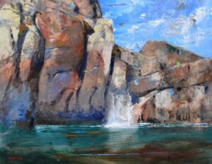
• Skip to primary navigation
  • Skip to main content
  • Skip to footer
  • Help Desk
  • My Account

OPA - Oil Painters of America

Dedicated to the preservation of representational art

  • About
    • Mission, Policies & Bylaws
    • Board of Directors
    • Presidential History
    • Frequently Asked Questions
    • History
    • OPA Staff
    • Contact Us
  • Membership Services
    • Member Login
    • Membership Information
    • State & Province Distribution For Regionals
    • Update Member Information
    • Membership Directory
    • Contact Membership Department
  • Events
    • Exhibitions
    • Online Showcase
    • Lunch and Learn
    • Virtual Museum Road Trip
    • Paint Outs
  • Resources
    • Brushstrokes Newsletters
    • Ship and Insure Info
    • Lunch & Learn Video Archives
    • Museum Road Trip Video Archives
  • Services
    • Scholarships
    • Critique Services
    • Workshops
    • Have A HeART Humanitarian Award
  • Sponsorship
  • Store
  • Awardees
  • Blog
    • Recent Blogs
  • Show Search
Hide Search

Albert Handell

A Symphony In Greys

Albert Handell · Feb 4, 2019 · Leave a Comment

“The Greys of Granite” by Albert Handell
18″x24″ – Oil

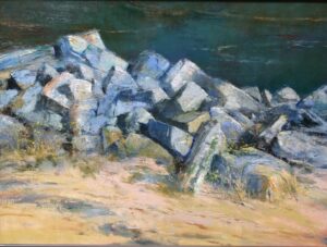
I have always been fascinated by the sparkling sensation I sense from viewing the strong greys of granite, especially in sunlight, they contrast so beautifully with the rich dark greys found in the shadow areas.
For me, it’s a symphony in greys. I feel this painting, which is in the Oil Painters of America, Western Regional Juried Exhibition at the Mary Williams Fine Arts, Boulder CO, September 7- October 6, 2018, is the best example of one of my oils that shows these greys beautifully (both the light and dark, cool and warm greys).
My use of the palette knife (from left to right): Cheson 808 made in Italy, Cheson 804 made in Italy, Cheson 814 made in Italy, No name on the knife from Morrilla, Italy (this is an old knife, for I think the Morrilla Co no longer exists).
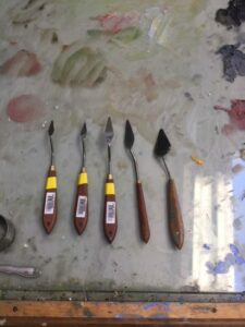
There are many different sizes and shapes of palette knives, if you decide to use them, you will have to experiment.

Speaking of Greys…
Black and white make a neutral grey, while black and Naples yellow makes a beautiful string of warm greys…..Add Mars black to white and you will get a beautiful string of cool grays.
There are many experiments that can be made for different strings of greys….The painting of the granite:
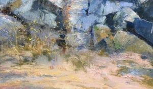
Certainly, there was a combination of brush and knife work to establish the rough texture of the granite rocks.
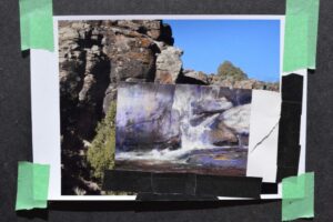
I started the underpainting using a combination of Ultramarine Blue and Burnt Sienna transparently. I then focused on an area of the granite and painted it to practically finished. Then I painted from this area out till finish (painting from the center of interest out).
I believe in contrast: Large shapes vs small shapes. Crisp edges as compared to lost edges. In this painting, I decided to contrast the most delicate of yellow flowers with the rugged texture of the granite. I used the palette knife (NOT THE BRUSH) for establishing the delicate yellow flurries found at the base in front of the greys of the granite. How is this accomplished? Good question!
Close up of the delicate yellows of
“The Greys of Granite”
by Albert Handell
It might be a good idea not to try getting those delicate yellows while the greys of the granite are still wet! I suggest you wait until the under painting is completely dry. Then you can try it and if it doesn’t work, you can take it off without disturbing the greys. Unfortunately, there is no clear-cut answer to create such delicate yellows. The palette knife is applied by “feel”, it has a particular beauty all of its own. Just realize, it can be done, and if you wish to try it, it will take patience and practice.
Good luck.

Some Thoughts About Using Photography

Albert Handell · Dec 17, 2018 · Leave a Comment

This year I was asked what my thoughts are about painting from photographs and if this is a practice I use.
There is much I can write about, and I will start with……. Yes, I paint from photographs.
But the painting does not look like the photograph,  yet, there is no painting without the photograph. So what’s happening?
I think the photographs touch something inside of me,  which awakens and inspires me…
Usually, when painting from a photo or my monitor, it is in the studio and with oils. I set up the image(s) the night before, then sleep on it, and I’m ready to start the next morning.

EMERALD FALLS bt Albert Handell OILS 22X28 $18,500 .00
“Emerald Falls” by Albert Handell
Oils – 22″ x 28″

Here is a good example of what I mean when I say my paintings do not look like the photographs, yet with out the photograph there is no painting.
I took two photographs, one photo is a pastel I painted on location, and I pasted it on top of a photograph from the Taos Valley, where I have painted numerous times. This was all the inspiration and information I needed to paint the oil “Emerald Falls”

I would like to say more about myself and photography:
I started studying painting when I was 20 at the Art Students League with the late Frank Mason.
Back then the rage in New York City was Abstract Expressionism. Realism was considered dead by the intelligent ones. You were actually considered stupid to want to paint realistically, “don’t you realize it has already been done?” At that time painting realistically was limited and very different from today.
Among us young artists who wanted to paint realistically, we had a false notion which I swallowed completely …. “if you work from a photo you were an illustrator (God forbid), and if you worked from real life you were considered a fine artist, yay!”
For my first 20 years of painting which was in the studio and out on location, I never considered using a photo.
When I returned from Europe I started using black and white photography as I got involved painting Mexican and Guatemalan marketplaces. That was during an eight-month visit to San Miguel de Allende and afterward.
 
Woodstock, NY (1970-1983)
A few years later I moved to Woodstock. The landscape and the Catskill mountains were breath-taking. Painting on location and exclusively with pastel. Of course, the light would change and be different from when I began, I found I could have painted both light conditions. While taking a short break and viewing other mouth-watering subjects to paint, I felt as if I was a child in a candy store. This caused inner anxiety.
To satisfy my anxiety I started taking slides of subjects I would have painted if I wasn’t already involved. The weather in Woodstock could get nasty. Since taking only slides of something I would have painted if not already committed to a  painting… I found myself in my studio viewing these slides, reliving them, they excited and they inspired me, and I found myself starting to paint from them.
Much to my chagrin, the paintings were beautiful.
This caused a lot of confusion and guilt within me which I struggled with for a good many years till finally getting over it. I now use photography for landscape and find it as a great help for painting my oils in the studio, and my workshop demos.
Photograph used for inspiration
“Spring 2009”
by Albert Handell

WC and Pastel – 12″ x 18″
“The Red Barn”
by Albert Handell

Oil – 24″ x 36″

  • « Go to Previous Page
  • Page 1
  • Page 2

Footer

  • About
    • Mission, Policies & Bylaws
    • Board of Directors
    • Presidential History
    • Frequently Asked Questions
    • History
    • OPA Staff
    • Contact Us
  • Membership Services
    • Member Login
    • Membership Information
    • State & Province Distribution For Regionals
    • Update Member Information
    • Membership Directory
    • Contact Membership Department
  • Events
    • Exhibitions
    • Online Showcase
    • Lunch and Learn
    • Virtual Museum Road Trip
    • Paint Outs
  • Resources
    • Brushstrokes Newsletters
    • Ship and Insure Info
    • Lunch & Learn Video Archives
    • Museum Road Trip Video Archives
  • Services
    • Scholarships
    • Critique Services
    • Workshops
    • Have A HeART Humanitarian Award
  • Sponsorship
  • Store
  • Awardees
  • Blog
    • Recent Blogs

© 2026 OPA - Oil Painters of America · Design by Steck Insights Web Design Logo