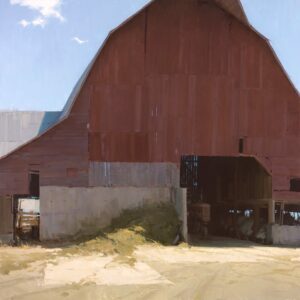
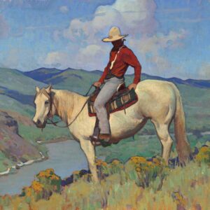
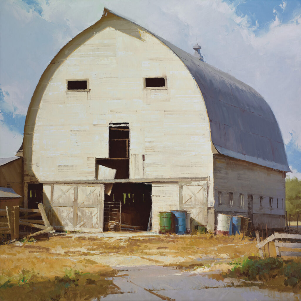
• Skip to primary navigation
  • Skip to main content
  • Skip to footer
  • Help Desk
  • My Account

OPA - Oil Painters of America

Dedicated to the preservation of representational art

  • Home
  • About
    • Mission, Policies & Bylaws
    • Board of Directors
    • Presidential History
    • Frequently Asked Questions
    • History
    • OPA Staff
    • Contact Us
  • Membership Services
    • Member Login
    • Membership Information
    • State & Province Distribution For Regionals
    • Update Member Information
    • Membership Directory
    • Contact Membership Department
  • Events
    • Exhibitions
    • Online Showcase
    • Lunch and Learn
    • Virtual Museum Road Trip
    • Paint Outs
  • Resources
    • Brushstrokes Newsletters
    • Ship and Insure Info
    • Lunch & Learn Video Archives
    • Museum Road Trip Video Archives
  • Services
    • Sponsorship Opportunities
    • Scholarships
    • Critique Services
    • Workshops
    • Have A HeART Humanitarian Award
  • Online Store
  • Awardees
  • Blog
    • OPA Guest Bloggers
    • Blogger’s Agreement (PDF)
    • Comment Policy
    • Advertisement Opportunities
  • Show Search
Hide Search

David Dibble OPA

A Few Thoughts on Light

David Dibble OPA · Dec 20, 2021 · 19 Comments

The Dairy by David Dibble OPA
48″ x 48″ – Oil

Over the past several years I have written posts for OPA about different painting fundamentals. I would like to continue with a few thoughts on light. 

As a representational painter, much of my technical work boils down to understanding how light behaves in the natural environment.  Theoretical knowledge of how light works, plus observation of how these principles play out in real life, combine to provide the basis used to communicate a story, emotion, or idea (along with other design principles of course, such as composition, etc.).  This concept is often put more simply as “we paint both what we see and what we know”.  

Since most of us deal with the concept of light in our paintings, I’m sure these ideas are neither new to you nor novel. And it’s perfectly okay if you think about light in a completely different way (that can be fascinating).  But sometimes hearing a familiar idea stated in a new way can expand our understanding.

With all of this in mind, I would like to share a few perceptions of how I think about light as a painter:

PRIMARY LIGHT SOURCE AND SECONDARY LIGHT SOURCE 

The interplay (push-and-pull, tug-of-war, etc.) between these two forces is nearly always at play in nature.  Understanding how the two interact within a scene is the key to understanding the color theme or ‘thrust’ of a piece. Typically, the sun is the primary light source and the sky is the secondary source, but that can be different depending on other factors (for example indirect light, moonlight, car lights, etc.). Multiple secondary sources can definitely exist simultaneously (such as street lights, house lights, moon, etc.), but I find that these usually need to be simplified to a dominant secondary light source (i.e. choose one).  One of the only places where there is no secondary light source influence is in outer space (though sci-fi artists usually cheat and add one anyway). Thus, even in small and subtle ways, most things in nature have a gradient of value and color as they get either further away from, or closer to, the primary light source and consequently more or less influenced by the secondary source. That’s a heady way to say that, on a sunny day, the surface of an object is either being hit by sunlight, or it’s being influenced by whatever else is in the sky. 

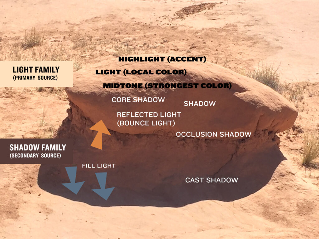
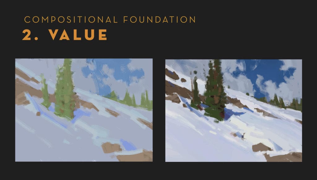
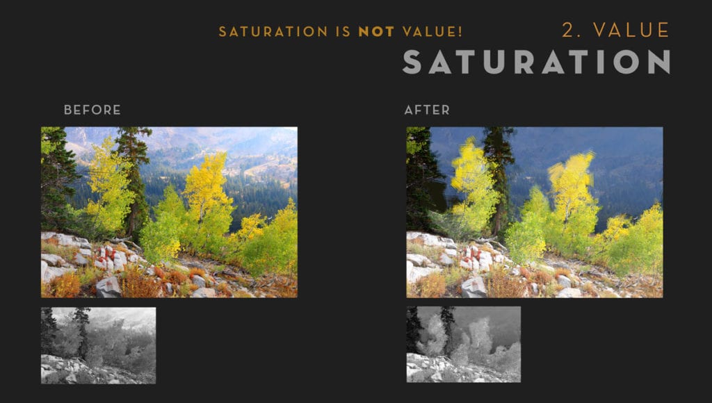
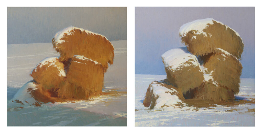
WHEN THERE IS A PLANE CHANGE THERE IS ALSO A CHANGE IN VALUE AND TEMPERATURE

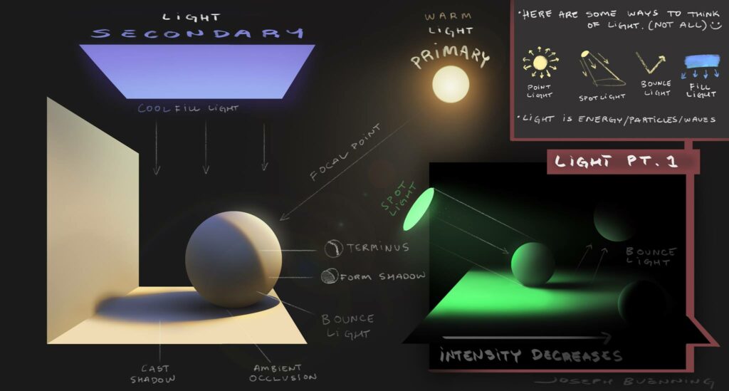
This seems obvious, but it can be both tricky to observe and easy to overstate. Sometimes the value change in a plane is so subtle that forms can be turned simply by changing color temperature.  The idea is that if a plane can be observed, then it’s because it’s being affected by light and thus has a value and temperature based on either a primary or secondary light source.  If that plane is less influenced by the primary light source, then it is by necessity being more influenced by the secondary light source (and vice versa).  A good visual to understand this relationship was created by Joseph Buenning:

Credit: Joseph Buenning

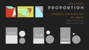
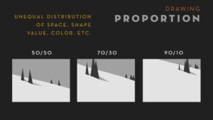
TYPICALLY, OBJECTS LOOK BETTER WHEN THERE IS UNEQUAL PROPORTION OF LIGHTING

Even if beautifully rendered, having equal amounts of light and dark in a painting is typically less dynamic and engaging then having one side of the value spectrum, or the other, dominate. (Granted, this may be more about composition, but it is important so I am including it in our discussion.)  For example, when I’m walking around a tree deciding what angle to paint, I usually avoid painting the tree with the shadow right down the middle. It’s about making a choice as to what is most engaging and committing to it. My students often hear me say this boiled-down version: “Mostly light with a little bit of dark, or mostly dark with a little bit of light”.  

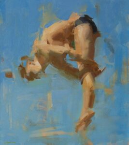
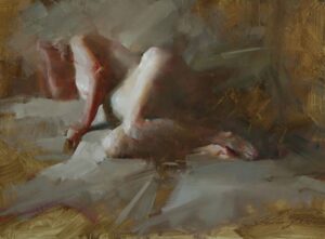
LIGHT AND TEXTURE ARE INTRINSICALLY LINKED

How light affects the appearance of an object generally depends on the material and texture of that object.  Generally, the smaller and more varied the planes of the object, the more light becomes fragmented as it bounces off, creating a matte appearance.  For example, a patch of dry grass is composed of many little parts which fragment the light, giving the grass a matte appearance. The opposite is true for a flat pane of glass, which has very little surface variation, and thus appears shiny.

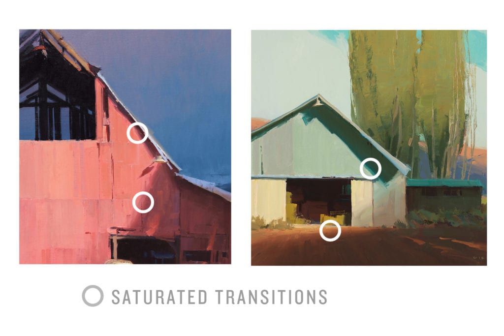
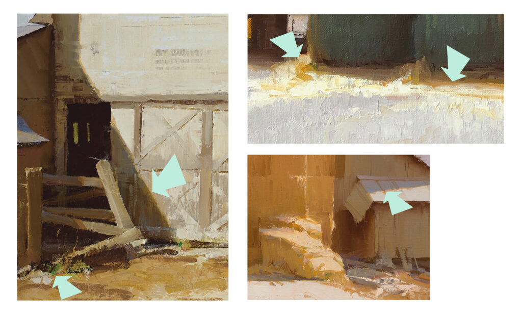
SATURATING UP THE EDGES OF A LIGHT AREA 

Doing this allows one to pull back the saturation within a light area while still maintaining a feeling of vividness.  This is especially helpful in areas that get really light, and due to the limitations of our paints, a choice between value and saturation must be made.

ALTERNATING OF TEMPERATURE 

This can give a painting rhythm and pleasing color.

ORANGE IS THE WARMEST COLOR, AND BLUE IS THE COOLEST  

The idea is that on the color wheel, either way that you shift away from Orange it cools down, and either way you go from Blue, it warms up.  The same is not true for any other color. (Special thanks to William Maughan for explaining this to me once). 

COLOR AND TEMPERATURE ARE RELATIVE AND BASED ON CONTEXT 

Thus, “warm light, cool shadows” doesn’t mean orange and blue, it means “warmer than” and “cooler than” what they are next to.  Understanding this key principle, was for me, the beginning of painting believable local color, the ability to differentiate of time-of-day, and subtle color harmony. It is the difference between having a rock that looks like it’s painted orange, and a rock that is being hit with warm light. 

THE MORE INTENSE THE LIGHT SOURCE, THE MORE INFLUENCE IT HAS OVER WHAT IT TOUCHES 

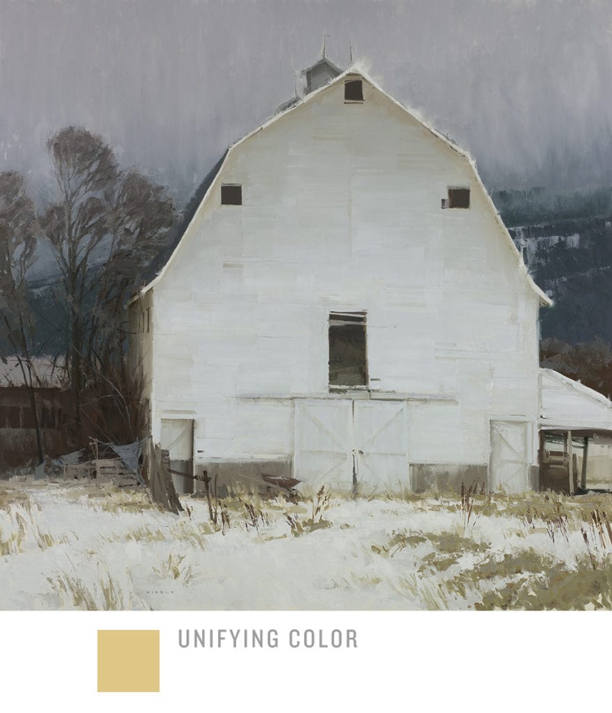
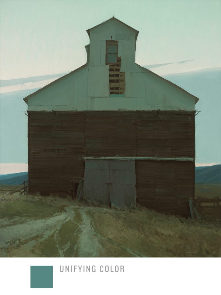
This is true until it eventually overwhelms a scene entirely. For example, an intense sunset is going to put a stronger wash of warmth and unifying temperature over everything than a mid-afternoon sun.

Haybales by David Dibble OPA
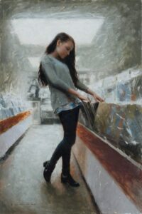
30″ x 30″ (each) – Oil

Well, there you have it. As I mentioned before, there are as many ways to think about light as there are people, and I love it when I see paintings which have approached light very differently than I have explained above (more emotionally, for example). As with most things, there is Truth, but also infinite variety and so many ways to create beauty. I wish you the best in this coming season of work, may the joy of Light fill your life!

-David Dibble OPA

Back to Basics: Edges

David Dibble OPA · Mar 18, 2019 · 3 Comments

“Break For Lunch” by David Dibble
60″ x 60″

Over the past two years I have done several posts on a progression of principles dealing with:

  1. Drawing
  2. Value
  3. Color
  4. Edges

For the final post in this four-part series, I will deal with the subject of Edges, which is really a discussion about paint application. You may have heard me or others talk before about “hard vs. soft skills”, and I would include edges in the ‘soft skill’ category along with other surface-quality related things like brushwork, texture, etc.  I include it in that category because it’s generally a secondary concern to the deeper issues of composition, value, and drawing that affect visual communication.  It’s kind of like the icing, not the cake.  (But oh, how icing can make or break a cake, right?!)  I would also go so far as to say that nowhere in a painting is the personality and temperament of an artist more visible than in their edge work and paint application.

People usually get really excited about edges because, like cake vs icing, edges are such an immediately visible part of a painting.  They are also one of easiest parts of a painting to imitate, and thus are often the first part of another artist’s style that will be internalized (often not consciously) as a developing artist searches for his or her style/voice.  If you look at the early work of any artist you will usually see that their paint application and edge work will more strongly reflect their influencers (or teachers) and then will diverge into a more unique style once they mature and decide who they are.

So that should be the first major caveat here: Edge treatment really comes down to preference, personality, and stylistic choice.

Edge treatment is also an important tool for emotional communication. If I were to describe a painting’s surface with words like: “Exciting” “Bold” “Aggressive” or “Intense” we would all have different ideas than if I were to say things such as “Calm” “Peaceful” or “Restful”.  There’s not one right way; I suppose I’m just saying: Match the delivery to the message.  Be purposeful.  And be true to yourself. 

Categories of Edge Handlers

There are a few major categories of edge handlers that I have observed (there are probably others, but we’ll just use these for now). I have chosen to use examples of four current artists employing these techniques:

  • Focal-Pointers: This style usually tries to create a focal point by an awareness of how we see naturally.  If you hold your arm out in front of you and make a fist, that fist-sized area is about the visible space that is in our focus at any given moment.  Of course, our mind fills in the blurry parts with information and our eyes dart around to constantly see other focused areas, so most of the time we’re not aware of the lack of clarity.  But as artists, we are constantly seeking to direct someone’s eye to an area in a painting that we want them to look.  So putting the focal point in sharp focus and then getting more vague/suggestive in detail and focus as we move away from that area can be a powerful way to create importance and dominance in a scene.  Photography has pushed this idea into more extreme places, but it can be seen far back into art history and is generally associated with naturalism in painting. 
Artist: Casey Childs, used with permission
  • De-Constructors:  Lots of variations on this, but it’s basically what the name suggests: Breaking down edges from their natural hard-edged state to create more interest.  Some use this technique to also create focal point, others to increase the feeling of light bouncing off an object, and some just love the way it livens up the subject/surface and is a means of communicating the emotional intent of a piece.  It is almost always seen as more contemporary.  Artists today employ it on every level from subtle pulled edges to intensive abstraction.
Artist: Dave Shevlino, used with permission
  • Lost-and-Founders: This can look a bit similar to deconstruction, but is different in that it is just a loosing of an edge into soft focus or similar value/color rather than actually breaking the form. 
Artist: Zhaoming Wu, used with permission
  • Hard-Edgers:  Once again, the name is obvious, and this is basically about creating hard edges and graphic shapes.  This has been done for centuries in situations requiring more graphic solutions such as mosaics and iconography, but it is a relative newcomer to gallery painting.  This style also has modernist roots, as many artists were seeking ways to separate from past naturalistic styles as well as reacting to the harshness of industrialization. Not all were that way, however, as many of the early Southwest artists used this style as means of reacting to the intensively graphic shapes of the Western landscape.
Artist: Glenn Dean, used with permission

Once again, there isn’t one right way, nor are these techniques mutually exclusive.  Most artists, including myself, incorporate elements of all four into their work to varying degrees.  But being conscious of what you’re doing and why is an important step to deeper visual communication.

A few final ideas/takeaways:

• Edges can help create focal point, but only in a supporting role.  Composition and contrast of value, shape, and saturation/color generally carry more weight in determining focal point.

• Understand focal area and use it to your advantage.  Don’t just flip the brush around willy-nilly because it feels fun and artistic.  Generally soft focus recedes and sharp focus advances.

• Often a good place to soften an edge is at the bulge of a shape.  Pull it tighter where edges come together because that is where things get anchored and carry a lot of visual weight/information. 

• Experiment.  Every once in awhile try a piece that is just for you in which you experiment with a completely different edge style.  Use different tools than you would normally use and get outside your comfort zone.

• Master copies: If you want to really grow in your ability to get more dynamic surface quality in your work, do some master copies of artists who you like.  Do multiple copies of different artists so that you don’t just end up being known as “that artist who looks like so-and-so”.

• Generally, my own rule on how much to work an edge comes into play when I step back and look at my piece.  If something is calling my attention that I don’t want to do so, then I lessen that attention, either by value, color, or softening the edge.

• Remember the old animation adage: “If it feels right, then it is right!”  This is to say that an edge treatment may not make complete sense logically but if it communicates the correct feeling or idea then it is justifiable.  Animation does this all the time with color and stylization.

• My general feeling about edges (and paint application in general) is that they should support the theme but not overtake it.  If gimmicky paint application is the first thing a viewer is bombarded with it can hinder the visual communication.

Hopefully something here is helpful! 

BACK TO BASICS: COLOR

David Dibble OPA · Sep 3, 2018 · Leave a Comment

In a fall post last year, I spoke about the importance of value in the hierarchy of a painting’s success. Color was the third item listed:
1. Drawing
2. Value
3. COLOR
4. Edges
In this post I’ll briefly share a few thoughts on color. Before anything gets discussed about color, let me give two caveats:
1. Though color delights and has huge emotional impact, it really is the frosting on the cake; value and drawing are the cake itself. Far too many people jump into color without a proper foundation.
2. There are as many ways to do color as there are people. There’s not one right way. There are a lot of ways to do it wrong, but while some prefer strong color, others tend towards muted. Both (and a lot in between) can be right.
There isn’t time in a blogpost to cover all of the basics of color, and no one wants to read pages of color blather anyway, so the following are a random smattering of thoughts on color that have made sense to me over time. They are in no particular order of importance, and are not absolutes:
• Find the dominant value shapes in a composition, and then look for the subtle changes of temperature within those shapes. Almost never does a plane not have a subtle temperature shift of some type (sorry for the double-negative). Look at a white wall sometime: it will be warmer with bounce-light towards the bottom, cooler towards the sky, really blue at the base where weeds or bushes block the bounce-light, etc. These subtle shifts are what give things life and reality.

• Color really is all about context, about what a color is next to. For example, sometimes making something feel more red is about making everything else less red, rather than trying to add more saturation.
• Limits help color harmony. More colors on a palette doesn’t equal better color in a painting.
• Blue is the coolest color, and orange (blue’s complement) is the warmest. The warmer a scene needs to be, the more it shifts to orange, not yellow or red.
• Mix a light violet (Ult./Aliz/White) and use it to turn forms as opposed to using gray (b/w) (I learned this from Lipking). This is dependent on light conditions of course. The idea is to basically use the sky color (the indirect fill light, not the direct light) to turn planes away from the light.

• Mixing a little bit of each of the primaries in each mixture will give things more naturalism and harmony (not in equal proportions, obviously). This isn’t always true, but surprisingly often it is.
• Nature has a lot more red in it than we think.
• Deep shadows are almost always warm. (i.e. the holes in rocks, the deepest parts of tree shadows, etc).
• Humans are mostly very warm objects covered with a translucent cool colored skin. The earth is that way too — a giant mineral ball with a scattering of cool colored plants. Thus the warmth is going to show through in the gaps.
• To subdue greens, use red or drag some pink subtly over the top.
• Use complements to control saturation (i.e. cut a green with a red, orange with blue, etc)
• For stronger color harmony, decide on a dominant color and mix it into everything. The choice of dominant color is based on the overall light temperature for the chosen time of day + the emotional mood I want to convey. For example, in a dusk scene perhaps I’ll mix in a little bluegreen with everything but desaturate it to be more emotionally subdued (see attached example).

• Use juxtaposed temperatures to give things excitement (i.e. color charm). I’ll often paint a base layer warmer, for example, and then drag slightly cooler paint over the top (after the base layer has dried).
• One color can be a strong accent, but not two, generally (or else they compete). For example, if the barn is red and you want to push that, don’t make the grass and sky the same strong saturation, or it will be too much. Again, choose the main actor and then everything else sings harmony to that.
• Mixing up piles of paint helps prevent the inevitable thinning down of already weak mixtures. Doing so ends up giving muddy color because we are often too lazy to mix up more and thus keep adding more thinner to stretch it.
• The strongest color is generally found in the mid-tone/transition– i.e. where a shadow turns into light. Pushing color transitions allows for more muted color in the light while increasing the feeling of brightness/intensity. This isn’t just a trick, it happens all the time in nature.

• Generally, on location, I need to add 10-20% more saturation so that it reads correctly once indoors (where it isn’t being blasted by natural light). Otherwise my paintings tend to feel dead once inside. This also helps me to have a clearer idea of what I saw once using it for reference later on.
• When confused about a color on location, just do a little ‘finger wedge’ to isolate it and break it down into the three basic components of Hue, Value, and Saturation and trust what you see. Some people use a cardboard or plastic viewfinder for this. I tend to lose those things so I just use my fingers.

• And finally, if you’ve read down this far, I’ll give you the real secret to improving color sense quickly: MASTER COPIES. When I give this assignment to students, I have them do the first few by printing out a physical photo of the painting they want to copy, and then dab bits of paint on it as they are doing the copy to exactly match the color. This trains the eye to get over preconceptions about color and usually helps them realize just how much red is in the environment and how muted most of nature really is. Sometimes I’ll do these in oil or gouache (or even in three-value grayscale), but it really is one of the only ways I know to try on someone else’s color sense and understand new ways of seeing. Do them small, do them quickly (set a timer), and do a lot of them.
Happy Painting!

BACK TO BASICS: VALUE

David Dibble OPA · Oct 30, 2017 · 9 Comments

In a spring post, I spoke about the importance of drawing in the hierarchy of a painting’s success. Value was the second item listed:
1. Drawing
2. VALUE
3. Color
4. Edges
In this post I’ll mention a few items regarding the importance of value as a foundational principle of strong work.

Drawing alone can’t fix a piece, the values have to be working. I fully acknowledge that we all know that correct values are important in painting, but the level to which I see even experienced painters (myself included) struggle with this convinces me of the need for constant awareness. As with so many things in life, it is the seemingly simplest things that are the most profound and the most challenging to master.
I break value down into three ideas:

1. SILHOUETTE:
Basically, it comes down to camouflage. Camouflage works because it scatters contrast and breaks up the silhouette of shapes. This makes sense intellectually, but even being aware of the effect, it takes a conscious effort to avoid it happening in artwork. Use this to your advantage and keep things clear in your focal point and more compressed value-wise in other areas.

2. THREE-VALUE STRUCTURE:
I can guarantee that nearly any painting I am moved by has a simplified value structure. Compressing and simplifying values to Dark, Medium, and Light will help communicate more clearly and feel more ‘real’. Again, it is seemingly straightforward, but it is surprisingly hard to do well. Thinking of these three distinctions in terms of ‘value families’ instead of only one value option may help.


3. SATURATION:

Saturation isn’t value, but we sure act like it is sometimes. We get sucked in by the color, and we get stupid. I do this all the time (ok, some of the time).
In this final example I’ve shown how I adjusted a piece of photo reference by pushing the surrounding value a little darker so as to read light-on-dark, as it was already leaning in that direction.

Usually, if a color is vibrating your eyes, you’ve got a value problem because the value and saturation are getting too close. This obviously can be used to your advantage in areas that you want to shimmer (such as a sky or mountain) by alternating temperatures slightly while keeping values close. But when you see this shimmer happening all around your main shapes you should pay attention to the alarm bells going off in your head because the shapes aren’t going to read well. Usually getting some distance from your canvas (i.e., across the room), and squinting is a good way to see what’s really going on.
Finally, to quote the great art teacher Leon Parson: “If there is a problem with your painting, it comes down to one of five things (Imagine him holding up a hand and counting down on fingers): value, value, value, value, or value.”
Happy Painting!

Back to Basics: Drawing

David Dibble OPA · Jan 9, 2017 · Leave a Comment

To be sound, a painting must be built on a compositional foundation in this order:

  1. Drawing
  2. Value
  3. Color
  4. Edges

If these get addressed in any other order, problems generally ensue.
Recently, the artist Jeremy Lipking was asked what advice he would give to painters, and he said:
“Draw more, that’s basically it. A lot of people feel like they know how to draw good enough already, but don’t trust yourself. Learn to draw better.”
With the fewest words and most pictures possible, I would like to briefly address the issue of drawing. In the following visual example, I have shown how fundamentally a piece can change when just the drawing is ignored. The values and color are the same in both pieces. The point is obvious:

Too often we divorce drawing from painting, and we do it to our own detriment. Drawing isn’t something we do in school once and then move on to the weightier matters of art; it is always the foundation. It’s also hard to do because it takes sustained and focused practice, which is why students usually, at least initially, copy the stroke quality and edges of other artists, because those things are more easily observed and imitated.
Another mistake we often make is to exclusively think of drawing as line-based. Line can certainly be a useful tool when drawing, because the instruments employed tend to create thinner marks, but really, drawing is about principles, not marks. Thus, I would like to address two principles of drawing: Proportion and Simplification of Form.

1. PROPORTION

There is a lot one could talk about here, but basically, it comes down to creating an unequal distribution of space in a piece. This is also the same for unequal proportions of value, color, and edges.


In these two examples, I have laid out how proportion of shapes, space, and value can affect a piece. No one of these proportion examples is correct or incorrect all the time, but it’s important to be aware of how and why you’re distributing/dividing space. When plein air painting, this is most often manifest in how we choose a horizon line and a focal point. We usually respond emotionally to everything we’re seeing in nature, and thus want to paint the sky, meadow, trees, and mountains all at once. But of course we can’t have a conversation with two people at once, so everything ends up feeling confused and passive. Next time you’re looking at a scene, try choosing one thing and letting that dominate. This is true within a shape as well (i.e. branches within a tree), which leads us to the next principle.

2. BASIC SHAPES

When I was young I saw how-to-draw books that broke things down into basic shapes and I thought they were lame. The drawings in those books didn’t seem to match the highly rendered pieces that I responded to and used as an aspirational goal. So, as most of us, I focused on rendering and shading and learned how to do it well. That was drawing to me.
But the more I learned post-high school, I started to see the pattern of truth re-emerge: Basic shapes REALLY ARE the way to draw. And it starts with training our eyes and minds to simplify down what we see to the most basic elements:


But it’s not enough to merely simplify something. In fact, getting to the essence of something is extremely difficult. It’s the same reason why writers often comment that a strong short story is harder to write than a novel. One can use fewer words in a conversation and be either concise or confusing. So, don’t just simplify down shapes, be descriptive with them.

To close, here is an example of how I made choices of proportion and simplification in a painting:

The reference image gives the basic information, but in a static way. I chose the elements I felt were most interesting and descriptive and tried to build a painting around the idea using unequal proportions and descriptive simplification of shapes, values, colors, and edges.
May this be a year of stronger drawing in all of our work.

  • Page 1
  • Page 2
  • Go to Next Page »

Footer

  • Home
  • About
    • Mission, Policies & Bylaws
    • Board of Directors
    • Presidential History
    • Frequently Asked Questions
    • History
    • OPA Staff
    • Contact Us
  • Membership Services
    • Member Login
    • Membership Information
    • State & Province Distribution For Regionals
    • Update Member Information
    • Membership Directory
    • Contact Membership Department
  • Events
    • Exhibitions
    • Online Showcase
    • Lunch and Learn
    • Virtual Museum Road Trip
    • Paint Outs
  • Resources
    • Brushstrokes Newsletters
    • Ship and Insure Info
    • Lunch & Learn Video Archives
    • Museum Road Trip Video Archives
  • Services
    • Sponsorship Opportunities
    • Scholarships
    • Critique Services
    • Workshops
    • Have A HeART Humanitarian Award
  • Online Store
  • Awardees
  • Blog
    • OPA Guest Bloggers
    • Blogger’s Agreement (PDF)
    • Comment Policy
    • Advertisement Opportunities

© 2025 OPA - Oil Painters of America · Design by Steck Insights Web Design Logo