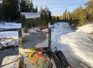
The thermometer in the car topped out at 104 degrees on the way home. I walked in the door after a frustrating morning out in the field feeling spent and exhausted. I had set the alarm for 4 a.m. so that I could get up and get out to my plein air destination right as the sun came up on this summer morning. But ignoring all my plans, Nature took her own course and decided to cast a few stray clouds on the horizon, just enough to obscure the sun and completely change the look of the scene I set out to paint. I tried to be patient and wait it out, but by the time the clouds passed, the sun’s angle was too high for the effect I wanted to paint. And after that it was just too dang hot to stay outside any longer. Argh. It’s times like this that I can’t help but think about the comfort of the studio and the quick snapshot I took of the scene when I drove past it last time I was in the area. And the question that so many people ask me: Why plein air? Why not stay in the studio and use those great photos you took? Why haul all your gear out there and stand in the heat/cold/wind/bugs just to do a little painting you could whip out in your climate-controlled studio in no time?
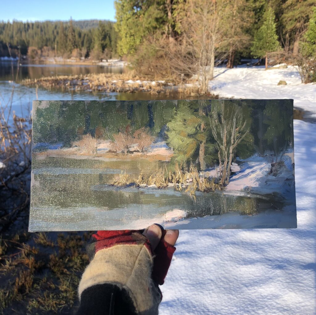
6″ x1 2″
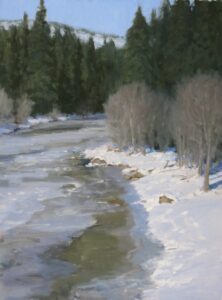
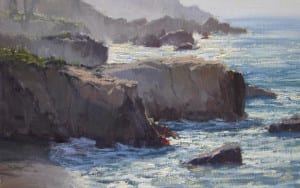
The answer is simple: no painting done from a photo can ever compare to the energy, immediacy, and sense of place that can come through in a plein air piece. Somehow the feel of the day, be it heat or cold or wind or just a perfectly pleasant morning, makes its way down the arm and off the brush and onto the canvas. I wish I knew how it happens so I could fake that quality in the studio, but that’s the magic of plein air. Our experience comes out on the canvas. All our senses help to create the painting, not just our vision. We hear the cows lowing, we feel the breeze, we smell the hay…..it’s all there on the canvas. Even my worst plein air pieces have some small element of that particular day in them. I feel like I’m recording a moment in history: it will never be July 28, 2023 at 6:00 in the morning ever again in the history of the world, but now I have a little bit of it on canvas. How exciting is that?
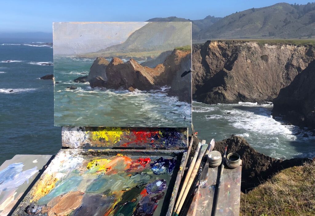
12″ x 16″
Not all of my paintings are completed on location, and I paint many larger works entirely in the studio. But every piece I paint has its genesis in plein air studies. Working solely from photos leaves my paintings looking flat and unexciting. I use my reference photos to jog my memory or to help me come up with better designs that I may have overlooked when I was on location. But I can’t tell you how many times I’ve discarded a studio painting because I didn’t have enough plein air information on the scene to make the painting look convincing and alive. All the answers are outside, and even the most frustrating day of plein airing brings a more acute awareness of the subtleties of painting from life. Those skills honed outside make the studio work that much easier and fun.
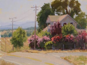
The day after that disappointing plein air excursion, I went out and hit it again…driving to that same spot and waiting for the sun. And this time it was perfect–all the things I love about painting outside came together in a couple of magic hours. I painted two quick studies for a larger studio piece I’ve had rattling around in my head for some time now, then rewarded myself with a loose, just-for-the-heck-of-it study on the way home. Standing in the shade of an oak tree with my dogs lounging around my feet, painting blooming oleander and distant hills with no expectations in mind except for the fun of putting paint on canvas: that’s just about as good as it gets. And that’s why I plein air.