• Skip to primary navigation
  • Skip to main content
  • Skip to footer
  • Help Desk
  • My Account

OPA - Oil Painters of America

Dedicated to the preservation of representational art

  • Home
  • About
    • Mission, Policies & Bylaws
    • Board of Directors
    • Presidential History
    • Frequently Asked Questions
    • History
    • Contact Us
  • Membership Services
    • Member Login
    • Membership Information
    • State & Province Distribution For Regionals
    • Update Member Information
    • Membership Directory
    • Contact Membership Department
  • Events
    • Exhibitions
    • Online Showcase
    • Lunch and Learn
    • Virtual Museum Road Trip
    • Paint Outs
  • Resources
    • Brushstrokes Newsletters
    • Ship and Insure Info
    • Lunch & Learn Video Archives
    • Museum Road Trip Video Archives
  • Services
    • Sponsorship Opportunities
    • Scholarships
    • Critique Services
    • Workshops
    • Art Opportunities
    • Non-OPA Call For Entry
    • Have A HeART Humanitarian Award
  • Online Store
  • Awardees
    • Legacy Awards
  • Blog
    • OPA Guest Bloggers
    • Blogger’s Agreement (PDF)
    • Comment Policy
    • Advertisement Opportunities
  • Show Search
Hide Search

Kim Carlton

Drawing the Fine Line

Kim Carlton · Jul 25, 2016 · 2 Comments

"Hill Country Creek, a study" by Kim Carlton
“Hill Country Creek, a study” 8×10

I have recently been exploring boundaries and have found some beautiful lines that are helping me to be a more thoughtful, loving artist. I’m mostly unloving toward myself, as the creator of my art; but I’m going to change that. I think that “unlove” of every sort will find its way to the canvas and spread “unbeauty” in a world that looks to artists for something higher. To help myself to grow in a positive way, I’m staking out better boundary lines between poetry and prose in my work, and art and life in my mind.

To introduce the idea of poetry and prose, I’ll share the thoughts of a writer, Ranier Maria Rilke, who wrote “Letters to a Young Poet”:
“In writing poetry, one is always aided and even carried away by the rhythm of exterior things; for the lyric cadence is that of nature: of the waters, the wind, the night. But to write rhythmic prose one must go deep into oneself and find the anonymous and multiple rhythm of the blood. Prose needs to be built like a cathedral; there one is truly without a name, without ambition, without help: on scaffoldings, alone with one’s consciousness.”
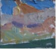
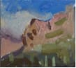
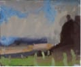
I think Rilke has drawn a beautiful, descriptive line between plein air/life study work (poetry), and the personal and important work that happens alone in the studio (prose). For us, plein air work and life study are very certainly inward-moving rhythms of exterior things; but as told in pigment instead of verse. We see and experience what is there; we learn from it and respond to it, organizing and recording the experience on the canvas. The beauty of alla prima “poetry” is that it conveys our actual experience to another person, so that they can share in—or even be shown how to see—what we have seen. It is a picture from our outside-in, not our inside-out. The more we engage in this activity, the more enabled we become to show the wonder of creation. Our lyric cadence in the field is just the same as the poets’.

Head Study from Life

Eventually, the stimulation and inspiration that we experience as faithful reporters of what we see will cause in us a longing to express something that can’t yet be seen, that can’t be copied down from exterior things; something that is born from within our soul. This place of creation in an artist is not related to sales or art events or other artists. It’s deep. It is not conformed to the things of the outside world, but rather conforms those things to its own expression.

The whole painting may be carefully composed and drawn out before a single model is hired or reference photo found. Our “cathedral canvas” takes time, just as rhythmic prose takes time for the writer.
The reason I had to draw lines around these two is because they are two ways of working, and they result in two different products. I have been mean to myself in the past by expecting a quick cathedral. A more productive way to approach painting is to decide what your purpose is and then disallow everything that does not help fulfill that purpose. Do not be thinking of what award you’ll probably win or how much you might get for a piece while you are in your studio! That’s shallow and external and will keep you from going where you need to go, which is deep and internal. Do not expect some profound and epic masterpiece in a two hour on-the-spot painting either! You will draw your skills of observation away from the moment. In the field means in the moment. The only way to honestly and kindly explore these two types of painting is to draw and respect boundary lines and recognize when you are about to cross them.
Everything I ever learn in art turns out to be a good life-lesson for me. Lines and edges are very familiar territory to the visual artist, so one would think we’d be super good at lines and edges in life. I have found the reverse to be true with most of my artist friends, regardless of their age, gender, or level of accomplishment. What I see instead is a struggle to balance our life so that we are able to produce art. I think it’s akin to what Rilke said about prose: there is no one pre-structured way to live our life; everyone has to go deep into their own soul and spirit to learn where the boundary lines are for them.
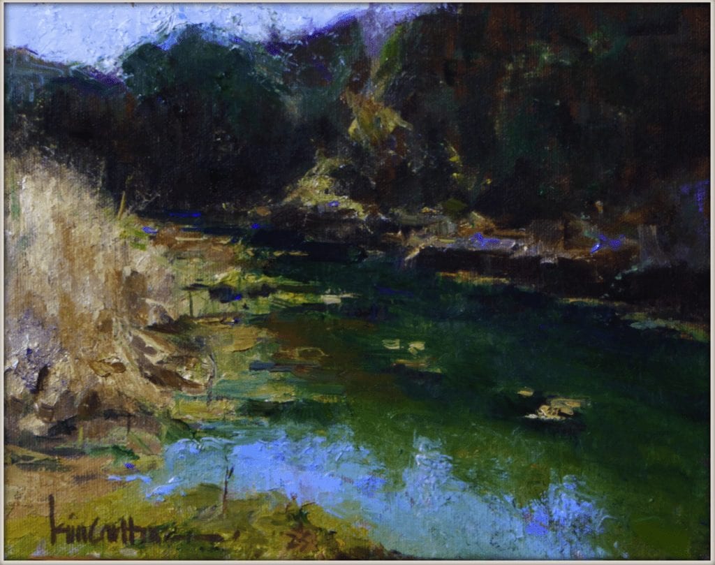
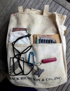
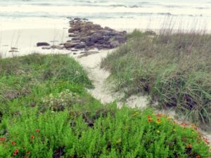
As for myself, I normally have to use a sort of Phone-a-Friend Lifeline to find things out. Because I’m so close to it, I often can’t see the forest for the trees, which is exactly how I came to see the life-connection to this question of boundary lines in painting. I was up in the mountains, walking through the trees. I’d brought my painting gear and had some high expectations because this was new and beautiful territory. The first day I was there, I just explored. I had my camera but mostly I was just looking. I walked around this beautiful place for a long time; like maybe eight hours. I was pretty sure that where I was walking, no one had ever walked before, which gave me a funny thrill. There were new bird and critter sounds, an eagle and some hawks, wonderful marbled and weird-shaped rocks in the path and little flowers, bright leaves and puffy clouds.

Detail of Studio Work in Progress

I was alone as I walked, so I sang and skipped and even fell down a couple of times. I was smiling so hard all day that my cheeks hurt when I got back. But dang it! I hadn’t painted. When asked if I’d gotten anything that day, I reported that I had been scouting and had found some good prospects for the next day. But then the next day, a new and irresistible path lured me off course and there was another wonderful day of laughing out loud, climbing on and collecting rocks, getting my feet wet and figuring out which bird was singing this one song. But dang it! I hadn’t even gotten my gear unpacked. On day three, I got my gear out first thing, so I wouldn’t accidentally be wooed into fairyland again. I did not paint well. Two mediocre paintings and it was now the middle of the afternoon, so I snuck away to see if I could get to this one place that I’d seen from afar the day before.

That night, my husband asked how I’d done and I had to rat myself out. I had failed, three days in a row. (He’s my favorite lifeline—because he knows me so well, he can cut me to the quick with the right answer, delivered in just the right way.) He said, “No, seeing that as time wasted is looking at it all wrong. You are resting your mind, exercising your body, and allowing your soul to be filled up with beauty. Don’t punish yourself for that; it’ll negate the experience, and then it’s a failure.”
Artists have to allow themselves to be filled up so that they have something of substance to give. The days of joyous fellowshipping with this new place was the beginning of a conversation that would continue on canvas. I do see that it is much more respectful and real to step into a place and allow it reveal itself in stages, as you would in any new relationship. Robert Genn used to advocate sitting in a place for at least 30 minutes before even getting a pencil out, so you would know what to say about it. So clearly, for me, this place between art and life was in need of some better boundary lines. Life is to be lived well. Art is an expression of a well-lived life. If it gets muddled up and becomes my life, it will not be as rich or deep or lovely.
Heretofore, the boundary line between painting and living seemed obvious. You create art over here, and you do everything else over there. Seriously, “everything else” in my life has been pushed past that line into the “Waste of My Time” category. Not painting? Not doing your job! The line around my art life was small and heavily guarded, and the rest of my life was always a threat to its safety. But I’m now beginning to see that my painting life has to have a much bigger line around it. It has to have a reservoir to draw from and should include books and talks and silence. And no guilt. It’s a fine line, but we have to draw it. Otherwise, we will cut off the source of the quality in our work in order just to have the quantity; just the work.
Last year was my Year of Painting Fast. So far, this year is my year of finding the Power of Peace. I’m coming to see that there is a great energy in quietness, and that wonderful art can come from a restful, joyous place. Just like any good painting: there is activity and then there is a place for the eye to rest; a balance. But underneath the paint, there are fine lines of thoughtful structure, helping us to know when to turn and when stop.

Detail of Tulip Tangent 18x24
Detail of Tulip Tangent 18×24

At the end of Rilke’s book, there is an excerpt from a letter that I’ll close with:
“…the using of strength in a certain sense is always increase of strength also; for fundamentally we have to do only with a wide cycle: all strength that we give away comes over us again, experienced and altered. Thus it is in prayer. And what is there, truly done, that is not prayer?”
And another thing, with regard to the recreation idea. There are here, amid this realm of fields, spots of dark ploughed land. They are empty, and yet lie they here as though the bright culms round about them were there for their sakes, rows of fencing for their protection. I asked what was doing with these dark acres. They told me: c’est de la terre en repos. So lovely, you see, can rest be, and so it looks alongside work. Not disquieting, but so that one gathers a deep confidence and the feel of a big time…

A Few of My Favorite Things

Kim Carlton · Jan 31, 2016 · Leave a Comment

Tool Bag
It’s not that I’m unimpressed by raindrops on roses or whiskers on kittens. It’s just that my favorite things are the things that help me simplify and strengthen my paintings. I have a handy bag that carries a few of my favorite things, stowed together with my painting gear in my backpack. In the back pocket of it are my idea-catchers and planning tools, kept handy for sketching out inspiration before I break out and set up my painting gear. In the right pocket, you can see my moleskine sketchbook and drawing tools. In the left pocket is my super-awesome MVP.
Developed by Peggi Kroll Roberts, the MVP is a tool that consists of a Mirror, a Value viewer, and a painting Planner. They come in a protective bag and are attached to a lanyard, which allows you to have the MVP around your neck while you are out in the field.

My Favorite Things
My Favorite Things
The Planner
The Planner
Value & Planner
Value & Planner

Presented in a 9×12 format, the planner is outlined in black to help you see the subject in isolation. The grid allows you to plan strategic “sweet spots” in a balanced, well-composed painting. It is helpful to have the same ratio (9×12) plotted out on page or canvas for ease of transfer. I travel with a variety of canvases, but normally use 8×10 or 9×12 as they are easy sizes for scaling up in the studio.
The way I normally use my planner is sandwiched together with the value viewer. This allows me to very quickly see likely candidates for a painting, as these two work as a team to show the simplicity and strength of good light and shadow patterns.
Mirror
The mirror is a good tool to affirm a composition choice and will also come in very handy later, when the painting is in progress. Looking at the subject upside-down in the mirror or viewing the painting and the subject together in the mirror will miraculously show the painter where weaknesses are. Also—and this is extra—it can be used to signal the search helicopter if you get lost, and let you check to make sure you look fabulous before they come to your rescue! I need to remember to tell Peggi that she should include that in the write-up (note to self).
You will see, when you begin viewing the world through the dark red Plexiglas, how easy it is to create your perfect notan (portrait and figurative painters may want to try a green viewer, but the red viewer is perfect for the landscape painter).
Subject
Subject
Subject thru Value Viewer

This is a scene from the east coast of Florida, made into an abstract design just by applying the red filter!
The next step will be to plan out a painting, either directly on canvas or—in my case here—in a sketchbook.
Sketch
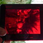
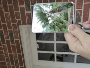
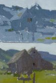
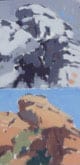
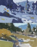
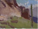
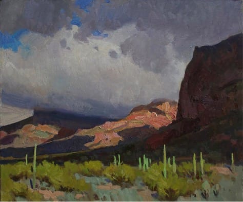
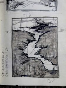
The MVP makes capturing the essence of a rapidly-changing scene much easier by literally framing and filtering it down to a wonderful design. I spent about an hour on the whole plan, including the strategy sketch and the transfer to my canvas. It’s amazing how much more smoothly the painting process goes when you have confidence in the plan and structure that underlies it. Having the right tools to simplify our job will go a long way toward the creation of stronger paintings.
If you are interested in learning more about the MVP and the other great tools that Ray and Peggi Kroll Roberts have created for artists, visit them at www.krollroberts.com and click on the Shop tab. Work smarter, not harder, so you can just paint your joy!

The Pace Race

Kim Carlton · Jul 13, 2015 · 40 Comments

Like any vital, living thing, the art world is ever evolving. In the distant past, paintings were accomplished in the studio by painstaking application of layers of paint over a period of sometimes years. In the not-so-distant past, the trend toward alla prima painting increased the expectation of completing a piece in a much shorter time span. In the present day, time-lapse videography has made it possible to witness a 3-hour painting demonstration in eight or ten minutes! Now, there’s a wicked thing in my head that tells me I’m incompetent if I can’t paint a decent demo in eight or ten minutes. Not literally but, well, almost literally. The truth is, I’m a slow painter. I want to be a fast painter and this has steadily stolen my focus away from the simple joy of painting. This year I learned that I’m not alone; there’s a bunch of us trying to get faster. It’s a painters’ version of anorexia: you see the magazine cover of the perfect quick-draw painting and look at yourself to see if you’re good enough. You’re not good enough in your eyes so you start starving yourself and exercising and self-destructing, when all along you really were good enough; you were just different! Maybe you need someone to tell you that. Maybe I do, too.
At the end of last year, I decided that I wasn’t fast enough to be good enough to call myself a plein air painter. I set my goals for this year, and my Number One Goal was to learn to be a really fast landscape painter. My training heretofore was exclusively studio and mostly portrait-oriented, and while I’d been painting outdoors for more than a decade (and frankly loving it with an unadulterated love), I’d never actually been taught how to paint en plein air. My plein air works were, in the words of Robert Genn, “unabashed two-steppers.” I would paint as much as I could on site and then finish the rest later, using my mixes, my start, and my reference photos. I hadn’t entered any plein air events because of that, and I have felt more and more ashamed about it. Well, that was all about to change because I signed up for two workshops at the beginning of this year; one with Ray Roberts and the other with Jill Carver.
Both of these great artists and great teachers asked their students what they hoped to gain from the respective workshops and the answers were pretty much the same: we all wanted to learn to think and paint faster in the field: to come to a place and be able to compose a finished painting in our head while we were setting up, mentally Photoshop trees and rocks and rivers in and out and all around a canvas, capture the essence of it before the light changed, be able then to slap a frame on it and win a gold medal. That’s what we all hoped to learn.
Here’s what we all did learn: sometimes what you think you need to learn is different from what you actually need to learn. The gentle admonition from them was, it’s not about speed: that’s asking the wrong question. Jill suggested that there would never be an entry in an art book saying, “Painted between 2:00 and 3:45 p.m., whilst competing against so-and-so.” No, the painting must forever speak for itself and if you can’t paint it well going super fast, slow down. Neither of these painters comes to a landscape with an expectation of coming away with some kind of slap-dash masterpiece. Roberts’ approach was to consider plein air work as fact-finding and idea-catching, making numerous small sketches with an eye toward a studio piece. And Carver’s strategy was to make it less of a hunting expedition (her words) in which you “bag a prize,” and more of a private conversation with a friend. Her approach was very slow and polite; sketching ideas in a book with a sharpie and making notes before her kit was ever unpacked for painting. When she does get her gear out, she often divides up the canvas into two or four sections upon which to paint her response to the landscape. I’ll tell you how this affected me: I felt liberated. Liberated from my own expectations and free to be myself out there.
When I watch great painters paint, they do not ever seem to be in a hurry. Even if they accomplish a painting in a short time-span, they are very deliberate in their application. I felt all warm and tingly when I learned that my hero, John Singer Sargent, might paint and scrape a head sixteen times, so as to ultimately leave a fresh mark that seemed quick and effortless. But even before that, he’d done dozens of sketches. Seeing the plein air studies of another hero, Joaquin Sorolla, was exciting because they were all so tiny and jotty, like the shorthand notes of a writer! When I shared with my husband my new goal to be a fast painter, he said, “You don’t do anything fast! Why would you want to do the thing you love the most fast?” None of these things will sink very far into a hard head.
When Jill Carver paints a place, she has first loved it. Her painting is a poem about it. She has already sketched different versions of it and maybe painted several studies before she approaches the Painting Proper. When she set up for one demo, she situated her canvas so that her back was toward the subject. By doing this, she could only paint whatever she remembered once she was facing the canvas. This is an old Robert Henri trick. It requires a bit of your soul. But it takes a little longer.
Here are some studies done by Jill, exploring the number of values needed to convey a scene, preferring to keep it between three and five. This is one of the ways she helps her students to deconstruct and tune into the scene. Note the way she matches the colors to the values:


While we were working outside, her repeated, disarmingly funny, admonition was, “Paint what you see and keep it simple: after all, this is not rocket surgery.” She encouraged her students to relax and let the scene choose us, let it reveal itself to us; that requires calm and quietude. It is much more courteous and respectful than the smash-and-grab technique that I thought I wanted to learn.
Ray Roberts was working with rapidly changing light because, as luck would have it, we had rare weather blowing through the desert while we were out there, including riotous thunder storms! It was exhilarating to watch him work; he engaged the constantly changing light by constantly changing canvases! I know I would have decided to stay in the studio if the weather were unpredictable like that, but he taught us to move with the weather, to let it speak to us and take dictation so we could report our experience later. Our steno pad was the canvas, 8×10’s quartered, so that we could make four 4×5 inch paintings of the changing light. If he ran out of spaces, he tossed one canvas panel to the ground and picked up another, never chasing the light in one piece, but letting every change have its own space to speak. And again, he wasn’t slapping on the paint at 90 miles an hour; he was brief and deliberate, making exact notes that would bring a flood of memories back in the studio. His experience in the field was respectful and joyous, and that was conveyed in both the sketches and in the studio painting he did from them.
Here are some of the field studies done by Ray, and the studio painting that sprang from them:

Ray-5
Notice how pieces of the studies found their way into the final painting, which truly captured the spirit of the experience, even though that single scene only existed in his mind’s eye.
Having been a runner, I know that there are some people who are good long-distance marathon runners, and others who are good short-distance sprinters; there are very few people who are good at both. There are master artists who enjoy the quiet, drawn-out pace of a marathon painting, working weeks or months (or years!) on a single piece, but who could not do a one-hour demo in front of an audience to save their own life. Then there are master artists who absolutely love the adrenaline-fueled fast pace of the quick-draw events and are astonishing in their ability to nail a sketch in one or two hours, but who could not spend any more time than that without going stir-crazy, and would never re-enter a painting that’s been “finished.” But! Sprinters do run long-distances when they are in training, and distance runners do train by running sprints for the same reason: it makes them better at what they’re good at.
So there are sprinter-painters who start out with a bang and run full-tilt to the tape, and there are marathon-painters, who have a relaxed stride and who pace themselves to endure a long run. But here’s the thing: painting is not a performance art. Jill’s right: the thing that will outlast us is the body of work we leave here. Focusing on speed, even if I secretly still want to paint fast, is focusing on the wrong thing. Use speed-painting as an exercise, not as a standard of excellence. Paint a lot! Remember, a million miles of canvas is one of the things it takes to make a great painter. And the more a person paints, the better a person learns to say more with less. It will happen at some point that it will take less time to do that well.
Ray Roberts and Jill Carver are able to produce masterpieces in the studio that are gleaned from their work in the field. They are also able to produce truly inspired pieces in the field because they are out there working in all weather, day in and day out: they are good because they train and hone their gift.
So now that the Year of Painting Fast is half over, I’m reassessing. Sometimes a person has to readjust their goals in order to be true to their purpose. My real purpose is to be the best artist I can be, and maybe I, personally, can’t do that by painting fast. We who call ourselves artists have chosen to run a road that is not easy, but we love it and that’s why we’re here. Applaud the sprinters, cheer the marathon runners, and enjoy your own journey. Press in happily and hard to the thing that makes your heart skip and sing when you paint. There are a lot of things going on out there but we really don’t have to do them all; we’re not failures if we don’t do them all. We need to just do our best thing in the very best way we can. Getting to do what you love is such a rare thing. We shouldn’t ruin it by wishing we could do something else. I think the thing I was starting to lose in my quest for quickness was the experience of just enjoying spending that time doing what I Iove to do! That old adage, “haste makes waste,” is an old adage for a good reason: it’s true! Haste could waste the thing that made you start on this road to begin with: the joy of painting.
So I’m adjusting my sights for the second half of this year: the point is the product, not the pace; this is not a race! I’m going to write a card to stick to my Soltek: “Haste Makes Waste~ Embrace Your Pace.” Even if I still feel the need for speed!
Featured-Image-OPA-kim-carlton
Kim Carlton
7×11
“Painted Between 2 & 3:45 Whilst Competing Against Kim Carlton”

The Value of Color Charts

Kim Carlton · Dec 1, 2014 · 11 Comments

My advice—my plea to you—is to do the charts for your sake. (Do not use mine.) The charts are not a sure-fire gimmick guaranteed to make you a color wizard, but they are the best way I know of to understand your pigments and enter the study of color on sound footing. Take your time; don’t be in a rush just to get them done. Stay alert and see what is happening, not only on your palette, but within yourself. Impatience will well up, so will exasperation as you make mistakes or struggle with decisions about the right color and value, but I urge you to stick with it. In a way, the charts are intended to be somewhat agonizing so that you will develop the patience and self-control so necessary in painting. It should be like an initiation ritual before what is to come, so you may endure it without giving up.
Richard Schmid, Alla Prima
I begin with this quote because, seriously, anything that Richard Schmid pleads with his readers to do is worth consideration. The discipline of charting color might be compared to learning to read music or understanding grammar. I know some great musicians who play “by ear,” and writers who know nothing about the rules of grammar, but they will admit that they wish they had that academic knowledge in their hip pocket. Color charts are like that. You may not learn everything possible about color by doing them, but you will have, as Richard said, “sound footing” to begin your journey. You will also have confidence, knowing you’ve done your work.
The purpose of the charts is to show how each color on your palette relates to all the other colors there. You will want a chart for every color, to see how that particular color interacts with one other color, and then how their offspring look when mixed with white. Each chart will show the influence of the dominant color on the other colors. You will be able to tell by looking which color is represented in the chart; your red chart’s red/yellow will not look like your yellow chart’s yellow/red. You will add white as you go down, tinting each color until it’s all but white; across the bottom, all the lightest lights should be the same value. Most of the other colors start out at different places on the value scale, so the other rows will have a variety of values. Even though you can tell by looking, it’s still a good idea to label all the columns.
Here’s what you will need: ¼ inch masking tape (easiest to buy online; costs about $2.00), a pencil and ruler, one or two small palette knives (the second one can scrape the first, you won’t have to wash brushes between each color, and your squares will be pretty), and of course your paints, palette, paper towels and canvas. When I am teaching color, I start with four colors (plus white) in order to reveal the unlimited potential of a limited palette. This number of colors fortuitously fits perfectly on a piece of 14×11 canvas, which can be bought in tablets.

Materials

Charts.Pic#1.Materials.materialsHere’s how you prepare your canvas: It’s easier to work on a tabletop for this than using an easel. Tape the canvas to a board to allow yourself freedom to spin the chart around as you fill the squares. Measure out a quarter of an inch for the width of the tape, then an inch for each square, and repeat for every color. Make tic marks with your pencil, rather than lines, to indicate placement. Put the quarter-inch tape between the marks and leave a tag hanging off the end for you to pull when you’re done. Place all vertical tapes first, followed by all horizontal tapes. You will carefully remove the tape as soon as you are done with each chart (don’t wait till later!); it is easy to pull the horizontals off first, then the verticals. Now write the initials of the colors you will be charting. For example, the colors I use for the limited palette are Transparent Oxide Brown, Ultramarine Blue, Cadmium Red, and Cadmium Yellow Pale: TOB, U, CR, and CY. The Transparent Oxide Brown chart will have these headings on the columns: TOB, TOB/U, TOB/CR, and TOB/CY. Note that the size of your chart/canvas will be determined by the numbers of colors and values you want to explore. For the limited palette, I chose four colors and five value steps, so I will have four across and five down, plus some space between each chart. Measure it out accordingly.

Prepared Canvas

image2Here’s how you create your chart: Understand that this is an exercise for your eyes, mind, body, and soul. It will demand your full involvement in a most personal way as you begin a real dialog with your colors. Give yourself lots of latitude, grace, and hours.
The order that the colors are laid out on your charts is a personal choice. Some people want the order of colors to be the same on every chart; others prefer that the dominant color leads on every chart and the rest fall in behind it. How you lay your colors out is a choice you make based on how you want to see your colors. To me, it makes sense to start with the dominant color, so I can see at a glance which chart it is. Then the other colors follow according to their value, so that whether reading across or down, they start with dark and move toward light. Lay yours out in the order that makes sense to you.
Allot a nice big pile of the color you’re charting on the palette and another pile of white. Your first color is always the easiest, as you only have the one color, plus white. The square you fill first is the top left one— pure, untinted, unmixed color. The second one you’ll mix is the last box on the column; it is nearly white. To mix that, start with a pile of white and add just the tiniest spot of color to it. All the bottom boxes on your chart will be the same value: nearly white. The value of the other squares will be determined by the value of your master color.
You will be working one column at a time, taking five value steps with each color. The first column of each chart is the master color’s value scale. All the other columns will show this master color’s effect on the rest of the palette’s colors. Here is the first column for the limited palette chart:

First Color Column

image3When you have your first and last colors laid in, you will mix the value that is right in the middle of those two. Mix it and hold it on your knife over the two color values on your chart and ask yourself which it favors more, the pure color or the lightest tint. This is when your colors really start talking to you. When you finally mix a color value that favors neither, you have your middle square. The last two colors are halfway between each of these: one is halfway between pure color and middle color value, the other is between middle color value and lightest possible value.
The next column will be a little bit more complicated, as you are adding another whole dimension: you’re making not only value decisions but also color decisions, as you mix color columns that show two colors in which one dominates the other. It should be clear on each chart that you’re showing a certain color as it’s influenced by other colors. You then create the tint steps in the value scale for each.

First Chart Before and After

As you are working, remember that this is your chart and no one is timing or grading you. Let it be a joyous experience, with not one nerve wracked and nary a tear shed. Scrape your mistakes and don’t worry about the squares; your tape is in place to keep you tidy. You will be so surprised when you pull the tape off and see how beautiful your work looks. When I first finished mine, I put them on my studio wall because it was just so satisfying to look at them; like a lovely rainbow of harmonies. But they had to come down. They are a tool, and just like the tools on the pegboard, they have another use besides looking pretty on the wall. I use them for teaching and for note-taking in the field. A good field sketch combined with informed color notes is invaluable back in the studio.

Limited Palette Color Chart

When you’re finished with all your color charts, you may want to varnish them after a few months to ensure their long life. You can keep them with you as loose canvas pieces or cut them out, hole-punch one side of them and put them in a binder, or you can just keep them in transparent sleeves. When you want to add a new color to your palette, it is good practice to create a new chart for it, to see if it can play nicely with your other colors. Some very nice colors are too weak or too aggressive to fit in with the family. Subjecting them to the scrutiny of the chart is a quick qualifier for contenders.
image6It’s easy to see how your mind and eyes are challenged by the creation of color charts, as all the measuring is intellectual and visual. If you try to literally measure part-for-part, you will not have an accurate chart because every pigment has a different saturating power. So, your mind and eyes are about to get smarter. You will not find how it challenges your body until you start the process. You will then be amazed at how physically demanding this assignment is. This isn’t for sissies. And as for the soul… ultimately your choices, as objective as this process seems, will be determined by how you feel. It can’t be taught. You will only get it when you do it. This is why charts must be done and not just seen. It’s also why the color charts vary between different artists, and why Richard Schmid can say that he learns something new every time he makes a new set. He is still making new charts for himself! And since he’s been painting longer than a lot of us have been breathing, perhaps it really is a worthwhile thing to try.

Footer

  • Home
  • About
    • Mission, Policies & Bylaws
    • Board of Directors
    • Presidential History
    • Frequently Asked Questions
    • History
    • Contact Us
  • Membership Services
    • Member Login
    • Membership Information
    • State & Province Distribution For Regionals
    • Update Member Information
    • Membership Directory
    • Contact Membership Department
  • Events
    • Exhibitions
    • Online Showcase
    • Lunch and Learn
    • Virtual Museum Road Trip
    • Paint Outs
  • Resources
    • Brushstrokes Newsletters
    • Ship and Insure Info
    • Lunch & Learn Video Archives
    • Museum Road Trip Video Archives
  • Services
    • Sponsorship Opportunities
    • Scholarships
    • Critique Services
    • Workshops
    • Art Opportunities
    • Non-OPA Call For Entry
    • Have A HeART Humanitarian Award
  • Online Store
  • Awardees
    • Legacy Awards
  • Blog
    • OPA Guest Bloggers
    • Blogger’s Agreement (PDF)
    • Comment Policy
    • Advertisement Opportunities

© 2023 OPA - Oil Painters of America · Design by Steck Insights Web Design Logo