• Skip to primary navigation
  • Skip to main content
  • Skip to footer
  • Help Desk
  • My Account

OPA - Oil Painters of America

Dedicated to the preservation of representational art

  • Home
  • About
    • Mission, Policies & Bylaws
    • Board of Directors
    • Presidential History
    • Frequently Asked Questions
    • History
    • OPA Staff
    • Contact Us
  • Membership Services
    • Member Login
    • Membership Information
    • State & Province Distribution For Regionals
    • Update Member Information
    • Membership Directory
    • Contact Membership Department
  • Events
    • Exhibitions
    • Online Showcase
    • Lunch and Learn
    • Virtual Museum Road Trip
    • Paint Outs
  • Resources
    • Brushstrokes Newsletters
    • Ship and Insure Info
    • Lunch & Learn Video Archives
    • Museum Road Trip Video Archives
  • Services
    • Sponsorship Opportunities
    • Scholarships
    • Critique Services
    • Workshops
    • Have A HeART Humanitarian Award
  • Online Store
  • Awardees
  • Blog
    • OPA Guest Bloggers
    • Blogger’s Agreement (PDF)
    • Comment Policy
    • Advertisement Opportunities
  • Show Search
Hide Search

Nancy Boren OPA

Make Your Own Marks

Nancy Boren OPA · Mar 25, 2024 · 5 Comments

As artists, we always desire that our work stands out. One of the key ingredients in a painting is mark making, your individual way of applying the paint.  So why not help that process of unique mark making along and actually make a tool to use that no one else in the world will have? I have found that mini relief printing blocks (or I guess you could call them original rubber stamps) are a great help.

There are many repetitive patterns I have found myself painting, sometimes occurring on fabric or sometimes I just want the repetition to create a unified image. As I have worked on those pieces, I’ve pondered different ways to create those repeating shapes since my freehand painting leaves something to be desired in the area of accuracy and painting small shapes over and over can get tedious.  I tried stencils cut from card stock and thin cardboard but they didn’t hold up very long or clean up very well when using oil paint.

In college, and off and on through the years, I have enjoyed various types of printmaking, including linoleum block printing, which I finally decided to incorporate in a small way into my oil paintings. For a long time, I have used a chop (a small carved seal or impressed design) along with my signature on paintings, so it wasn’t much of a leap to add other impressed marks. When the painting idea calls for it I carve designs out of eraser-like soft blocks which cut almost like butter. From 1/4” to 3/8” thick, they come up to one-foot square and are available at online art suppliers. Linoleum cutting tools work well, although I usually just use an X-Acto knife. 

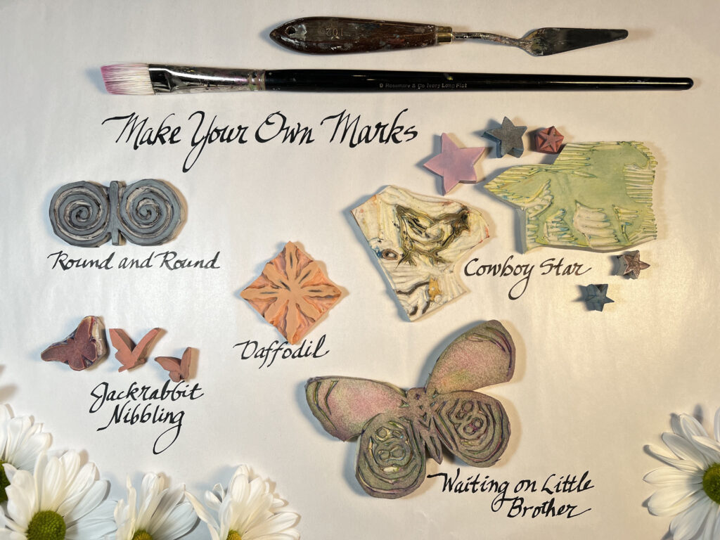
I can have an idea and literally in 20 minutes I can be holding the finished block, ready to use. The carved look of the stamp is also to my liking. Seeing the strokes of the carving tool is a little like seeing the strokes of paint; I enjoy having the process visible. *IMPORTANT TIP: if your design needs to face a certain way or it incorporates letters or numbers, draw it on tracing paper, flip it over and draw over it to transfer the pencil design to the carving block so you can carve it in reverse. I have learned this step the hard way! 

Round and Round by Nancy Boren OPA

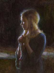
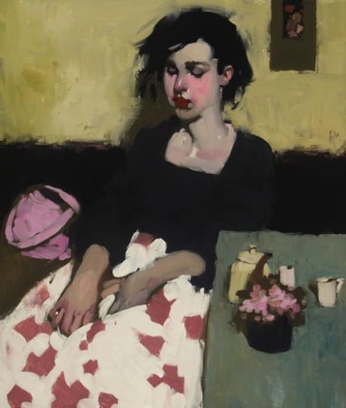
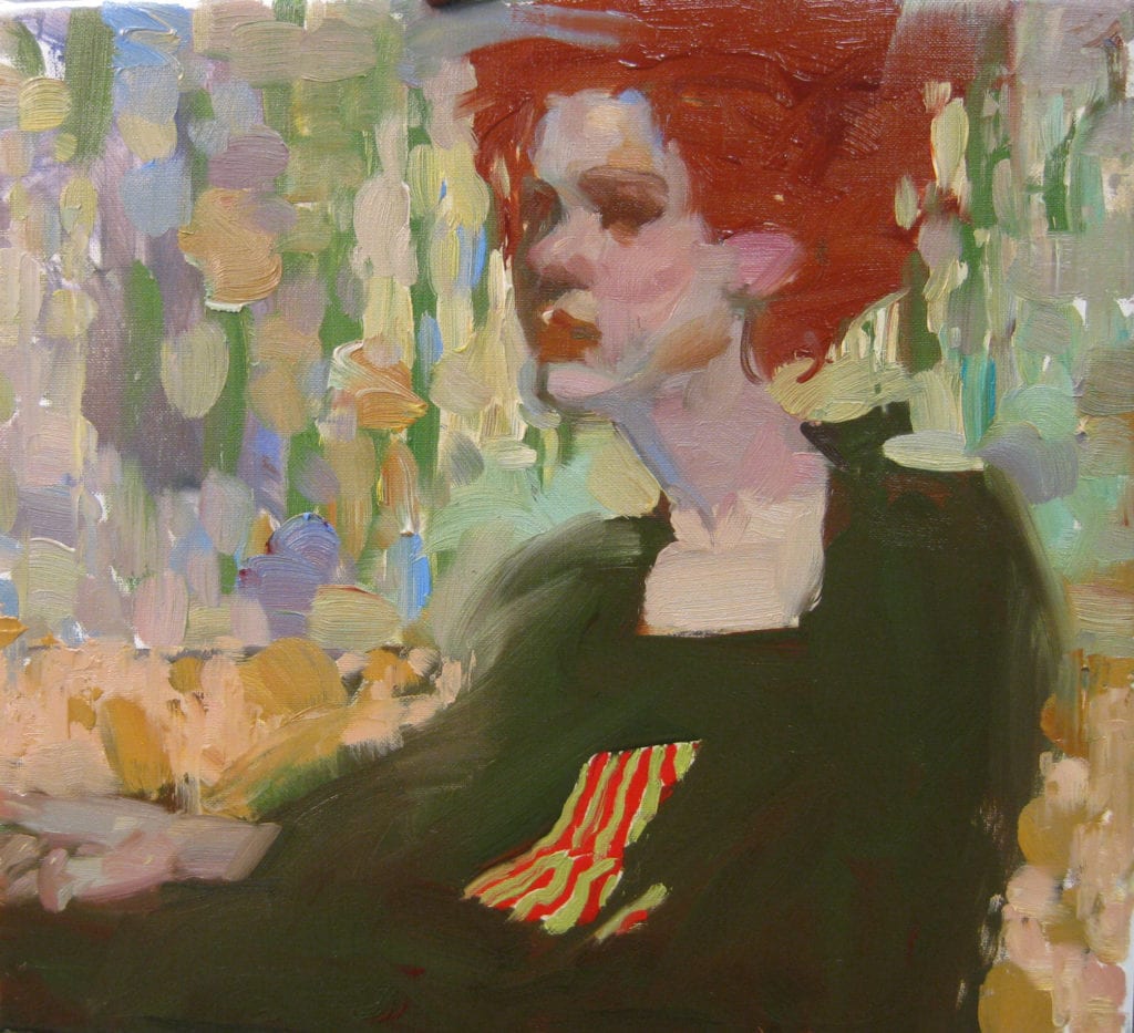
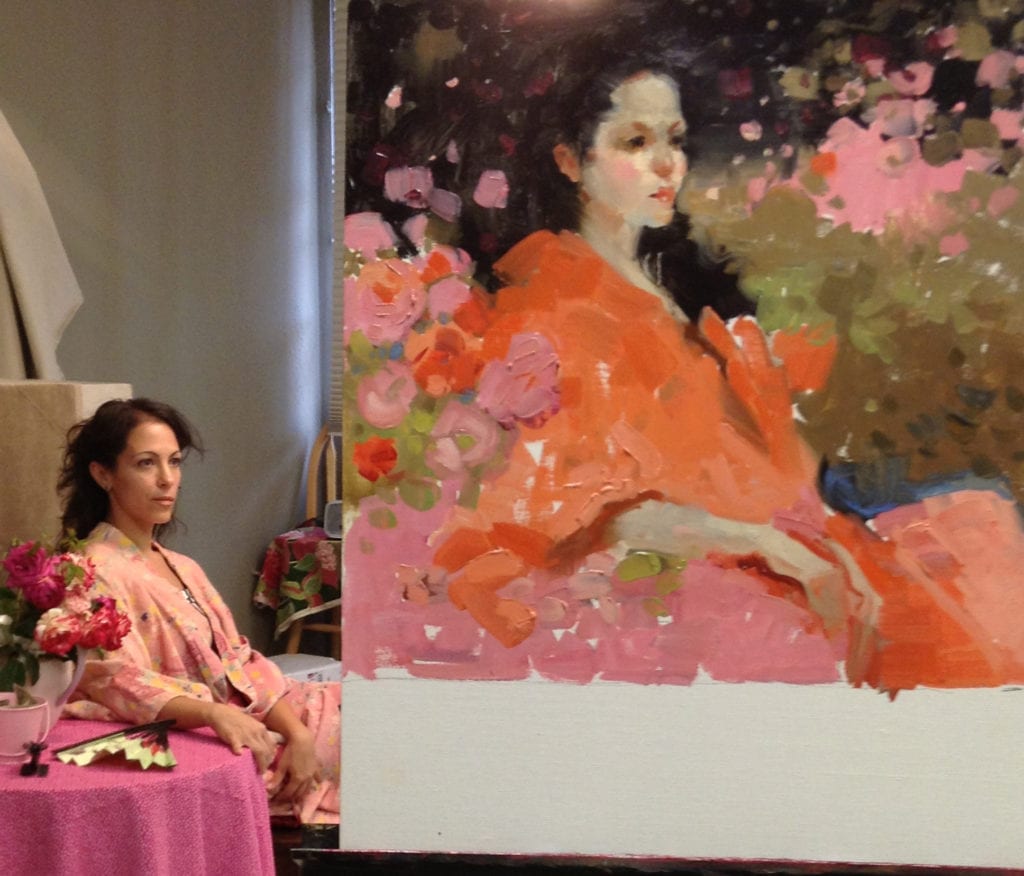
When I painted Round and Round, the model was wearing a coat from Uzbekistan with traditional embroidered designs. I had previously done a painting of a woman in the same coat and rendered it in a realistic way, so I decided to try doing it more abstractly this time and I thought the graphic designs on the coat would be a nice contrast with the realistically painted face. 

After selecting the spiral motifs and the small flowers to highlight, I carved the blocks. The spiral block ended up being 1 1/2” x 3”. Black oil paint was rolled onto my glass palette with a brayer (small roller used in printmaking) and the stamps pressed into the black. You could roll the paint directly on the stamp or apply it with a paint brush, just try to get an even coat. Then press it to the canvas. Press it again for a lighter mark or drag it like a brush. The large flower shapes I drew with a paint brush. The nice thing about stamps is that they can apply paint or if they are clean, they can lift it off, which I did on the right side where I had painted in the wet black background. I find it pleasing having the negative and positive of the same shape in an image.  I also pressed on one spiral in white above the black area. A day or two later, feeling that the black spirals were too dark, I lightly scumbled white paint over them.

Print in several colors, pick up, layer, smear – there are lots of possibilities. 

Cowboy Star by Nancy Boren OPA

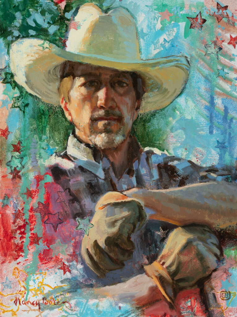
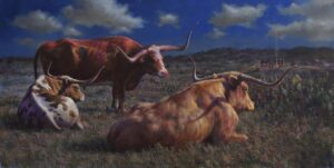
When you “ink” (with oil paint) the stamp and print into wet oil paint, like I did with Cowboy Star, you never know just how it will mix. That’s part of the fun of it. The stamp may lift off some paint already on the canvas while leaving some new color behind. I also painted just the edges on some of the stars to make an imprint of the outline.

The interesting silhouettes of miniature relief blocks are also helpful in creating texture on a background. There is a horse above the cowboy’s shoulder on the right and three chicken outlines in the left lower corner. No one else may have noticed those shapes in the background clutter, but I know they are there and it kept me entertained while I was doing it.

Waiting for Little Brother by Nancy Boren OPA

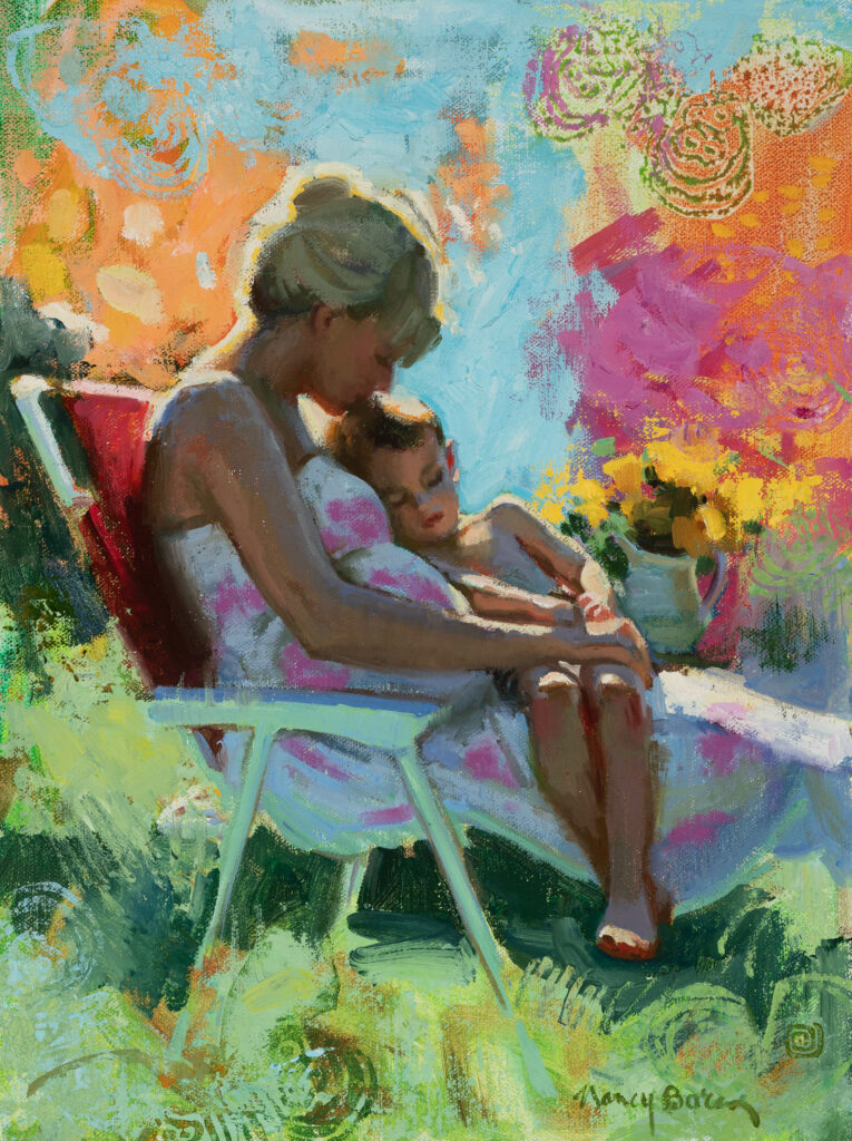
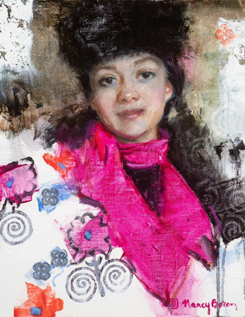
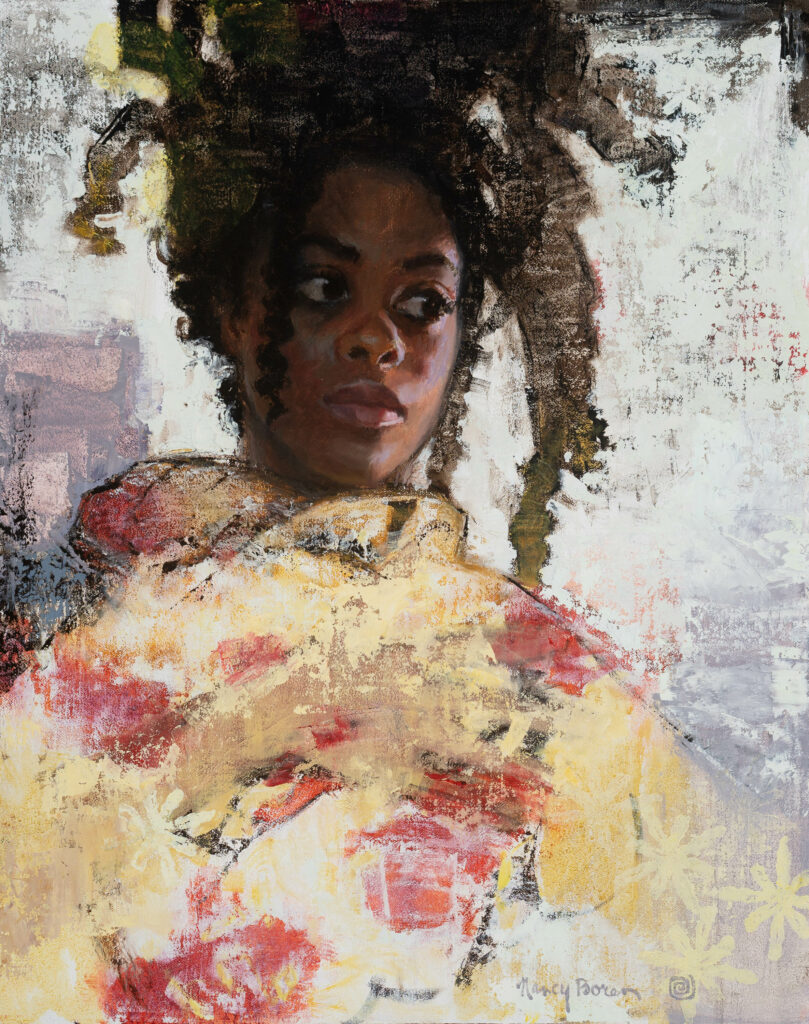
The big Anna’s Eighty-Eight butterfly stamp was used similarly in four colors to create background texture in Waiting for Little Brother. Some of them are only partial butterflies, just use what you want of it, like using the large flat side of a brush or the thin edge. The flower used in Daffodil was made for a different painting, one that didn’t work out, but then it was perfect to add a bit of structure to her dress.

Daffodil by Nancy Boren OPA

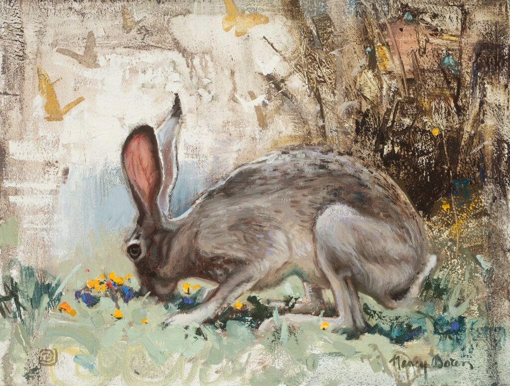
The butterflies in Jackrabbit Nibbling have been used in several paintings, in different arrangements and numbers.

Jackrabbit Nibbling by Nancy Boren OPA

Once you have amassed a collection of your original stamping tools (and the scraps in weird shapes that are leftover), you can use them over and over just like your favorite brush, palette knife, squeegee, or paint scraper.  As you work on a new painting you may realize that you already have a little extra something in your bag of tricks to give it the perfect unique touch.

When Your Name Is Called

Nancy Boren OPA · Dec 30, 2019 · Leave a Comment

What is it like to win a big award at a national art show? How would you spend the prize money? What impact would an award have on your career? These questions go through my mind with each competition I enter when I finally get my piece finished, photographed, uploaded, paid for, and submitted.

Since art competitions and competitive shows are a fixture in the art world, I enter often; in a good year when I am focused and paying attention to deadlines I enter about 25 of them. My first priority is always the national art groups to which I belong. Those shows are credibility-building and inspirational; when you walk into a gallery far from home and see your work next to that of one of your idols, it is humbling and energizing all at once. I also enter gallery and museum shows, special shows and monthly online competitions. I believe in having your line cast in many ponds.

Some award-winning artists recently shared their competition experiences with me.

“Gems” by Susan Lyon
24″ x 18″ – Oil on canvas

The Gold Medal Award in the Associate/Signature Division at this year’s OPA show was taken home by nationally recognized painter Susan Lyon of North Carolina. This was her first time to enter the show and she said, “I was really kind of dumbstruck when they said my name…there were so many great paintings there…and what a diverse show, it must have been incredibly hard to judge. I didn’t get the vibe at all during the week that people liked my painting, of course my close friends said nice things to me, but I was very intimidated to be there. After receiving the award, I have never felt so much support: I felt very humbled. The prize money was great, but I didn’t do anything specific with it. Much of my income goes to frames.”

Susan went on to say about competitions in general, “I have been in lots of shows and entered many contests and not won anything, so you brace yourself for that outcome. I have built up a tough shell, I try not to get too high when something goes right and not get too down when things don’t pan out; that is how I survive the rollercoaster of this profession. My advice is to enter shows or competitions and then forget about them. Use them as goals but don’t take the results personally. A painting’s true quality or worth is not determined by a prize.”

“Spade Fish” by Derek Penix
40″ x 40″

Derek Penix, from Tulsa, OK, won the OPA Gold Medal Award in the Associate/Signature Division in 2016. His wife, Kitty, helps with the business side of his career and says, “I search and enter Derek in as many competitions as I can. Always only enter your best work and even paint specifically for the competition. When galleries seemed to only want established artists we realized early on that being a part of competitions and winning as many awards as possible was going to give Derek the foundation he needed. They are a great way to get recognition amongst your peers and possibly get on galleries’ radar. Sometimes you win articles which also gives you more exposure.”

“Settling In” by William A Suys OPA
24″ x 48″ – Oil on linen

Wisconsin artist William Suys OPA won the prestigious $20,000 Dorothy Driehaus Mellin Fellowship for Midwestern Artists this year at the OPA National Show. Bill says, “I am required to apply this money specifically toward my education, understanding and growth as an artist, so it gives me added impetus for making the award have a real and lasting impact. I couldn’t be more thankful. Most awards are very welcome and appreciated but the amounts are not life-changing. Yet, I have been lucky enough to win a couple of major awards that certainly could have a major impact on an artist’s life. For me, these awards allow me to step back and really take note of what is important to me as an artist, and how I want to move forward in my work. We are often caught up in trying to create and deliver a product, but I want what I am doing to have greater personal meaning and these are wonderful opportunities to truly address the depth of my artistic soul. In a way, they become a challenge… forcing me to reach within.”

“Happily, I was there when the Driehaus Mellin Fellowship award was announced, and it was surprising, wonderful and thrilling. On another occasion, I was simply gob smacked when the panel of three judges for a major plein air invitational created a ‘Best Body of Work’ on the spot in recognition of my pieces in a show that featured top painters in the country…now, that was quite a jolt!”

“Orange Romance” by MaryBeth Karaus OPA
24″ x 36″

MaryBeth Karaus OPA, who lives in Cincinnati, OH, watched on Facebook livestream as her name was called for the 2018 Driehaus Mellin Fellowship and the Members’ Choice award. She says, “It was very exciting! My family was very proud of me and that felt good. The Richard H. Driehaus Foundation supports the purpose of the OPA which is to preserve and promote representational oil painting. I am so very grateful for their generous and direct support of artists individually. The Member’s Choice meant so much to be recognized by my peers. It meant that my work was achieving new levels…standing out.”

She says, “My focus and heart has been with OPA for the last ten years. I usually enter the National and Eastern Regional every year. I have thought about entering other national competitions, but I don’t want to be spread too thin, although I have entered Art Renewal Center because it is easier since it is online.”

“I think the awards have had a very positive impact on my career…entering really puts your work out there in front of a national audience. I have been asked to judge shows recently and my workshop filled up quickly last year, both as a result of name recognition from the awards. Also, Southwest Art featured a six-page article on me that was a direct result of OPA involvement.”

MaryBeth’s thoughts on competitions — “Well, put on your coat of armor. It can really be a boost or a blow to your sensitive artist ego. After such a great year in 2018, both my paintings were rejected from the OPA National in 2019. Ouch. But sometimes one will never know why and that has to be okay if you are going to take the risk, come out from behind your easel and try. Keep entering!”

“Halfway Home” by Elizabeth Pollie
30″ x 30″ – Oil

Elizabeth Pollie, from Harbor Springs, MI, won the Driehaus Mellin Fellowship in 2016. She says, “Winning an award is naturally always a very “feel good“ moment. With every award, comes a mixture of gratitude, exhilaration, a sense of being affirmed and in my case, always surprise with a decent dose of humility. But I have to say, when I won this award, it really was a very unique experience. Why? Because philanthropy is so central to creating, enhancing and sustaining a rich and diverse culture. So, bring on an extra heap of gratitude and humility.

Elizabeth continues, “When I was a child I practically lived within the walls of the Flint Institute of Arts which has been generously supported by the Mott Foundation and others. I could name my favorite pieces by age ten; it was all key to shaping my future as an artist.

“That is why not only winning this award but also having the opportunity to meet Dorothy and Art Mellin was profoundly meaningful. They are both caring and engaging individuals who have gifted The Oil Painters of America a generous amount of support. I used the award to both help maintain and repair my studio and assist me in my art related travels. There was not a moment in which I did not reflect upon how crucial the role of philanthropy is in changing the lives of artists and supporting both historical and emerging cultural institutions.

“If I were to give any advice to those entering a competition I would say the greatest value comes from giving thought to how you would like to put your work into the public eye. First, satisfy your own level of excellence and then, let it go. You have done your work. If it results in an award enjoy the moment and be gracious. And if the light casts its’ glimmer upon the work of another, be equally gracious. Art in its most pure form is not competitive. The best of it is something intrinsically fascinating, worthwhile and maybe, with time, historically significant. That in and of itself is reward enough.”

_____________________________

“Spring Pink” by Nancy Boren OPA
24″ x 18″

As for me, 2016 was a great year, when my painting was awarded a Bronze Medal at OPA; that was incredibly exciting but also receiving the Members’ Choice award that year was as meaningful as an award gets. In 2018 as the American Impressionist Society Show was streaming live, a good friend called and said I had better turn it on, I had won Best of Show. It is a strange and transcendental feeling to know that you were able to convey your emotions about a subject in a painting so that a stranger you’ve never met was touched by it. That is probably the best part of the recognition, the fact that you have made a meaningful connection with another soul.

The prize was $12,000, which did get my attention too. I finally got to answer my own question about how I would spend the prize money; I get to check off an item on my bucket list: a trip to Rajasthan, India. The people’s faces, stacks of jangling bracelets, the texture of the embroidered clothing, gold embellishments, the vibrant colors of the fabric, formed into turbans and saris, are all heart-stopping images for me and I can’t wait to see them in person. My artist’s cup will be overflowing.

After four decades in this art world, I can say that perseverance is key to an art career and to entering competitions. Just like lots of other artists I have submitted to many, many shows and been turned down or won nothing, but dozens of rejections don’t matter when your commitment to excellence pays off. Embrace your creativity, value the journey, and don’t give up.

Pigments, Painters and Thieves

Nancy Boren OPA · Dec 16, 2013 · 3 Comments

A Random Guide to Entertaining Books, Fact and Fiction, that Reveal Minutia, Mysterious Happenings, Tangled Webs, and Outright Larceny, all Engendered by What You May be Creating at this very Moment: Art.

While we are all familiar with the lavish coffee table books, artist biographies, and how-to books which most artists stockpile in their studios like hoarders with empty pickle jars, there are countless books in other categories for the curious art reader.
For the history-loving art reader there are books that trace the evolution of a single pigment: Blue: The History of a Color as well as Black: The History of a Color, both by Michel Pastoureau or The Perfect Red by Amy Butler Greenfield. You will never take your colors for granted again. Instead, you will be grateful each day in the studio when for example, using alizarin or scarlet that you are not in Mexico in 1560, laboriously scrapping tiny cochineal bugs from prickly pear pads.

James E Butterworth, c1870

For the true-crime-loving art reader there are books that read like fast-paced thrillers. Two art forger tell-alls approach the forgery challenge from opposite points of view: In Caveat Emptor (Buyer Beware), Ken Perenyi reveals his methods to create as perfect a fake as he could. You’ll forever be skeptical now of every Butterworth yacht painting appraised on Antiques Roadshow. Read along with him about the day he accidentally figured out how to fake the unmistakable green florescence of centuries-old varnish when seen under a black light.
Giacometti
Giacometti

In Provenance by Laney Salisbury and Aly Sujo, the mastermind’s plan was to use fabulous faked provenances to pass off often sloppily painted copies of modern paintings by Giacometti, Graham Sutherland, and Ben Nicholson. This London con man went so far as to corrupt archived catalogs by inserting made-up pages with photos and information about the fakes. The Forger’s Spell by Edward Dolnick, chronicles a frustrated Dutch artist who faked Vermeers and then had the nerve to sell them to WWII Nazis as they plundered their way through Europe. Perenyi claims the Dolnick book inspired him. Take all the tales with a grain of salt; after all, the authors are professional con artists, but riveting reading it is.
The Monuments Men by Robert Edsel details daring art rescues during WWII. The George Clooney movie version is due out in early 2014. Other Edsel books: Saving Italy and Rescuing Da Vinci.
Caravaggio, Taking of Christ

The Lost Painting, The Quest for a Caravaggio Masterpiece by Jonathan Harr is the true story of a Caravaggio discovered by a museum art restorer in Ireland at the same time a University of Rome graduate student began tracing it from its first recorded appearance in a dusty Italian archive.
The Art Detective, Fakes, Frauds, and Finds and the Search for Lost Treasures is by Phillip Mould OBE, a British art expert who appears on BBC’s Antiques Roadshow and Fake or Fortune?, a London- based show about authenticating antique paintings.
Rembrandt, Storm on the Sea of Galilee

 
The true 1990 story of one of the world’s biggest and yet unsolved art thefts is told in The Gardner Heist by Ulrich Boser. Still missing in Boston: several pieces of Degas, a Vermeer, and two Rembrandts, including Storm on the Sea of Galilee. Empty frames hang on the wall of the museum to this day. Robert Wittman discusses numerous crimes in Priceless; part of his career was spent on the FBI Art Crime Team.
There are several books about the life and mysterious 1934 disappearance of American artist-adventurer Everett Reuss. Last seen in the Utah canyon lands at age 20, Ruess was acquainted with Ansel Adams and Maynard Dixon, but his solitary search for beauty ultimately was his undoing.
Study for Madam X
Study for Madam X

For behind-the-scenes loving art readers, there are two books that explore the surroundings of single paintings: Strapless by Deborah Davis deals with John Singer Sargent and Madame X, who in real life was Louisiana-born Virginie Amelie Gautreau and Lady in Gold by Anne-Marie O’Connor chronicles the creation of Klimt’s masterpiece, Portrait of Adele Bloch-Bauer.
 Churchill
Churchill

Winston Churchill wrote Painting as a Pastime and tells a hilarious tale about his first dramatic confrontation with THE BIG EMPTY WHITE CANVAS. He says, “Just to paint is great fun…Try it if you have not done so – before you die.” His work is on display at the Dallas Museum of Art and in the studio at his home, Chartwell, near Westerham, Kent.
Sir Alfred Munnings
Sir Alfred Munnings

For the mystery-loving art reader, there is In the Frame by Dick Francis. Francis is known for his series about English horse racing, but here he incorporates a horse painter and a fake Sir Alfred Munnings. Another of his books, To the Hilt, features an artist living in Scotland.
Masterclass by Morris L. West intertwines two stories – one of a brutally murdered Manhattan artist and one of an unearthed Italian masterpiece. Double-crosses, commissioned fakes, Swiss bank accounts, and international art dealers abound. Chasing Cezanne by Peter Mayle (A Year in Provence) is a fun art romp from France to the Bahamas.
More art mysteries include The Art Thief by Noah Charney and The Art Forger by B. A. Shapiro, which is inspired by the Gardner heist.
For the romantic, fiction-loving art reader, a personal favorite is The Shell Seekers by Rosamunde Pilcher. A three-generation saga set in England and the Spanish island of Ibiza, The Shell Seekers describes a fictional painting of the same title done on the beach in Cornwall, obviously inspired by the Newlyn School, an art colony established in the early 1880s near Penzance. Real artists there included Lamorna Birch, Elizabeth Forbes, Stanhope Forbes, Laura Knight, and Alfred Munnings.
The Swan Thieves by Elizabeth Costova is also delightful: a modern day obsessive painter unlocks the secret surrounding a fictional female Impressionist’s abandonment of her promising career. Contains star-crossed love, stolen letters, and a painting that makes it all clear when you know how to decipher it.
Vermeer fans will enjoy The Girl With the Pearl Earring (basis for the movie) by Tracy Chevalier and The Girl in Hyacinth Blue by Susan Vreeland. The latter traces a fictional painting’s journey through the centuries.
A graphic, dramatic description of a fictional painting is found in Alexander McCall Smith’s 44 Scotland Street. A portrait painter set up a large canvas to paint a “tiny, crabbit man, (from the Wee Reformed Presbyterian Church [Discon’t]), sitting there in his clerical black suit and staring with a sort of threatening disapproval.” The artist found himself sketching in a “tiny portrait, three inches square, right in the middle of the big canvas…a picture which set out to express all the sheer malice and narrowness of the man…I had boiled down his spirit and it came to a tiny half-teaspoon of brimstone.”
duchamp-nude-descending-a-staircase-1912
For the poetry-loving art reader, there is When Earth’s Last Picture is Painted by Rudyard Kipling.

“…and those that were good (is that behavior or technique?) shall be happy
They’ll sit in a golden chair
They’ll splash at a ten league canvas
With brushes of comet’s hair…”

If you prefer happy endings, skip over The Painter Chap by Robert Service (of Yukon fame.) The Painter Chap starts with despondency and despair over his daubs and quickly sinks to knives, a hissing gas jet, and a sad goodbye to Paris. Nude Descending a Staircase by X. J. Kennedy cleverly mimics the painting by Marcel Duchamp with words,

“…We spy beneath the banister
A constant thresh of thigh on thigh –
Her lips imprint the swinging air
That parts to let her parts go by…”

Rory Ewins at speedysnail.com has even composed a group of limericks about famous artists like
Michelangelo, artist of feeling,
Is known for his Vatican ceiling:
The Pope saw some faults
In its featureless vaults
And said, “Paint over that, Mike – it’s peeling.”

Whatever your area of art interest, gentle reader, you would be advised to purchase another bookcase. Life is short, read fast; here we have barely scratched the surface. You are invited to share your favorite art books in the comment space at the bottom.

A Week Painting at Scottsdale Art School with Milt Kobayashi

Nancy Boren OPA · May 13, 2013 · 3 Comments

Nancy Boren was the proud winner of the $500 Shirl Smithson Scholarship. Click here to learn more about the Shirl Smithson Scholarship.

Milt KobayashiLast December, I was fortunate to be selected for a $500 scholarship from OPA to use toward attending a workshop of my choosing. Since I’ve long admired the rich, evocative figure paintings of Milt Kobayashi I elected to sign up for his recent class at the Scottsdale Artists School. The ocotillo and palo verde trees were blooming red-orange and yellow making April in Arizona a real joy.
“Stay attuned to opportunities and be open to change” was the advice we received throughout the week. Kobayashi views his once a year class in Scottsdale as a valuable experimental time for himself as well as his students, painting new models, trying new compositions, hearing ideas from his class. He also enjoys the opportunity for creative freedom — no thinking about producing work for galleries or shows. Back home in New York he paints late into the night, the solitary work time often giving his paintings an introspective quality. Every year he says he takes something valuable back to his studio from his workshop experience; maybe something tangible, like a new color combination or maybe simply a creative spirit rejuvenated by the wide open southwest and the bonhomie of simpatico painters in the lively class. He certainly doesn’t take home the actual demos he does — the class participants were avid collectors and there was good natured rivalry on Friday when names were drawn for the chance to purchase the five new Kobayashis.
The emphasis for the week was on composition and he encouraged the 18 students to try new arrangements of objects, repeating several times that there are no rules about placement except try to avoid aligning edges. He enjoys pushing the figure to the far edge of a painting, sometimes even looking straight out to the side, an arrangement few artists use. He painted with various color schemes: dark blue (Egyptian blue by Doak) and brownish orange (Mars orange and Mars Yellow he likes for their rich opacity), orangey red-green-lavender, black with a host of grays, and the last day, medium blue and rusty red punctuated by a large area of black. He loves black and is not afraid to make the commitment to use it boldly.

Nancy Boren's Tuesday Demo Finished
Tuesday’s Demo – Final

He paints things how he thinks they should be, not exactly the way they look. Nothing is set in stone. He urges you to understand the form and why light is hitting it the way it is.
As he started to paint each morning, beginning with a tone of a warm gray, he seemed to let the design present itself to him. On occasion it was suggested by the shape and strokes of the initial tone, other times, it evolved from pencil lines over the tone as he played with placement of the objects he had in mind. On Tuesday, he decided to place the figure dead center with arms out stretched, making a cross composition. He further emphasized the centrality of the figure by placing a deliberate rectangle of blue right behind her face. He committed himself to his decision. When it came time to paint the mouth, he said with a laugh he was going to make it green, “just because I can.” He added a couple more touches of green so the color of the mouth would be repeated. The girl in the painting echoed his attitude of being attuned to possibilities and celebrating who she was.
In Kobayashi’s discussion of painting with cool and warm grays of similar values, he made a statement that distilled his decades of experience working in subtle tones: it won’t look muddy if you make the strokes crisp. When a painter starts to over blend it is easy for it to turn to mush.
Each afternoon for student painting time, there were three complex model set ups to choose from. These were orchestrated by artist Nancy Chaboun, who also participated in the workshop. Gorgeous fabrics, kimonos, fresh flowers, pillows, vases—if you couldn’t get inspired there, you couldn’t inspired anywhere.
Nancy Boren's Wednesday Demo
Besides the great class at SAS, there was so much to take advantage of while in Scottsdale. I painted Monday evening in the open studio with a wonderful model, at no charge since I was enrolled in a workshop. Wednesday evening, one of the class members invited everyone to her lovely home for dinner where we also enjoyed her art collection which has an impressive number of Milt’s paintings. Thursday afternoon is Thirsty Thursday, put on by the Friends of SAS — great hors d’oeuvres and wine. Thursday evening is gallery walk for the Main Street galleries and the rest of my free time I spent plein air painting or photographing dramatic Arizona scenery. It was a fabulous art week.
Nancy Boren's Thursday PaintingAfter some hit or miss work the first three days, finally on Thursday I felt I did a painting that incorporated some of Milt’s advice.
In case I forget in the future to embolden my compositions, use lots of neutrals in the skin, or throw in a surprising color choice now and then, I only have to look back at Tuesday’s dead-center girl with the green lipstick to remind me–and that’s easy, because she hangs on my wall.

The Spirit Forges Ahead While the Brain Has To Figure It Out

Nancy Boren OPA · Nov 26, 2012 · 3 Comments

"Stepping Out" by Nancy Boren
“Stepping Out” by Nancy Boren
A few years ago, I was fortunate to be involved in an unexpected conversation one day at my studio with an artist friend. I didn’t know when we started talking that the next few minutes would so significantly sharpen my understanding of one aspect of my painting. We casually looked through a group of my paintings while she offered her observations.
 
"San Patricio Church" by Nancy Boren
“San Patricio Church” by Nancy Boren
After much discussion, we both simultaneously realized we had stumbled upon a truth about much of my work. A common abstract thread that made sense of my varied subjects: it wasn’t so much the crisp white sail boats moving over dark blue water, big puffy clouds in turquoise skies, or white houses surrounded by greenery, but rather it was large white objects in a colorful settingthat I was painting over and over again. What an awakening! I thought I liked painting those different subjects and I do, but now I can see that they are all variations on a theme.  It’s almost like looking through a kaleidoscope; different shapes and patterns emerge, but there are always large chunks of white and scattered backgrounds of saturated color.
 
"House of the Little Old Lady" by Nancy Boren
“House of the Little Old Lady” by Nancy Boren
That may not sound very revolutionary, but in the blink of an eye, I suddenly owned two new possessions:
1.)  An answer for countless viewers who have remarked that I certainly painted a lot of different subjects. Now I had a way to tie many of them together.
2.)  A better understanding of my artistic hard-wiring, which
a.)  I can use on occasion to find what I want to paint faster and more easily
b.)  In a purely narcissistic way—a fascinating (to me) fact about myself, of which, after all these decades I had been unaware.
 
Every piece I do does not feature white on a color field, but now when it happens, I smile to myself and recognize it as another chapter in my love affair with this combination.
 
"Sailing" by Nancy Boren
“Sailing” by Nancy Boren
Painters speak in the language of paint; it doesn’t seem fair that every artist should also be required to speak eloquently in the English language about painting. But language and thought are so intertwined that verbalizing and analyzing your artistic visions, as difficult as that may be, can actually illuminate them.
 
"Princess Zazu and Pip" by Nancy Boren
“Princess Zazu and Pip” by Nancy Boren
Maybe Henry David Thoreau had an experience similar to mine that caused him to say, “So we saunter toward the Holy Land, till one day the sun shall shine more brightly than ever he has done, shall perchance shine into our minds and hearts, and light up our whole lives with a great awakening light, as warm and serene and golden as on a bankside in autumn.” And who can resist the colorful image this conjures up—maybe a white horse in a grove of yellow cottonwoods?
 
If you feel there may be a hidden theme in your work, or some unrecognized essence, or you wonder how all your painting threads connect, I have a suggestion: block out some time for a lunch with a savvy artist friend and leisurely peruse each other’s portfolios. A fresh eye and a frank discussion may uncover a powerful current flowing just under the surface of your paintings.
 

Footer

  • Home
  • About
    • Mission, Policies & Bylaws
    • Board of Directors
    • Presidential History
    • Frequently Asked Questions
    • History
    • OPA Staff
    • Contact Us
  • Membership Services
    • Member Login
    • Membership Information
    • State & Province Distribution For Regionals
    • Update Member Information
    • Membership Directory
    • Contact Membership Department
  • Events
    • Exhibitions
    • Online Showcase
    • Lunch and Learn
    • Virtual Museum Road Trip
    • Paint Outs
  • Resources
    • Brushstrokes Newsletters
    • Ship and Insure Info
    • Lunch & Learn Video Archives
    • Museum Road Trip Video Archives
  • Services
    • Sponsorship Opportunities
    • Scholarships
    • Critique Services
    • Workshops
    • Have A HeART Humanitarian Award
  • Online Store
  • Awardees
  • Blog
    • OPA Guest Bloggers
    • Blogger’s Agreement (PDF)
    • Comment Policy
    • Advertisement Opportunities

© 2025 OPA - Oil Painters of America · Design by Steck Insights Web Design Logo