• Skip to primary navigation
  • Skip to main content
  • Skip to footer
  • Help Desk
  • My Account

OPA - Oil Painters of America

Dedicated to the preservation of representational art

  • Home
  • About
    • Mission, Policies & Bylaws
    • Board of Directors
    • Presidential History
    • Frequently Asked Questions
    • History
    • OPA Staff
    • Contact Us
  • Membership Services
    • Member Login
    • Membership Information
    • State & Province Distribution For Regionals
    • Update Member Information
    • Membership Directory
    • Contact Membership Department
  • Events
    • Exhibitions
    • Online Showcase
    • Lunch and Learn
    • Virtual Museum Road Trip
    • Paint Outs
  • Resources
    • Brushstrokes Newsletters
    • Ship and Insure Info
    • Lunch & Learn Video Archives
    • Museum Road Trip Video Archives
  • Services
    • Sponsorship Opportunities
    • Scholarships
    • Critique Services
    • Workshops
    • Have A HeART Humanitarian Award
  • Online Store
  • Awardees
  • Blog
    • OPA Guest Bloggers
    • Blogger’s Agreement (PDF)
    • Comment Policy
    • Advertisement Opportunities
  • Show Search
Hide Search

Poppy Balser OPA

Big Lessons from Tiny Paintings by Poppy Balser OPA, ASMA, CSPWC

Poppy Balser OPA · Feb 13, 2025 · Leave a Comment

I don’t know about you, but when I begin a larger painting I tend to start thinking of the painting as “precious” far too early. Either it is a large and costly substrate, or I get going on the painting and as it is going well, I get too worried about messing it up. Then I get into trouble by painting too carefully and the painting suffers as a result.

I use small studies to counter that.

Before we go further, I have to talk about watercolours. Yes, I know I am writing for the OPA blog, but please humour me for a minute. I started as a watercolour painter and it is on paper that I learned much of what I know about painting.


There have been a number of times on my artistic journey when I have made quick strides in acquiring better painting skills. The first time was when I got myself some better materials, switching from student-grade paint and paper to 100% cotton paper and good paint. This experience is true in any medium. If you are painting with paint and cardboard canvas panels from the craft store, you will see a change when you switch to actual linen or buy a few tubes of good quality paint.


The next artistic leap forward was when I briefly got on the daily painting bandwagon in 2013. I committed to making one small (5″x7”) painting a day for 60 days. I did it for 2 months only because I was also still working at my first career and had 2 children under 10 years old. I didn’t feel I could commit to more than 2 months.


I initially had planned it as a marketing strategy, and it worked well for that, but it ended up being far more valuable in terms of what the daily practice taught me. I ended up repeating the 60 day experiment twice more in the next two years. Each time, I found myself learning more about how to compose a painting, how to simplify, how to use a bigger brush proficiently and more about what does and does not make a successful painting.

I also learned that a painting that fails is no big deal. Rather: an unsuccessful painting was just an idea that did not work, and I would get to try something different when I painted again the next day. This gave me an unanticipated freedom from expectation. I did not have to carefully consider what subject I was going to paint because I would be painting something else the next day. This freedom let me play and it was wonderful.


I learned the value of repetition. I was publishing these paintings each day so I did want to have something to show by the end of the day. If I made one that flopped completely, I would just restart. I was painting on small pieces of paper, after all. The second attempt gave me a chance to address what I thought went wrong. This was incredibly valuable as it let me answer the question of “what if I had done this instead of that?”


Ok, enough about watercolour. This is the OPA blog after all, I should write about oil painting.

Now, years later I am also an oil painter. As I explore a new idea for an oil painting I often start with a small study. I have gotten comfortable with small square panels, 6″x6”. I like the square format because it helps to remind me that I am just painting a piece of a larger idea. I buy birch panels from a local supplier in bundles of about 20 and so I never feel like I am going to run out.

When I am painting on such a small surface I do not feel like I am taking a risk when I try something new. The little paintings don’t feel “precious”. Rather they are a place where I can play with the paint. If one doesn’t turn out, it’s no big deal at all. I do not feel I have “wasted a panel” because I have a bunch more sitting on my shelf, waiting their turn.

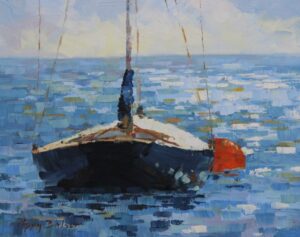
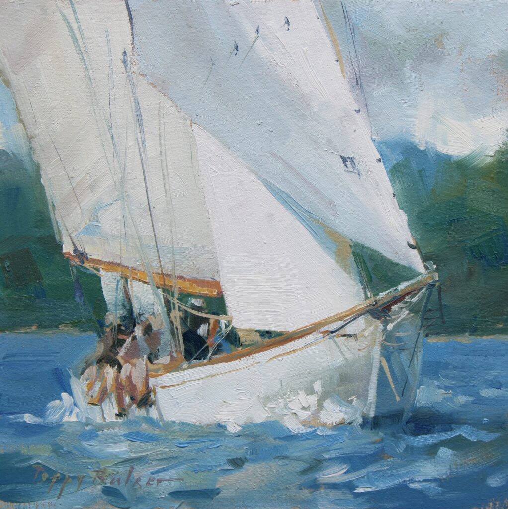
Here is one such little study that ended up leading me down a whole new path as far as portraying light.

Catalina Sunrise Study, 6″x6″, studio oil

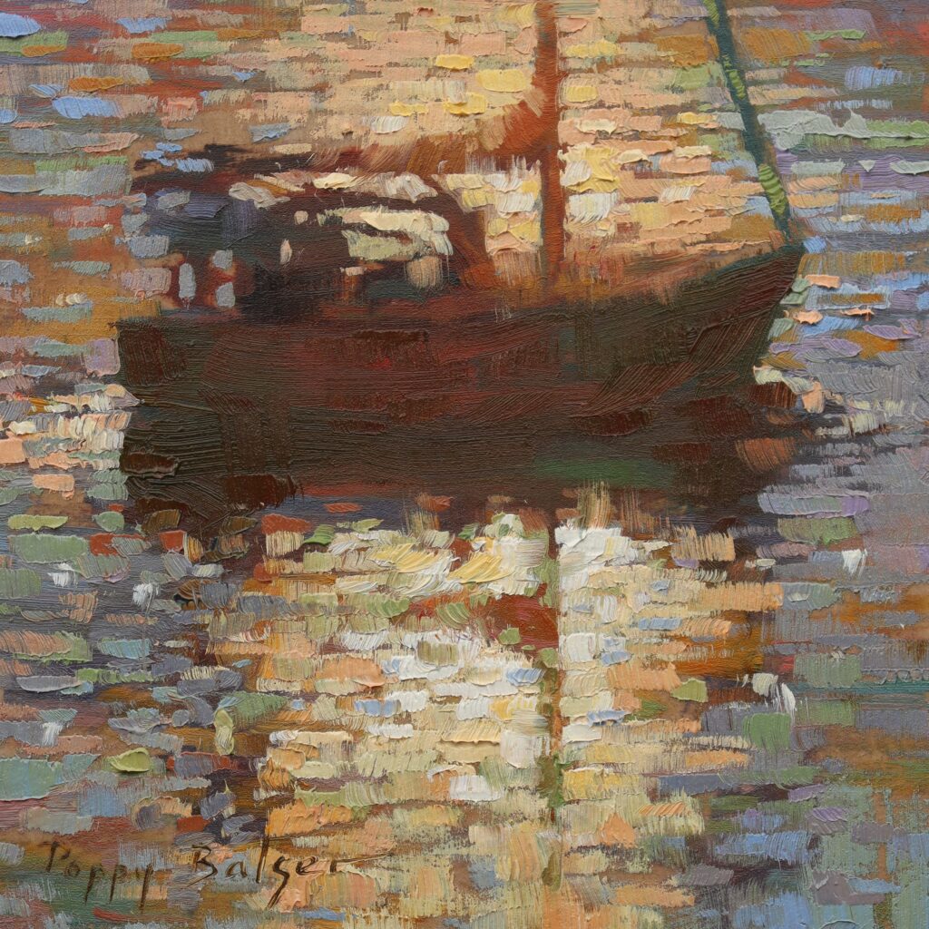
I’d never painted anything quite like this before and so I started it as an experiment. I was pleased with it so I did several more small boats like this, immediately after, getting a feel for what did work and what did not.

Sunlit Sail V, 6″x6″, studio oil (study for:)

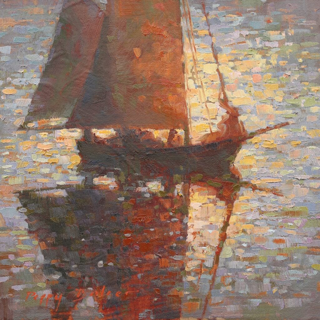
From those smaller studies I went on to make a few larger ones, all pulling from the experiments begun in my initial studies.

A Glorious End to the Day, 12″x16″, studio oil

This was a series of studio studies which led me to take this small painting practice outside. I find the small size much more manageable than a larger surface would be when painting at the seashore. For example, where I live, during mid-tide, the water level will rise or fall 5 or 6 feet over the course of an hour. As rocks are hidden or revealed by the waves the composition changes completely. This means I have to work quickly. I am still slower in oils than I am in watercolours, but I can more or less complete a 6″x6” study before before my scene is gone.

Coastal Study X, 6″x6″, plein air oil
Coastal Study IX, 6″x6″, plein air oil
Rock Formation, 6″x6″, plein air oil

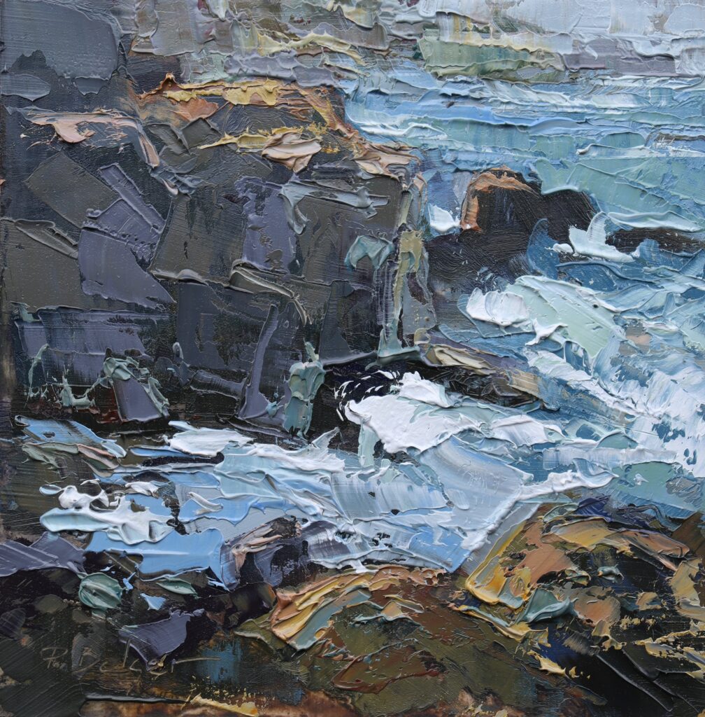
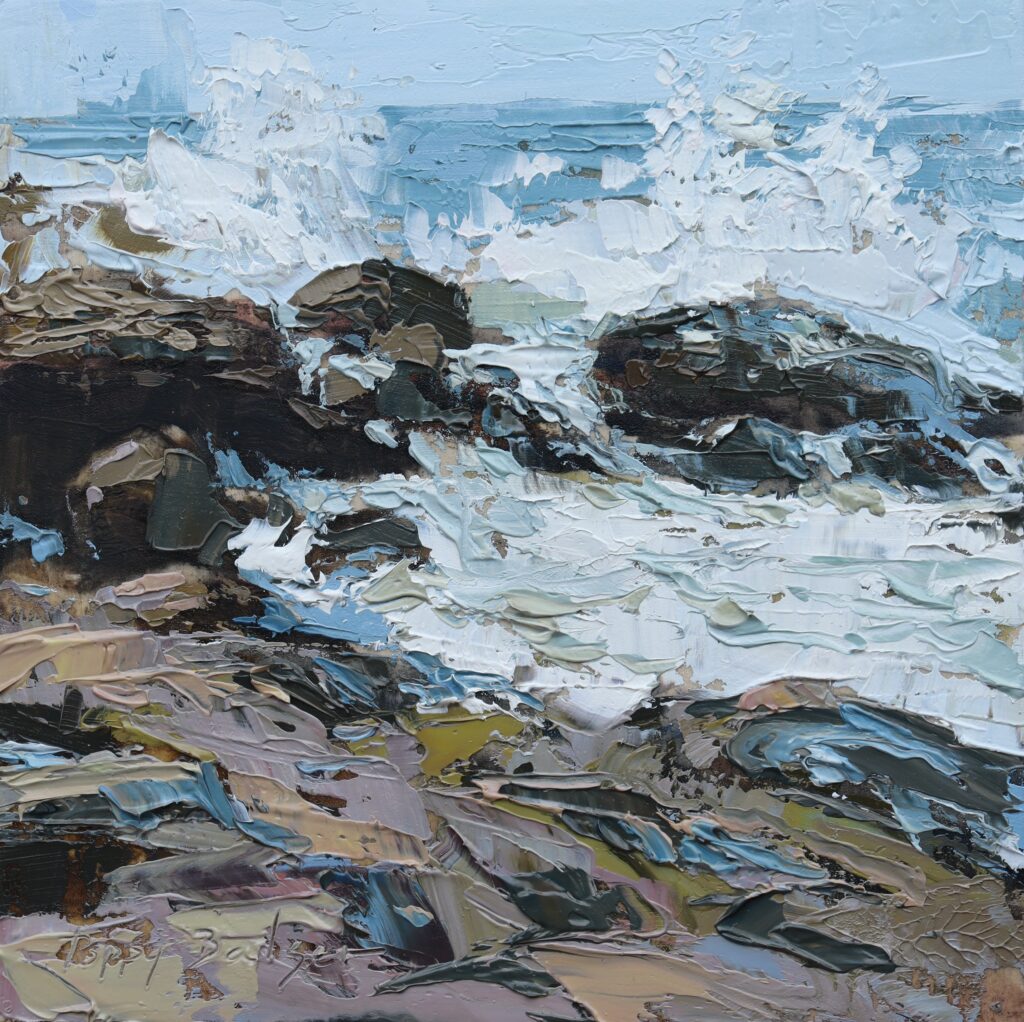
I used a palette knife in these, again, so I could work faster. I was painting outside and speed was of the essence.


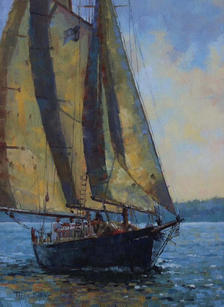
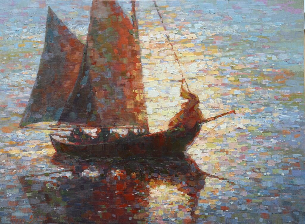
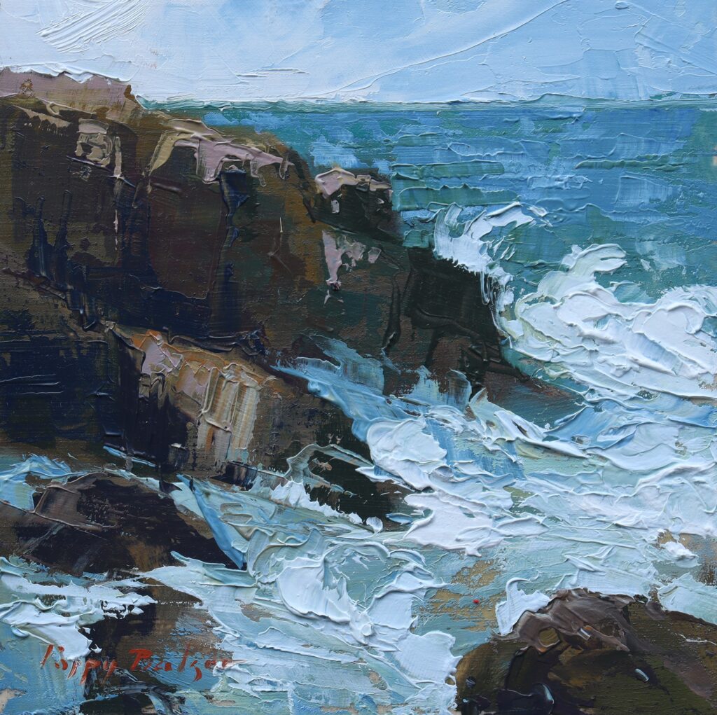
When I came inside, I could slow down and paint with more intention, and a brush instead of a knife:

Flung Spray, 12″x16″, studio oil

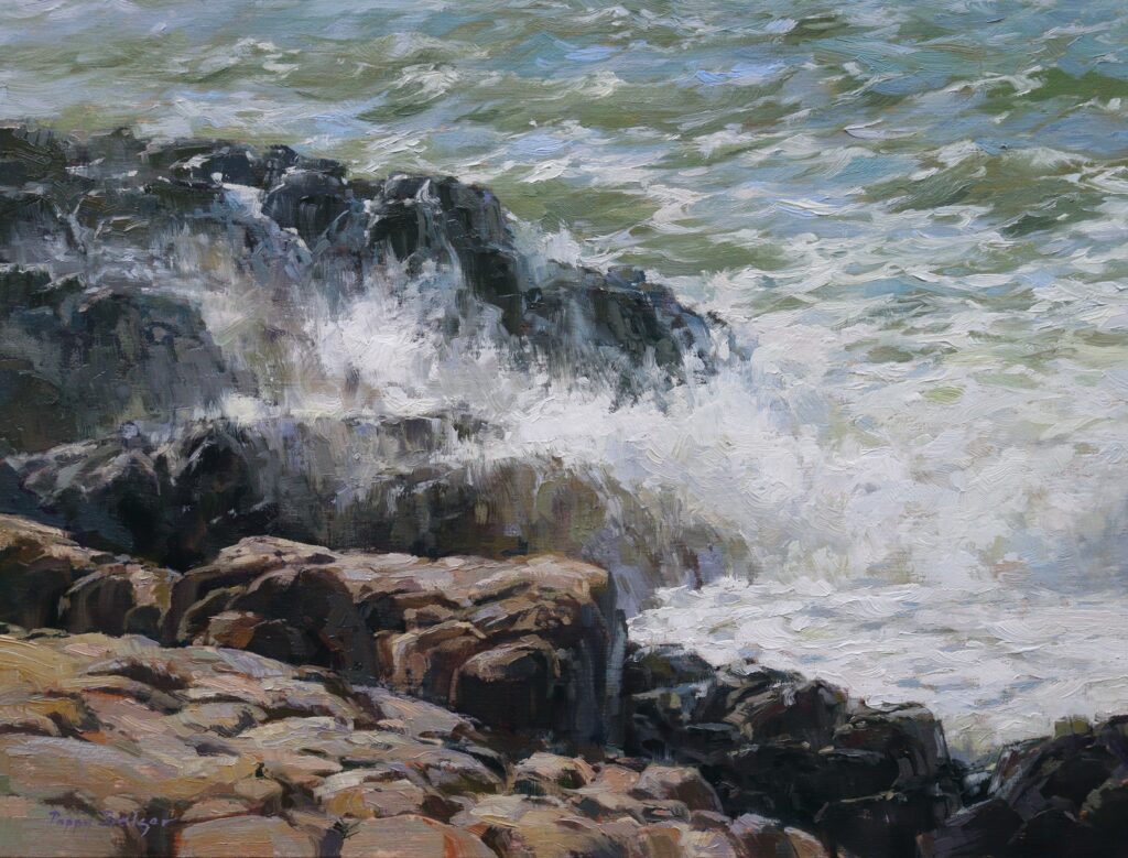
Perhaps you can see where some of the observations from my tiny plein air studies are incorporated in this studio painting.


Lately I have come home from a trip where I was lucky enough to spend several days observing classic yachts in a regatta. I sketched on location (again watercolours, faster medium and easier to travel with). When I got home I wanted to paint all the boats. At once! There were so many boats I wanted to paint that I had a hard time choosing just one to start with. I started with a series of small studies so I could paint several of them, quickly, getting familiar with them and figuring out which ones I would want to paint on a larger scale.

Classic Study I, 6″x6″, studio oil
Classic Study II, 6″x6″, studio oil

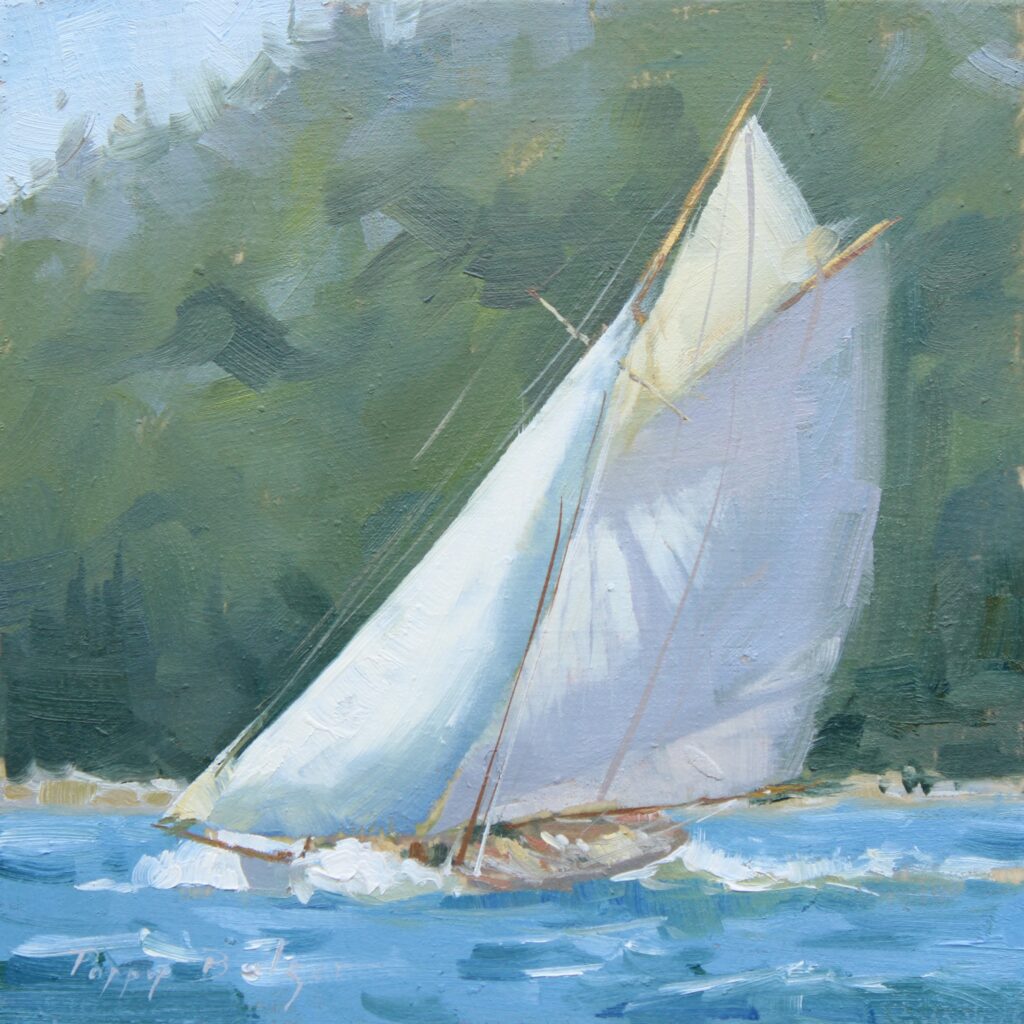
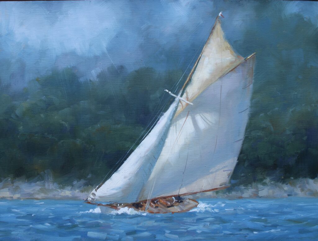
The lessons I am learning from these small paintings are important. Even now that I am a relatively newly elevated OPA Signature member, I feel like I still have much to learn about putting down paint. For one example, I have long struggled with backgrounds in my boat paintings. How much do I show? How much do I leave out? How much can I blur out?


If you look closely at the background in the two studies above you’ll see some progression between the first and the second. In the first I was still fixated on showing a discrete tree line whereas in the second I let go of that and discovered the painting doesn’t need it. I don’t know how many times I have read the words of better painters than I saying “simplify, soften edges, paint less not more”, but I had to have that happen in my painting in front of me to absorb what they were expressing.


To restate what I said earlier, it is far easier to experiment, and try risky ideas and be open to
accidental discoveries when producing many works on a smaller and less “precious” surface
than it is by working labouriously on one or two larger paintings.


I’ve taken the atmospheric blurry background from Classic Study II and put it into this painting:

Sailing Dreams, 12″x16″, studio oil

I have left out the cluttered suburban background that was really there, letting me concentrate on the beauty of this elegant ship.


If you have read this hoping for a list of specific lessons I have learned over the years from my small studies, this is where I disappoint you. What I learned might not be the lessons that you will learn. The important message I want to share is: do the work. Experiment. Paint many paintings. Make them small for speed if you need that like I did. Try lots of different ideas. Make lots of paintings. Don’t treat each one like it is headed for a museum, or even a frame. Try something different. Mess up. Try again. Paint something else. Have some fun with the paint. The more you paint the more you will figure this thing out.


As for me, I will keep painting, on surfaces small and large, learning as I go.

Boats Should Look Like They Will Float

Poppy Balser OPA · Feb 18, 2019 · Leave a Comment

When I was learning to paint, living where I do on the shores of the Bay of Fundy, boats of all sorts were a readily available subject. I ended up painting a lot of boats. I have always been drawn to the water and boats were an excuse to paint water. People who know boats will not accept a painting of a boat that looks like she will sink. Over the years, through trial and error, I have learned how to render a boat that looks seaworthy.

Whether elegant sailing vessels or battered fishing craft, boats are a challenging subject. Personally, I find it easier to accurately portray a boat than a building. Mind you, I paint boats far more often than architecture. As a result, boats come more easily to me. It is a matter of practice and familiarity with the subject.

When asked “How can I learn to paint boats like you?” my reply is only-partially tongue in cheek “Paint a lot of boats. Make lots of mistakes, learn from them, eliminate those mistakes from your painting vocabulary and finally what you are left with is the ability to paint a good boat.”

In our house we actually have a term for a poorly rendered boat. We say it is suffering from “Wonky Boat Syndrome” Sometimes it is terminal condition. Most usually a terminally wonky boat is suffering from a fatal error in drawing.

The key to portraying anything correctly is taking the time to look at it closely and to identify the relationships that make it the shape it is. In other words, the key is knowing how to draw. Whether you use a pencil or a brush loaded with juicy oil paint, you need to be able to see the shapes and get them down in front of you.

I learned how to paint in watercolour long before I took up oil paints. In watercolour, pre-drawing is pretty much crucial. In oil painting drawing is still key to rendering a good boat. The blessing with oils is that I can start with a loose representation of the shapes in the approximate right place. As I work I can move them around, correcting as I go. Small adjustments make the difference between a boat that will float and one that would sink.

Here’s how I go about rendering a boat.

I take a good look at the darned thing. I really look at it. I rough in the shape. This next step is the important bit: I look at the boat again and compare it to the shape I just made. I fix the most obvious error and then I compare it again. Fix it again, compare again. Over and over, until I am done. In words this sounds simple. In practice it’s a bit more challenging, especially if the boat is twisting at a mooring.

“September Sunshine” by Poppy Balser
8″ x 10″ – plein air oil on panel

That is a problem with boats. They move. The tide goes out and suddenly you notice the boat is several feet lower from the top of the wharf than it was before. (Or several meters if you are in my beloved Bay of Fundy.) The wind comes up and shifts the boat from a bow view to a stern view. The skipper comes along, hauls anchor and sails away. Drawing a preliminary sketch in a sketchbook can help, learning to capture shapes quickly can help, too.

I painted this 8″ x 10” portrait of a boat from shore as it waggled back and forth in the harbor, tied to the orange buoy ball. While boats do move while moored, they tend to pass through the same position repeatedly which helps. Luckily this one did not sail away as I was painting it. I did end up having to move the mast over an inch to the right from where I had initially put it. (Can’t do that in watercolor!)

Here are some common reference points that I check as I draw a boat.

“Morning Radiance” by Poppy Balser
16″ x 20″ – Studio oil on canvas

I get the big shape right first, paying attention to relationship of the height of the hull to the length of the hull. Is it 3 times as long as it is high? 5 times? Get that correct first. Then I include the cabin, if there is one. Rough it in, paying attention to size relationships again. Is it the same height as the hull? How much of the length of the boat does it extend?

In this painting, the closest boat is approximately 4.5 times as long as the height of the hull at the bow. The front face of the cabin is slightly more than half the height of the hull and is set back from the bow about the same distance as it is tall. The cabin shape ends at about the midpoint from bow to stern. I pay attention to these relationships, and yes, if I am painting outside, I stand there with my brush in my hand and I hold it up and I measure.

Then I start looking at the finer points.

Look closely at the mast, if you are painting a sailboat. In your rendering, does the mast come up from the centerline of the boat (ie does it sit in the middle between the two sides?) It should.

Look at the line of the bow and the stern (that’s the rear). Are they straight up and down? Are they slanted one way or the other? Different boats, different angles. Pay attention. Look closely.

Pay attention to all these little details. Look at what you are painting. Even if you “know” boats, look at the one that is in front of you. Compare what you have drawn to what you are seeing. If something looks wrong, measure. Keep measuring until you find where the problem has crept in.

“When and If in the Afternoon”
by Poppy Balser
16″ x 12″ – Studio oil on panel

Is the waterline straight? Boats sit in the water. The water surface is flat. Even though boats are full of curves everywhere, water still follows the laws of gravity. If looking at a boat from the side, the waterline will appear straight and run parallel to the horizon. (It can be broken up by waves, but overall should be straight.) If the boat is at an angle receding away from you this becomes more complicated… Then you have to look closely. Measuring helps. Hold your brush up in front of you and line it up against the waterline of the boat. This shows you the degree of angle if there is one, and if there is any degree of curve. You’ll be surprised how often there is no curve when you thought there was one.

This ship is over 63′ long and pointing almost directly at us. Despite that, her waterline looks relatively flat, because this picture is from just about water level.

Where is the boat in relation to the horizon?

Remember that the horizon line, the true horizon, where the sky meets the water, will always be pretty much at your eye level. This means if you are at the water’s edge, the horizon might be just above or even behind the boat you are rendering. If you are up a hill, or on a high pier, the boat will be further below the horizon line, so much so (depending on how high up you are) that you may not even be able to include the horizon in your picture.

In this next drawing the vantage point is higher than that from the painting above.

Illustration of Maine fishing boats, seen from slightly above.

(Conversely, where are you in relation to the boat?)

The boats are depicted with a vantage point from the road running above the shore, so they all fall below the horizon.

Placing your boats correctly in relation to the horizon line becomes especially important when you are painting a group of boats. This is to avoid that sub-genre of Wonky Boat Syndrome, the Tiny Boat Illusion. Perspective applies to boats just as much as it does to buildings in a city. If you have two identical boats, one near and one far, they will maintain proportionally the same distance from the horizon line.

Here I’ve drawn in some perspective lines:

Perspective lines show two left hand boats are identical.

Then I added another boat, one that is proportionally out of place.

Another third similar boat added in the wrong place looks very small in comparison.

Do you see that it is actually the same size as the left-most boat?

Finally, here is an illustration showing the relative ship height and the horizon. Those marked in red, you will note that the height of the boat is roughly double the space between the top of the boat and the horizon. The center boat, marked in green, does not match that proportion and hence looks like a tiny boat.

Note the proportion of the height of  each boat to its spacing with the horizon 

I have given a laundry list of some of the problems I have seen most often in painting boats. I have certainly made all of these mistakes and more. The important thing is to learn from them and move on. That is, after all, what creates experience.

There is plenty written about rendering boats accurately.  For another perspective on how to avoid missized boats, please visit James Gurney’s post on the “Toy Boat Problem”

Footer

  • Home
  • About
    • Mission, Policies & Bylaws
    • Board of Directors
    • Presidential History
    • Frequently Asked Questions
    • History
    • OPA Staff
    • Contact Us
  • Membership Services
    • Member Login
    • Membership Information
    • State & Province Distribution For Regionals
    • Update Member Information
    • Membership Directory
    • Contact Membership Department
  • Events
    • Exhibitions
    • Online Showcase
    • Lunch and Learn
    • Virtual Museum Road Trip
    • Paint Outs
  • Resources
    • Brushstrokes Newsletters
    • Ship and Insure Info
    • Lunch & Learn Video Archives
    • Museum Road Trip Video Archives
  • Services
    • Sponsorship Opportunities
    • Scholarships
    • Critique Services
    • Workshops
    • Have A HeART Humanitarian Award
  • Online Store
  • Awardees
  • Blog
    • OPA Guest Bloggers
    • Blogger’s Agreement (PDF)
    • Comment Policy
    • Advertisement Opportunities

© 2025 OPA - Oil Painters of America · Design by Steck Insights Web Design Logo