When I was a child, I wanted to be an artist. I read books on drawing and painting. I also learned some basics about color. All the teachings about color always start with introducing the 3 primary colors: red, yellow, and blue. We cannot get primary colors by mixing other colors. If we mix two primary colors, we will get the secondary colors, which are orange, green, and purple. If we arrange the primary and secondary colors into a circle, we get a color wheel. For the convenience of further discussion, we call this color wheel the conventional color wheel (shown as Fig. 1).
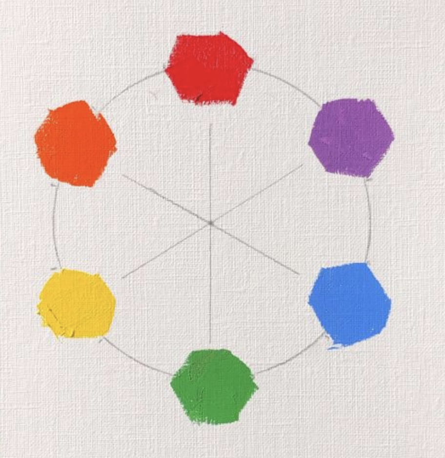
From the color wheel, I have learned the complementary colors. They are the two colors on the opposite sides of the color wheel. So red and green, yellow and purple, blue and orange are three pairs of complementary colors. I also learned that if we mix two complementary colors together equally, we will get a neutral grey.
I never doubted the correctness of this color theory because all the teachings are the same. Even now, if you ask an artist to teach you about color, you probably hear the same thing. Since everybody talked about the same thing, it must be correct. So, I used this color model in my painting practice. After I started, I realized that color was not easy. It is not as simple as the three primaries, and mixing a correct color was a difficult thing. Many teachers give a formula to mix certain colors, and many artists have a special palette and use specific brands of paint to get the color effects they want. All of those theories, I have learned, do not have much of a practical use, and color became a highly experience-based empirical practice.
However, this kind of color practice bothered me. Before I turned into a full-time artist, I worked as an engineer for many years. My rational mind felt uncomfortable when I saw how artists dealt with color so ambiguously. I started to examine my understanding of color, and tested the correctness of theory with experiments. The first test I conducted was the complementary relationship.
From what I have learned, I mix (1) red (cadmium red medium) and green (permanent green), (2) orange (cadmium orange deep) and blue (cobalt blue), (3) yellow (cadmium yellow light) and purple (manganese violet). I have added a little white to make the mixed color easy to see. The results of the above color mixings are shown as Fig. 2 below.
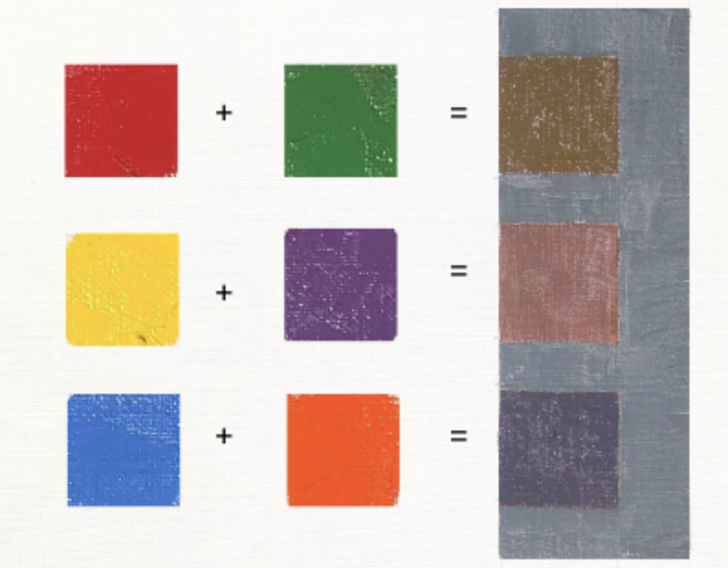
From the results we can see: 1) Red/green mixing gives a dirty yellow color, and it does not give us neutral grey. 2) Yellow/purple mixing gives a dirty red color, and it does not give neutral grey either. 3) Blue/orange mixing is really close to a neutral grey. In order to show the results more vividly, I put the true neutral grey next to the mixed colors. From this experiment, we have concluded that 2 of 3 of the conventional given primary/secondary color pairs are NOT complementary. If we stretch, we might see they are almost complementary. Please do not take my word for it. If you do the experiments yourself, you will know that I am telling the truth.
Now we have confirmed that the conventional color theory is not right, but it is not the end of the research. The immediate next question is: then what are the “correct” primary and secondary colors? What does the “correct” color wheel look like? With those questions, I continued my research. I have found other artists and scientists have noticed the same problem and the most of them accepted that the “good” color theoretical model was the Munsell color system.
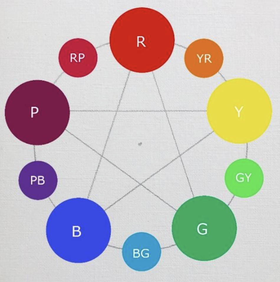
Albert Munsell proposed his color system in 1905. He had mentioned that there are five fundamental colors. They are red, yellow, green, blue, and purple. He evenly placed these five colors on a color wheel. Most astonishingly, orange was not selected by Munsell. He called orange “yellow-red” and it is considered subsidiary to the fundamental colors. We may call it a Munsell secondary color. I have made a Munsell color wheel shown as Fig. 3 below.
Now, let’s put only the 3 primary and 3 secondary colors from the conventional wheel on the Munsell color wheel. It looks like Fig. 4 below.
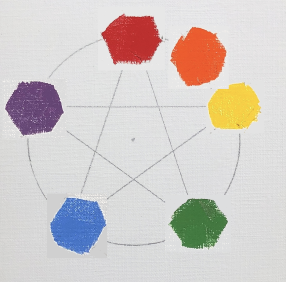
We can tell immediately that red/green and yellow/purple are no longer complementary. However, blue/orange is still complementary. We also tested the complementary relationships between the Munsell fundamental and secondary colors. We have proved they have true complementary relationships. For the color red, yellow, and blue, their corresponding complementary colors are blue-green, purple-blue, and yellow-red.
After I studied Munsell color theory I noticed another ambiguous area of the color system. Our definitions (or vocabulary) of color are quite vague. For instance relating to the color red, there are so many different kinds of reds. The color red is not one specific color, it covers a group of slightly different colors. We even give specific names to many specific reds, such as crimson, scarlet, maroon, and so on. Even the color pigments make so many different red paints such as cadmium red, alizarin, venetian red, and so on.
This crude way of defining colors makes me go deeper to study the color theory. I looked into the numerical model of defining colors. Munsell had talked about his numerical model for all the colors. In a nutshell, every color can be precisely defined by three numbers (or color coordinates): hue, chroma, and value. The Munsell color system has been published with a set of color charts. We can obtain the color coordinates of any specific color by matching the color sample with a specific color swatch in Munsell color charts. Although the Munsell color system was established more than 100 years ago, it is still commonly used by paint manufacturers and artists.
Time goes by so quickly, now we are living in a time when technology develops extremely fast. New pigments have been invented and we artists have many more colors to use than Munsell’s time. There are many vibrant colors we cannot get in the Munsell color coordinates since the Munsell charts are so limited. This problem has led me to study the computer color system.
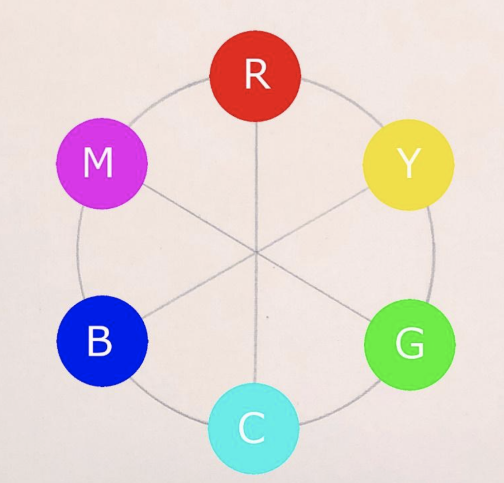
I am going to skip the process of how the computer scientists developed their color system. I just simply present the color wheel that the computer color system uses. The following Fig. 5 is the computer color wheel.

It is quite interesting that we can see that the computer color wheel is very similar to the Munsell color wheel, so I can predict that the complementary color relationship is correct on the computer color wheel. The color coordinates of the computer color system are very similar to the Munsell system. They can be converted back and forth.
If we still want to use the concepts of three primary colors that we learned before, we can see there are two sets of primary colors. One set is red, green, and blue, (or RGB) and the other set is cyan (turquoise), yellow, and magenta (red purple) called the CYM system. These two sets of primaries are complementary to each other shown in Fig. 6
I am so glad my color research has clarified my color understanding. I feel much more confident when I use colors now.
Many artist friends might wonder why we should be bothered to understand the color wheel so rigorously. What is the practical use of this understanding? My answer is: it will help you to mix neutral grey much more easily. For instance, you may ask why blue and yellow are complementary on the computer color wheel? From your knowledge and experience, blue and yellow should give you green, not grey. Is that right? The answer is that the computer “blue” is very specifically defined. It is a violet blue. So it is complementary to yellow. The second reason is that human eyes are more sensitive to perceive greens in comparison with other hues. Any dirty green will appear very green to us.
This clarification of color wheels is a tip of the iceberg in the color science. It gives me the curiosity to go deeper. I am happy to have a chance to talk about it with all of you.