When I was a child, I wanted to be an artist. I read books on drawing and painting. I also learned some basics about color. All the teachings about color always start with introducing the 3 primary colors: red, yellow, and blue. We cannot get primary colors by mixing other colors. If we mix two primary colors, we will get the secondary colors, which are orange, green, and purple. If we arrange the primary and secondary colors into a circle, we get a color wheel. For the convenience of further discussion, we call this color wheel the conventional color wheel (shown as Fig. 1).
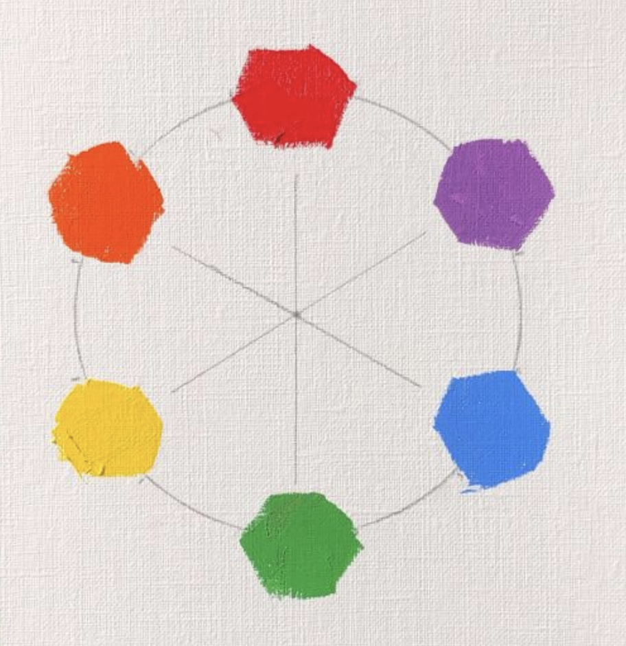
From the color wheel, I have learned the complementary colors. They are the two colors on the opposite sides of the color wheel. So red and green, yellow and purple, blue and orange are three pairs of complementary colors. I also learned that if we mix two complementary colors together equally, we will get a neutral grey.
I never doubted the correctness of this color theory because all the teachings are the same. Even now, if you ask an artist to teach you about color, you probably hear the same thing. Since everybody talked about the same thing, it must be correct. So, I used this color model in my painting practice. After I started, I realized that color was not easy. It is not as simple as the three primaries, and mixing a correct color was a difficult thing. Many teachers give a formula to mix certain colors, and many artists have a special palette and use specific brands of paint to get the color effects they want. All of those theories, I have learned, do not have much of a practical use, and color became a highly experience-based empirical practice.
However, this kind of color practice bothered me. Before I turned into a full-time artist, I worked as an engineer for many years. My rational mind felt uncomfortable when I saw how artists dealt with color so ambiguously. I started to examine my understanding of color, and tested the correctness of theory with experiments. The first test I conducted was the complementary relationship.
From what I have learned, I mix (1) red (cadmium red medium) and green (permanent green), (2) orange (cadmium orange deep) and blue (cobalt blue), (3) yellow (cadmium yellow light) and purple (manganese violet). I have added a little white to make the mixed color easy to see. The results of the above color mixings are shown as Fig. 2 below.
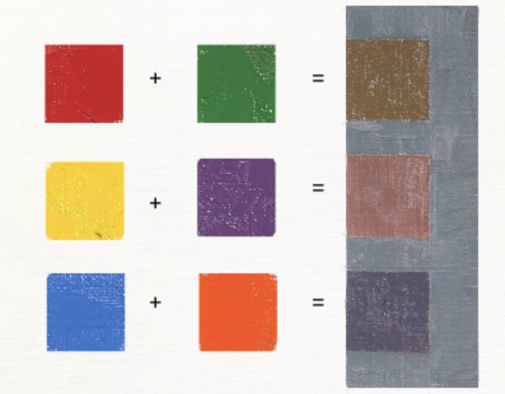
From the results we can see: 1) Red/green mixing gives a dirty yellow color, and it does not give us neutral grey. 2) Yellow/purple mixing gives a dirty red color, and it does not give neutral grey either. 3) Blue/orange mixing is really close to a neutral grey. In order to show the results more vividly, I put the true neutral grey next to the mixed colors. From this experiment, we have concluded that 2 of 3 of the conventional given primary/secondary color pairs are NOT complementary. If we stretch, we might see they are almost complementary. Please do not take my word for it. If you do the experiments yourself, you will know that I am telling the truth.
Now we have confirmed that the conventional color theory is not right, but it is not the end of the research. The immediate next question is: then what are the “correct” primary and secondary colors? What does the “correct” color wheel look like? With those questions, I continued my research. I have found other artists and scientists have noticed the same problem and the most of them accepted that the “good” color theoretical model was the Munsell color system.
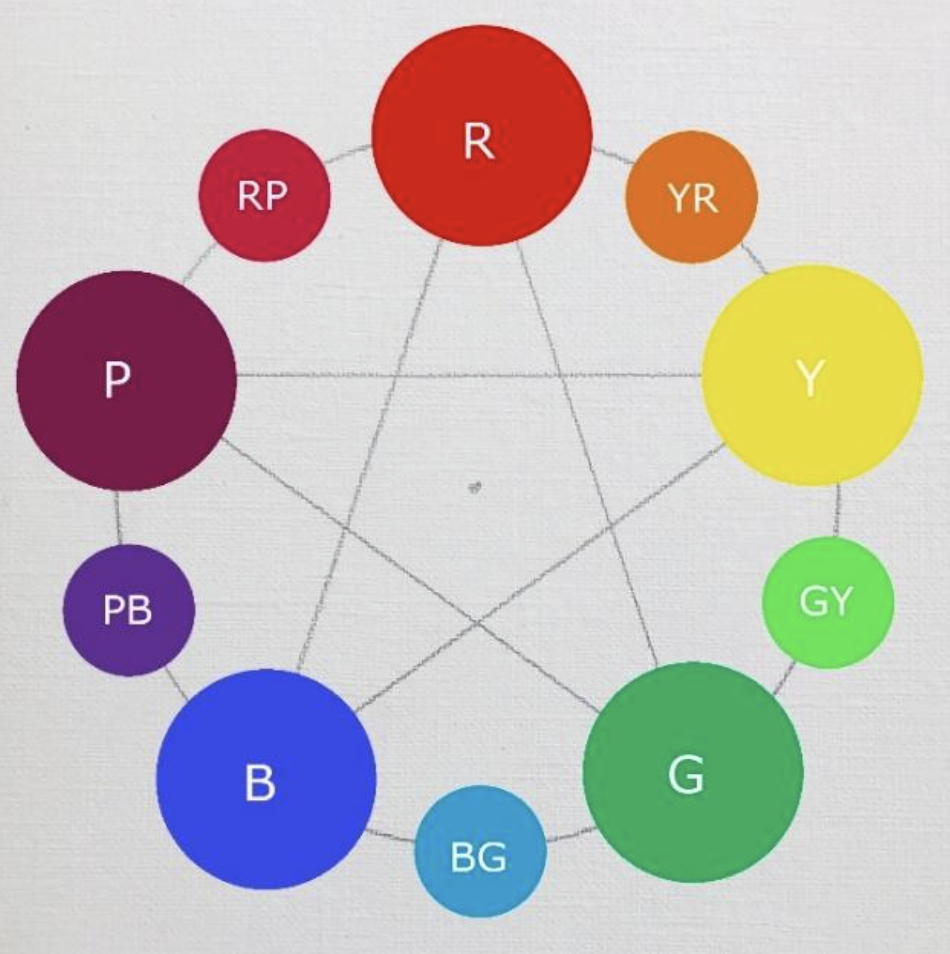
Albert Munsell proposed his color system in 1905. He had mentioned that there are five fundamental colors. They are red, yellow, green, blue, and purple. He evenly placed these five colors on a color wheel. Most astonishingly, orange was not selected by Munsell. He called orange “yellow-red” and it is considered subsidiary to the fundamental colors. We may call it a Munsell secondary color. I have made a Munsell color wheel shown as Fig. 3 below.
Now, let’s put only the 3 primary and 3 secondary colors from the conventional wheel on the Munsell color wheel. It looks like Fig. 4 below.
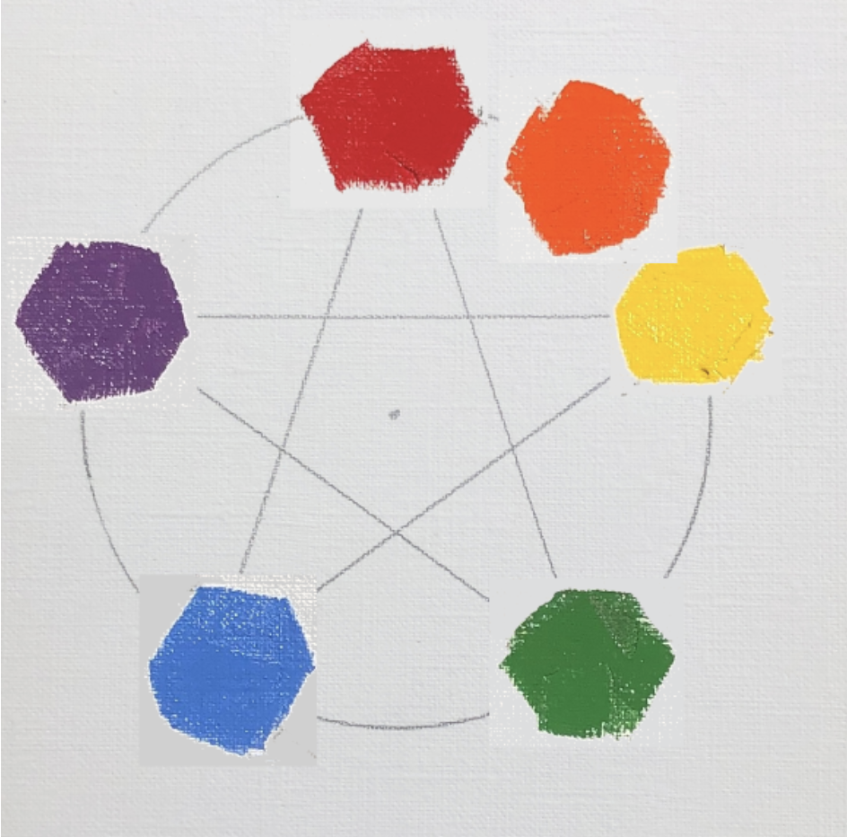
We can tell immediately that red/green and yellow/purple are no longer complementary. However, blue/orange is still complementary. We also tested the complementary relationships between the Munsell fundamental and secondary colors. We have proved they have true complementary relationships. For the color red, yellow, and blue, their corresponding complementary colors are blue-green, purple-blue, and yellow-red.
After I studied Munsell color theory I noticed another ambiguous area of the color system. Our definitions (or vocabulary) of color are quite vague. For instance relating to the color red, there are so many different kinds of reds. The color red is not one specific color, it covers a group of slightly different colors. We even give specific names to many specific reds, such as crimson, scarlet, maroon, and so on. Even the color pigments make so many different red paints such as cadmium red, alizarin, venetian red, and so on.
This crude way of defining colors makes me go deeper to study the color theory. I looked into the numerical model of defining colors. Munsell had talked about his numerical model for all the colors. In a nutshell, every color can be precisely defined by three numbers (or color coordinates): hue, chroma, and value. The Munsell color system has been published with a set of color charts. We can obtain the color coordinates of any specific color by matching the color sample with a specific color swatch in Munsell color charts. Although the Munsell color system was established more than 100 years ago, it is still commonly used by paint manufacturers and artists.
Time goes by so quickly, now we are living in a time when technology develops extremely fast. New pigments have been invented and we artists have many more colors to use than Munsell’s time. There are many vibrant colors we cannot get in the Munsell color coordinates since the Munsell charts are so limited. This problem has led me to study the computer color system.
I am going to skip the process of how the computer scientists developed their color system. I just simply present the color wheel that the computer color system uses. The following Fig. 5 is the computer color wheel.
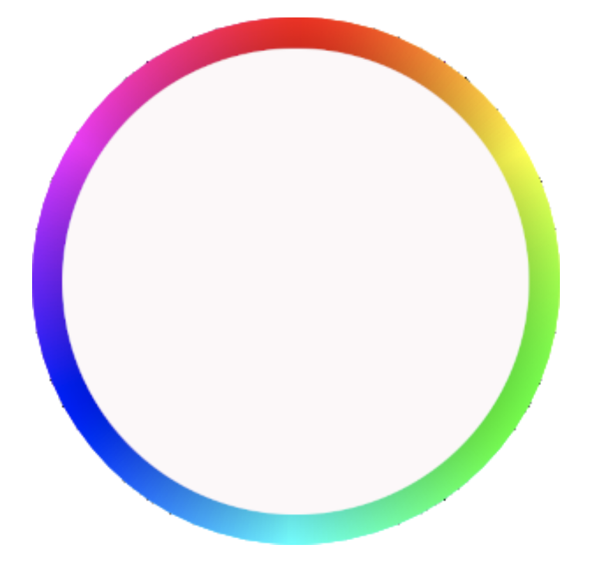
It is quite interesting that we can see that the computer color wheel is very similar to the Munsell color wheel, so I can predict that the complementary color relationship is correct on the computer color wheel. The color coordinates of the computer color system are very similar to the Munsell system. They can be converted back and forth.
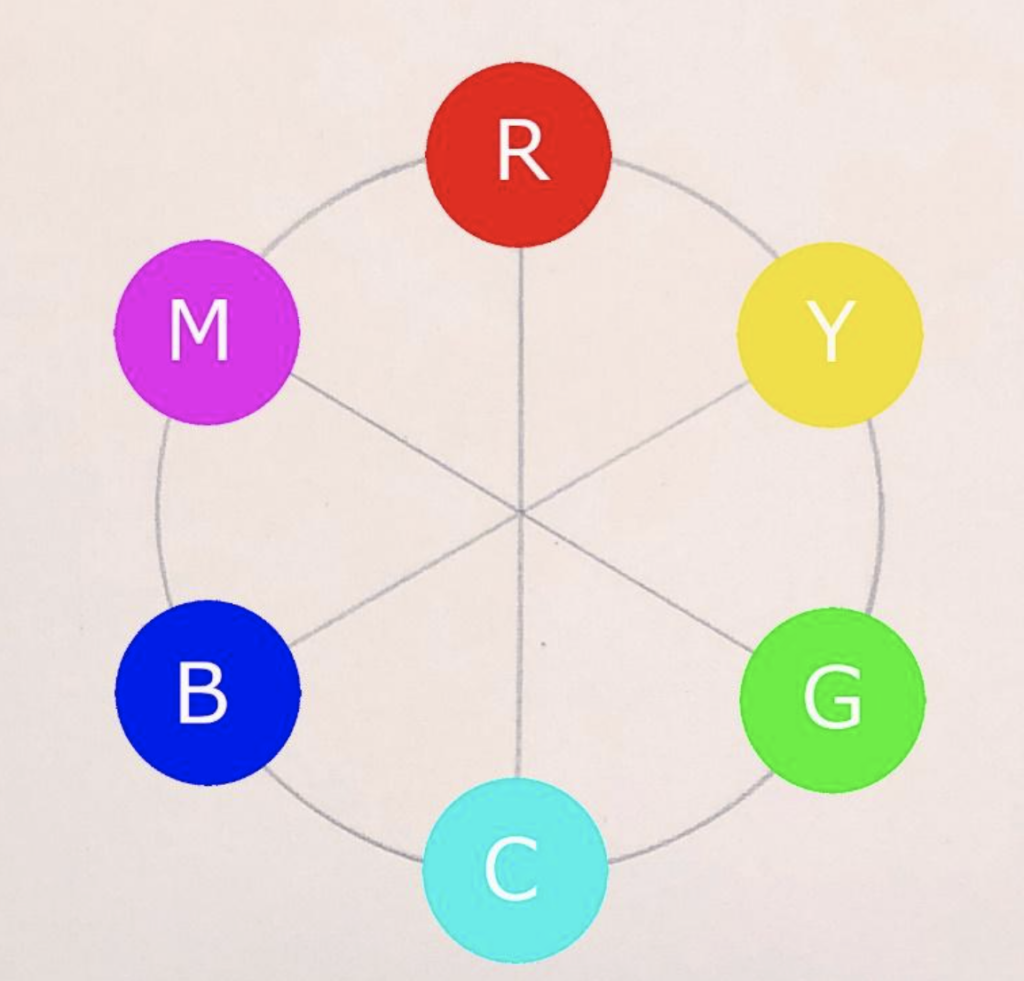
If we still want to use the concepts of three primary colors that we learned before, we can see there are two sets of primary colors. One set is red, green, and blue, (or RGB) and the other set is cyan (turquoise), yellow, and magenta (red purple) called the CYM system. These two sets of primaries are complementary to each other shown in Fig. 6
I am so glad my color research has clarified my color understanding. I feel much more confident when I use colors now.
Many artist friends might wonder why we should be bothered to understand the color wheel so rigorously. What is the practical use of this understanding? My answer is: it will help you to mix neutral grey much more easily. For instance, you may ask why blue and yellow are complementary on the computer color wheel? From your knowledge and experience, blue and yellow should give you green, not grey. Is that right? The answer is that the computer “blue” is very specifically defined. It is a violet blue. So it is complementary to yellow. The second reason is that human eyes are more sensitive to perceive greens in comparison with other hues. Any dirty green will appear very green to us.
This clarification of color wheels is a tip of the iceberg in the color science. It gives me the curiosity to go deeper. I am happy to have a chance to talk about it with all of you.
Pamela Hiatt says
This has made me really think about why it’s so hard for me to mix colors. I actually have a CMY primary color wheel which has the RGB primaries also. I think I’ll experiment and see how it goes. Thanks!!
Janice Yow Hondes says
The value to me, besides mixing neutral colors is knowing the complements of light – which precise color is added to shadows depending on the color of the light. Check out James Reynolds late day paintings with red light and the blue green added to the shadows
A Cremins says
Illuminating! Thank you for sharing.
Kathy Fox Weinberg says
Only Fig 1 is visible in this great article! Is it my device or something else? Thank you!
Kathy Fox Weinberg says
Ever mind my comment – all figures are now visible. Again. Thank you for this piece!
Alisann Smookler says
That makes so much more sense to me. Thank you for writing this. It is important, as an artist, to truly understand color and your article does support that.
Elizabeth Tucker says
I love Munsell and use it when I teach color theory, how to mix colors, and why you will or won’t get certain colors based on a person’s color palette. What is missing in this conversation is that the BIAS of the color affects the outcome of the color mixtures. As we all know, there is no perfect primary color. Each color has its own bias. The color wheel is just a wheel of family names. The Red family can range from red-violets to red-oranges. The Blue family can range from blue-greens to blue-violets. And the Yellow family can range from yellow-greens to yellow-orange. The same is true for the secondary and tertiary colors. To get a clear(er) violet, for example you want to mix a red that has a violet bias (alizarin as an example) with a blue that ALSO has a violet bias (ultramarine blue for example). If you mix the same red with a blue that has a green bias, Cobalt, Cerulean, Windsor Blue Green as examples, you will various degrees of dull violets to browns. The colors mixed will neutralize each other. Most colors are not perfect complements that would yield a good grey. Ultramarine Blue when mixed with Burnt Umber (a VERY neutralized orange and also a complement to blue) yields lovely greys. The same when Burnt Sienna (a warmer version of orange yet still neutralized) is mixed with Ultramarine Blue. When you mix Alizerine and Viridian you will also get a version of grey, though it tends to be more a blue grey because of the blue bias found in both Alizerine and Viridian. One other thing to be aware of is whether or not the color you have on your palette is a single pigment color or one made with several colors to give the impression of the color. These are usually called ‘hues’. The addition of those other colors will also affect the mixture. There is more to know, of course, but to me color bias is the most important factor in consistent color mixtures.
Deborah Lazar says
So how would you describe color temperature? And how important it is to creating depth in a painting?
Elizabeth Tucker says
Deborah…..Color temperature is relative to what’s around it. One of the really fun things about painting is playing with temperatures. You appear to make something look warmer or cooler by how you surround the color. If you want it to appear warmer, use cooler colors around it, even if it’s the same family of color. You can also make it appear more chromatic by surrounding the color with greys or neutralized version of a color. Honestly, for me, there is nothing more fun than playing with colors!
Christine M. Cancelli says
I find color mixing to be a grand experiment all the time. It’s a journey I’m always learning from. As others in this conversation have said, the temperature of the colors is a factor you’re missing, or simply choose not to take into account. I think the selection of reds, blues and yellows is key to this discussion, since there are warm and cool variations of each of these hues. Consequently, mixing cool and warm complimentary colors with each other without consideration given to their relative temperatures is going to give you unsatisfactory results, i.e., warm, cool or muddy grays instead of the neutrals you expect.
Although I have studied the Munsell system briefly, I found it to be ponderous and difficult to understand because I’m a visual and audio learner. An excellent source on mixing colors is Ian Sidaway’s “Color Mixing Bible.” Lots of pictures of color combinations in oil, pastel watercolor, etc. It’s the perfect reference for visual artists!
Christine M. Cancelli says
I find color mixing to be a grand experiment. It’s a skill I’m still learning. As others in this conversation have said, the temperature of the colors is a factor you’re missing, or simply choose not to take into account. I think the selection of reds, blues and yellows is key to this discussion, since there are warm and cool variations of each of these hues. Consequently, mixing cool and warm complimentary colors with each other without consideration given to their relative temperatures is going to give you unsatisfactory results, i.e., warm, cool or muddy grays instead of the neutrals you expect.
Although I have studied the Munsell system briefly, I found it to be ponderous and difficult to understand. After all, I’m a visual and audio learner. An excellent source on mixing colors is Ian Sidaway’s “Color Mixing Bible.” Lots of pictures of color combinations in oil, pastel watercolor, etc. It’s the perfect reference for visual artists!
George Jennings says
Let me qualify my comments by saying that for me this treatise is very academic, and exhausting. I am not someone who went to art school. I am not someone who follows anything academic about art well. I respond to what I “feel.” Art for me is a “feeling response” to a dynamic creative process. It is very personal journey.
I have been mentored by Kami Mendlik, whom to me is the last word on color, what it is, and how to use it in your art. She just wrote a wonderful book, “Color Relativity, Creating the Illusion of Light With Paint.” After. taking a workshop from Kami, and having a few individual mentoring sessions with her, I felt that she had certainly showed me a way to become more accurate with I am seeing with colors and the attending characteristics of color in my paintings. And honestly, I don’t know if I said “That is too tedious,” or whether I actually started unconsciously using much of what she tried to teach me, and maybe did teach me. But I went back to shooting from the hip and paying close attention to what I am seeing when I paint.
Now, I more carefully pay attention to tonal qualities of my colors in my paintings, but I get a great kick out of creating my colors without thinking about the color wheel, complementary colors, and all of the other
goodies that can be blamed on color! And very often I mix my colors on the painted surface to get them to relate more correctly to what they are living with on that surface. And it works for me.
As mentioned in the blog, there are many different varieties of a color, and it is finding or creating the one that works for you in a specific instance. You just have to try them out and see what works for you.
All this goes to a greater comprehension of painting for me. I am not painting to be graded, published, or purchased now. I am painting to see how I feel about the assignment I give to myself in a particular work. How did I do? Can I improve it?
Certainly I love it when I am complimented in my work, But more importantly, the effort is my responsibility, and I want to determine how I well I met that responsibility.
It goes back to the answer of that basic question about painting. “No, I am never through!”
M Kathryn Massey says
Hi, I have to agree with George’s line of approach to color. Color charts, etc. are an external-meaning they are outside of you as the painter. Color charts and such are merely theories. Theories may only point you in a direction. Theories are not an absolute.
You as the painter must sit with the subject and paint what is before you not to match color note for color note, but rather, build the painting with your idea or concept ABOUT the subject material before you. This should be present BEFORE you pick up a brush to make a mark. Observing temperature changes is more important than memorizing charts with the idea of imposing those charts when you paint.
The painting will TELL you what it needs at the time you most need it.
M Kathryn Massey, OPA
Kelly Best Bourgeois says
Excellent interpretation and explanation! Thank you for sharing along with your visuals.
Jerrie Powell says
I am planning to experiment with the CYM palette. Printer cartridges use these three colors plus black and produce any color needed. Recently I attended the OPA convention where Classico gave away a sample box with these four colors. Something to think about.
Pamela Smithsted says
This is very helpful! Thank you so much Qiang.
Pam
Michael E Bartlett says
Color wheels have changed progressively with conventional ideas of color science. What you have described is the transition from old color theory to modern color theory. I teach classes about color through oil painting and have also settled on a six color primary wheel. Though, I demonstrate that with only three pigment colors I can mix a full spectrum of 18 exemplar colors. Where the fun begins is when color theory meets the palette and the brush. Thanks for your article, it is time painters start to understand modern color theory and how to apply it in practice.
Linda darsow Sutton says
THANK YOU, I too have been fascinated by “color wheels” most of my life. My dad was an optical engineer so I grew up familiar with the light wheel as well as using the conventional color wheel as I was told too in art classes. When changing to transparent watercolors the “light wheel” started to make more sense. Then studying afterimages (before computers) the two came together as you say. Stare at one set of 3 “primaries” for a minuet then a white wall and you will see the other three. There are lots of tricks in my color workshop working with the relationships in the six color wheel you propose. Light and pigment don’t mix the same, I work in oils and transparent watercolor, so it’s just the title of “primary” that changes. And now we have cyan paint.
Qiang Huang says
I am so happy to see this active discussion after my blog post published. “Color” is so much fun. You can go either the way of a rigorous scientific research or just play it experimentally. I am interested in both. You all are welcome to use my free color apps on my website: https://www.qhart.com. They are both fun and informative. For instance, I have the color temperature quantified. All the colors can be identified numerically with a simple clicking. Artists are visual and our goal is to paint better. However, theories is a good assistant to us. When you put things in a system, you do have to memorize too much and go deeper. A good color theory is a piece of art itself.
Qiang Huang says
Correct my typo: When you put things in a system, you do not have to memorize too much and you can go deeper.
Jeff Merrill says
I think there are several truths about color that are useful to all artists and I agree that understanding the various color models is educational. Color is an expansive topic and seems like any effort to create a comprehensive color summary only yields the realization that there is always more to learn and explore.
With that in mind I certainly do not profess to know everything about color. However, I think a strong argument can be made there are certain truths about color that ALL artists can rely on to make accurate color choices to achieve predictable and precise results.
1) The traditional color wheel works. Mixing primary colors will yield secondary colors.
2) Mixing complementary colors DO “neutralize” each other but will not give you a true “desaturated” gray like mixing black and white together. And why would they? All colors have saturation as a fundamental part of their color DNA. Black and white have no saturation.
3) All colors have unique qualities in their intensity (tinting strength), saturation, temperature, and transparency and value. Understanding the unique qualities of the pigments you use is fundamental to achieving predictable results.
4) Each color (paint pigment) is inherently warm or cool, or better expressed as “warmer or cooler” compared to other colors. For example, viridian green is inherently cool while sap green is inherently warm. Having a warm and cool version of each color on your palette makes color mixing easier. Choosing a pigment for its color temperature has made color management easier in my experience. I use cadmium yellow lemon because of its inherent cool nature. It has a slightly cool greenish bend that makes it unique. It can always be turned it into a regular (warm) cadmium yellow by adding orange or red to it.
5) Color Temperature is relative. Although each color is inherently warm or cool, this must be qualified by the understanding that color temperature is relative, given that any color will appear warmer or cooler based on the colors it’s next to.
6) Adding white to any color will make it cooler and less saturated. Adding black to any color as a means of darkening a color generally destroys the color harmony.
7) When trying to mix any color first identify its inherent color (red, orange, yellow, green, blue, or purple). Then identify if it leans warm or cool and use the appropriate colors to “bend it” warmer or cooler as needed.
8) Lastly, color temperature and intensity often need to be exaggerated to achieve the correct relationship, to make things look correct.
This is not a comprehensive list of color theory, but I simply offer it as a list of practical ideas that can help any artist get control of color. I hope it can help you.
John Taft says
Great points Jeff!
John Taft says
A very interesting discussion, Qiang, for sure!
I have taught color wheel mixing over the years, and have noticed what you point out, that mixing pure complimentary colors doesn’t necessarily result in perfect neutrals. In my classes we mix around the wheel, and also fill in the whole circle, making steps to the neutral center. It is an awesome exercise.
The primaries: red, yellow, and blue, are still the three colors that cannot be mixed, and the secondaries are the colors resulting from the mixing of any two primaries. So, the conventional theory in subtractive mixing, like we do with paint (verses mixing with light/RGB), is sound.
I see that Munsell’s uneven spacing between the primaries, like where red is closer to yellow (squeezing the orange a bit), results in a wheel where the color opposite results in a more accurate neutral. This leads me to believe that dimensional color space is more dynamic than equal. Simplifying the concept into a perfect circle with evenly spaced primaries is good for understanding the concept and relationships, and that neutrals will result when mixing across the wheel. Thanks.
Allen Tager says
Violet and purple: what sets them apart? These two colours do not only differ in few shades but are fundamentally different.
Why it took us thousands of years to see the color violet?
https://psyche.co/ideas/why-it-took-us-thousands-of-years-to-see-the-colour-violet
https://astronomy.com/magazine/stephen-omeara/2021/12/violettomania-in-the-stars
Allen Tager says
Violet and purple: what sets them apart?
There’s a world of difference between these two colours.
Purple and violet are two different colors
Sir Isaac Newton’s Theory of Light proved that the colour spectrum consists of red, orange, yellow, green, blue, indigo and violet. That’s right: NO purple. You might be surprised to learn that while violet is a true colour and is part of the spectrum of light, purple is non-spectral, and can be used to describe any shade of colour occurring between red and blue.
https://drive.google.com/file/d/1Ju23gu3UqgQqBCtUM04e2ctCHmJvR1aD/view?usp=sharing