Painting portraits can be complicated, but mixing skin tones shouldn’t be. In my workshops, I teach a method to simplify the process.
How to mix skin tones
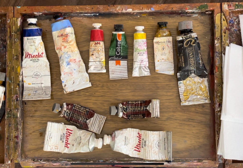
- First, choose a “base” color like yellow ochre, transparent oxide yellow, raw umber, burnt umber, raw sienna, transparent oxide red, or transparent oxide brown based on the skin tone you are painting. This is what makes this process work for all ethnicities.
- Mix the base color with white to form the “foundation color.”
- Mix that “foundation color” with various warm and cool colors- like red, blue, and green. The goal is to tint it- so you only need a touch of the primary color.
- The result is a palette of premixed harmonious- warm, cool, and neutral- skin tones with the correct “undertone” throughout.
Mixing the needed skin tones is now almost done. Small tweaks in the value or temperature will be necessary, but that is much easier than staring at pure red, green, and yellow piles of paint every time you need a new mixture.
———————————————————————————————————————
A closer look
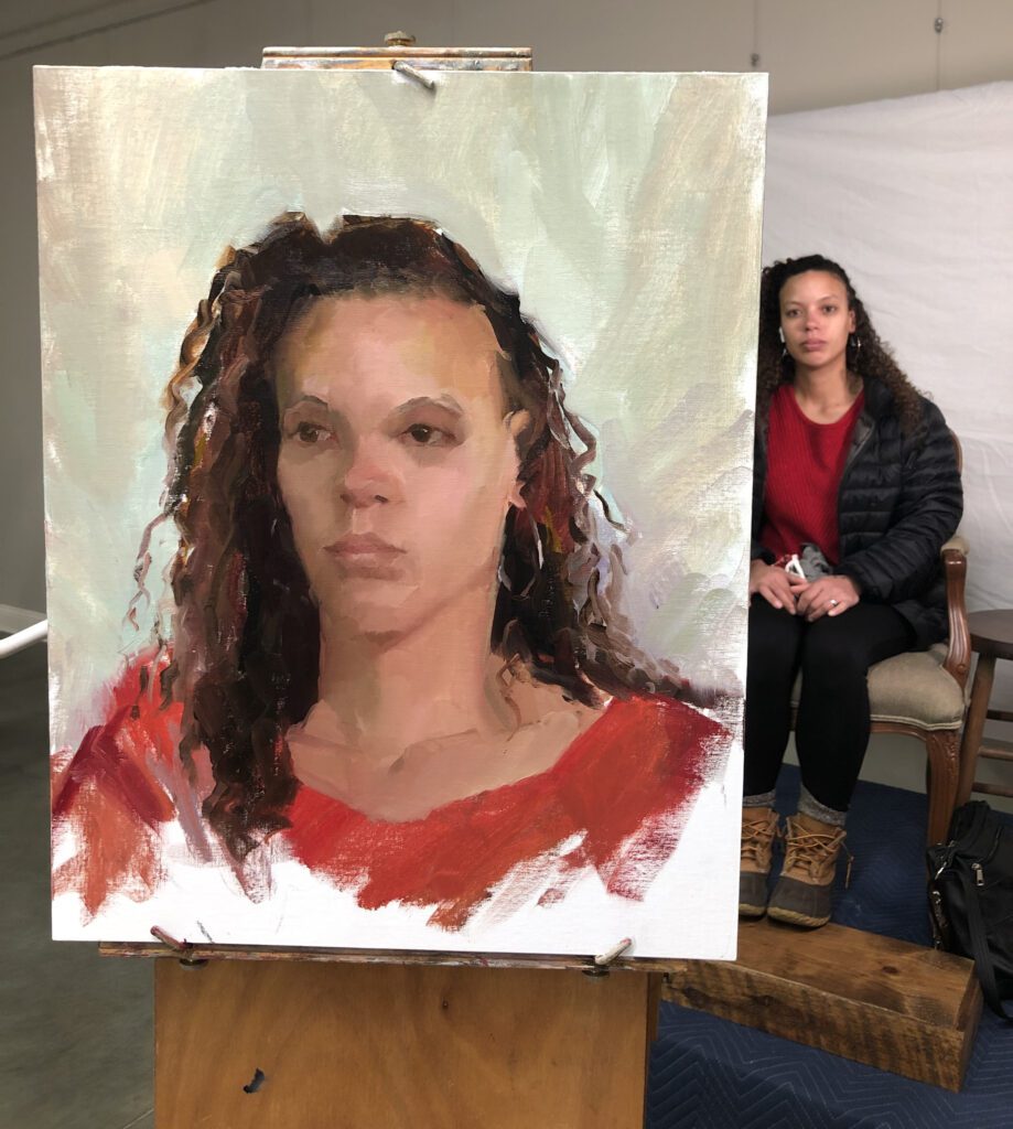
Let’s look closer at these steps. I will demo for you in pictures so that you can see what I do. (I also have uploaded a video on YouTube that explains this process. @susanpattonart)
- Choose a base color.
To help you decide, do a simple color chart. (A quick one- I promise.) This will help you to choose which “base” color is best for your subject’s skin tone. Mix one base color at a time – yellow ochre, transparent oxide yellow, raw umber, burnt umber, raw sienna, transparent oxide red, or transparent oxide brown with white and put it onto a canvas. Repeat with each color until you have a sample canvas of foundation colors to reference each time you paint portraits. (Eventually, you will be able to choose your base color without this aid.)
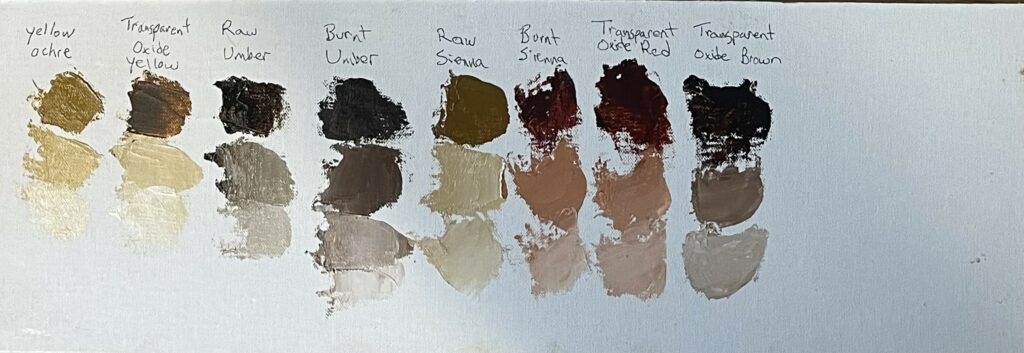
Next, hold this canvas with its mixtures up to your subject. Choose the color that has the correct undertones. Choose the one with the least contrast between your subject and the mixtures,
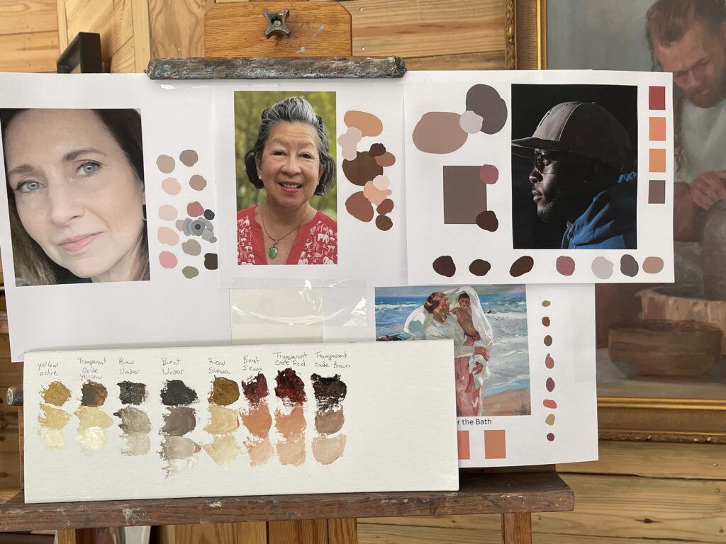
I made a canvas with several sample “Base” colors on them. I put it next to skin tones requiring a different base color based on their undertones for you to see the advantage in making this color chart. I can use this simple color chart to choose my base color with portraits in the future if need be.
Tip: To help you out even more, mix several warms and cools for each base color and paint them onto separately labeled canvases. You can keep these canvases for future use when choosing your “base” color.
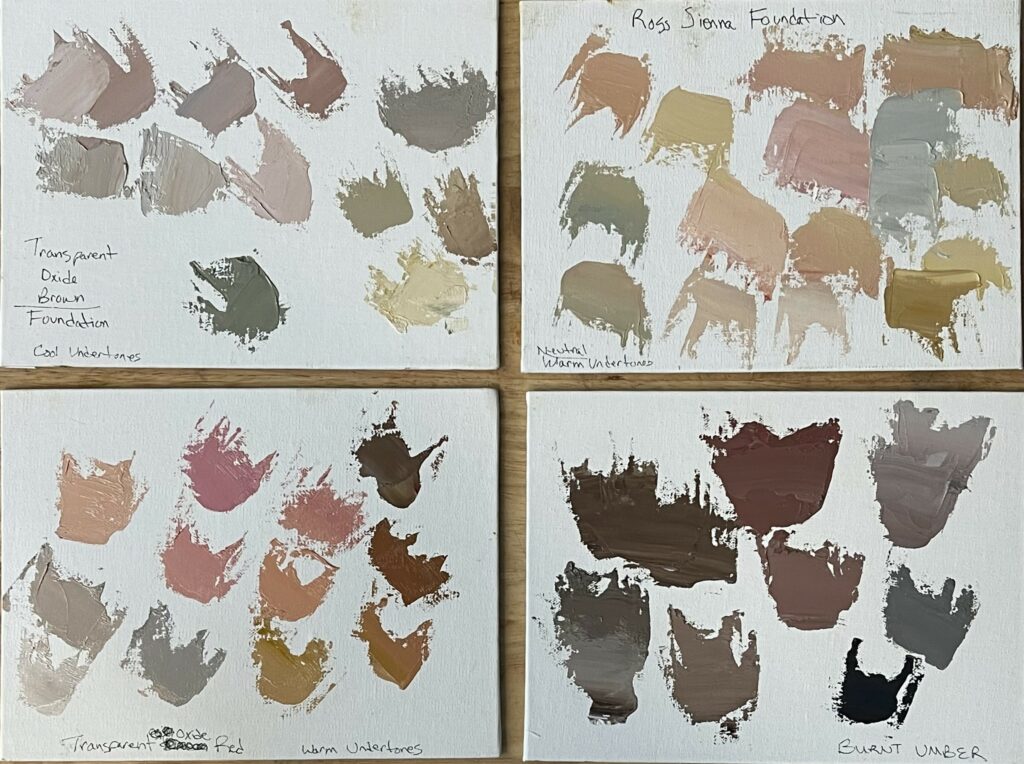
These 6 x 8 canvases were made with different “base” colors, but otherwise the same palette. The first is Transparent Oxide Brown, the second is Raw Sienna, the bottom left is Transparent Oxide Red, and the bottom right is Burnt Umber. Which would you choose as your base color for these pictures?
Which base color would you choose for doing a master copy of Sargeant’s painting?
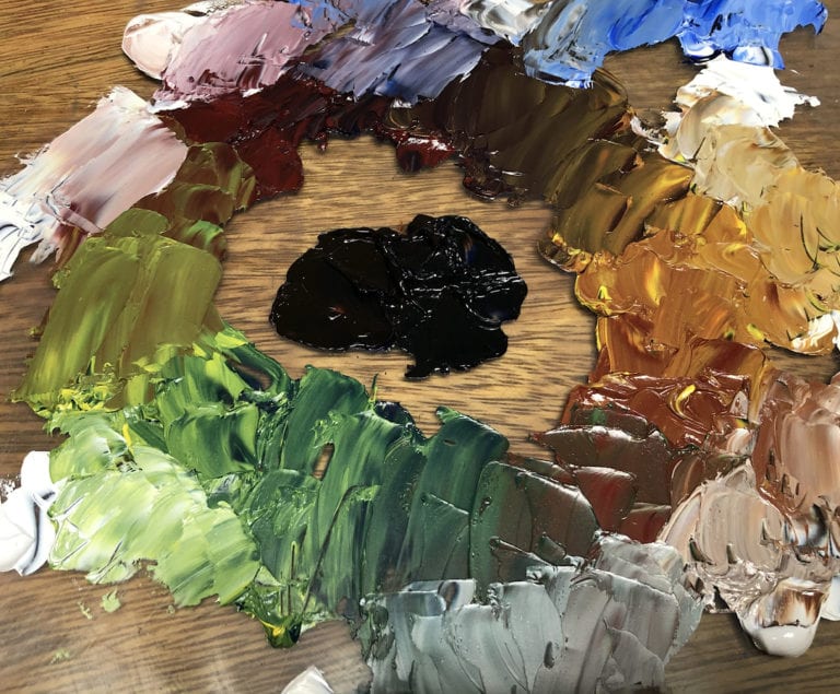
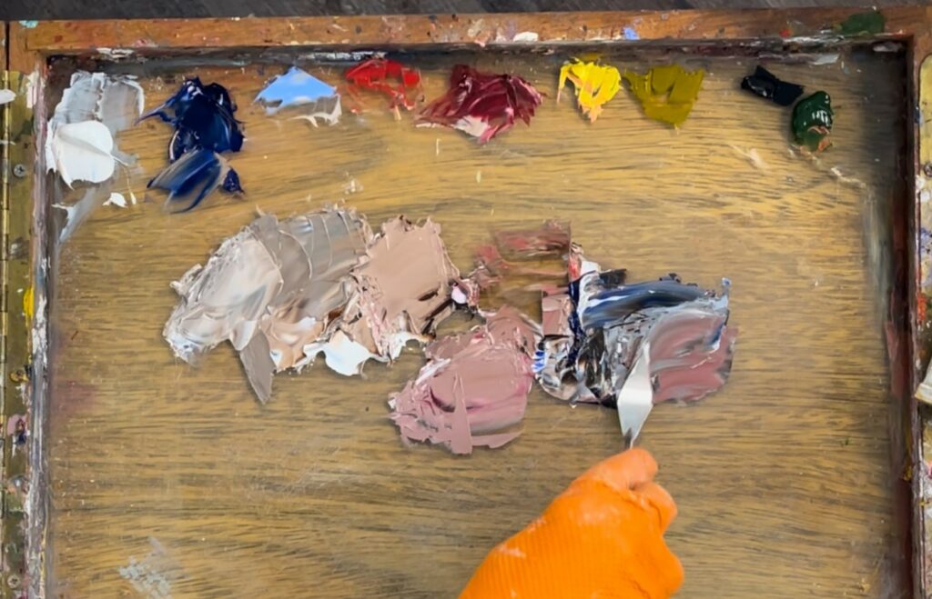
Once you have chosen your “Base color”, put a small line of it onto your palette with a thicker line of white above or below it.
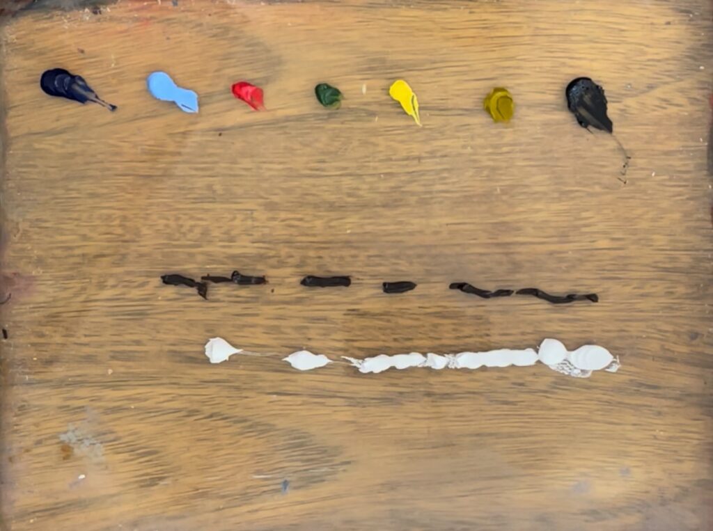
Tip – Can’t decide? A good middle-of-the-road is “Raw Sienna” for light skin. “Burnt Umber” works well for darker skin that has cool undertones.
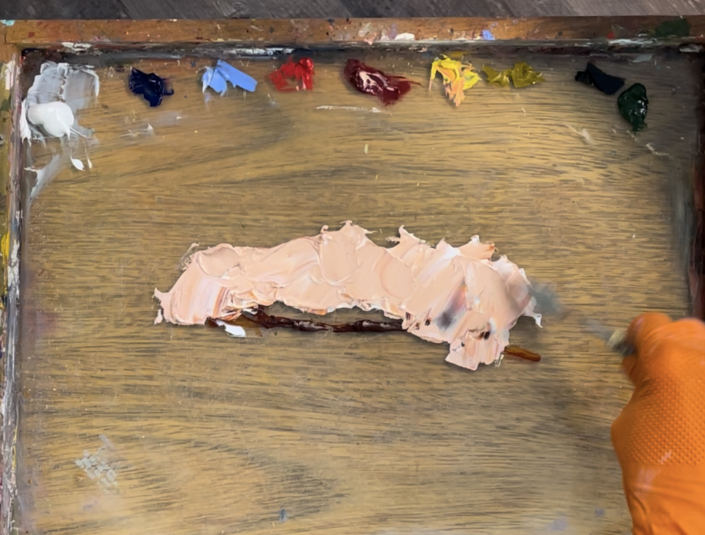
2. Mix the base color and white to form the appearance of makeup that would blend in with the person’s skin.
Above that line, put dots of other colors. These colors are up to you and can be chosen based on the colors you see in the person’s skin. The idea is to have both warm and cool colors. Put a dot of blue, red, yellow, green, and black paint in a row above the foundation line. (You can also use any of the colors we named above as a “base color” in this row if you’d like.) No color is outlawed in this row- these are up to you. You can also put as many colors as you’d like.
Tip: Can’t decide which colors to put on this line? Try Ultramarine blue, Cad red, Alizarin Crimson, Yellow Lemon, Sap Green, Transparent Red Oxide, and Black. Mix purple using blue and alizarin.
Tip: Also be sure to include colors reflected onto the person’s skin from their clothing or surroundings. For example, if you plan to paint their shirt “Turquoise” be sure to put “Turquoise” in this line. That is because light bounces and carries color with it. Some of this color will bounce up and reflect in the skin around it.
3. Now that you have your “Foundation” line and dots of colors above, take your palette knife and “tint” the foundation with the colors- one at a time. For example, take a small amount of the blue and mix it into the foundation color (base color + white + small drop of blue), next, bring a small amount of red into the pure foundation below to get a pinkish flesh color (base color + white + red). Continue this process across your palette until you have various flesh tones to paint with.
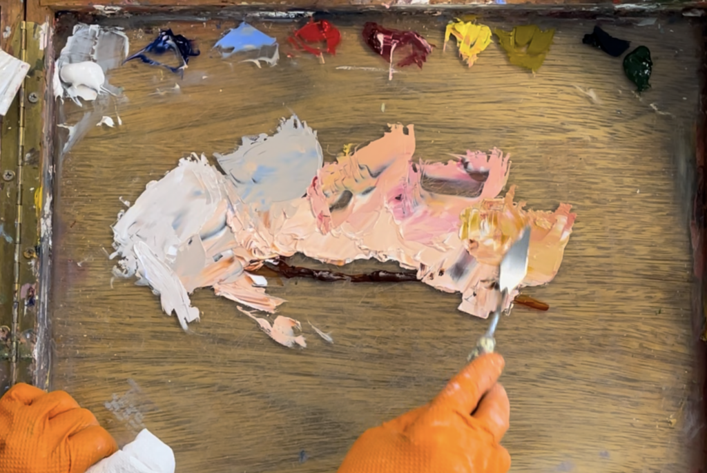
Tip: Depending on your base colors, your flesh tones will have an undertone of warm or cool. Different base colors will yield a different spectrum of colors.
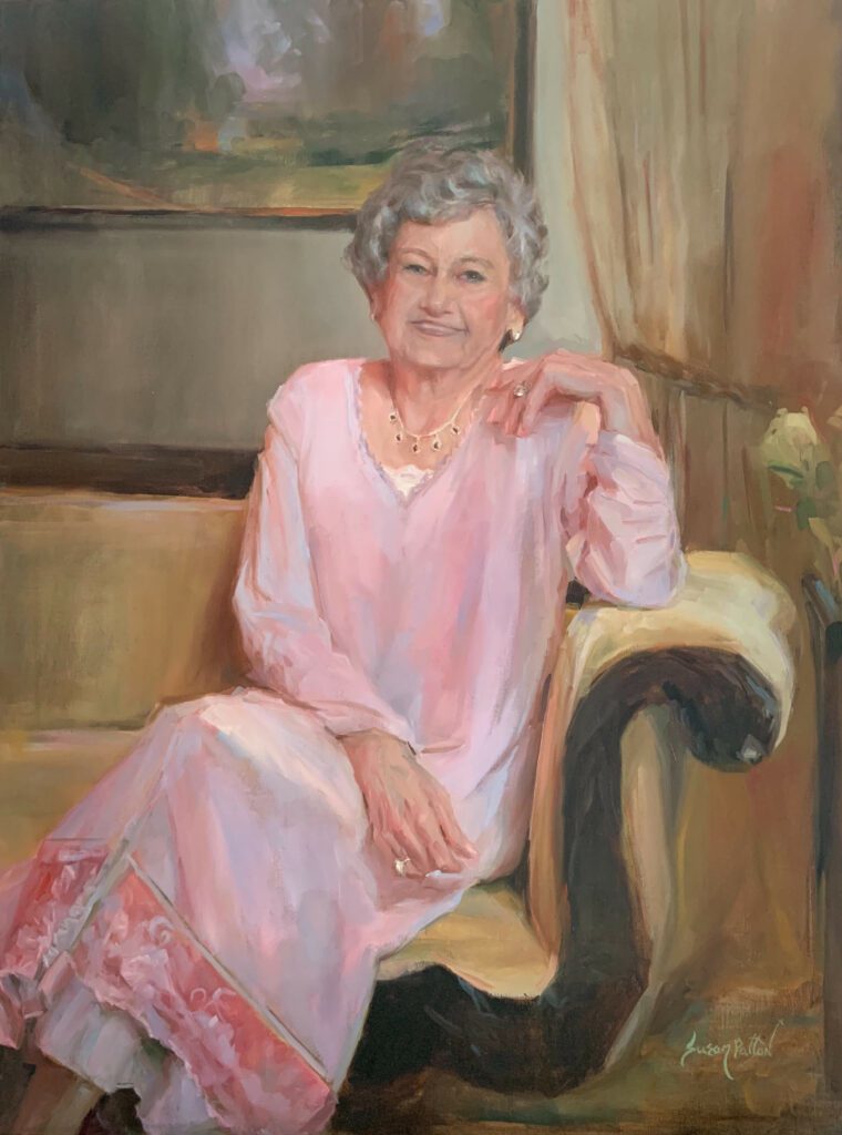
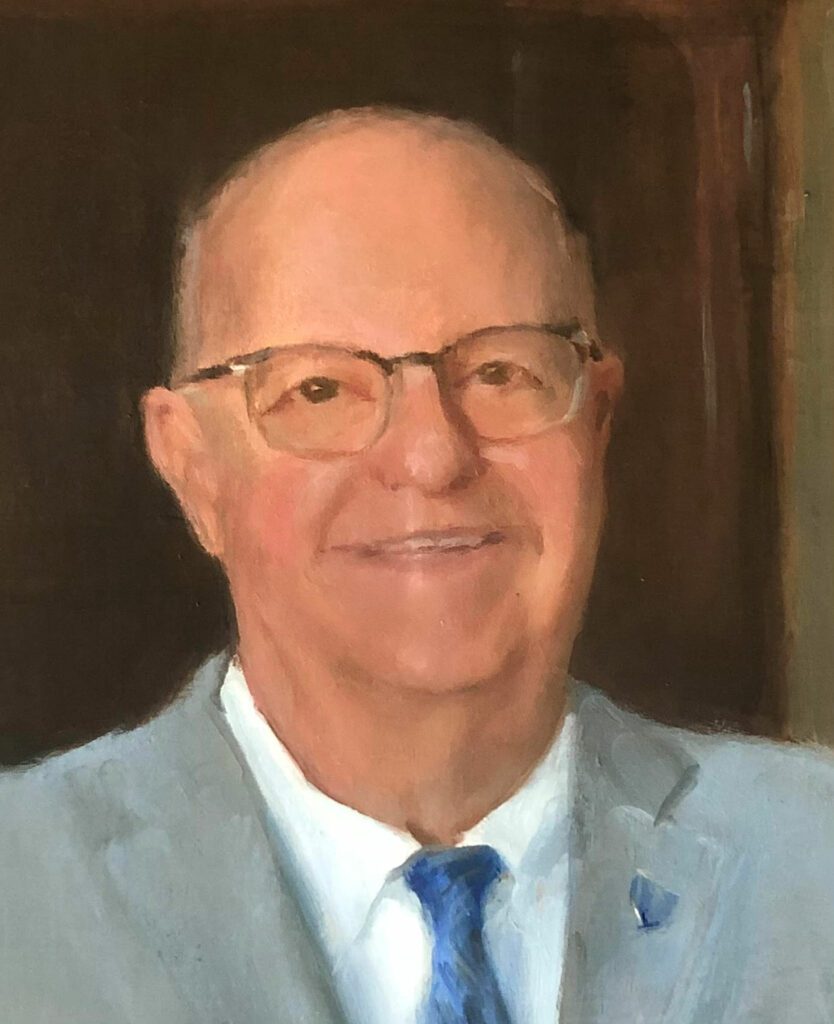
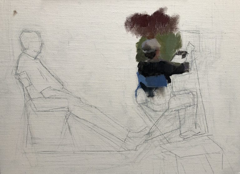
4. You are now ready to begin painting the portrait! The advantage of this method is that in choosing a base color, the colors stay “interconnected.” This makes them flow harmoniously from one to the next as the form turns around the head.
Tip: You can also mix the pure colors to form darker colors.
Be aware:
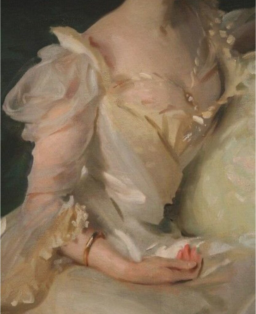
- Skin tones do not have to be matched precisely. The value and temperature are much more important than matching the hex color code. Look at Sorolla’s painting, After the Bath. Sorolla was much more concerned with beautiful shifts in temperature and getting the light and shadow correct than with matching the precise skin tones. It appears he wanted every area to be beautiful, regardless of the “actual” color.
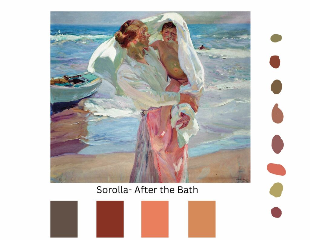
These are some colors that I sampled from the skin of the lady and the child in this painting. Notice the beautiful warm and cool colors.
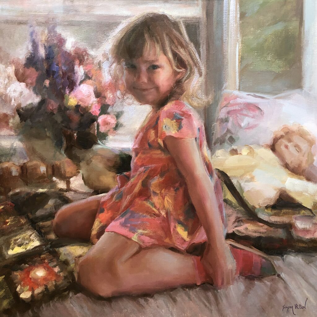
2. Avoiding plastic-looking skin, unless it is your intent. In my painting, Cherished, I painted a little girl and her baby doll.

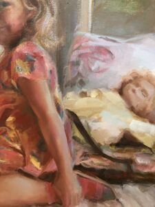
There are differences between the baby doll and the little girl’s flesh. The baby doll is made of plastic in 1 color, so the only change of color or value is the light reflecting on the hard surface. Conversely, the girl’s hand has the warmth of blood flow, a bigger temperature change where the light hits it, and limited reflection because the skin is porous and soft. To show these differences in a painting, use a change of temperatures with similar values to indicate translucence. Control the amount of reflection on the skin by using stronger chroma without a big change in value. To show light reflection on the doll, use a change in value with less chroma.
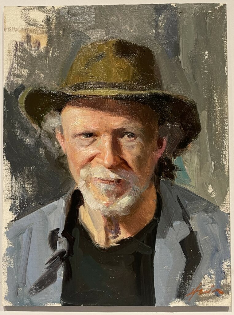
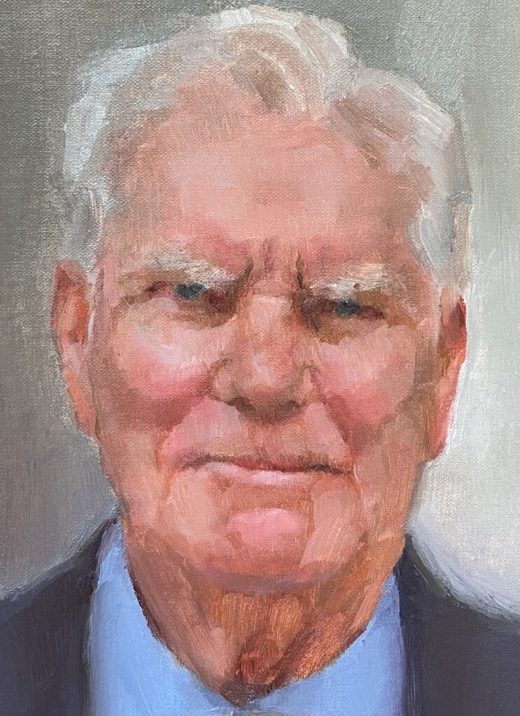
3. The application of the paint and the direction/visibility of the brushstrokes are as important as the color you choose. Every artist has their tendencies and practices regarding this. Practice and time will tell your preference. The Portrait Society of America hosts an annual International Portrait Society Convention. It is a great way to see wonderful examples of beautiful portraiture. This painting was done as one of the “Faceoff” demonstrations by artist Jeff Hein at this year’s International Portrait Society Conference. Note how every color, temperature, and direction of the brushstroke is intentional.
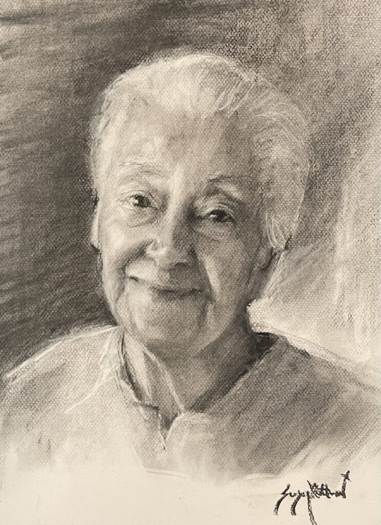
4. Mixing beautiful skin tones is important but secondary to getting the drawing correct. Drawing with charcoal is a great way to practice getting likeness by focusing on turning form without color. After learning to draw, you can learn to sculpt (push/pull) the painting with temperature and “Color Value”, as Everett Raymond Kinstler would say. Never just color. Never just value. “Color-Value.”
This is a charcoal sketch of my grandmother. I drew it from a photo of her looking at me one day when I visited her. It is just like her, even though it is monochromatic.
My process of mixing skin tones is not the only way that works nor the only way I ever paint, but it has been an effective method to help my workshop participants see color in portraits. Maybe this will help you, as well, get a “head start” on mixing skin tones.
To see Susan’s upcoming workshop schedule, visit www.susanpattonart.com/workshops
View Susan’s video here: https://youtu.be/eKuH-oWqQx4?si=vw1IqotYPHuKRHr2