• Skip to primary navigation
  • Skip to main content
  • Skip to footer
  • Help Desk
  • My Account

OPA - Oil Painters of America

Dedicated to the preservation of representational art

  • Home
  • About
    • Mission, Policies & Bylaws
    • Board of Directors
    • Presidential History
    • Frequently Asked Questions
    • History
    • OPA Staff
    • Contact Us
  • Membership Services
    • Member Login
    • Membership Information
    • State & Province Distribution For Regionals
    • Update Member Information
    • Membership Directory
    • Contact Membership Department
  • Events
    • Exhibitions
    • Online Showcase
    • Lunch and Learn
    • Virtual Museum Road Trip
    • Paint Outs
  • Resources
    • Brushstrokes Newsletters
    • Ship and Insure Info
    • Lunch & Learn Video Archives
    • Museum Road Trip Video Archives
  • Services
    • Sponsorship Opportunities
    • Scholarships
    • Critique Services
    • Workshops
    • Have A HeART Humanitarian Award
  • Online Store
  • Awardees
  • Blog
    • OPA Guest Bloggers
    • Blogger’s Agreement (PDF)
    • Comment Policy
    • Advertisement Opportunities
  • Show Search
Hide Search

William Schneider

Value does the work, Color gets the credit! by William Schneider OPAM

William Schneider · Dec 12, 2024 · Leave a Comment

When someone tells me, “I just love your colors,” I, of course, appreciate the compliment, but I think the real key lies in getting accurate value relationships.

The artists’ cliché, “Value does the work, but color gets the credit!”, is absolutely true.

It’s like being a lineman in football; the big guys upfront slug it out to create space for the running back to dance through. The RB gets the girl, the glory, and the endorsements. The lineman gets ice packs and the whirlpool!

Value is not only the key to successful color choices, but it is also the key to design. Composition, or design, is, at its heart, the distribution of three or four large, interesting, value masses on the picture plane. (What makes those shapes interesting? According to Master Artist Quang Ho, they are unique and specific.) Noted instructor, David Leffel, has said, “a painting composed of a number of small value shapes will appear small and petty.“

There are two problems:

  1. Seeing the correct value relationships
  2. Painting them

So, what are the solutions?

Chunking

Bryan Mark Taylor in his instructional video, The Master’s Mind, talks about chunking as the most efficient way to master a new skill. He describes a process of isolating and rehearsing one “chunk” of information until it is mastered, rather than trying to do everything at once. (BTW the video is well worth the price; click here to find out more.) Musicians do this routinely – I’m working on improving my guitar playing, so I practice scales in five positions up and down the fretboard. Using a metronome, I gradually increase the speed.

The traditional way to develop a good understanding of value was to draw from the plaster cast, trying to render the light and shadow in five values. Drawing in graphite or charcoal takes color out of the equation. That’s how Bouguereau, Sargent, Sorolla, and Zorn all learned! When I studied at the American Academy in Chicago, my instructor, Ted Smuskiewicz, had me make my first paintings using only mixtures of white and black paint. I wasn’t making finished pieces; I was learning to see the relative values! It’s interesting to note that Jeremy Mann actually sells his stunning large monochromatic cityscapes which he gives titles like “Composition 172”. You can see his work here.

Quick Fixes

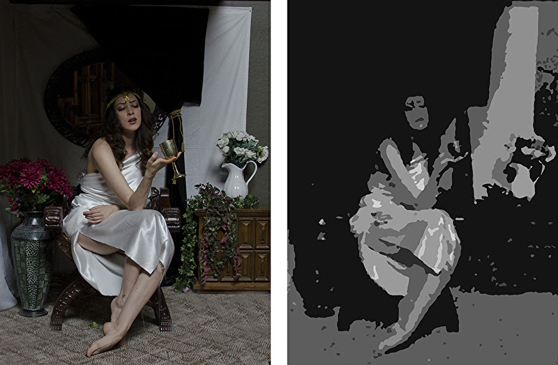
For those of you who want some “quickfix tools” here are four ways to help you see the value structure in any subject:

Squint – (and compare). At the American Academy I was told to squintâ¦oh, about 10,000 times! Squinting simplifies the world into five or six values.

Use a red acetate film – It takes the color out and again lets us see the value masses.

Use Notanizer– This is available in the app store; it reduces any scene to black & white (a “notan” – the Japanese word for “light and dark.” A notan is two values. You can also set the app for three or four values). The app costs a couple of bucks but has saved many a painting!

Use Photoshop – You can go to “image – adjust – hue and saturation” to de-saturate the image. Then go to “filters – artistic – cutout” to reduce the image to 3, 4, 5, or 6 values (Adobe calls them “levels”) It does the same thing as Notanizer.

“Drink From My Cup” reference and value “cutout”
Drink From My Cup

How to paint them

The good news is that the hard work of seeing the value structure is done. The bad news? We still have to execute. Here are a few “hacks” that might help:

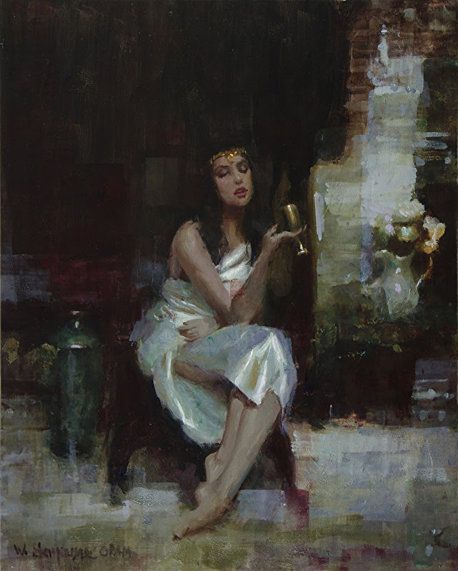
Grisaille (pronounced like Versailles) – This is an indirect painting method developed during the Renaissance. The artist first makes a complete under-painting in 4 or 5 values of grey. After the grisaille dries, the artist glazes transparent layers of color on top of it, finally arriving at the full color painting. (You have to allow each layer to dry before applying the next). Time consuming, but artists like Bouguereau and Ingres created stunning masterworks using this technique.

Monochromatic block in – Richard Schmid and others sometimes use a single color (raw umber, or transparent oxide brown, for example) to create an underpainting. By wiping out the light areas with a rag and deepening the darker areas with more paint, one can arrive at a very believable full value representation. The artist then paints into that underpainting with opaque paint, working “wet into wet.” Hint: you need to do this on oil-primed linen or canvasâ¦an acrylic primed support can’t be wiped all the way back to white! This technique is much faster than using a grisaille.

Paint big value masses – Think of areas as opposed to things. For example, the shadow on a figure might bleed into the shadow on the wall behind the figure. Zhaoming Wu (a master who teaches at the Academy of Art University in San Francisco) calls this a “unified shadow shape.”

Make “puddles” – When I paint a portrait I mix a single “puddle” for all the colors that I see in the flesh in the light. Part of that puddle might be redder, part greener, part more violet etc. but the values are tight, meaning there are no unintended value jumps when the hue changes. The key is, there is no space between the colors in the puddle.

Check your work – Notanizer, Photoshop, or even your red acetate film come in handy to make sure that you did what you intended.

Happy painting!

Painting Backgrounds

William Schneider · Jun 3, 2024 · 7 Comments

Some things don’t change, such as painting backgrounds and backdrops.  With that in mind we are re-presenting a blog written by one of our Master Signature artists, William Schneider.

I have received a number of questions about painting “backgrounds” specifically for portraits. Too many students spend their time rendering the subject and then try to paint the background at the last moment. The result is often a disaster; the figure looks pasted on or there is a formless envelope around the head. The problem is that the background is an afterthought rather than an integral part of the painting. 

Don’t forget, someone looking at the painting sees the whole…not just the subject. In reality, the background is vitally important because it defines the center of interest. My pastel mentor, Harley Brown OPAM, told me “always work the background at the same time as the subject”. The key is to give some thought to what you’re doing and why. Here’s a great quote from Quang Ho OPAM: “If you make a decision, it’s always right!” Think about it! 


I think of three elements and three approaches when I make decisions about the background: 

Elements:
  1. Value – is the background darker (like a typical Rembrandt portrait), lighter  (like a more contemporary graphic piece) or the same value (used by some artists to lose the edges on the light side of the face).

  2. Hue – A background that is the complement of the dominant color of your subject (either grayed or high-Chroma) automatically defines the subject as the center of interest. Furthermore, if you place equal amounts of the discords (two steps on either side of the subject’s hue on the Munsell color wheel) near the subject you reinforce the effect.

  3. Shape – Rather than have a flat tone around the portrait (boring) you can create secondary points of interest…the three approaches listed below. 
Approaches:
  1. A specific scene or environment. Sargent did this in almost every portrait. He used columns, chairs and vases as secondary points of interest to create a mood.

  2. A suggested environment. Abstract shapes still place the subject somewhere other than empty space. 

  3. A vignette– although the picture plane is not completely filled, the shapes that are there fulfill a design purpose. (I was taught that it’s a good idea to have a vignette touch three sides of the picture plane. I often design the “background” to have a movement that opposes the thrust of the figure.)

Here are some examples of all three approaches. By the way, I cover this (plus a lot more) in my workshops and DVD on Design / Composition Secrets of the Masters. 

 “Circe’s Potion” by William Schneider OPAM – Oil
“Kelly by Moonlight” by William Schneider OPAM – Pastel
“Persecuted” by William Schneider OPAM – Pastel

Indispensible Art Book

William Schneider · May 18, 2020 · Leave a Comment

When I attended the American Academy of Art in Chicago, my life-drawing instructor, the legendary Bill Parks, often spoke of Creative Illustration by Andrew Loomis. In fact, one time he even said, “All I try to teach is what’s in that book.” Of course, I wanted to buy a copy but it had been out of print for years and was trading for around $550 on E-bay. Fortunately, one of my fellow students had access to a copy, so a number of us chipped in to have Xeroxes made of the entire book! Even though the section on color was reduced to black and white, I still found the information invaluable!

Not withstanding the title, the book is more about creating good representational art rather than just “illustration”.  I read the book cover-to-cover, and then went through it again several times underlining and highlighting key concepts. Finally I made an outline of the important principles, just to try to cement them in my mind.  A couple of years ago I was thrilled to learn that the book had been reprinted. Right now it’s available on Amazon for $22.95!

Why is it so good?

It is pragmatic. It was written in 1947 when “fine art” was firmly in the grasp of  “Modernism,” (with all its pretensions and affectations). So this book was designed to quickly and efficiently teach the principles of 400 years of the representational art tradition not to effete artistes, but rather to humble illustrators – who had to be good or they wouldn’t get work.

Loomis states that everything in the book is based on the Form Principle – “The convincing illusion of form must do so first by the rendering of light on that form.”

He then explains how light behaves when it strikes an object and its environment.

Every chapter is filled with nuggets of information such as:

  • “No area in the shadow [including reflected light] can be as light as the areas in the light.”
  • “The big form makes the subject carry, not the incidental surface forms.”
  • “The best pictures run to a few simple values.”
  • “The design makes the picture, not the subject or material.”
  • “Contour becomes lost and found and interlaced or woven into other areas in nature.”
  • “The darkest part of the shadow appears nearest the light, between the halftone of the light and the reflected light within the shadow.”

All these quotes appear within the first three pages of the first chapter!

Loomis provides practical thoughts on materials, drawing, various methods to begin a painting, design principles, avoiding common flaws, dramatization, and narrative…among other concepts. He also ties various approaches to historical masters like Sargent and Zorn.

Well worth the price!

Painting Backgrounds

William Schneider · Feb 3, 2020 · Leave a Comment

I have received a number of questions about painting “backgrounds” specifically for portraits. Too many students spend their time rendering the subject and then try to paint the background at the last moment. The result is often a disaster; the figure looks pasted on or there is a formless envelope around the head. The problem is that the background is an afterthought rather than an integral part of the painting. 

Don’t forget, someone looking at the painting sees the whole…not just the subject. In reality, the background is vitally important because it defines the center of interest. My pastel mentor, Harley Brown, told me “always work the background at the same time as the subject”. The key is to give some thought to what you’re doing and why. Here’s a great quote from Quang Ho: “If you make a decision, it’s always right!” Think about it! 


I think of three elements and three approaches when I make decisions about the background: 

Elements:
  1. Value – is the background darker (like a typical Rembrandt portrait), lighter  (like a more contemporary graphic piece) or the same value (used by some artists to lose the edges on the light side of the face).

  2. Hue – A background that is the complement of the dominant color of your subject (either grayed or high-Chroma) automatically defines the subject as the center of interest. Furthermore, if you place equal amounts of the discords (two steps on either side of the subject’s hue on the Munsell color wheel) near the subject you reinforce the effect.

  3. Shape – Rather than have a flat tone around the portrait (boring) you can create secondary points of interest…the three approaches listed below. 
Approaches:
  1. A specific scene or environment. Sargent did this in almost every portrait. He used columns, chairs and vases as secondary points of interest to create a mood.

  2. A suggested environment. Abstract shapes still place the subject somewhere other than empty space. 

  3. A vignette– although the picture plane is not completely filled, the shapes that are there fulfill a design purpose. (I was taught that it’s a good idea to have a vignette touch three sides of the picture plane. I often design the “background” to have a movement that opposes the thrust of the figure.)

Here are some examples of all three approaches. By the way, I cover this (plus a lot more) in my workshops and DVD on Design / Composition Secrets of the Masters. 

 “Circe’s Potion” by William Schneider OPAM – Oil
“Kelly by Moonlight” by William Schneider OPAM – Pastel
“Persecuted” by William Schneider OPAM – Pastel

Paint From Life or Photos?

William Schneider · Aug 27, 2012 · 12 Comments

"Alone In Warsaw" by William Schneider OPA
“Alone In Warsaw” by William Schneider OPA
Especially since the advent of good, inexpensive digital cameras, the debate about whether to use photo references has become almost sectarian. Purists admonish us to paint “only from life.” Yet the instructional art magazines regularly feature artists whose methods start and end with a photo reference. Certain subjects (squirmy kids, transient light effects, horses in motion etc.) almost demand photographs. Even great masters like Fechin and Zorn clearly used photo references for some of their paintings.
There are a host of good reasons to use photos:

  • They’re convenient
  • The light doesn’t change
  • You can blow up small details
  • You can be comfortable
  • There are no bugs, wind, interrupting strangers etc.
  • The model doesn’t move or get tired

There’s only one really good reason to work from life – it will make us much better artists.
Over time, we representational artists become skilled at rendering what we see. The problem is that even high-quality digital photos lie to us. Think of the four elements of a realistic painting: shapes (drawing or proportion), values, color temperature relationships, and edges. Three of the four are always wrong in a photo… and sometimes it’s all four.
The two or three darkest values turn into black and the lightest values become white (photographers call it “blowing out” the lights). The color temperature relationships are limited by the dyes used to make the prints or the phosphors in our computer screens. Also, the camera sees edges as equally sharp (not at all like the human eye which focuses on a sharp area in the center of our visual field surrounded by fuzzy shapes on the periphery).

"Platinum" by William Schneider
“Platinum” by William Schneider
Even the shapes may not be accurate. If you photograph a person six feet away, you will probably get an image of a normal-size face but legs and feet that appear tiny. In other words, the foreshortening distorts the proportions. So, if we work exclusively from photos, we become extremely proficient at painting subjects that don’t look real. We don’t even notice the errors.
When I critique portfolios at various art events I often see paintings where the shadows are black, the lights are white, all the edges are hard, and the light and the darks are the same temperature. I ask the artist, “you work mostly from photos, don’t you?”  I often get the astonished reply, “how did you know?”
The pros work primarily from life: For one, it’s much easier to develop good edge control. Also, our sensitivity to nuance of color and temperature improves exponentially. We just can’t see those nuances in photos… I know; I’ve tried! Working from life, we learn to see the elusive, sparkling color in half tones. Our shadows start to have a sense of light and air in them instead of being dense, opaque blobs.
So, if you’ve decided to go the extra mile, how do you break free of the photo? The still life is easy. Just set it up and start painting. Likewise, there’s little excuse for trying to paint a landscape from a photo. If you’re nervous about going out alone, find a painting buddy or group. There are Plein Air groups in most areas now.  OPA sponsors paint outs all over the country.  Seek, and ye shall find.
"The Mercenary" by William Schneider OPA
“The Mercenary” by William Schneider OPA
It’s a little more challenging to find place to paint the live model but a little digging will yield results. Local colleges or art centers may sponsor open studios. I paint with a number of groups in my area. In fact, I started hosting a group in my studio. We all chip in to pay the model. If you can’t find a group, start one. Finding models is relatively easy. Most people are flattered if you ask them to sit for you. There are even model websites.
Once we start to see the benefits in our work, we want more. The little bit of extra effort to paint from life, pays off tenfold.
Happy painting!
 

  • Page 1
  • Page 2
  • Go to Next Page »

Footer

  • Home
  • About
    • Mission, Policies & Bylaws
    • Board of Directors
    • Presidential History
    • Frequently Asked Questions
    • History
    • OPA Staff
    • Contact Us
  • Membership Services
    • Member Login
    • Membership Information
    • State & Province Distribution For Regionals
    • Update Member Information
    • Membership Directory
    • Contact Membership Department
  • Events
    • Exhibitions
    • Online Showcase
    • Lunch and Learn
    • Virtual Museum Road Trip
    • Paint Outs
  • Resources
    • Brushstrokes Newsletters
    • Ship and Insure Info
    • Lunch & Learn Video Archives
    • Museum Road Trip Video Archives
  • Services
    • Sponsorship Opportunities
    • Scholarships
    • Critique Services
    • Workshops
    • Have A HeART Humanitarian Award
  • Online Store
  • Awardees
  • Blog
    • OPA Guest Bloggers
    • Blogger’s Agreement (PDF)
    • Comment Policy
    • Advertisement Opportunities

© 2025 OPA - Oil Painters of America · Design by Steck Insights Web Design Logo