• Skip to primary navigation
  • Skip to main content
  • Skip to footer
  • Help Desk
  • My Account

OPA - Oil Painters of America

Dedicated to the preservation of representational art

  • Home
  • About
    • Mission, Policies & Bylaws
    • Board of Directors
    • Presidential History
    • Frequently Asked Questions
    • History
    • OPA Staff
    • Contact Us
  • Membership Services
    • Member Login
    • Membership Information
    • State & Province Distribution For Regionals
    • Update Member Information
    • Membership Directory
    • Contact Membership Department
  • Events
    • Exhibitions
    • Online Showcase
    • Lunch and Learn
    • Virtual Museum Road Trip
    • Paint Outs
  • Resources
    • Brushstrokes Newsletters
    • Ship and Insure Info
    • Lunch & Learn Video Archives
    • Museum Road Trip Video Archives
  • Services
    • Sponsorship Opportunities
    • Scholarships
    • Critique Services
    • Workshops
    • Have A HeART Humanitarian Award
  • Online Store
  • Awardees
  • Blog
    • OPA Guest Bloggers
    • Blogger’s Agreement (PDF)
    • Comment Policy
    • Advertisement Opportunities
  • Show Search
Hide Search

Education

Marketing your art with a Facebook page

Jane Hunt · Nov 21, 2016 · 1 Comment

"Autumn Aspens" by Jane Hunt
“Autumn Aspens” by Jane Hunt

A lot of people ask me how I gained tens of thousands of fans on my Facebook art page in such a short period of time. There are many different opinions about how to do this, and I spent time studying different people’s approaches, experimenting, and reading articles. I use my Facebook page, along with my galleries, website, magazines, and other traditional means, as part of a broad based approach to marketing my work.

Here, I will share many of the tips and tricks I’ve learned along the way.
Is a Facebook Profile the same as a Page?
No! When you sign up for Facebook you are given an account and a personal profile. This profile is meant to be used for non-business related reasons; in fact Facebook has been known to suspend accounts of people using personal profiles to promote their business! Anyone with a personal profile can set up a business page (or multiple business pages).
Pros
There are many benefits to creating a business page – first of all, it’s free, which is hard to beat! I think the biggest advantage is that there is no limit to how many fans you can have, unlike a personal profile which limits you to only 5000 friends! You can connect with a limitless number of art lovers, potential students, buyers, editors, and galleries. The sheer number of people seeing your work is incredible – the average painting I post reaches about 40,000 people! Unlike profiles, pages are designed to promote businesses – there are built in analytic, and administrative tools, and tons of apps to use – the sky, and your imagination, is the limit!
Cons
There are a few cons I’ve found, many of which probably come with any large level of exposure. People will post to your page with scams or try to gain traffic for their pages. I receive hundreds of messages asking for feedback or advice, and I simply don’t have time to respond to most of them! Another con is possible image theft (which also happens on websites etc.) If this is a real concern for you, size your image accordingly, so it can’t be reproduced easily.
Considerations when setting up your page
You basically have two options: start your page from scratch, or choose to convert your personal profile to a business page. There are pros and cons to both, and I would suggest reading up on this to decide which option is right for you. You can read the basics here (update: there is now the 3rd option of ‘merging’ the two).
Most people start their page from scratch. If you do, choose the name carefully, you’re only allowed to change it once! Setting up a page is easy, and Facebook leads you through it step by step. You can read more here. Consider search engine optimization is the name you’re choosing easy to find and does it work with your other marketing (website etc.)? Along those lines, don’t use your middle initials or similar, unless you’re consistently listed that way all over the web. Use artist as your category. Pick your thumbnail image and cover photo carefully, do they represent you well? Once your page is set up and you’ve added some awesome content, you can start inviting friends. If you have a lot of friends I’d recommend doing this alphabetically and in batches. Why? Several reasons, first, it allows you to track which days/time of day you get more favorable responses. Secondly, when a friend ‘ignores’ your request, the ‘invite’ button immediately shows again, making it easy to accidentally invite the same people over and over again. I’ve found that people don’t tend to appreciate that!
What to post?
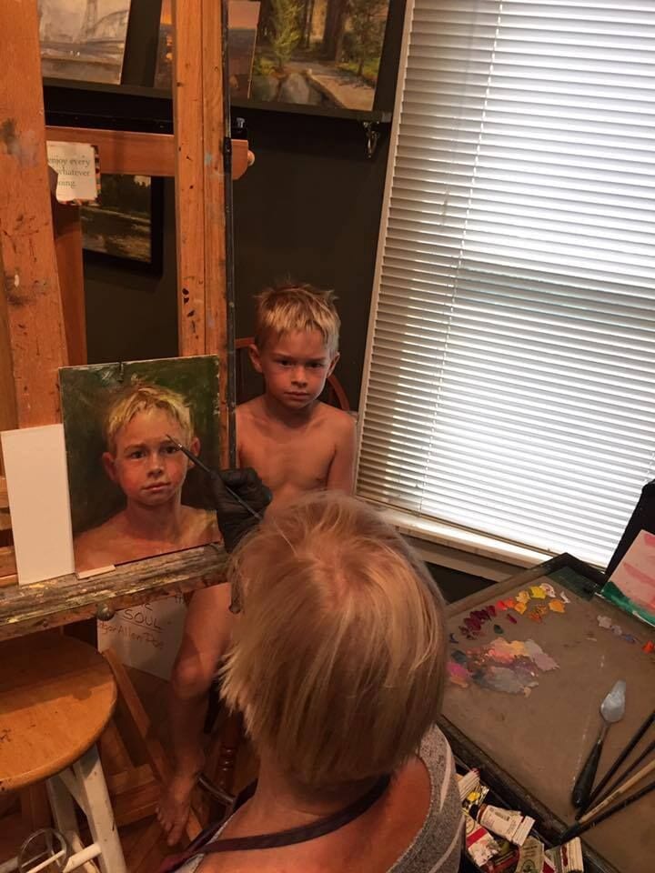
First, decide what your goal is for your page: is it to showcase your process, connect with other artists, grow your sales, fill workshops, boost your confidence, get gallery attention, or get feedback on your work? Determining your goals will help guide you in what to post and how to proceed. The best advice I can give is to be yourself, engage your viewers, and like and reply to your comments. Obviously, it’s not always possible to reply to hundreds of comments but I still read and appreciate every single one!
Go easy on the links!
Most people are using Facebook to drive business to elsewhere on the internet, and so they add links or share from various websites. Watch your insights carefully and see what happens if you do this less. My advice: use minimal links until your page numbers grow and even then use them sparingly. Use original posts (not shared from other sources) whenever possible. It may seem counter-intuitive, but once your page numbers are huge you’ll get plenty of traffic to your website without always depending on links.
How often to post?
This is a hotly debated topic that opinions vary wildly on. Through trial and error I’ve discovered that posting about 2 days a week seems to work best for me. When I post more often than that I’ve noticed not only are less people reached, but I receive more ‘unlikes’ on my page. Use the ‘insights’ tools that come with your page to determine what times of day, days of the week, and frequency people respond best to. You can also use these tools to figure out which kinds of posts your fans enjoy.
Other tips

  • Read articles on setting up and growing your page, there are hundreds out there, but Facebook’s ‘Help’ pages are a great place to start
  • Shorten your Facebook URL to make it easier to find. Find out more here.
  • I can’t say enough about how useful your insights tab is. Study this information to understand what is working and what isn’t and your page should grow fairly steadily. Add other artist’s pages to ‘pages to watch’ and you’ll soon see which approaches work the best.
  • Pre-schedule your posts so they reach people at optimal times.
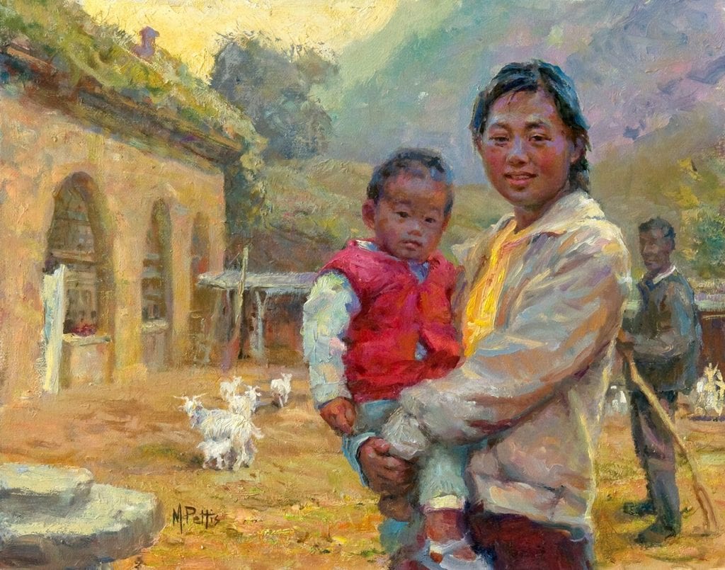
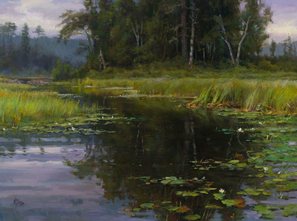
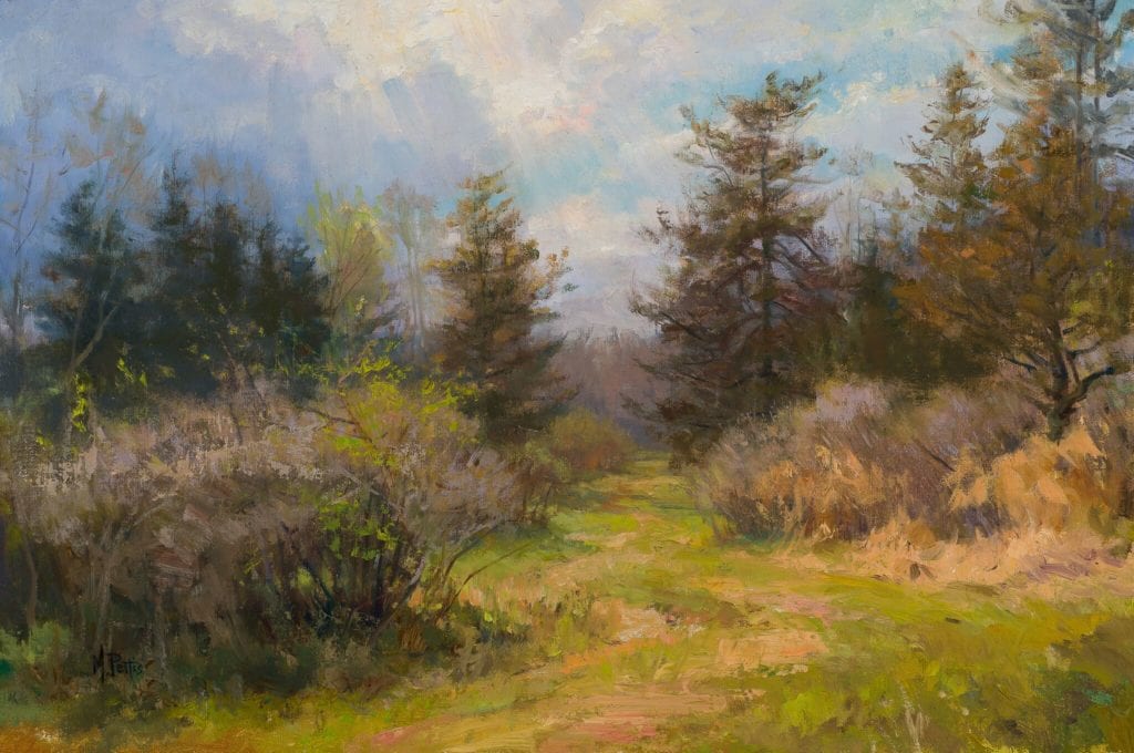
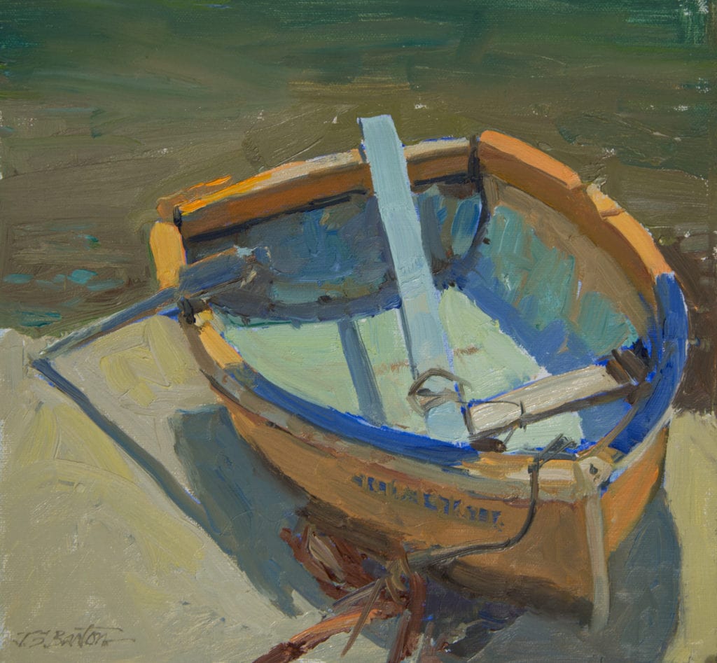
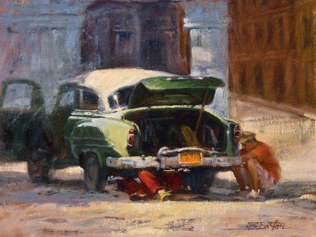
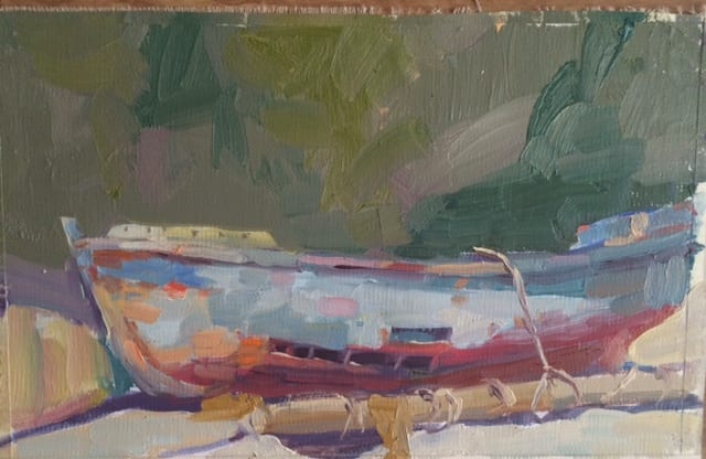
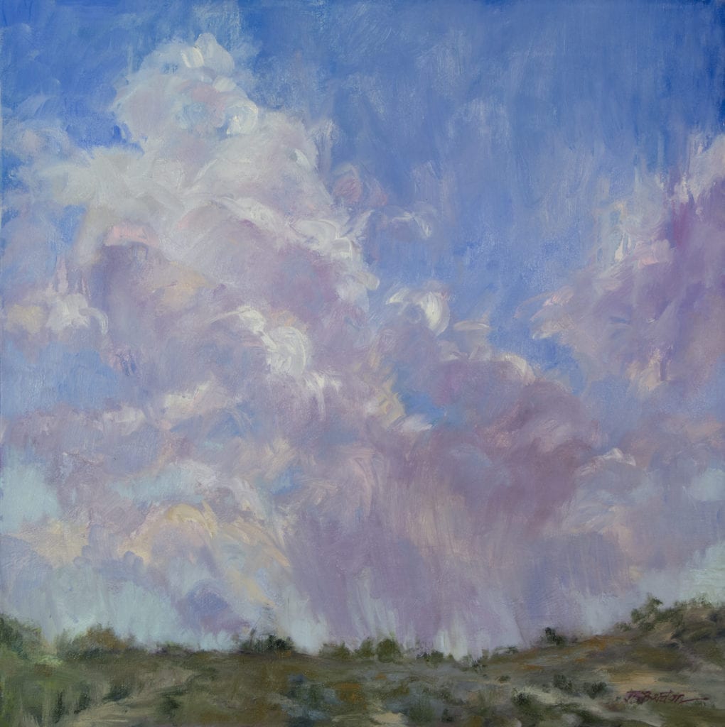
  • Use images most of the time – people respond best to shorter posts with images.
  • Brand yourself by choosing great thumbnail and cover photos (use the correct sizes and check them on various devices – phone, tablet, laptop)
  • Learn about Facebook’s rules and newsfeed algorithm.
  • Experiment with some of the optional apps for your page, like events, videos, or newsletter.

Have fun, be yourself, and your page will grow rapidly!!
My Facebook art page: facebook.com/Jane.Hunt.Art/

Experimentation

Susan Hotard · Oct 17, 2016 · 1 Comment

In the aftermath of Hurricane Katrina nine years ago, my husband and I moved to The Woodlands, Texas. I found a walking path. It was like walking in a beautiful forested park with magical birdsong, colorful wildflowers, various species of trees and wildlife. I’ll be forever grateful for the therapeutic sanctuary this path and the move to The Woodlands has provided us in the aftermath of the New Orleans destruction.
But after nine years, I explored a different walking route. It was refreshing to take in different scenery of new streets and wooded paths circling unfamiliar cul de sacs. I greeted fresh faces in my own neighborhood. Taking an unknown path was so energizing in my walk, I decided to take new paths in my painting as well.
I had a long term association with The Garden District Gallery in New Orleans, located across from the famous Commander’s Palace. It became extremely valuable as historical real estate and the gallery closed. With that closure came a freedom from gallery expectation of my art work. I felt free to experiment with my approach to painting.

“Security”
by Susan Hotard
12″x16”
With “Security”, I combined drawing with modeling.
“Brass Pot with Onions”
by Susan Hotard
11″x14”
My painting of” Brass Pot with onions” was painted from life initially toned with a transparent red oxide rather than the usual raw umber.
“Mother and Child”
by Susan Hotard
8″x10”
“Mother and Child” represents a backlit, plein air feeling by using a light airy palette.
“Eric”
by Susan Hotard
11″x14”
Using a limited palette of red, yellow ochre, black and white on a traditionally gray ground; “Eric” was painted alla prima.
“Eric II”
by Susan Hotard
11×14”
Also painted alla prima, “Eric II”, was achieved using a white linen panel and limited palette of red, yellow ochre light, black and white.
“Daddy Love”
by Susan Hotard
8″x10”
“Daddy Love” was painted on a red oxide imprimatura concentrating on shapes.

The above paintings are just a few examples of the experimental work I’ve been trying.

Suggestions for Experimenting:

  1. No rules
  2. No expectations
  3. No formula
  4. Begin a new way
  5. Paint a new subject
  6. Start with a white canvas or an intensely toned canvas rather than always gray or raw umber
  7. Rather than drawing first, begin with shapes
  8. Paint with a new color palette
  9. Play with a different medium*

*But I realize this is an Oil Painters of America blog. Don’t worry, I may be unfaithful to oils every once and a while but I’ll always return to my true and passionate love: oil. I love the sensuousness of a juicy brushstroke, the feel and touch of a wooden palette, and the smell of turpentine.
The departure was just a fling to take a different path to refresh my thinking.
So in conclusion, if you are bored in the studio, perhaps it is time to experiment. If you always start your paintings the same way, paint the same subjects, and use the same formula for starting your work, of course you’ll have the same, safe, predictable outcome. The same old same old. The same sure thing.
If you are just a little bit bored in your studio, it might be time to take a different route, if only for a little while. Experiment!

Contemplating on Gradation

Mary Pettis · Sep 26, 2016 · 4 Comments

madonna-and-child
“Madonna and Child”
by Mary Pettis
14×11

Through the years I have been trying to follow my own counsel to fellow artists — basically, “Paint when you can’t paint!” Here’s an excerpt from a handbook I wrote for my students back in 1997, when my youngest of three was eleven years old and life was more hectic:
“So much of being an artist (and becoming a better artist) lies in taking time out to be sensitive to our surroundings. Pausing to paint pictures in our mind brings untold joy. Study and reflect on beautiful and great art and see how your information relates to it. Then humbly go back to nature and do the same thing. Through this process the artist in you will be astoundingly more mature the next time you pick up a brush. So do not feel badly when the rigors of life impose unwelcome sabbaticals from your work. They are a gift as well, and make you the person that you are. Use them wisely, and then come to your easel feeling ready, refreshed and blessed for the honor of the opportunity to unfold the artist within.”
water-lilies-on-balsam-creek
“Water Lilies on Balsam Creek”
Mary Pettis
24×32

Critique Your Work

I still hold this philosophy — we can learn and grow without a brush in our hand. Of course we need to eventually get miles of canvas behind us, but when life takes us away from our easels, we can actually use that time to train ourselves to see more deeply. To that end, I have created for myself a list of 30+ words that aids me in critiquing my own work, and helps me to identify and understand what I am responding to in front of nature. One of those words is GRADATION.

How It Works For Me

Most of us are familiar with the basic instruction to look for the gradation in the shadow values, being darkest in the nearest upright plane, getting lighter and cooler as they recede. We know that color generally gradates from the highest, purest chroma in the foreground or by the focal point to more grave and neutral colors in the distance. But this is just the tip of the iceberg.

Understanding Gradation

Gradation is a property that shows up in all six of the tools we use: Line, Shape, Value, Color, Edge and Texture. When I find a subject that makes my heart skip a beat, even if I can’t paint it at that time, I look for the gradation elements that would help me tell my story more simply. I go down the list to identify what I love most about this subject in terms of our six tools. Here are some examples of leading questions I may ask myself:

oliver
“Oliver”
Mary Pettis in progress

oliver-2016
“Oliver 2016”
Mary Pettis
12×9

Gradation of Line
What is the main direction of the Line of this visual path? Does it start out strong and then direct my eye to relax and meander? Is its movement sympathetic to how I feel?
Gradation of Shape
What is the large pattern? Can it be cropped better? Can middle values be raised or lowered to connect with either the light shape or the dark? Chinese artists say: ‘Where is your dragon?’ Does the shape move from loud to quiet?
Gradation of Value
How does the value of the sky change as it moves away from the source of the light? How does the tree change in value from its center to the top?
Gradation of Color
How do the local colors of similar parts or objects differ and influence the surrounding colors along various planes and different parts of the painting?
Gradation of Edge
How does the backlit edge of the jawbone melt away as it follows up the form? How does one edge move from crisp to soft or lost?
Gradation of Texture
How heavily do the masses of lily pads form a sumptuous carpet over the glasslike surface of a reflecting pond? How do leaves or grasses appear to change in texture from side to side or near too far?

Closing Thoughts

As I compare and relate how one part of my subject flows into another, I sense a musical structure emerging. One note follows another to form a melody, with crescendos, phrases, and pauses corresponding directly to what I am feeling. I exaggerate what matters and edit what doesn’t. I have faith that there is a time for everything. I’ve been impatient and doubtful over the years that I will ever get what’s inside out. But in crazy times I have tried to grow as an artist even though I couldn’t be painting. Contemplating the visual gradation I perceive in nature is one of the things that has helped me along this path.

The power in a work of art depends on the depth of the artist’s insight of that object he contemplates. ~ Ralph Waldo Emerson

spring-path
“Spring Path”
Mary Pettis
16×24

Making Draw Down Cards:

Mrs. Julie Barbeau · Aug 15, 2016 · 3 Comments

What They Can Teach You About Your Oil Paints


Making a draw down.
Making a draw down.

If you have been painting for a while you may have a large collection of paints in many assorted colors or even multiple tubes of the same color from different manufacturers! Draw down cards can help you compare your paints and tell you a great deal about your colors. They are essentially paint swatches from each tube of paint you own. They can even be useful to help you quickly find the right color for an unusual painting subject.


    Draw downs can tell you:

  • How transparent or opaque the paint is.
  • How fast it dries.
  • If the color’s value or hue looks different when it is applied thickly or thinly.
  • How oily the pigment is. Very oily paint will leave an oil ring on the card and can give you clues to how much pigment vs. oil per tube the manufacturer uses.
  • If it darkens or yellows with age. You can compare the dry sample to fresh tube color.
  • If the paint blooms, i.e. gets a waxy haze over the color sample, a sign the paint may have wax added to it.
  • How the same color from different manufacturers varies in tone and value.
The reds and oranges card.

To make your own cards, first sort your tubes by color and keep the tubes with the same pigment together. For example, all cadmium red samples should be applied next to each other for ease of comparison on the cards.

In addition to your paint tubes you will need the following supplies: 14 x 17 inch pad of smooth Bristol board sheets, a thin black Sharpie marker, palette or palette paper, paper towels and a 1.5 inch hardware store putty knife.
Use one sheet of Bristol board for each color family: whites, reds and oranges, yellows, blues and purples, greens, browns and blacks.

The greens draw down card.

To start, squeeze a small amount of paint onto your clean palette. Using the putty knife, scrape up the color evenly along the entire flat end of the knife and apply to the Bristol board in a square shape. For the top half apply the paint thickly and for the bottom half press hard as you draw down the putty knife. This shows you how opaque and transparent each paint sample is. Then using paper towels, carefully clean the putty knife, including the edges and you are ready for your next draw down square.

Recording the tube information isn’t as much fun as applying colored swatches but is very important. With a thin Sharpie pen note the brand, color name, pigment color numbers and type of oil, if mentioned on the label. For the whites card also record the year you make the paint swatches so you can see how fast and how much they yellow or darken. The tops of bookshelves are a good place to stash draw down cards while they dry.

The whites draw down card.

Four to seven days after adding new colors check the cards to see if they are dry. Any swatch that is still wet mark “slow dry.” If some paint squares are still wet at ten to fifteen days mark them “very slow dry.” Knowing which colors dry fast or slow can be a big help when working on deadlines! When you try a new color or brand you can continue adding to the cards.

While making draw down cards can take a bit of time in the beginning, the color swatches and the information you record are invaluable. You will find yourself referring to them over and over as you work on your future paintings.

Art in Cuba and the Traveling Painter

Ms. Jane Barton · Aug 1, 2016 · 1 Comment

Orange & Blue Boat
Orange & Blue Boat

There are no starving artists in Cuba. One reason for this is that each person receives food from the government each month: one quarter of a chicken, 5 eggs and 5 pounds each of rice, black beans and sugar. (Sugar is cheap in Cuba and health care is free to the rising numbers of diabetics.) Artists there make more money than doctors, lawyers or university professors. Why? Because they are not, like the others, state employees, and are able to keep more of what they make. Again, why? Because Castro considers them cultural ambassadors and curators, and very important to keeping the Cubans….Cuban. Would it be worth it to live in Cuba, with the restrictions that entails, to be at the top of the food chain for a change? Not for me. But I can tell you that in many ways the young, hip, vibrant artists that I recently met on my trip to Havana were no different from artists here in the U.S. They were enthusiastic about their current work, complained about the price of art supplies which had to be imported from Europe and knew how to party. The Art gene is a powerful one.

PIT STOP by Jane Barton
“PIT STOP” by Jane Barton

I’ve just started paintings from that wonderful trip. The Cubanos are a beautiful, friendly group. The city of Havana reminds me of a stunning woman “of a certain age” whose beauty is still there under the surface of time’s wear, and I don’t know what they do to the black beans and rice (known as “Moors and Christians”) but my mouth waters just thinking about them. The Buena Vista Social Club music is in the air and makes you want to get up and dance in between endless rounds of mojitos and pina coladas. Oh, and then there are the cars–I took 360 photos of mid-century Chevys, Buicks and even one of the few 1956 Lincoln Continental Mark Twos in the western hemisphere. My first painting, shown here, is a common scene in Havana: a car is stopped dead on a city street and Cubanos are all over it, once more figuring out how to make it run again with no parts and no gas. That’s what I really loved about the people–they may be captive on their little island, but they sure know how to, in the words of Tim Gunn, “make it work.”

I wasn’t able to paint on this trip, but I’m often asked about the nuts and bolts of managing it all. Travel with art supplies takes some careful preparation. Finding art stores can be challenging, if not impossible, in some countries. Besides that, we all have our favorite colors and canvas surfaces and painting in a foreign country can be intimidating enough without trying to make do with unfamiliar supplies. Since 9/11 the rules regarding combustibles are strict. I often avoid the problem by taking watercolors, but even then those little tubes often look suspicious to a TSA agent. I’ve had no trouble (so far) packing oil paints in my luggage and I thought I’d share what I do, with the understanding that we can but try…

Old Boat
Old Boat

1.) Before you leave, try to determine how many canvases you’ll be able to complete each day: one in the morning, one in the afternoon, one for good luck? How much paint will you need? If you don’t know how much paint you use in a week or two, start keeping track of what you use before you leave. You’ll probably need a lot of white paint and small (37ml) tubes of colors you use regularly, but just half a tube of specialty colors, like reds for flowers. Paint tubes are heavy, so find out the weight limit for your airline and pack carefully to avoid extra baggage charges.

2.) I make sure that I include a very visible note (see below) to the TSA on the outside of a double zip lock bag of paints. The note assures the TSA people that the contents are not combustible. I learned on the Gamsol site and others NEVER to refer to the contents as “paint”! The double bag is because the paints might pop open due to baggage hold pressure and you probably don’t want to wear dioxizine purple all over your clothes…for a week.

ATTN: TSA
THESE ARTIST COLORS ARE MADE FROM VEGETABLE OIL AND
CONTAIN NO SOLVENT.
ARTIST GRADE COLORS ARE VEGETABLE BASED WITH A
FLASH POINT ABOVE 550.
THEY ARE NOT HAZARDOUS.

Suddenly Showers
Suddenly Showers

3.) The next question is how to transport those precious wet canvases home. Once you know how many canvases you think you’ll need, there are several ways to carry and pack them efficiently. On my first trip to France I precut my 8 x 10” canvas with a 1/2 inch border around them. I carried three or four 1/8 inch gator boards that were another half inch larger than the canvas. (Wildlife painter Carl Rungius just thumbtacked the corners, so you can try that.) At the end of a painting session I pulled the wet canvas off the board, set it aside to dry, and taped a fresh one on for the next day. You can bring dozens of canvases this way with a minimum of weight and space. By the end of the trip–a week or two–the first canvases are pretty dry and can safely be stacked with sheets of waxed paper between them. The wet ones can be mounted on both sides of the boards and taped together with push pin “spacers”, then wrapped tightly in plastic for the trip home. You can also use a light weight card board wet box to transport them home. On my last trip to Italy, I brought Raymar’s Featherweight boards and loved them. Whatever method you decide to use, it helps to bring just one size board so they’ll stack and pack easily. You can always adjust the size with tape if you decide you need a different shape for a particular subject.

4.) Be sure to carry on the things you can’t live without. I carry a 2 to 3 oz. plastic bottle of Liquin in my carry on “liquids” bag and add a little of it each day to my white paint. That ensures that most of the colors will have some drying agent in them to help speed up the process. I carry on my brushes. We all have our favorites and are unlikely to find them in little out of the way towns). I also include a few canvases, boards and masking tape. These are the things that are hard to replace if my bag gets lost for a few days.
5.) Needless to say, you cannot pack or carry on Gamsol or turps–the first adventure in each town is finding some at a hardware store or art store if they have one! It helps if you can look up the words for “turpentine”, “mineral spirits”, “solvent” and “odorless” and write them down before you leave the country.
6.) I also make sure that my brush washer container is as odor free as I can make it–I wash it out in soapy water and double zip lock bag it to avoid having any problem there. I pack my palette knife in my luggage, too, and pray for it’s safe arrival.
7.) Finally, my “insurance kit”: I always carry on a very compact kit of watercolor paper, paints squeezed out in palette cups and left out to dry before I pack them, brushes and old film containers for water–if the oils don’t make it for a while, I still can hit the ground running and start painting when I arrive in town.

Painting buddies
Painting with an audience
Painting with friends
Peanut Gallery

There are no guarantees and the rules change, so be sure to check airline websites before you leave, but these ideas have worked for me and I’ve had so many wonderful experiences painting abroad! I hope you’ll share any travel tips you’ve discovered in your travels with us on this blog. Happy painting–wherever you may be!
“A journey is a person in itself; no two are alike. and all plans, safeguards, policies and coercion are fruitless, we find after years of struggle that we do not take a trip; a trip takes us.” John Steinbeck

  • « Go to Previous Page
  • Page 1
  • Interim pages omitted …
  • Page 5
  • Page 6
  • Page 7
  • Page 8
  • Page 9
  • Interim pages omitted …
  • Page 14
  • Go to Next Page »

Footer

  • Home
  • About
    • Mission, Policies & Bylaws
    • Board of Directors
    • Presidential History
    • Frequently Asked Questions
    • History
    • OPA Staff
    • Contact Us
  • Membership Services
    • Member Login
    • Membership Information
    • State & Province Distribution For Regionals
    • Update Member Information
    • Membership Directory
    • Contact Membership Department
  • Events
    • Exhibitions
    • Online Showcase
    • Lunch and Learn
    • Virtual Museum Road Trip
    • Paint Outs
  • Resources
    • Brushstrokes Newsletters
    • Ship and Insure Info
    • Lunch & Learn Video Archives
    • Museum Road Trip Video Archives
  • Services
    • Sponsorship Opportunities
    • Scholarships
    • Critique Services
    • Workshops
    • Have A HeART Humanitarian Award
  • Online Store
  • Awardees
  • Blog
    • OPA Guest Bloggers
    • Blogger’s Agreement (PDF)
    • Comment Policy
    • Advertisement Opportunities

© 2025 OPA - Oil Painters of America · Design by Steck Insights Web Design Logo