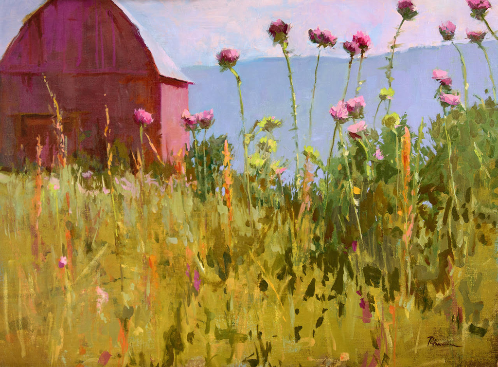
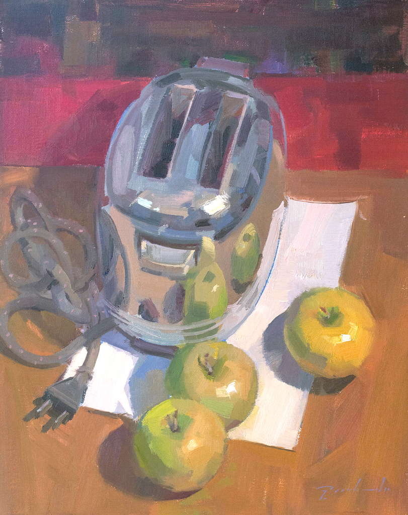
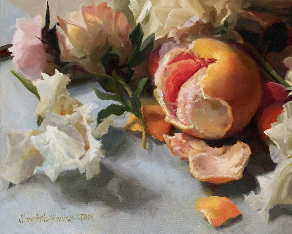
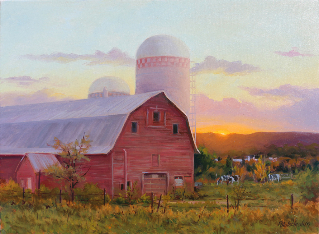
This article was written by long-serving Board member and Master Signature artist James Bruce Jr., (January 1938 – December 2020). It is reprinted from our archives and outlines the methods and criteria the OPA jury uses to select paintings for the National Juried Exhibition. We hope it helps you select your best work to enter into this year’s show. See you in Steamboat Springs!
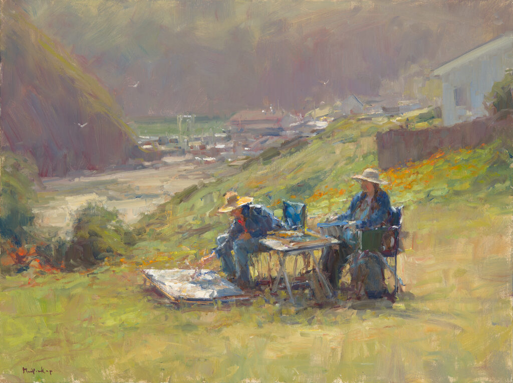
The deadline I’m referring to is the last date to enter OPA’s competition, 35th National Juried Exhibition of Traditional Oils to be hosted by Steamboat Art Museum, Steamboat Springs, Colorado. The focus in the jurying process will be to select paintings which show the highest quality in draftsmanship, color and composition, emphasizing a diversity in representational style and subject matter. Entries must be received no later than Friday, March 6, 2026.
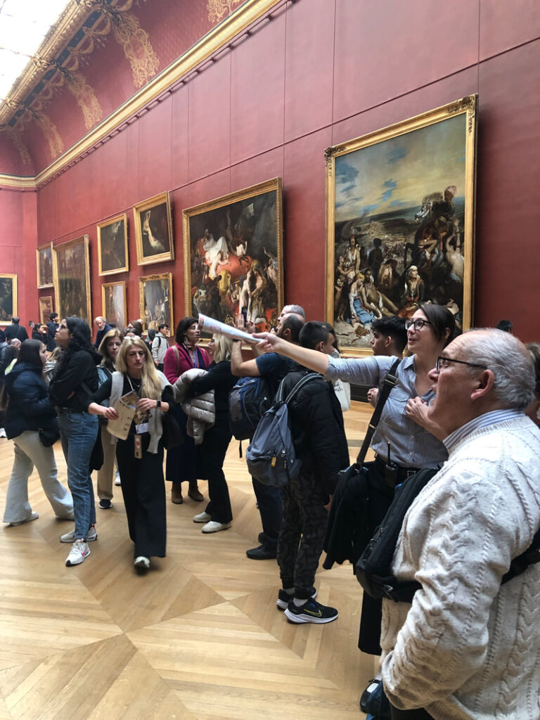
Each year OPA receives approximately 1,900 entries and jurors must carefully choose approximately 200 paintings to be included in the exhibition. As always, the goal is to assemble the finest display of representational oil paintings.
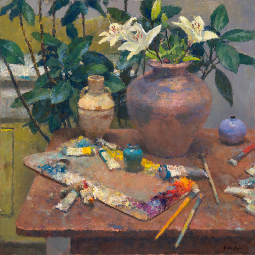
This annual national competition is one of the most important endeavors of the OPA mission to promote representational painting. Awards for this annual competition total approximately $100,000, including a $25,000 Best in Show, so there is good reason to enter. That said, every artist entering should understand the jurying process and what criteria is used to determine the paintings that are included in the competition.
OPA selects a jurying committee comprised of 5 OPA members. Three are Signature members of OPA and two are Master Signature members. The make-up of the committee is different for each exhibition and jurors do not know who else is jurying with them. The Jurying Chair always attempts to get jurors that represent a variety of painting styles and that are located in different parts of the country. Jurors are asked to use the criteria below in making their selections.
- Is there a dominant value?
- Is there a dominant harmony?
- Is there a clear center of interest?
- Is there balance?
- Do the shapes and lines lead the eyes to focal points within the picture plane?
- Is the drawing accurate?
- Are the value relationships convincing?
- Are the color temperature relationships consistent and believable?
- Is there an appropriate variety of hard and soft edges?
- Is the paint application varied and interesting?
III. Expression/Idea:
Does the painting’s intent or execution demonstrate a unique, compelling or worthwhile idea?
There are two rounds of jurying. For the first round, jurors are asked to evaluate each painting and assign it a “yes” or “no” vote. Yes means that the juror believes that the painting meets some or all of the criteria and warrants a second, more critical evaluation.
The second round is usually comprised of approximately 600 – 700 paintings. In this round, jurors are asked to vote using a scale of 1 to 7. It is important that jurors are consistent and use the following scoring system when making their selections.
- One represents a painting that is weak in all or almost all of the above.
- Two represents a painting that is weak in most areas.
- Three represents a painting that may be competent in a few areas but, overall, is aweak painting.
- Four represents a painting that displays knowledge of the fundamentals but overallis mediocre.
- Five represents a painting that is competently handled in most areas.
- Six represents a painting that is skillfully executed in almost all areas.
- Seven represents a painting that is outstanding and is skillfully executed in virtually every area. These are the top 1-3% of entries for this show.
Summary:
- Very Weak
- Weak
- Some Competence
- Average
- Competent (top 15 – 25% of entries)
- Excellent (top 10% of entries)
- Outstanding (top 1– 3% of entries)
After the jurors have completed voting, the scores are tabulated and artists receiving the most points will be accepted into the exhibition. Only one (1) painting may be accepted.
Again, the last date for you to enter is Friday, March 6, 2026. I hope that you will enter the annual competition. Your painting cannot be selected if you don’t enter, so do so starting November 1, 2025, and use the criteria that the jurors will use to select your entry. Present your very best painting. Follow the entry rules and use the criteria the jurors will be using to judge your painting against the best paintings entered into the competition. And best wishes to each member of OPA. The competition is stiff but it is worth the effort to participate by submitting your entries before the deadline!
Respectfully,
James Bruce Jr. OPAM
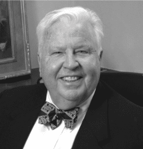
In Memoriam
(January 17, 1938 – December 25, 2020)
James W Bruce Jr. began pursuing art at age 14. He was a Master Signature member of Oil Painters of America and believed that art competitions organized by OPA provide wonderful opportunities to learn and grow. In September 2016, Bruce and Scott Christensen had a two-person exhibition in the Patrons’ Gallery at the Salmagundi Club in New York City. In addition to his love of painting, Bruce pursued a significant career in banking. After retiring from Banks of Mid-America, the largest banking company in Oklahoma, he acquired controlling interest in American Bank Systems. He was also a member of the Board of Directors of American Bank and Trust Company of Tulsa, Oklahoma and InvesTrust of Oklahoma City. He served on boards of the University of Oklahoma and Oklahoma City University, Canterbury Voices, and Oklahoma Arts Institute. In 2006, Governor Brad Henry awarded him one of the prestigious Governor’s Arts Award. A retrospective of 25 of his paintings was held in the Governor’s Gallery at the State Capitol in recognition of this award. James tirelessly gave his time and expertise to Oil Painters of America, serving on the Board for over ten years.