Pin this on your wall. It’s your license to learn. I’m giving you permission…right now… to slow down. We’ve become victims of speed. “How many paintings did YOU get done today??” A better question. What did you feel about the place you chose to paint today? Someone once asked me, “What do you paint?” An innocent enough question but I knew that they were asking what ‘things’ do you paint. Do you paint landscapes? Do you paint cats? I didn’t say anything for a while because I wanted to give them an honest answer. I finally said, “I paint what I love.” And you can’t love something in a hurry. It takes time.
Okay let’s talk about speed. You’re watching the Olympics. You see a skier totally shred a slalom course at a billion miles an hour carving a perfect line as you hear them give the smack down to each gate. It’s INSPIRING. It’s so inspiring you run out and buy skis (probably the wrong ones) and a lift ticket. You dump yourself off at the top of a Double Black Diamond and with every cell of your being, every ounce of your will, every deep desire of your heart you decide to just ‘express yourself’ with wild abandon. You launch yourself over the edge. You are carried down in a stretcher. Do I need to say it. You see a great painter. You are INSPIRED. You buy a bunch of stuff. You launch yourself at your canvas to express yourself with wild abandon. You’re carried out on a stretcher.
I’ve been asking myself a question for the past couple of years. Why do we as painters sometimes try to ‘cheat the gods’ – meaning – try to shred the gnar without the chops – when athletes and musicians would never dream of it. Because they clearly know if they do they will end up dead, in the hospital or humiliating themselves on stage at Carnegie Hall. As painters we can cheat because: One, we’re not going to poke an eye out with a paint brush if we do piles of paintings showing zero improvement. Two, we can always find someone who doesn’t want to hurt our feelings to tell us we’re brilliant. Three, we can find a show to enter that gives out so many ribbons they’re pretty much participation awards. For us there are no life-threatening consequences. Except maybe to our soul. Then one day we look in the mirror and say, “How’s that workin’ out for ya?” We get a fire in the belly that drives us to find another way. We wake up and start working our butts off to conquer the skills that have bucked us off a hundred times. We never give up and we let out a battle cry that echoes off the canyons the day we stick it – the day we stay on for the eight seconds and hear the buzzer. Now THAT makes life sweet and imbues our paintings with a power that speaks to our audience.
Taking on the coaching style that athletes and musicians practice, can, by slowing us down, actually kick our progress into high gear. One of the keys is to clearly separate practice from performance. The masterful painting comes at the end of much preparation and study. When we go to a concert the musician has already prepared. We don’t go to watch them practice. Be patient. Work the problem. Practice. Study. Do it when nobody is looking. When there’s no glory. Then present your performance. Give the audience your best.
Here are a few of the exercises I use to herd my own set of mental cats:
MEASURE YOUR PROGRESS
a.) Every 90 days or so give yourself a report card. On paper or mentally – first list the core skills: drawing, perspective, composition, values, color. Next, list the higher level skills: edges, brush handling, surface quality, intent, site selection, atmosphere, carving space, designing using local tone, designing use light and shadow, rhythm, intervals, pacing, eye travel, etc.
b.) Without over thinking quickly assess your skill level in each area on a scale of 1-10. Make note of the weakest area.
c.) Set yourself on a focused course of study until you’ve brought the weakest area in line with the stronger skills. As you continue to do this your whole skill set slowly improves and becomes more cohesive.
You may have great skill in a few areas but your painting can be totally sunk when you confront something that reveals your weakness. Pretty much…we can’t run. We can’t hide. Measuring our progress also gives us the time to reflect on and feel the satisfaction that we ARE indeed improving. This CAN be done.
STOP MAKING PAINTINGS…(AT LEAST 9 TIMES OUT OF 10)
a.) For 9 painting sessions – studio or plein air – don’t make a painting. Painting infers we are going to create a finished product – come to a conclusion. Instead on the 9 canvases – study your core skills in order of weakness.
b.) Make the 10th canvas the performance. Attempt to orchestrate the skills you worked on in the first 9 into a harmonious painting.
c.) Then do it again. And again.
I used to be so performance oriented I tried to badger every canvas into becoming a painting. I murdered many a nice study session that, though not perfect, had some nice passages I could have used for future reference.
GET OUT OF THE BIG MUDDY – FIND CLARITY
a.) Mentally separate studying from painting – the practice from the performance. Be clear about what you are doing and do nothing until you are clear. Just moving your paintbrush doesn’t accomplish anything.
b.) If something goes sideways in a painting, stop, analyze, set a course of study to correct the weakness, then revisit the subject and try again from a point of knowledge and a stronger skill set.
NOW DO IT – HAVE FUN – NOBODY’S WATCHING
Buy stacks of inexpensive 5″ x 7″ canvas panels so you won’t feel they are precious. If you really have a problem reining in the desire to ‘perform’ rather than ‘practice’ then choose something non-archival so there is no chance you’ll be tempted to think you might come home with a painting. It removes the pressure to perform. Use one brush a size larger than feels comfortable to you. I prefer a nylon long-flat made for oils that can hold a clean edge when I want. I can get nearly every stroke I want out of this one brush. Before you begin a study on one of your wee canvases first set a problem to be solved or a question to be answered. Be curious. Set your intent. Examples: Today I will get the values right. Today I will see the scene as 3 to 5 large shapes. Today I’ll work on edges. Today I’ll do wireframes of a landform to better understand it. How does the light falling on this object change throughout the day? How many value steps are there between the zenith of the dome of the sky and the horizon at high noon? Next work the problem. Enjoy the process. No..bo..dy..is…watching. Work on one and only one problem at a time. There is no sense trying to orchestrate the complexity of a complete painting without mastery of the individual skills. One oboe out of tune can ruin an entire concert. Spend only about 30 minutes on a panel NOT in an effort to ‘paint fast’ but to practice the discipline of focusing your mind, making clear and simple decisions and resisting the temptation to wander, daydream or start picking at the canvas. Don’t ‘pet the kitty’! The urge to lay down a stroke and then ‘pet’ it again and again. Don’t place a stroke until you are sure of why you are placing it. Then place it, leave it and move on. When you are finished do your post game analysis. How did you do? What buffaloed you? What new light went on in your head?
DAILY TRAINING
Daily painting is an excellent discipline to develop a work ethic. However, I’d like to refine the concept a bit and take it a step further. I prefer to call it daily training. Putting paint on a canvas every day without purpose and direction – without a program – doesn’t do much to move us forward. Athletes take rest days. They plan their program so they peak at the right times. They know how to not burn out. To not injure themselves. Schedule in days to do nothing but flip through your collection of books on the great artists and illustrators throughout history. If you don’t have a collection start building one. Schedule in a day to simply pack a lunch and explore an area that you’ve had an interest in painting. Sit and become aware of the sounds, the feel of the light and shadows as they change throughout the day. Take the time to truly connect with a place. Find a coach who will help analyze where you are in your education as a painter and help you create a program for moving forward. If you can’t find a coach do the best you can to model a program for yourself. We have a world of great material available to us. Be selective when choosing material, teachers, workshops, coaches.
 In the end it is only in slowing down that we’ll be able to speed up, to learn to lay down that confident stroke that doesn’t need correction or fiddling. To say what we want to say with brevity and elegance. The end credits on a favorite old TV series of mine always makes me take notice. Over the sound of a film reel rolling there’s a voice-over. It says, “I made this!” After our work, our commitment, we get to stand back with deep satisfaction and say, “I made this!”
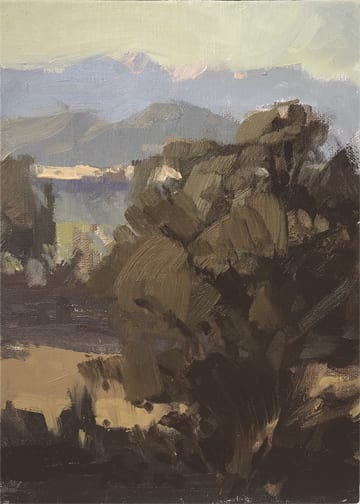
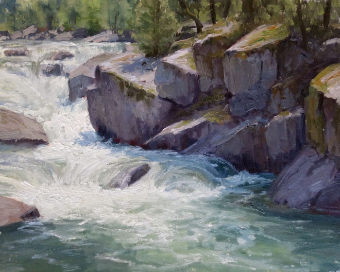
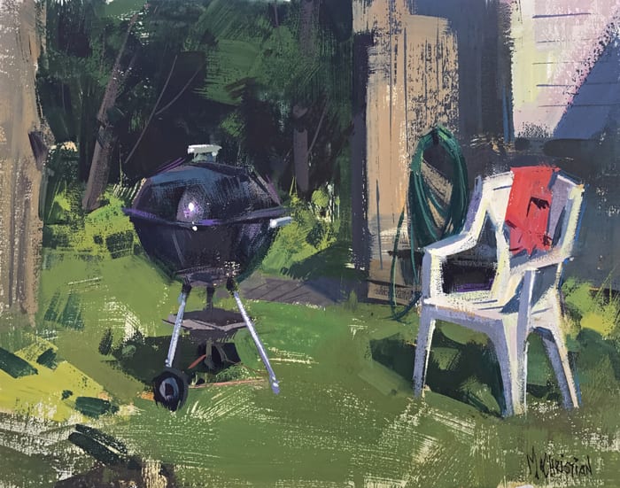
Below I’ve included 4 examples of my own 30 minute training sessions and a description of the question I set out to answer, the skill I chose to practice – the motivation – for each.
For my study sessions I use inexpensive 5″ x 7″ oil primed panels and normally only one brush – a Rosemary Ivory size six flat/long bristle, long handle.
I hope if you incorporate the study sessions into your training program you’ll enjoy doing them as much as I do. You’ll find the descriptions below the block of four images.
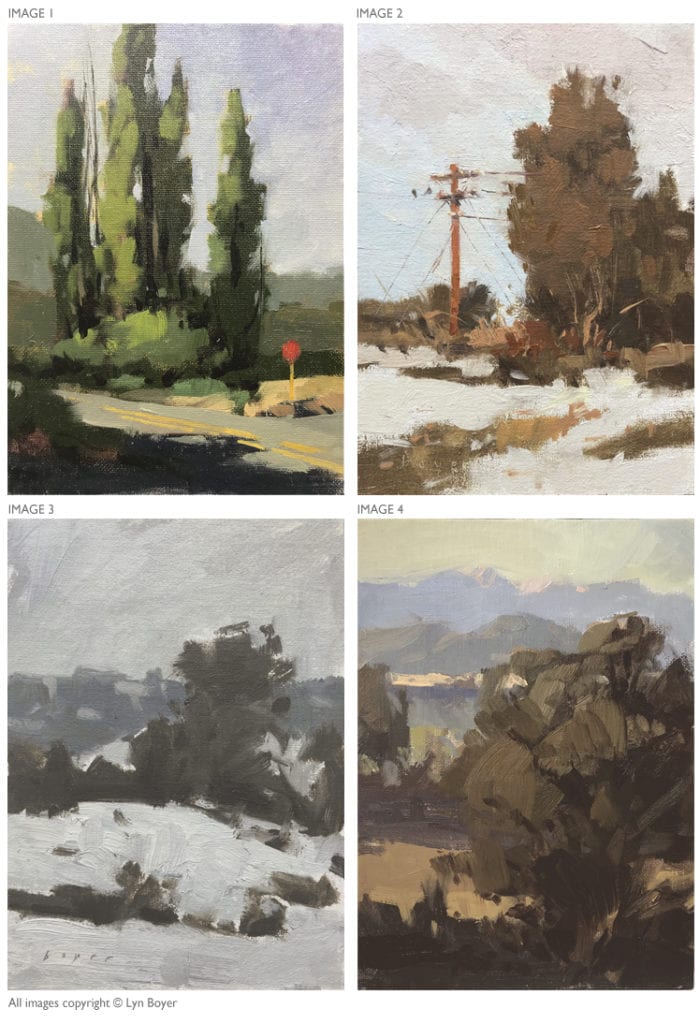
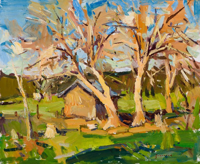
 I set out on a ‘light and shadow’ day to describe trees using basically two values with a clear division between light and shadow. Reduced to the simplest shape these trees are simply tall cylinders and obey the same rules of how they interact with light.
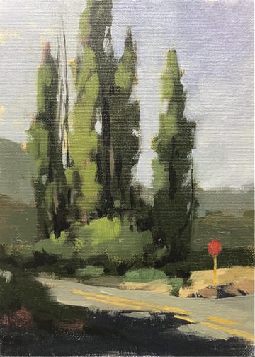
 When another painter recounted a somewhat humorous story of setting out in the morning with a friend to find a painting location, they drove for hours and…yes…ended up back where they had started and finally stopped the car and set up their gear. It made me wonder why the endless search for the perfect time of day, the perfect light, the killer scene, as if finding those will somehow make us good painters. The answer came in another story I heard of a writing instructor at an Ivy League college. When final exam time came, each student pulled a piece of paper out of a bowl with the subject they were to write about. When one student whined it was a boring subject the professor said, “There are no boring subjects only boring writers.” OUCH!! That sounded so incredibly harsh but I never forgot it. I took it as my job as a painter to learn to be able to paint any subject, any place, any weather, any time of day and find beauty in it. My new mantra. Just stop the darn car! For this session my intent was to go out on what appeared to be a dull, gray, uninteresting winter day and paint the first thing I came upon which turned out to be a tree and a phone pole. I was fascinated to learn that something so mundane could become a nice little study. I found a pleasing value pattern relying on local tone.
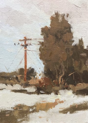
I’m always tuned to moments when an opportunity presents itself. I glanced up one day from what I was doing and saw a scene entirely made of grays, clearly divided into 4 differing value shapes with each gray bent to a different cool or warm. I immediately grabbed one of my small training panels and set my intent to get those values right and also to practice mixing the subtle shifts in the grays.
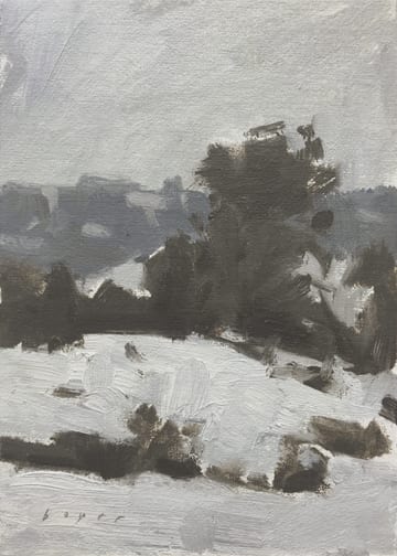
 When a study panel can become your backup plan. Always keep a few of your 5″ x 7″ panels handy. I was painting with a pal and didn’t want to bail even though my invincibility cape had temporarily failed and half my brain was being used for pain management. I knew I didn’t have the focus to ‘paint’ but really wanted to have the time with my pal AND not have to admit I was a weeny. I downgraded my plan for the day, took out one of my small study panels and set a very simple task for myself. I glanced around and became interested in a patch of light in the mid-ground that was equal in value to the values of the dome of the sky and light on the mountains. One of those exceptions when the dome of the sky is in fact not lighter than everything on the ground plane. What also interested me was because the patch of light abutted the darker value of the foothills it in fact appeared lighter than the sky and the light on the mountains when in fact all three are the same value.
Oil Painting
Finding the Key for Creating a Series
A few months ago, pressure to create enough work for an upcoming solo show and several group shows meant I needed a lot of art in a hurry. I thought if I could work in a series the art would flow faster and have a cohesive look for my show. But the journey to start my series was not easy.
In the Beginning
Procrastination sets in if I seek ‘the big idea’ too long and I was getting there fast. A good long talk with a close artist friend luckily intervened and led to inspiration. I realized I wanted to explore important moments from my life, and re-create a distilled memory of that emotional response with a visual image. But what exactly would my visuals be?
Dig Into Memories and Sketches
I tried something new to brainstorm for my future paintings. Since I was starting with only an idea, I sat in my studio and recalled strong memories with no reference in front of me. I thought of sunrises and sunsets during family vacations at the ocean and how happy I was; or childhood memories growing up in France and what it felt like to revisit and sketch in Monet’s garden again 30 years later. I thought of a period of artistic growth during a workshop near marshlands. I thought of things I really wanted to paint!
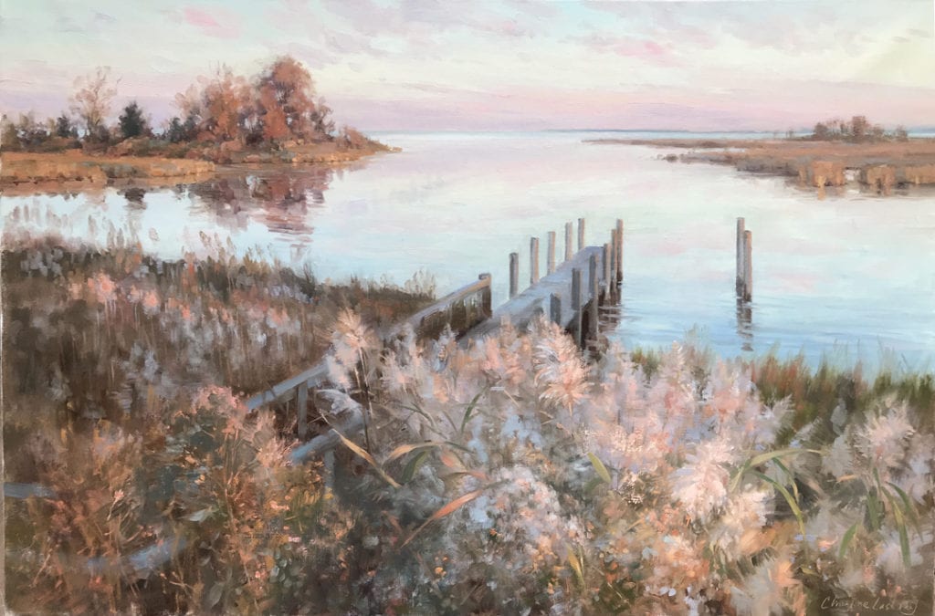
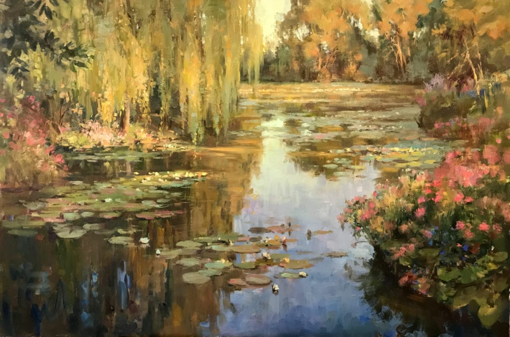
by Christine Lashley
oil, 24″ x 36″
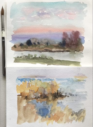
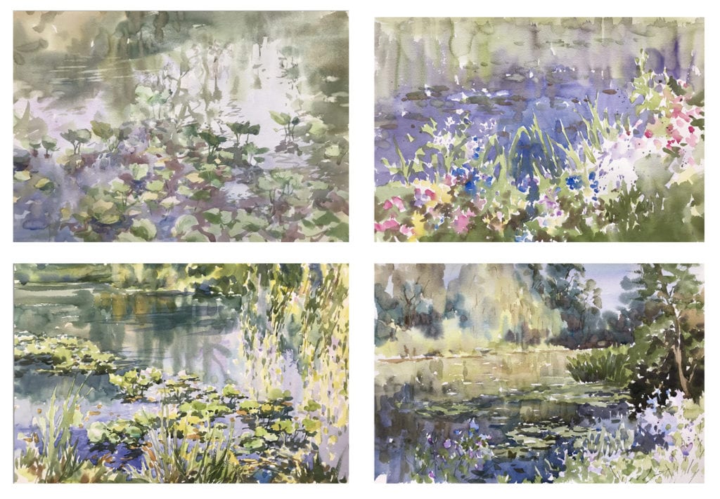
watercolor marsh studies
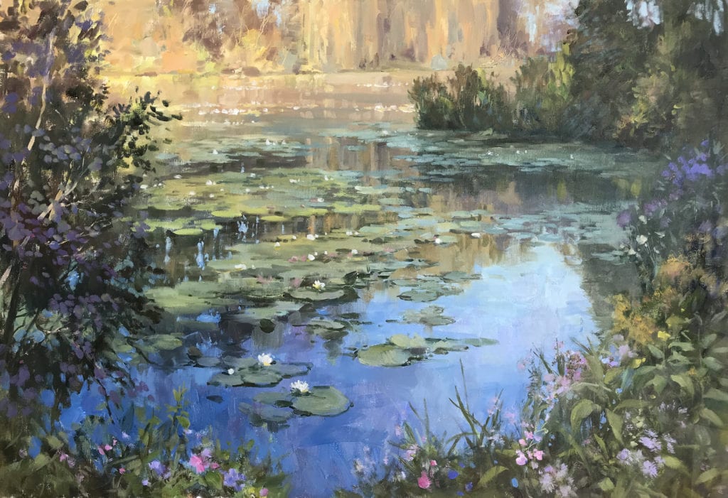
by Christine Lashley
oil, 24″ x 30″
I tried photos for further inspiration of these places and moments, but they were a dead end. Looking for a photo ended with disappointment: often I passed right by a photo of my chosen moment. My memory had morphed the moment into something visually different so my memory and the photo didn’t match anymore! In fact, looking at photos distracted me with a flood of extraneous details and confused me (‘really – the scene looked like THAT?’). It didn’t help that I have thousands of photos on my computer to sift through. I got overwhelmed and discouraged.
by Christine Lashley
oil, 24″ x 30″
Ideas and Abstraction
An open mind to the new direction a painting would take was important, as the studies did not solve all the design, value and color issues needed for working larger. Interestingly, I could ‘see’ the flaws more easily in older sketches; maybe because I’m (hopefully) a better painter now, or perhaps because so much time passed I no longer was so firmly attached to the literal scene. As I worked, I realized intuition was allowed to guide many of my choices by taking the work into abstraction with merged shapes and random texture to imply detail. I often repainted large areas with no reference. This did not mean that I skimped on accuracy if needed, however. I frequently sought new information while creating paintings (this could take the form of a new plein air study if needed, or new photos). So I did end up using photos for reference, but only after I had decided what element or detail to find in a photo. Paintings were done only after they ‘matched the memory’ in my head. Some took a long time; some were done in a week.
by Christine Lashley
oil, 24″ x 36″
Forging Ahead Without Judgment
The whole series could have been derailed early on by fears of what others would say when they saw my work. Such as ‘haven’t water lilies been done to death already?’ I took courage from the fact that I felt very passionate about my scenes, as they were intensely personal. For example, my water lily paintings are inspired by my years living in France, my love of natural areas, and my knowledge of plants as a gardener. My dark fears I tried to suppress were put to the test when it was time to show my gallery the first few paintings, but they were very enthusiastic and supportive. Then there was the yearly angst of submitting to the OPA National Show. Did I trust what I was doing enough to submit this personal artwork? Would it be dismissed as only a pretty image? I took the risk and was very honored that my lily painting “Blues and Gold” was selected for this year’s OPA National Show at the Steamboat Art Museum.
by Christine Lashley
oil, 24″ x 36″
It's Not a Competition
I had a very interesting conversation last month with two aspiring artists, still in high school. Both were concerned about competing in an art world where, to their young eyes, all the art had already been made. Why try to make a Mona Lisa when ‘its been done’? Michelangelo defined Renaissance painting and sculpture, Brancusi modern sculpture, Picasso modern art, Weston and Adams twentieth century photography. The students wanted to know how they could possibly compete in a world where it’s all been done, and done to perfection?
That concern might be valid if art were a competition. But if we treat art as a competition then few of us would ever have the courage to add our voices and vision to the world. Just think of all the incredible work that’s been done since Michelangelo. If art were a competition, we might not have Rembrandt or Vermeer, no Rodin or Giacometti. And while Beethoven’s 5th and Handel’s Messiah rock my world, so do Elton John and Paul Simon. Tolstoy’s “War and Peace” may cover everything from soup to nuts, but I want more than just that one perspective. I need more variety, alternative voices, and points of view. The same subject in a painting is not only made new by the medium and the brush strokes, but also by the back story, the moment in our cultural timeline, and the voice of the individual artist. So perhaps we should see art not as a competition, but as a contribution to the long history of human experience.
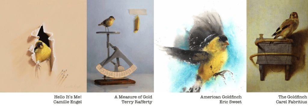
Here are four paintings of a goldfinch. Each one expresses something totally different about the bird and our relationship to it. We wouldn’t have three of these if we believed that Fabritius had done the definitive “best” Goldfinch back in 1654.
It’s easy to get caught up in the competitiveness of winning: a gallery, a show, an award. In part, winning translates into money, and we do like to eat. And, as we work mostly alone, we appreciate the validation and accolades that competitions bring. It is my belief, though, that if I don’t try to compete with other artists I will have greater success. Finding my own path and doing what I love helps me to create my best art. Not The best art, but My best art. When I put my work out in the world I’m not saying that my work is better than another artist; I’m saying “Here. This is how I see a rabbit – or person, or landscape. I hope it gives you a different way to see it too.”
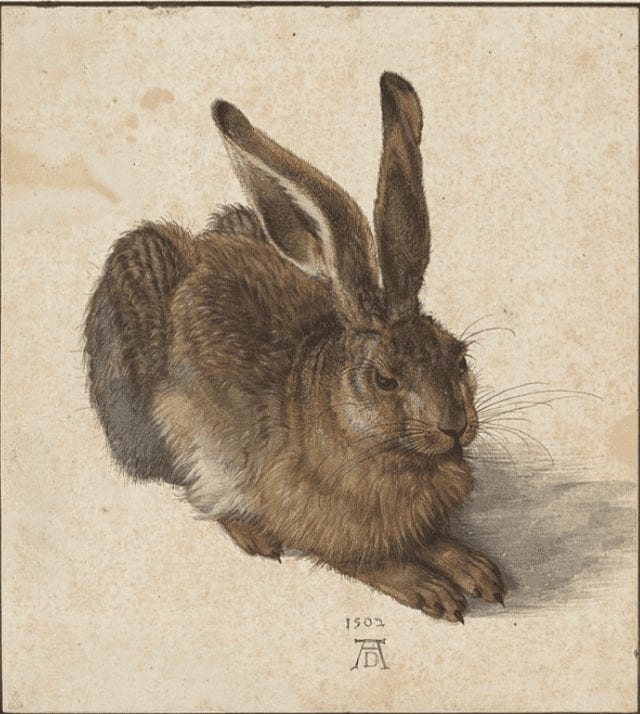
by Albrecht Durer
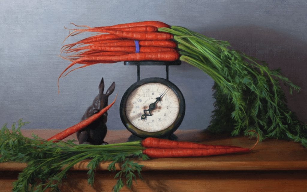
by Terry Rafferty
Art isn’t a competition: it’s a contribution to the collective experience of humanity. Please contribute yours.
Outdoor Painting
I am fortunate to have been given, several years ago, some 50-70 year-old American Artist magazines. Browsing through one of them recently, I came across an article about direct painting…meaning, paintings created directly from life or nature. In light of the current fascination with, and gushing acceptance of all things done en plein air, the writer of the article brings a little sanity to the topic. I think you’ll find it helpful. All images shown in this article were done en plein air.
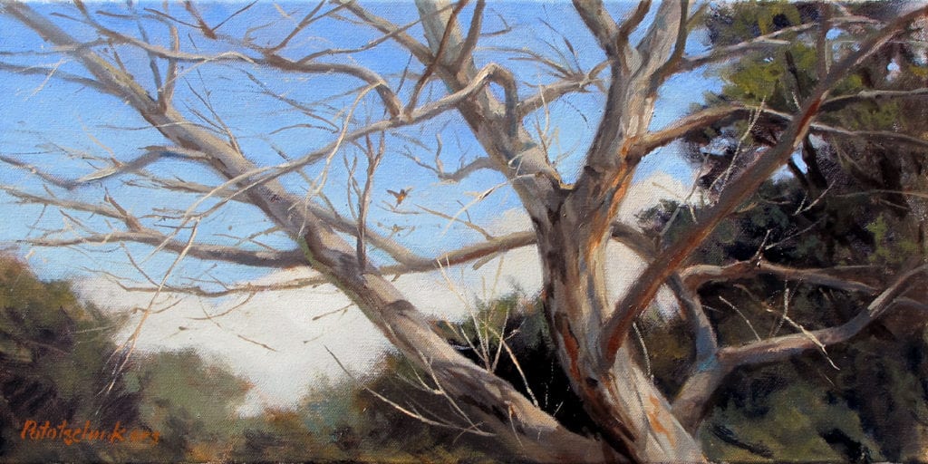
by John Pototschnik OPA
10″ x 20″ – Oil
“Direct painting, when practiced by an expert, gives wonderful results; it also imposes stringent rules upon those who practice it. An error of judgement may, probably will, ruin the whole work. For this reason, much knowledge must back up the brush. What must this knowledge comprise?
- The power of visualization must be developed in order that the artist may see, on the canvas, what effect he is aiming for.
- Ideas of color must be worked out before ever touching brush to canvas.
- The ability to draw, not only with the pencil but also with the brush, is mandatory.
- The ability to decide the importance of every object painted, in order to put it down in proper relationship to the whole, is a must.
- Must have a clear understanding and knowledge of masses, of tone, and of design.
“Maybe this long list of requirements will bring disappointment to many; it should not, for every true artist desires to base his work on knowledge. He can only paint what he knows. His development, therefore, depends upon the amount of knowledge he imbibes. That knowledge must be based upon close study of the moods of nature. Never, until nature is thoroughly understood, will an artist paint direct works successfully.”
by Louis Escobedo OPA
8″ x 8″ – Oil
by Eric Jacobsen
18″ x 22″ – Oil
“Nature shows her precious moods for short periods, and only the artist who understands those moods can seize upon them and put them down in paint, with certainty. That glorious period, for example, when the world is flooded with gold, just before the sun begins to set, must be understood to be painted; the artist must have observed this effect often before ever he can paint it in the time nature provides. The mind must be stored with those observations so that, when a scene presents itself opportunely under such conditions, he can set to work, backed up with the information provided by earlier study.
“Knowing the characteristics of each mood of nature enables him to apply them to any scene. If he puts down those characteristics, he has seized the mood, however roughly objects are drawn.”
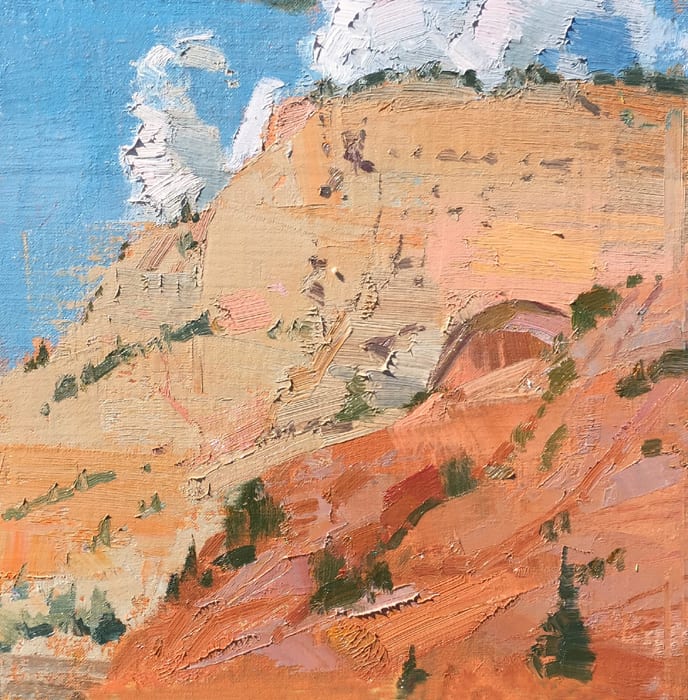
by Suzie Baker OPA
10″ x 30″ – Oil
“The beauty of the subject relies not upon detailed delineation of the objects in the scene, but on the effect of a certain light upon them; hence, direct work must seize upon the object, arrangement, and effects of light, but mainly upon the last two. Nature will not allow the artist sufficient time to draw everything perfectly; indeed, if it did, detail would be so intricate that it would surely kill the fresh, pure effect the artist desires to incorporate in his work.”
“The “bloom” of color put down in one stroke and left, is something well worth striving for. Few can do it well. Success in this means certain mastery not only of brush and color, but of knowledge.”
Kapalua Bay”
by Dave Santillanes OPA
9″ x 12″ – Oil
by Roos Schuring
9.6″ x 11.8″ – Oil
by Kathleen Dunphy OPA
16″ x 20″ – Oil
by Jennifer McChristian OPA
9″ x 7″ – Gouache
How does one become an accomplished landscape painter without direct study of nature? The simple answer…you don’t. Painting and sketching directly from nature, and spending time just observing, are probably the most important habits of the landscape painter.

by Fran Ellisor
14″ x 18″ – Oil
by George Van Hook
30″ x 40″ – Oil
Here are additional benefits of creating paintings or studies when working directly from nature:
- They’re a perpetual record of where you’ve been, what you’ve directly observed, and what can always be referenced when needed. They also help recall the moment it was painted and all the circumstances involved.
- Direct observation becomes more deeply ingrained and remembered.
- They create a deeper learning experience because more time is spent observing and attempting to faithfully represent the subject.
- Compared to working from photos, more senses are involved; not only sight, but also sound, smell, and touch. Even with improved photo technology, the eyes still are able to discern subtleties that the camera cannot.
- They provide a direct interaction with the subject; it’s like speaking to someone face-to-face versus reading something someone else wrote about them.
The next step is yours…assemble your painting equipment, head outside, set up, and get after it. Your efforts, over time, will be well rewarded.
Snow Cones and Grits
Sometimes it seems that painters look for answers anywhere except from where they can most readily find the truth… personal observation. I get loads of emails asking about everything, literally, from what kind of brushes I use to where to eat in Rome. A recent question came in regarding the different colors for painting snow versus those for painting white sand. I love this question! It seems logical and that it should have an easy answer.
The problem is, there are no easy answers. Sure, I could spout all sorts of physics equations and present scientific research on the reflective and refractive indexes of surfaces. Any of you can look online and read the same. (Search Albedo Measurement just for fun.) Of course, what we are really talking about are the differences between snow cones and grits.
Percentage of diffusely reflective sunlight relative to various surface conditions:
Lori Putnam OPA
6″ x 8″
If we are looking at white sand, however, we need to remember that it is comprised of different particles such as silicone dioxide (in the form of granite) and other gems and minerals filled with particles of impurities. The light hitting these tiny grains scatters about, some absorbing more light, others very little, and at differing speeds. The appearance to the novice may be similar to snow, but after much observation it becomes more apparent that one is an opaque surface and the other a translucent one. Just as in any situation, the same theory applies to the shadow color, which is reflected sky and surroundings’ colors, but is now relative to a totally different surface condition.
Lori Putnam OPA
11″ x 14″
Plein air (private collection)
Wait! I just asked you to learn to observe and now I’m asking you to make a decision about those observations. Yep. You’re a big boy/girl now and you get to make your own decisions. You choose what to put in and what not to put in. You choose how chromatic or neutral you want your painting to be. You are in control of the painting, rather than the other way around. This is where science, personal observation, and creativity collide and you are a full-fledged artist. Congratulations.
Here’s my challenge: Find out where you think you are along this path, and be open to growth into the next phase. Never just settle for someone else’s answer; find your own.
A final word: Yellow sand, good; yellow snow, not so good.