Is there such a thing—the “perfect” subject to paint– on any given day?
Like song-choice for a musician, the subject an artist chooses to paint carries his/her personality, abilities and message to the viewers who will see it. Possibilities abound: perhaps a 300-foot tumbling waterfall, the sun poised on a dramatic orange horizon, or that striking profile of a most beautiful model. What really makes for a “perfect” subject?

Let’s see what some other artists say on that “subject:”
“The subject itself is no account; what matters is the way it is presented.” (Raoul Dufy)
“Content is more than ‘subject matter.’ It is all the feelings and ideas you bring to your painting.” (Rene Huyghe)
“There has to be that magical ‘urge’ and excitement to paint the subject, or it just will not work.” (Randall Sexton)
“Just because it is there, doesn’t mean you have to paint it.” (CJ Rider)
Is there such a thing—the “perfect” subject to paint– on any given day?

When choosing what to do next in their college courses, or in their personal lives, or in their careers, I have told my daughters, “choose to W.I.N.” Ask yourselves, “What’s Important Now?” –then do that. That is an aid to stay focused, look at the Big Picture, and avoid getting frustrated or sidelined by details.


“It is only with the heart that one can see rightly.” – Antoine de Sainte-Exupery
Oil Painting
My Favorite Thing – Thomas Jefferson Kitts
The Ubiquitous All-purpose Palette Knife
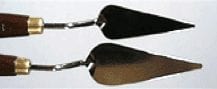 When I first saw this palette knife in the hands of Richard Schmid a lightbulb went off. Years later, I have found this knife to be the most useful tool ever. I can rapidly mix my colors and paint with it, and it is substantial enough to scrape a wet or dry passage of paint down to the underlying ground. I prefer this knife because the blade is metal, wedge-shaped, and has an ‘off-set’ handle. The blade itself is about 1 inch wide at the base and about 3 inches in length. The width allows me to mix a lot of color quickly and the tip makes short work of applying a highlight. The length allows me to laid down an incredibly sharp line or crisp edge on the rare occasion I need one, far thinner than any rigger can create. I use this knife to mix my neutral light tints, such as flesh and snow, which keeps those delicate colors clean, and I use it to scrape off the inevitable failure when they occur. And yes, I abuse this knife constantly. I drop it often and clean my palette with it at the end of the day. (Or a week later, to admit the truth…ha!) And yes, the offset handle keeps my knuckles out of the paint – a constant hazard for me. These knives are so cheap I give them away in my workshops.
I have even sharpened the edge of the blade like a chisel, to give it the ability to cut through a crusty paint film without digging into the ground below. You can read about it here
www.thomaskitts.com
WHAT DO YOU DO? “I AM AN ARTIST.”
How far into your artist career did you start answering to the ever-present question, “What do you do?” with a smile and an assertive reply “I AM AN ARTIST”? This is a query I presented to all my mentors at the beginning of my artistic career some years ago after switching from Petroleum Engineering and International business fields.
I would like to revisit this question once more on behalf of all those people out there considering changing paths in life and crossing the bridge to becoming full-time artists. To the question above, some artists said they always responded with “I AM AN ARTIST” but most replied that they avoided the question, sidetracked it, redirected it or simply ignored it to avoid the obnoxious looks from friends and family expecting them to have grown up and taken a “serious track.” In the words of the artist Ben Shahn, “I believe that if it were left to artists to choose their own labels most would choose none.”
Is an art career even worth pursuing? After all, only the most determined artists can sustain themselves with art-related income. Isn’t it true that many artists have been ignored all their lives only to be recognized for their vision, genius and creativity until much later after their deaths? We admire and revere the works of artists such as Brunelleschi, DaVinci, Caravaggio, Van Gogh, Modigliani, Vermeer, El Greco, Rembrandt, Gaugin and other artistic geniuses. Weren’t they for many years the outcasts or had careers marred by debt. Some, nobody knew about until their works were found in dark monasteries, forgotten and uncared for, then studied, revived and given the value they deserved, decades or even centuries after the artists were deceased?
“Starving Artist” is a cliché that has been casted by well-intentioned people to deter us from being successful and happy. Art is, in my opinion, a very rewarding career, but it is not an easy tag to put on your head and display proudly to those close to you. Art in our society tends to be perceived as the choice of irresponsible, unreliable people and that of dreamers. Family pressure to stir you out of your path is often very painful and difficult to overcome.
Of all those artist-to-be, some who are strong and stubborn enough will pursue an art degree even at the cost of their family disapproval. Others, like myself, will take up a different career altogether, following the advice of elders and peers. Those who persisted and managed to go to art school enjoy tremendously the learning process and the exhilarating sense of creating out of simple thoughts what they perceive as a reality. However when school was over, and there were no projects to submit, no classes to attend, no teachers to please and no peers to offer support, many art graduates found the irreconcilable truth that their creativity was drained and creating was now a painful process. Many went into other fields just to avoid the risk of displeasing the world. Many denied they were artists choosing to wear a different hat and label.
On the other hand, those of us for whom the influence of our peers, siblings, parents, teachers, guides succeeded in rerouting our destiny, go through life carrying with ourselves mixed feelings of guilt, remorse, regret and a sense of an unlived life, questioning who we are and what we are supposed to become, where and why we strayed. In both cases, it is only by the tenacious and persistent tug of your “true call” that a trained but forgotten artist in the first scenario or the hidden artist in the second, becomes a real artist.
Many people in the engineering, medical, science fields are returning home to what they feel is their true path: doing art. Workshops, ateliers, art schools, continuing education classes are full of those lost artists, talented, determined, ready to shake the shame off and create. I did it several years ago, transferring from petroleum engineering to art, without any previous knowledge or experience and not knowing where to start, but being blindly guided by an intense desire to do what I came here to do. I applaud those people, who like me years ago, are jumping in now, because giving up a financially prosperous career, steady income, promotions, benefits, stability, in lieu of a profession where nothing is certain, requires a monumental leap of faith and an unfathomable amount of perseverance and courage.
I can assure you, having been through it, that once on the other side, you will never regret it. The happiness of living your true call is absolutely priceless, especially when you can experience the most exhilarating moments immersed in your own creations and the immense possibilities that your mind will open to you in a creative career such as in the arts.
The transition cannot be left unplanned though. There are several strategies that you can use to make the leap less strenuous. I am listing below the ABC’s that personally helped me with a swift and smooth shift.
- Art books and guidance books such as Art and Fear by David Bayles and Ted Orland, The Artist Way by Julia Cameron and Accelerating on the Curves by Katharine T. Carter will boost your creativity and will help you find the courage and confidence needed for the switch.
- Be prepared. Prepare a financial plan that allows you to leave your current job without monetary distress. Assessing your resources, expenses and savings will reduce the pressure of meeting financial obligations on top of the transition.
- Connect. Find a mentor, willing to support you from the beginning. Look for artists whose art you admire and enquiry on mentorships. Contact art communities, Art Leagues, and colleges where you can associate with other artists. These groups will motivate you, and encourage you to improve and grow.
- Develop your skills by doing art daily and by registering for classes, workshops at art schools, art organizations or individual teachers near you. On this topic, I’ve heard this wise quote from Bart Lindstrom, “Step one is to get really good. Step two is to get out there. The better you do step one, the easier step two is.”
- Establish realistic goals both short and long term. Knowing where you want to go will help you see the opportunities available to reach your set objectives.
If you are in the midst of making the decision of crossing the bridge, I would recommend you to go ahead and do it. Start by proudly calling yourself AN ARTIST!
In the words of Ralph Waldo Emerson “What lies behind us and what lies before us is tiny matters compared to what lies within us.
www.hruedart.com
“The Art Spirit” Book
“The Art Spirit” Book
Robert Henri
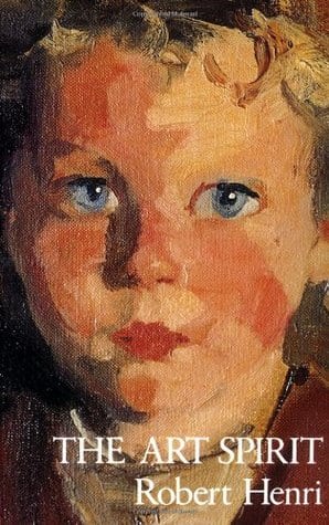 What is in a book? What can be finer than reading a deep, marvelous, enthralling book? This book is so magnificent that do I dare compare its influence on artists as the Bible’s influence on believers? Maybe, it is not quite as important as that, but close. And like the Bible, I can flip to any page of it and be inspired by a truth. In fact, when I was first serious about painting, after my morning coffee and devotional, I would open this book to any page hoping for some insight.
What is this book? It is entitled, “The Art Spirit,” a compilation of critiques to his art students by Robert Henri (1865 -1929). Robert Henri was an influential teacher and artist who, according to Wikipedia, studied at the Pennsylvania Academy of Fine Arts and taught at the Art Students League in New York City. I have seen many of his paintings in major museums, and in my very humble opinion, his teachings are much more beautiful than his paintings.
For those artists not familiar with “The Art Spirit,” I recommend purchasing it. The paperback version is inexpensive (around $20.00), and makes a great gift for fellow artists who do not own a copy.
I use “The Art Spirit” as a reference whenever I have a question about painting. It has a useful index in the back. It is especially helpful to teachers. I have frequently used Henri’s lessons in my classes and workshops. For example, on page 34, he suggests: “You start by making a very simple drawing on your canvas, paying particular attention to the exact location, size and shape of all the masses, the hair, collar and shirt, the tie, his coat and the background. In this I have named seven areas, and together they cover the total of the canvas…You work at these seven tones on your palette until you are quite sure you have made mixtures that closely approximate in color and value the (1)light of the face, (2)shade of the face, (3) hair, (4)collar and shirt, (5) tie, (6) coat,(7)background…your palette represents but seven notes, each to represent flatly its corresponding area.”
Henri discusses brush strokes. It takes him seven pages! Every point he makes about brushstrokes is worthwhile.
On the subject of backgrounds:
The following quote is becoming a favorite of mine: “Age need not destroy beauty. There are people who grow more beautiful as they grow older. If age means to them an expansion and development of character [sic] this new mental and spiritual state will have its effect on the physical. A face which in the early days was merely pretty or even dull, will be transformed. The eyes will attain mysterious depths, there will be a gesture in the whole face of greater sensibility and all will appear coordinate.” As a baby boomer, I will be meditating on that thought!
I highly recommend that you read this book and include it in your art library.
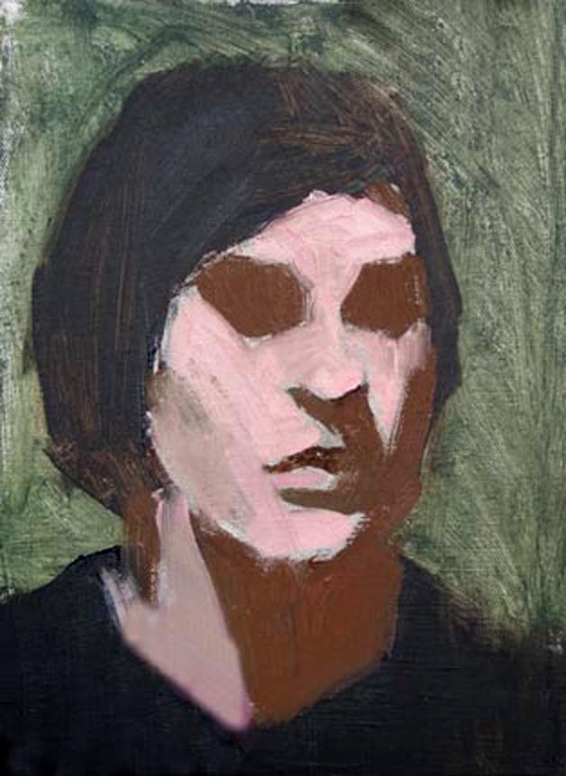
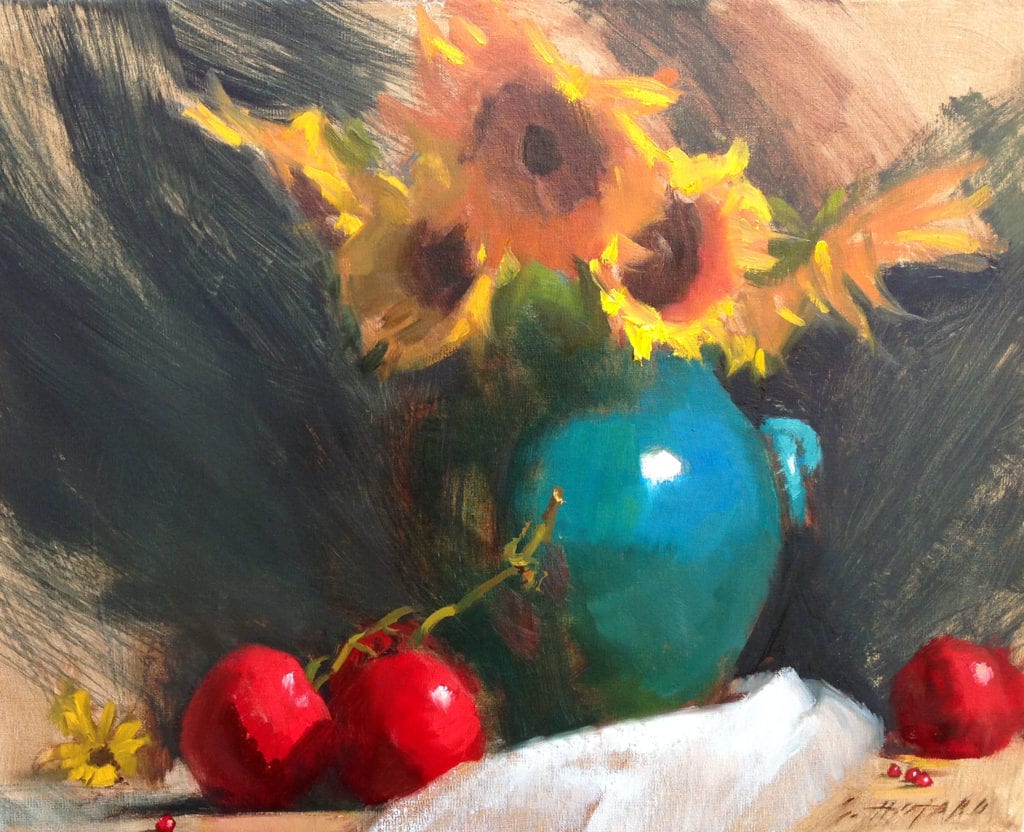
Artwork by Susan Hotard
Sources:
The Art Spirit, Robert Henri
Wikipedia
Cindy Baron Interview
In July of 2013, I asked a group of women artists if they noticed any significant differences in the way male and female artists are accepted within the American art scene. Cindy Baron, one of the women asked to comment, senses there is a difference in how the two genders are perceived in the marketplace. Men are considered to be more serious about their work than women.
Commenting on the difference in support received, Baron notes, “Most male artists have a support system behind them. As women, we have a natural tendency to support everyone around us, and most often we are unsupported or not taken seriously.”
Well, there is little doubt that this Rhode Island artist is totally committed to her work. She is one of the few artists accomplished in pastel, watercolor and oil, while being awarded signature membership status in the American Watercolor Society and Oil Painters of America. Quite an achievement for those that might question her seriousness.
It’s my pleasure to bring you this inspiring interview with Cindy Baron.
Why are you an artist?
It is a vocation for me – I could not imagine doing anything else with my life. Art is about creating beauty, and I have been doing that for as long as I can remember.
If you were not an artist, what would you like to be?
I would definitely be a carpenter. I’m sure that sounds funny coming from a woman, but I love construction, building and woodworking. In my early twenties I helped build a house and learned so much – from roofing to masonry. It was a two-story English Tudor with lots of stonework and woodwork. I truly enjoyed the experience and would love to do it again.
What have been the major challenges you’ve had to face in order to establish yourself as a professional artist?
My biggest challenges have been timing…and myself! I am very hard on myself, many artists are. I am always challenging myself to be better, to see the landscape simpler.
Princess Diana famously said, “if you mess up raising your family, then nothing else matters”. I believe that. I would not be where I am today had it not been for my sons. Through patience, I have gained tremendous passion for my art and it has become clear about where I want it to go.
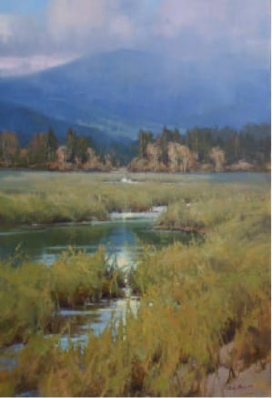
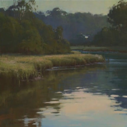
Your paintings are very atmospheric; what are the key points one needs to know when creating a true sense of atmosphere?
What is the major thing you look for when selecting a subject?
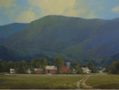
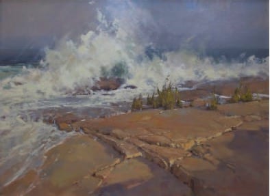
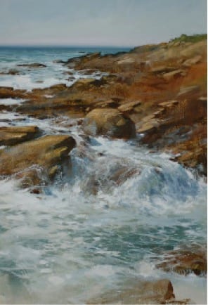
I’m attracted to shapes and edges or drama of the scene. A coastal landscape has the wonderful movement and big value changes. Mountains have all the elements of shapes, edges and subtle changes. I love to draw, so I look for certain edges to focus on and how I can enhance the lighting on it.
When designing a painting, do you attempt to simplify and minimize value masses? How do you determine those value masses?
I will be the first one to tell you I can complicate a painting more than anyone else. Simplifying has been continuous development work for me. This is where my sketchbook and field studies are key. To enhance that, most of my paintings start with just a tonal wash of a warm value and then I work on shapes and decide my value ranges. This has been very helpful to me. I also have a friend in a mirror. I have a large one directly behind me when I am at the easel. I am constantly checking my drawing and painting through this process. It won’t lie.
Please share with us your working process.
Do you consider the process of painting more important than the result?
No, the result is the key. It doesn’t matter how you get there, it’s if you achieved what was in your mind and your heart.
How much of your work is intellectual vs. emotional…and how would you define the difference?
This is a hard one to give a percentage to, but when you are so moved to create what you feel, I don’t think anything can stop you. Intellectually you know the structure of a good painting that has come from time spent in the field and studio. Of course you need both, but passion plays a tremendous role for without it you would just be going through the motions. Most of my life has been spent in the sports arena and it takes a lot of passion, dedication and discipline to succeed, not just athleticism. I apply that concept to fine art; academics without heart and soul would reflect in your creativity.
What colors are typically found on your palette?
Ultramarine Blue, Cobalt Blue, Permanent Red, Cadmium Yellow Med and Dark, Alizarin, Yellow Ochre, White, Viridian, Savanna Gray, Unbleached Titanium, Black
What part does photography play in your work?
Photography plays about 50% and mostly just for reference. I use my painting studies and black and white sketches. Photographs are great to recall or study a shape, but they are not good for values and depth of a scene. That has to come from you and your recall. The last 20% of my painting is done without any reference and I go mainly on my memory of the scene and what moved me to want to paint it.
What part does plein air painting play in your work?
A huge amount, you have to paint in the field just to gain the knowledge of values and color. I love being outside and my trips I plan every year are more like boot camp. This is where the good, the bad and the ugly happen, but so invaluable to a successful studio painting. That hour or two you spend on a painting, you learn what shapes are good, how to hold your masses and color temperature. The knowledge of this can only be achieved through painting on site.
What qualifies as a plein air painting?
I like using the term “field studies” instead of plein air as most of my work is for capturing knowledge. I almost always paint a little on them in the studio without references and go by the memory of that day. Plein-air I would apply to timed painting events that cannot be painted on later and entered into shows. I love to revisit my field studies and paint on them, great knowledge is gained.
How would you define “success” as an artist?
Peer recognition and wealth would be the go-to answer, but it’s not. Yes I am an artist and I believe that is a gift, but most importantly I am a mom, an entrepreneur, a good friend and most of all, ever evolving. Yes there is success, but it came with discipline, hard work, teaching and a feeling of pride that I am allowed to be an artist.
What’s the most difficult part of painting for you?
Probably calling a painting “finished.” I like to look at my paintings with fresh eyes. When you revisit a painting after not looking at it for a couple of days it is so helpful in problem solving.
How many hours per day do you typically paint?
A typical day starts with coffee, emails than exercise. I am usually at the easel by 11 and will paint till about 5. I break for a couple of hours, but I am a fan of late night painting. I paint every day, it is seldom that a day goes by and I haven’t touched a brush, even if it’s just to lay a couple of strokes on a painting that I see has an issue.
What advice do you have for someone desiring to be an artist/painter?
Be passionate, disciplined, determined. Leave the ego behind and always challenge yourself. You will have good times and hard times and even question your artistic abilities more then you will want to admit. Study from artists you admire – living or deceased – and be open to several mediums to find your expression. Being an entrepreneur has many challenges but know that you were given a gift and it would be a sin to not use it.
If you could spend the day with any three artists past or present, whom would they be?
Tucker Smith, so talented, I love the stories he paints. Edgar Payne, for introducing me to the mountains. And William Trost Richards, I cry when I see his paintings.
What has been your most effective marketing tool?
Several things; one being, my two feet. I have had the privilege of living and traveling around the country and would do my research on galleries, museums and artist that were in the area. Making a personal connection has always been a good avenue. Other tools have been Plein Air events, gallery representation, collector lists, advertisements and the Internet.
For more of Cindy’s work: cindybaron.com
For more about the interviewer, John Pototschnik, visit www.pototschnik.com