FIGURE PAINTING WORKSHOP AT THE WOODLANDS ART LEAGUE, Sept. 8th-12th/14
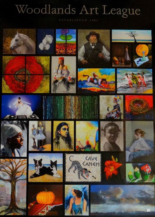 The Woodlands Art League, www.woodlandsartleague.org , a 30+ year old, nonprofit visual art organization that operates in the Woodlands Tx,, was visited by Clayton J. Beck III, one of America’s more acclaimed and recognized artists. The Woodlands Art League is proud of housing more than 300 members, whose careers have been notably carved and enhanced by the training and knowledge visiting masters have provided throughout the years. Clayton, who was teaching his third workshop at WAL, is one of those artists who has enriched the league’s history not only by means of his unconventional training philosophy but also with his professional advice related to the improvement of the physical space necessary to produce better quality art, lighting, space distribution, etc. Robert Liberace, Judy Carducci, and many other masters have pitched in to make art instruction accessible to a whole Houston community, thus facilitating the means of progressive artistic development for all, and the cultural enhancement of the entire area.
Clayton, walked in with a confidence that is at the same time intimidating and reassuring. New artists were not sure what to make of his well-worn out hat which didn’t seem necessary in this “dark cave”, as he calls the wall to wall mirrored studio where WAL currently functions. As he introduced himself and the workshop, his eccentricities became less eccentric and turned into logical statements. Clayton, reminded us, artists, that nothing that shows up in the canvas is a mistake or an accident but the result of a thought we consciously or unconsciously deposit in the painting surface and that in order for our art to improve we have to recognize what those thoughts are and change them. He pointed out that not having a goal to strike for, at the beginning of a painting session is like getting in a car and start driving not knowing where you are going.
 All artists have at one point or another attempted to do color charts but being frustrated we dropped the chore off the list. Clayton encouraged us all to complete them and used them. Debra Latham, one of the artist attendees, from Kingwood, Texas, when asked about the most important thing she had learned from Clayton’s workshop, puts it this way: “The biggest thing I learned was the importance of doing color charts. I’ve only dabbled with them a bit in the past but never to the extent he had gone to. He had such an elaborate way of doing them that I had never seen before. That is one thing on my near future “to-do” list”.
 Is it in the light or is it in the shadow? All artists wrestled with that question while we attempted to look at the model as dispassionate as we could to avoid falling into the trap of painting eyes, mouths and hair instead of the patterns of the light and shadow, lost and found edges. We tried to take ownership of Clayton’s remarks, almost never addressed to an individual attendee but to the group in general, prompting us to put the brushes down and observe the model to collect certain information, before we pick them up again and decide where the next brushstroke is supposed to go.
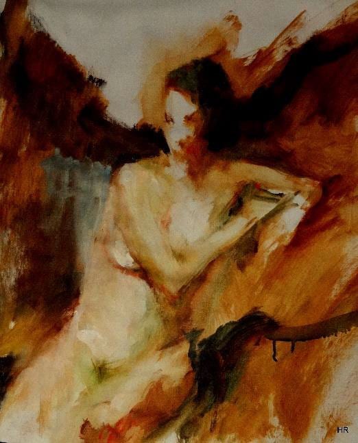
Is It In the Light? Oil on linen, 20×16, and exercise on light
Hilda Rueda. www.hruedart.webs.com
Workshops like the one offered at WAL by Clayton are valuable for artists of every level. Beginners and advance students take pride on absorbing or recalling knowledge that will help them improve their artistic careers. Suzie Baker, an accomplished and nationally awarded artists, who also participated in the week- long course expresses her foremost lesson as follows:
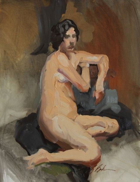 “During Clayton’s workshop, he mentioned several challenges as ways to break out of old ways of thinking, one challenge was to create a painting with no more than 10 brushstrokes per model session. So, let’s do the math: 6 session, 25min each, 10 strokes max per session, that’s 60ish strokes. The economical nature of this way or painting required a deliberate thoughtfulness. I had to spend more time mixing the right value and color of paint, choosing the right brush and amount of paint to load onto that brush, planning the brush stroke (angle, direction of pull and pressure of the stroke). The challenge was as rewarding as it was nerve wracking. Now, I just need to keep it up when Clayton isn’t watching over my left shoulder!”
Suzie Baker, www.suziebaker.com
“Keli in 60 Strokes or Less, 20 x 16“, Oil on Linen, 2014.
The week dwindled down as we attempted to recognize our own mistaken perceptions. We are determined to eradicate all those thoughts and habits, which although feel comfortable, hinder our progress and make us repeat the same mistakes over and over, piece after piece.
The guidance Clayton, and other masters, have provided us with, is invaluable, not only individually but as an art community which intends to be true to its mission of promoting the visual arts, enriching the general community trough art education and offering our artists easy access to professional instruction. We believe it is possible to make art available to all and it is through workshops with traveling masters that big groups can be reached at a reasonable price and at convenient locations and thus the goal of art-educating all can be achieved. Isn’t this the globalization of our art world? We genuinely so hope.