• Skip to primary navigation
  • Skip to main content
  • Skip to footer
  • Help Desk
  • My Account

OPA - Oil Painters of America

Dedicated to the preservation of representational art

  • Home
  • About
    • Mission, Policies & Bylaws
    • Board of Directors
    • Presidential History
    • Frequently Asked Questions
    • History
    • OPA Staff
    • Contact Us
  • Membership Services
    • Member Login
    • Membership Information
    • State & Province Distribution For Regionals
    • Update Member Information
    • Membership Directory
    • Contact Membership Department
  • Events
    • Exhibitions
    • Online Showcase
    • Lunch and Learn
    • Virtual Museum Road Trip
    • Paint Outs
  • Resources
    • Brushstrokes Newsletters
    • Ship and Insure Info
    • Lunch & Learn Video Archives
    • Museum Road Trip Video Archives
  • Services
    • Sponsorship Opportunities
    • Scholarships
    • Critique Services
    • Workshops
    • Have A HeART Humanitarian Award
  • Online Store
  • Awardees
  • Blog
    • OPA Guest Bloggers
    • Blogger’s Agreement (PDF)
    • Comment Policy
    • Advertisement Opportunities
  • Show Search
Hide Search

Selection

OPA 2013 Eastern Regional Exhibition Juror Comments

Nancy Howe · Apr 7, 2014 · Leave a Comment

In anticipation of OPA’s upcoming 2014 Eastern Regional Exhibition, we’re presenting juror comments from last year’s exhibition. Nancy Howe OPAM, juror for the 2013 Eastern Regional Exhibition, was kind enough to offer detailed notes on the paintings she selected. Enjoy!
Associate/Signature Division
"Gaze" by Mary Qian
“Gaze” by Mary Qian

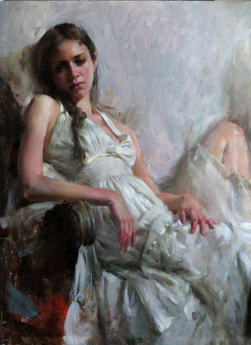
Gold Medal Mary Qian“Gaze”

This painting has strong composition, good technical execution, and emotional content. The composition has a lovely rhythm of repeating curves in the figure, and the lines of the composition direct the eye to the face that is the focal point and central to the emotional success of the painting. This focal area is further accentuated by the beautiful skin tones, bright lights in the garment, and darker values in this area of the canvas.

"A Pear Dressed For Dessert" by Susan Budash
“A Pear Dressed For Dessert” by Susan Budash

Silver MedalSusan Budash“A Pear Dressed for Dessert”

The artist makes a quiet and serious statement with this classical style still life, and then gives it her own twist with a whimsical theme. It has a compelling composition, with the pear draped in white linen cloth as a dramatic focal point, which has the power to pull you in from across the room. There is a nice rhythm of repeating lines of the forms and a harmony of color and form that makes it especially pleasing to the eye.

"Nine Days of Fog" by Elizabeth Pollie OPA
“Nine Days of Fog” by Elizabeth Pollie OPA

Bronze MedalElizabeth Polli OPA“Nine Days of Fog”

This painting represents a good example of an artist who has developed her own recognizable style of painting and choice of subject matter. The piece has strong composition, designed with lines that converge and serve to focus the eye on the center of interest, which is the horse’s face. Focus here is further accomplished by making this the lightest area of the image and through the position and attention of the dog. She has also created has a great feeling of atmosphere.

Dolgov-Vadim-BytheFireplace-24x20-$3800
“By the Fireplace” by Vadim Dolgov

American Art Collector Award of ExcellenceVadim Dolgov“By the Fireplace”

This painting has a great sense of mood that draws me in to the intimacy and warmth of the scene. It has strong composition with the foreground figure’s face as a compelling focal point. The artist has skillfully, and to me magically, used the application of thick paint and bold, loud brushstrokes to create a sense of quiet and introspection.

Malcolm-Dana-WhatWillBe-24x36-$4800
“What Will Be” by Dana Malcolm

Fine Art Connoisseur Magazine Award of ExcellenceDana Malcolm“What Will Be”

The artist has created a unique presentation of common subject matter, with compelling composition and lovely flow of line. The foreground shell serves as a strong center of interest. The reflected clouds and sky light in the water give it a dreamy, otherworldly quality that lifts the subject matter from the physical to the concept of something spiritual, which is reflected in her choice of title for the painting.

SchneiderOPA-William-FinalChapter-18x24-$3125
“Final Chapter” by William Schneider OPA

McBride Gallery Award of ExcellenceWilliam Schneider OPA,“Final Chapter”

This painting has wonderful composition that is set up by the use of light that directs the eye in a circular pattern from the book to the arm and face of the figure to the flower. This has the effect of holding me to that place and drawing me into this space the artist has created. It is a painting that really holds up from across the room, where the technique disappears and the figure appears lifelike. I feel as if I am having for myself the artist’s experience of this setting.

Hou-Haiou-BeardedMan-8x8-$1600
“Bearded Man” by Hai-Ou Hou

Award of ExcellenceHai-Ou Hou“Bearded Man”

The artist does so much in this painting with great economy of brushwork. She has created a very sensitive portrait of this “gentle man”. Her portrayal has a gentleness about it that is further supported by the quiet blue tones she has chosen. It is a simple and very clear statement of her impression of the subject.

Neighbors-Brandi-SubtleDeception-16x20-$1050
“Subtle Deception” by Brandi Neighbors

Award of ExcellenceBrandi Neighbors“Subtle Deception”

The artist has been able to convey with economy of brushwork and pleasing harmony of color and line a refreshing sense of the outdoors. I feel the sunlight and movement of the air. She achieves this suggestion of gentle movement through subtle use of value changes. There seems to be stillness only in the woman’s expression, which makes this part of the painting become the focus of attention and expression of the concept of the piece.

Damico-Tony-SnowTracks-9x12-$2000
“SnowTracks” by Tony Damico

Award of ExcellenceTony Damico“Snow Tracks”

This painting is a wonderful composition with a fresh and lively plein air feel. The sunlit banks of the tracks, with the brightest lights in the image, serve to direct the eye through the landscape, drawing the viewer into the scene. This vertical movement is echoed in the placement of the trees, and there is a nice counterbalance that is accomplished by the darker value horizontals of the landscape.

WangOPA-JanPeng-TibetGirl-9x12-$1250
“Tibet Girl” by Jan Peng Wang OPA

Award of ExcellenceJan Peng Wang OPA“Tibet Girl”

The artist skillfully uses clean bright color and expressive brushwork to convey a sunny atmosphere and open fresh quality to a child’s face. It is a sweet and lively statement in a small image.

Master Signature Division
"Jim’s Indian" by Craig Tennant OPAM
“Jim’s Indian” by Craig Tennant OPAM

Gold MedalCraig Tennant OPAM“Jim’s Indian”

The artist has created a powerful statement of ownership and attitude, with design, chiaroscuro, and color that conveys this man’s don’t-mess-with-me-or-my-bike attitude and attachment to his Indian. We quickly focus on the bright red shirt, arm extending toward the viewer, and brighter highlights from the bike. The placement of the bike, aligned perpendicular to the viewer and extending beyond the frame of the image, creates a bold and contemporary look to the subject painted in a classical style. Although the painting is detailed, there is softness to the treatment of these details that allows me to think both the artist and “Jim” have a soft place in their hearts for this bike.

Perception

Mr. John Hulsey · Nov 4, 2013 · 2 Comments

We are currently reading two fascinating books about human development and the evolution of art: The Social Conquest of Earth by E. O. Wilson and The Age of Insight: The Quest to Understand the Unconscious in Art, Mind, and Brain, from Vienna 1900 to the Present by Eric R. Kandel. While each author offers different but mutually supportive discussions on the rise of perception, self image and cultural myth-making, they are both sharing with us different aspects of the latest scientific discoveries in the fields of human development and cognition.
Mystics have told us for centuries that what most of us experience as life is an illusion. They assert that we do not see life as it is. Rather, we impose our biased interpretations on everything that touches us and that our particular, personal vision guides our actions and reactions.
Recent research by cognitive scientists has also determined that our brains are wired to deduce general, global patterns from whatever limited, local information we can gather and then to try to form a reliable, predictive pattern or picture of the world from which we can operate. This ability to think in the abstract is a sign of higher intelligence, and is at the very root of art-making. Furthermore, we each tend to assign high value to those random events which seem to support a view or pattern which pleases us and a low value to everything else. In essence, we are seeing through personal-colored lenses.
Because the whole is too large for us to see well normally, we have evolved to operate with this illusion of certainty, each forming our own unique view of the world. Our deviations from each other’s views may be slight, or they may be great. We all accept and share certain facts about the largest phenomena in common, like gravity, the seasons, orbits of the planets, and so on. However, there are an innumerable amount of details about the world that we individually may not agree upon, that are open to interpretation. Enter the Shaman, the mystic and the artist.

"Moon Road" by John Hulsey
“Moon Road” by John Hulsey
"Queen of Snows" by John Hulsey
“Queen of Snows” by John Hulsey
"Morning Meadow" by John Hulsey
“Morning Meadow” by John Hulsey

So, if life is partly an illusion, what does that mean for the visual artist? Number one is good news – since everyone has a slightly different perception of the world, each artist, by definition, must create unique work. The trick is to be able to thoroughly tune in to and assign high value to one’s perceptions about the world, and then have the courage to express that unique view in one’s art.
Surprisingly, it is also ambiguity that makes great art. A certain amount of ambiguity in an image allows viewers to participate in the artist’s world-view while simultaneously imposing their own interpretations. Mr. Kandel writes, “The meaning of the image depends on each viewer’s associations and knowledge of the world and of art, and the ability to recall that knowledge and bring it to bear on the particular image.”
When looking at art, our brains are using our pattern-making architecture and our memory to extrapolate familiar, personal associations from the image, and in a sense make it part of our own experience. In this way, great art always possesses the potential to become a unique experience for each person.

The Artist and their environment

Bill Farnsworth · Jun 24, 2013 · 9 Comments

"Hanging With Albin" by Bill Farnsworth OPA
“Hanging With Albin” by Bill Farnsworth OPA
Artists have long been influenced by their surroundings.
California artist’s paint mostly California scenes and so on. But that is just the surface layer in what makes us who we are. For me, family is first , and if all is well on the home front, all will be well in the studio. Working out of my house all those years as an illustrator kept me in close contact with my family, so I knew most of the time what my kids were up to and put out the daily fires that spring up when you are working out of your home. I love to cook so at the end of a hopefully good day in the studio, I’ll pour a drink and start prepping dinner. The process of switching from a brush to a spatula is relaxing and is great time to wind down. Food is such a great part of life that if we treat it only as fuel, we are missing out. Cooking, like art has core principals, and if you learn those principals, wonderful things can happen. My wife Debbie is a Kindergarten Teacher, so she comes home wiped out and in need to talk with an adult and I need to talk to anybody but the dogs. We have created a home we both really love and it is a place of sanctuary. Our neighbors and friends come over for Potluck dinners once a week. Living in Florida has allowed us to live outside year round and working for myself was a great way to work at another passion, my back yard. During a couple of good illustration years I starting putting patios, Tiki bar, fountains and an outdoor fireplace. Building the fireplace was an extension of my creative energy.
"In The Bowl" by Bill Farnsworth OPA
“In The Bowl” by Bill Farnsworth OPA
"Dash of Light" by Bill Farnsworth OPA
“Dash of Light” by Bill Farnsworth OPA
It also became a big meeting place for family and friends. I think these elements family, friends, cooking and building things have made me a better artist. The balance act artists have to juggle in order to survive is different with all of us, but I think we all have to be aware of not just what’s in our studio but what surrounds us.
As artist’s, we are sensitive to our environment and usually shows itself in our paintings. Some move to locals that inspire them and start creating the best art of their lives. For many of us moving is not feasible, but we can make our studio and home a place that inspires. My wife understands that her five year old students, who are starting school for the first time, need to feel safe and happy in order to learn. If our environment is one that inspires and makes us happy it will show in the art we produce. Collectors buy art that makes their lives better and are in essence buying a piece of who we are. I don’t want to sugar coat our careers as artists because it is very difficult, but I am reminded of a school talk I did years ago and at the end of my show a little boy asked me “so you get to stay home and color all day?” Yes, yes I do.

Dianne Massey Dunbar Interview

Mr. John Pototschnik · Feb 4, 2013 · 3 Comments

Diane Massey Dunbar Headshot

“I paint ordinary objects and scenes from everyday life. While I have the highest respect for artists who paint vistas and exquisite nudes and the like, I believe that there is a great deal of beauty in the world that often goes unnoticed. The amazing color in raindrops, the variety in fallen autumn leaves, the interesting greens one finds in a stack of French fries, there are endless opportunity for paintings. My hope is that people view the world just a little bit differently after seeing my paintings.”

"Red" by Diane Massey Dunbar OPA - 4x4 -Oil
“Red” by Diane Massey Dunbar OPA – 4×4 Oil
I’m a huge fan of Dianne Massey Dunbar. Her work is exciting and joyful. It reminds me somewhat of Wayne Thiebaud’s work, but I find Dunbar’s work every bit as exhilarating. Thiebaud speaks of painting as celebrating the joy of living, the thrill of experimentation and expectation, I think Dianne would fully agree with that. Her works ooze with enthusiasm and controlled recklessness.
What is so amazing to me is her fabulous ability to take the most mundane of objects and transform them into delectable treats. How can someone take a simple tube of lipstick, or plain glass bottles, or even raindrops on a windshield, and transform those things into objects of desire…paintings sought after and cherished? Dunbar does it and makes it look easy. How she does it is what this interview is about.
"Driving Through A Downpour" by Diane Massey Dunbar OPA - 12x16
“Driving Through A Downpour” by Diane Massey Dunbar OPA – 12×16

"Driving Through A Downpour (Detail of raindrops on windshield)" by Diane Massey Dunbar OPA - 12x16
“Driving Through A Downpour (Detail)” by Diane Massey Dunbar OPA – 12×16
Not only is Dianne extremely thorough, even fastidious in her preliminary work for each painting, but what is so admirable is her ability to take risks…to try new things. I talk to my students about not being afraid to fail, but Dianne lives in that world with every painting. Just examining a “simple” raindrop she has painted, I can only shake my head and ask, “How does she do it?” Each individual drop is not only a masterwork of texture but is also full of reflected color. Paralyzing fear must be thoroughly conquered when attempting a painting such as Driving Through a Downpour. Quite amazing.
Mark Smith, co-owner of the Greenhouse Gallery of Fine Art in San Antonio, said, “To view one of Dianne’s paintings is to experience complexity in its most artistic form. Most often, her choice of subject matter is quite complex, challenging and can be categorized as “crazy”. However, this type of complexity is the stage that most accurately reveals Dianne’s stunning sense of color and expert brushwork. Dianne is a master of articulating her inspiration and the “story” that she finds in the most mundane and overlooked objects and moments.”
"Gumdrops" by Diane Massey Dunbar OPA - 10x18
“Gumdrops” by Diane Massey Dunbar OPA – 10×18
I wondered how she went about selecting her subjects…”I try to remain open to what I consider interesting subject matter. If I am not interested in the subject before I paint it, I have found the resulting painting looks flat. I carry a small camera with me wherever I go, and when I see something that catches my eye. I photograph it. I may or may not decide to paint the subject matter, but at least I have a subject to consider. My still life’s are painted from the objects; the other material is painted from photos. When I take photos I don’t limit myself to one or two. I may take twenty or thirty of the same subject, from different angles, cropping them, expanding them and bracketing them. Once I have an idea that I like, I then take the photos or the objects and work on designing the painting. So, I would say the composition or design of the painting is very important when selecting a subject. If the shapes and composition are not strong to begin with, it will not matter how fancy the brushwork, or sophisticated the color scheme or values. The painting will not work.”
"Cans" - 12x12 - Diane Massey Dunbar OPA
“Cans” – 12×12 – Diane Massey Dunbar OPA
I will not be featuring Dianne’s complete interview here since it is quite lengthy. Her thoughtful answers have actually sparked topic ideas for future blogs, so you’ll be hearing more from her in the future.

Visit John Pototschnik’s Blog for more articles.


And now more from Dianne Massey Dunbar…

“I want to thank John Pototschnik, whose work I have been watching for some time now and greatly admire, for asking me to answer a few questions. I have tried to answer these questions honestly and openly and I truly hope that my comments are helpful.”

"Cityscape In Green" - 8x8 - Diane Massey Dunbar OPA
“Cityscape In Green” – 8×8 – Diane Massey Dunbar OPA
How would you define your role as an artist?  I think we all have an important place in the world at large and are equipped with unique skills and resources. Some of us are called to be doctors, others to be lawmakers or dancers or carpenters or electricians or teachers or florists. My world, my role, is to paint; to use my training and whatever talent I have to create images that are meaningful to me and hopefully have an impact on others. In a way it is like storytelling but my paintings are my voice. There are other aspects to the role of an artist beyond painting that may include encouraging fellow artists, leadership, teaching and involvement. Primarily through, I need to show up at the easel.
"Fire Engine" by Diane Massey Dunbar OPA - 5x7
“Fire Engine” by Diane Massey Dunbar OPA – 5×7
How much of your work is intellectual vs. emotional…and how would you define the difference?   I would define intellectual as rational, deliberate, thoughtful and thought out, planned and intentional. I believe it includes problem solving that in turn fuels creativity. I would define emotional as one’s personal likes and dislikes, opinions, sentimentality, excitement, spontaneity, responsiveness and our relational selves. As for those rare moments of inspiration, well I think they are largely emotional, but I also believe they result from an intellectual process. In my work, it takes both the intellectual and the emotional to create a painting.
For me, the intellectual part of painting is the process of designing the painting, the drawing involved, and the problem solving along the way. It is not sentimental and it frequently is not much fun. There is skill and experience that an artist draws on, and every painting, no matter how well it has been thought out, has an area somewhere that is troublesome. There are times when work is tedious or even boring. The emotional part of painting is for me what I like and don’t like, the subject matter that I paint, the thinness or thickness of paint, the “play” time I have with a painting, and the colors I may choose. And for good or for bad, I emotionally invest in my paintings.
Finding subject matter that is exciting is personal. I am drawn to simple common images: candy bars, cupcakes, rain on my windshield, jars, dishes, road crews, and reflections. After that, almost all of my preparation for each painting is intellectual and frankly a little tiresome. I study various compositions and value arrangements for my chosen subject matter long before I put brush to canvas. I tape the value studies upside down in my kitchen and study them to see if the design and the shapes are working. Once I have a design, only then do I begin painting. And for me, the beginning and early stages of a painting tend to be thoughtful and deliberate and even a little intimidating.
However, I absolutely love to play with paint, so when I have a painting far enough along, I can then begin to have fun with it. I might decide to smear paint, or flick it. I use any number of implements to play with paint, from the jagged edge of gum wrappers to torn pieces of paper towel rolls to palette knives to inexpensive brushes that I have cut gaps in. Today I experimented with my rubber kitchen spatula (I had fun but unfortunately was not happy with the result!).
I think non-artists have a notion that art is the result of “inspiration”. Well, there are times of inspiration, when instinct takes over and something happens on a canvas that I probably can never do again but I look at it in wonder. However, those times are few and far between for me. Being an artist is very much like other careers, there is leaning and thinking and hard work involved.
"From The Outside Looking In (Photo Reference)"
“From The Outside Looking In (Photo Reference)”

"From The Outside Looking In (Value Study)"
“From The Outside Looking In (Value Study)”

"From The Outside Looking In" by Diane Massey Dunbar OPA - 20x20
“From The Outside Looking In” by Diane Massey Dunbar OPA – 20×20

Describe your typical block-in technique, the thoroughness of your initial drawing, and the part photography plays in your work?  I have more than one process that I use, depending on my subject matter. If I am doing a relatively simple still life, between one and three objects, I will do one or two quick thumbnails on a piece of inexpensive canvas board, and if I am happy with the shapes, I will begin to sketch those shapes in on my canvas. On the canvas, I may do a very simple sketch, or a more complete sketch, either very lightly with pencil or with a small brush. I then paint, working from background to foreground, massing in the large areas of a single value without much regard to detail. Once I have the large value shapes in, I can begin to break them down into smaller shapes, etc. I try to work on gradation and edges as I go along.
On the more complex paintings, I generally use photographs and work with a grid system. I might start with 20 or more digital images that I study. I look at the overall design, and see what happens when I zoom in or crop the images. I narrow these down to maybe the top five and I have those printed at my local camera shop. Then I make black and white Xerox copies of the color photographs. After the copies are made, I use inexpensive poster paint in white, gray and black and paint directly on the copies exactly where I think I want the light value, the medium value and the dark value. For each photograph I might do two different value studies, to see what the resultant design is. I do this by hand instead of computer because I can make all kinds of decisions when I work by hand that might go unnoticed otherwise.
Value Study For A Possible Future Work

Every part of that image needs to fall into one of those three values (I have been known to work with four values, but that gets very complicated). I then tape them up in my condo and live with them for a day or two, turning them upside down and sideways to see if the design is satisfactory. It is tedious, but I have found this process works for me and I have more successful paintings. After I have a design I like, then I have that photograph enlarged. However, I keep the value study because that is my “roadmap” for the painting. So, I paint the image that I have chosen, using the values of my value study. If I am working on a square canvas, I might work from an 8″x 8″ photograph, and work on a 16″x 16″ canvas, or 20″x 20″ canvas or even a 24″ square canvas. The photograph is taped to lightweight cardboard and I use a sewing needle and thread to grid the photograph so that if necessary I can move the thread aside to see what’s underneath. I usually use 1″ squares on the photograph. I grid the canvas (the canvas must be the same proportion as the photo you are working from) with very light pencil lines, usually in two or three inch squares. I then paint each square, starting from the upper left hand corner and working to the right. After my canvas is painted, then I go back and make necessary corrections, work on edges, simplifying, etc.
"Late Afternoon" by Diane Massey Dunbar OPA - 24x18
“Late Afternoon” by Diane Massey Dunbar OPA – 24×18
What colors are most often found on your palette?  I love color! So, you would find a great many colors on my palette. My ‘stock’ colors are: Titanium White, Cadmium Lemon, Cadmium Yellow Light or Medium, Cadmium Orange, Cadmium Red Light, Alizarin Crimson (permanent), Dioxazine Purple, Cerulean Blue, Cobalt Blue, Ultramarine Blue Deep, Permanent Green Light, Cadmium Green, Sap Green (permanent), Phthalo Green, Yellow Ochre, Burnt Sienna, Burnt Umber, Torrit Grey (Gamblin).
I use other colors in different situations, especially Zinc or Transparent or Flake White Replacement. There are times I really need Indian Yellow. Caucasian Flesh is a very useful color in a number of situations. I also use Venetian Red or Naphol Red and a number of other greens, especially Emerald Green Nova. I mix my blacks, but I do have a tube of black that I use if needed.
Some of these are quite transparent in nature, and some opaque. An artist needs to know the tinting power of different colors and use the intense colors sparingly (Alizarin Crimson and the Phthalos immediately come to mind). However, a lot of wonderful effects can be achieved with a more limited palette, so you do not need all these colors to produce wonderful paintings. Indeed, if you are new to painting, you would probably be best served by using a more limited palette.
"Ten" by Diane Massey Dunbar OPA - 20x20
“Ten” by Diane Massey Dunbar OPA – 20×20

"Nancy" by Diane Massey Dunbar OPA - 27x23
“Nancy” by Diane Massey Dunbar OPA – 27×23

"Cups And Saucers" by Diane Massey Dunbar OPA - 10x10
“Cups And Saucers” by Diane Massey Dunbar OPA – 10×10

How do you decide on a dominating color key for a painting, and how do you maintain it?  I use the subject matter to guide this decision. If it is an overcast cloudy day, then much of my painting will be grayish. If I am painting toys, obviously the colors wil be much brighter. However, too much pure color is overwhelming. I mix almost all of my color. I reserve pure or intense color only for small splashes or small areas.
You have entered a number of significant art competitions. Why are art competitions important to you and how do you go about selecting the paintings for these shows?   I usually enter two to three art competitions per year. I started by entering local and state competitions, and when I was comfortable with those, I started entering regional and national competitions. There are two main reasons that I enter art competitions. The first one is to see how I stack up against other artists. Secondly, I enter competitions to hopefully have my work seen by other artists, collectors, galleries, and even magazines. There are other good reasons as well: meeting other artists, being inspired, and being challenged. Some art competitions have seminars that an artist can attend to learn and expand their knowledge on any number of topics. And, let’s face it, competitions can be fun! As far as selecting a painting, when I have what I feel is a good to exceptional painting and a deadline for a show that I want to enter is approaching, I will try to put the painting aside and keep it to enter in the show. Be aware that competitions can be expensive, there are entry fees, shipping and storage fees, and perhaps travel fees if you decide to attend the opening.
"Ketchup, Mustard and Relish" by Diane Massey Dunbar OPA - 11x14
“Ketchup, Mustard and Relish” by Diane Massey Dunbar OPA – 11×14
What advice do you have for a first-time collector?  Speaking as an artist, it is my hope that my paintings find homes where they are loved. So, I suggest that you buy a painting that you love and respond to. Also, trust your instincts. You will hopefully have it in your home for years; you will look at it over and over, perhaps seeing something different every time. So, before your worry about who the artist is, or how the colors might work in your home, look at the painting and see how you feel about it. Does the painting interest you? Do you want to get close to it and see all the beauty in the brush strokes and splashes of paint and even fingerprints? Do you find yourself thinking about a particular painting you have seen but have not yet purchased? You will know it when the right one comes along.
"City Sidewalk" -18x36 - Diane Massey Dunbar OPA
“City Sidewalk” -18×36 – Diane Massey Dunbar OPA
If you could spend the day with any three artists, past or present, whom would they be?  Every artist brings something different to the viewer. I admire so many artists, from Rembrandt to Wyeth, Monet to Van Gogh to Fechin. And, there are many current artists that I greatly esteem. I cannot begin to choose one over another, as they are each brilliant in their own individual way. However, I will state that for many years I struggled to appreciate the work of Vincent Van Gogh. Then, on a trip to New York, almost twenty years ago, I went to the Metropolitan Museum of Art. It was there that I saw my first Van Gogh in person. I could ‘feel’ the passion and the painting just by looking at it. I remember standing there for a very long time, with tears running down my face, finally getting it. I have never forgotten that experience. It was profound.
"Shopping Cart" by Diane Massey Dunbar OPA - 20x30
“Shopping Cart” by Diane Massey Dunbar OPA – 20×30

What do you think of that amazing interview, folks? Personally, I so appreciate Diane’s willingness to submit to this interview…and being so thorough in her answers. I hope you do also.

Here are important links to see more of OPA Signature Member Diane Massey Dunbar’s work:

  • Dianne Massey Dunbar website
  • Greenhouse Gallery of Fine Art
  • Gallery 1261

Click here to receive John Pototschnik’s monthly newsletter

Marc Hanson Interview

Mr. John Pototschnik · Jan 7, 2013 · 9 Comments

“Painting from life, plein air if outside, is critical and necessary to me for what I want out of myself and out of my Art”.

Marc Hanson OPA
Marc Hanson OPA
This Marc Hanson guy is a pretty interesting fellow. Not only is he a really good artist but he expresses his creativity in other areas as well. He’s an instrument rated pilot, so what’s he doing? Well, he’s building an airplane. It’s a two-seat, all aluminum, tricycle landing gear baby, capable of 200 knots (roughly 230mph). The plane’s not totally built yet, but the tail section and wing spars are. During the process he has learned to rivet and to be very meticulous with measurements and finish.
Besides the airplane, he’s also building a boat…a 12′ flat bottom rowing skiff…and it’s all done except for sanding and painting. Add to that his landscape painting and I think he’s pretty much got it all covered…land, sea, and air.
Right or Left? by Marc Hanson OPA
Right or Left? – 24″x 30″ – Oil (2011 Oil Painters of America National- Bronze Medal)

When you talk about Marc Hanson though, you’re really talking about a man who is absolutely dedicated to the craft of painting. He is most at home outdoors in the open air, brush in hand, capturing on canvas his excitement about the natural world. He feels most confident expressing himself in this way, visually, through painting and drawing as opposed to writing and speaking. That’s probably not uncommon for us visual artists, but believe me, Hanson is no slouch when it comes to writing. As you will see in this interview, his answers are seriously considered and clearly stated.
Marc’s primarily a plein air painter and he’s out there rain or shine every season of the year. He works mostly in oil, but also in pastel…and sometimes even in qouache. Because of the hundreds of paintings he’s done on-site, there is an absolute authentic reality associated with his work whether the paintings were conceived in the studio or outside.
I had the pleasure of meeting him at a plein air event we both participated in last year in Kansas. Organized by Kim Casebeer, a group of us spent several days painting in the Flint Hills and Steve Doherty, editor of Plein Air magazine, reported on the event in the Feb/Mar 2012 issue.
It was a challenge selecting images for this blog. It’s like being forced to choose just one M&M candy from a large bag of many colorful, delectable possibilities. They all taste the same, but oh, so many choices…which one to choose? I wanted to take them all, but…
River Silence by Marc Hanson OPA
River Silence – 18″x 36″ – Oil
What would be your definition of art?
That’s a big question, one that much deeper thinkers than me have pondered and explored. But…my take is that Art is the expression humans use that incorporates a skill other than communicative speech, to show others what they feel about the world around them. Music, Dance, Visual Art, Poetry, Prose…these are all ways that we humans use to talk about the world around us, in an intelligent way, based on our emotional reaction to our world, that is unique to our species. Other creatures build amazing structures, have incredibly beautiful song and sound, and they communicate with their own kind. But we are the only species that can ‘create’ beauty, ART, as an expression of our emotional existence.
How do you define your role as an artist?
My role as an artist is to be honest with myself, so that I make Art that is solely mine. I have no illusions that what I do does or will matter to anyone other than me in the end. Not to slight those who collect it, and compliment me on it, that’s an honor that I never discount. When Art is your life, however, you live it, breath it, are up and down with it. If I stay true to myself and honestly evaluate what and how I’m creating it, then all of the other factors will fall into the place that they belong, whatever that may be.
Vineyard Near Ceres - 11″x 14″ – Oil
Vineyard Near Ceres – 11″x 14″ – Oil

Abandoned #2 – 8″x 10″ – Pastel

How does one find their individuality as an artist?
Paint, paint, paint! That sounds simple, but it’s the key. Once one has the skills in hand to be able to self evaluate, with occasional help from your peers, diving deep into your own creative space and working hard is the best way to see who you are as an Artist. Style, or individuality, will come out of you, it can’t be held back, if you’re really working hard at your art.
Sunday Morning Frost - 16″x 20″ – Oil (John Marion Pardy Landscape Award of Excellence – 2010 OPA National)
Sunday Morning Frost – 16″x 20″ – Oil (John Marion Pardy Landscape Award of Excellence – 2010 OPA National)

Your paintings are uniquely yours because of the many paintings you have done. I suppose your personality is reflected in your work?
I’m all over my work. My background as having always been interested in bugs, birds, things that bite and slither, large furry things, and where they live, has made me pretty sensitive to Nature and her color and mood. I’m fine being with myself, with being in a quiet place and state, and my work reflects that I think. I’m pretty happy about life. I don’t paint dark and tragic, unless I’m painting a severe thunder cloud…and that’s fun to me.
Plein air painting is pretty important to you, just how important is it?
Painting from life, plein air if outside, is critical and necessary to me for what I want out of myself and out of my Art. Life is where the truth lies, the truth in color, in spacial relationships, in texture, in shape and all other visual aspects of the subject. Photographs are a hollow substitute, one that I am always hesitant to use, but do. Painting from life is a joy, painting from photographs is pure drudgery in my opinion.
What is the major thing you look for when selecting a subject?
I look for something that makes my ‘painting eye’ light up and begin seeing the possibility for a painting in it. I’m not looking for a thing, I’m looking for a combination of the elements that make a painting, first the light followed by how that is affecting the color, edges and design. What is the impact on me and what is it that caused me to be interested in painting the subject in the first place.
Osealia - 24″x 20″ – Oil
Osealia – 24″x 20″ – Oil

3/10/12 ‘ATV Trail’ - 6″x 8″ – Oil
3/10/12 ‘ATV Trail’ – 6″x 8″ – Oil

Low Tide Silence - 12″x 16″ – Oil
Low Tide Silence – 12″x 16″ – Oil

Do you consider the process of painting more important than the result?
No…Every part of painting, starting with what I feel is most critical…the Concept…is important to the Art. The Result is the product of all parts of the process, the Concept, and the implementation of ones techniques and skills. The quality of the Result is tied to the level of skill and maturity of the artist, meaning that they are both as important in the end.
You speak of the importance of having a concept in mind before painting. Do you let the subject determine that concept or do you create the concept and use the subject only as the starting point?
The subject is raw material for a concept. Concept is #1numero uno to me. A concept has to at least be thought of before any other element or design principle can have a purpose in a painting. If you don’t know what you are going to do, what your concept for the painting is, how do you use those elements? I’ve painted paintings to music, emptied my head, had no concept whatsoever other than to listen to the music and apply paint according to how I felt about it…almost concept free painting. I see many students, who until I harp on it, have no concept when they begin…and they usually flounder until they decide ‘why’ they’re painting the painting. That does not mean that a concept locks you into anything, it only means that you have a reason to proceed.
Monday Morning – 16″x 20″ – Oil (Best of Show and Artist’s Choice Award – Door County Plein Air Festival 2012)

How do you decide on a dominating color key for a painting, and how do you maintain it?
I let the color harmony of the scene determine that for me. I will squint, turn my head nearly upside down or sideways to try to get a sense of what the color of the light is in the scene. Then I am very careful to pay close attention to my color mixtures so that they are in that harmony as I put them up. I test each color on the painting each time, several times, before I commit to it. Another reason for painting from life, the color harmony or ‘key’ is already there. The problem is how not to destroy that if it’s what you want in the painting.
Moonstruck Dinghy – 20″x 24″ – Oil

What is your major consideration when composing a painting?
I look for a way to set the stage so that I can talk about what it is I have to say. It’s about that simple to say, though complicated to implement.
How thorough is your initial drawing?
That depends on the complexity of the situation. But I’m more of a ‘large shape’ kind of painter now. I get the big proportions going, simple shapes as possible, and then refine down to the details from there. So, a complex drawing would be counterproductive. That’s the way I paint  today. I came out of the ‘tracing paper overlay’ world as a younger artist/illustrator…and am happy to let that go.
Chisago County Dusk – 18″x 24″ – Oil

Campfires and Moonlight – 16″x 20″ – Oil

What colors are most often found on your palette?
Titanium white, Naples yellow (light version), Cadmium lemon yellow, Cadmium yellow deep, Yellow ochre (lighter version), Cadmium red light, an Earth red (Venetian, Terra Rosa, English red light, etc), Alizarin crimson, Transparent oxide red, Viridian, Cobalt blue, Ultramarine blue deep, and often now a blue like Manganese blue…and sometimes Chromatic black.
Block-in Techniques
Block-in Techniques

Block-in techniques
Block-in techniques

Describe your typical block-in technique.
One way is that I get a cheap 1-1/2″ or 2″ bristle varnishing brush (hardware store variety $1.79) and start knocking in big blocks of color pretty fast. Usually using a colored block-in that gives me an idea of what the large masses of color will look like in the composition. Then I lightly wipe out most of that and begin to restate the drawing or just begin applying areas of color.
Do you paint in layers?
In the studio, yes I do. And on multi-session plein air landscapes I also do.
What are the key points one needs to know when creating a true sense of atmosphere?
I might just answer that by saying that if you just pay attention to the relative color and value relationships, you’ll be fine. However, having just taught a class, I know that’s my experience talking. Studying recessive situations from life, understanding recessive color theory, then going out and trying to make your color recede and reflect the atmosphere that you’re painting is a way to improve that in your work. Every situation is different outside. Unless an artist wants to paint a generic reflection of the landscape, studying and painting from life is the only good way to create the atmosphere that you’re seeing.
How much of your work is intellectual vs. emotional…and how would you define the difference?
I would say that it takes the intellectual to produce the emotional. The process is intellectual, although as time goes on, some of painting is almost intuitive…things like mixing and applying paint (that comes up as I’ve just come off of teaching a workshop. It’s not automatic to students, still in the low end of the learning curve, how to physically make a painting…things like how to mix and apply paint is a big deal to them). The quality of the end result has to be full of the emotional or it will be but a rendering of a ‘thing’. When the masters reach that place where the two mesh…the intellectual and emotional are working in harmony…they produce poetry…Art.
Winter Solstice Nocturne – 20″x 24″ – Oil

What part does photography play in your work?
It plays a big part when I’m in the studio, along with field studies. Especially if I’m needing to paint Cape Cod when I’m in my Minnesota studio. One reason I just relocated to Colorado is to be able to be outside painting more often and not stuck in the studio so much. I always try to only paint an area that I have first painted from life, or at least where I’ve done some work from life to be able to know how the light in that area looks. If I need to pull out the photos on the computer, I use the photo as a starting point and let the painting emerge and grow into it’s own thing, away from the photo usually. At that point, I barely look at the computer.
What are the major problems encountered when translating a field study to a large studio painting?
I would say that if you expect to recreate the field study, you’re bucking up against a big wave. I realized that the field study is there as a starting point into a different voyage, to give you some notes that you can use to create a brand new image with it’s own inherent qualities that were not in the field study. Trying to replicate the 4″ swish of an emotional brushstroke at a scale that is 3 or 4 times larger in all dimensions…is nearly impossible. The field study is a ‘note’, maybe a pretty finished one able to stand on it’s own, but as far as a larger studio painting goes, it’s just a reminder for me.
I notice you work in both oil and pastel, why do you do that, and what are the significant differences?
I started pastels many years ago because I had a show coming up and needed more work, faster. I took to it immediately. They have the sensitivity for me that is attractive for rendering natures’ textures. I like the broken color that is achievable with pastel, and it’s taught me a bunch about color and using color in the oil paintings that I wouldn’t have thought to mix on my own. Otherwise I paint with pastels in the same basic way that I paint with oils…dark to light, thin to thick. I break the pastels into brushstroke sizes and use it as sweeping strokes. I don’t draw linear strokes with it. I think it’s always good to switch mediums from time to time. I also use gouache for field studies pretty often. That’s my third favorite medium.
What advice would you have for a young artist/painter?
I like what Henri said…to the effect…paraphrasing…’Discourage and dissuade any child who wants to become a painter and if they still want to, then they may have the fortitude to withstand it all, and succeed’. Wish I had the quote at hand on that one, but that’s basically the idea. I’d tell them that they need to seek out good advice and training, learn to draw first and foremost. I’d also tell them to try every medium, technique and style that they can. Learn about all of the materials and techniques that they can. Too many painters I run into today start with a workshop, learn about one kind of brush, one palette, one kind of canvas board. Materials are like musical instruments or dance shoes…every artist finds the ones that work best for them. If all they use is the ‘one’ that their first instructor told them to use, they may be missing out on the ones that take them to a higher level of creating art. Young artists are in a great place right now. There are academies, ateliers, workshops and schools all over the country from which to pick either a designed curriculum program, or in an a la carte way.
What advice would you have for a first-time collector?
I would have to say that is really dependent on the level of the spending the collector can do. If it’s a few hundred dollars, local galleries and art shows would be a way to begin to follow the artists and art that appeals to them.  Also, educate themselves by looking at magazines like American Art Collector, American Art Review, Southwest Art, etc. I’m sure that gallery owners would be the best ones to answer this question, so I’ll leave it at that.
If you could spend the day with any three artists, past or present, which would they be?
Sorolla, Levitan and Monet.
Hex River Valley – 30″x 40″ – Oil

Who has had the most influence on your career, and why?
My Dad. He was a part-time artist and always my biggest supporter and encourager to become an artist or anything for that matter. He shared all of his knowledge with me about art materials, from crowquill pens and India ink, to woodcuts, oil pastels and oil paints. He even did scrimshaw later on in his life. I would not be doing this today if it were not for the hours of his life he gave me.
How important are art competitions and how do you decide which piece to enter?
I like to enter some, OPA is my main competition. I use it as a yearly barometer for my progress. Nothing like seeing your work amidst the work of your peers, year in and year out, to see how you’re doing. It’s an awakener.
Thanks Marc for a great interview and your willingness to share your thoughts with our readers.

Here are important links to see more of Hanson’s work:

  • Marc Hanson website
  • Blog
  • Addison Art Gallery
  • American Legacy Gallery
  • Elizabeth Pollie Fine Art
  • Ponderosa Art Gallery
  • R.S. Hanna Gallery

Click here to receive John Pototschnik’s monthly newsletter

  • Page 1
  • Page 2
  • Go to Next Page »

Footer

  • Home
  • About
    • Mission, Policies & Bylaws
    • Board of Directors
    • Presidential History
    • Frequently Asked Questions
    • History
    • OPA Staff
    • Contact Us
  • Membership Services
    • Member Login
    • Membership Information
    • State & Province Distribution For Regionals
    • Update Member Information
    • Membership Directory
    • Contact Membership Department
  • Events
    • Exhibitions
    • Online Showcase
    • Lunch and Learn
    • Virtual Museum Road Trip
    • Paint Outs
  • Resources
    • Brushstrokes Newsletters
    • Ship and Insure Info
    • Lunch & Learn Video Archives
    • Museum Road Trip Video Archives
  • Services
    • Sponsorship Opportunities
    • Scholarships
    • Critique Services
    • Workshops
    • Have A HeART Humanitarian Award
  • Online Store
  • Awardees
  • Blog
    • OPA Guest Bloggers
    • Blogger’s Agreement (PDF)
    • Comment Policy
    • Advertisement Opportunities

© 2025 OPA - Oil Painters of America · Design by Steck Insights Web Design Logo