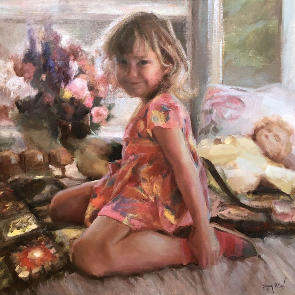
30″ x 30″ – Oil on Linen
I chose to paint this piece because of the dramatic nature of the composition, the lighting, and the color. The composition would be like none other I had ever painted before- full of everything “a little girl is made of”- keeping your eye wandering around like an “I spy” game. (Even she seems to be trying to hide the fact that she let the cat on the bed.) Most of my other paintings were centered on one idea with very little “supporting characters” to that central theme. This one was more complex- a story in a snapshot that displayed the overwhelming love that was lavished on this little girl- from the flowers, to the pet, to the doll, to the flowered laden dress, to the homemade throw. So, yes, simplifying the painting would have “brought out” the subject more, but the narrative (and the added interest, in my opinion) would have been lost.
The lighting was a challenge- back lit by cool light casting warm dark shadows on the face. It was important to not go too dark because of the child’s age, and to be sure to alternate warms and cools to get a lifelike appearance.
But the color- wow. The color! I knew it would be the star of the show. Her little dress was a gorgeous, vibrant pink with yellow and blue flowers, with matching multi color sandals and pink socks. The array of flowers behind her echoed her dress but added new colors. And if that weren’t enough, the crocheted throw she was kneeling on had it’s share of color. Then there was the doll with a sweet sunshine yellow dress. (I also had to make sure that the doll’s face looked like a doll and the child’s face looked alive.) Then there was the “hidden” cat- with it’s reflected colors.
The first decision I made on color was to decide I wanted a very limited color palette. One red, one blue, and one yellow would be used along with two transparent colors and white to make the various colors in this painting. But I knew that the choice of which red to use would be the most important, because of the rose colored dress was a main part of the beauty of the picture. I brought out a small 9″ x 11″ canvas and drew a square on it. From there, I did a compositional study, along with a color study. You can see from the image below that I mixed some colors on the side of this canvas with 3 different reds in order to see which I needed to go with. In the end, “Napthol Red” was the winner.

So, I took Napthol red, along with a blue and a yellow and created my “color circle” from just these three colors, along with a dark transparent in the center of the circle. In all of my workshops I teach how to create this circle. It allows you to have a wide array of colors at your fingertips without having to think about every single color you see and how to mix it while you are painting.
It is amazing how many colors show up when you premix from just three primary colors. And it’s a good thing. This painting would use most of them, as the wide arrange of colors each told a story of how this child is very much “Cherished.”
To see me mixing this color circle in one of my workshops, click this link: https://www.youtube.com/watch?v=PQTEsOLp5YU&t=2s


Leave a Reply