• Skip to primary navigation
  • Skip to main content
  • Skip to footer
  • Help Desk
  • My Account

OPA - Oil Painters of America

Dedicated to the preservation of representational art

  • Home
  • About
    • Mission, Policies & Bylaws
    • Board of Directors
    • Presidential History
    • Frequently Asked Questions
    • History
    • OPA Staff
    • Contact Us
  • Membership Services
    • Member Login
    • Membership Information
    • State & Province Distribution For Regionals
    • Update Member Information
    • Membership Directory
    • Contact Membership Department
  • Events
    • Exhibitions
    • Online Showcase
    • Lunch and Learn
    • Virtual Museum Road Trip
    • Paint Outs
  • Resources
    • Brushstrokes Newsletters
    • Ship and Insure Info
    • Lunch & Learn Video Archives
    • Museum Road Trip Video Archives
  • Services
    • Sponsorship Opportunities
    • Scholarships
    • Critique Services
    • Workshops
    • Have A HeART Humanitarian Award
  • Online Store
  • Awardees
  • Blog
    • OPA Guest Bloggers
    • Blogger’s Agreement (PDF)
    • Comment Policy
    • Advertisement Opportunities
  • Show Search
Hide Search

Education

Notan Sketch VS. iPhone 6

Rusty Jones · Aug 10, 2015 · 5 Comments

“Notan” is a Japanese term referring to exploring the harmony between light and dark. Artists use Notan sketches to explore the composition elements of a scene and the relationship of major shapes. A good Notan drawing simplifies a scene into three values…dark, light and halftone. It also acts as a memory and planning tool that helps the artist focus on essential elements of a scene, draw simple shapes and record important elements should the scene change as weather and sunlight alter a scene.

 
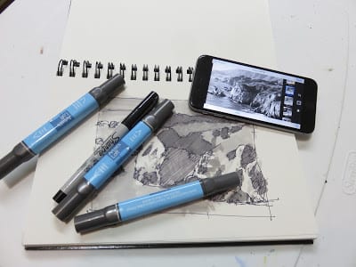
I was first introduced to the importance of the Notan sketch in a workshop I took with Skip Whitcomb. Skip starts every painting session with two or three quick sketches of the scene. The process takes him about thirty minutes. As part of the workshop Skip required students to do at least three sketches before starting a painting. Since that time I have come across many artists that rely on the Notan sketch process and for years it has been my practice as well.
The advantage of a Notan sketch over a camera is the camera records everything in the scene indiscriminately leaving nothing to the imagination. That being said I have come to prefer the camera over the sketch as the smart phone increasingly takes over every aspect of our life. Using the photo app in my iPhone has reduced the time to produce a Notan to a matter minutes rather than a block of time that cuts into painting time.
I recently took the opportunity to produce a Notan sketch and a Notan photo to decide once and for all what my routine was going to be going forward. Below are my results.

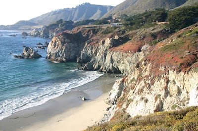
South of Monterrey on the way to Big Sur is this amazing scene, painted by many. On the day of my painting the fog was rolling in and out all day constantly changing the light. The scene was so captivating it was hard to decide what to leave in and what to take out. It was the perfect time for a Notan sketch so by the time I put brush to canvas most of the major decisions would have already been made.

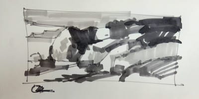
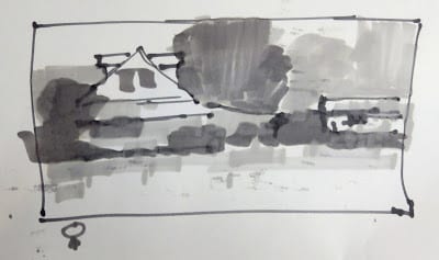
Like many plein air painters my “go to” format is the horizontal on a 9″ x 12″ or 12″ x 16″ panel. I also like the long, narrow horizontal format I use frequently in Texas due to the lack of mountains or anything taller than a fence post. My first inclination was the long horizontal as seen in my Notan which took about ten minutes.

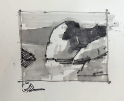
Just for kicks my second sketch was a square format and my third sketch was my usual horizontal.

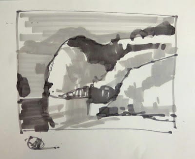
The whole process took longer than expected because of the fog that would come in and obscure the distant cliffs that I wanted to include in my painting so all total it took almost forty minutes to get the sketches done.
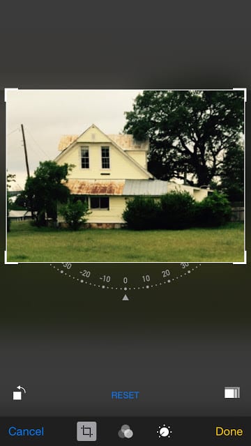
Simultaneously when the sun was just like I wanted, I took a single photo with my iPhone and as the fog destroyed my scene, I quickly opened the photo app
to look at the scene in different formats.

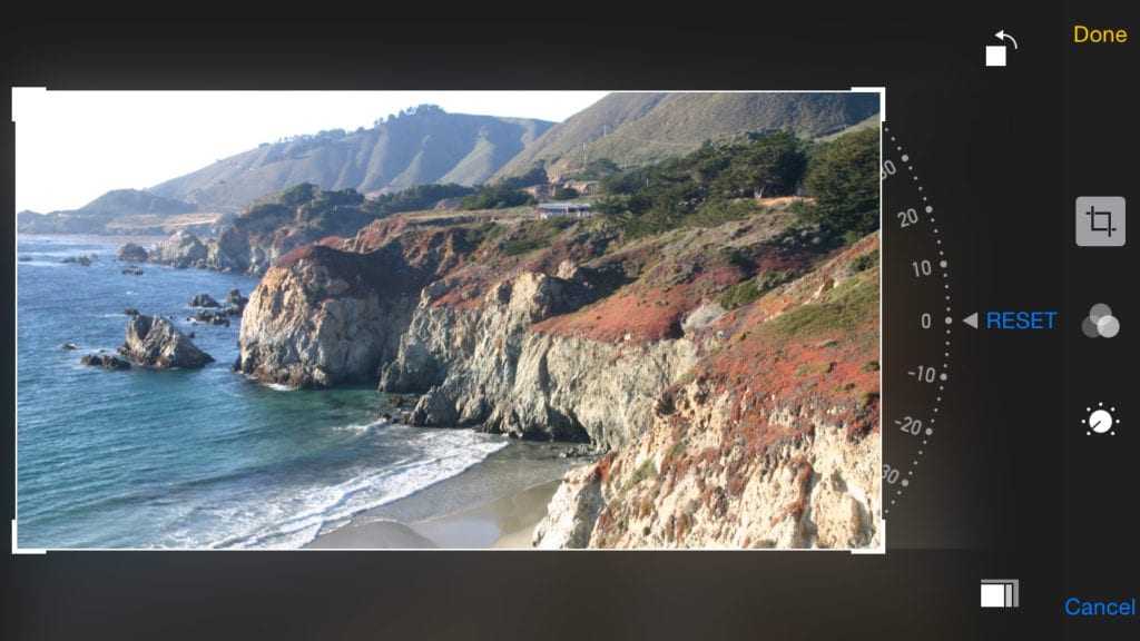
I first looked at the long, horizontal format, cropped it accordingly and saved the image for future reference.
Blog-1-image6
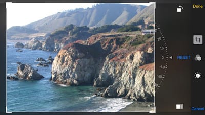
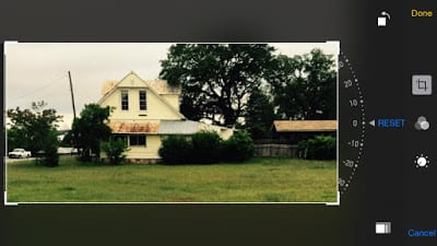
Then I cropped the same photo in the more typical horizontal for a 9″ x 12″ painting. Again I saved it for later.
Blog-1-image7
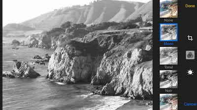
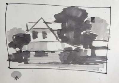
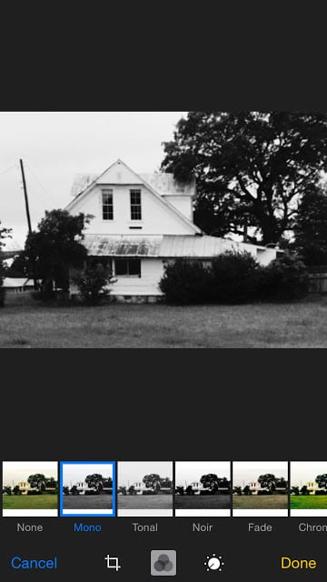
Then I used the halftone filter to give me a Notan photo of my scene. The whole process took less than ten minutes which is an important consideration when the goal was to produce four paintings this day.
Blog-1-image8
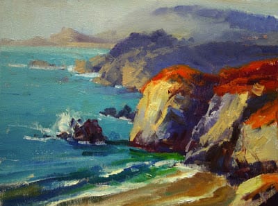
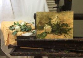
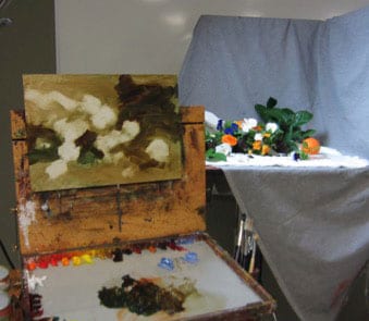
“On the Way to Big Sur” 9″ x 12″ oi/linen
When it came time to paint, the fog became unavoidable. In the end I gave in and included it in my painting, but the Notan exercise was well worth the effort.
 
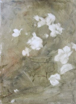
Below is another example of sketch versus photo Notan.
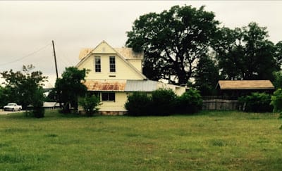
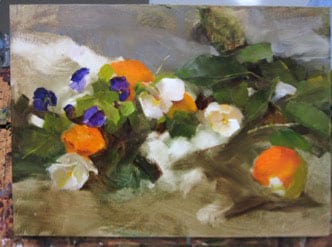
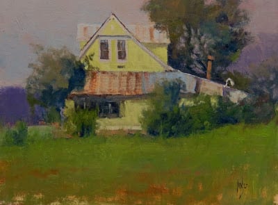
I’m a sucker for old farm houses and this one is a favorite. I quickly produced two Notan sketches.
The long horizontal.
The standard format. Then I created Notan photos.
The long horizontal
The standard format.
The halftone Notan.

 
The painting.
“Historical” 12″ x 16″ oil/linen

There is something that makes me feel more “artistic” drawing Notan sketches before beginning a painting. But at the end of the day, for me at least, its all about evaluating the scene for composition and values and the iPhone provides me the quickest means to an end while also providing me a permanent record. In less than ten minutes I can produce several Notan photos with complete halftone evaluations of my scene and I think it gives me a clearer understanding before I begin to paint.

Kathy Anderson Class

Chris Saper · May 11, 2015 · 9 Comments

Through the generosity of the OPA’s Shirl Smithson Scholarship, I attended Kathy Anderson’s flower painting class at the Scottsdale Artists’ School. While I’d loved Kathy’s work for many years, it was once I’d met her, and subsequently watched her DVD, that it became obvious that she was as skilled an instructor as she is a painter – particularly important to me because I take very few workshops, and have learned along the way that an artist’s excellence at the easel has absolutely nothing to do with whether he or she is a talented teacher.
Having approached the workshop with some specific goals in mind, I’d like to share how they were met from my own perspective as a commissioned portrait artist – things that were different, those that were similar, and how I experienced addressing the challenges. My goals in taking the workshop:

  • To understand the disciplined use of transparent and opaque pigments and the use of washes to get desired results;
  • To achieve the clean color for which Kathy’s work is so widely recognized; and
  • To manage edges in a more cohesive and creative fashion.

Set-up

Unlike some other workshop situations, Kathy had us each select our flowers from a huge variety of fresh planted flowers from a nursery, encouraging students to choose flowers that we thought were beautiful. Although it took more time up front (compared to Kathy setting up our compositions for us in advance), it accomplished several things right away: we each could choose to paint subject matter that was individually exciting to us; it gave us time to examine and explore the structure of each different flower in our set-ups; and it forced us to consider a design that had movement and areas of both energy and rest, compositional elements that she stressed throughout each demonstration.

Some of the flowers available for students.
My easel in close proximity to still life set-up.

The twist-tie solution to an errant azalea branch.
There were only two students per still life set-up, which meant we were uncrowded and could be very close to the arrangements. By close, I mean REALLY close, in that we couldn’t physically GET our easels any closer. In this way our observations were quite similar to sight-sizing the portrait or figure, and encouraged life-sized work. In contrast to a portrait painting workshop, (where one model per every two students would add enormously to the cost of the workshop), I could see right away why this was so important – because in painting portraits, some distance is necessary to view the model and canvas with a gestalt, but in painting flowers properly, each bloom to be accurately painted has to be treated like a tiny face, attending to drawing accurately, measuring distances and angles. Proportionately speaking, the distances are probably equivalent. However, my thinking about all good representational painting is that while detail is not necessary to convey accuracy, the relationships among shapes, color and value are.
Kathy stressed the importance of having a design that works as well as possible, from the beginning, commenting that her plein-air kit contains (among other things) clips and bungee cords to move stuff that needs to be adjusted. I found this micro-solution for my azalea branch in one of the drawers in the student lounge.

Lighting

The taborets were lit by daylight-corrected bulbs – probably about 5000-5500 degrees K, lending warmth to the shadowed areas. This color temperature seems to be prevalent an Kathy’s floral and still life paintings, and is what one would expect in a garden from life, in conditions other than strong direct sunlight where lighting is subject to rapid change resulting from time and climate conditions.

Materials selection

my wash and lift-out
My wash and lift-out.
Kathy’s detailed description and reasoning for the choice of materials was on the money. Oil-primed surfaces – and not just ANY- oil primed surface – is a prerequisite to properly lift out areas of transparent wash in order to set up the surface to accept clean application of fresh color. We experimented with several different warm, transparent washes, using Viva paper towels to lift out areas of interest. It was particularly challenging to me to use so many colors not on my regular portrait palette, and not to have access to more familiar colors, but it worked out fine just the same. It also helped to underscore that there are many ways to arrive at the color you’re after. The warm undertones were also very different for me, since when I tone a canvas prior to I always use cooler colors- greys, green or blue greys and the like, because I know I’ll always paint realistic skin tones with warm colors, and I like to have the cooler notes show through in places. Using warm undertones for flower paintings makes sense to me, though, since earth and foliage are warm, and are inherent in natural garden settings. Blossoms, though, can be a variety of warm and cool colors and can have very strong color saturation, unlike skin tones.

The Demonstrations

Kathy’s daily demonstrations were thorough and varied. They focused on alla-prima approaches to painting the floral still life, always emphasizing the importance of a lyric design, variety of color, shapes and angles, and the joy that has to precede doing them (well, anything actually) really well. As the composition developed Kathy described Nancy Guzik’s approach to finding places to paint “little triangles”, serving as directional arrows though their dark values and the crisp edges they create.

Kathy conceptualizing the design
Kathy conceptualizing the design.
Kathy’s wash and lift-out.
Beginning the orange and pansy demo.
Little triangles.
Adding detail.
“Oranges & Pansies”, Kathy Anderson, oil on panel, 10 x 14

However, Kathy also demonstrated continuing to work on the painting from life during a second day, as well as taking photos at the first session in order to be sure to preserve the things that are most exciting- flowers, just like humans, can tend to droop after too much time on stage ☺
Also extremely valuable was her demo on how to go back into a painting that is dry to make adjustments or to complete the piece. The only reason – and I completely concur with this- artists can paint successfully from a photograph is because they have had extensive experience painting from life. Photographs lie to artists in the ways we most desperately need truth: color, value and edges. I firmly believe that learning has to be done from life – regardless of whether portrait, landscape, or floral subjects- and only after many, many canvases, can photos be interpreted in the best, most convincing manner.

The Opening

11On Thursday night, Scottsdale’s Legacy Gallery hosted a two –person show with works by Kathy Anderson and Mark Boedges (spectacular landscape painter). Although I wasn’t able to attend, fellow student Josi Callan shared photos from the opening. Legacy’s Scott Jones dropped in several times during the week, and couldn’t have been a better ambassador/advocate for artists everywhere. (Look for future information on Scott and his insights into gallery-artist relationships).
Because I am fortunate to live only a few minutes from Legacy Gallery, I had the chance to visit on a quiet day after the opening and to spend as much time as I wanted drinking in Kathy’s fabulous paintings, each of which offered a silent, retrospective review of all that she’d taught the previous week.

In Summary

Yes, you should take the opportunity to study with Kathy Anderson. If you like learning from DVDs, buy hers. Kathy is as generous and warm as she is on her video. I don’t think there is ever a time when an artist should stop being challenged, stop studying or stop trying new things. Choose your instructors with care. Show up to class with the right materials and most importantly, the right attitude. Your time is too valuable to waste.

my piece from class, “Debbie’s Garden”, oil, 6 x 8
My piece from class, “Debbie’s Garden”, oil, 6 x 8.

Career Building Advice for Any Level

Lori Putnam · Mar 30, 2015 · 17 Comments

First of all I would like to start out by making it very clear, there is absolutely nothing wrong with being an artist who chooses NOT to turn making art into a “career.” It in no way makes them less of an artist; it only means they are not going to rely on their art to live. If you are one of those artists and you make art solely for the joy, congratulations!

Beginning-Mid-Level Career Artists

  • Entering exhibitions and competitions:
    For the rest of us, building a career is, at the very least, time-consuming. It can also be super degrading and, at times, expensive. Someone told me once to expect a good resumé item to come in at no less than a grand. That was many years ago. I suspect by now, it costs much more than that. By this I mean the expenses incurred with membership fees, entry fees, crating fees, shipping fees, travel to the event (if you are fortunate enough to be able to attend), return shipping fees if the painting or paintings do not sell, etc. can add up quickly. At this point, you are up to several thousand dollars, and this does not take into account the time, supplies, framing, oh, and lest we forget, painting the award-winning painting!
    PainterWEBOkay. So many of you already know this part. But for anyone just entering the world of competitions, it may be tough news. Yet, entering competitions is one way to begin to build a good resumé and career. Quite frankly, it is also one of the least expensive ways to start. [Note: yes, you will be rejected from time to time and want to give up. Don’t. I say this with all honesty and humility. Pouting, making accusations, and posting your failure all over social media will get you nowhere. Try again. It is true that the very piece that did NOT get into one event, may win the top prize in another. You must learn to leave your ego out of this and continue to seek these opportunities.]
  • Networking:
    Another way to help your career along, is to attend conventions and events that are meaningful to you. For example, you have already taken the step to belong to OPA. If you can take one trip this year, why not try to go the conference? I remember my first one. My $1200 painting was hanging next to David Leffel’s $100,000 painting. I could have tucked my tail and retreated; instead I felt a sense of “WOW. Here I am! Next to these amazing painters.” Research conferences, conventions, and other networking opportunities and set a goal to make it happen.
    GroupWEBSometimes even more difficult than going to an event, is to leave your ego or shyness at home. As artists, many of us are introverts. I am no exception. This can manifest itself in one of two ways: arrogance or timidity. Fight both. A few public speaking, improv, or acting classes, professional coaching, or counsel, followed by rehearsing and preparing what you might say and can get you through a lot. You will not die. You will make connections and friends that will have an effect on your career for years to come. I met Quang Ho at my first OPA conference. He, in turn, has mentored me and become one of my dearest friends. We are now working together on projects. Whether you mean to or not, the people with whom you connect can help build your career. This is in no way using their goodness. It is just a product of it. Chances are you will in turn help their careers as well.

Mid-Level-Upper-Level Career Artists

First of all, you should STILL be doing those things listed above. Now, you will add…

  • Marketing and Advertising:
    Go ahead and say it with me… marketing. See, it isn’t an ugly word at all. Some people cringe when they hear it, but the truth is that you produce a product. It is one that is near and dear to your soul, but it is still a product to the mere mortals (buyers) of the world, and it has to be marketed. No one is going to accidentally stumble onto your front porch looking for a great piece of art.
    ComputerdudeWEBMarketing can mean a lot of things. For instance, if you are putting your work on facebook, twitter, pinterest, blog, or any other social media, you are marketing. You are just choosing the free route which doesn’t seem quite as icky somehow. The question is, are you making those efforts on a whim or do you have a plan? Look into the insights of what works and what does not, which types of posts are getting the best response, and what subjects your followers most want to hear about. Follow the advice of experts to make “free” marketing work for you.
    There will come a time, mid-level career, that you may find it a good idea to up your game with some paid marketing. You need to know that you are ready for such a leap. One of the best ways to determine that, is to answer these simple questions:

    1. Do I paint regularly and produce a steady stream of work?
    2. Is my work consistent in style? (We will keep growing, but your work should look like YOURS, not your instructor’s
    3. Can I commit to at least a year of paid advertising?

    Paid advertising can be in the form of print ads or banner ads in publications, direct mail, or whatever. The hard truth is that it will cost some money to do these things. This is money you don’t have, after all, because you are an artist building a career. But like a lot of things, consistency will prove that it will pay for itself over time.
    ConfusedArtistWEBWhen I began print advertising in a meaningful way (by that I mean, not just once here or there to get editorial coverage), I was absolutely in no position financially to do it. You’re thinking, yeah, but you weren’t as broke as I am. Yes. I was. The point is, I did it anyway and lived on faith and water for a very long time. Only you know your responsibilities and can make this decision. After about 8 months of consistently advertising, I noticed things changing. collectors, gallery owners, event organizers, and other artists, do not always distinguish between paid ads and editorial content. This is great news! As your ads show up every month, the lines become more and more blurred. All people really remember, is that your name is in the magazines “all the time.” Name recognition builds clout. Clout builds career.

You-Think-You’ve-Made-It Level Artists

  • All of the above and then some:
    Sorry to tell you this, but the stakes are even higher for you now. There are still important exhibitions in which you will want your work. They may be on the museum-level and/or high-end-private-collector-level. It is also a fair idea to be a leader by continuing to exhibit as Masters of those core groups and organizations that helped “make” your career in the first place.
    speakerWEBThis seems more important than ever. While the demands are greater on you, so is your responsibility. Look to the artists who still do this. They are revered. The others who allowed ego to make decisions for them are getting lost in the pile. If you are at the top of the heap, congratulations. You are now one of the artists whose name may show up in the history books. For you, public appearances, lectures, community involvement, and mentoring will solidify this, and you may well be remembered for many generations to come. You will leave a legacy behind and your children and grandchildren will reap many benefits!
    As for conventions, mailings, and advertising, you should still do those. (Remember, someone else is eager to take your place if you do not.) They are just directed differently now. Now you are doing this because it keeps your name fresh among the newer converts to this business, the go-getter types who are making the calls, getting the high-dollar collectors who are talking about your sales. The museum directors, the top 1% of collectors who want to visit your private studio, and buy your books that are now worth several hundred dollars, are watching and guess what, they get magazine subscriptions too. They watch TedTalks and CBS Sunday Morning. Your name has to stay on the tip of their tongues. Now that you can offer only a few pieces on the market each year and have some guaranteed collectors ready to buy, your calling is a higher one. Use it for good.
  • A Few Other Quick tips:

  • Snail mail – Send handwritten notes to would-be workshop attendees and art buyers. People love a personal touch.
  • Become an expert – on a topic at which you are passionate. People will come to you for lectures and answers.
  • Get your art seen – If you are at “museum exhibition” level, great. If you are not but you paint lovely dog portraits, ask your veterinarian if you can hang your work there. Put ego aside and just do it. It’s a start.
  • Start a blog (or wipe the dust off of that old one you started) – Don’t make it all about You, You, You. Be giving and sharing of your information.
  • Support your friends – Going to art openings for your friends is a great way to learn how things work, meet others in the business, and maybe even find a great gallery. Just remember, it is THEIR night. Do not approach a gallery owner during someone else’s moment to shine.
  • Email – Begin an email campaign. Start your list of people with a few or hundreds, but start it. (By the way, NEVER add anyone to your list without permission.) Then, email people on the list in a very personabe way. Sure, send them announcements about all of your great trips and accomplishments, but also send them stories and helpful tips and links (like one to that last blog post you finally got around to doing).
  • Social media – Free. Use it. Don’t abuse it. You do not want to shove your news down everyone’s throat, but remember that most things must be posted more than once, in different groups, and at different times of the day. If you feel you are already doing too much of this, enlist someone else to “brag” on your behalf and tag you.
  • Volunteer for an Organization – So much good can come from being part of an art organization. By default, your name is in front of people all of the time. There are many great artists in positions in organizations but there are also many who are, perhaps, not as great yet. If your name is in a publication as a leader in an organization, the assumption is that you are a professional, good at what you do, and everyone should know and respect you.
  • Set goals – and I should add, WRITE THEM DOWN. Goals keep you on track. These should certainly be artistic goals, but you should also write career goals. Make them just beyond what you think you can actually reach in a specific period of time. On April Fool’s Day in 2005, I became a full-time painter. I gave myself many goals. One of them was for where I wanted to be in 10 years. Happy anniversary to me! But I didn’t stop making goals all along the way. Things change; your goals change. Write them all down. Make them happen. If you don’t realize a goal in the specified time frame, reevaluate what you did or what you might have done differently or even if the goal was totally unattainable in the first place. Example: Paint en plein air on the Mars.
    More realistic goal: meet a real astronaut who, by the way, happens to also be an artist. (Seriously, look up Alan Bean. Send him a note and tell him I asked you to. He will get a kick out of it).

So what are you waiting for? No matter where you are in building your career, I have given you something to do. Go do it!

The Beauty Of The Brain

Ms. Marie-Eve Lauzier · Jul 28, 2014 · 5 Comments

"The Birth of Venus" by William-Adolphe Bouguereau
“The Birth of Venus” by William-Adolphe Bouguereau
How would you define a beautiful piece of artwork?
Would you say, “It takes years to study aesthetic in art!” or ask, “Is appreciating a simple orange utterly different than judging a masterpiece of artwork?”
Orange Cross Section - Wikipedia.org
Debating what is beautiful can be sometimes hazardous. I often got myself into serious arguments with curators of the “modern art establishment connoisseur”.
I am a painter, but also a physicist, so I believe in facts. In this science abstract, the results showed that the most important part of the brain for aesthetic appraisal was the anterior insula: a part of the brain that sits within one of the deep folds of the cerebral cortex. When we read deep in the cerebral cortex, that means we are dealing with the very basics: eating, drinking and reproduction.

Ouch! I see a masterpiece…

Lascaux Cave Painting - Upper Laieolithic Art
Lascaux Cave Painting – Upper Laieolithic Art
The anterior insula is typically associated with emotions of NEGATIVE quality, such as disgust and pain, making it an unusual candidate for being the brain’s “aesthetic center.” Hence, the most reasonable hypothesis is that the aesthetic system of the brain evolved first for the appraisal of objects of biological importance: is this good food or what about this nice suitable mate…. Then, later in our evolution, we started to ask: is this object bad or good for me? This study shows that we came to use this part of our primitive brain to judge artworks such as paintings and music.
Being a classical painter, my quest for beauty is an endless one, just like yours I believe. This study explains the gut feeling I have when I see a remarkable work of art, hear a beautiful music piece or witness a dazzling sunset.
"Mona Lisa, by Leonardo da Vinci, from C2RMF retouched" by Leonardo da Vinci. Licensed under Public domain via Wikimedia Commons - //commons.wikimedia.org/wiki/File:Mona_Lisa,_by_Leonardo_da_Vinci,_from_C2RMF_retouched.jpg#mediaviewer/File:Mona_Lisa,_by_Leonardo_da_Vinci,_from_C2RMF_retouched.jpg
“Mona Lisa” by Leonardo Da Vinci
However, I had no idea how instinctive and primal this process is. I kind of believed that art was an acquired taste. Before this article, I believed there was a need to educate people to make them sensitive to our world. As much as philosophers of modern art like to believe, our brains does not contain a specialized system for the appreciation of artworks. Research suggests that our brain’s responses to a piece of cake and to A BEAUTIFUL CLASSICAL artwork are in fact quite similar.
The next time I hear experts telling me that classical art is only good for decorating walls and that they’d prefer an abstract piece over, say, the Mona Lisa… I will have my doubts.

Packing Paintings for Galleries & Shows

Susan Blackwood OPA · Mar 3, 2014 · 2 Comments

Packing Paintings for Galleries & Shows

By Susan Blackwood

Here is an excellent way to pack your paintings for shipping. It is reusable, relatively inexpensive and extremely sturdy. Your galleries will love it and so will OPA and other shows. No matter how you pack, please do not use “popcorn” packing material. Galleries and shows do not like it at all.

Here are the Materials that you will need:

    •  Plastic sheet or a large plastic bag to wrap the painting.
    •  Corrugated cardboard – can be purchased or you can use cardboard from large boxes like mattress boxes and appliance boxes ( free at stores ).
    •  Construction Styrofoam (comes in various thicknesses from 1″ to 2½” – the larger the painting the thicker the Styrofoam (purchase from lumbar yards).
    •  Plastic super strength packing tape.
    •  Reinforced brown paper packing tape (optional).
    •  Water and sponge for wetting the brown packing tape.
    •  Knife with a thin long blade.
    •  Measuring tape.
    •  Long steel ruler or straight edge for marking, cutting and scoring lines.
    •  Marker for making lines.
    •  Screwdriver for scoring lines.

shipping2
Step 1: Wrap the painting in plastic.
This protects the frame’s finish from rubbing off while it is in transit. It also keeps packing particles off of the painting.
shipping3
Step 2: Measure the outer dimension of the frame.
In this example a 24″ x 30″ painting with a 4″ frame width makes the outer dimensions 32″ x 38″. Now add to that dimension the width of the Styrofoam that you are using. In this example we are using 2 inch Styrofoam. Therefore, make the bottom Styrofoam layer measurement 2 inches bigger on each side than the outside measurement of the frame. The measurement is now 36″ x 42″.
Mark your lines (36″x 42″) on the Styrofoam with a marker.
Step 3: Next using the long bladed knife cut the Styrofoam.
shipping4
Step 4: Center the painting onto the Styrofoam.
shipping5
Step 5: Cut strips to fit all around the frame. Be sure the strips are the depth of the frame.

shipping6
shipping7
shipping8

Step 6: Mark and cut another piece of styrofoam to the same size as the bottom piece,
(36″ x 24″ in our example), tape the layers together. You have just created a sturdy interior package for your painting, but it needs an outside layer of cardboard before you ship it.
shipping9
To encase your Styrofoam package you have the following options:
Option 1: Slide the Styrofoam package into an existing cardboard box (if you have one); cut down the box to fit or fill in the gaps with bubble wrap.
shipping10
Option 2: Making a cardboard “skin” for the Styrofoam package.
Step 7: Making the bottom of the cardboard skin.
Mark the cardboard the size of the Styrofoam package adding the height of the Styrofoam package on each side.
For example our Styrofoam package measures 6 inches deep. So we added 6 inches to each side of the outside measurement making our cardboard piece 48 x 54.
shipping11
Step 8: Score (denting cardboard but not cutting it) the lines with the side of a screwdriver so the cardboard folds on the lines.
shipping12
Step 9: Fold the sides up.
shipping13
Step 10: Using the knife cut one line only in each corner.
shipping14
Step 11: Position the Styrofoam package into the center of the cardboard.
Put the name of the painting, the size and your name on the side and top of the Styrofoam for easy identification.
shipping15
Step 12: Bring the sides up, folding the wings around the corner.
Tape the corners.
shipping16
Step 13: Making the top of the cardboard box:
Repeat steps 7 through 10, measuring the outside of the newly constructed cardboard box. Cut the new piece of cardboard about 1/8th inch larger on each side. Measure the height of the cardboard box and add 1/8th inch to it. Draw lines, score, and cut one line in each corner.
shipping17
Step 14: Place the cardboard box upside down in the center of the cardboard.
shipping18
Step 15: Bring the sides up, folding the wings around the corner.
Tape the corners.
shipping19
Step 16: Secure the sides with plastic packing tape.
shipping20
Step 17: Reinforce the corners and open edges of the box with brown paper reinforced packing tape.
shipping21
Step 18: Turn the cardboard box over. Put the title of the painting, size and your name on the side and the top, along with your return address. This makes it easier for a show/gallery to find your box in their storage and get your painting back to you safely in the correct box.
shipping22
Once you get the hang of it, you should be able to build this packing system in an hour or less. When your gallery/show returns this box, you will be able to reuse it over and over again.
shipping1

  • « Go to Previous Page
  • Page 1
  • Interim pages omitted …
  • Page 7
  • Page 8
  • Page 9
  • Page 10
  • Page 11
  • Interim pages omitted …
  • Page 14
  • Go to Next Page »

Footer

  • Home
  • About
    • Mission, Policies & Bylaws
    • Board of Directors
    • Presidential History
    • Frequently Asked Questions
    • History
    • OPA Staff
    • Contact Us
  • Membership Services
    • Member Login
    • Membership Information
    • State & Province Distribution For Regionals
    • Update Member Information
    • Membership Directory
    • Contact Membership Department
  • Events
    • Exhibitions
    • Online Showcase
    • Lunch and Learn
    • Virtual Museum Road Trip
    • Paint Outs
  • Resources
    • Brushstrokes Newsletters
    • Ship and Insure Info
    • Lunch & Learn Video Archives
    • Museum Road Trip Video Archives
  • Services
    • Sponsorship Opportunities
    • Scholarships
    • Critique Services
    • Workshops
    • Have A HeART Humanitarian Award
  • Online Store
  • Awardees
  • Blog
    • OPA Guest Bloggers
    • Blogger’s Agreement (PDF)
    • Comment Policy
    • Advertisement Opportunities

© 2025 OPA - Oil Painters of America · Design by Steck Insights Web Design Logo