As a first time attendee of the Oil Painters of America National conference, I cannot stress enough the incredible value of being a part of such an inspiring community of artists. The conference provides a platform for artists of all levels to come together, learn from one another and share their experiences, techniques and insights.
One of the biggest advantages of attending an OPA conference is the opportunity to network with other artists. Meeting people from all over the world who share a similar passion for painting is not only motivating but also helps to build lasting connections that can be extremely valuable in the future. By attending the conference, I was able to learn new techniques, gather insights and gain inspiration from some of the best artists in the field.
The conference also provides a retreat-like atmosphere where one can focus on future goals and plans. This is especially valuable for all artists looking to improve their craft and take their work to the next level. By being in the company of other artists, I was able to see how others see and create, which in turn helped me to broaden my own perspective and approach to painting.
One of the most exciting aspects of attending the conference is seeing new products and innovative solutions to create art. The exhibitors showcased some of the latest products, tools, techniques and learning opportunities that can help artists create their best work. It was amazing to see all the new ideas that are constantly being developed in the world of oil painting.
The OPA conference also features the top, most unique 200 oil paintings in North America this year, all hung in one gallery. This gives attendees the opportunity to study and understand which paintings are attracting them. And by asking myself good questions as to why this painting? How did the artist achieve this effect with shape, form, line, color, value, edge and texture? Which principles of design are most important to me at this moment, such as harmony, contrast, high key, vs. low key, subject matter, etc? All this is giving me deep insight and affirmations as to my own style and subjects I love to paint.
Also, what are some ideas I want to explore and experiment with this year? What are good finishes and framing solutions? This kind of insight can help artists improve their work by learning from the best in the field and take years, if not decades, off the learning curve.
As an instructor myself, I’m also interested in learning new ideas and approaches I can share with my students. All really good stuff.
In the end, the goal of any artist is to expose him/herself to opportunities to grow, and the OPA conference is one of the best places to do so. Whether you are a seasoned professional or just starting out, attending the conference can be an invaluable experience. It is a great way to connect with other artists, learn new techniques, gain inspiration and exposure to new products and innovative solutions. I highly recommend attending the next national or regional OPA conference and being a part of this incredible community of artists.
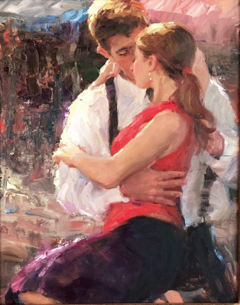
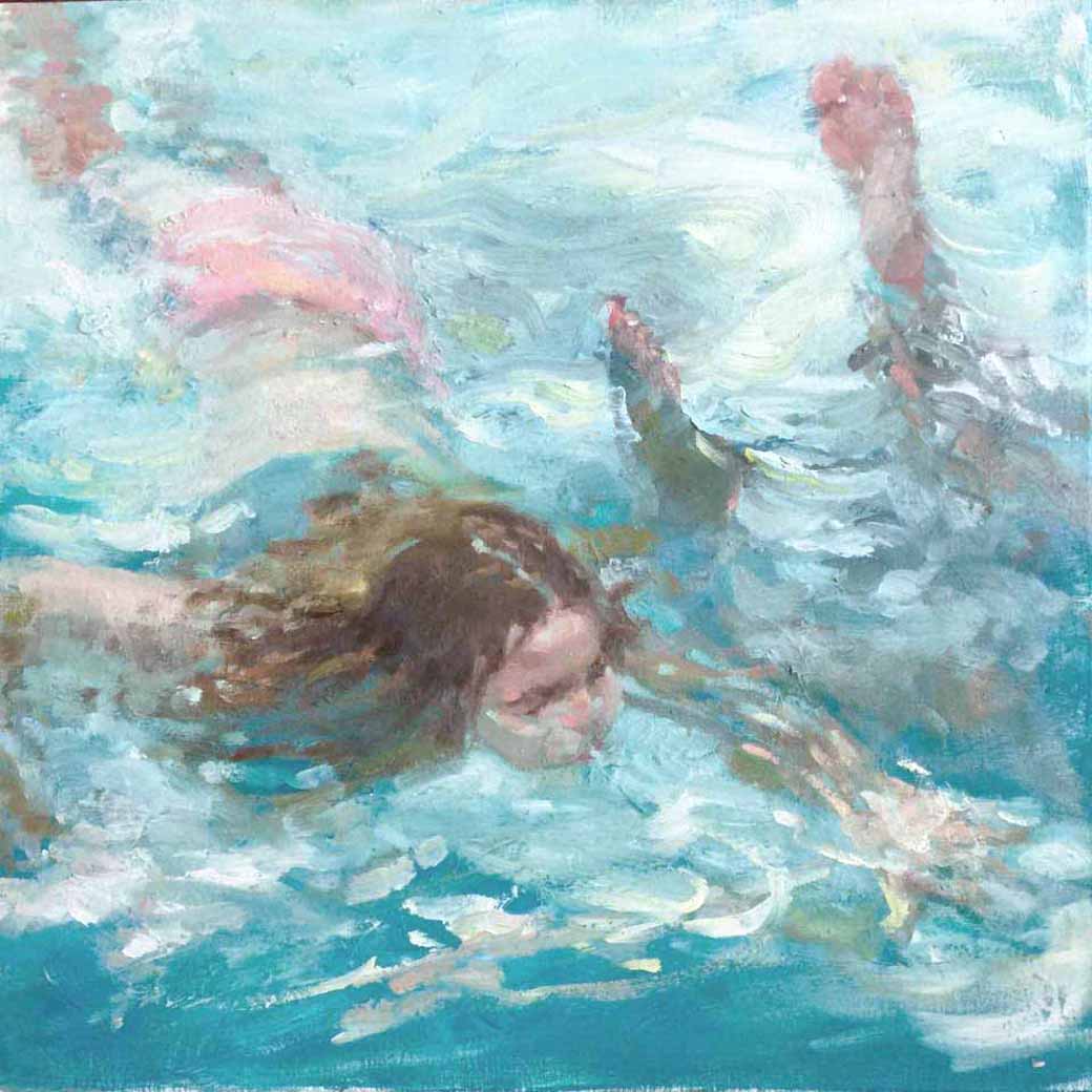
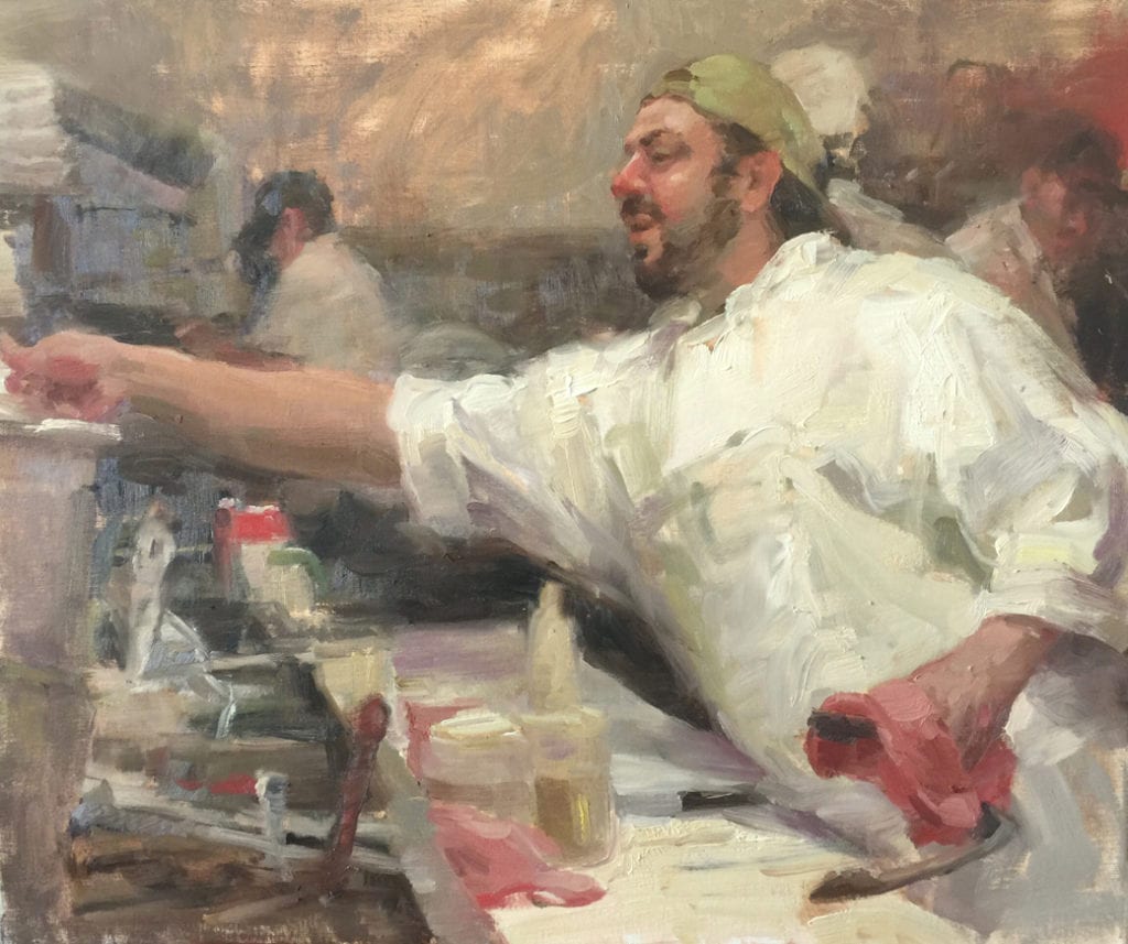
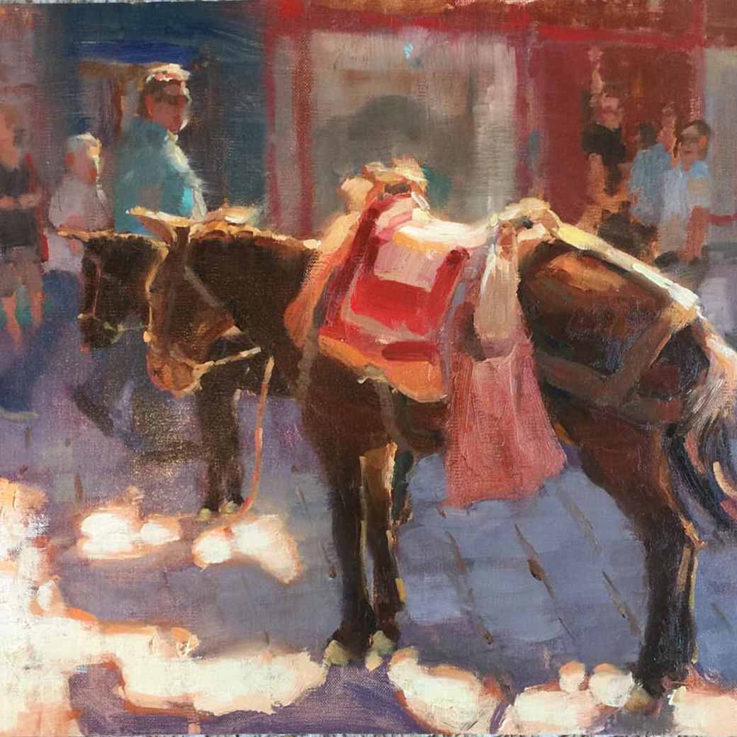
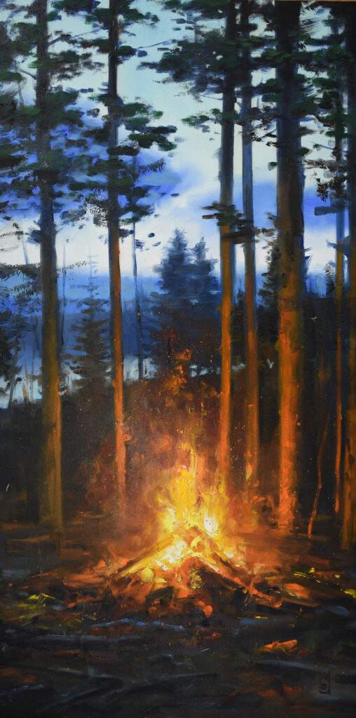
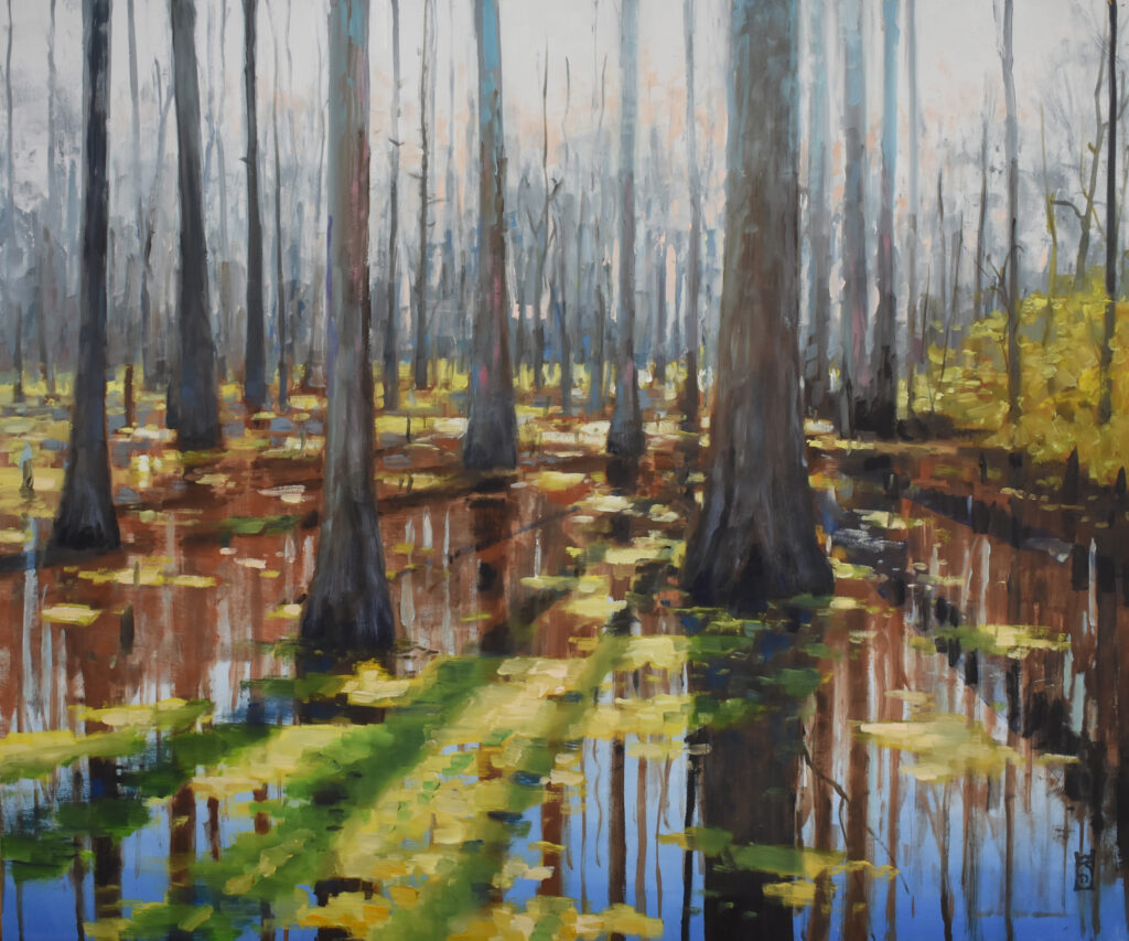
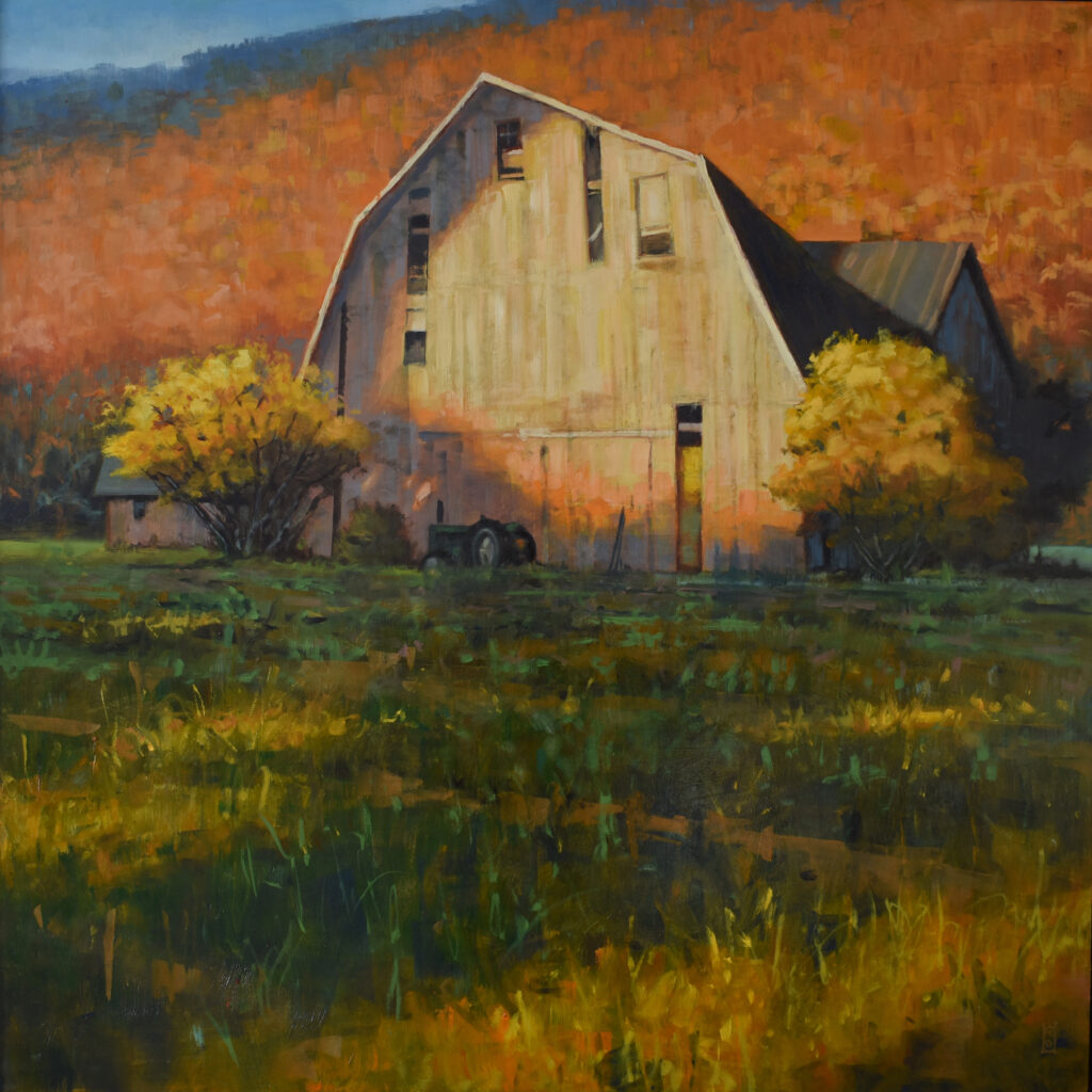
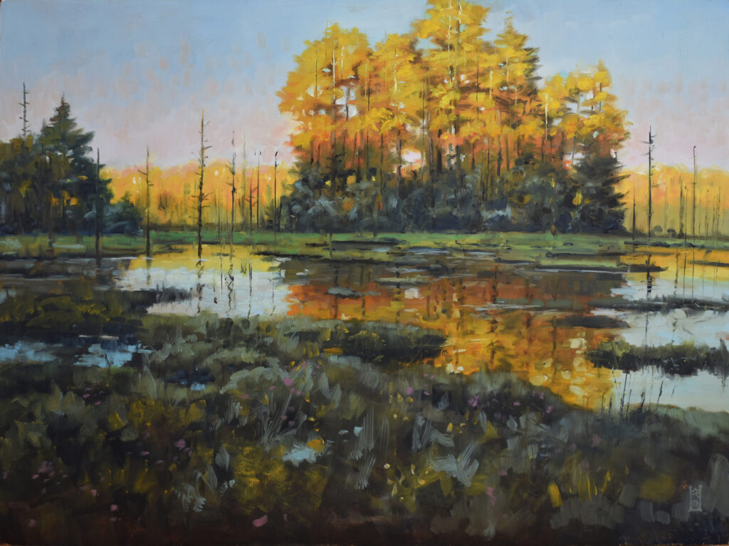
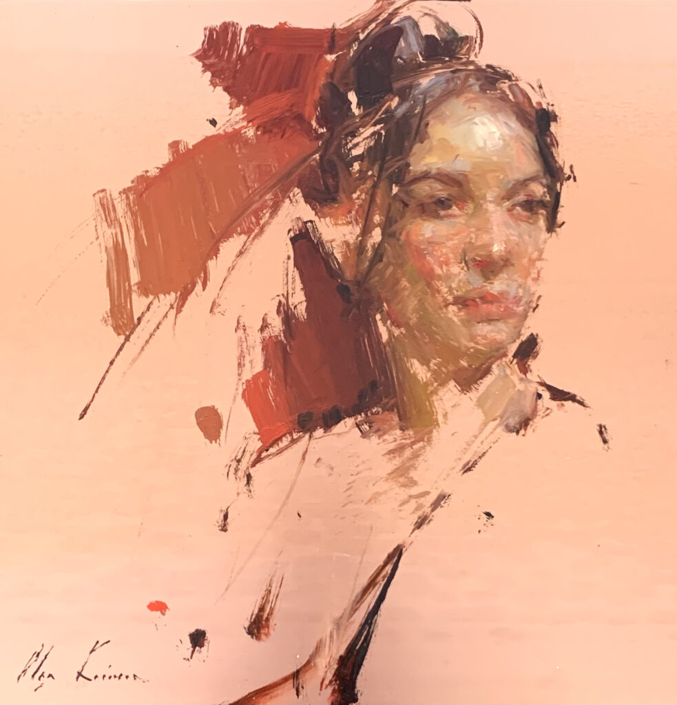
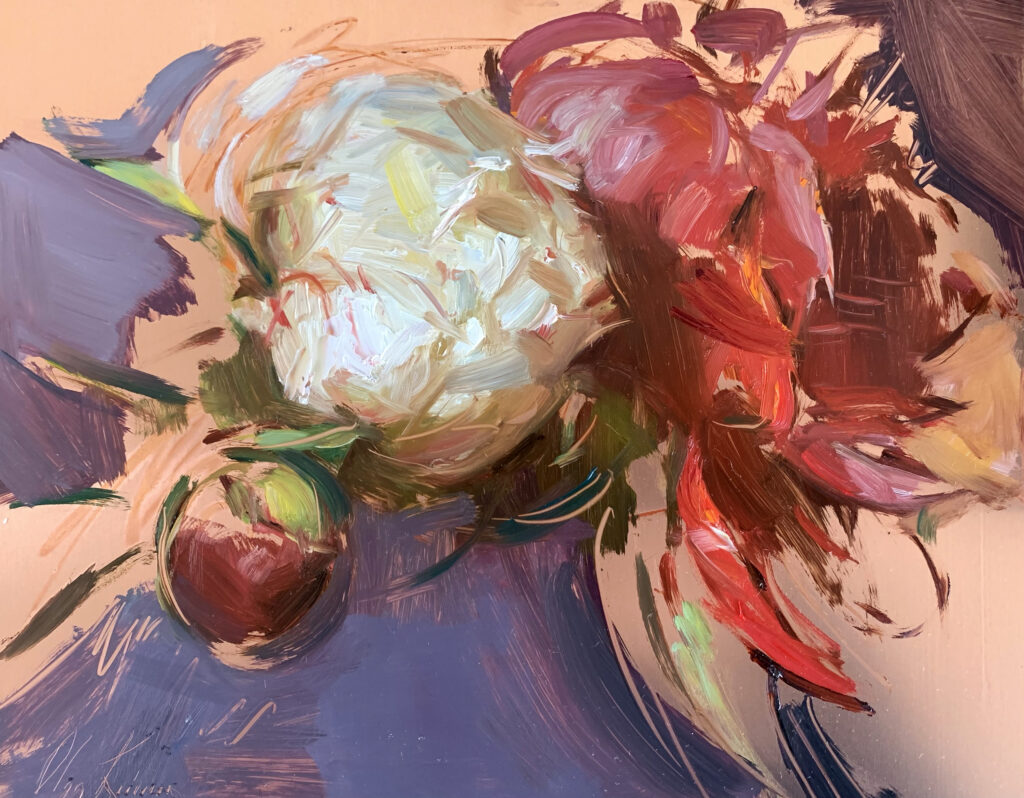
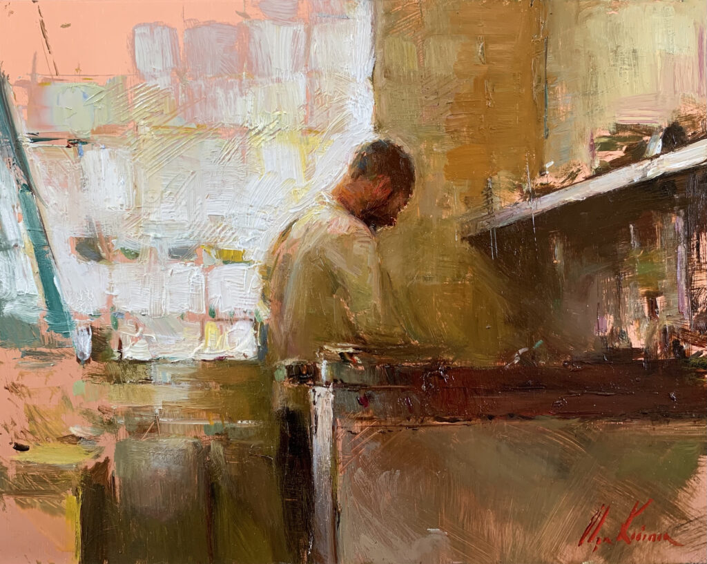
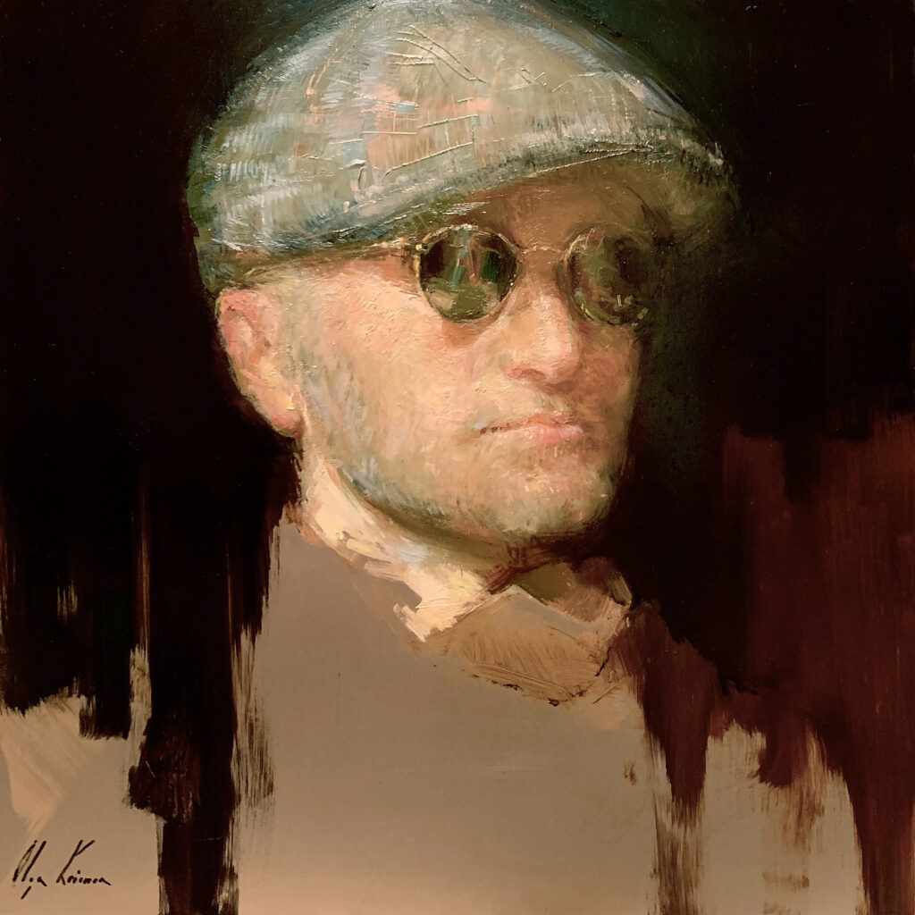
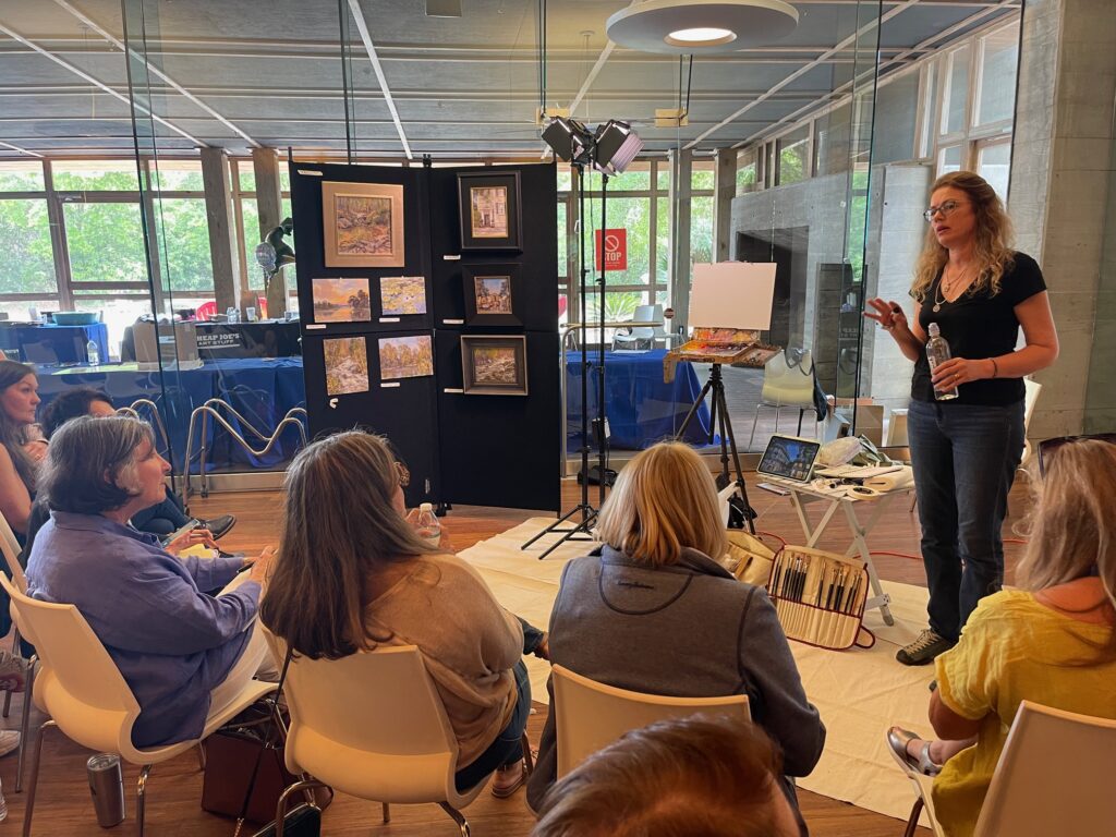
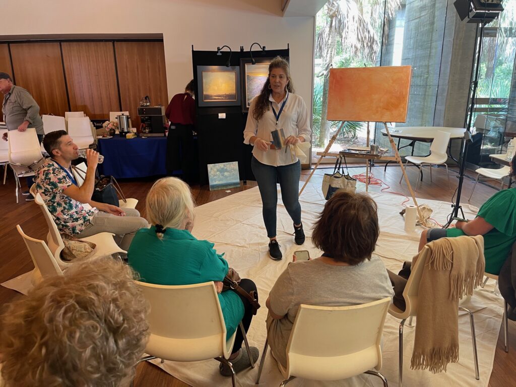
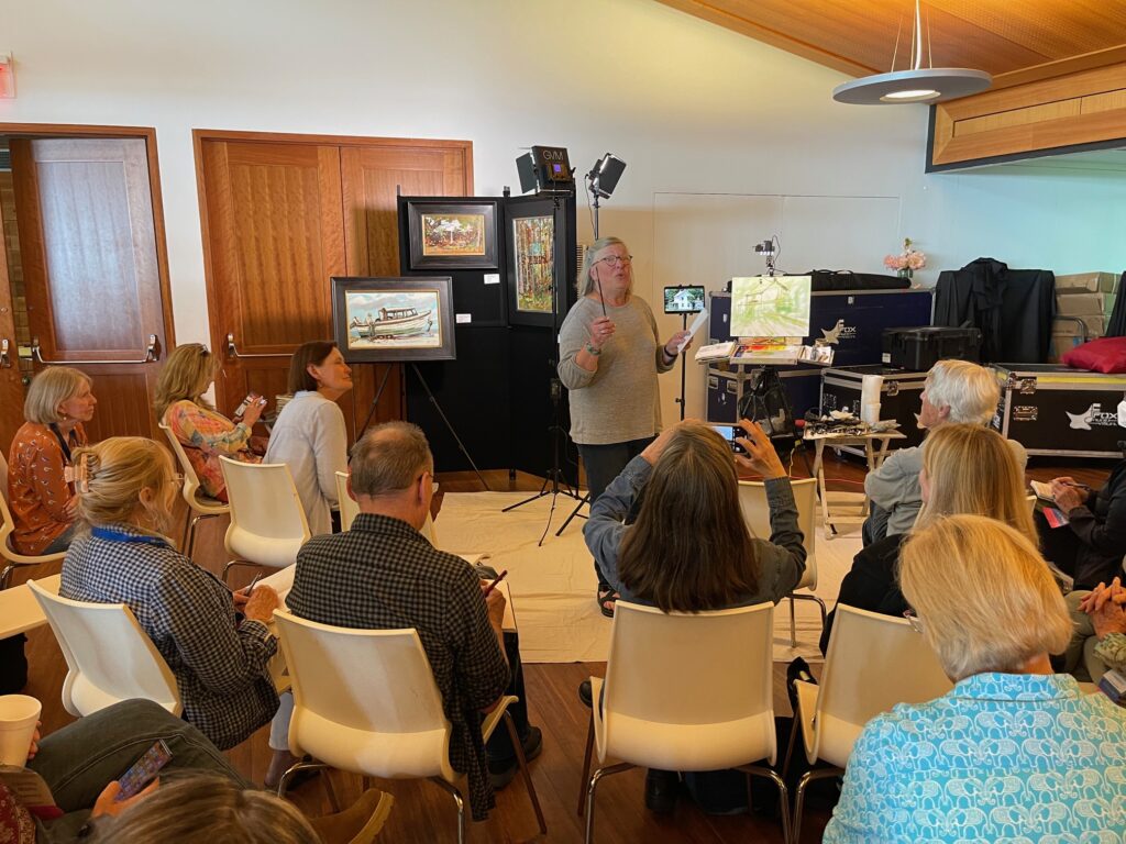
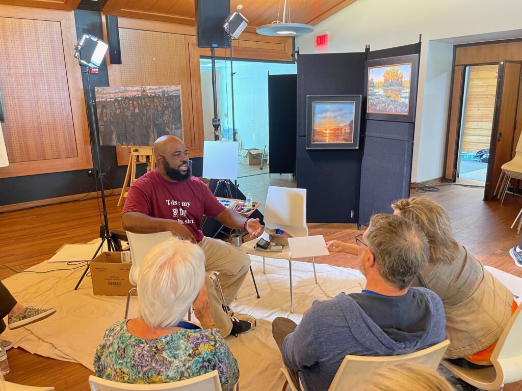
Included in this blog are four shots of the last day of the conference where, for two hours, four of the top artists in the nation were all painting demos at the same time. A beautiful example of the abundant, giving, serving spirits of artists / instructors and the people who make up this wonderful organization.
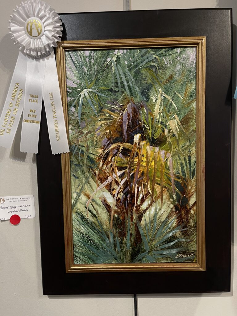
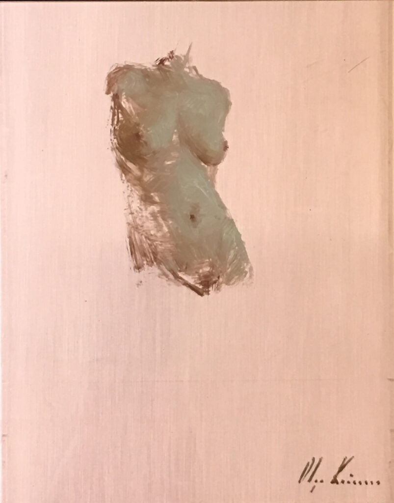
20″x12″ – Oil
Here’s a haiku poem I wrote from this inspiring scene.
Green fronds sway and dance,
Alive and full of energy,
Palms living with grace.
But as time passes,
The leaves turn brown and life fades,
Dying, withered palms.
Yet even in death,
Palms leave interesting shapes,
Connecting us all.
Wet or dry, they stand,
A symbol of courage and strength,
Inspiring us all.