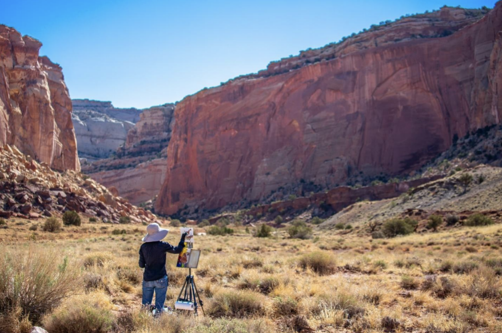
Does the thought of being without your phone for a week fill you with joy or dread? I know that for myself and many other artists, it is a constant daily struggle to disentangle from technology- to just slow down, simplify, and focus on artmaking. In recent years, I have welcomed multiple invitations to participate in extreme experiments that force you to “unplug”. I have camped in rustic off-grid properties without cell service in the Rocky Mountains, went plein air painting in a rural Mexican fishing village only accessible by boat, and attended an intensive workshop on a Mediterranean island where they confiscated your phone for the full week.
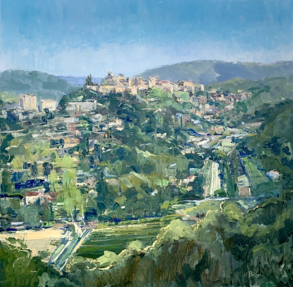
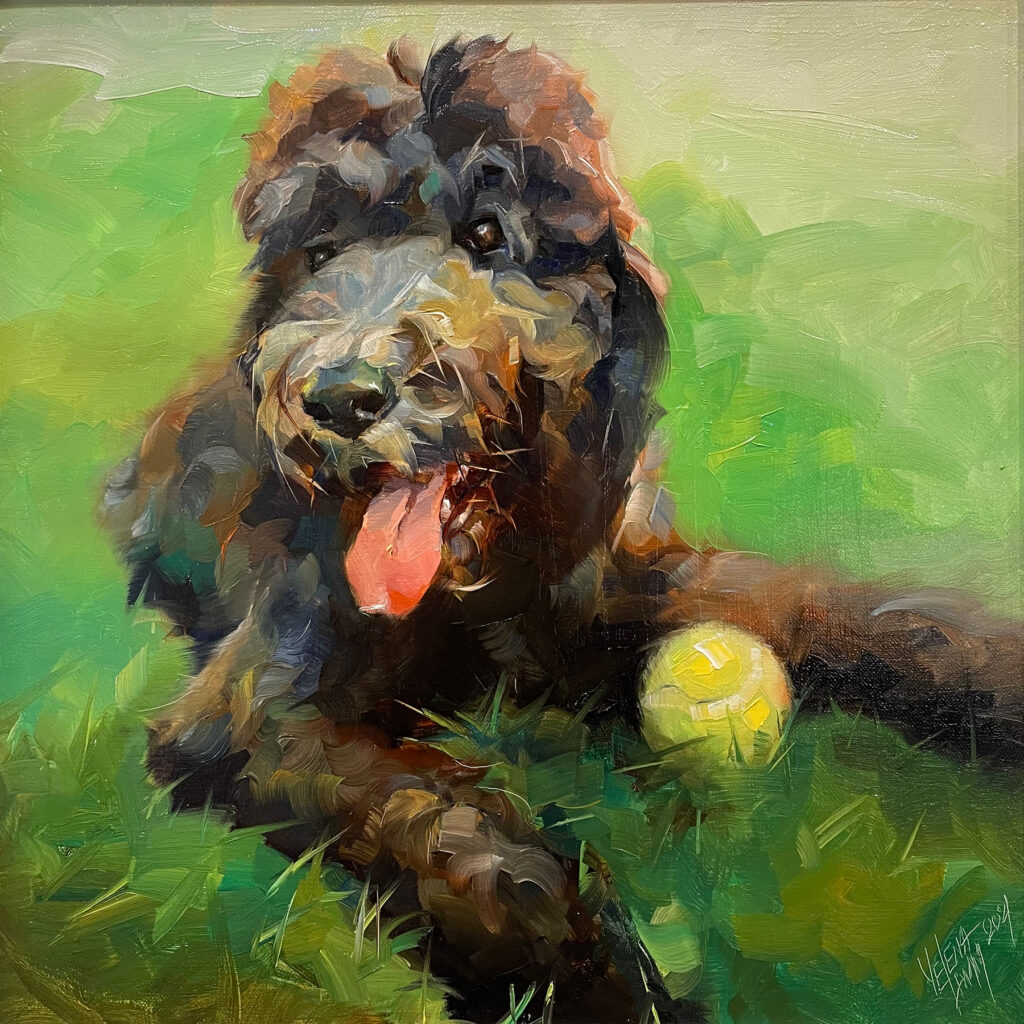
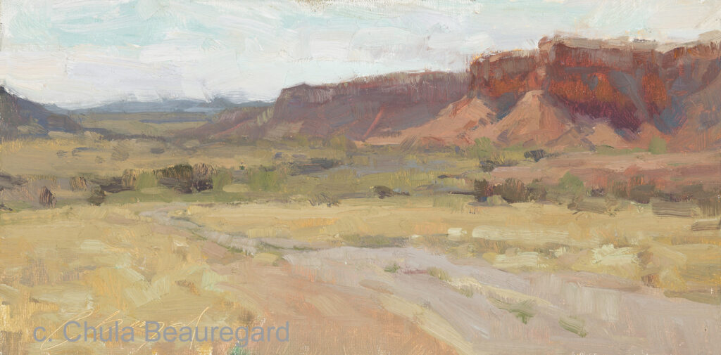
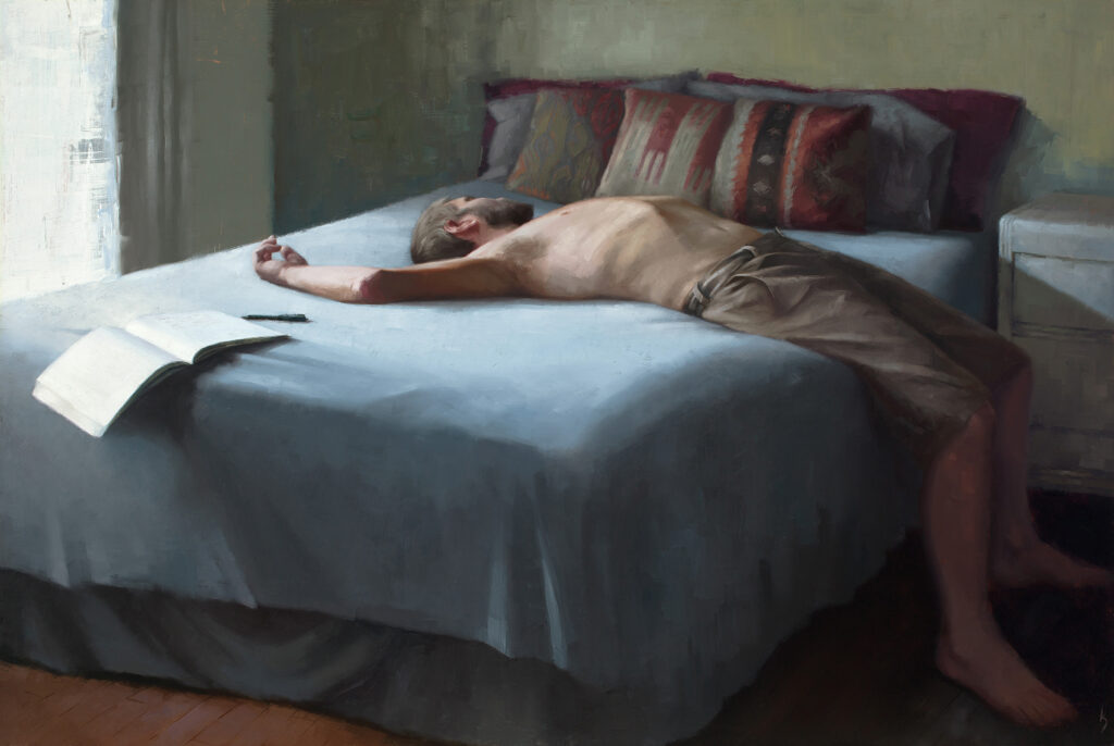
7″x16″ – Oil
Maybe it will come as no surprise to you when I say that I was a much happier and wildly prolific artist throughout these experiences. Getting into the state of “flow” came naturally. Each time I was reminded that it is essential as artists to eliminate digital distractions and reclaim our attention in order to allow for the mental space and sacred time needed to create deep, meaningful work.
Taking much needed intentional breaks from the easel are one thing- getting distracted involuntarily is another. A recent study from the University of California Irvine shows it takes an average of 23 minutes to regain your focus after a distraction because different parts of your brain are activated each time you switch between tasks. Multiply those 23 minutes with answering a couple texts, replying to some emails, and scrolling social media- and suddenly you are wasting hours of mental energy every day that could be better used at the easel.
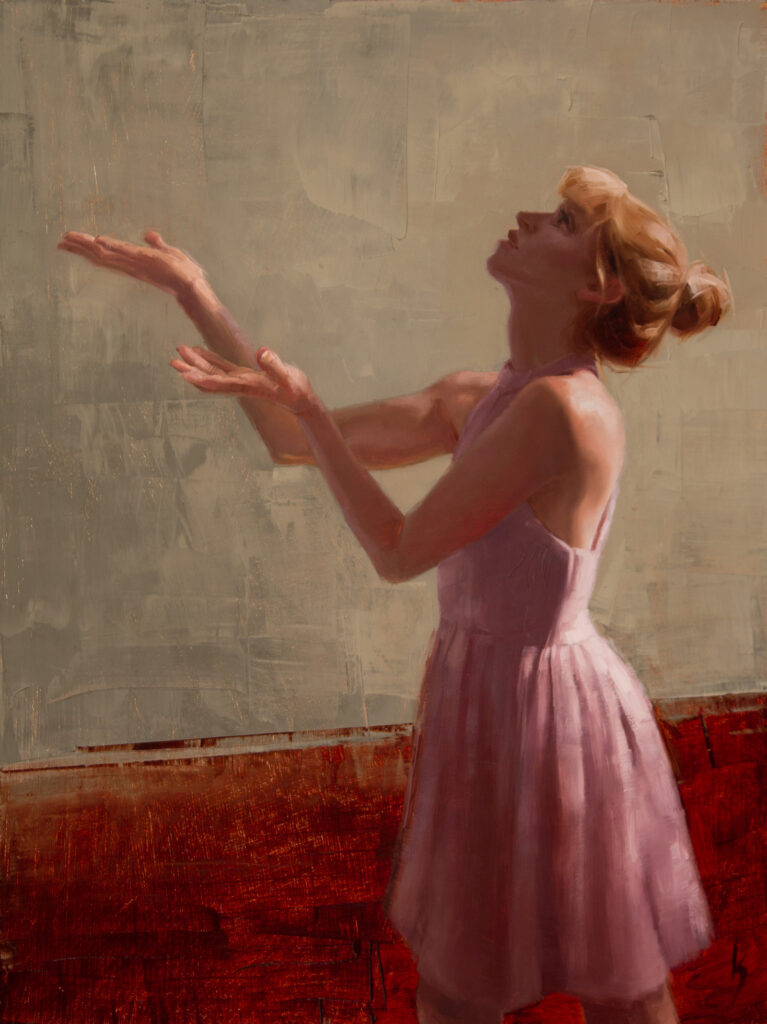
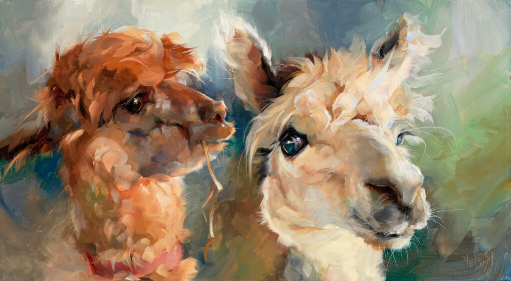
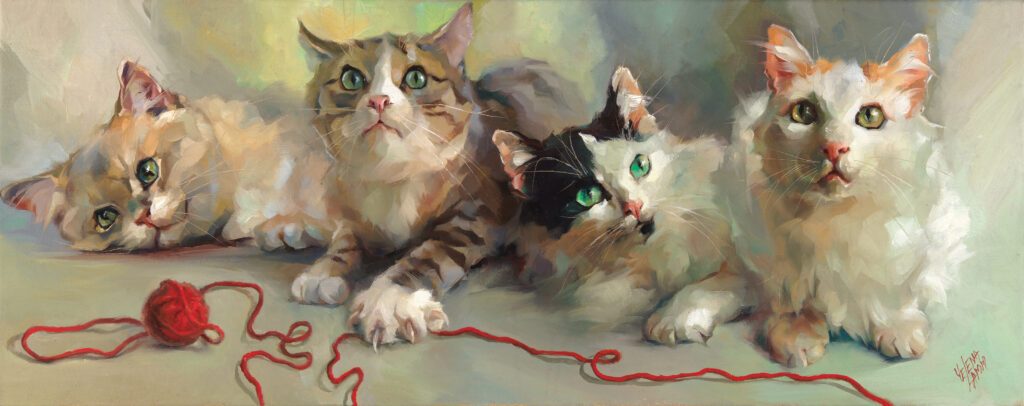
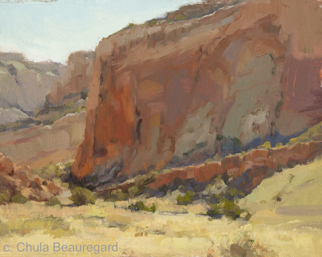
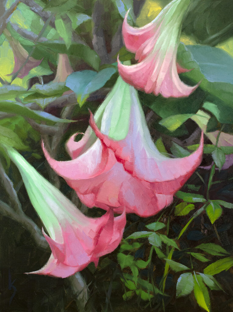
12″x 9″ – Oil on panel
Since running off to the hills or isolating ourselves on an island isn’t always practical, we must be vigilant and purposeful about creating a studio space that eliminates distractions. We also need to protect ourselves from the psychological effects of the constant barrage of sound, stimulus, and information in a technological world.
In one of his renowned TED Talks about listening, Julian Treasure states that our increasingly noisy world is gnawing away at our mental health and offers some solutions for softening this sonic assault. He recommends 3 minutes of silence per day and listening to sounds of birds, wind, and water. Birds only come out to sing when all is right in the world, so the theory is that there is some deep-rooted evolutionary instinct that allows us to relax and regain focus when we hear these sounds.
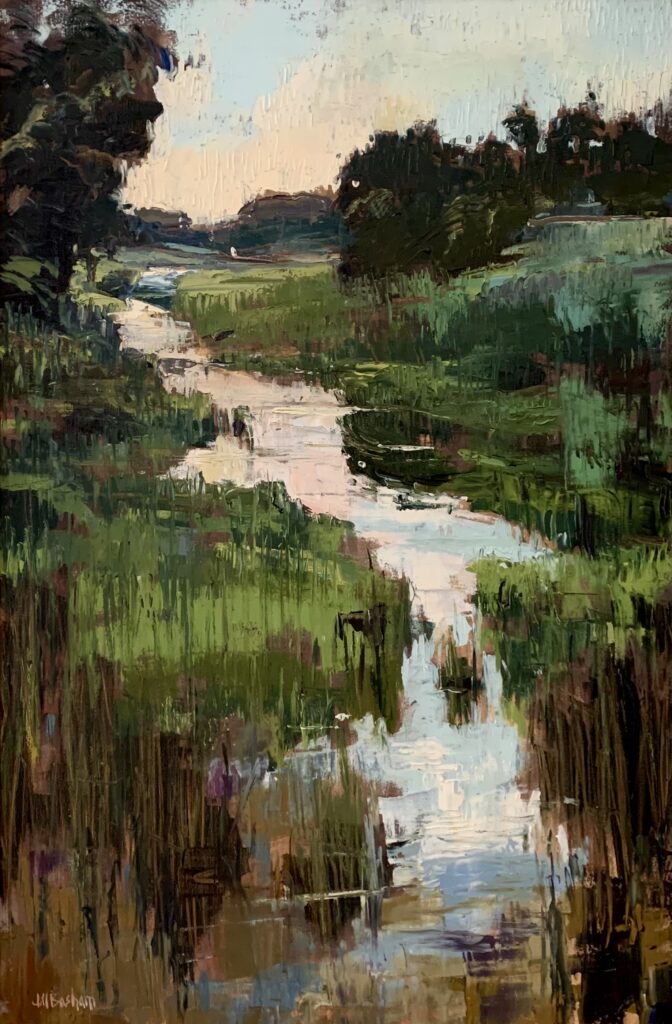
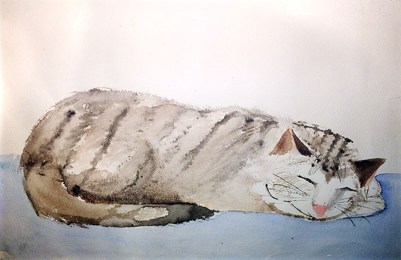
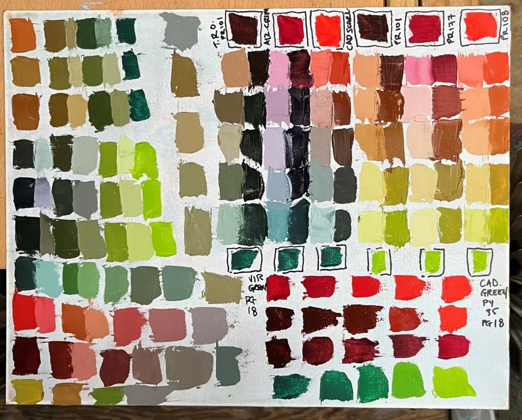
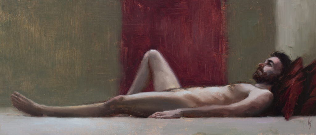
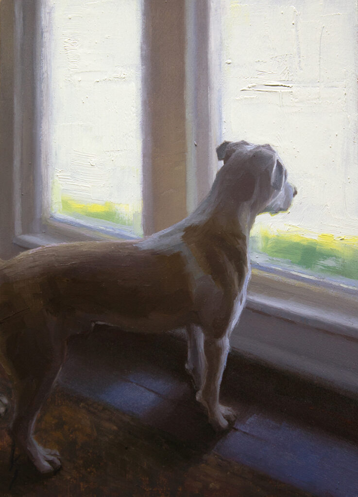
24″x 36″ – Oil on panel
Some other helpful tools to minimize distraction include turning your visually attractive phone to greyscale, putting it in “do not disturb” mode, or leaving it in a different room, out of sight. If you still find yourself compulsively checking your phone, try using the Forest app. On your phone’s home screen, you will see an animation of a growing tree. If you don’t touch your phone during your studio work session, the tree continues to grow. But if you check your phone, the tree withers and dies. It may sound ridiculous, but it’s a surprisingly powerful motivator. Then over time, each tree eventually creates a forest that represents your progress in conquering your digital distractions.
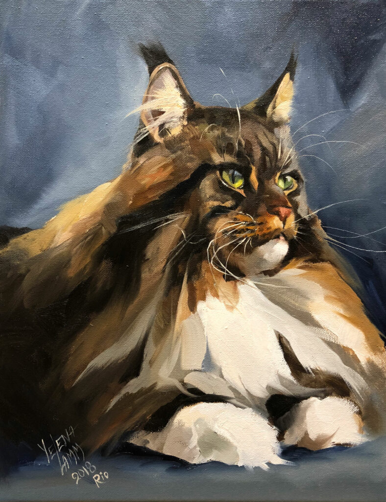
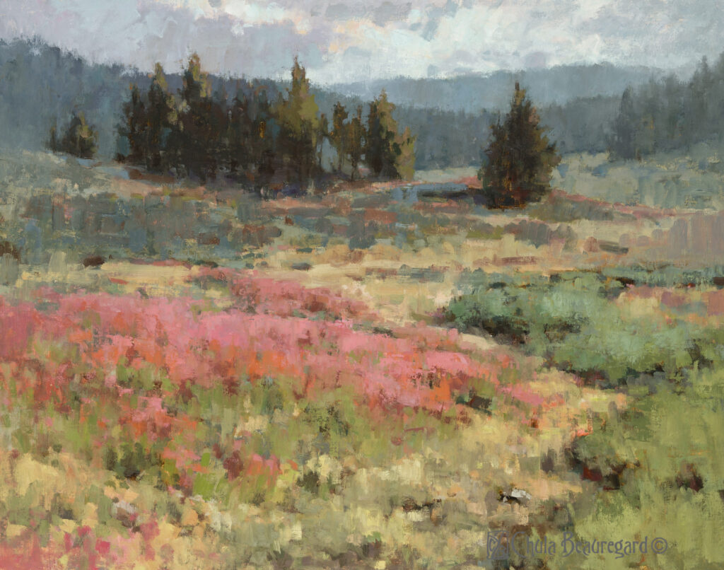
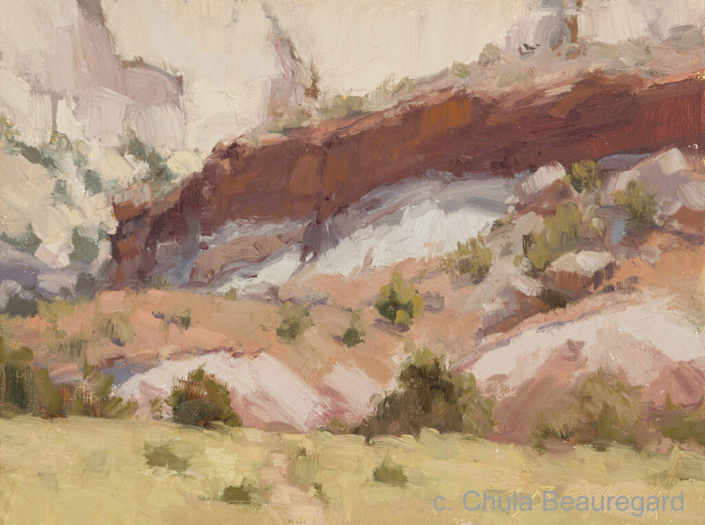
8″x 6″ – Oil on panel
In my studio practice, I have been listening to sound recordings of nature, seeking more silence, and growing my silly little forest. I am picking up the paintbrush more and leaving the phone alone. The effects have been profound. My hope is that all of you can carve out a little peace and quiet in the upcoming weeks.
7″x 5″ – Oil on panel
What other tools and tips do you utilize in order to eliminate digital distractions during your studio time? Share in the comments below.