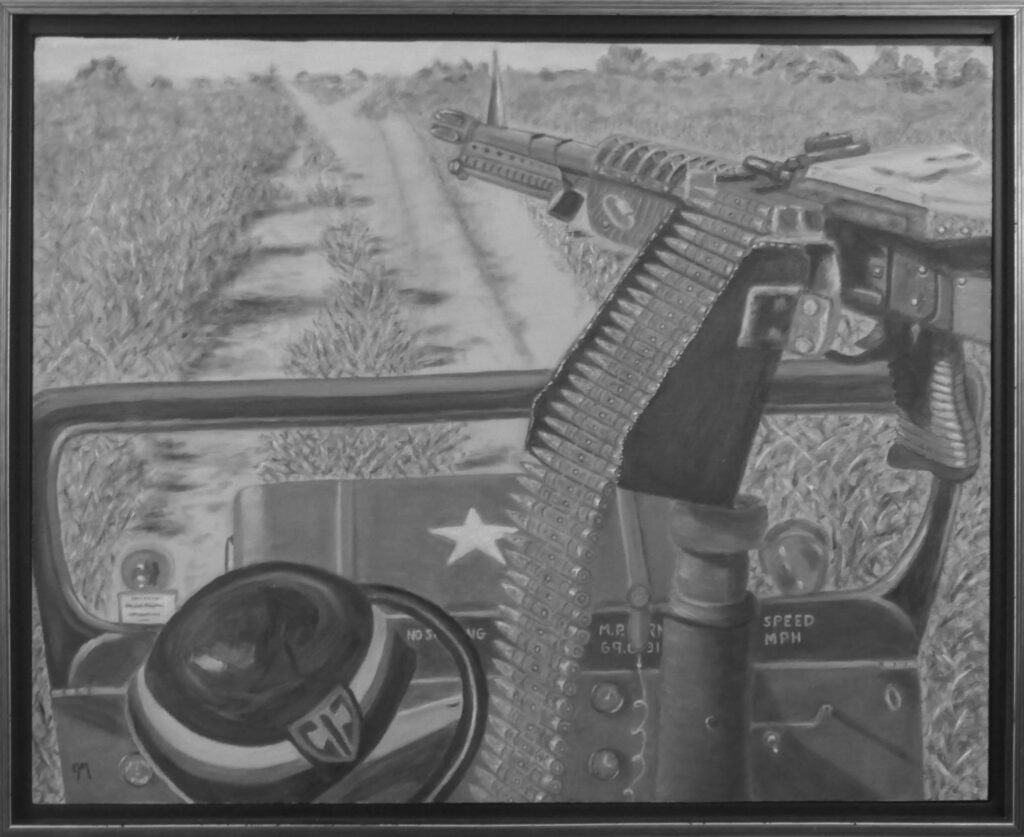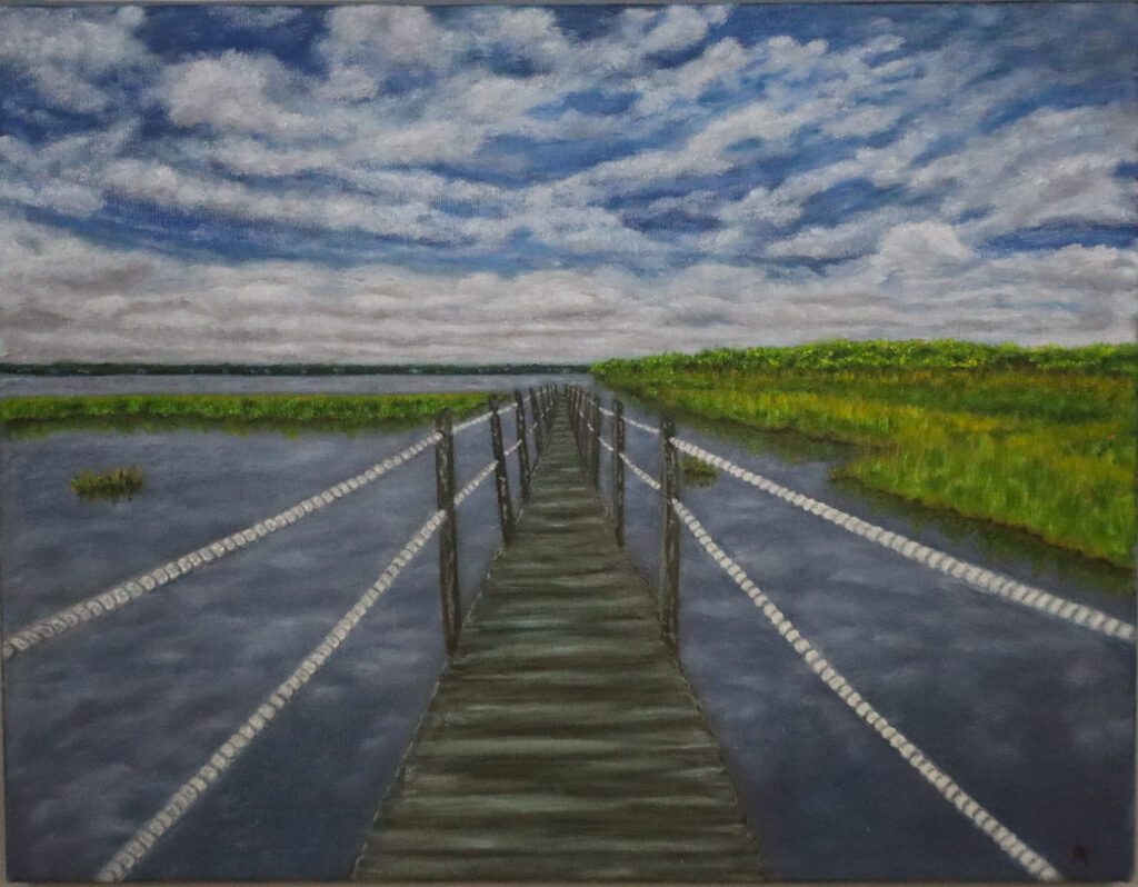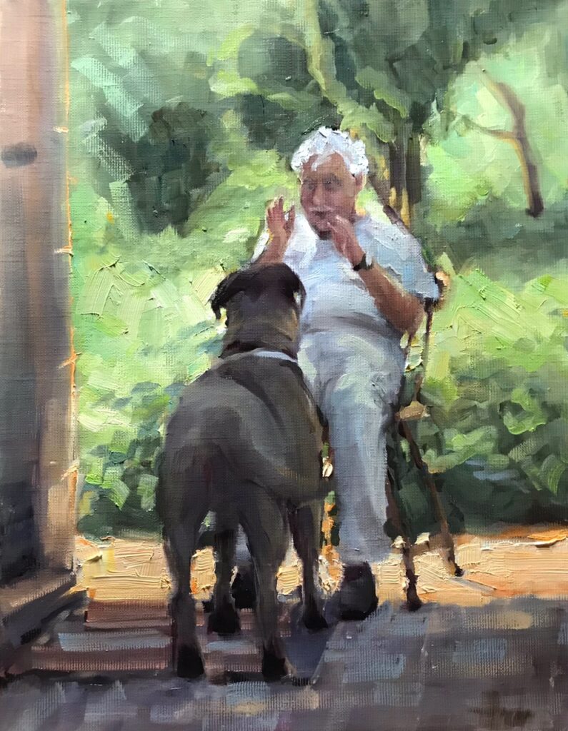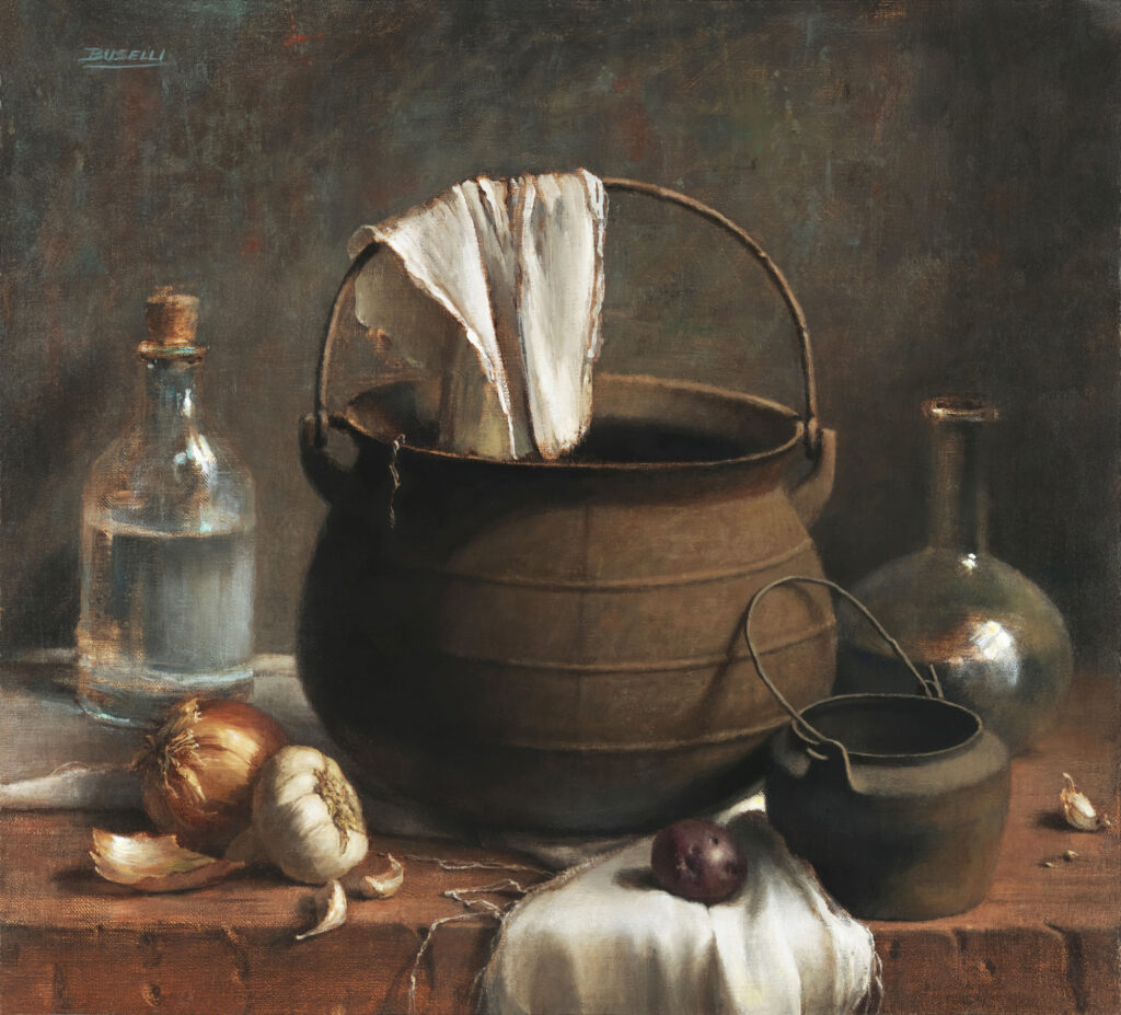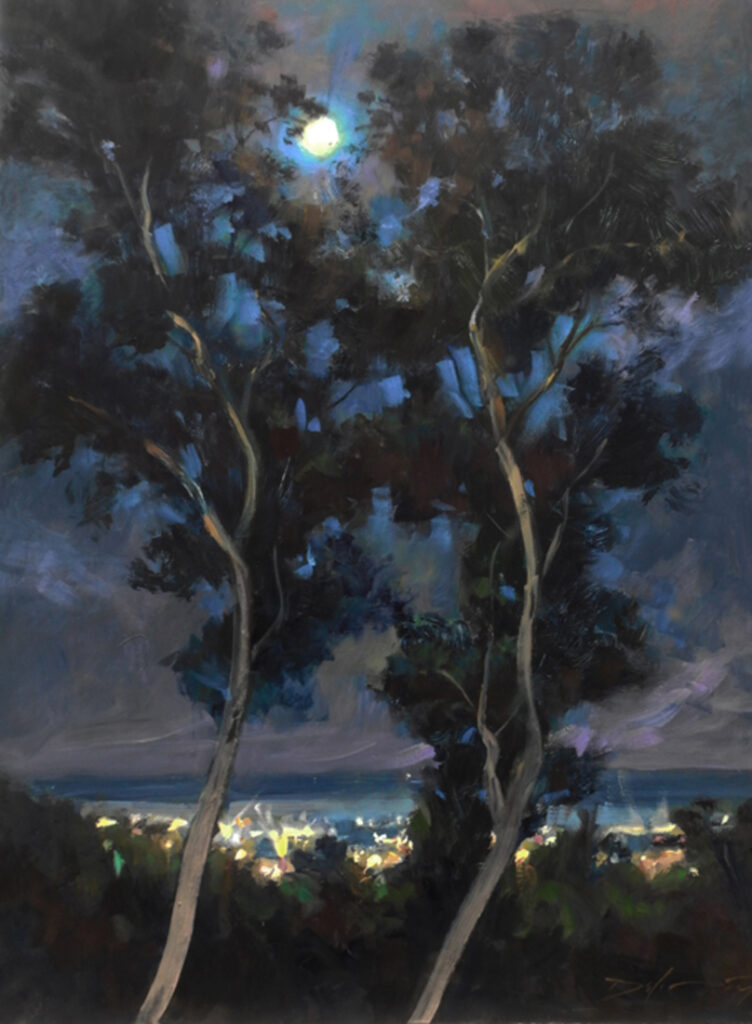
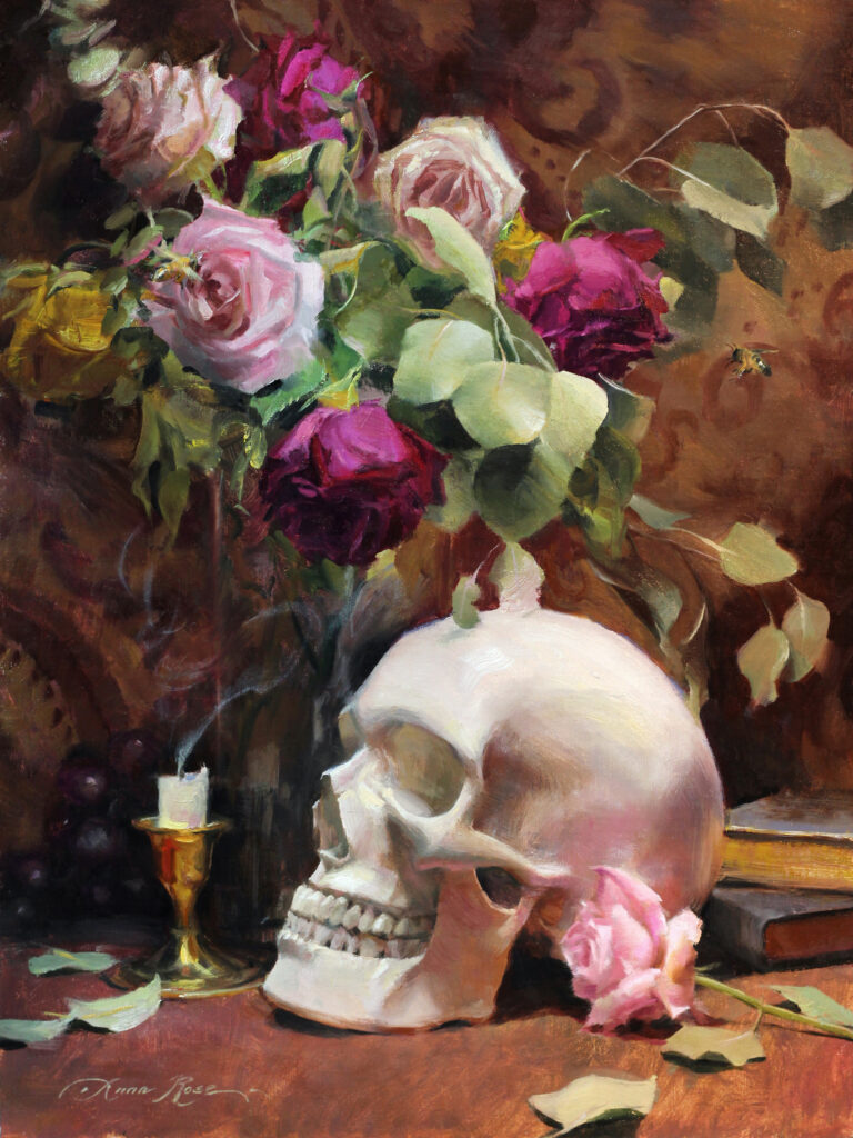
30” x 30” -Oil on Linen
If you’re an artist, you’ve probably considered that your work, once it’s “out there” for the world to see, has the power to impact people in some way. It could elicit any number of responses, from admiration, to nostalgia—or on the opposite spectrum, to disgust, or shock. Quite possibly—because we are bombarded with images every day—it might not elicit a response at all. Either way, there’s always some risk involved. It takes courage and vulnerability to put your art before the public eye. Get a big enough audience and you might even be called an “influencer” or a “culture shaper”. But have you considered that, with any audience large or small, this also means you are a leader?
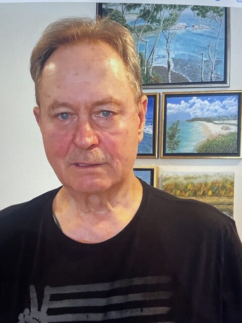
Last week I was invited by my Crossfit gym owner to join him and the other coaches for a monthly professional development meeting. Now, I am not a coach, rather, I provide services to my gym in the form of photography, video/video editing, and design work. I love being part of this team, but I still feel a bit out of place at “coaches” meetings. As an artist, what I know about leadership has evolved organically over the years (a.k.a. I’ve read a lot of Brene Brown books). I’ve never received formal leadership training, so I was intrigued when my gym owner said, “You might get something out of this”.
He was right. We watched a video where someone was analyzing a coach teaching a class, and he broke it down into technical terms as to what methods this coach was using to effectively train and teach athletes proper form. I found myself engaged, not just because I’m also a CrossFitter, but because my brain immediately went to ways I could implement these coaching techniques in teaching art, or in my interactions with other artists. Whether you’re in a gym setting or a workshop setting, there are going to be people who don’t want to listen to you, or those who cherry pick some of what you have to say while leaving the rest. And there will be some who require you to say the same thing ten times over but in ten different ways before it clicks for them. It’s important to learn how to communicate effectively with people so you can actually reach them.
I’ve only recently come to terms with the realization that I am a leader in the art world. For better or for worse, whether I like it or not, I have a part to play and I am influencing someone. My younger self brushed this off by saying, “I’m just keeping up with the times on social media”, or “I’m just doing what I love”, “making art for art‘s sake”, etc. But the truth is, most of us can’t possibly live in a bubble where our life and work don’t affect someone else. If our work is out there, we are influencers. We are above and beyond the norm. There’s no minimum or maximum age, no minimum audience for being a leader, and as artists, our leadership roles are especially unique and necessary.
But not everyone who leads is a good leader. It takes work, and a servant’s heart. I’ll name a few of the things I’ve learned that make up a great leader (of course I offer this list through the lens of being an artist but it can certainly apply to other aspects of life).
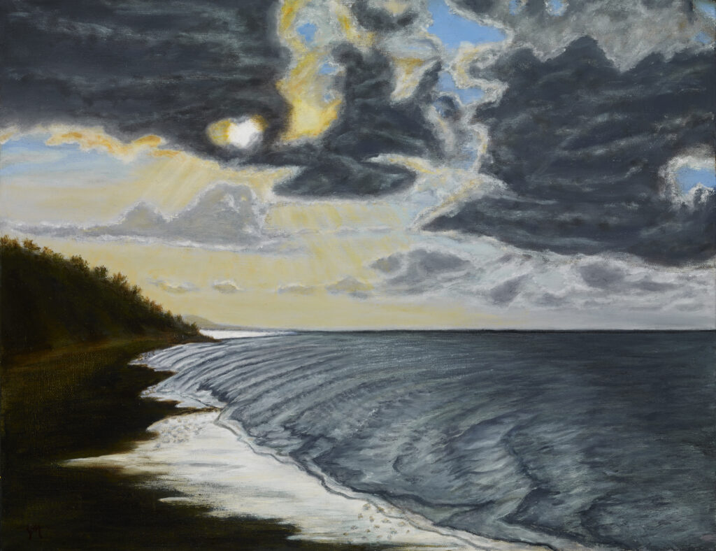
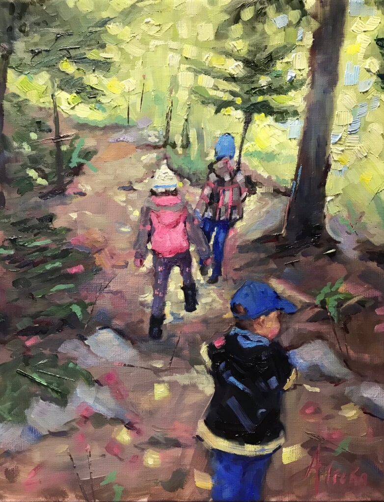
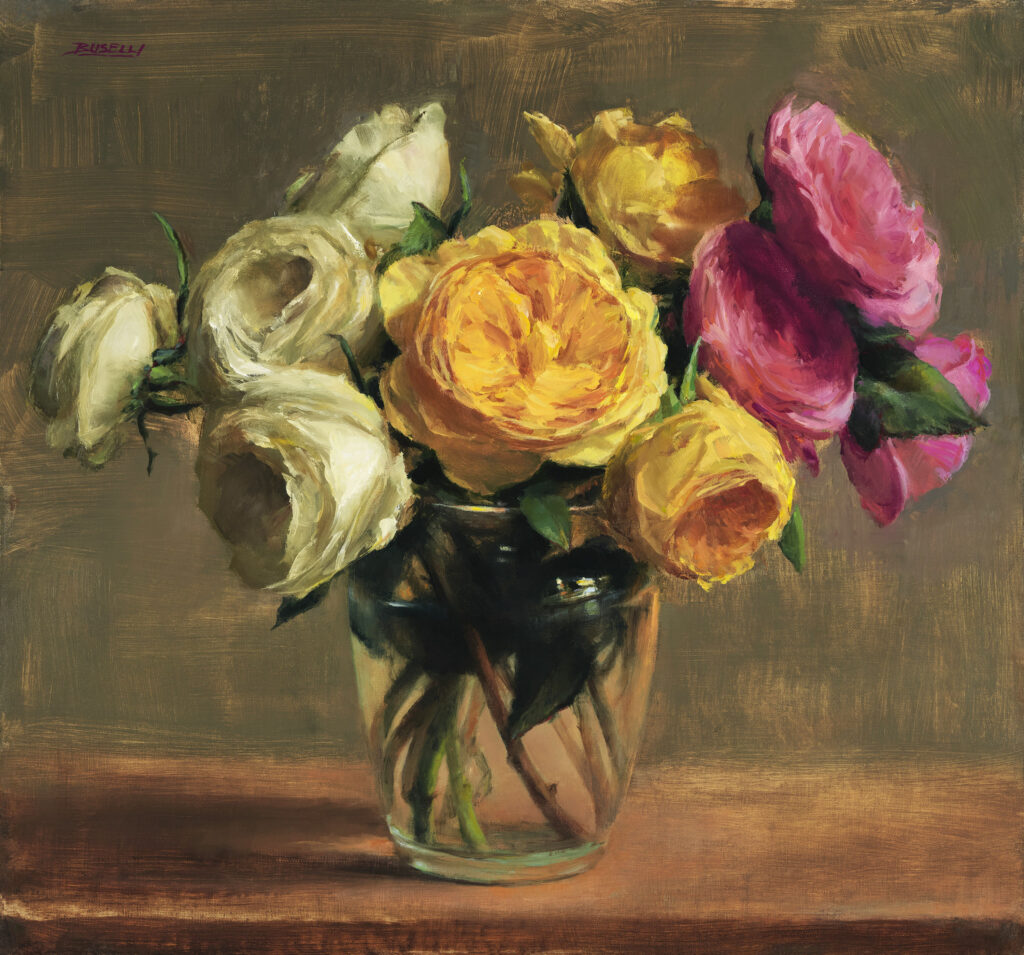
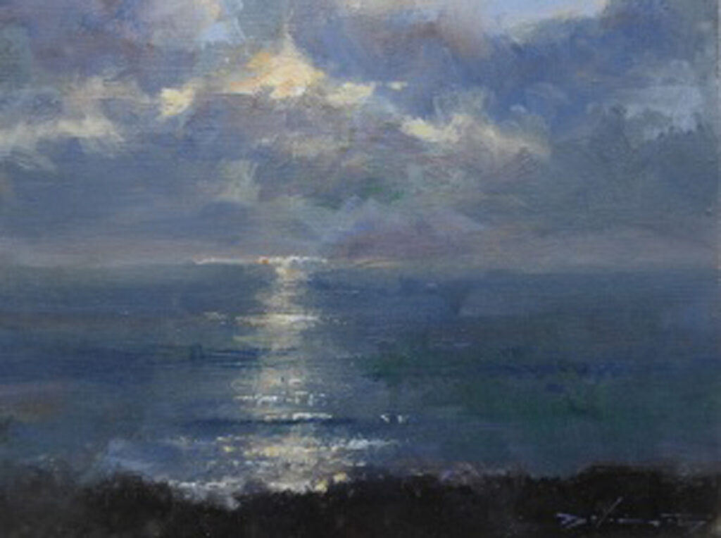
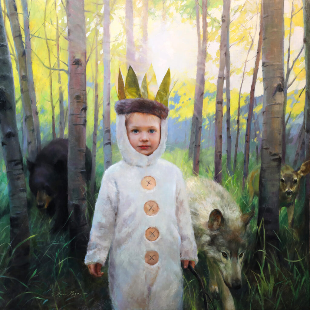
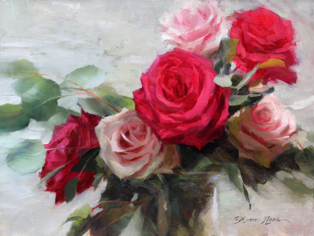
30” x 24” – Oil on Linen
Belief in purpose. As artists, we write an “Artist’s Statement” to communicate our “why”. The great thing about a statement is that it forces you to examine your goals, motivations, and process, and condense it into a few brief sentences. There has to be a “why” behind everything we do and every choice we make. If we truly believe in our “why,” and are confident in the direction we are going, we are setting ourselves up for becoming good leaders in our field. If writing an artist’s statement is daunting to you, don’t worry. It can change and evolve with you as your work evolves. Think of the core values you hold most dear, and how those manifest themselves in your work. Or look at your body of work and try to find the common thread that ties them all together. It won’t be too hard to see what really matters to you.
Early on I had to come to terms with the moral question of painting nudes and including them in my portfolio. I grew up in a very conservative environment, and to this day, I still have acquaintances from home who won’t talk to me because they think I’ve sold my soul to the devil. It’s a subject that raises a lot of different questions, and I realize that if I’m going to paint nudes, I need a standpoint on it, and once that’s been established, I need to be able to defend and honor that standpoint.
One way to uphold your belief and purpose is by aligning yourself with arts organizations that support your values. Two of the esteemed groups I’ve been a part of for quite a few years now, are the Portrait Society of America, and Oil Painters of America. Both are non-profits with the aim of furthering representational art and art education. I share a core value with them: the pursuit of excellence. This commonality creates a fertile garden for artistic growth, both on their end and mine.
Authenticity is important because your worldview, or belief in purpose as described above, are dependent on this. It doesn’t make sense to believe one thing while making art that goes against that, just so you can make a buck, or get in with the cool kids. Also, don’t be the person who will advertise for any company as long as you get something free out of it. Be the real deal. Advocate for causes you actually believe in. I am generous with my social media posts about art supply manufacturers, but I only post about the ones I actually use and love.
Humility. Admit when you’re wrong or you don’t know. When I teach, I sometimes get asked technical questions about the chemistry and lightfastness of the paint brands I’m using. Quite often I have to say, “I don’t know the answer to that,” but I’ll try and point my students in the right direction for finding the answer themselves.
Have a servant’s heart. Give of your time and talents. Don’t be entitled, and don’t get “too big for your britches”. We all started somewhere; we are all still learning. I find artists who are aloof and unapproachable, with their enormous egos taking up all the space in the room, to be abhorrent. Don’t be like that!
Master the basics and continue practicing them; never stop learning. Basketball star Kobe Bryant was known for doing the most basic drills in order to stay at the top of his game. Every day he shot 700-1000 hoops and did 20 minutes of dribbling. For artists this might be similar to sketching every day, doing color charts, or copying masterworks. This is something I need to work on; too often I think my studio work is more important and I don’t have time to go back to the basics. But the basics are everything.
Foster community. This involves a combination of all the above listed things. When you are in community, you allow yourself to grow and learn from others. They don’t have to be other artists. A wise friend once told me, “I learn from everyone I meet. It doesn’t matter who they are or what they do—everyone has something to bring to the table.” That kind of humility opens the door for better listening, more empathy, and greater understanding. It also allows for a bigger melting pot of ideas to inspire creativity and growth as an artist.
There are many practical ways we can foster community in the art world. We can host open studios, attend art openings and events, have regular critique sessions, or attend life drawing and plein air sessions to name a few.
Know your worth, and stay confident. One pill that’s been hard to swallow is the realization that as a leader, I will make enemies. No, not the kind where you duke it out in a fist fight, although sometimes I feel like that would be easier. But, you might get slandered. You might get talked about behind your back. You might get shunned or blacklisted. There will be people who not only disagree with you, but actually hate you.
It’s so important to know who you are and to keep in mind that negative reactions reflect more on the other person’s character than yours. I was shunned in college by some of the other art majors. I could only speculate as to why, but I suspect they were envious.
My emergence to the art scene coincided with the onslaught of social media. There has been this continuous question of: how much do I share about my political views and should that tie in to my art? Some would argue that as an “influencer”, I ought to use my platform for that. Others would say that I should “stick to the art.” Whether or not this is true for you, what I realized for myself was that real change only happens in settings where people feel safe and respected. Intimate conversations, friendships that are built on trust – that’s where change happens, not by blanket statements made on social media. Unfortunately, I had to learn this the hard way. I’ve burned some bridges. I hope that, moving forward, I can learn from my mistakes and make wiser choices.
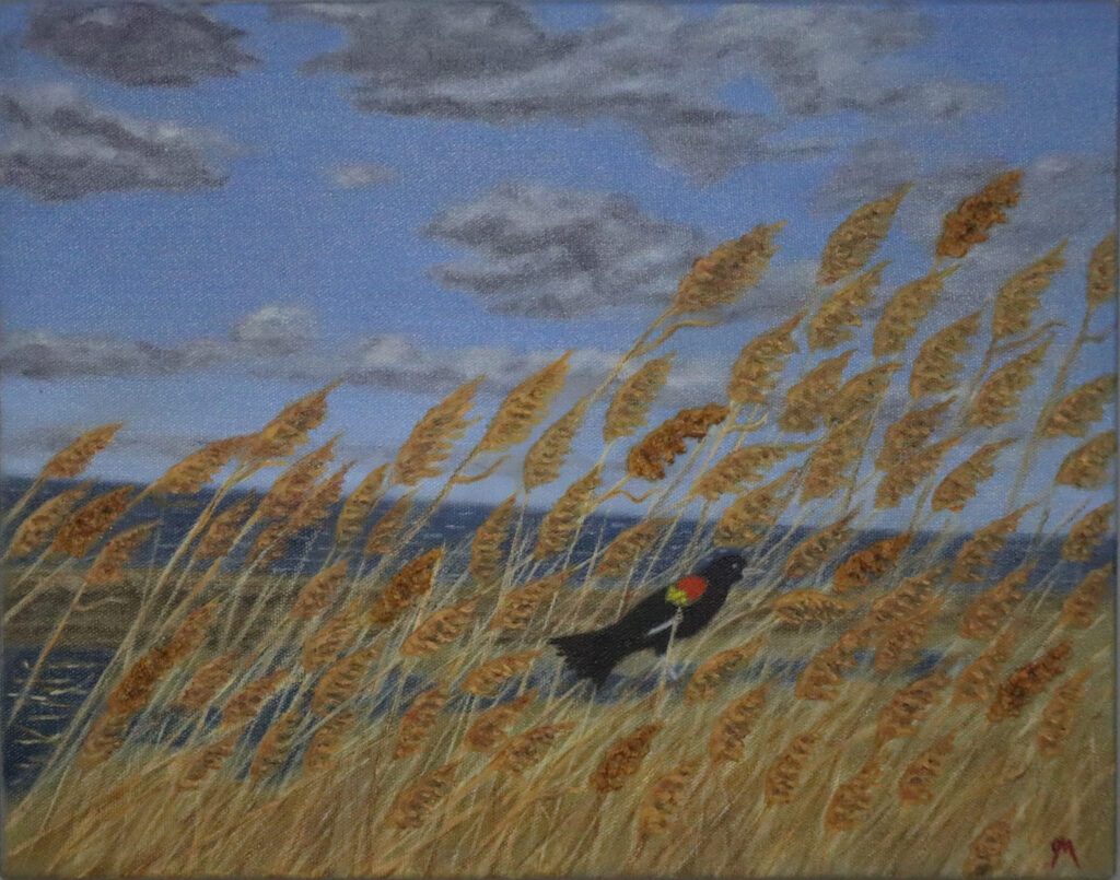
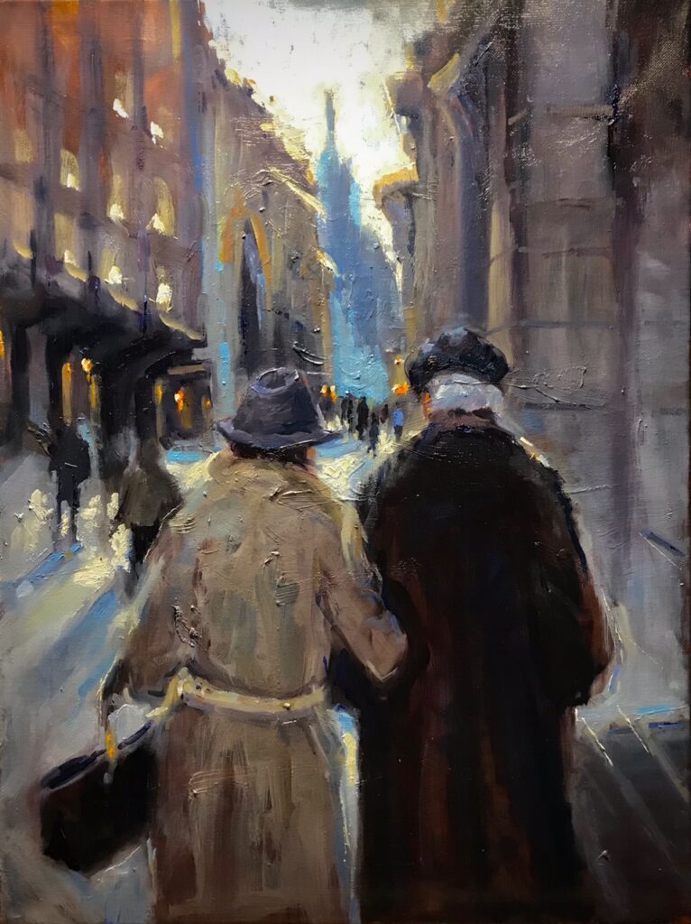
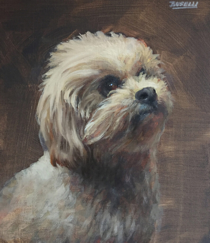
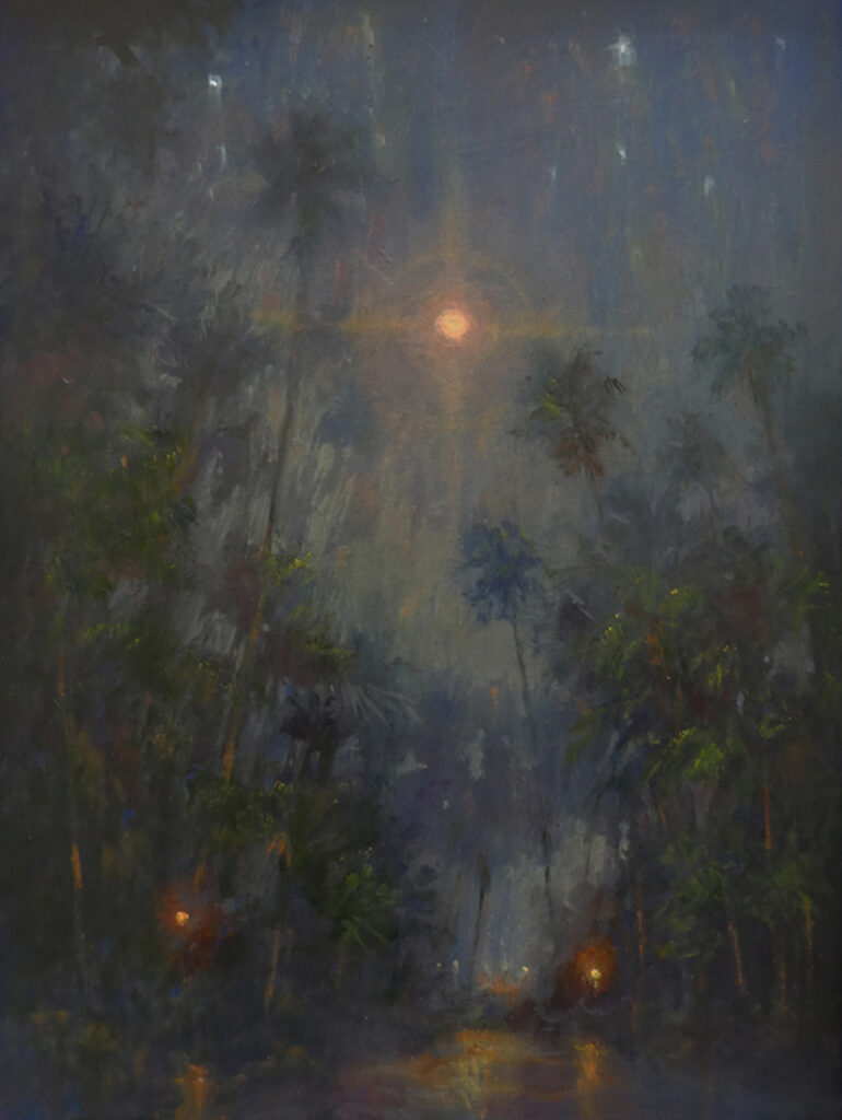
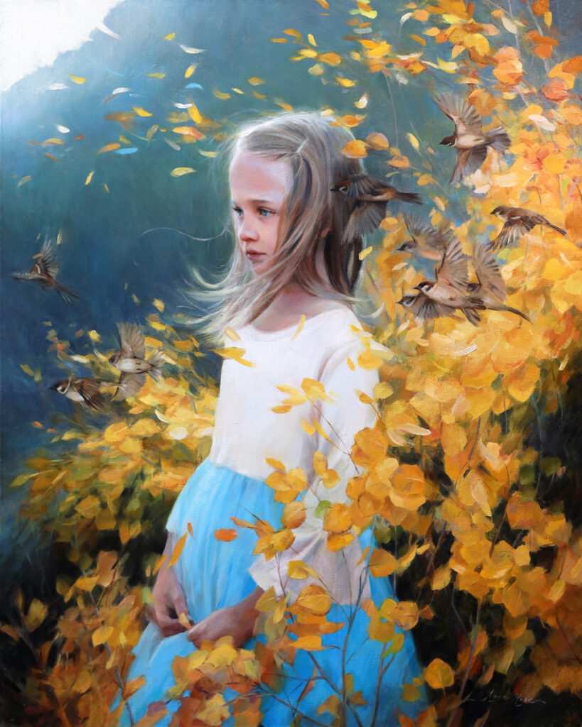
16″ x 12″ – Oil on Linen Panel
Since then, I’ve gone through other experiences, such as getting negative feedback or being attacked by internet trolls (sometimes people I actually know which is way worse…). These experiences can sometimes feel like a test to see whether or not I will cave in to the lies that I am inadequate, unworthy, or a fraud. When bad things happen to you (or bad paintings, ha!), hold your head high, know your worth, and carry on. Don’t let them paralyze you from continuing your work and sharing it with the world.
As the reader you might be thinking, “You are not making a very good case for putting yourself out there”. Sorry…not sorry. If you’re an artist and you truly feel that it’s your vocation, then you’ll have to come to terms with this, like I did. Thankfully, it doesn’t all happen at once. Little by little, you learn what leadership looks like for you and your own circle of influence. You may be lucky enough to be born with natural confidence, but if you’re like most of us, leadership is a skill that takes time and experience to develop. And that’s okay! Just know that if you are being true to your values and being authentic, remaining humble and embracing community… your art and life will become part of something bigger, and you are going to make a positive difference in someone’s life.
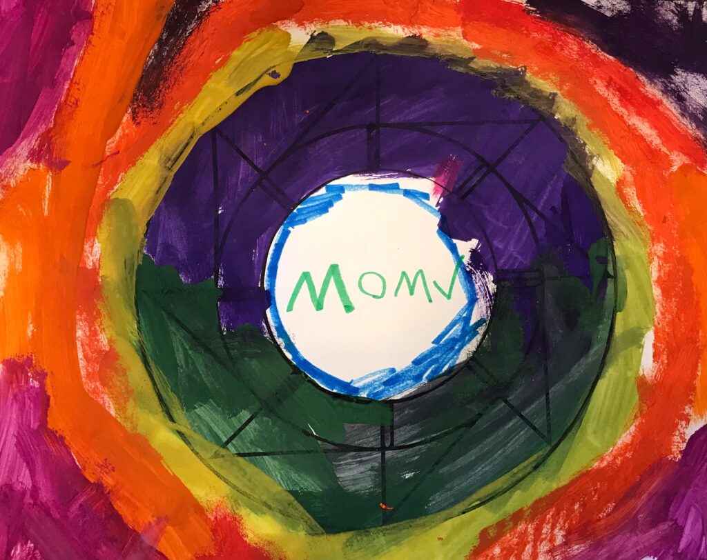
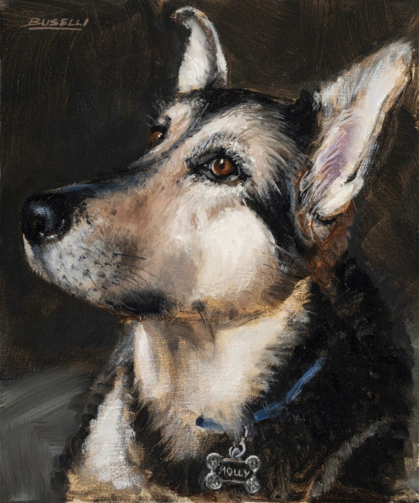
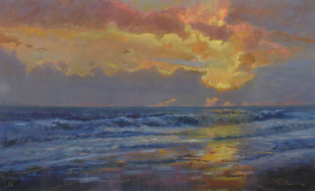
9” x 12” – Oil on Linen Panel