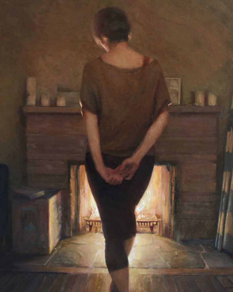
The first thing I do when starting a new painting, is ask myself three questions:
1. What is this painting about and why am I painting it?
2. How can I use design, color, and value to express #1?
3. What can I edit out, or add in, to the original subject to better express #1?
Since everything depends on the answer to question #1, I think carefully about it. For this painting, my answer is stillness, quiet, a state of static tension, and lastly, a girl reading a book. For question #2, I decide to use a “L” composition, dark cool colors (blues for example), and mostly horizontals and verticals with a minimum of diagonals to best express my intentions. A flatness in the picture plane seems more appealing, so I keep overlapping shapes, and over rendering, to a minimum. To answer question #3, I decide to eliminate a tree trunk that appears in the background of my reference photo because it doesn’t benefit my story.
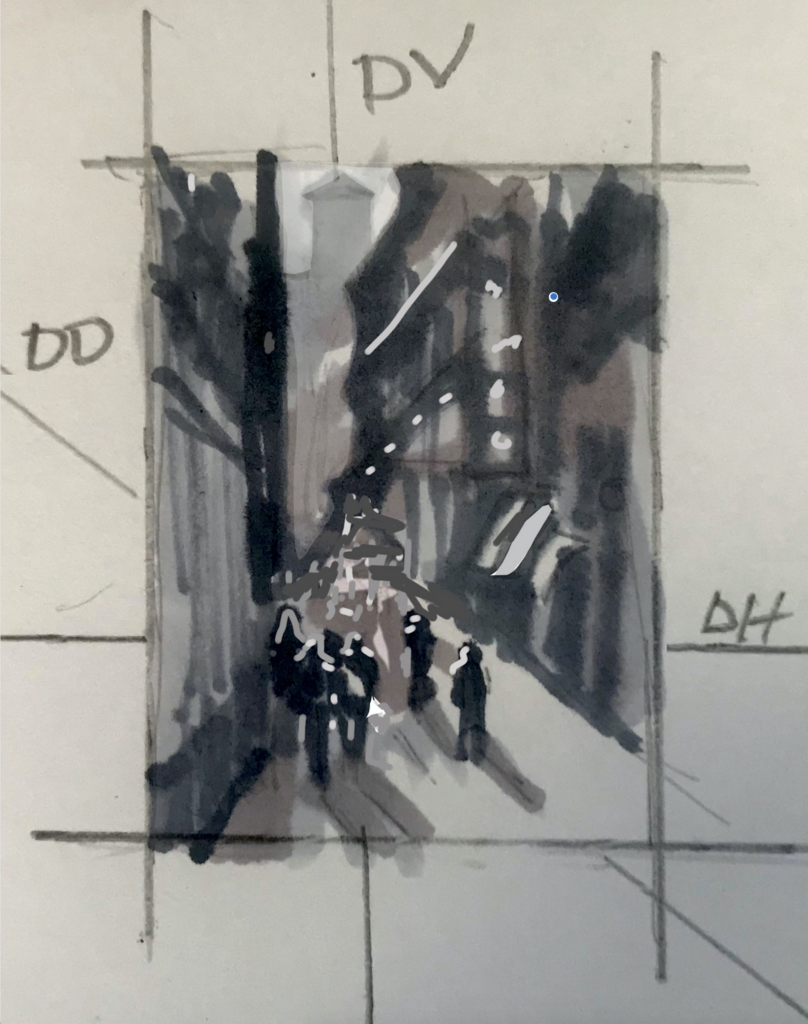
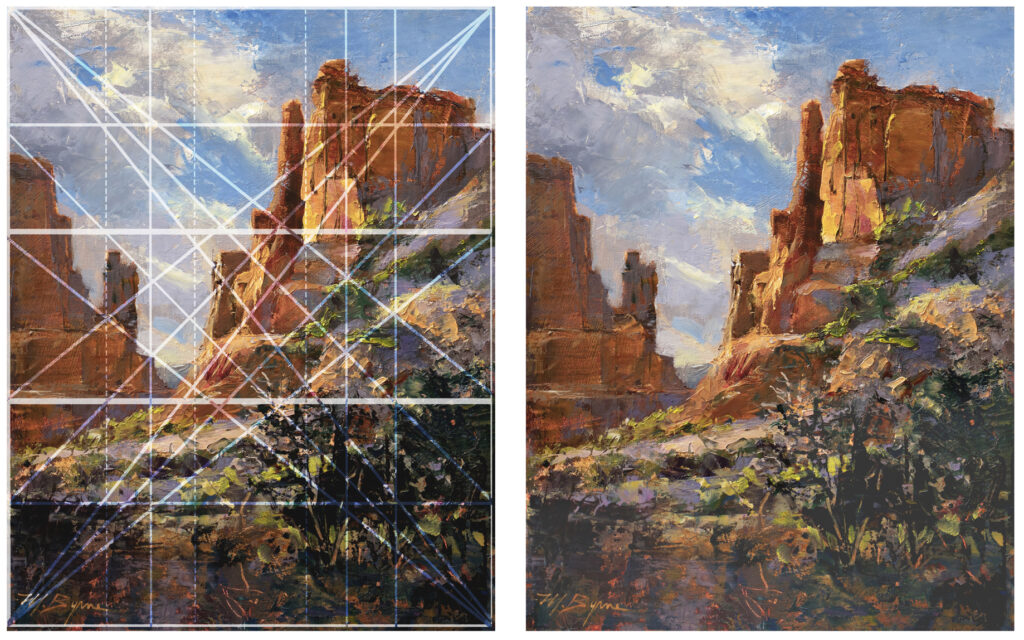
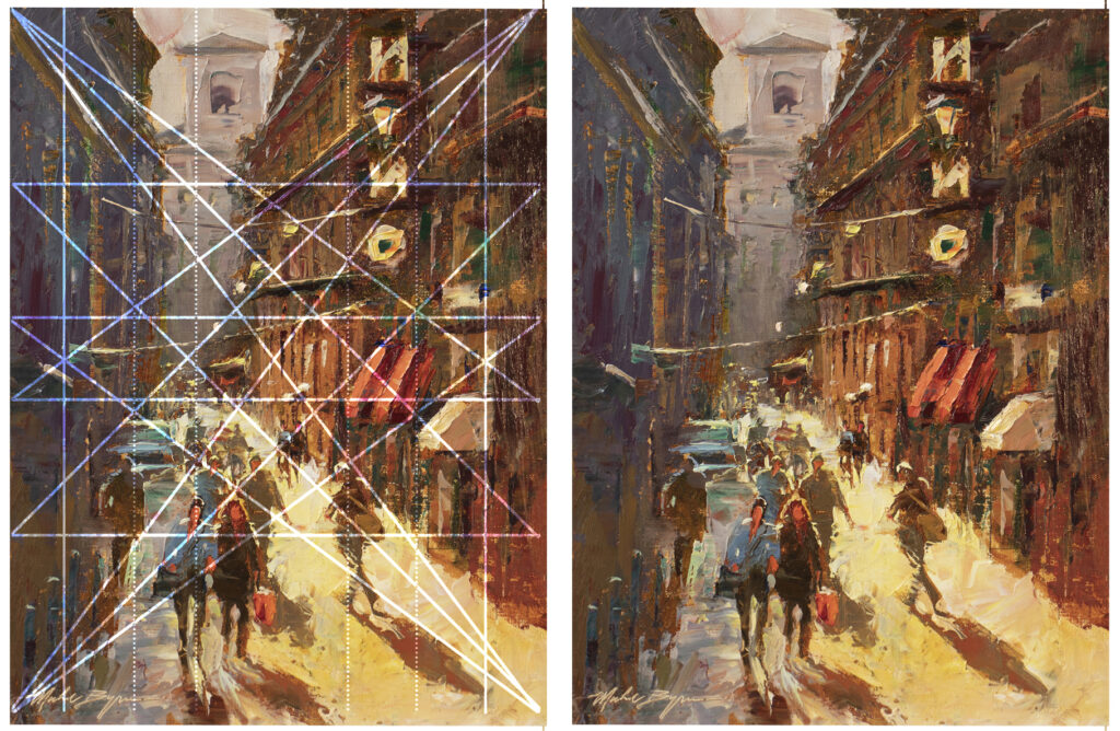
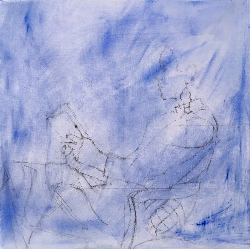
Next, I place a simple grid of lines at the quarter and halfway measurements on the canvas using vine charcoal, and on the digital image as well. This helps to place the overall subject at an interesting distance from the edges of the picture plane.
I then create an accurate drawing, again using vine charcoal. I stress an “accurate drawing”, because starting out with a weak drawing holds back the progress of the painting. I don’t want to spend my effort on questions like “is the nose in the right place?” When I begin painting, I want to be free to concentrate on color, design and movement.
I use vine charcoal because it can be changed and erased without a trace. Using pencil or even paint to do the initial drawing can leave ghostly versions of the drawing on the canvas, which I find distracting.
Once the drawing is how I want it, I use a kneaded eraser to knock the lines back until an even simpler version is left with only essential key reference points. I then spray this with workable fixative to help keep the drawing intact, so it does not get wiped away when I begin painting.
Since there is going to be a dark background and a lot of blue in this painting, I start with a wash of Ultramarine blue to get rid of the white canvas and give myself a head start on the background.
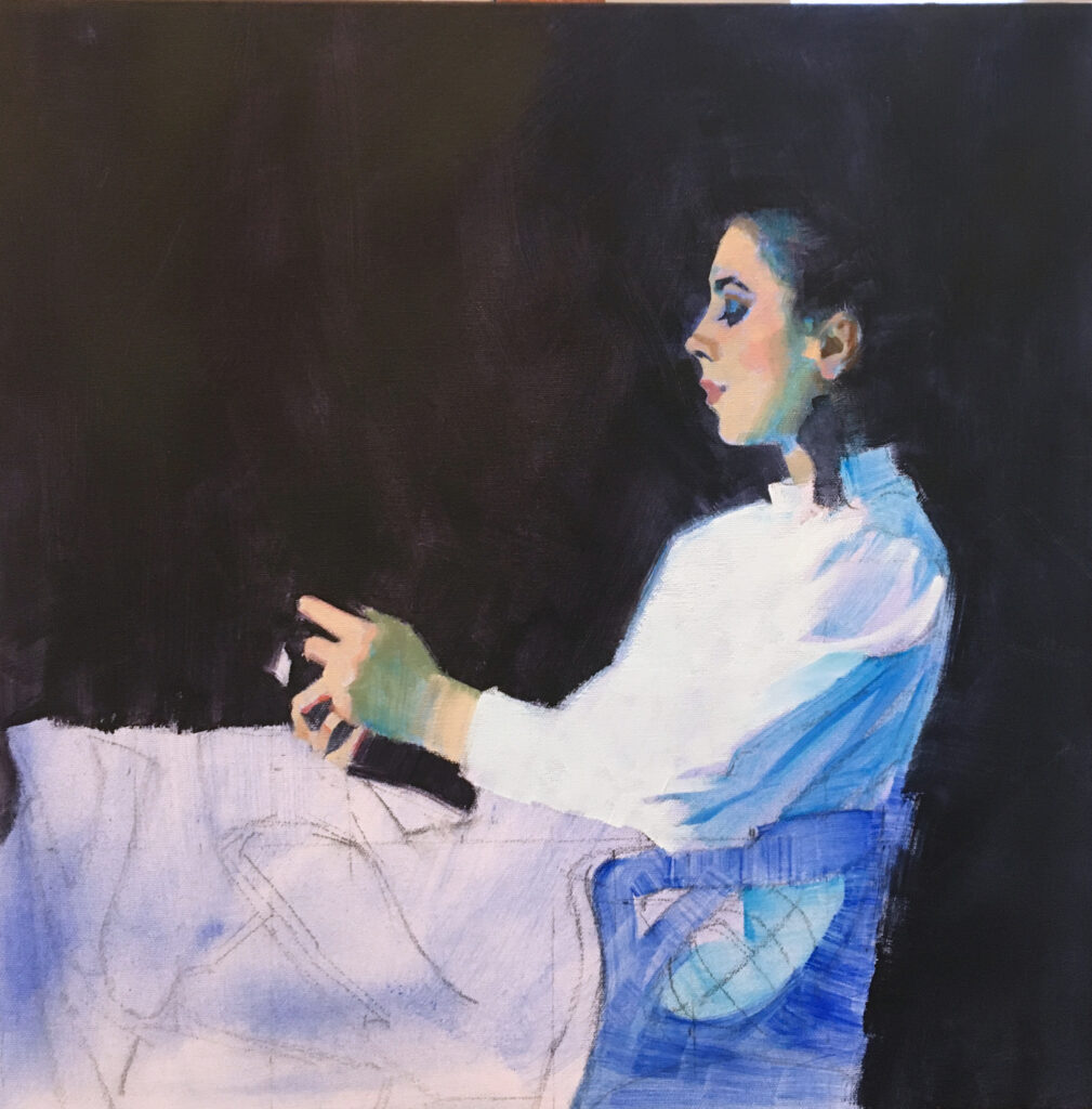
I always begin with the background. I consider it to be the air she breathes and the light she is surrounded by. It will greatly influence every aspect of the main subject. Remember, the young girl reading is only the literal subject. I keep going back to question #1—what is this painting really about? The answer — stillness, quiet, static energy — keeps circling in my head as I work though the painting.
After the background is in, I paint her face into it, having the two react to each other. I continue working down her blouse, keeping it simple and on to the arm and hands. The book goes in after the background is dry. This is the easiest part of the painting since I have a very clear idea of how I wanted to paint them. The skirt, however, is another story.
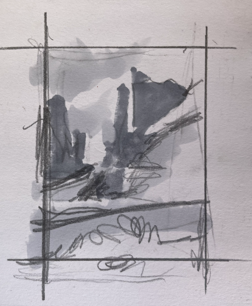
The skirt is a swirling mass of shiny satin fabric. Whenever I’m faced with something like this that I can’t quite wrap my head around, I get out the sketch pad and do a three-value sketch of the area to decipher what I’m actually looking at. When I understand it, I move on to design it in a way that benefits the other elements in the painting. It’s not important to match the appearance of the skirt to the original subject, but rather to make it work as a path to lead the eye around the painting in the right direction.
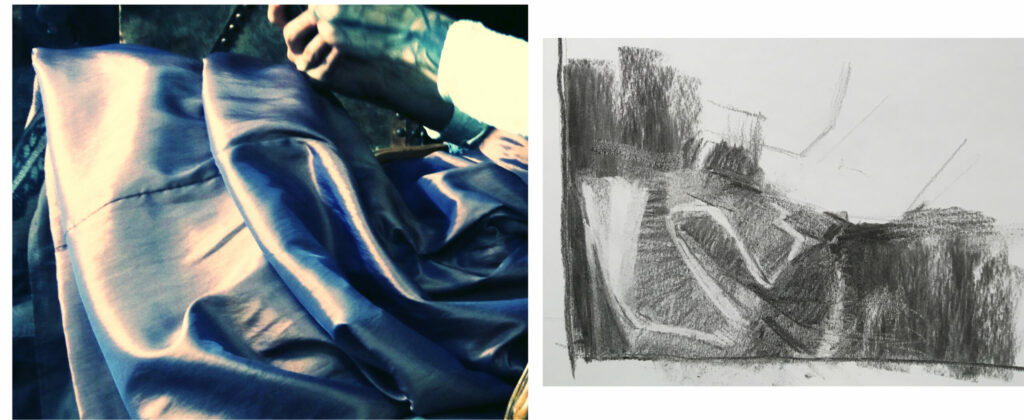
I can see at this point that the visual movement in this area is not going to work with the rest of the painting. The high contrast plus the snaking direction takes too much attention away from the area of interest, her face. So, I decide to simplify the skirt, giving it a more subordinate role. When areas go totally off script like this, I have to rely on my intuition as to what it should look like.
One of the things I like about oil paint is the way it lends itself to experimentation. If it doesn’t work, just wipe it off. Now that the skirt is working, on to the book.
Many times, I will paint over a dried, dark area. Before painting the book, a bit of a drawing would help with placement. I’ve discovered one type of white chalk that works well for this. Tailor’s chalk, something about it will grab onto the smooth surface and stays there until erased with a kneaded eraser.
In this painting, I’m working from the foreground to the distance. I’ve learned to be flexible in the way I construct a painting, never wanting to fall into a formula, it keeps everything a little unpredictable and gives me a fresh outlook.
And now, the painting is complete!
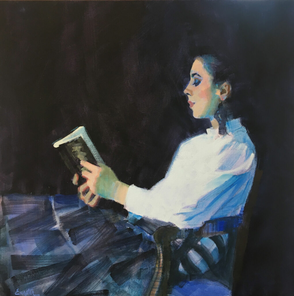
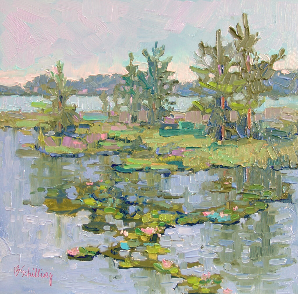
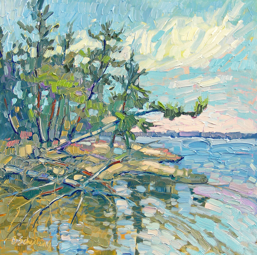
24” x 24” – Oil