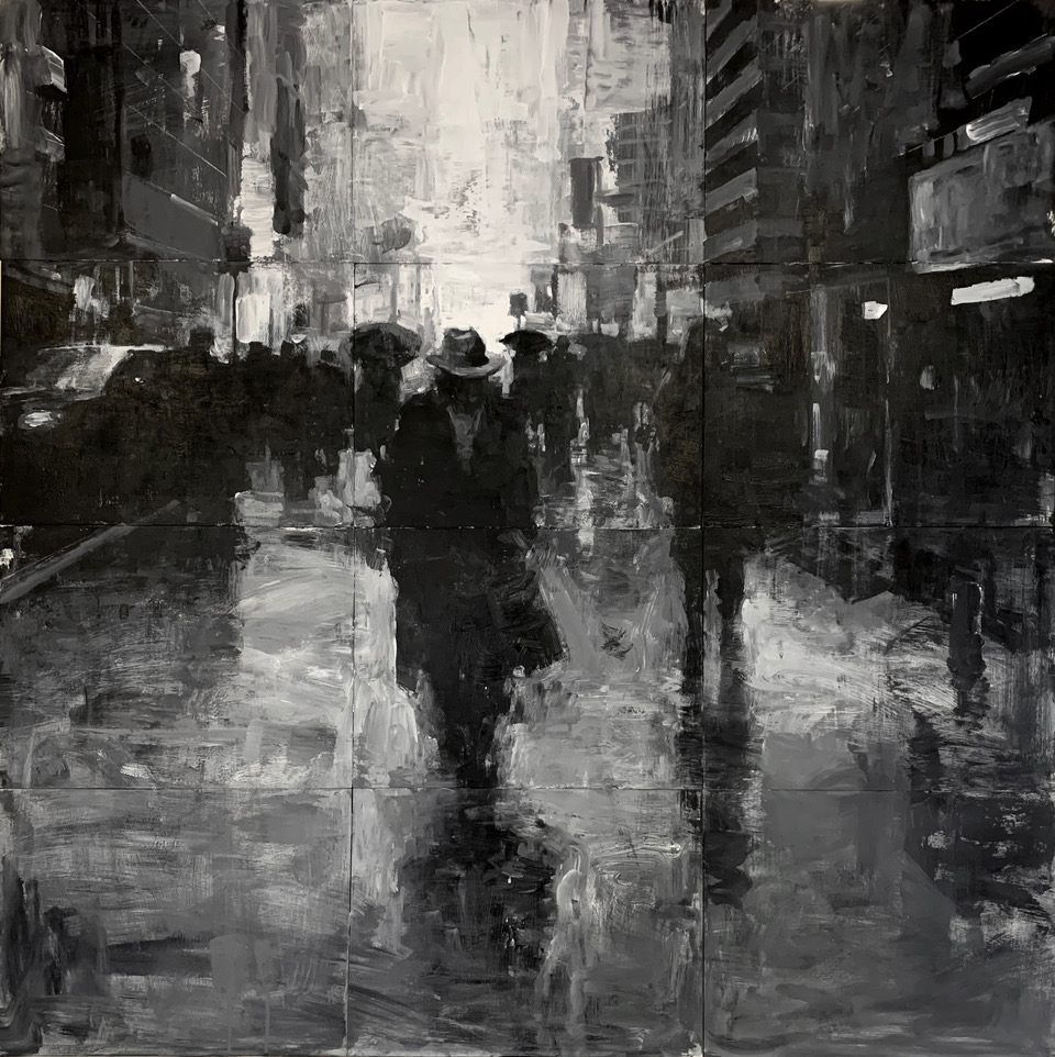
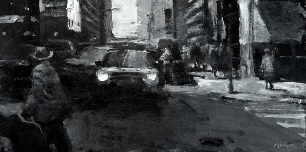
48″ x 48″ – Mixed media on panel
The Pandemic changed everything.
I’m sure this is true for many artists; the prolonged social isolation became a period of self-reflection and soul searching. There was a sense of uncertainty that permeated every aspect of our lives. Yet we still had to produce artwork, even though there seemed to be much more important things to worry about.
Not surprisingly, my creative juices stopped flowing and I hit a wall. Slumps are no strangers to an artist, but this one seemed different, maybe because the whole world was in crisis mode. Try as I may, I just could not work through it as I normally do.
I began to question the work I was doing. Soon, I was no longer sure about my choice of subject matter, tools, materials, or process. I’ve always worked hard to gain control of these things, with the firm belief that one must have a command of the language in order to communicate effectively. And painting is a visual language.
But during this mother of all slumps, I found myself equating control with predictability, and not in a good way. I began to think, maybe I’m playing it too safe; maybe I’m not taking risks with my painting; maybe I’ve become complacent!
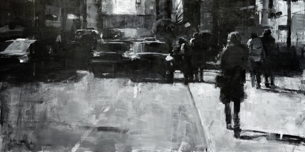
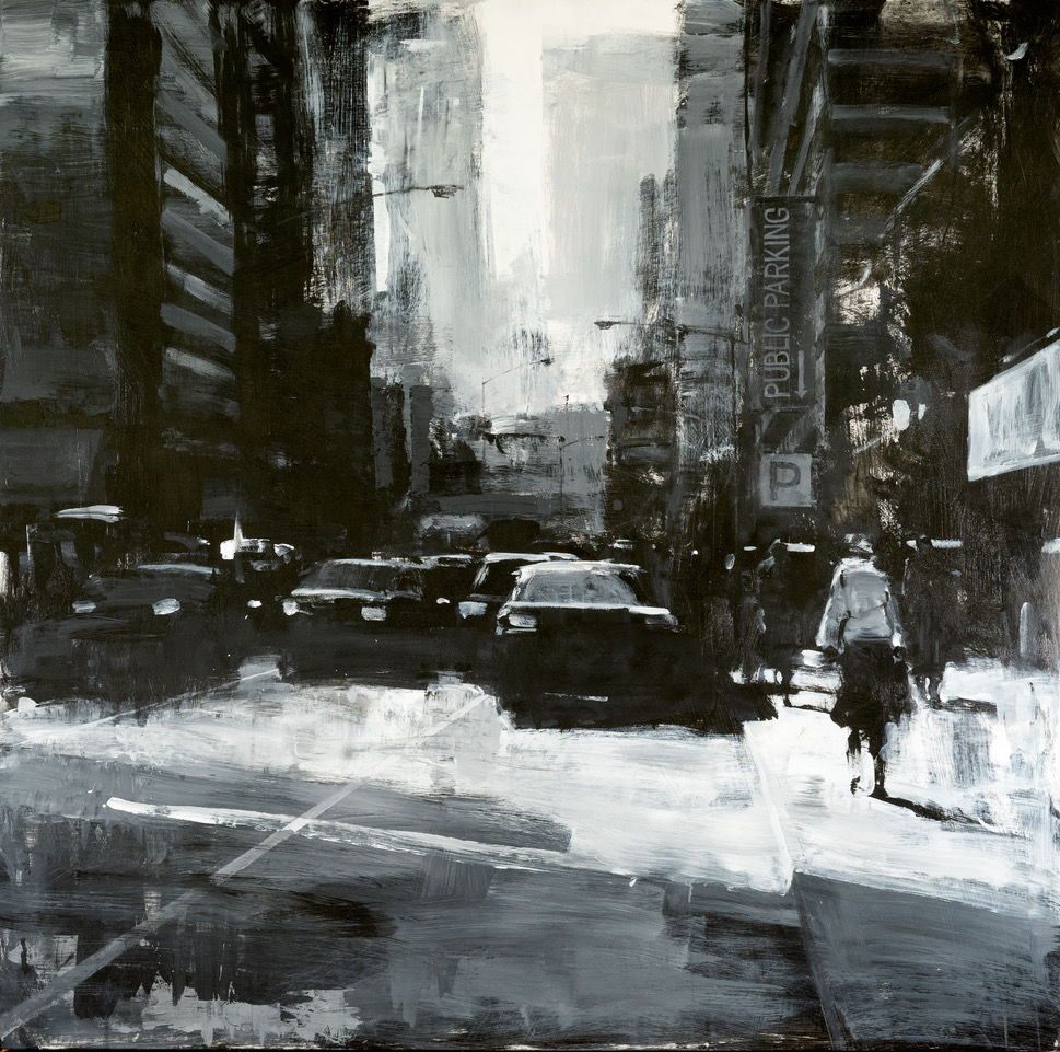
30″ x 60″ – Mixed media on panel
Before long, these doubts became truths, and at that point, I felt like I was having an identity crisis. Drastic action was in order. So, to shock myself into a new way of thinking and doing and to tear down my comfort zone, I destroyed about three hundred paintings and thousands of drawings that had accumulated in my studio. It was absolutely terrifying, but ultimately, cathartic.
What followed was a series of experiments and studies where I deliberately used unfamiliar materials and approaches, essentially denying myself the old way of working.
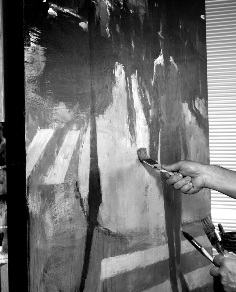
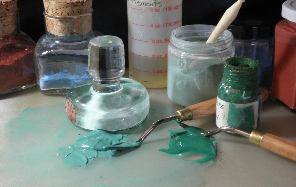
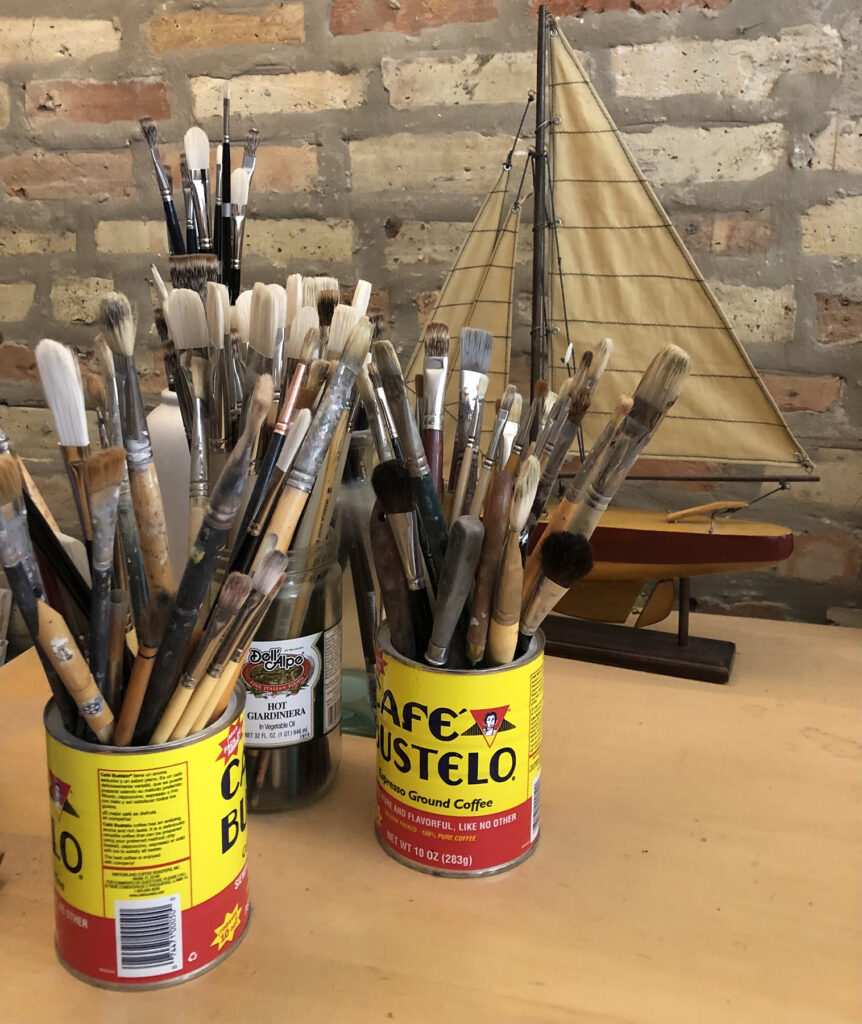
I started painting with acrylics and mixed media on hard surfaces primed with gesso, other times I used black house paint. I painted on different kinds of paper, plastic, and metal. (Previously, I had always been an oil painter, and my go-to substrate was linen.) I put away my nice brushes and picked up cheap house painting brushes and putty knives.
I painted tiny pictures, a couple of inches wide, and also much larger works several feet across, both with the intention of doing something unfamiliar and uncomfortable.
Because I wanted fewer things to think about and to work more intuitively, (as opposed to working methodically and controlling everything) I eliminated color, and only used black and white paint.
I decided that thumbnails and other preparatory studies allowed me too much room for analysis, so I abandoned them. Carefully drawing on my support prior to painting was giving me too much of a safety net, so that had to go as well.
I did away with all reference photos. I wanted to work spontaneously and freely. I did not want to be hindered by what I saw in photos, so I chose to paint only from memory and imagination. I wanted to see where it would lead. I really had no idea what to expect, and I guess that was the whole point. This uncertainty and the lack of predictability was such an adventure.
As expected, it was a huge struggle. Dozens of studies went straight into the trash, but wouldn’t you know it, I found the struggle really exciting! I felt like I was back in school making fresh discoveries.
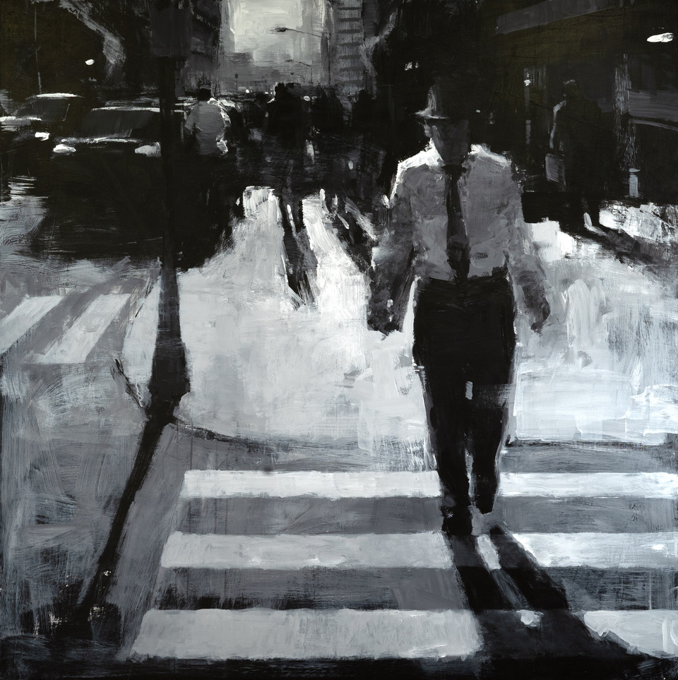
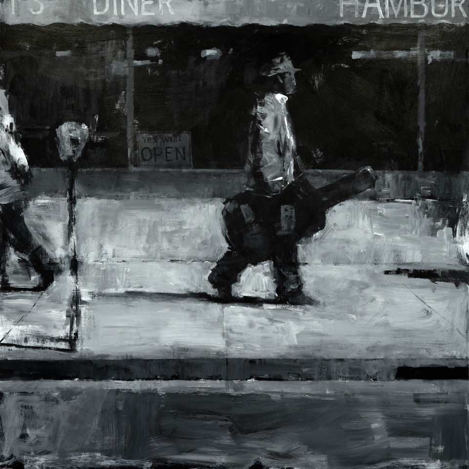
48″ x 48″ – Mixed media on panel
Eventually this exploration led to a series of larger, monochromatic, urban paintings. I learned to embrace the state of not being in control, of not having an expectation of outcome. It was all about the doing, and the pleasure of the discoveries.
I would gesso (or not) a big sheet of birch plywood and start slapping gobs of black and white paint on it, without any reference or preconceived notion of the result — no preliminary drawing, no thumbnails, no clue. The start of a painting often looked like a bad imitation of a Franz Kline painting.
One of the central blobs would remind me of a figure or a car, and I would start to shape it to make it more recognizable. From there, a context would emerge, sometimes slowly, sometimes quickly. I would find other shapes and fit them into this visual space.
During the process of creating a believable environment on my panel, I would make drastic changes on a whim. A building would be demolished, figures moved around, cars would come and go. I made a point to just follow these impulses, especially if it meant destroying perfectly good passages. Why? Because it meant that I’m doing it for the sake of expression, not the end product. Not without trepidation and second thoughts, but I almost always found it very liberating and satisfying.
12″ x 24″ – Mixed media on panel
Many paintings from this series have a very noir feel to them, owing to the fact they’re black and white, and also, probably, because I like hardboiled crime novels and 1950’s jazz. The moody, atmospheric qualities of the works of James Cain and Miles Davis are clear influences. The improvisational nature of jazz is something that resonates with me especially. In fact, these paintings to me, feel very much like jazz improvisation, only using paint, rather than sound.
48″ x 48″ – Mixed media on panel
One aspect of this process that I find fascinating is the role of narrative. When a painting includes figures, often a narrative develops, whether intended or accidental. In my case, it plays a large role in this series because of the noir influence. I start thinking about the figures in my painting and their story which naturally, plays a role in how they develop.
Because I don’t have a plan when I begin a new piece, the narrative is hidden from me. I watch it materialize and change as I paint the picture. It’s like reading a book and I am finding out what happens as I turn the page. Even though I am the creator, I’m also a spectator, a reader. I come back to the realization that NOT knowing what happens next is the crux of this series. The mystery and uncertainty keep me engaged, and pushes me to make drastic changes on a whim. If I want to find out what happens next, I have to write it.
To get over my pandemic slump, I had to find ways to disconnect myself from thinking too much, planning too much, and following the rules too much. It allowed me to pursue immediacy, urgency, and intuitive expression. And because the process is more visceral, I feel I’m closer to touching upon my authentic voice.
The pandemic is a terrible thing, but if there’s a personal silver lining, it is that I’ve gotten to know myself better, and I’ve always felt that that’s the ultimate purpose of making art.
48″ x 48″ – Mixed media on panel